Unexpectedly, Dulux Just Announced a Trio as Its Color(s) of the Year for 2026 — They'll "Soothe, Steady, or Excite, Depending on How You Play It"
Blue has been a popular interior color for centuries, but it's far from one note

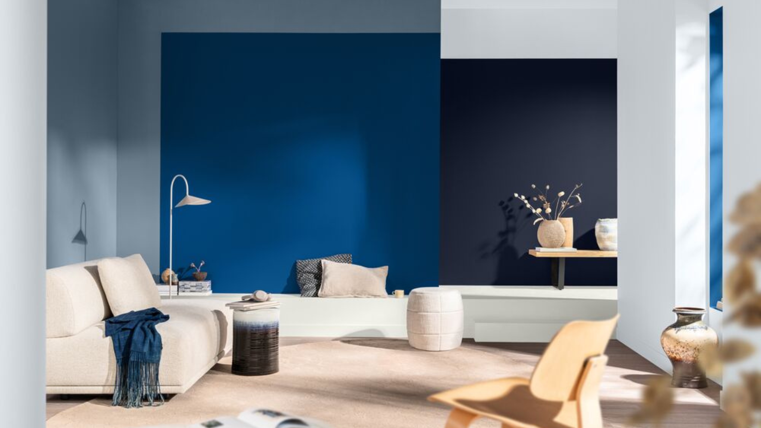
With just over three months left of this year, the design world is starting to look to the year ahead. What colors and patterns have defined the past months, and what do we have to look forward to in 2026? For the UK-based paint brand, Dulux, that means announcing its next color of the year, and for the first time ever, there are three of them.
It's a collection of upbeat, versatile blues in the aptly named Rhythm of Blues family. The palette features three shades: the airy and serene Mellow Flow, rich and grounding Slow Swing, and vibrant and expressive Free Groove.
Having three rather than a single shade gives a better chance at finding a color tempo that speaks to the mood of your interior, as well as the perfect palette for creating a more nuanced look. There's a moment for calm reflection, carefree bliss, and bold fun — and it's open to creativity with how we use them. Why choose just one blue when you can have a layered trinity?
Article continues belowBelow is everything you need to know about the Dulux color of the year announcement, the respective palettes, and how to style them in your home.
Marianne Shillingford, creative director and color expert at Dulux, explains that the choice to have a trio of blues as Dulux's 'color' of the year for 2026 helps steer us away from focusing solely on color trends and instead makes us think more about what we want from our homes.
"Blue has been the world’s favorite color for years, but it’s far from one note," she says. "It delivers a sense of fluidity, relief, stillness, and freedom, which is exactly what’s needed in today’s fast-paced world."
While an office may suit a sensory-conscious paint color like light blue to promote productivity and focus, a living or dining room could call for a darker shade to boost energy and ambiance.
The Livingetc newsletters are your inside source for what’s shaping interiors now - and what’s next. Discover trend forecasts, smart style ideas, and curated shopping inspiration that brings design to life. Subscribe today and stay ahead of the curve.
"Rhythm of Blues allows us to do both — it’s a family of colors that can soothe, steady, or excite, depending on how you play it," says Marianne.
But beyond just a trio of blue paint colors, The Rhythm of Blues launch is accompanied by three color stories — Free, Slow, and Flow — each inspired by a different 'tempo' of life. From grounding neutrals to pops of warm ochre yellows, these color palettes help you master the art of decorating with blue and plan the perfect scheme for your space.
Meet Mellow Flow
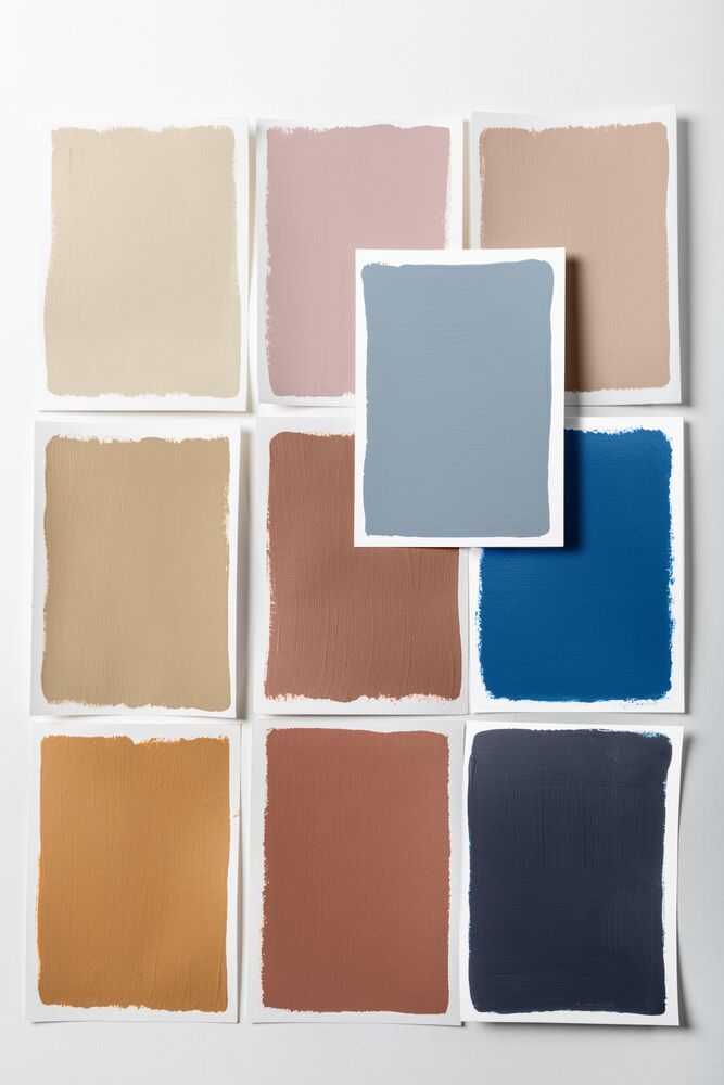
This palette is more subdued, but the darker shades can still blend beautifully into the scheme.
Image credit: Dulux
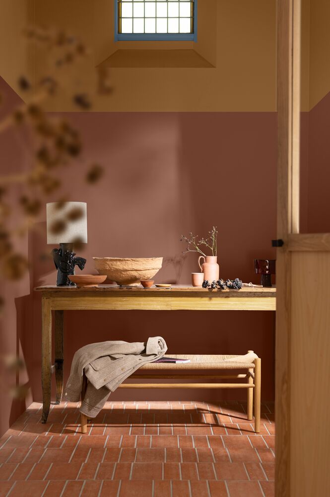
Even just a pop of blue in the window ties these colors together.
Image credit: Dulux
Mellow Flow is a soft, light blue that brings a sense of clarity, calm, and open breathing space, and is the first palette in Dulux's new color collection. These shades are for those who want a relaxing atmosphere, but don't want to sacrifice on stand-out color.
The natural tones are reminiscent of fresh seaside walks, or soft sunsets, and the rejuvenating quality that comes with those scenes..
"Its roots in nature give us something to connect to, as well," says Marianne. "When we see light blues like Mellow Flow, we might think of soothing springs or sunrise skies, for example," — instantly inviting serenity.
Use this as a calming bedroom paint palette or anywhere you need a little extra relaxation.
Slow Swing
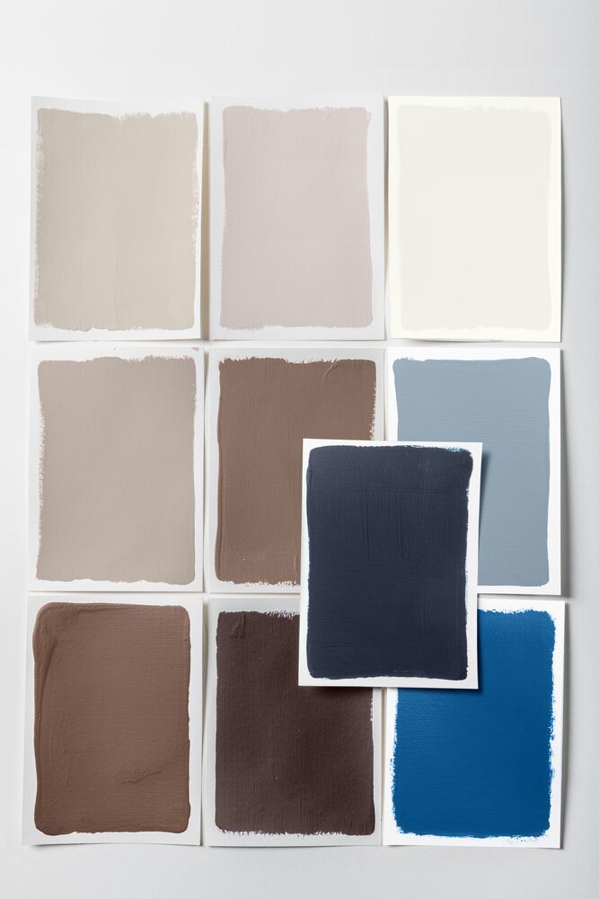
This palette provides plenty of design-forward contrast while still feeling easy on the eyes.
Image credit: Dulux
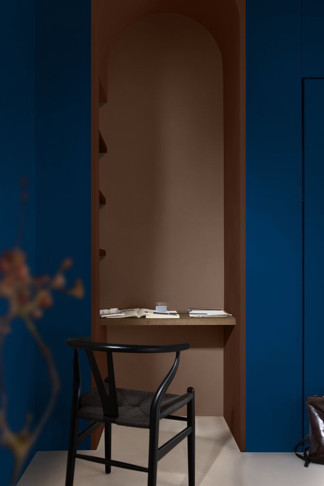
A deep and soothing palette that oozes with elegance.
Image credit: Dulux
Slow Swing, on the other hand, is the Dulux color collection that picks up the pace a little bit. This color palette is anchored by a deep, velvety blue that offers grounding and reassurance, providing the same familiarity and coziness as an inky starlit sky or a deep ocean scene.
You can either pair this navy blue with other dark colors like mocha brown for intensified drama, or create contrast in design with a creamy off-white or dusty pink.
Free Groove
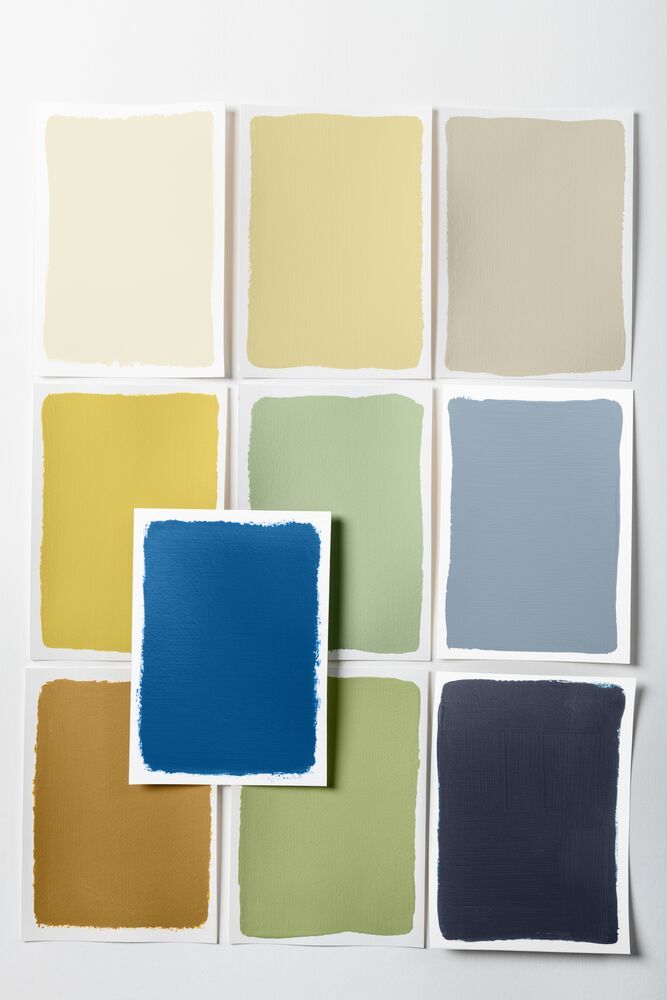
Not for the faint-hearted, this palette will make your home sing.
Image credit: Dulux
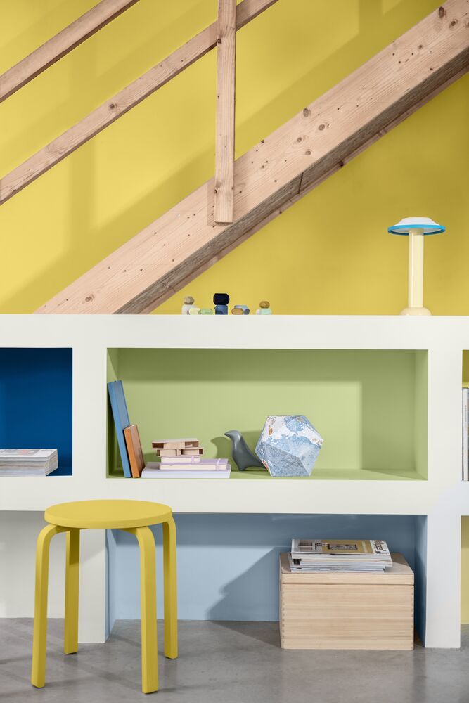
Zesty and bright, it's playful and energizing.
Image credit: Dulux
Lastly, Dulux introduces the bold color palette made for the vibrant and energizing Free Groove. Where the other colors and respective palettes have a more subdued or calming effect, "Free Groove offers a more intense heat, like that of summer pool parties," says Marianne.
Decorating with saturated colors doesn't have to feel intimidating, and this color collection proves that. For example, the bright sunshine yellows are balanced by pale butter yellows, and the bright mid-tone blue feels like a natural accent against the other Dulux color of the year selections.
Use this palette to brighten kitchen walls or bring a more playful atmosphere to living rooms or hallways.
Blue has been considered an expensive-looking color for centuries, which is why we've been decorating with it in our homes for as long. And it seems like 2026 (and 2027) are set to continue the trend.

Olivia Wolfe is a Design Writer at Livingetc. She recently graduated from University of the Arts London, London College of Communication with a Masters Degree in Arts and Lifestyle Journalism. In her previous experience, she has worked with multiple multimedia publications in both London and the United States covering a range of culture-related topics, with an expertise in art and design. At the weekends she can be found working on her oil paintings, reading, or antique shopping at one of London's many vintage markets.


