This Paint Brand's 'Color Edit' for 2026 Is Giving Me Unexpected Inspirations for Color Pairings for My Next Decorating Project
Lick is proving the colors you've known since elementary school are just as fashionable in today's interiors

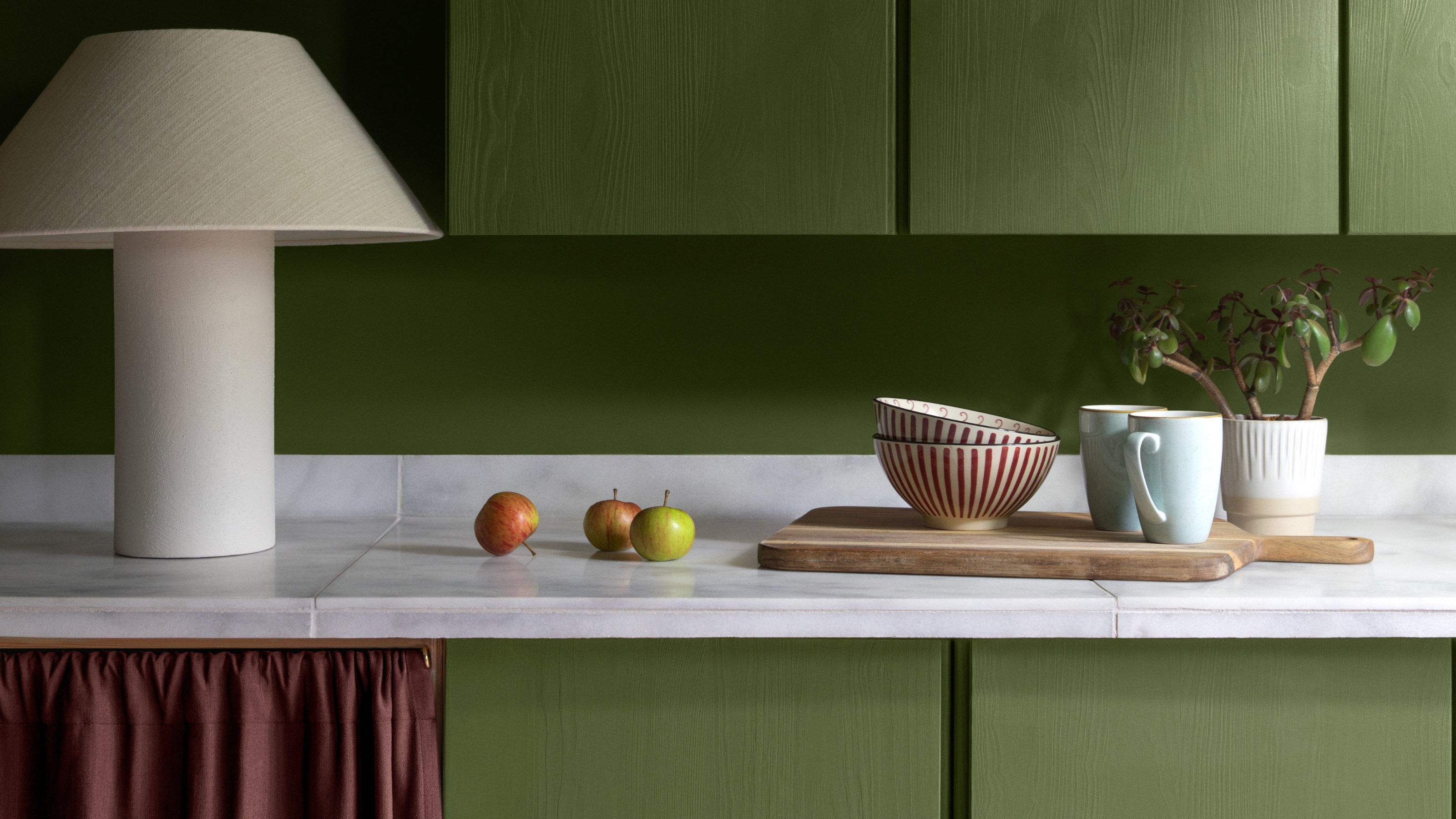
September's here, and several months of snuggling up indoors lie ahead of us. That means the colors on your wall matter — now more than ever. If your room could use a refresh, why not take some inspiration from UK paint brand Lick's just-announced 2026 color edit? It's playful, primary-packed, and full of pigment.
If you're up to date on color trends, you may have already noticed a running theme: nostalgia. Over the last year, interior design has embraced reimagined neutrals and retro-inspired schemes (Lick even welcomed this with its 2025 color edit: New Nostalgia), and it's a trend that's set to grow and evolve in 2026, though those nostalgic shades are gaining a truer, sharper form.
Lick's 2026 color edit (yes, not just one color of the year, but eight) invites us to return to the whimsical, child-like way of choosing color solely based on interaction — how it makes us feel and what we are drawn to. For that, the brand has released a primary-based palette of eight of Lick's best paints in saturated tones that are as timeless as they are playful. Explore the full color edit, aptly named 'Return to Play', below.
Article continues belowLick's 2026 Color Edit

Butter yellow isn't going anywhere. In fact, Lick's director of interior design, Tash Bradley, was quick to dub butter yellow paint the new olive green. It's fashionable, yet an instant classic, and it should be used wherever you want a neutral that reads more exciting and elevated.

Taupe 03 has been featured in three of Lick's color edits and has since become one of the brand's best-performing neutral paint colors. Tash says, "I've believed in this 'dirty' neutral since the beginning, and it's truly a shade that can go with anything."

This red paint color is the second primary color appearance in the palette. Interior design trends have revelled in a pop of red lately, but Red 06 feels like a more refined take. Use this as an accent or dare to drench an entire moody space in it.

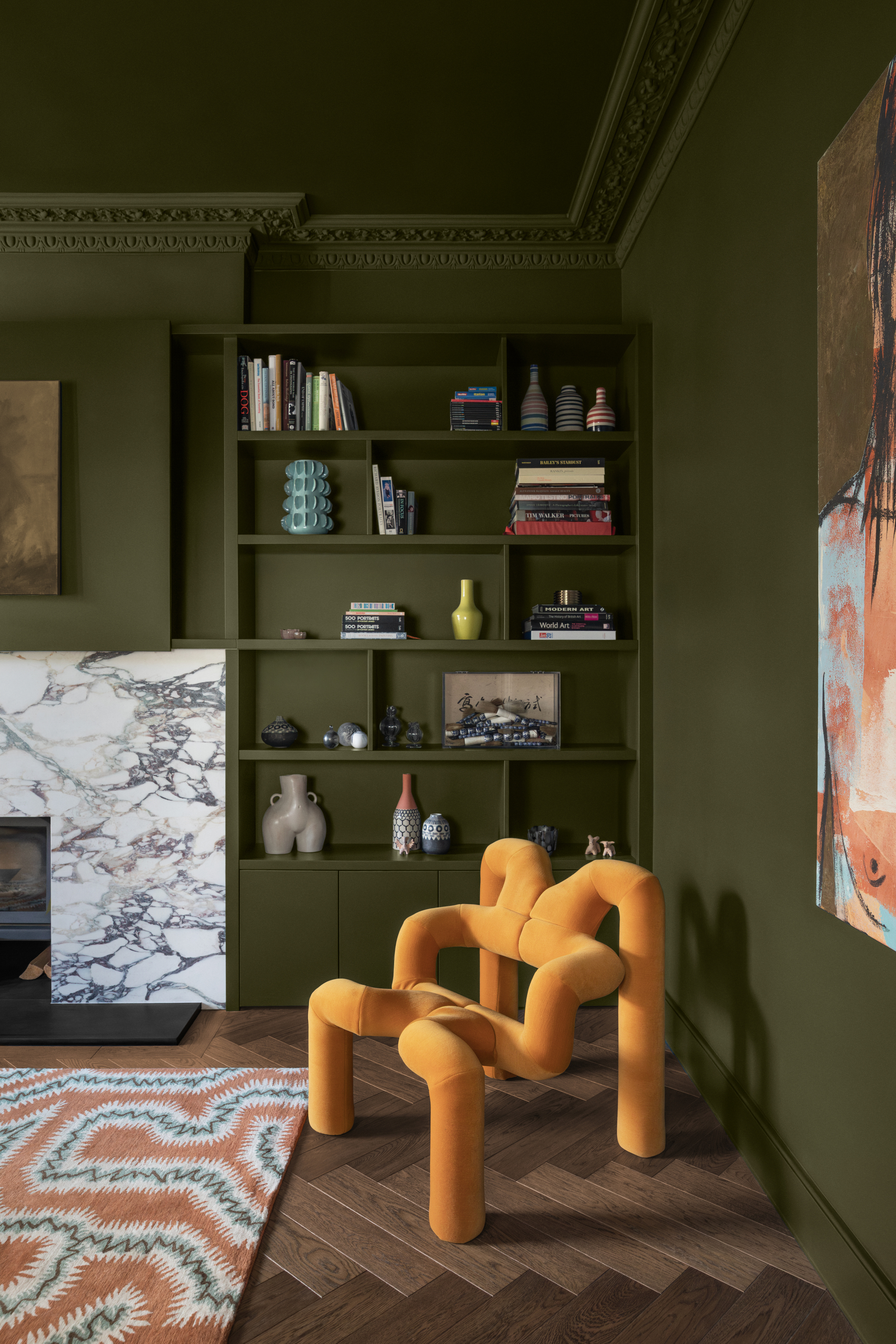
Every palette needs at least one darker, grounding color. This olive has depth, appearing brighter in sun-soaked spaces and as a moody forest green when used as a paint color in north-facing rooms. Green 05 is bold, but it can just as easily become an anchoring neutral.

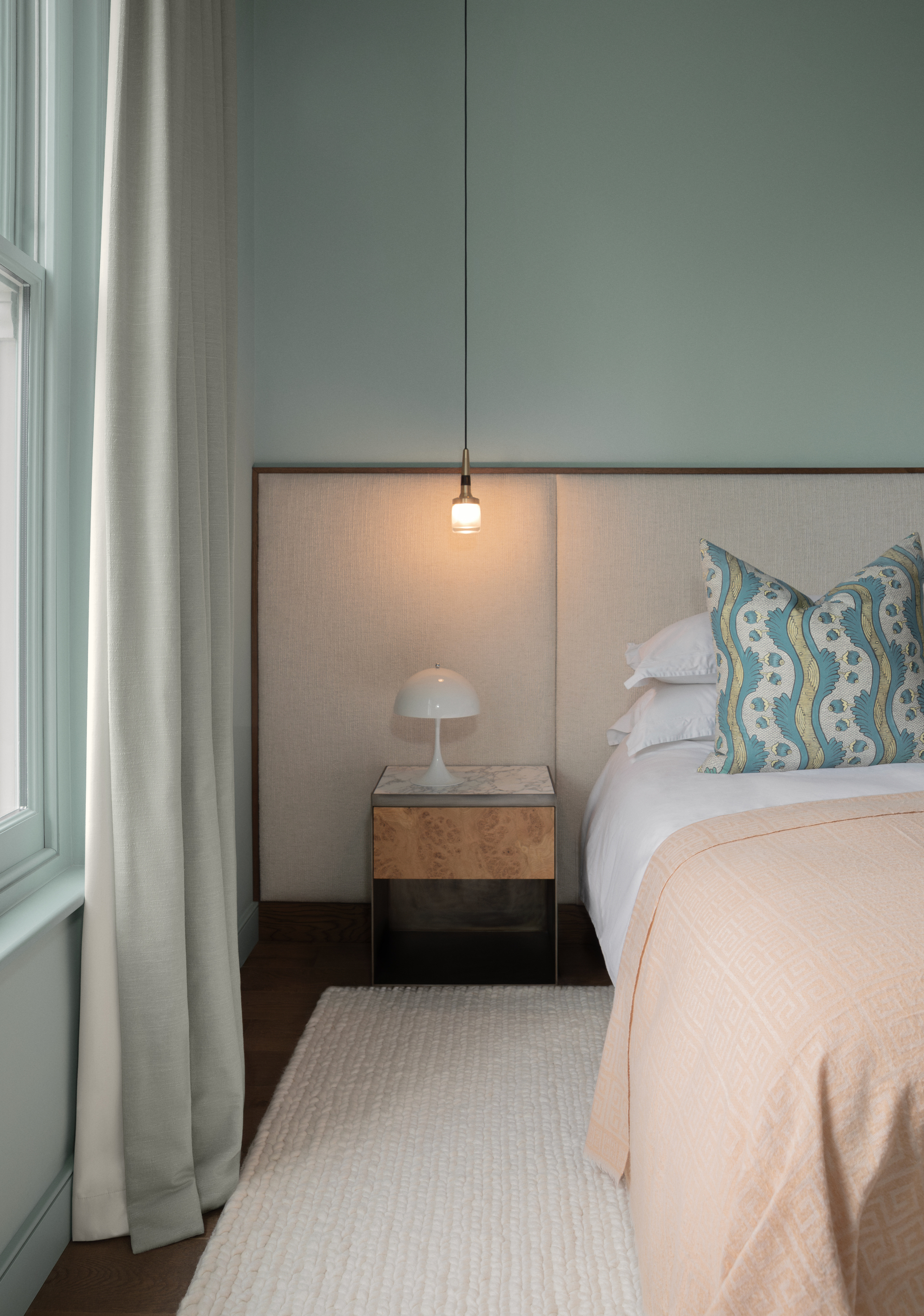
When the Livingetc team shared their predictions for 2026's color of the year, teal was the crowd favorite. However, Lick's Blue 03 feels much cooler, brighter, and mint-adjacent than expected in 2026, and I'm loving it. It's a calming respite from the rest of the quite moody palette.
How the 2026 Color Edit was Created
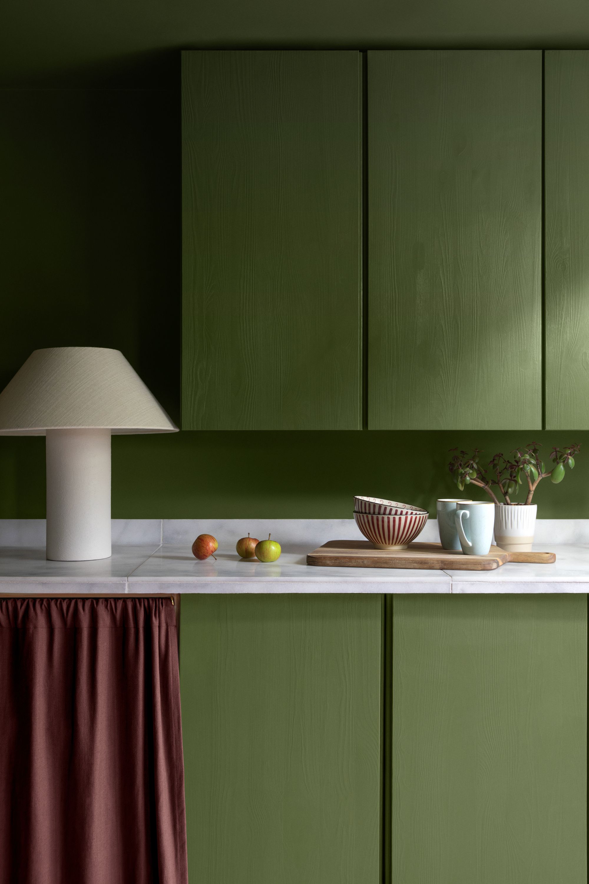
This green is bold, but can easily be used in everyday spaces.
Image credit: Lick
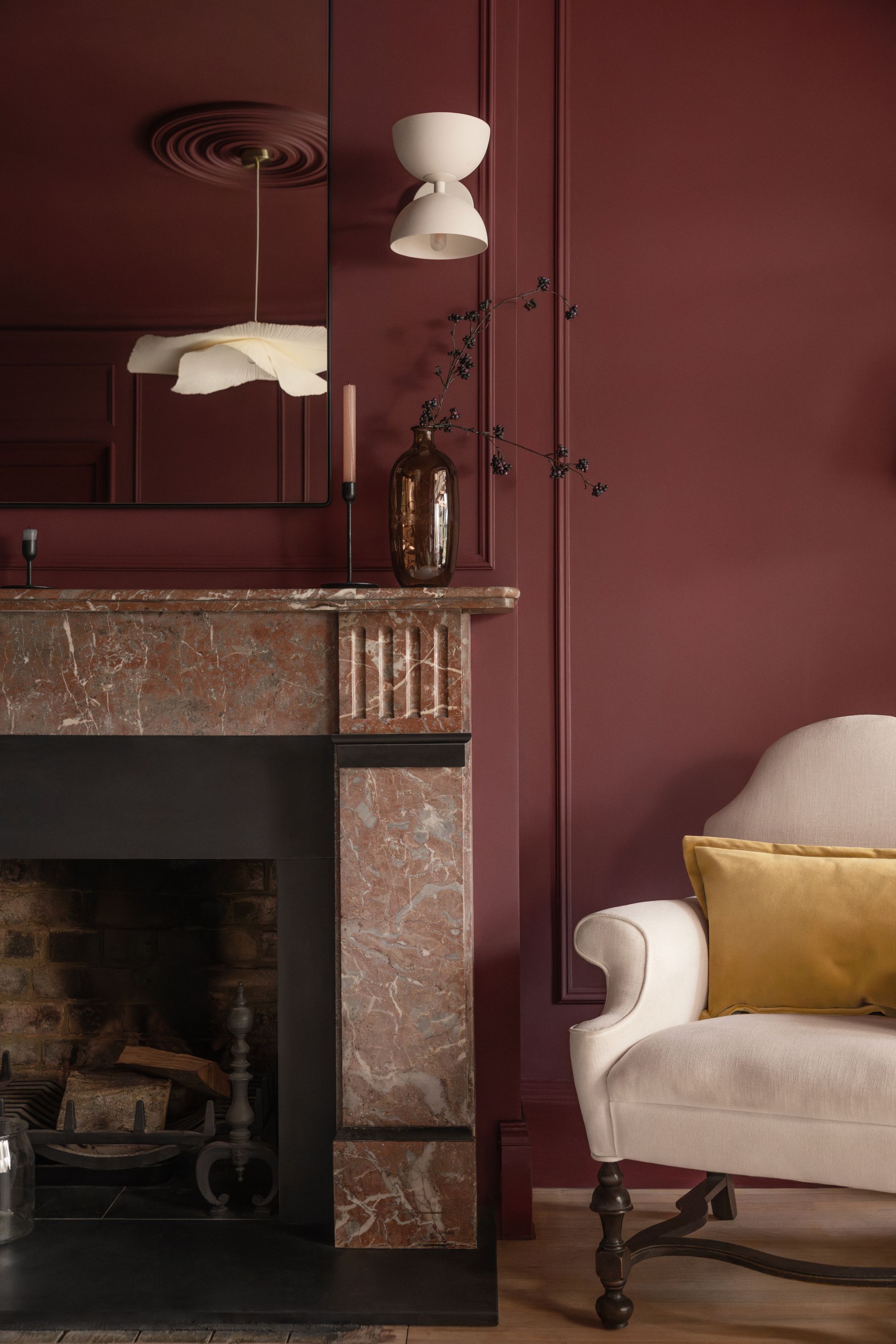
Don't be afraid to color-drench a room in this deep red.
Image credit: Lick
Rather than promoting a single color of the year, Lick opted for a more nuanced and comprehensive edit that explores how color has evolved over the last year and how it will continue to set the tone for 2026.
Tash Bradley and the team based the 'Return to Play' edit on several musings found within the interior design and fashion world. Surrealism in design, daring colors used as "drenches" instead of feature walls, the "gamification" of fashion trends (think Labubus, and Louis Vuitton's Snakes and Ladders-themed runway) — these all led to a clear idea of what color would mean for Lick in 2026.
The edit is meant to offer bold, yet classic colors that can be clearly and creatively combined for years to come. "The paint at Lick is never made out of any necessity to follow strict trends," says Tash.
Picking a single color to define the year can easily confine the color palette throughout your home to something you may grow tired of or that will date. Breaking this mold is what inspired Lick to build its yearly palettes out of the colors already existing in its repertoire, since the beginning.
The Livingetc newsletters are your inside source for what’s shaping interiors now - and what’s next. Discover trend forecasts, smart style ideas, and curated shopping inspiration that brings design to life. Subscribe today and stay ahead of the curve.
That's right, no new paint colors made for the 2026 color edit; instead, this palette is a reimagining of how colors interact with one another. "Colors are meant to be layered," explains Tash. "When a blue you may not have formerly paid any mind to is now seen next to a deep red or moss green, it becomes something fresh and exciting."
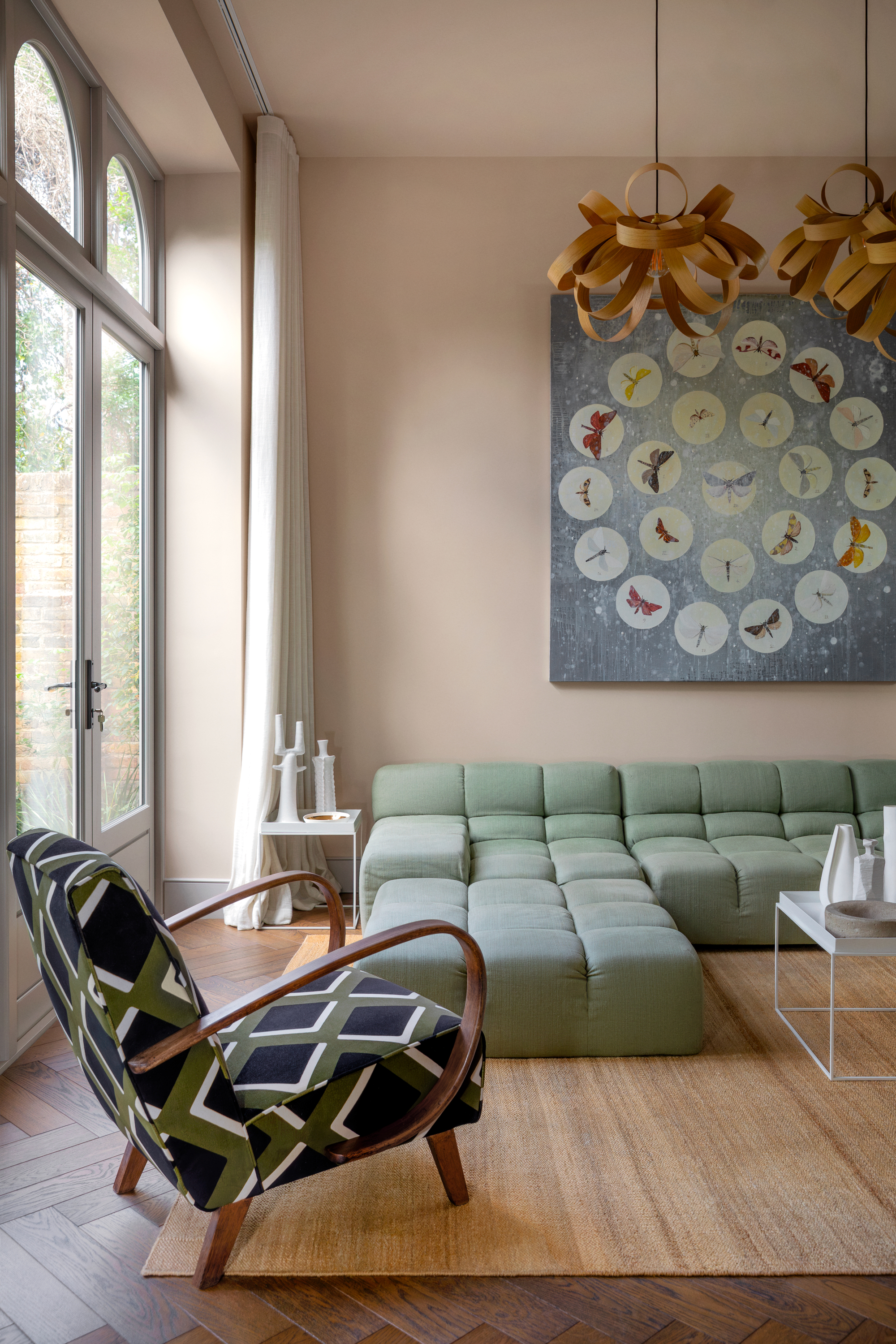
2026 has a lot in store when it comes to decorating with color. Here's to the start of color of the year season!

Olivia Wolfe is a Design Writer at Livingetc. She recently graduated from University of the Arts London, London College of Communication with a Masters Degree in Arts and Lifestyle Journalism. In her previous experience, she has worked with multiple multimedia publications in both London and the United States covering a range of culture-related topics, with an expertise in art and design. At the weekends she can be found working on her oil paintings, reading, or antique shopping at one of London's many vintage markets.
