Psst — Little Greene's Color of the Year Has Been Announced, and It Looks Like Your Home Could Soon Be Officially Pivoting to Purple
The paint and wallpaper brand predicts that the shade set to define 2026 is a moody mix of burgundy and plum purple

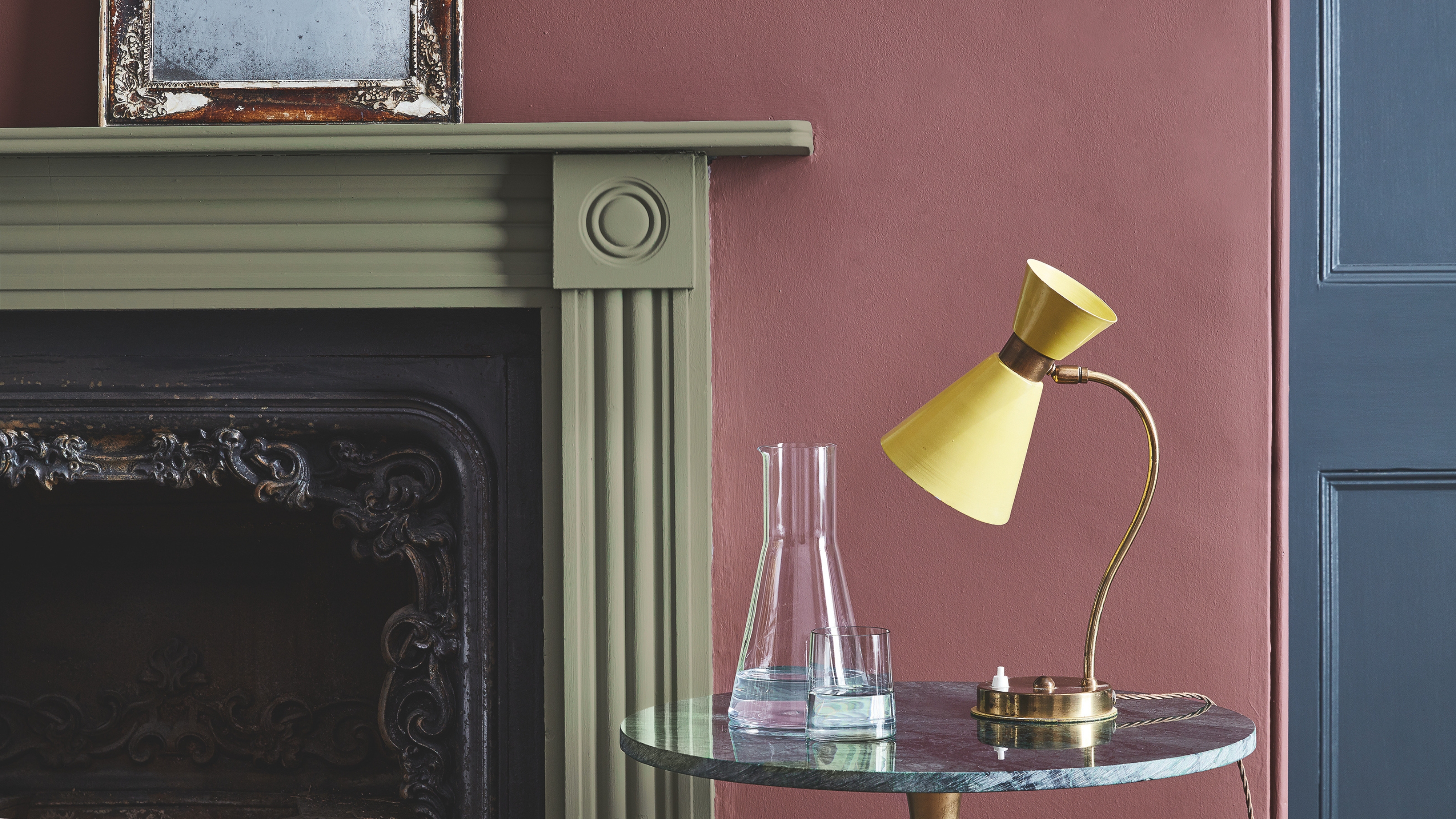
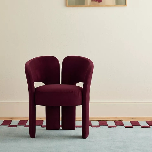
Love it or hate it, purple is shaping up to be the most stylish color for 2026. Not just any purple, though — Aubergine, specifically. As the color forecasting season descends upon the design world and paint brands announce the shades that will define the next 12 months, it's somewhat comforting to see familiar colors in the mix. From the mocha browns and warm chocolates we know, plum-perfect purples feel like a nice next step.
That's what paint company Little Greene thinks, at least, having just named its dark aubergine, Adventurer, as the color of the year for 2026. The burgundy-adjacent is dark with warm undertones that foster an intimate, comforting, and refined atmosphere.
It's exactly the aesthetic we've been drawn to over the past year — the kind of bold, warm colors that create comforting environments. But this feels like we're pushing it further, experimenting with a bit more heightened confidence and character. And why wait for 2026? It's perfectly timed for the autumn season, I say. Here's what you need to know to style it.
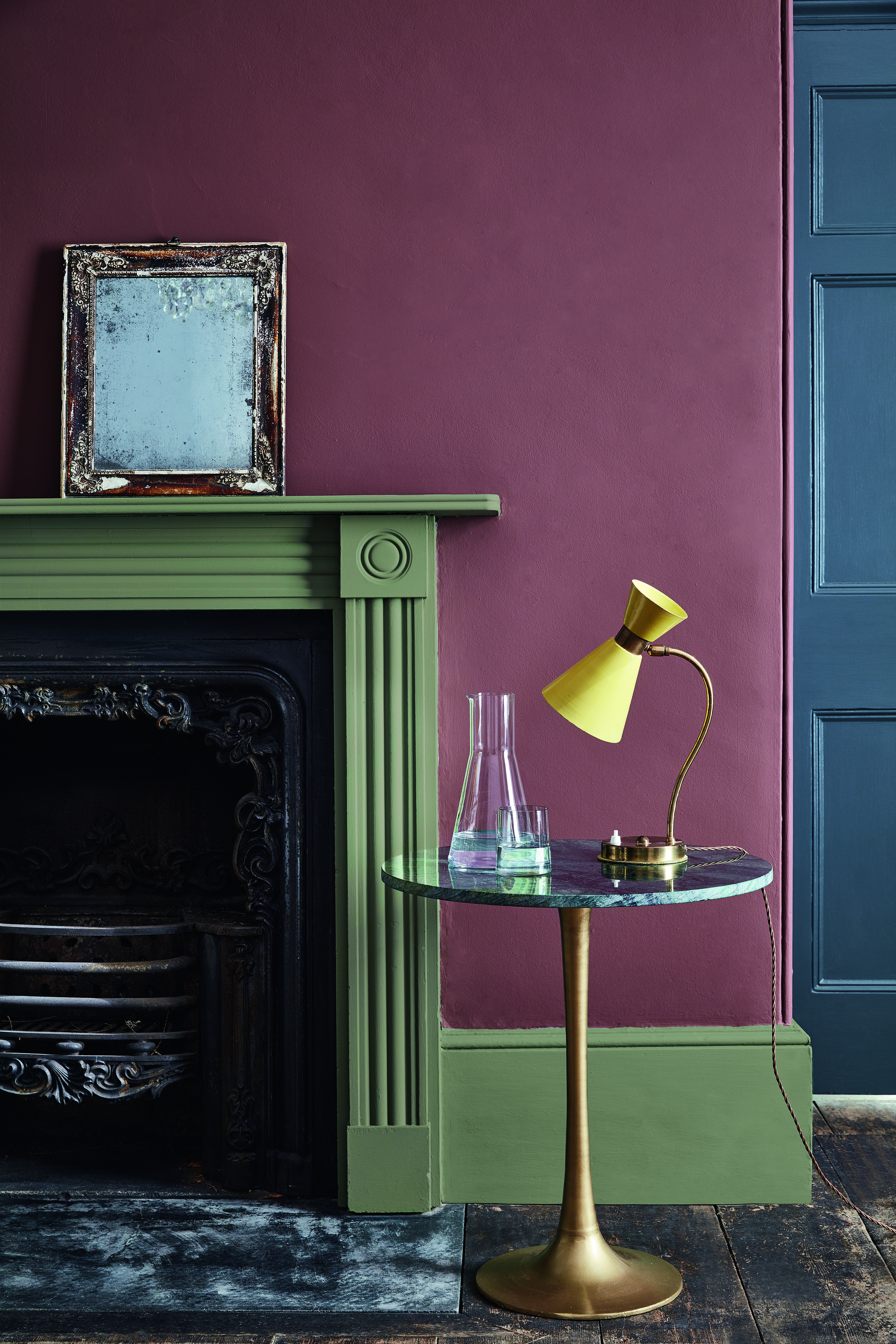
Paired with other earth-toned colors, Adventurer strikes the perfect balance between an accent color and a warm backdrop.
Full disclosure: a dark aquamarine-teal was top of the list for the Livingetc team's color of the year 2026 predictions, but between Little Greene's announcement and the recent Graham & Brown design of the year, it looks like we're sticking to the warm side of the color wheel for another year yet.
Why? Ruth Mottershead, creative director at Little Greene, explains, "We first saw this in the use of calm, earthy neutrals that have an inherent warmth to them, and more recently in the return of brown, with deep, sumptuous chocolate hues being embraced alongside rich caramels and honey tones to create elegant and indulgent spaces that offer real comfort."
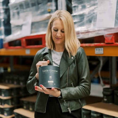
Ruth Mottershead is a color expert and the creative director at Little Greene Paint Company. At Little Greene, she has pioneered the way the brand thinks about color and pattern, creating new palettes, new pigments, and becoming the force behind sustainable paint offshoot Re: mix. She is also a regular contributor to Livingetc.
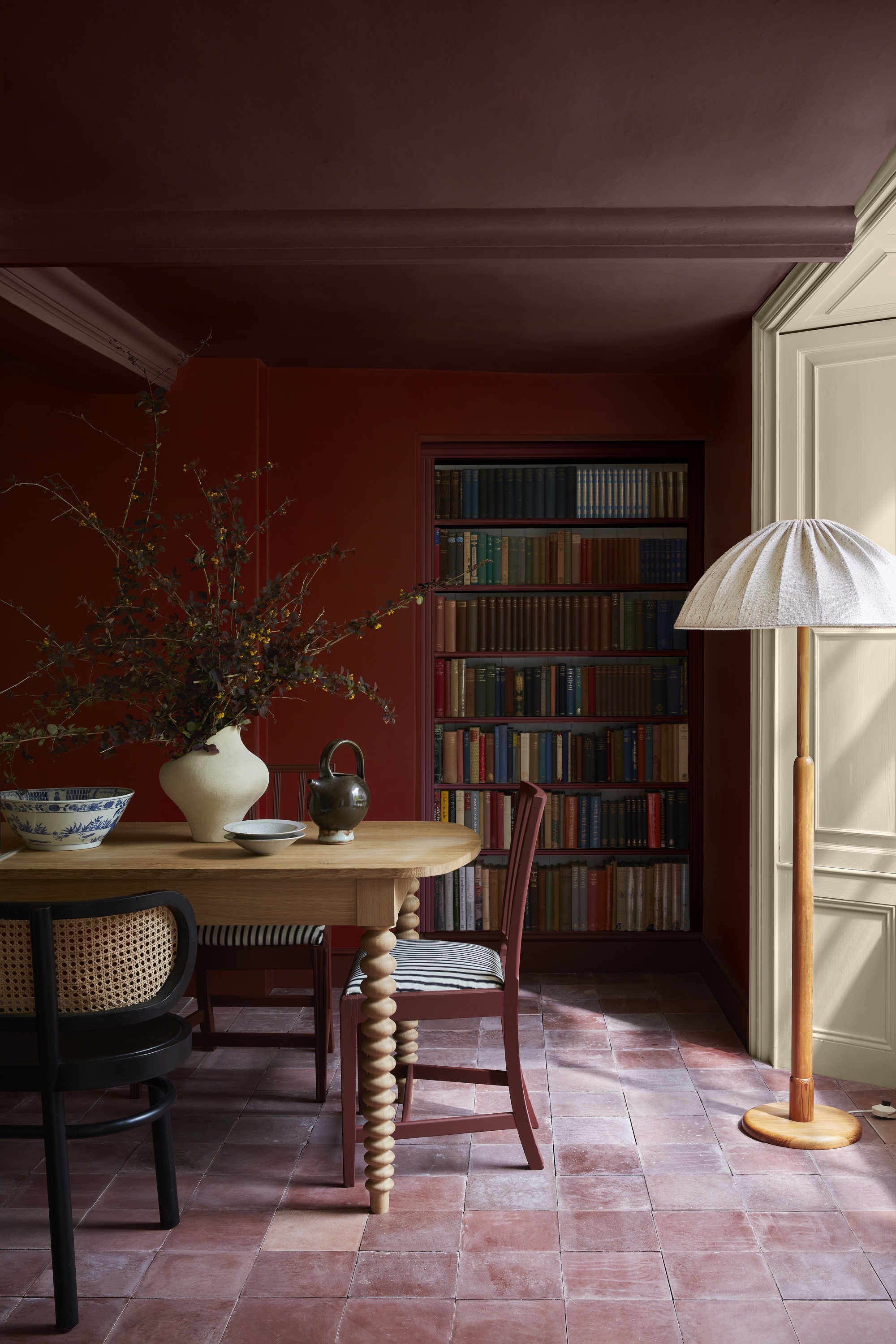
These darker purple hues truly come into their own when paired with a tonal combination of dusty pinks and more saturated reds.
Color trends have seen a clear shift towards warm, earthy shades that are soothing and connected to the natural world. For 2026, Ruth predicts we'll see a natural progression in the use of burgundy in interior design, "with shades of red, pink, and purple all becoming more popular as customers continue to demonstrate more color confidence in their homes."
It's about taking that nostalgic familiarity of earth tones and 70s color palettes, and expanding them in ways that feel slightly more contemporary and vibrant.
The Livingetc newsletters are your inside source for what’s shaping interiors now - and what’s next. Discover trend forecasts, smart style ideas, and curated shopping inspiration that brings design to life. Subscribe today and stay ahead of the curve.
How to Use 'Aubergine' in Your Interiors
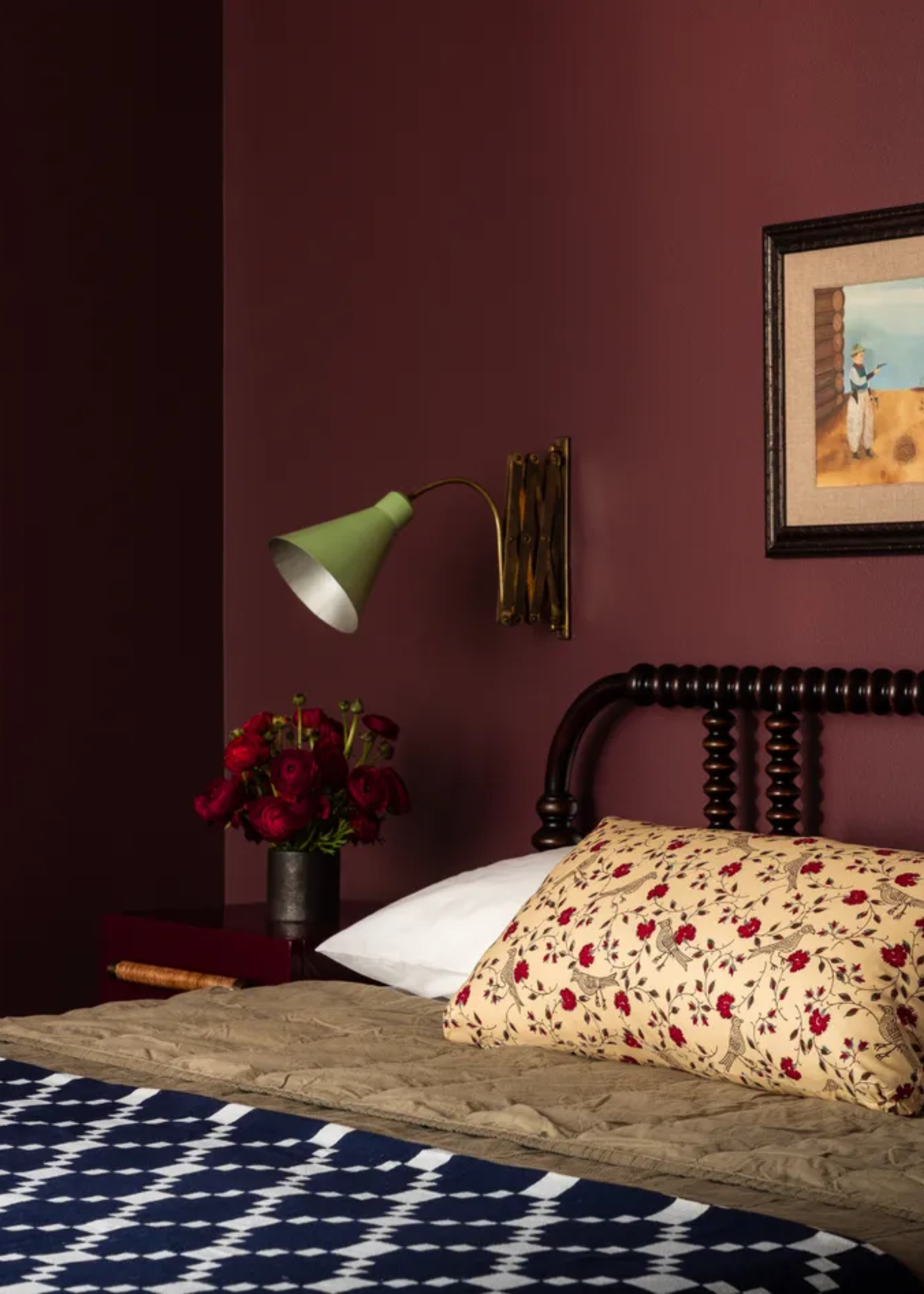
Styling purple in the home isn't as scary as most people think it is.
So, now comes the fun part — figuring out how to style rich colors like Adventurer in our homes. Decorating with purple (especially dark, plum purple) may seem daring, but that doesn't necessarily mean scary.
In fact, "Regal, reassuring plum aubergine hues like Adventurer are historically associated with opulence, providing the perfect shades to combine luxury with tranquillity, intimacy and restfulness," says Ruth, making it ideal for bedroom wall colors, dining rooms, and bathrooms.
When opting for an aubergine color-drench, deep, earthy pinks like Little Greene's Nether Red provide a wonderful tonal contrast. Creating this balance is essential when working with darker paint colors.
On the other hand, there are plenty of colors that go with burgundy, outside of the red-pink-purple family. Use softer, more neutral shades to tone down its intensity while still allowing it to shine. I even think butter yellow would make a fabulously stylish color pairing for aubergine (purple and yellow are complementary colors on the color wheel after all).
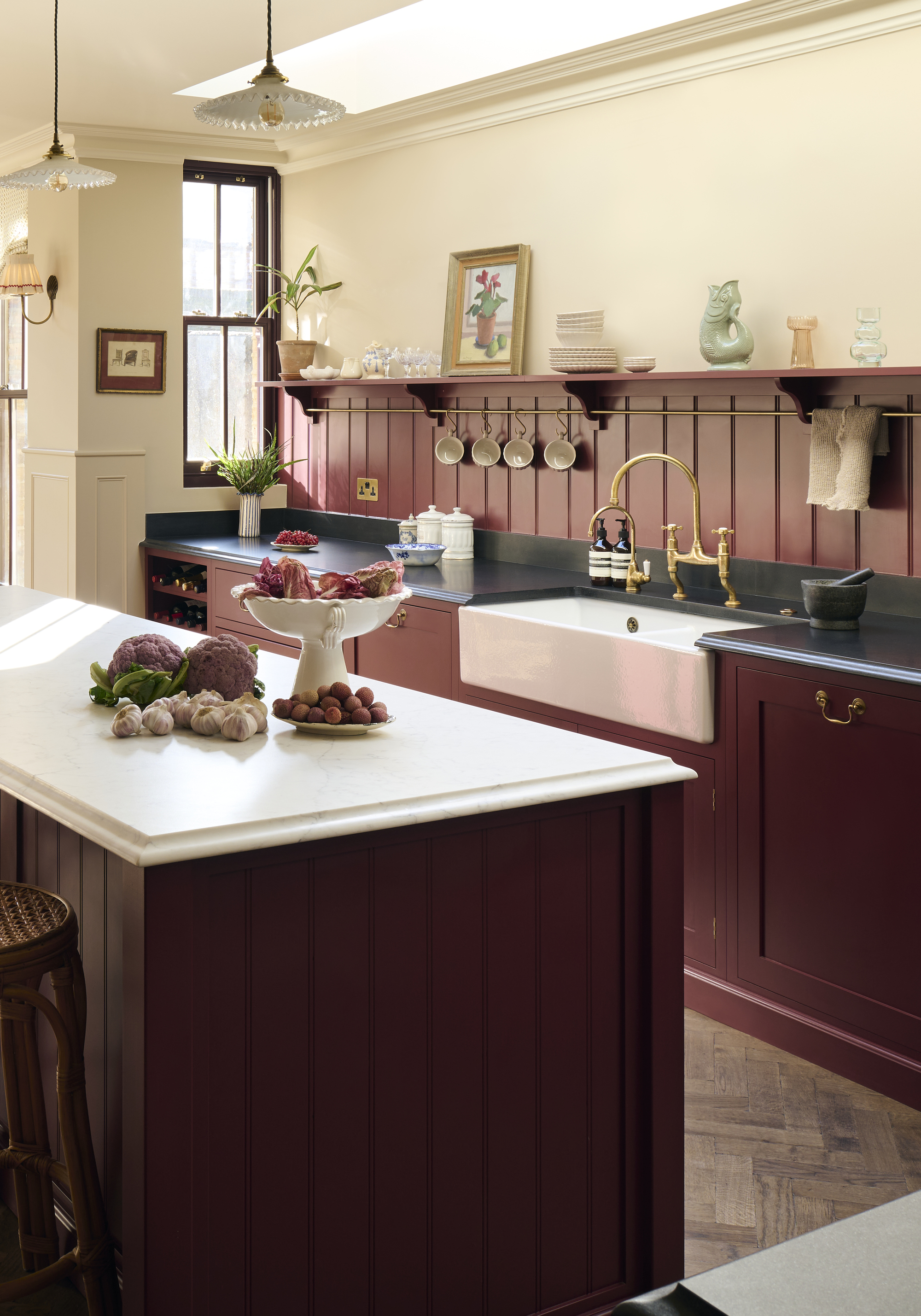
"Darker aubergine shades like Córdoba and Purple Brown are becoming a popular choice to create impact on both walls and woodwork — a fabulous choice for cabinetry, doors, or baseboards in a high gloss finish," says Ruth.
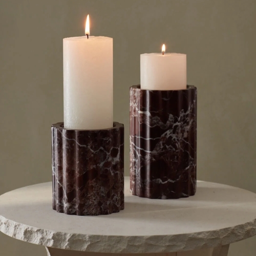
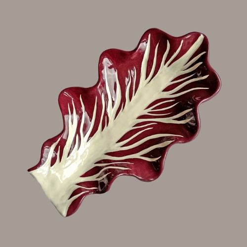
Once you've planned where to paint this luxurious color, dot a few aubergine decor pieces around the room to tie it all together.
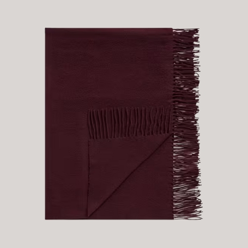
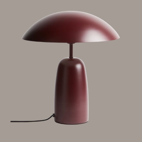
A cheeky purple throw across the end of the bed or over the back of a neutral sofa? An aubergine table lamp to add ambiance and a moody reddish glow to the room? There are so many ways to make this color work for a contemporary interior.
Loving this purple-tinted color renaissance? Wait until you hear about the purple sofa trend.

Olivia Wolfe is a Design Writer at Livingetc. She recently graduated from University of the Arts London, London College of Communication with a Masters Degree in Arts and Lifestyle Journalism. In her previous experience, she has worked with multiple multimedia publications in both London and the United States covering a range of culture-related topics, with an expertise in art and design. At the weekends she can be found working on her oil paintings, reading, or antique shopping at one of London's many vintage markets.


