Designers Share How to Avoid Your Color Scheme Feeling Overstimulating — While Still Using Plenty of Color
We all want our homes to feel nurturing while still looking stylish. Here are a few key tricks to perfecting that through color

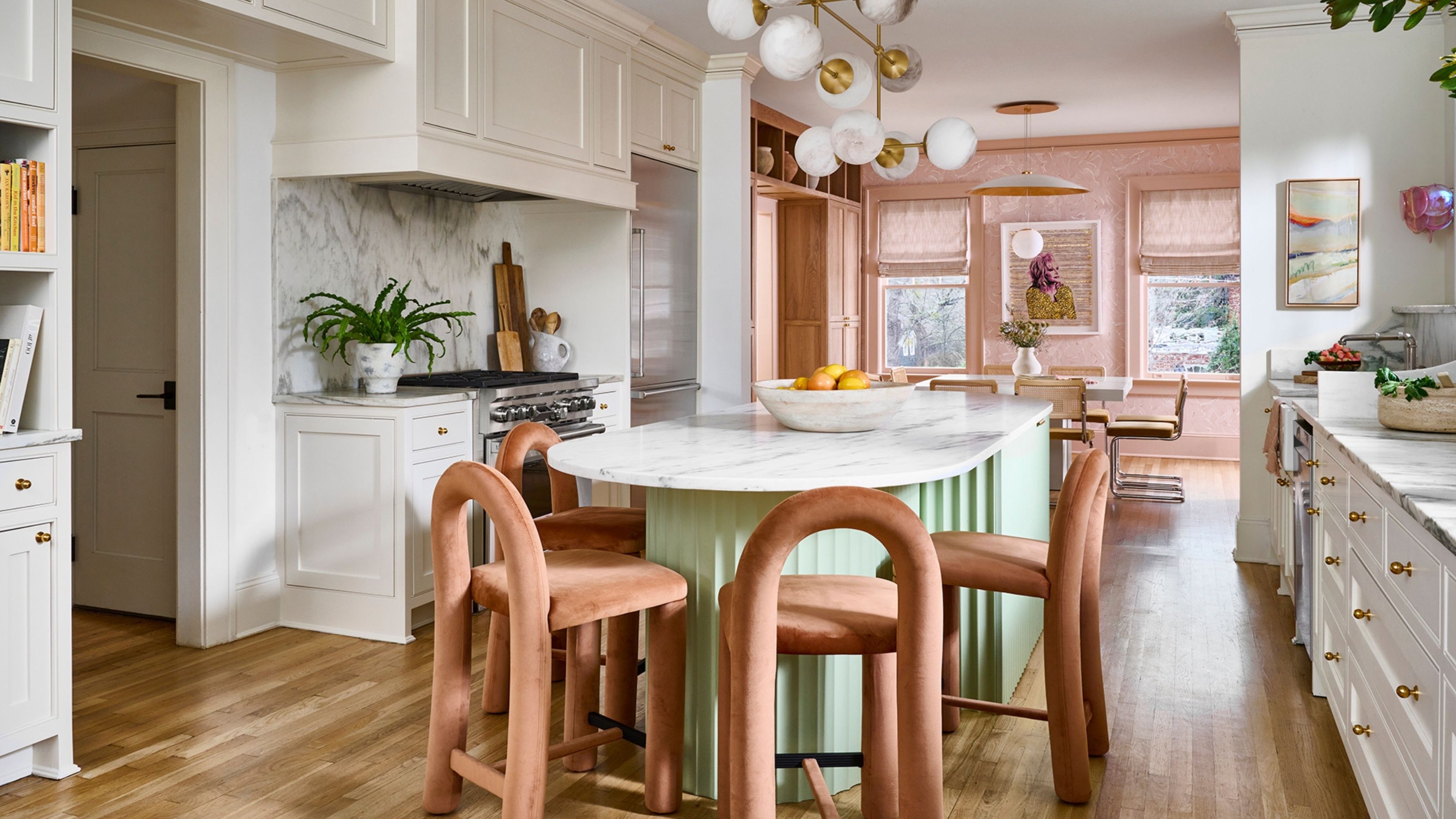
So, you want to use color in your home, but are scared it's going to feel overstimulating? Fair enough. It's a tough balance to find, especially with the bold, saturated hues currently dominating trends. But don't worry, whether you've already put paint on the wall or are still planning your palette, there are plenty of ways to use color while avoiding an overstimulating color scheme.
Decorating with color is an art in itself. It takes a little practice and patience to understand which colors work in a space — and together — as well as how to decipher more technical details like tint and tone. When planning a color scheme, Livingetc's color expert, Amy Moorea Wong, says, "The eyes need places to rest in a room. When spaces don't offer moments of pause through calming shades or a color break, or if there's too much saturation, hues can end up competing for attention and feeling mentally exhausting."
So, before you try that bold shade of electric blue on your walls, it's key to make sure it's incorporated in a way that is conducive to a calming environment rather than a stressful space. Our homes are supposed to be our safe havens, so if your color scheme is feeling a little overstimulating, here is how designers recommend fixing it.
Why Do Color Schemes Start to Feel Overstimulating?
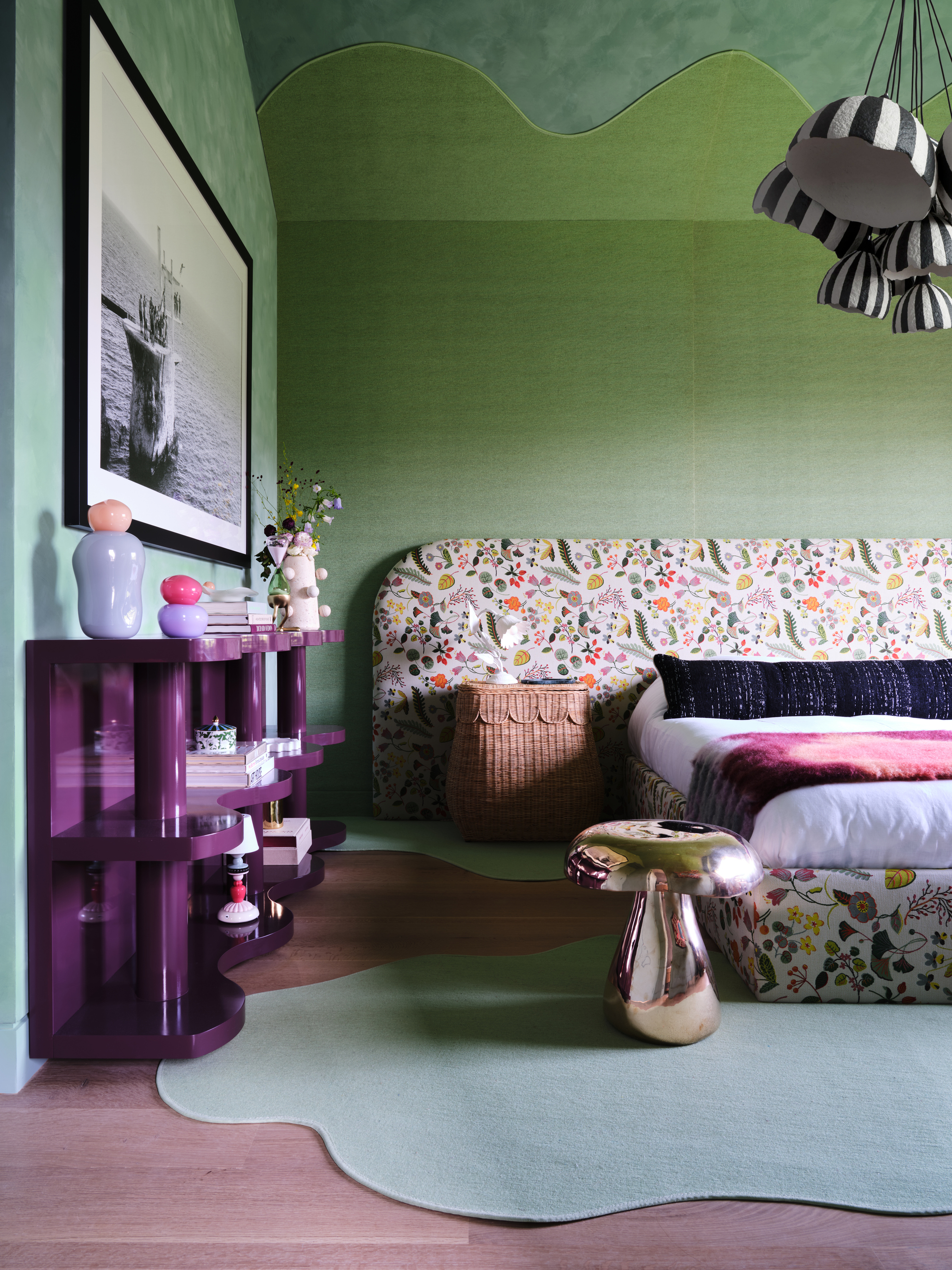
This bedroom uses lots of bold colors, but nothing feels too overstimulating or competing for attention.
So what causes a color scheme to feel overstimulating rather than a balance of comfortable and visually striking? "I naturally design with a lot of restraint when it comes to color, but I don't shy away from it," says interior designer Gabriela Eisenhart of Silo Studio. "There is a way to introduce energetic colors in a space while still keeping it calm and visually fluid."
Color schemes tend to feel overstimulating when colors compete. "When you enter a room, your eyes should travel, and your nervous system should be able to rest," Gabriela explains. When too many colors compete, the eye has nowhere to move, which can create visual overwhelm.
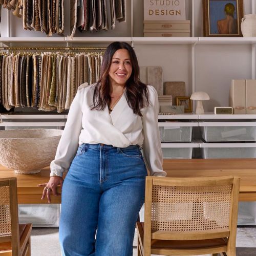
Gabriela is an Atlanta-based interior designer and the founder of Silo Studio Design. Rooted in an organic modern sensibility, Gabriela loves layering minimal, tactile materials to create soft, grounded interiors with just a hint of the unexpected.
So what are the key triggers to look out for? "Proportion," says Amy Moorea Wong. "If colors are used in equal amounts and no hues lead, the scheme can feel too much, and the space is confusing to observe (let alone live in)."
The wrong hues, tones, tints, shades, and undertones can also create overwhelm. "The warm vs cool colors can fight each other for dominance, which can create more subtle visual overwhelm," Amy adds.
The Livingetc newsletters are your inside source for what’s shaping interiors now - and what’s next. Discover trend forecasts, smart style ideas, and curated shopping inspiration that brings design to life. Subscribe today and stay ahead of the curve.
And then, of course, there's lighting to think about. "If a color is glossy and bounces light, that can lead to overexposure of the hue, as can overly bright artificial lights, which can sharpen colors beyond what the eye feels comfortable with," explains Amy.
All of these elements can cause color to feel visually taxing and stressful rather than promoting a serene living environment.
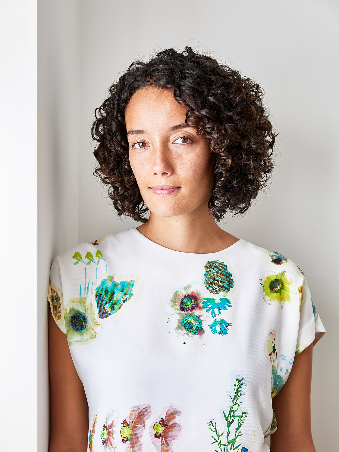
Amy Moorea Wong is a color authority and contemporary interior design writer who has specialized in all things decorating for over a decade. Alongside being Livingetc’s Color Expert, she also contributes to an array of global publications and has a book, Kaleidoscope: Modern Homes in Every Colour. Amy is an ardent believer in the power of color in a home and how creative design should never be intimidating.
Are There Certain Colors to Use or Avoid?
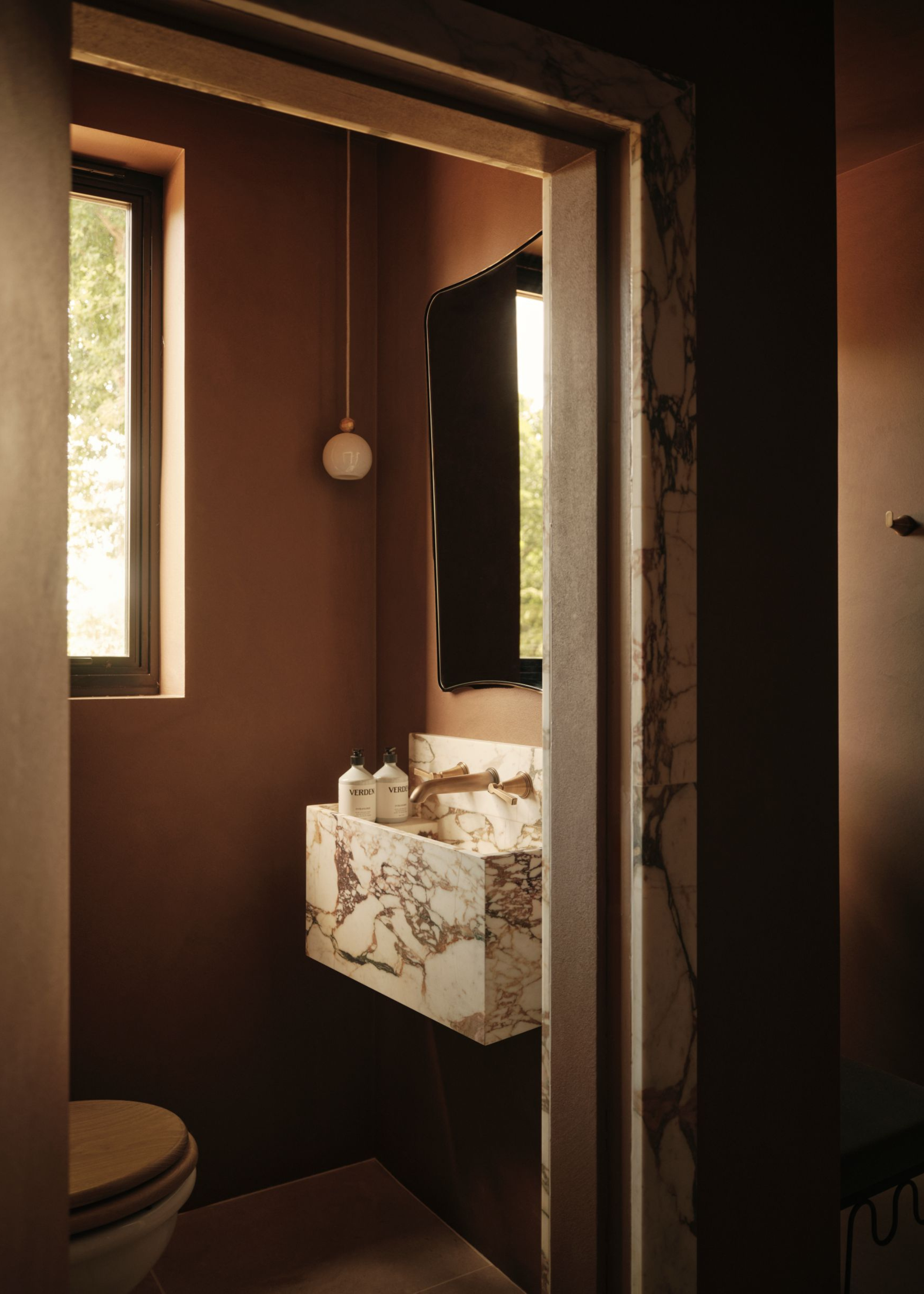
Even though this bathroom has a dark color on the walls, it feels warm and inviting rather than too intense.
What colors feel overstimulating in a space is largely subjective and really depends on how the color is used, as well as your personal feeling towards (and history with) that color. "The colors that most frequently overwhelm are either those that are bright, especially with an extreme visual energy, or colors used boldly over large surfaces," notes Amy.
Energetic colors like acid yellow, hot pink, phone box red, ultraviolet, and electric blue are a few stereotypical colors that can easily lean towards 'overstimulating.' "The shade Brilliant White is also a huge offender, creating spaces that feel cold, harsh, and glaring (even if more quietly than the more pigmented colors)," adds Amy. "And jet black also feels heavy and oppressive, like it's dragging you down and weighing on the space."
Of course, earthy tones, neutral color schemes, and sensory-conscious colors will always be a safe bet, but there is no need to count out bold colors entirely — it's all in how you use them.
How to Fix an Overstimulating Color Scheme
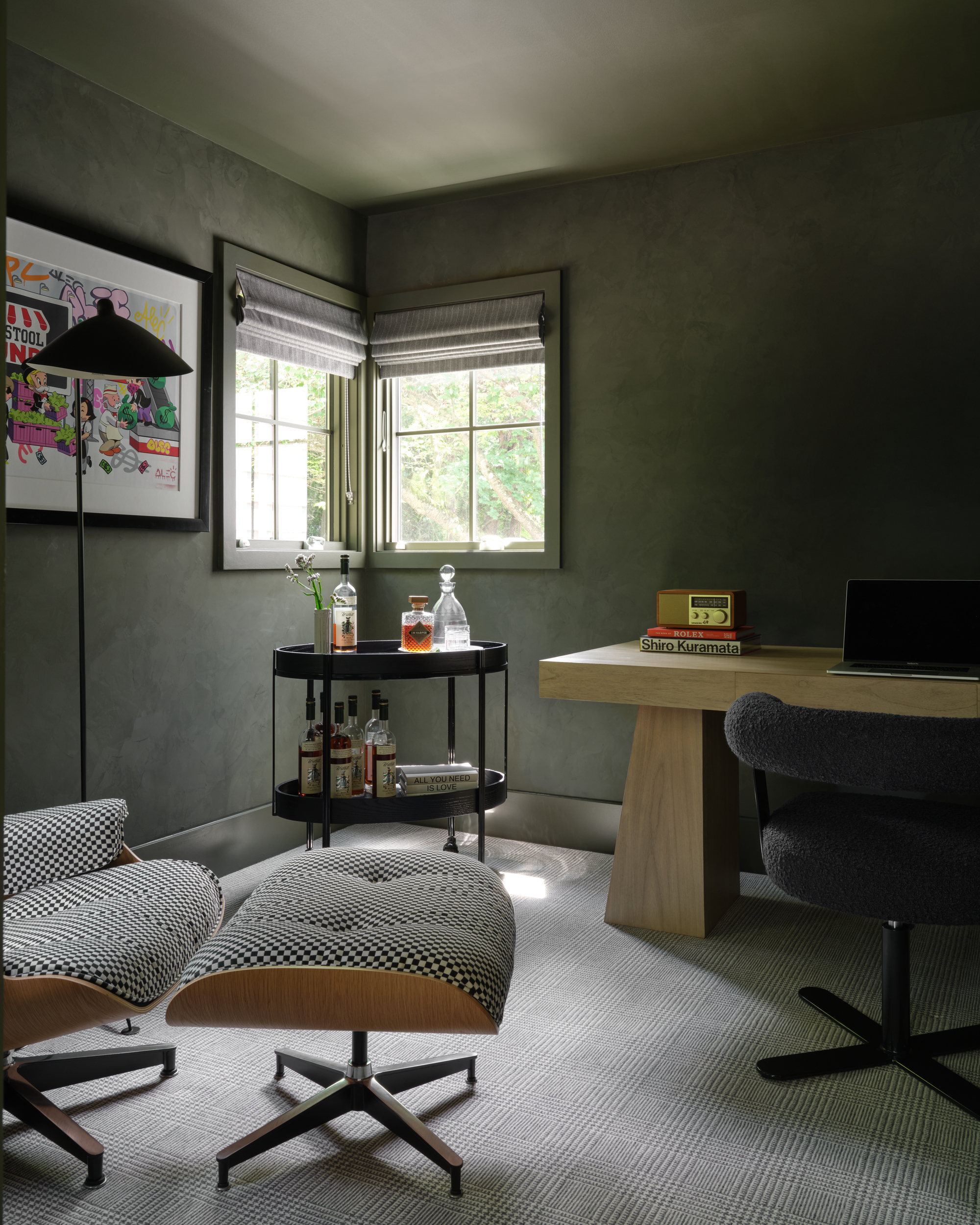
Color drenching in a more saturated earth tone is a great compromise for bold and soothing.
Whether you are prepping a new project or hoping to fix a past painting mistake, there are several ways to bring serenity back into a colorful space.
Start by trying bolder hues (or colors that feel overstimulating to you) in small doses; think joinery, trims, or even decor around the room. Didn't work? Try reducing a color's saturation level rather than banning the hue itself. "How about brick red rather than something fire engine bright?" suggests Amy. "Olive rather than lime green?"
Paint finishes can also help. Try something matte, chalky, or textured to temper the brightness and add depth and tactility.
And then there's your application. New York-based interior designer, Sarah Tract, says, "This may be slightly surprising, but I actually think color drenching makes creating a calming color scheme easier. Painting an entire room a bold color often has a more soothing impact than you might expect."
That said, I'm not suggesting that color-drenching your room in a bright orange will instantly be more calming. "Earthy color palettes and warm neutrals are a good starting point because they resonate with what we are used to," notes Sarah. "Rich browns, deep greens, and burgundies are naturally occurring schemes that will ultimately feel organic and comfortable."
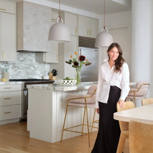
Sarah Tract is a New York-based interior designer and the force behind her firm, Sarah Tract Interiors. Her designs seamlessly blend elements of sophistication with a touch of warmth and whimsy, resulting in spaces that reflect the individuality and lifestyle of each client.
Bold colors in interiors becomes overstimulating when the entire room or palette isn't considered. Think of how you want to layer your space and live within it before you jump into any highly saturated color trends.
Before you know it, you'll be a pro at coordinating paint colors through an entire home soon enough.

Olivia Wolfe is a Design Writer at Livingetc. She recently graduated from University of the Arts London, London College of Communication with a Masters Degree in Arts and Lifestyle Journalism. In her previous experience, she has worked with multiple multimedia publications in both London and the United States covering a range of culture-related topics, with an expertise in art and design. At the weekends she can be found working on her oil paintings, reading, or antique shopping at one of London's many vintage markets.

