4 Color Rules for Neutral Rooms That Designers Don't Want You to Forget — Or Else "Things Can Start to Feel a Bit Flat"
Remember: neutrals can't feel just as dynamic as high chroma colors, if you know the decorating rules to live by


The Livingetc newsletters are your inside source for what’s shaping interiors now - and what’s next. Discover trend forecasts, smart style ideas, and curated shopping inspiration that brings design to life. Subscribe today and stay ahead of the curve.
You are now subscribed
Your newsletter sign-up was successful
Designing a space with only neutral colors comes down to a fine balance — a lack of pigment makes things delicate and less tolerant of error, as there are no colorful, eye-pulling distractions; the entire mood of the space can be tipped by a clashing undertone, poor contrast control, or the wrong kind of light.
But don't let that put you off — there are rules to follow when it comes to neutral rooms. Spaces with low chroma (minimally saturated) shades rely on elements such as depth, light and darkness, undertone, contrast, texture, form, proportion, and materiality to create visual interest. Yes, pigment is ever so slightly present (tinting the shades a little to give them cadence and charisma), but such schemes eschew bolder hues in favor of cohesion and restraint.
Decorating with neutral colors creates spaces that feel calm, considered, and timelessly chic. From the paleness of creamy ivory and gold-tinted sand, through to dusty taupe, earthy mushroom, and rich coffee, pared-back organic shades are the most timeless. Echoing the peace of the natural world, a neutral color scheme is grounding, evoking a sense of steadiness and stability, and imbuing the home (and body) with a sense of downtime, allowing the mind to unwind and the eyes to recuperate on the muted, quiet canvas.
Article continues belowA neutral room is bound by aesthetic continuity and points to elements such as layout, architecture, changing light, and craft, rather than keeping focus on wow-look-at-that pigmentation. It creates a flexible backdrop for furniture, art, and objects, allowing items to be appreciated in context rather than in isolation. Not sure where to start? Let these expert rules when it comes to using neutrals in the home, guide you.
1. Focus on Tone and Contrast

Use light and darkness to create tone and contrast in neutral spaces.
The wisdom of color theory is there to lean on when putting together a neutral scheme, and if you’re choosing just one principle, let it be how variations in light and dark define a shade’s effect: in other words, tone and contrast.
"Tone and contrast are the key things," explains Emma Shone-Sanders, founder of interior design firm Shone Sanders Studio. "Every neutral has a warm or cool undertone which needs to sit comfortably together, and contrast is what gives a neutral scheme depth. Without the right level of contrast, things can start to feel a bit flat."
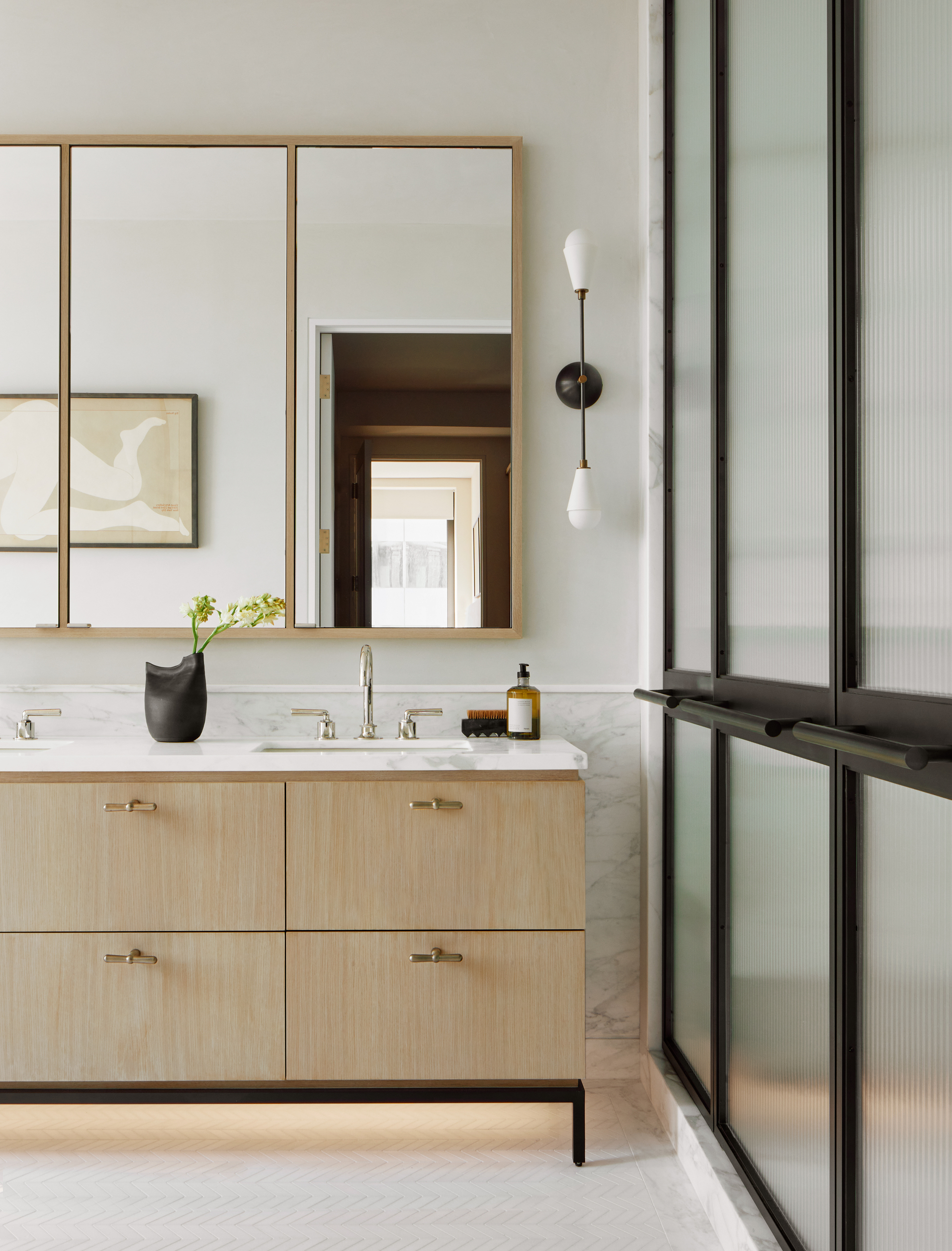
The warm neutrals span cream, oat, almond, camel, and chestnut, while on the cool side lie dove gray, greige, slate, charcoal, and gunmetal — use light and dark contrasts (for example, cream with walnut or dove gray with charcoal) to add dimension.
The Livingetc newsletters are your inside source for what’s shaping interiors now - and what’s next. Discover trend forecasts, smart style ideas, and curated shopping inspiration that brings design to life. Subscribe today and stay ahead of the curve.
"You should generally try to pick a side between warm and cool colors," explains Sheena Murphy, founder of interior design studio Nune. "We usually encourage warmer neutrals for cozier spaces, but adopting a mix works, too. For example, oaks and brasses can be a really effective way to add warmth to a cooler neutral space without confusing the direction, and, conversely, stainless steel and cooler blacks can really add dimension to a buttery scheme with lots of natural woods and golden tones."
An expert in soulful, rich, but neutral interiors, Emma Shone-Sanders, the founder of London interior design firm Shone Sanders Studio, creates refined, moody palettes that feel effortlessly warm, relaxed, and deeply personal. Her studio is known for its love of beautifully made furniture, natural materials, and inviting textures, which add flair and timelessness to her spaces.
2. All Rooms Are Not Equal

Using the same neutral in every room of the home will leave it feeling flat.
So, you’re going neutral, but that doesn’t mean the living room should have the same mood as the office, or the hallway as the bathroom. To get things sorted vibe-wise, divide spaces between the high-use and energy-filled, and the relaxing and restorative.
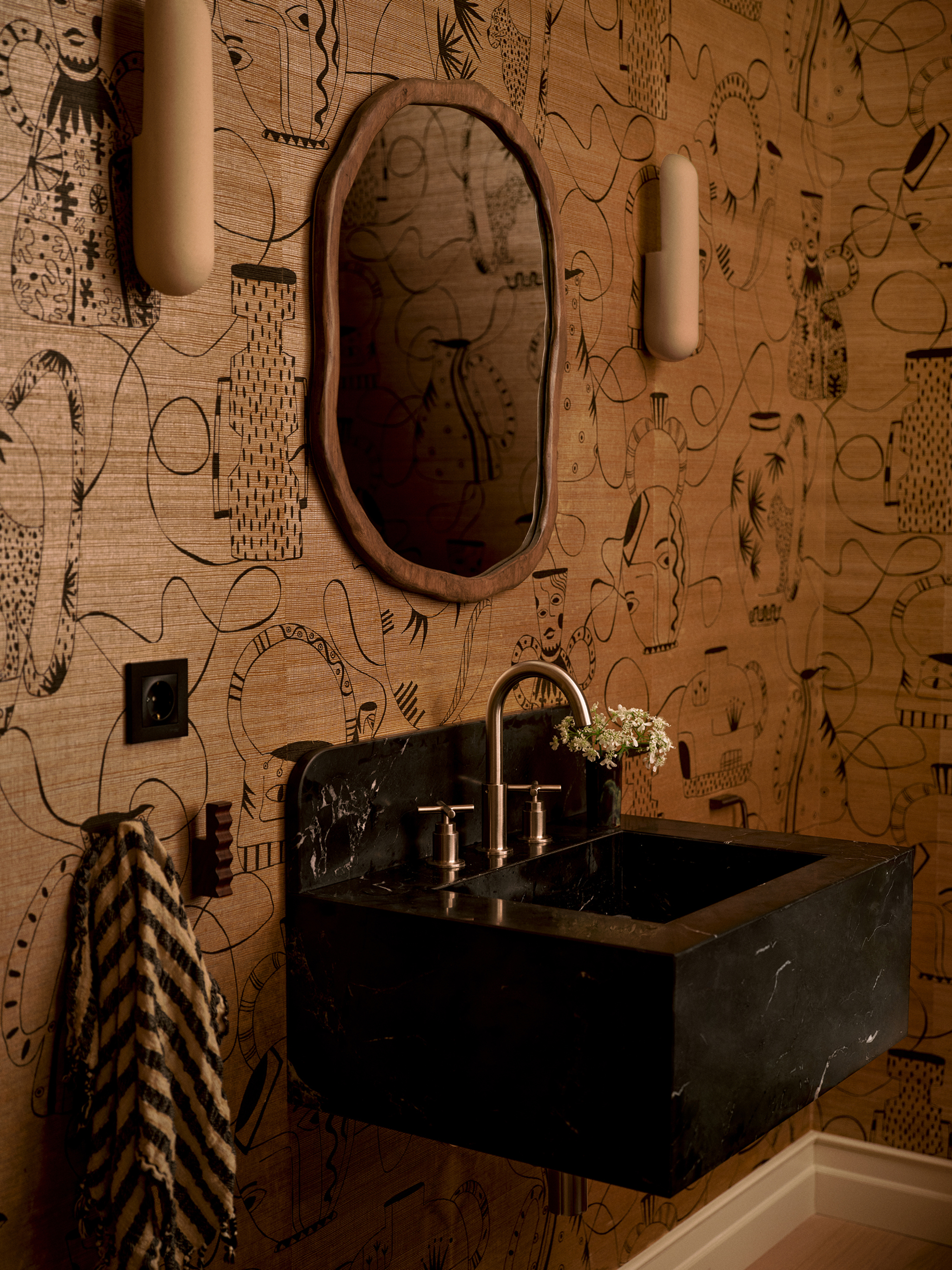
"In busy lived-in spaces, such as kitchens and living rooms, go for richer, layered neutrals with a bit more contrast and depth, and add in subtle accent tones," advises Emma Shone-Sanders. Neutrality doesn’t mean a lack of dynamism — for lively spaces, use layers of tactility and contrast to create oomph without overwhelming.
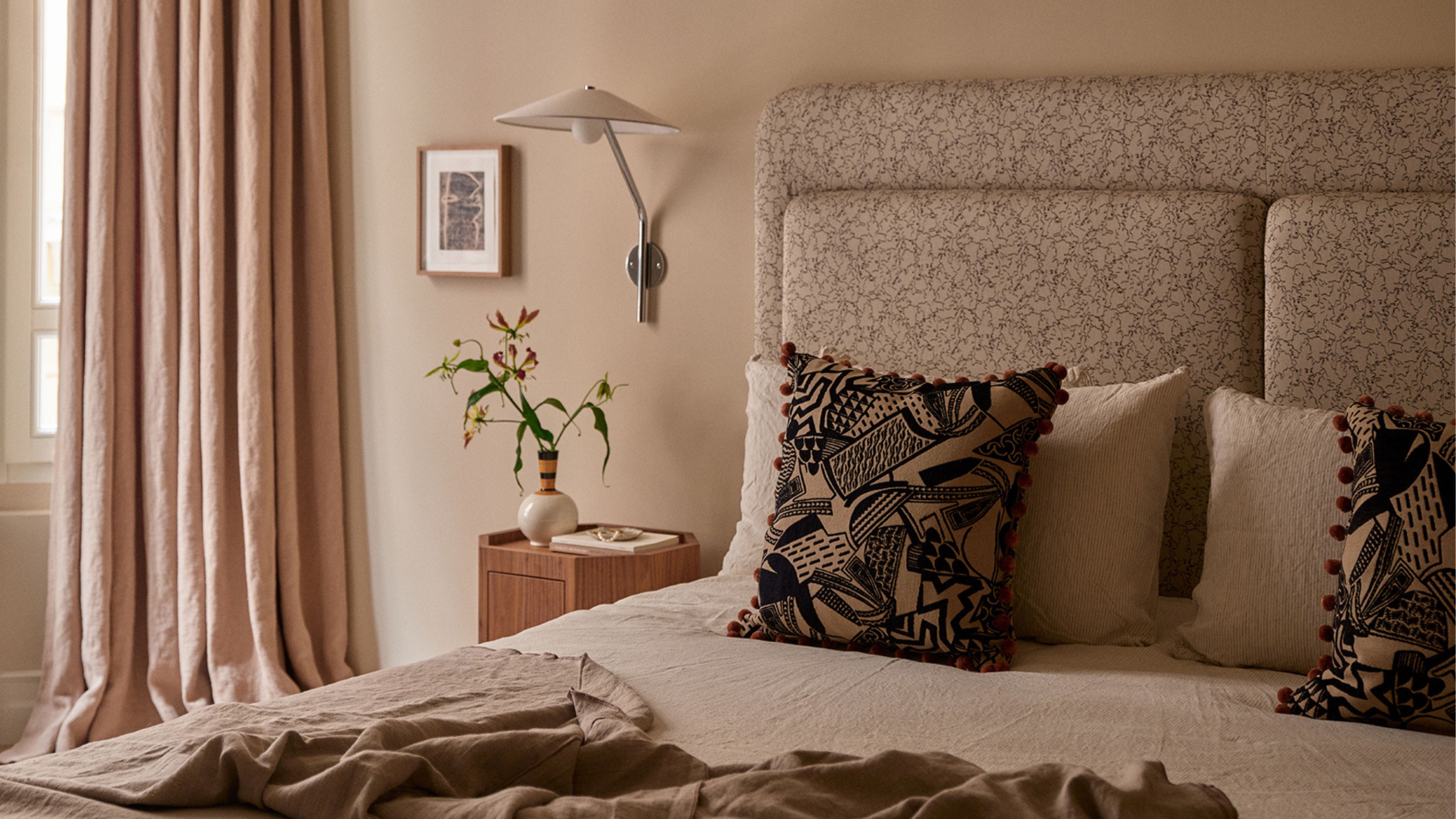
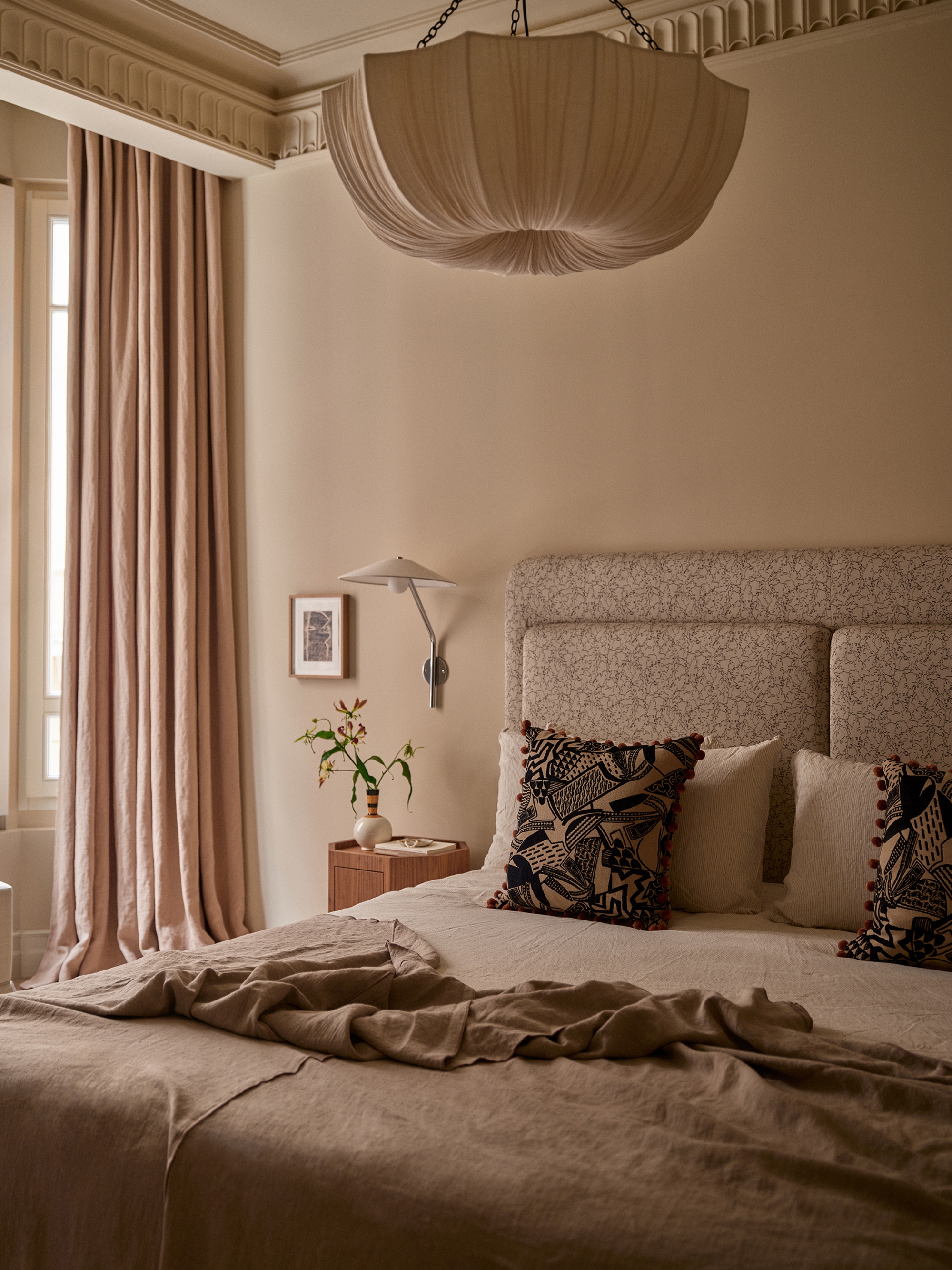
"In quieter spaces where you want to be calm, such as bedrooms, soften everything with gentler neutrals and less contrast so it feels more cocooning," Emma adds. A mix of soft and mid-toned shades, smooth materials, and understated patterns will transform an interior into something tranquil and down-tempo.
Then, there are a handful of areas that need special attention. "Playrooms and children’s rooms should be approached differently from the rest of the home — try starting with a base neutral that ties into the rest of the house and then bring in pops of color through rugs, bedding, or artwork," says Emma. "In rooms with limited natural light, such as basements, lean into darker, moodier neutrals to make the space feel cozy rather than trying to fight it — hallways, on the other hand, are usually kept fresher and lighter."
3. Shift Rather Than Switch

Stick to the same undertone, but subtly shift up and down shades throughout your rooms.
Crafting a neutral aesthetic for the whole property? Then you’ll be looking for smooth movement within the interior as a whole, as well as needing each room to have its own character.
"The key is to shift rather than switch," says Sheena Murphy. "Within a neutral color story, there should be variance throughout the home, so don't repeat the same color too much, but ensure your selections make sense alongside one another, so that when you move through the spaces, the transition is apparent but not jarring."
To do that, "Stick to one undertone throughout, then vary the accents from room to room," advises Emma Shone-Sanders. "That way, everything flows naturally as you move through the house, but each space still has its own personality through materials, finishes, and texture."
After you’ve chosen your warm or cool base, mix in pale, mid-level, and dark neutral paint colors for cohesive depth. Then, introduce a signature color, pattern, or material to each room to make it unique without disrupting the momentum, and repeat textures such as timber, fabrics, or metal across the entire house to tie it all together.
For a final flowing flourish, carry elements of adjoining rooms into the connecting areas, such as doorways or hallways, to make it all seamless and graceful.
Sheena Murphy, founder of New York and London-based interior design studio Nune, specializes in crafting neutral spaces that feel tactile and full of individuality. By mixing and layering materials, shades, patterns, textures, and finishes, she creates warm interiors that are sophisticated yet exciting and visually interesting.
4. Get Maths Involved

Getting the balance of neutrals right can be a simple equation.
The balance between the tones is the secret to success in the world of decorative neutrals. You can go with what feels right — or rely on easy percentages to keep it all in check like the 70 20 10 color rule.
"A simple rule of thumb is to have around 70–80% of a main neutral tone, with 20–30% as a secondary accent," Emma Shone-Sanders explains of accent tones, which can be slightly lighter, darker, warmer, or cooler than the main shade.
"The accent should show up in the smaller details — skirting board paint or textiles, for example — rather than taking over the whole room," she adds. Splitting the numbers in this way produces a cohesive and visually balanced interior where no one tone is competing for attention. This approach takes out the guesswork and ensures the palette feels intentional, layered, and harmonious.
These days, neutrals can be more creative, sophisticated, and nuanced than ever, and lead to interiors that soothe and settle. For when the differences between shades seem almost imperceptible, color theory (and the neutral color wheel) can provide guidance, but don’t let it dominate over shades that you naturally have a connection with.
Ultimately, "be guided by what you truly love, and think about elements in real spaces you've experienced (such as homes or hotels) to understand how certain tones make you feel," says Sheena Murphy. And, as Emma Shone-Sanders adds, "a neutral will always feel more timeless if you’re drawn to it — not just because it’s on trend."

Amy Moorea Wong is a color authority and contemporary interior design writer who has specialized in all things decorating for over a decade. Amy is Livingetc magazine’s Colour Expert, Interiors Editor at The Glossary magazine and a Contributing Editor at Homes & Gardens magazine, and she frequently contributes to an array of global publications to share her insights on interior design zeitgeist. Her book Kaleidoscope: Modern Homes in Every Colour explores a collection of cool colorful homes fizzing with creativity, surprises, and inspiration.