You Might Not Know About the 'Neutral Color Wheel', but Understanding How It Works Can Help You Decorate Your Home While Avoiding a Scheme That Falls Flat
"The challenge is not the colors themselves, but the confidence to play with tone, texture, and proportion."

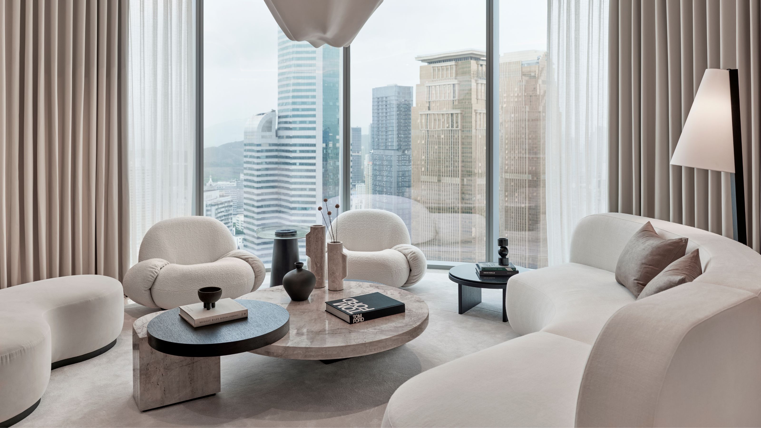
The color wheel is a tool strapped onto the belt of many a home-updater, but the neutral color wheel flies a little more under the radar. There are, I’m afraid, no prizes for guessing its USP; yes, it’s a toned-down version of its more pigmented cousin. Built around a spectrum of neutrals arranged by undertone, the neutral color wheel is a visual guide for those trying to pair their greiges with their grays, their creams with their chalks, and their mochas with their mushrooms.
What makes a space sing when decorating with neutrals is the delicacy with which they all pull together — the way one tone quietly lends warmth while another oh-so-similar shade somehow introduces a cool, refreshing counterpoint. It’s this subtlety that gives neutrals their lasting appeal. When adeptly curated, they create depth, cohesion, and a sense of calm without vying for attention, and the neutral color wheel is key in decoding the minute differences that can make or break a scheme.
Renowned for her aptitude with luxurious, considered neutrals, Kelly Hoppen CBE, owner of interior design company Kelly Hoppen Creatives, highlights why these shades resonate so deeply and how the neutral color wheel brings order: "Neutral spaces evoke a sense of serenity; they feel calm, cocooning, and timeless," she explains. "They’re smart and chic, but easy on the eye and livable — it’s not about lack of color, it’s about creating a space where the mind can rest."
Article continues below"The challenge," she continues, "is not the colors themselves, but the confidence to play with tone, texture, and proportion. The neutral color wheel takes away the guesswork and allows you to create color harmony, rather than ending up with a scheme that feels off-balance." This shift from instinct to intention is what makes this wheel such a trusted advisor to home decorators who are considering the muted. Here's what you need to know.
What Is the Neutral Color Wheel?
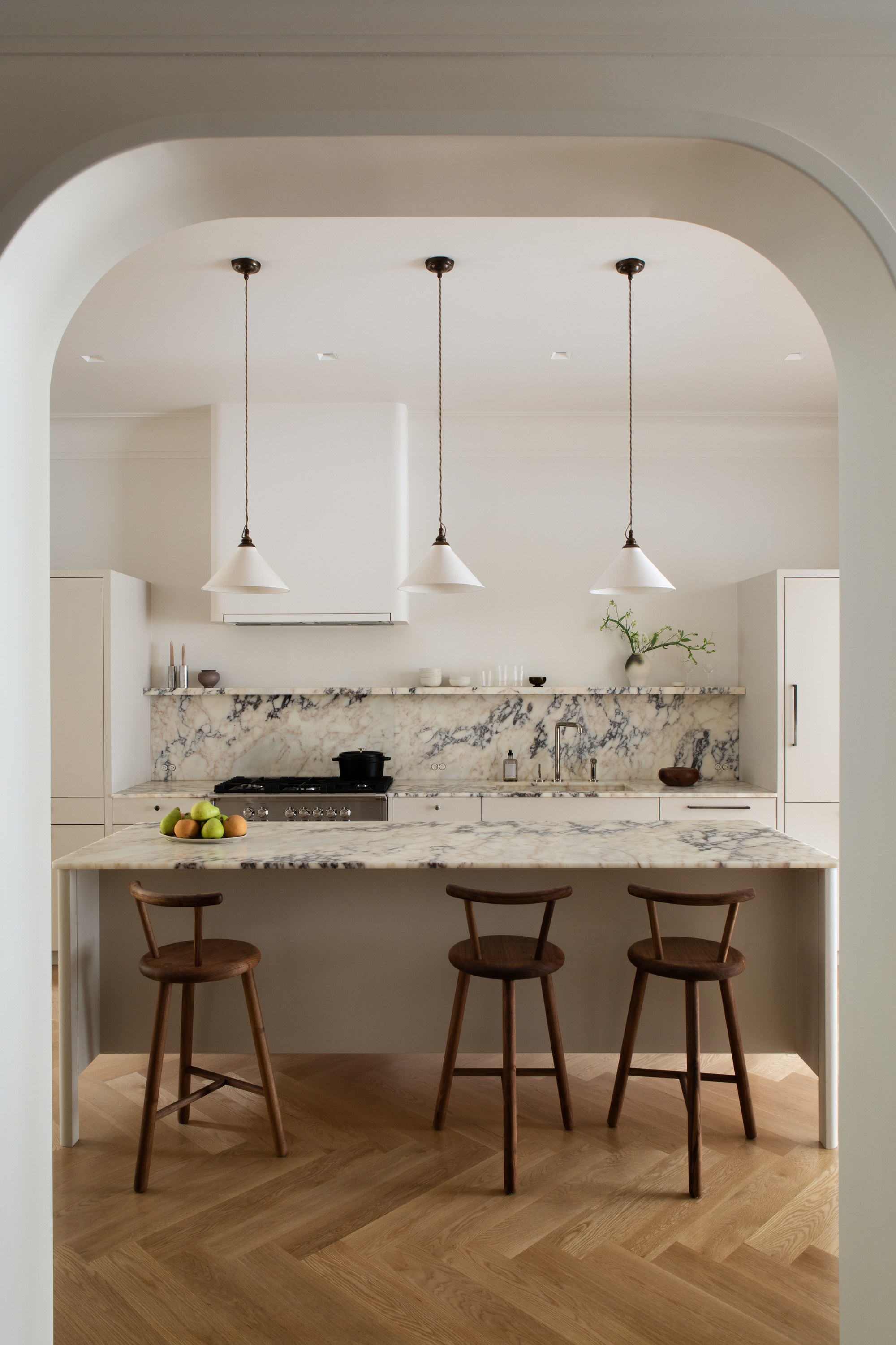
Understanding the neutral color wheel will help you curate a minimalist scheme that doesn't feel flat.
Not as rigid, formal, or rule-bound as the standard rainbow-esque color wheel, the neutral wheel is less of a set-in-stone decades-old theory and more of a loose reference system that can vary from here to there.
You’ll find them created by a handful of interior designers, decorators, or stylists — or feel free to make your own. Even the neutral fan decks or color cards compiled by paint brands can function as ‘neutral wheels’, if you ignore the non-circular layout.
On the neutral color wheel, you’ll generally find a warm-to-cool transition of soft shades arranged by undertone. Groups tend to include the core neutrals (white, off-white, gray, and black), warm neutrals (tinted with yellow, orange, or red such as ivory or beige), cool neutrals (with undertones of blue or green, including oyster and graphite), and — sometimes — nearly-neutrals (such as dusty rose and sage), those that can behave like neutrals within an interior. Most wheels move in a circle as the shades shift from warm to cool, with the core tones in the middle.
The Livingetc newsletters are your inside source for what’s shaping interiors now - and what’s next. Discover trend forecasts, smart style ideas, and curated shopping inspiration that brings design to life. Subscribe today and stay ahead of the curve.
What Does the Neutral Color Wheel Do?
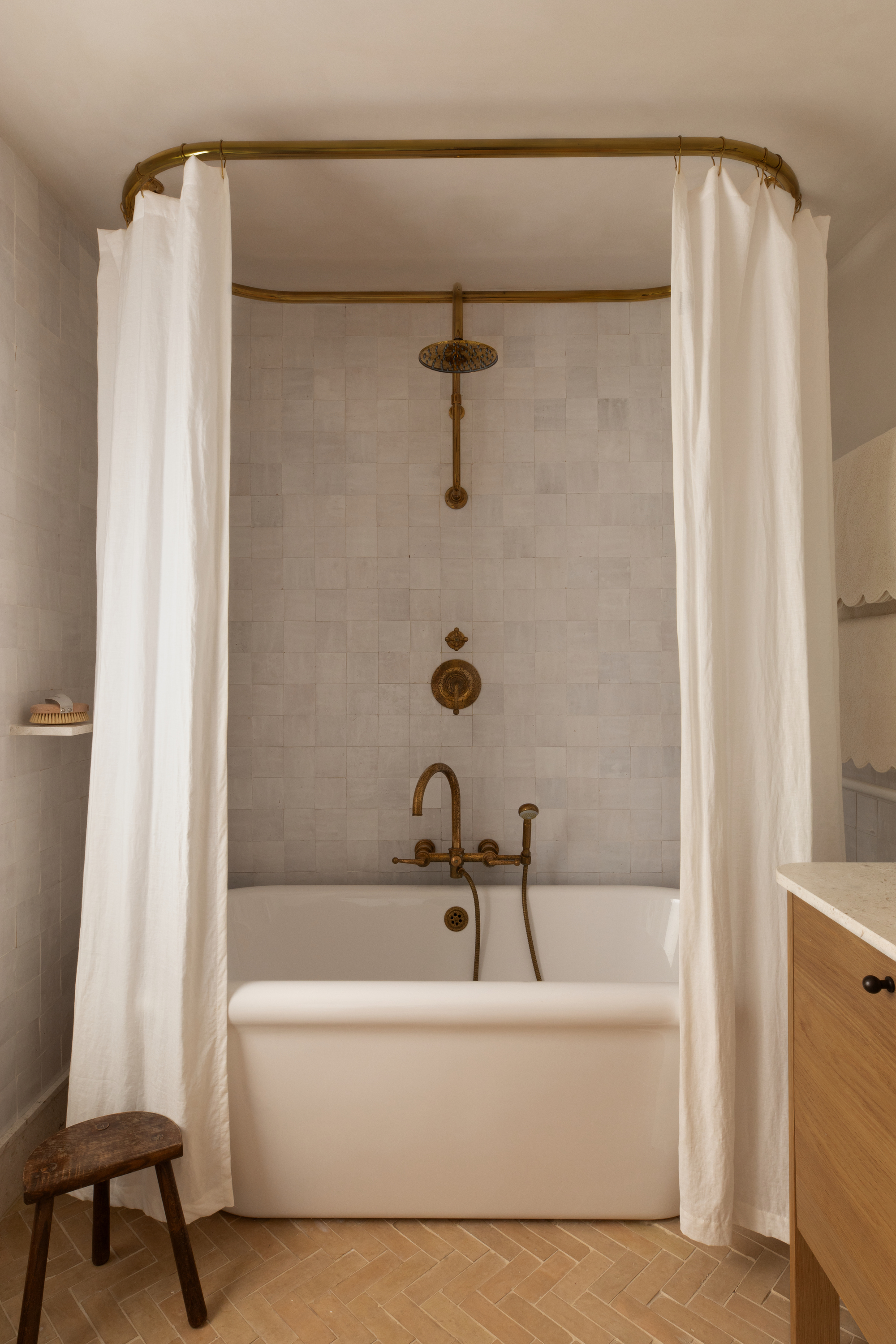
Neutral colors have just as much complexity as more saturated shades.
The neutral color wheel’s clearly organized undertones highlight relationships between shades, aiding you in creating layered palettes that enhance each other rather than clash.
Take one decor or paint shopping, and you’ll obliterate will-this-go-there guesswork as even small swings between temperature affect a neutral room’s mood and flow.
Its clarity and structure make the neutral color wheel an indispensable guide for anyone working with the understated shades. "The neutral color wheel is an invaluable tool for building a palette with real intention. People often see color wheels only in terms of bold hues, but neutrals have the same complexity," Kelly Hoppen CBE, tells us. "A neutral wheel helps you see the undertones more clearly and gives you a structure to work within, so you’re never guessing or clashing, teaching you to see the subtle differences that can make or break a scheme."
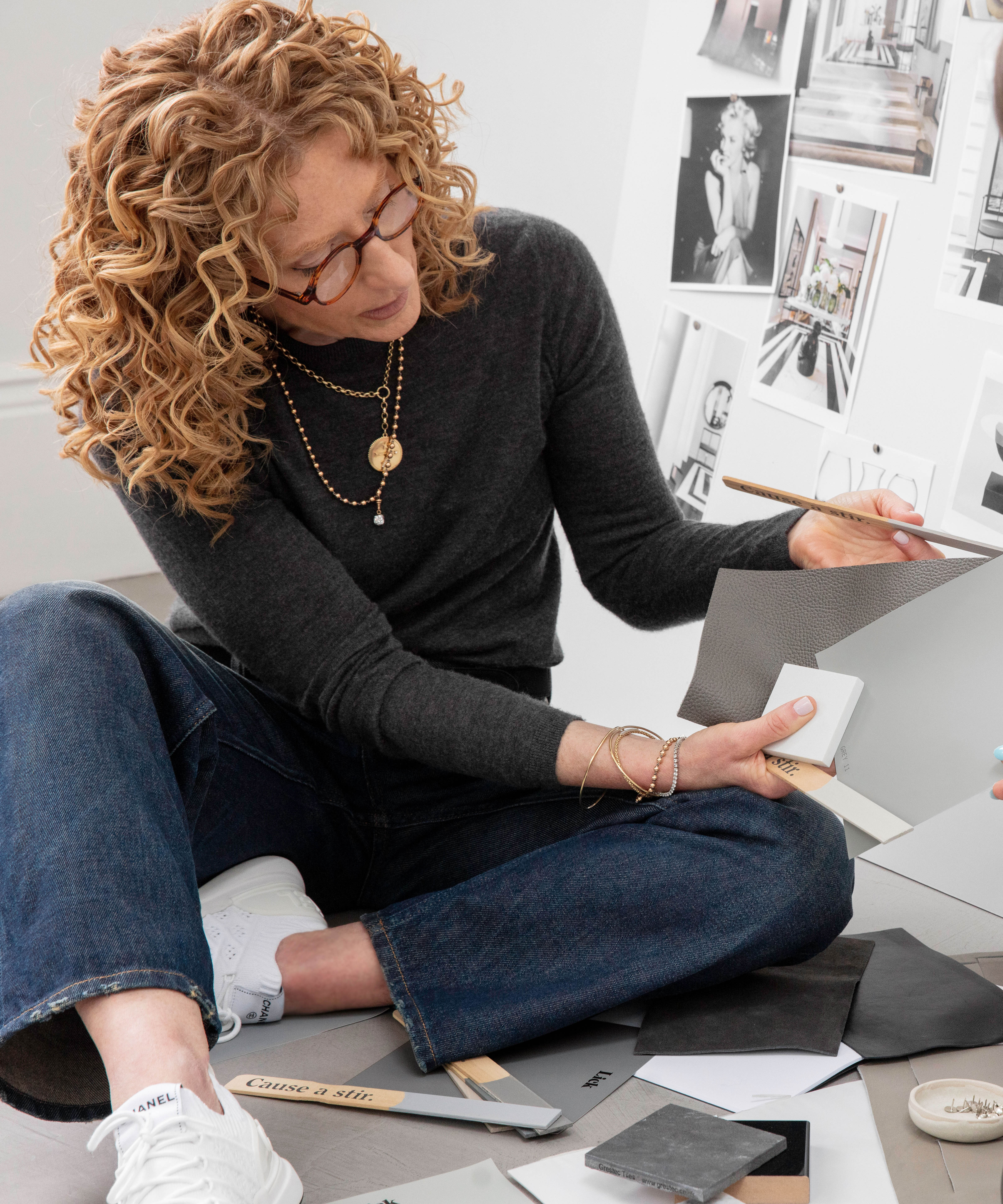
Sometimes known as ‘the queen of beige’, Kelly Hoppen CBE, founder of Interior Design company Kelly Hoppen Creatives, is renowned for her mastery of neutral palettes, creating homes that feel calm, timeless, and effortlessly sophisticated. She approaches neutrals with both precision and creativity — subtly layering tones, textures, and finishes to create a richness that makes them feel luxurious rather than plain.
How to Use the Neutral Color Wheel
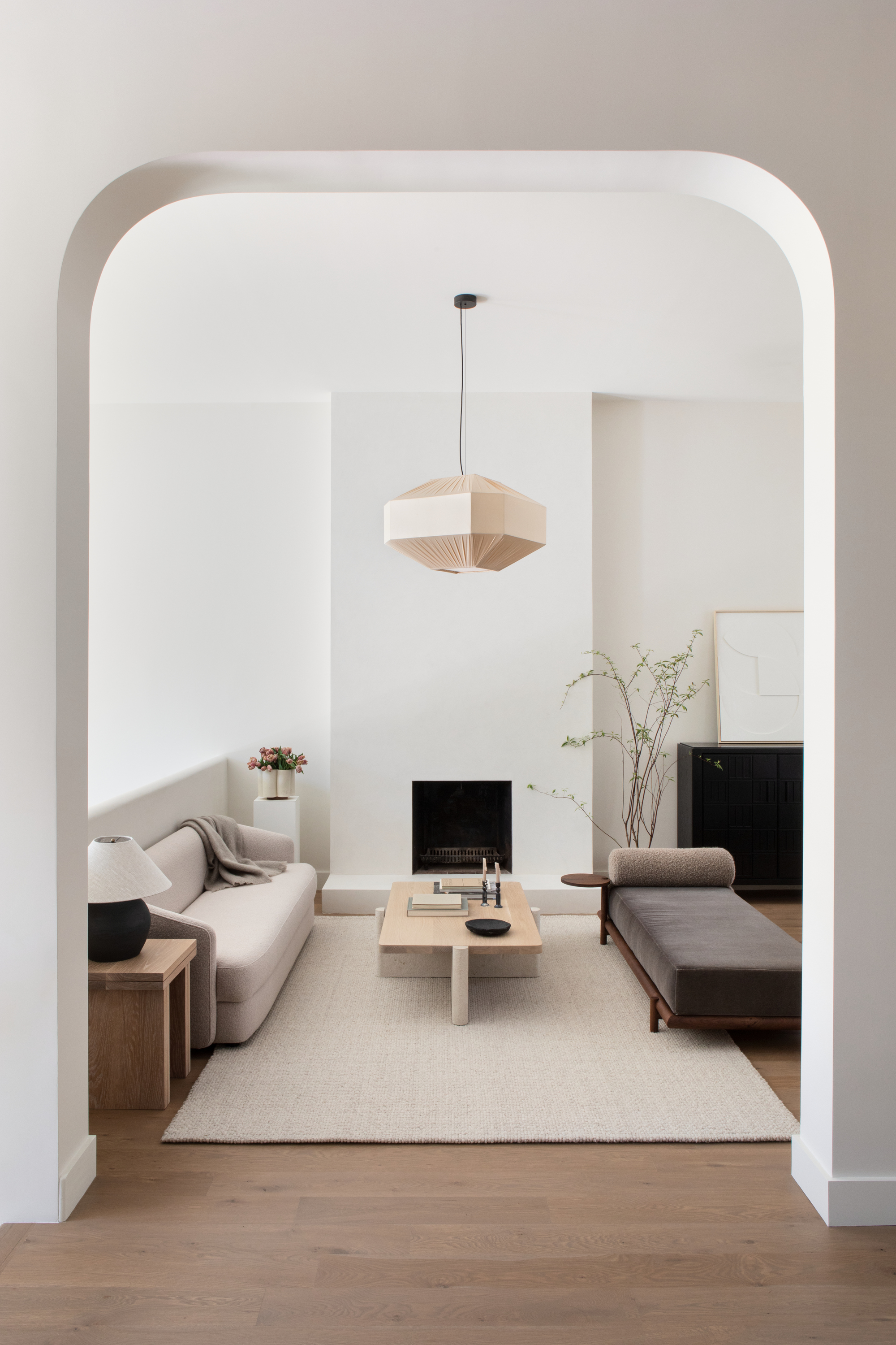
It's even more important to know how to create contrast in interior design when working with neutrals.
To create a neutral wheel-guided room, start by identifying if your base neutrals are warm or cool. Then explore the shades near the base color on the wheel to find a few complementary neutrals with similar undertones to fold in — think warm taupe, putty, and ivory, or cool ash gray, dove gray, and oyster.
Introduce gentle contrasts with small doses of opposing warm/cool shades to create visual tension. The wheel will keep it all balanced — place your base neutral in the middle to see how it interacts with other potential options.
The wheel makes it easier to see subtle undertone differences by pointing to what harmonizes and provides contrast, and showing how small adjustments can transform a home from just-doesn’t-feel-right to thoughtful and sophisticated.
"The key to making neutrals feel elevated rather than plain is variety and warmth — I avoid cooler tones and mix warm shades to build a space with dimension and interest," Sheena Murphy, founder of New York and London-based interior design studio Nune, tells us. "Think warm neutral walls, wood floors, or a rich chocolate rug, textured neutral upholstery, beige linen curtains, and pewter accents. Keep it varied and don’t be afraid to mix and match materials and tones."
Sheena Murphy, founder of New York and London-based interior design studio Nune, specializes in crafting neutral spaces that feel tactile and full of character. By mixing and layering materials, shades, patterns, textures, and finishes, she creates warm interiors that are sophisticated yet exciting and visually interesting.
The Warm Neutral vs the Cool Neutral
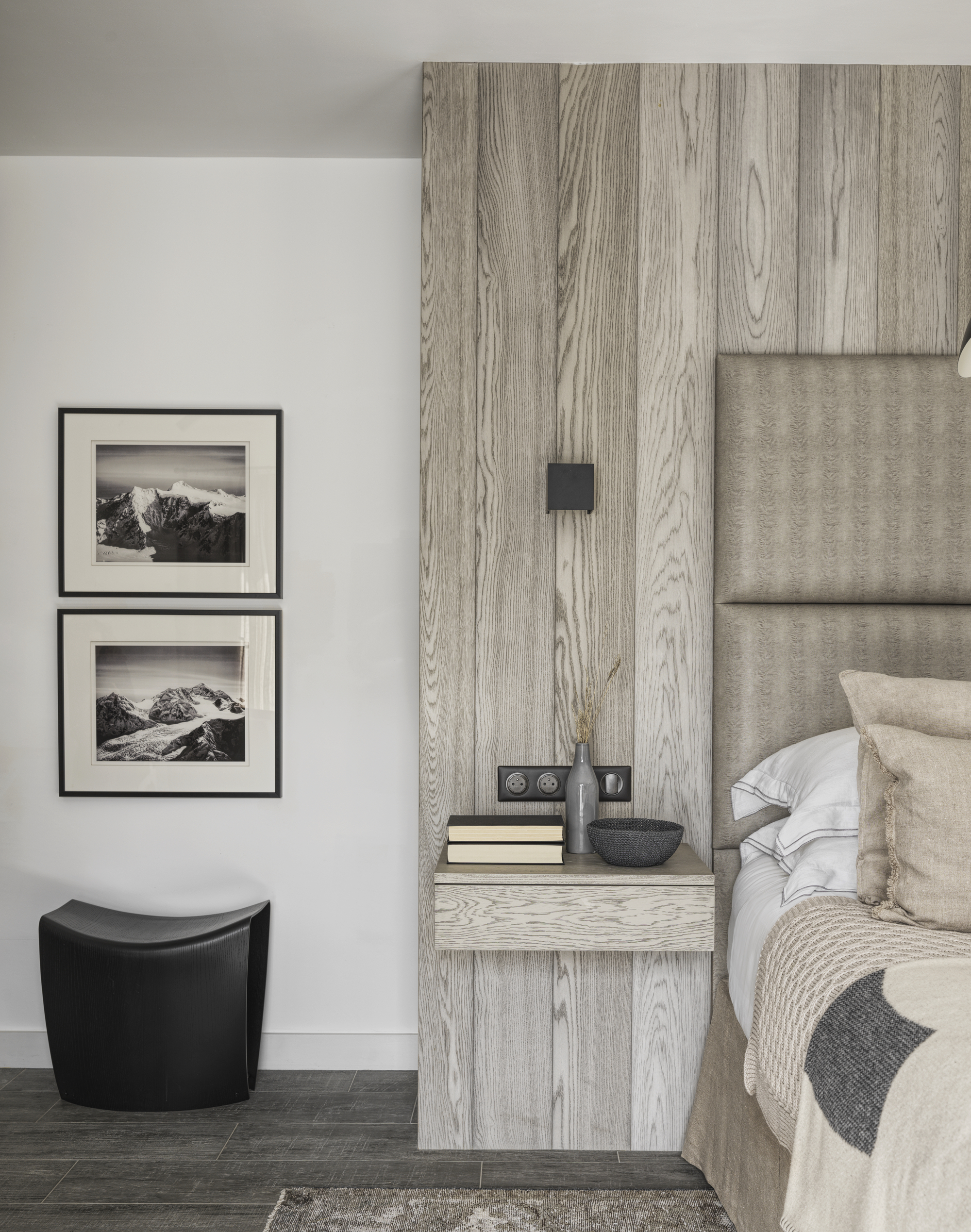
It's also worth knowing the difference between warm and cool neutrals when it comes to adding depth to a scheme.
A matching set of warm or cool undertones creates harmony (with a few of the opposing temperatures carefully allowed in as accents/clashes), so is the neutral color wheel essentially a way to simplify the face-off between the warm neutrals and the cool? How to make that first big decision between them?
Take a look around the to-be-decorated interior. Are we surrounded by skyscrapers or trees? "Neutrals can reflect the character of the environment — it all depends on the space," Kelly Hoppen CBE says. "For a beach-side location, I love to use warm neutrals that work with the natural light and complement the nature outside. For a modern city apartment, I like to use cooler gray tones to bring a sense of serenity. In more traditional homes, I often gravitate toward taupes and soft plaster shades, layering them with natural textures like linen or stone to create warmth and depth."
Not all neutrals are going to be on a neutral color wheel, either. There simply isn’t space, and what classifies as ‘neutral’ changes along with the times, our backgrounds, and what mood we woke in that day. "I have started to think more open-mindedly about what actually constitutes a neutral," admits Sheena Murphy. "Mildly-saturated greens like olive, moss, or sage can feel very neutral. The same goes for some pink or orange tones like peach or sienna/dark orange."
"I call them color-neutrals," she adds, "from brick red, khaki green, and mustard to yellow-toned butterscotch (which I currently love) and (throwback) magnolia. They create a really inviting environment, and they make things feel a little sunnier and happier.’"

Amy Moorea Wong is a color authority and contemporary interior design writer who has specialized in all things decorating for over a decade. Amy is Livingetc magazine’s Colour Expert, Interiors Editor at The Glossary magazine and a Contributing Editor at Homes & Gardens magazine, and she frequently contributes to an array of global publications to share her insights on interior design zeitgeist. Her book Kaleidoscope: Modern Homes in Every Colour explores a collection of cool colorful homes fizzing with creativity, surprises, and inspiration.
