Sherwin-Williams' New Palette Predictions Will Give You the First Glimpse of How to Decorate in 2025
These curated palettes from Sherwin-Williams offer a forecast of refreshing color to introduce into your home

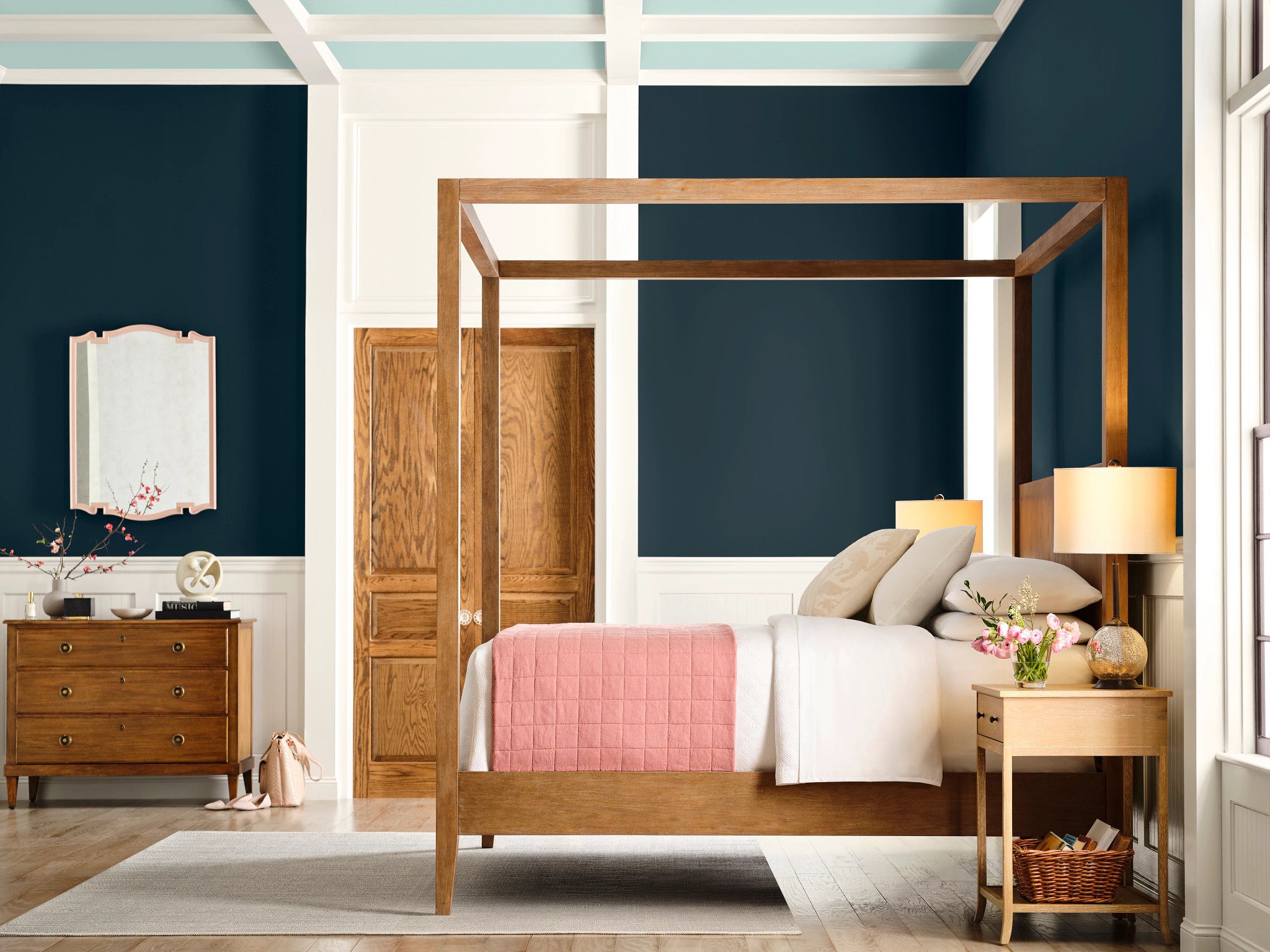
Like an anxiously awaited package, the Sherwin-Williams 2025 Colormix Forecast has finally arrived. This year's predictions are full of life, vibrancy, and tradition. And with moving season rapidly approaching, it feels like the perfect time to dive into the trends in paint and color that will guide the coming year.
The renowned paint brand is pivoting from last year's Colormix Forecast to highlight macro-trend storytelling in their new theme: Capsules. As usual, the collection will encompass 48 hues organized into four different palettes. But unlike in 2024 where the main focus was directly on key colors, 2025's forecast takes a more narrative approach.
"We are cycling back to talk about the drivers," says Sue Wadden, Director of Color Marketing at Sherman-Williams. "We wanted to look at the big-picture themes happening in design that are inspiring the color movement, and tell a story about how the colors we love reflect the lives we lead."
Article continues belowThe new Colormix Forecast is divided into four capsules - Chrysalis, Paradox, Wellspring, and Kindred - offering suggestions on how to combine some of Sherwin William's most popular paint colors. We are here to take a look at these trend predictions and, with the help of Sue, understand how best to implement the colors in all your upcoming projects and renovations.
Capsule One: Chrysalis
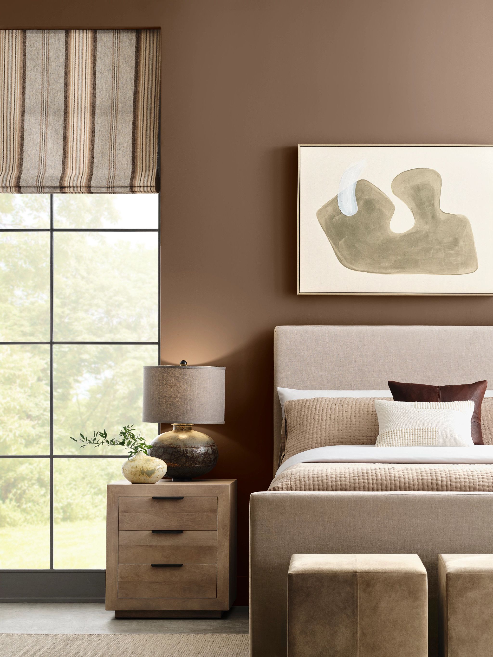
The first capsule in the ColorMix Forecast is Chrysalis. This color trend-focused palette features authentic interpretations of colors in the natural world. The return to nature has been a prominent theme in design since the pandemic, but Sue describes this capsule as more of "an evolution of nature. It is an inward look at rawness and authenticity."
"The color space for Chrysalis is super neutral, almost like stone or monolithic," says Sue at Sherwin-Williams. "Nothing is really jarring in the color palette, and with a focus on really rich, warm tones." The colors Sealskin and Grounded, shown above, are hues that best embody the feeling of sophisticated homeliness that Sue describes.
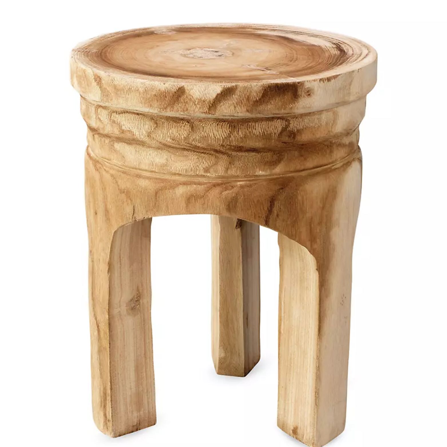
Multiple textures and exposed natural materials will thrive in a space following this palette. Shades like Drift of Mist and Thunderous from the capsule are the perfect backdrop to experiment with wooden or stone furniture pieces. Layering the neutral colors with organic materials will highlight both comfort and chicness in your space, and is the perfect evolution of this modern, minimalist color scheme.
The Livingetc newsletters are your inside source for what’s shaping interiors now - and what’s next. Discover trend forecasts, smart style ideas, and curated shopping inspiration that brings design to life. Subscribe today and stay ahead of the curve.
It's a palette that stands as an interpretation of the viral "quiet luxury" trend, but it's also super versatile, too. "You could see this in really high-end design or you could see it interpreted somewhere like IKEA. It's usable is really the antithesis of Chrysalis' story," says Sue.
Capsule Two: Paradox
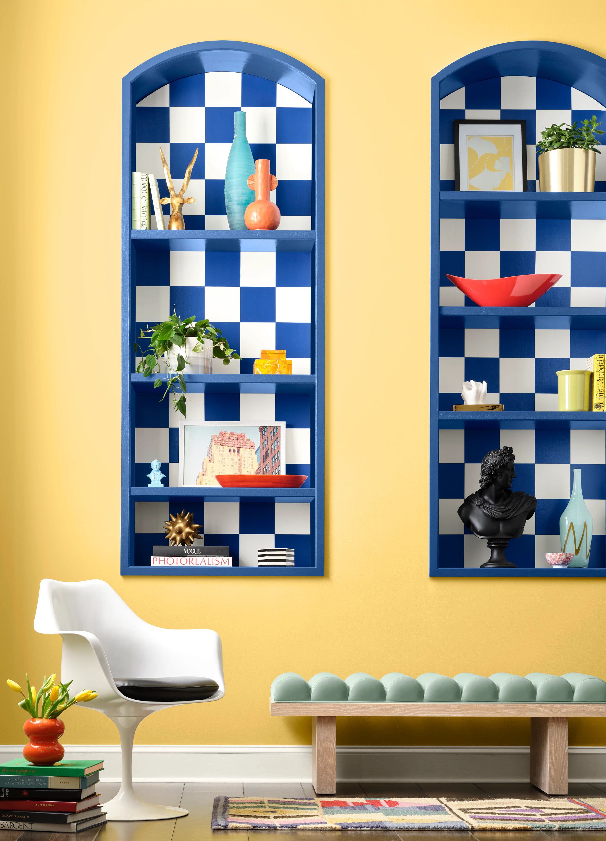
A vibrant array of bold colors encompassing deep blues, soft golden yellows, and cheerful lilacs is what defines the second palette, Paradox. The striking mix of colors is meant to embrace the idea of the unexpected — and maybe even invite a little creative chaos into the home.
"The world we are living in can be a little loud, a little chaotic; this palette is meant to reflect that energy in a stylish way," explains Sue. "Paradox is all about the willingness to try something new."
This palette combines bright, well-loved neutrals, with rich, exciting statement shades, but how does this translate into the home? Color-drenching and accent walls are a couple of eye-catching ways to incorporate Paradox in your living spaces. However, the daring palette can be used beyond just wall color.
To create a color palette with these shades, Sue suggests going for pops of Paradox through "checkerboard finishes, interesting trim details, or framing a doorway with something experimental, like a waved line." This playful style, as pictured above, is displayed perfectly by paring Sherwin-Williams' shade, Quilt Gold, with a bold checkerboard accent in their shade, Frank Blue.
Sue explains that the use of such bold colors does not necessarily have to be used throughout the home, but "incorporating moments of explosive color can be super sophisticated or this really dynamic, daring expression." Whether you gravitate towards a more maximalist style of Paradox, or rather a more subtle color-pop moment, it is a trend that Sue believes will continue to rise.
Capsule Three: Wellspring
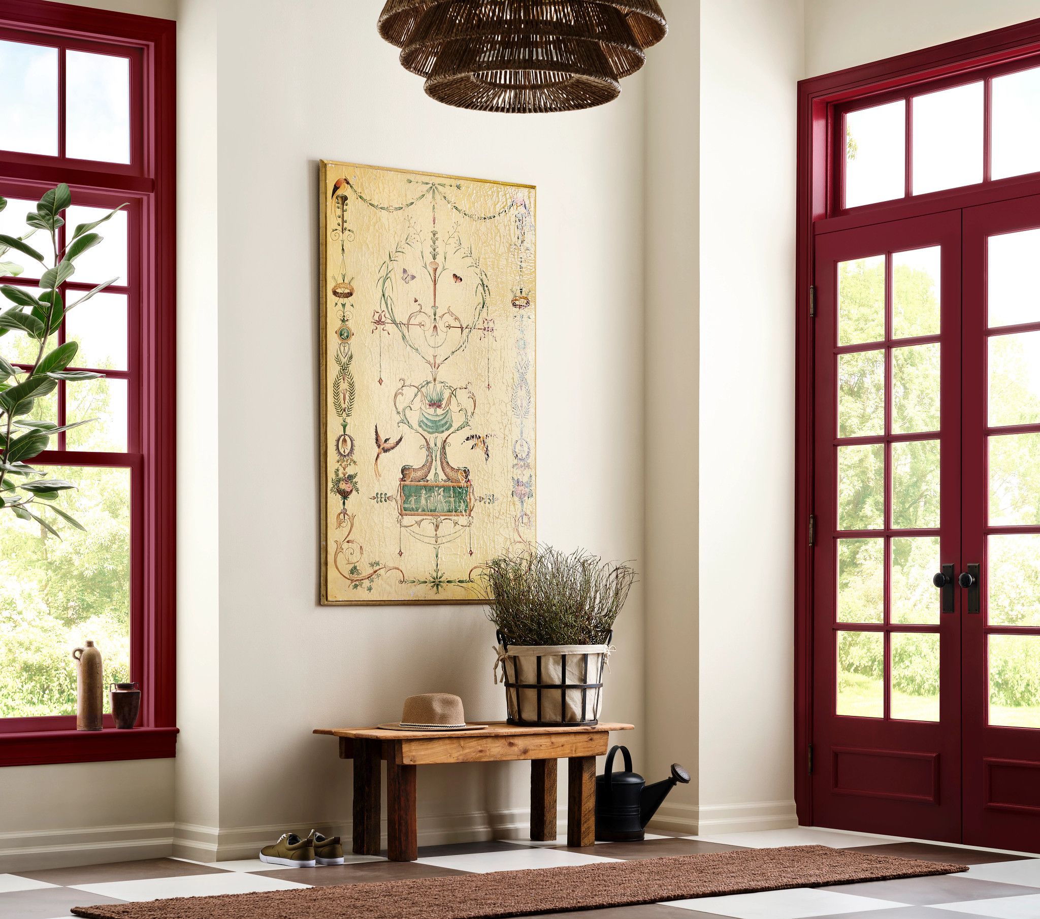
The story behind the third capsule explores the idea of "ancient wisdom" by tapping into the classics of design. Moving away from minimalism, the colors in this palette are representative of what designers are seeing as a return to neoclassicism, ornamental, and Victorian designs.
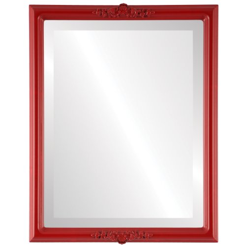
In this palette, paint color ideas like deep navy, vivid red, and burnt orange hues are calmed by more neutral shades like Oyster White, Tres Naturale, and Green Bray. "When you pair these traditional colors with the fusion of more modern, peachy, and warmer tones, what comes out is something really unique and different," says Sue. Using the more dramatic and rich hues of this palette - like Borscht, Outerspace, and Bosc Pear -for trim and accent pieces will help give your room a nostalgic feel with a modern twist.
Sue admits that this capsule may be her favorite (at the moment anyway). "I love everything about this story," she says. "It is artisan, it is craft-focused, it is nostalgic design, but then, of course, taking that and making it into something new."
Capsule Four: Kindred

Kindred, the final capsule of the Colormix Forecast, is all about the human side of design. A home is meant to be lived in, and Kindred's story is about "designing homes for the people who live there, your community and the friends that come to your house and have dinner with you," says Sue.
Because of the softer hues, this palette works well in rooms that center around nurturing and everyday environments like dining rooms, offices, and living rooms. Taking note of color theory ideas, Sue recommends balancing brighter, icy tones like Tidewater with the coziness of colors like Dark Night and Sun Bleached Ochre.
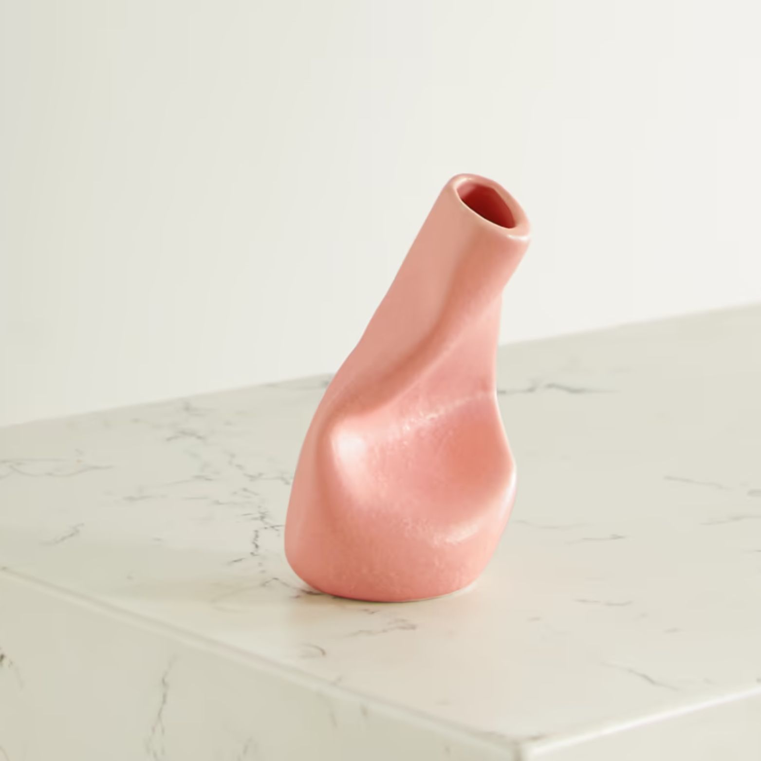
A color that immediately caught our eye in this palette is coral, and it appears in a couple of shades including Caribbean Coral and Koral Kick. Sue weighs in on the resurgence of this orange-pink hue explaining that it's a different take on the popular pink of last summer, which was all about a bright, hot pink. "With coral, it's taking that comfort of the initial terracotta shade and jazzing it up a little - making it brighter and a bit more fun," she says.
"All of these stories are about a return to color and assigning a vocabulary of color to the home again," says Sue. "We are living in our homes, and so thoughtfully incorporating color is always a good thing."
It is difficult to say which trend prediction will dominate 2025, but we do know that it is time to get decorating. Color trends do not always have to be restricted to wall paint, so get inspired by these creative ways to incorporate the Colormix Forecast into your home.

Olivia Wolfe is a Design Writer at Livingetc. She recently graduated from University of the Arts London, London College of Communication with a Masters Degree in Arts and Lifestyle Journalism. In her previous experience, she has worked with multiple multimedia publications in both London and the United States covering a range of culture-related topics, with an expertise in art and design. At the weekends she can be found working on her oil paintings, reading, or antique shopping at one of London's many vintage markets.
