5 kitchens with dark cabinets that make me want to lean into a moodier cooking space for my next remodel
Dark, atmospheric colors that interior designers have used for kitchen cabinets that'll convince you to go to the dark side
The Livingetc newsletters are your inside source for what’s shaping interiors now - and what’s next. Discover trend forecasts, smart style ideas, and curated shopping inspiration that brings design to life. Subscribe today and stay ahead of the curve.
You are now subscribed
Your newsletter sign-up was successful
Darker colors can feel like an intimidating choice for your kitchen cabinets but in reality, these shades prove to be incredibly inviting and entrancing. Research suggests that these deeper tones illicit emotional responses better and visually stimulate us, making them an ideal choice for a readily used space like your kitchen.
Where brighter and bold tones can feel jarring and pastels feel too safe, darker colors can provide the perfect balance, introducing color and sophistication to your kitchen. The key to success with darker cabinets is creating visual balance in the scheme, this could be opting for white walls to reflect more light around the room or adding jewel tones to your backsplash for a colorful accent. Carefully considering your color and opting for a hue that speaks to you personally whilst working within your proposed design, ensures that you are never left wondering ‘what if?’.
To help make life a little easier, we have curated a selection of our favorite dark kitchen cabinets from interior designers and color experts. From moody charcoal to sleek navy and punchy purple, each of these kitchens is a testament to the versatility and beauty of darker pigments.
1. Create a contemporary kitchen with charcoal
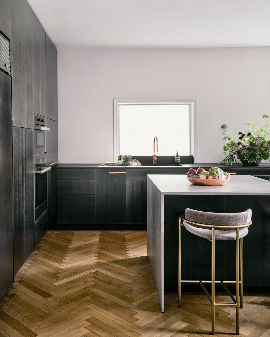
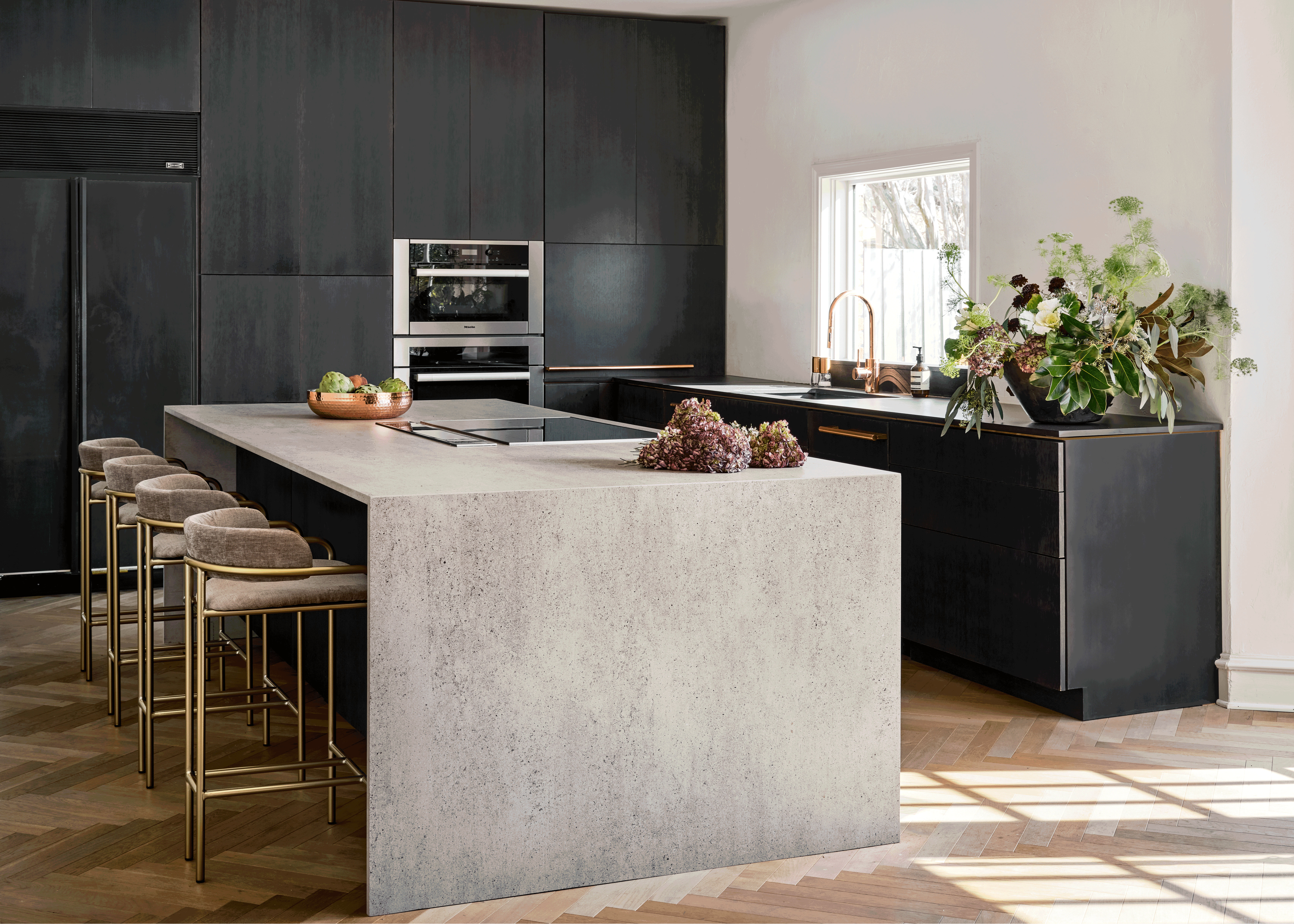
For those scared of committing to the endless depths of black, charcoal cabinetry feels like an easy solution. Not only does this Kohl-like kitchen offer a more resistant canvas for your kitchen, but the smart and sophisticated color gives the room an elevated finish.
'The 4,000-square-foot home had a traditional exterior, Georgian style which is common to the Preston Hollow neighborhood in Dallas, Texas,' says says Los Angeles-based interior designer, Huma Sulaiman, founder of Huma Sulaiman Design. 'However, the clients wanted a more modern approach inside. They wanted a clean minimalistic European flair to the interiors. We had to be mindful of how we tied in both the minimalist contemporary interior with the traditional architecture of the home.'
Another benefit of coal-colored cabinets is their ability to blend with more traditional surroundings, the pared-back coloring of this grey kitchen makes it feel both contemporary and timeless. 'We kept the palette monochromatic, predominantly using white and charcoal, and darker hues,' adds Huma. 'Our team designed the custom cabinetry including the copper hardware that compliments the Dekton covered island and countertop and Miele appliances.'
2. Mesmerize guests with dark brown
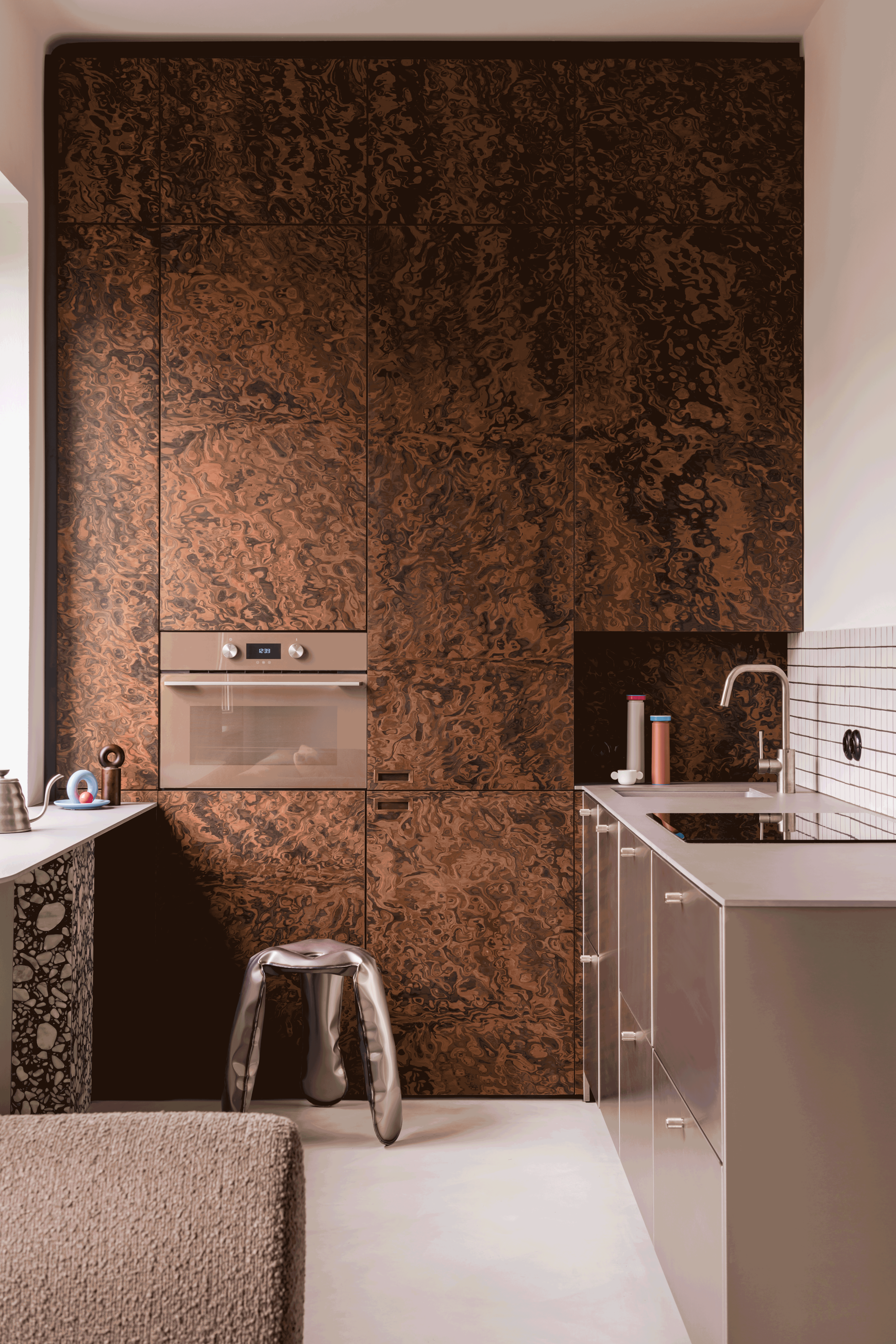
A post-modern apartment in Warsaw’s Praga district hides a dream-like kitchen created by local design studio, Mistovia. The ink-like movement of the American walnut veneer not only showcases the complex beauty of natural materials but also makes the case for warm brown cabinetry for your kitchen.
The Livingetc newsletters are your inside source for what’s shaping interiors now - and what’s next. Discover trend forecasts, smart style ideas, and curated shopping inspiration that brings design to life. Subscribe today and stay ahead of the curve.
'In the kitchen, the tall built-in furniture finished with a veneer made of an extremely impressive American walnut burl constitutes the main feature,' says reveals interior designer Marcin Czopek, founder of studio Mistovia. 'The mesmerizing organic pattern contrasts perfectly with the smooth surface of the brushed steel cabinets and the rigorous geometry of simple white tiles lining part of the wall.'
By pairing the rich walnut with cooler brushed steel, this wood kitchen still feels incredibly modern and showcases how warm and cool tones can work together in new ways.
3. Look to navy for an electric interior
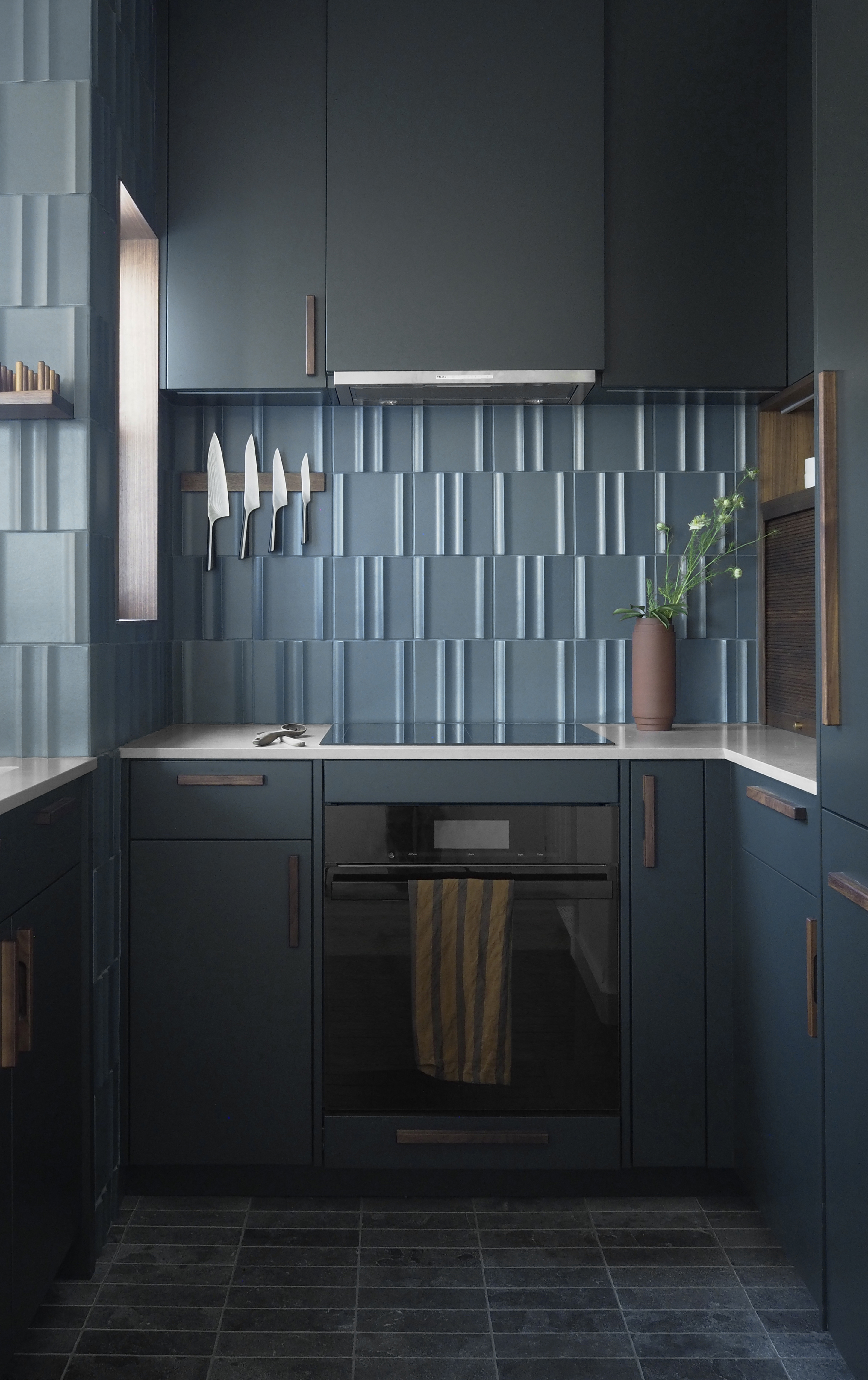
This teal-toned small kitchen was created by San Franciscan studio, Form + Field for their Nopa Jewel Box project. The dark navy cabinets are made that much more impressive, as they are juxtaposed with the tonal backsplash and warm copper and wooden accents. The result feels cohesive and considered, showcasing a kitchen that fascinates with every detail.
'The initial concept was a modern, muted blue/green jewel box kitchen that contrasts with the rest of the space which is lighter in color and material palette,' reveals Christine Lin, founder of Form + Field. 'The paint color is Regent Green by Benjamin Moore while the tile color is Aventurine Matte from Ann Sacks. Dark tones are great for a kitchen because they hide stains so well. You'll just want to make sure that lighting is sufficient for all the work surfaces in the kitchen since there will be less light reflected off surfaces.'
As mentioned by Lin, lighting is another aspect to consider when designing your kitchen. Darker colors naturally reflect less light which works well to hide stains or marks but also means it’s worthwhile selecting complimenting lighter tones to add some light back into your space.
4. Bring in a natural touch with emerald green
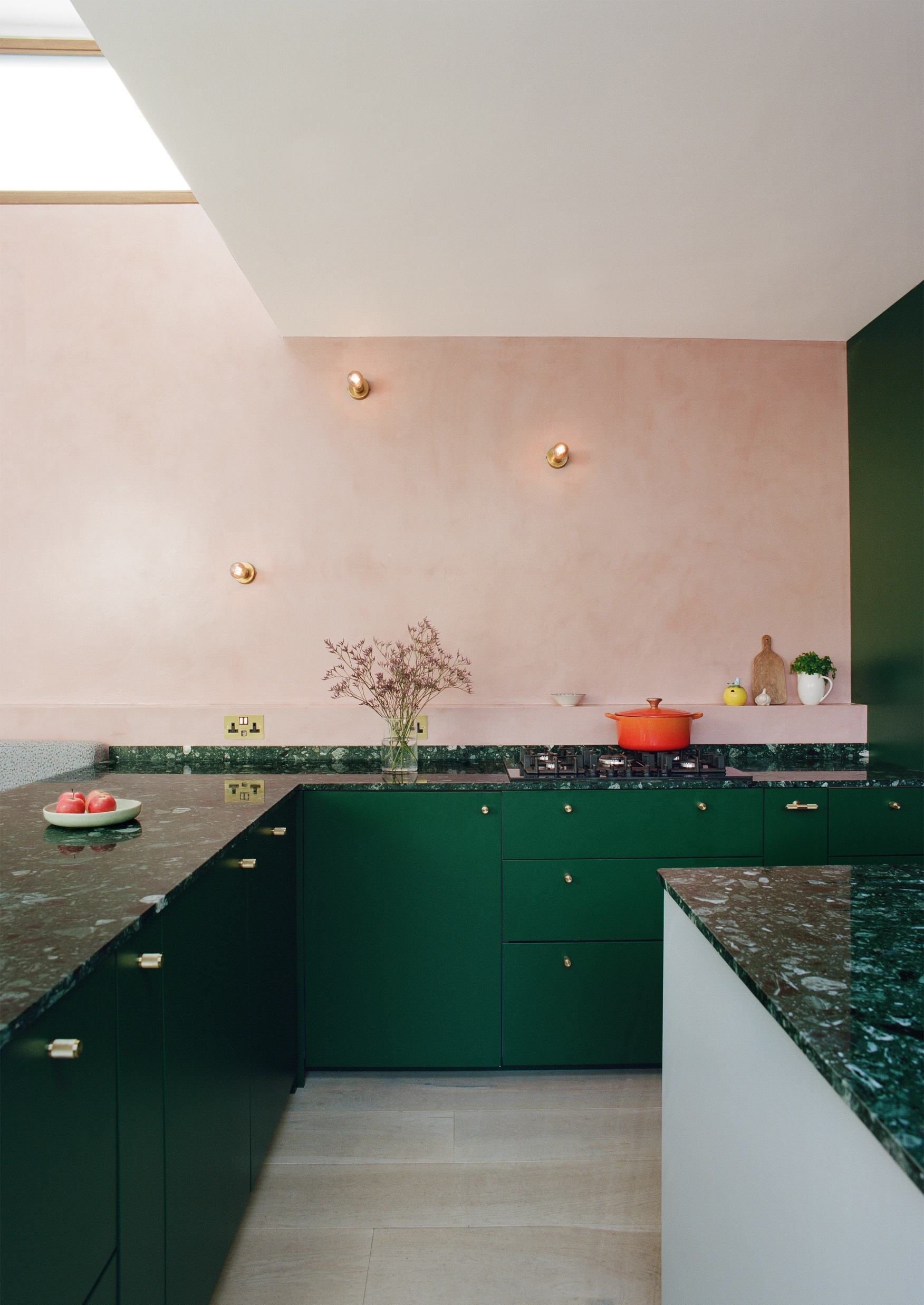
Darker cabinet colors can still feel playful and feminine as we see in this charming kitchen design realized by design studio Space A. The marriage of rich and distinctive emerald cabinetry and worktops with soft and delicate pink walls and lighting delivers a kitchen that is not only well-balanced but also beautiful from every angle.
'The kitchen and dining space is the heart of the house. With cupboards of ‘Puck’ green, the magical, mischievous color reflects the quirky nature of the house, with its arched windows and cubby holes,' reveal Anna Drakes & Amelia Hunter, founders of design studio, Space A. 'The depth and richness of the deep green kitchen cabinetry is offset by a soft pink plastered wall. This hand-finished surface adds texture to the modern kitchen and is durable enough to be wiped clean, even when splattered with cooking oil.'
The designers raise a key point for consideration when it comes to any aspect of your kitchen design, choose materials and finishes that will stand up to the wear and tear of daily life whilst looking their best.
5. Choose a punchy purple for your kitchen
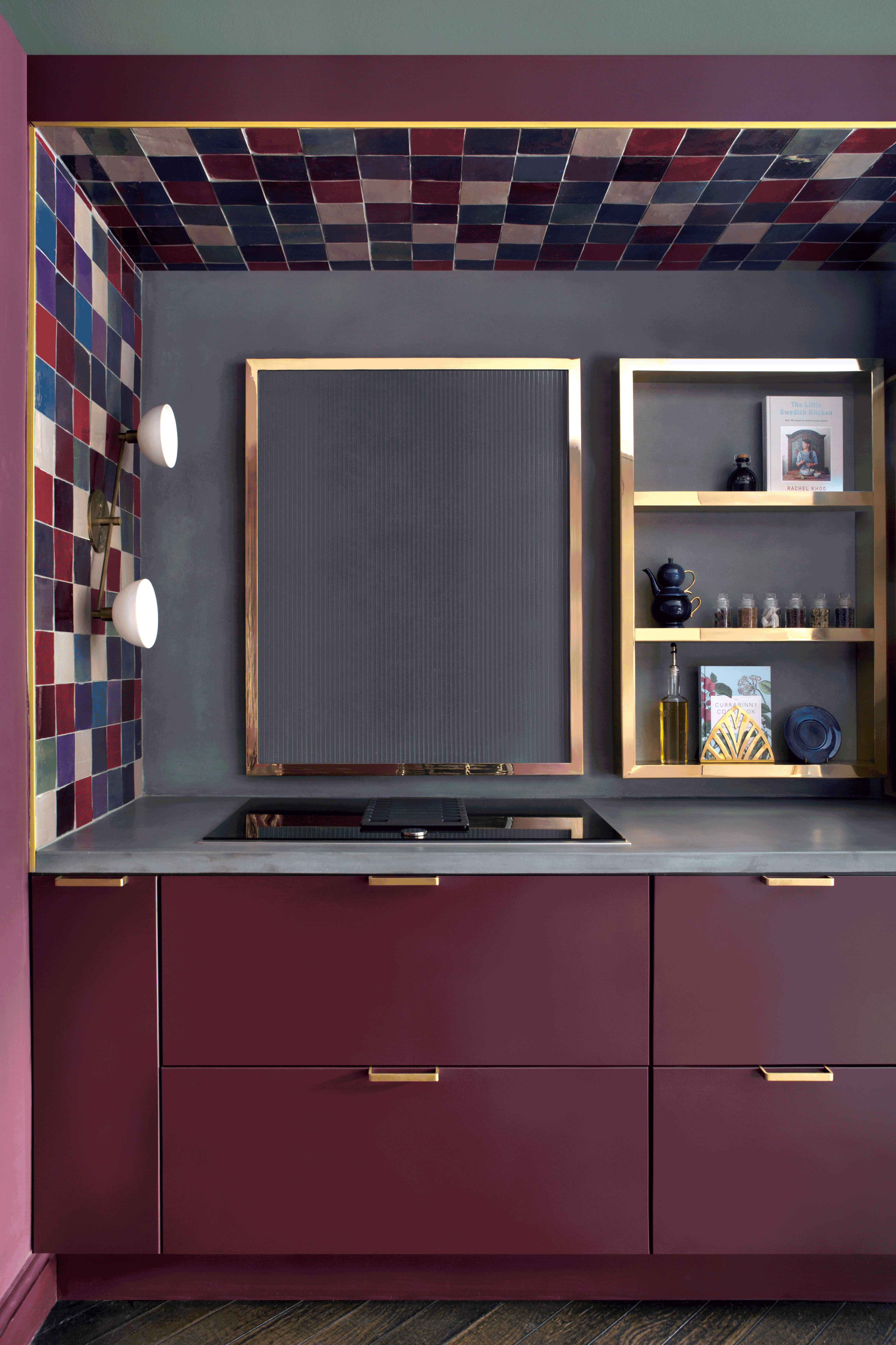
This daring design makes the case for more fun when it comes to dark kitchen cabinets. The vibrant magenta cabinetry is brought to life by the metallic accents and jewel-like tiles that frame the upper half of the kitchen. The choice of lighting echoes the joyful design and tempers the darkness of this design. The choice of a smooth and smart grey countertop and backsplash complements the moody nature of the purple but also ties these shades together.
'The inspiration for this kitchen was a jewelry box,' says Roisin Lafferty, founder of Kingston Lafferty Design. 'We wanted to create a feature of the kitchen framed in a brass band with rich jewel tones and playful elements of the mixed Zeligge tiles and ribbed splash back set against the concrete countertop and rich burgundy tone of the kitchen cabinets. The client loved to entertain and wanted a bold expression of color and drama in the kitchen.'
Writer and design expert Faaizah Shah is the founder of The Interiors Consultancy. She has worked with designers such as Staffan Tollgard and design houses such as Sanderson to help them understand and communicate their narratives. She is known for crafting engaging stories and imaginative content, and understanding great decor from her years alongside some of the best creatives in the industry. She is also a contributor to Livingetc.

