5 Kitchen Countertop Finishes, Colors, and Styles That Are Going to Feel Outdated in 2026, According to Designers
Experts caution against these specific looks that could leave your kitchen feeling drab in 2026

Designs and styles in kitchens naturally go through cycles, with trends constantly evolving. And while I'm always going to advocate for choosing what you love, you can still recognize that certain choices are going to instantly make a kitchen feel dated, especially when it comes to countertops.
So if you’re in the midst of designing or redesigning this all-important room, it pays to take note of outdated kitchen countertop trends that experts strongly advise against. Everything from drab colors to certain dated materials.
There are a handful of elements that designers agree are officially past their prime. Here’s what the experts had to say on countertops, and what to keep in mind as you put together your mood board.
Article continues below1. 'Too Conventional' Colors
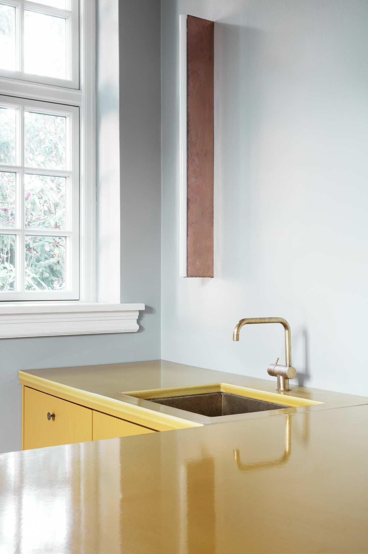
The staid old bright whites and grays may finally be among the kitchen countertop colors that are going out of style. Instead, professionals are recommending hues that actually add a sense of fun or freshness to the space, boosting its overall personality.
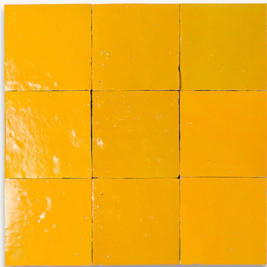
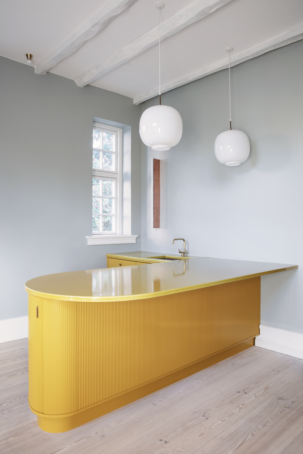
A yellow kitchen, for example, can help to create a modern feel that's both bold and enduring. If this tone feels too vibrant, consider deeper options, such as a black kitchen or charcoal gray, which can work just as well.
“This yellow kitchen features several bespoke warm yellow lava stone worktops, along with matching lava stone backsplash tiles,” says Rosario Parrinello, founder, ceo, and art director of Made a Mano, a company specializing in artisanal lava stone and terracotta products. Yellow is, after all, one of the most joyful colors you can decorate with.
2. Perfect Polish
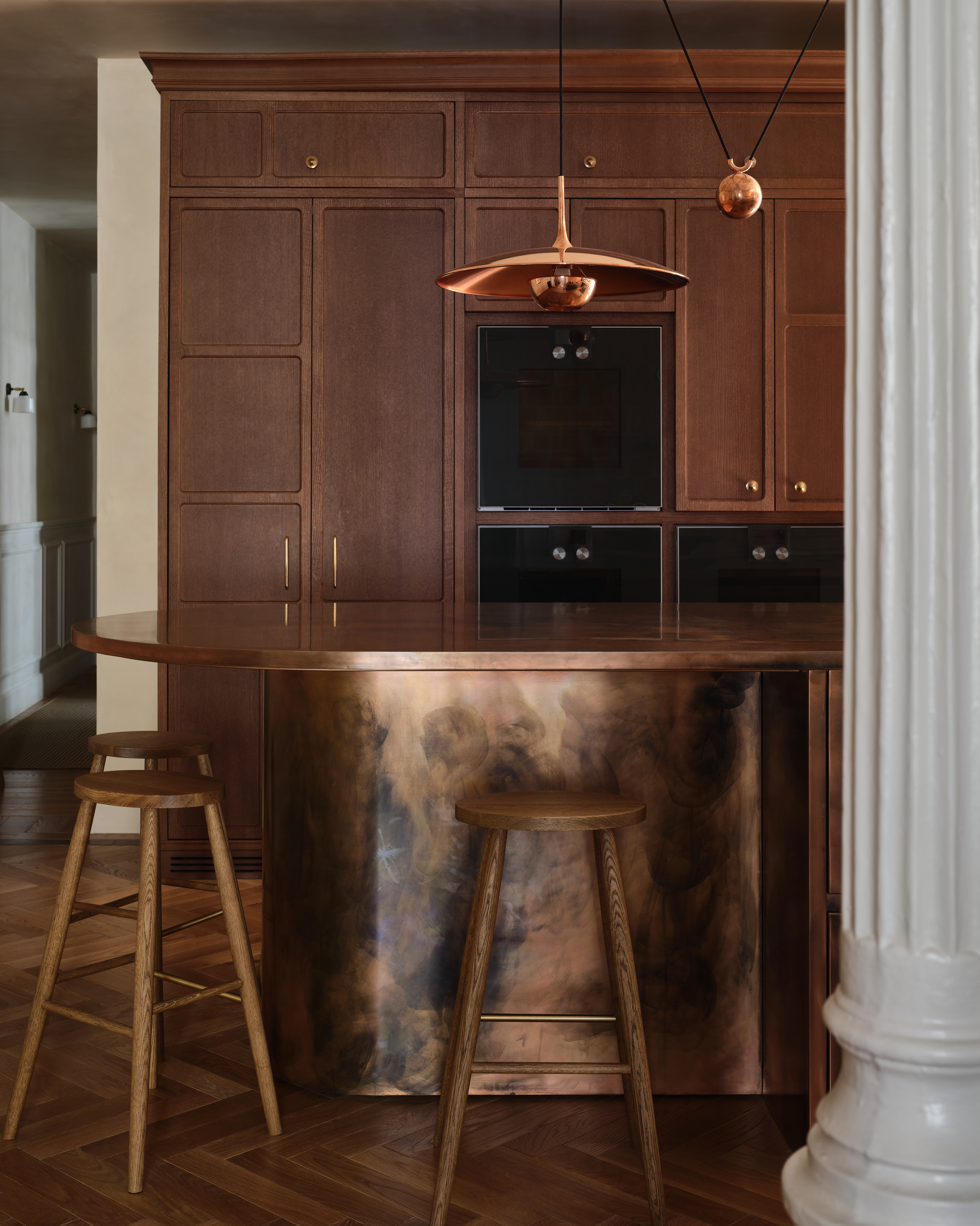
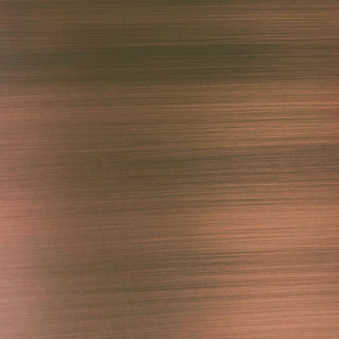
DO INSTEAD: Choose copper counters that bring tactility and evolve with daily use.
Shiny, perfectly polished countertops are making way for more textured finishes, whether that's something like a leathered stone, or more out-there finishes like metal.
The Livingetc newsletters are your inside source for what’s shaping interiors now - and what’s next. Discover trend forecasts, smart style ideas, and curated shopping inspiration that brings design to life. Subscribe today and stay ahead of the curve.
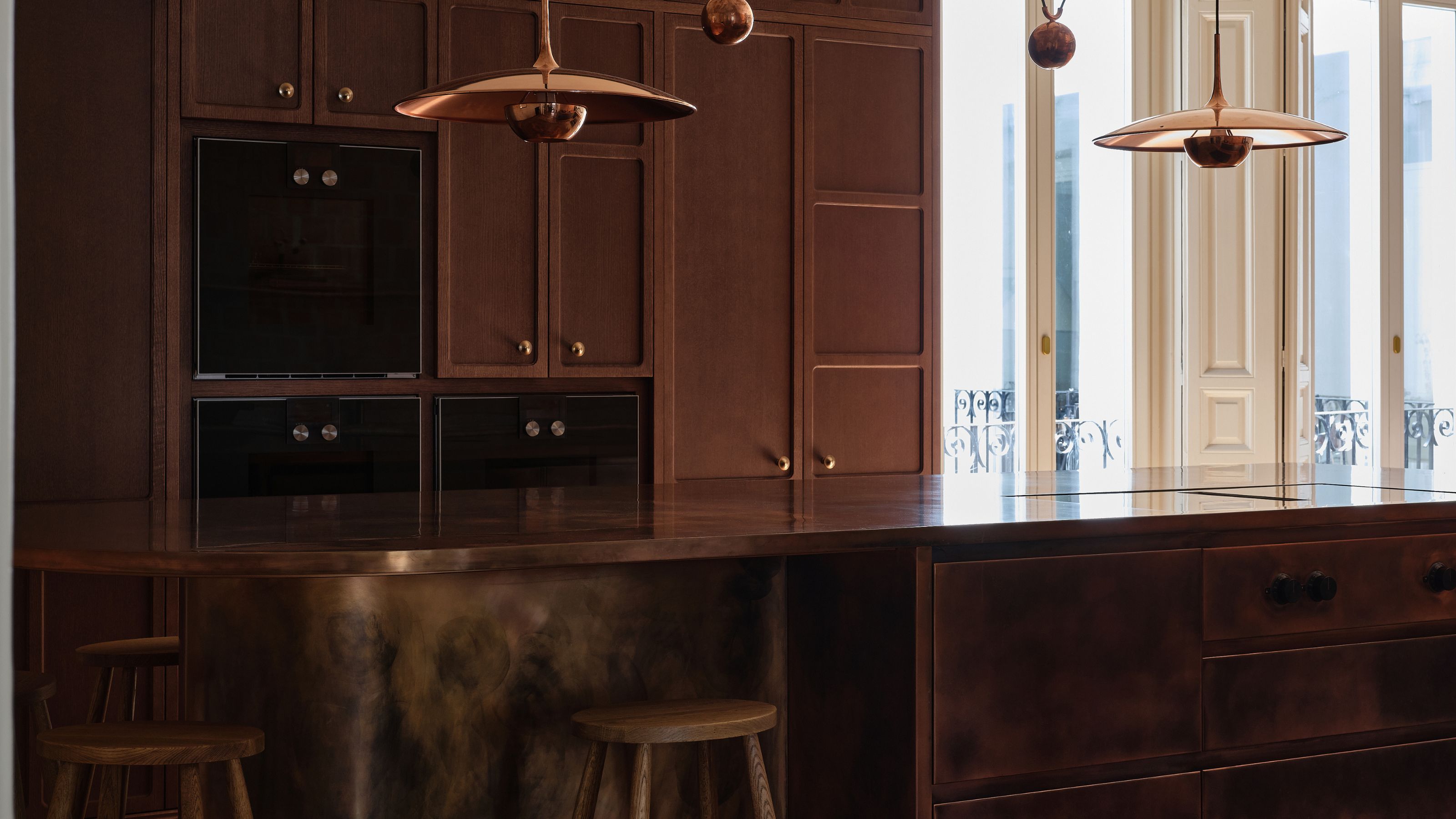
The copper interior trend has made a confident comeback, with everything from kitchen backsplashes to countertops finished in this standout material, valued for its durability, high heat resistance, and unmistakable visual warmth. Instead of clean, overly polished metals, experts suggest opting for those that age gracefully and show patina.
In this project by designers Richy Almond and Pernille Lind, founders of Lind + Almond, copper is showcased in full bloom, with the island, countertops, and even the kitchen island's lighting all finished in the material. Pernille explains: “Serving as the true heart of the home, the copper island offers an intimate sanctuary for gathering. We chose this material for its living finish — a surface that will deepen and evolve, proudly bearing the marks of its history so that every interaction leaves a memory.
"To reflect the heat of Madrid, we embraced a bold, tone-on-tone palette. The deep red copper is layered against ZIA red clay Cotto tiles from San Miguel de Allende and local Alicante marble. The result is a texture-rich immersion in color. Above, copper pendants catch the light, casting a soft amber glow that bathes the space in warmth.”
The studio delivers holistic boutique hospitality and residential projects, blending layered detail, contextual design, and emotionally resonant spaces grounded in nostalgia.
3. 'Background Character' Designs
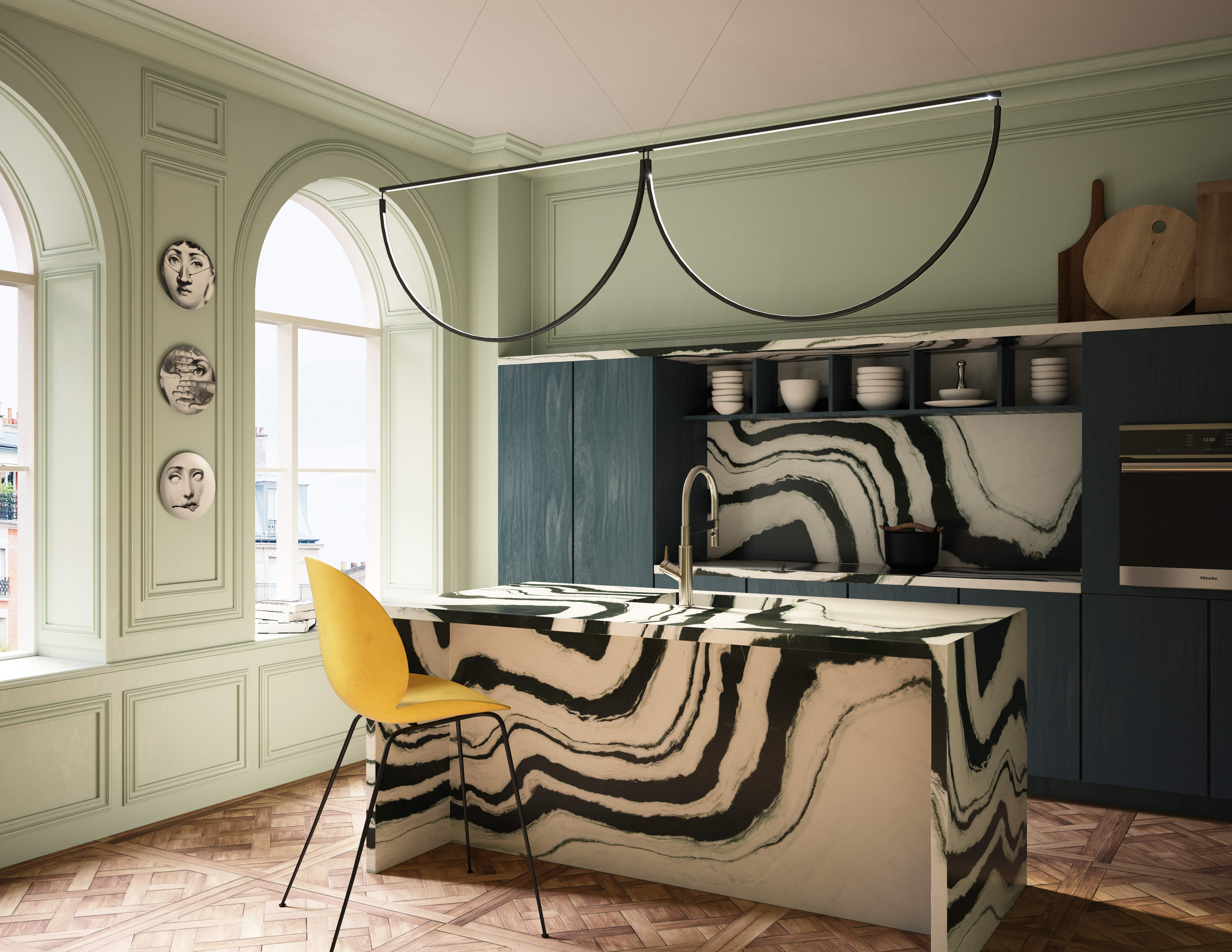
DO INSTEAD: Choose a marble with bold patterns and heavy veining to give the kitchen movement.
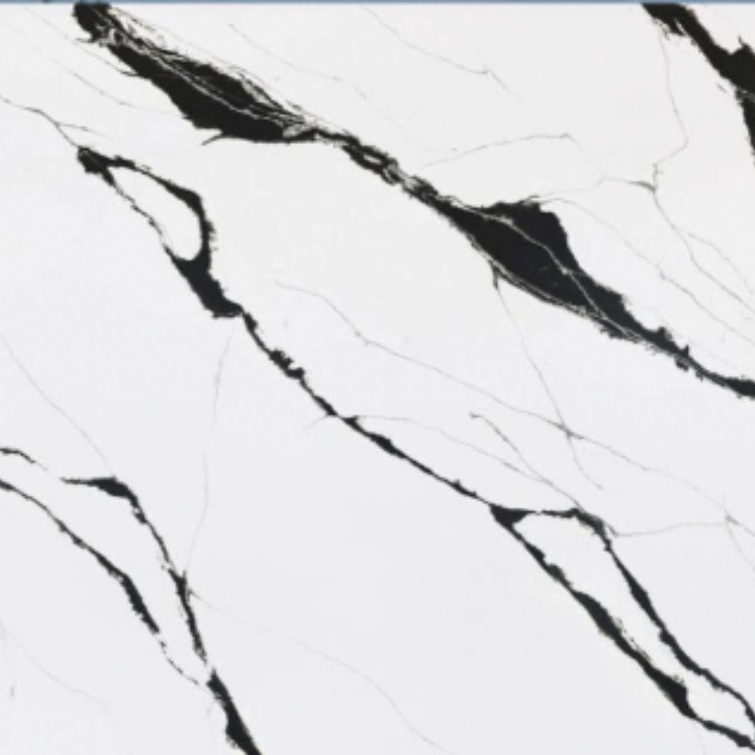
In the coolest modern kitchens, designers are choosing countertops with 'main character energy', and avoiding surfaces that don't add interest to the overall scheme. Go bold with kitchen countertop colors and even veining to make your kitchen stand apart. “When we first brought Panda White Marble in from China, it was unlike anything else on the market,” shares Zach Epstein, president and chief product officer at Artistic Tile.
“Now it’s become almost a classic for us; a statement stone that designers choose as the centerpiece of their designs. When used in the kitchen and properly sealed, Panda White will age gracefully, developing a natural patina over time.”
This type of design feels inherently unique, with its high-contrast appearance acting as a natural work of art that elevates the entire space.
4. Non-Functional Stones
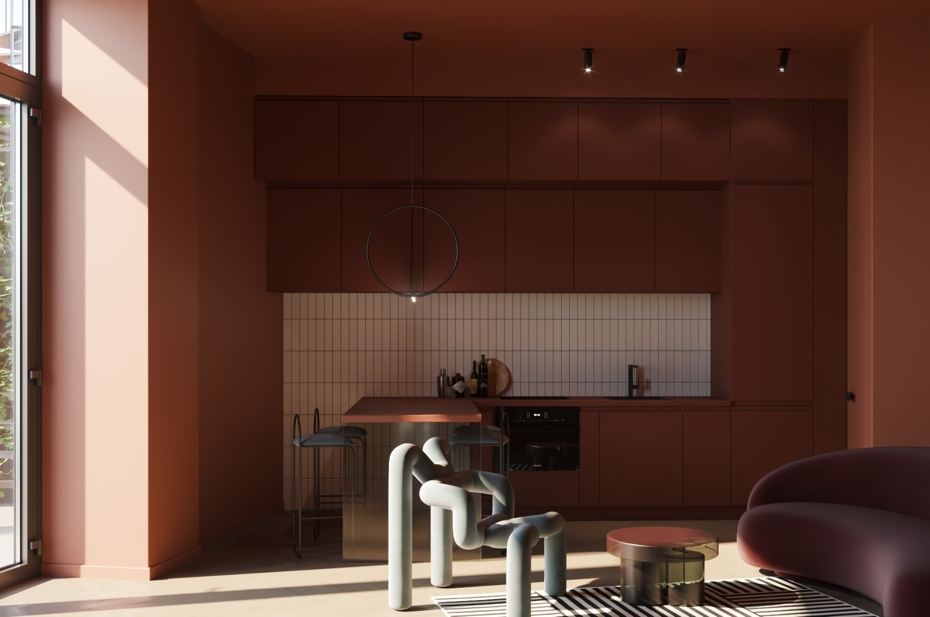
DO INSTEAD: Extend the kitchen counter to create a seating nook for eating & socializing.
You might love that marble countertop, but it's a material that requires a lot of care and attention, so there's a reason it's a countertop trend being left behind. Functional doesn't need to mean boring, either. In this kitchen, the countertop is crafted in the same finish as the cabinetry, using a high-performance composite material that ensures durability while allowing for perfect chromatic continuity.
“The kitchen’s countertop was conceived as a seamless extension of the cabinetry, maintaining the same sharp geometry and monolithic presence that defines the entire volume,” says Elena Tomlenova, founder and artistic director of Archventil. “By extending outward, it transforms into a bar peninsula, introducing a social and multifunctional layer to the space while preserving a clean, minimal aesthetic.”
“This deliberate choice eliminates visual interruptions, emphasizing the sculptural quality of the design,” adds Elena. “The glass base beneath the peninsula introduces a subtle contrast, visually lightening the mass and adding a contemporary edge. The deep red-brown tone was selected for its ability to infuse the kitchen with warmth and intimacy. Red, historically associated with energy and conviviality, enhances the emotional connection to cooking and gathering.”

Born in Moscow, Elena Tomlenova is the founder of Archventil, a Milan-based design studio and general contractor delivering emotionally driven interior experiences across Italy and Switzerland.
5. Tiles
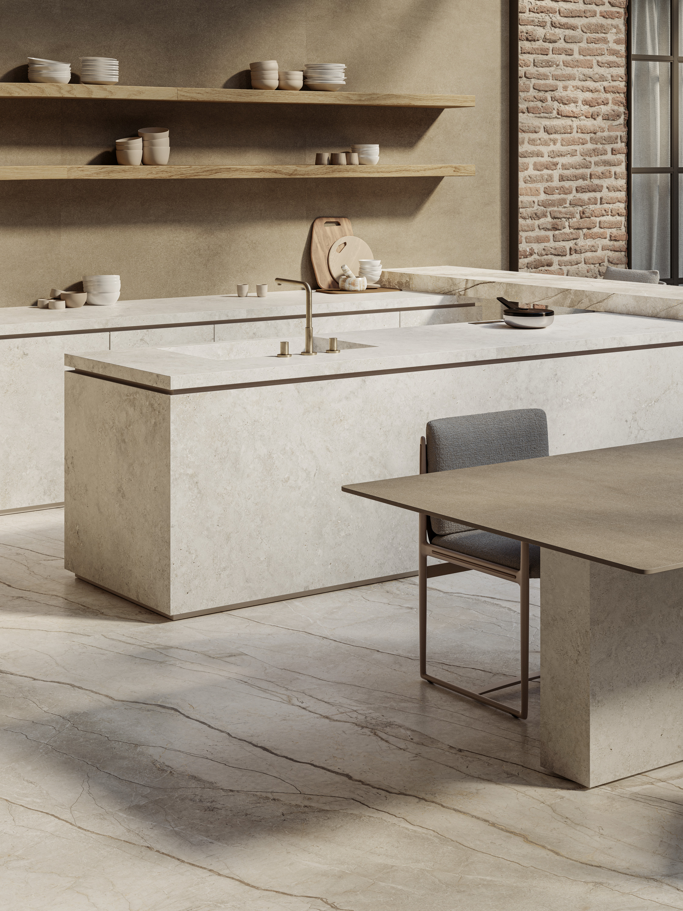
DO INSTEAD: Choose large-format slabs for a seamless-looking kitchen.
Tiled countertops are a cool look, but a lot of designers say this retro throwback should be, well, thrown back for not being practical enough.
Replace small-format surfaces with large slabs, such as porcelain countertops, especially for those seeking a quiet luxury kitchen; they feel understated yet undeniably elegant.
“The large-format porcelain stoneware slabs designed for kitchen countertops combine technological innovation, aesthetic elegance, and maximum design freedom,” states Mauro Vandini, CEO of Marazzi Group.
“These surfaces, available in matte, satin, or glossy finishes, stand out for their hygiene, durability, and long-term stability.”
While on the subject of what’s trending in the kitchen, it’s also worth looking at kitchen cabinet color trends to create a cohesive scheme that feels modern, crisp, and built to last, perhaps even for an entire generation.

Aditi Sharma Maheshwari started her career at The Address (The Times of India), a tabloid on interiors and art. She wrote profiles of Indian artists, designers, and architects, and covered inspiring houses and commercial properties. After four years, she moved to ELLE DECOR as a senior features writer, where she contributed to the magazine and website, and also worked alongside the events team on India Design ID — the brand’s 10-day, annual design show. She wrote across topics: from designer interviews, and house tours, to new product launches, shopping pages, and reviews. After three years, she was hired as the senior editor at Houzz. The website content focused on practical advice on decorating the home and making design feel more approachable. She created fresh series on budget buys, design hacks, and DIYs, all backed with expert advice. Equipped with sizable knowledge of the industry and with a good network, she moved to Architectural Digest (Conde Nast) as the digital editor. The publication's focus was on high-end design, and her content highlighted A-listers, starchitects, and high-concept products, all customized for an audience that loves and invests in luxury. After a two-year stint, she moved to the UK and was hired at Livingetc as a design editor. She now freelances for a variety of interiors publications.
