I'll Say It, White Countertops Aren't Exciting — 6 Kitchens That'll Convince You a Bolder Counter Color Is the One Thing to Elevate Your Design
From bold greens to rich burgundies, and more, discover the counter tones redefining kitchens with style, depth, and timeless character

The Livingetc newsletters are your inside source for what’s shaping interiors now - and what’s next. Discover trend forecasts, smart style ideas, and curated shopping inspiration that brings design to life. Subscribe today and stay ahead of the curve.
You are now subscribed
Your newsletter sign-up was successful
When it comes to designing a space that makes an impact, white is not always the most compelling of kitchen countertop color ideas. Instead, a bolder countertop color might be just what you need.
The right worktop color can completely transform the atmosphere of the space, and often makes it feel more considered and more luxurious — after all, white is often the standard. Designers say that while we often focus on durability and finishes, color deserves just as much attention — it can give a kitchen its soul.
Of course, with so many options out there, choosing a countertop color can feel daunting, and colorful kitchen countertops are often not the cheapest of choices. But according to the experts, a few hues stand out as especially timeless and versatile.
Article continues belowHere’s a look at the six countertop colors worth considering for your next remodel beyond your basic white, gray, or beige — and why each one actually has timeless appeal that you won't get bored of.
1. Dark Green
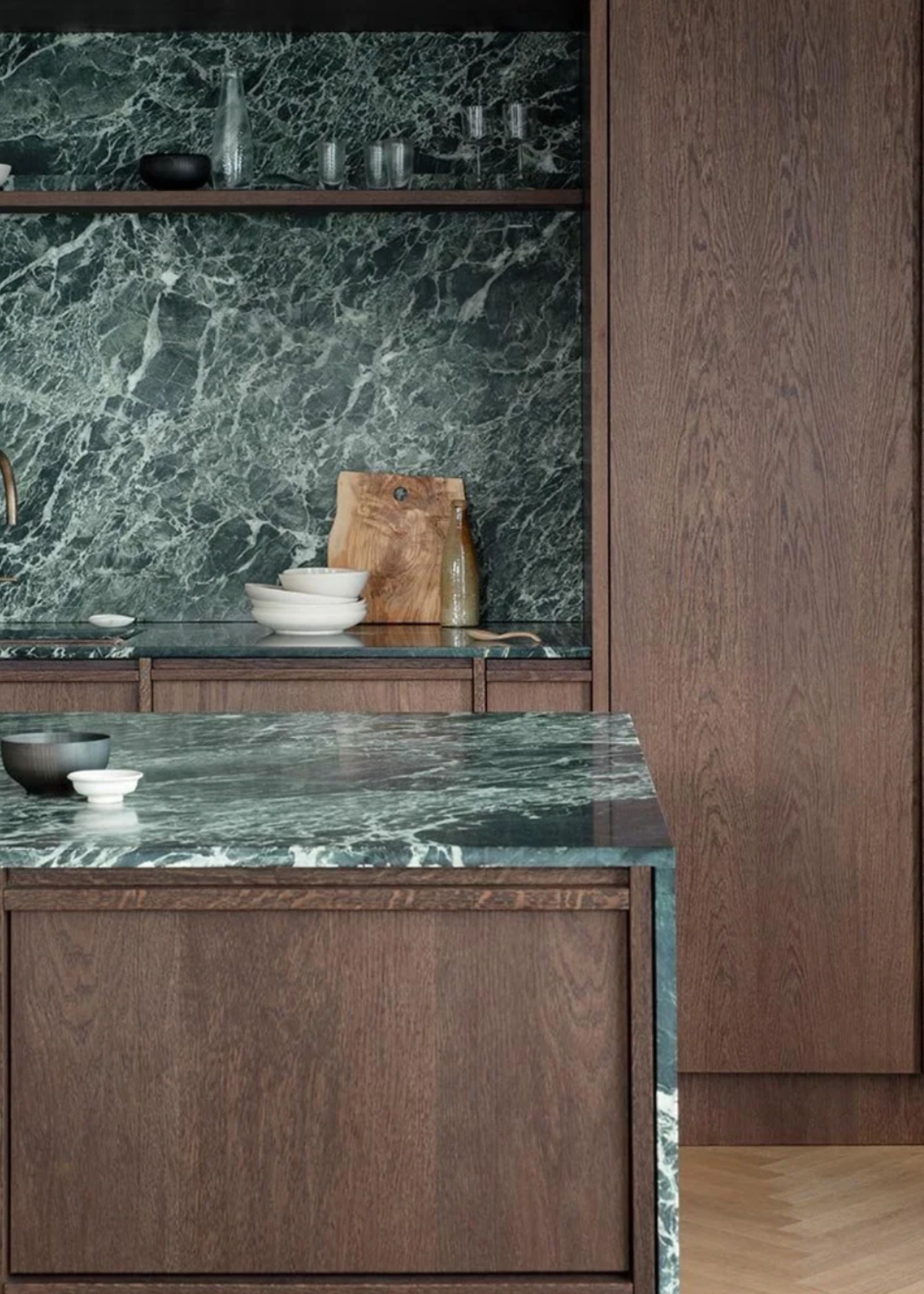
Nothing says timeless style better than a dark green, heavily veined marble countertop and backsplash.
Dark green is a kitchen color that feels expensive — it evokes nature, the outdoors, and an inherently calming aesthetic. When paired with other natural materials like stone, wood, or concrete, it feels especially soothing, like in this kitchen, which marries dark wood with a rich, near-emerald green countertop color.
“We wanted the kitchen to feel lively by combining natural materials in simple, clean contrasts,” says Jonna Karlsson, kitchen designer at Nordiska Kök. “The dark oak provides a warm and solid foundation, while the green Verde Alpi marble adds subtle color and character. The green tone was chosen to bring a natural sense of calm and energy. The marble wall behind the sink creates a thoughtful focal point, allowing the natural stone to take center stage in a modern Nordic kitchen.”
2. Black
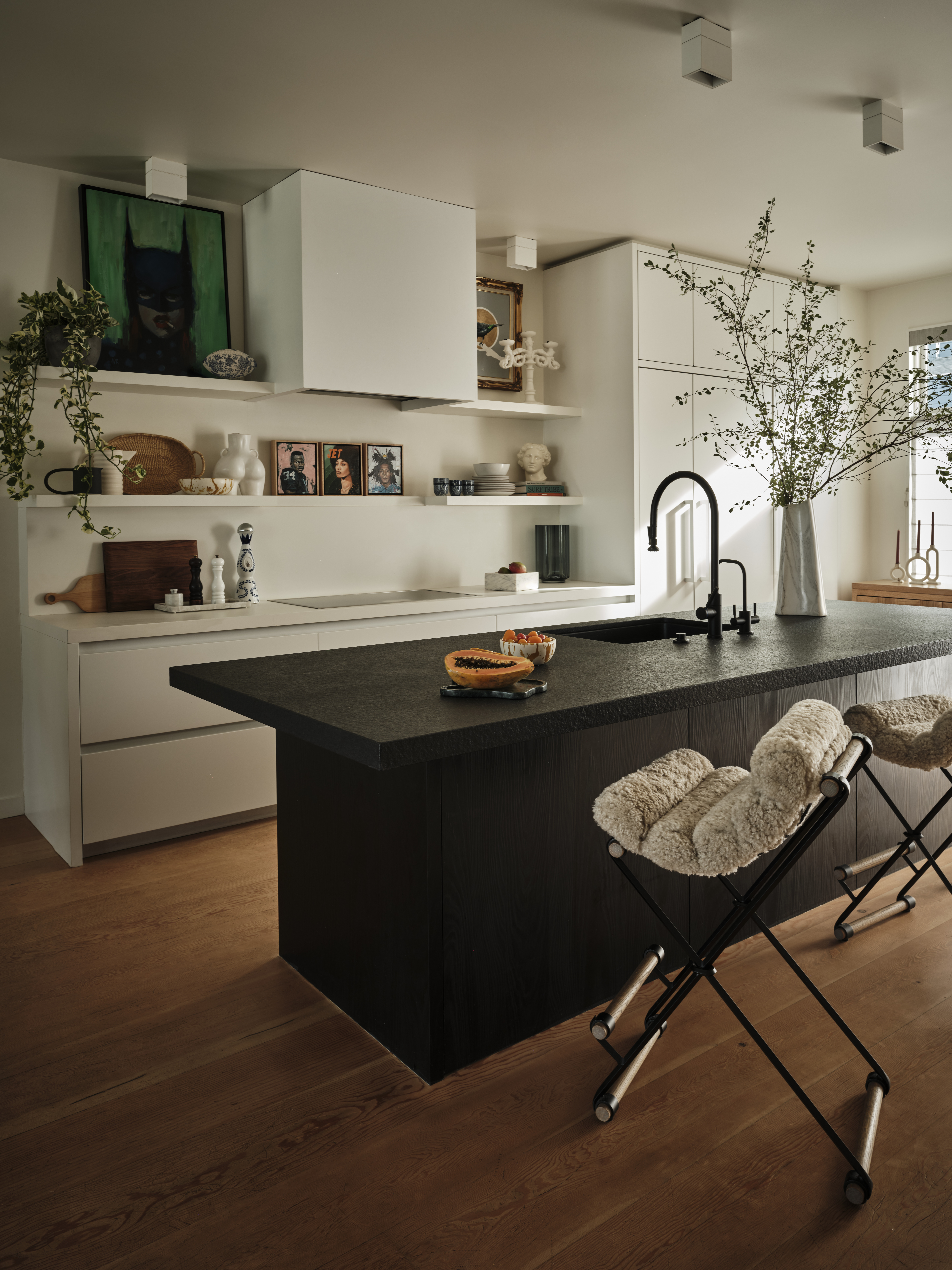
Black kitchen countertops can easily hide stains, cracks and everyday spills; a practical choice.
Black kitchens are sometimes considered neutral, but black is such a dramatic color that its actually a brave choice to make for your kitchen countertop color. The deep, dark tone works especially well as a countertop tone in large, open kitchens flooded with natural light. At its core, it’s a practical hue that hides the daily hubbub of a busy household. Design-wise, it pairs beautifully with primary colors and even metallic accents.
The Livingetc newsletters are your inside source for what’s shaping interiors now - and what’s next. Discover trend forecasts, smart style ideas, and curated shopping inspiration that brings design to life. Subscribe today and stay ahead of the curve.
In this kitchen, black has been used for an island with uniform counters and cabinets, which makes a dramatic centerpiece for the otherwise white kitchen. “This kitchen island is a study in contrast and texture,” shares interior designer Eva Bradley. “We chose modern black-stained cabinets paired with a flamed black granite countertop. Its subtle, matte texture not only creates visual depth but is also incredibly durable, stain-resistant, and forgiving of smudges; perfect for a busy family with kids. A black sink and plumbing fixtures allow the functional elements to disappear seamlessly into the island, keeping the focus on form and material. Set against crisp white perimeter cabinets and walls, the island creates a striking tension that energizes the space, all while being grounded by the warmth of Douglas fir flooring beneath.”

Eva Bradley is known for crafting timeless, personal interiors that merge modern elegance with an edgy sophistication. Drawing on European roots, global travel, and art, she brings bold, nuanced, and contemporary sensibilities to every project.
3. Pink
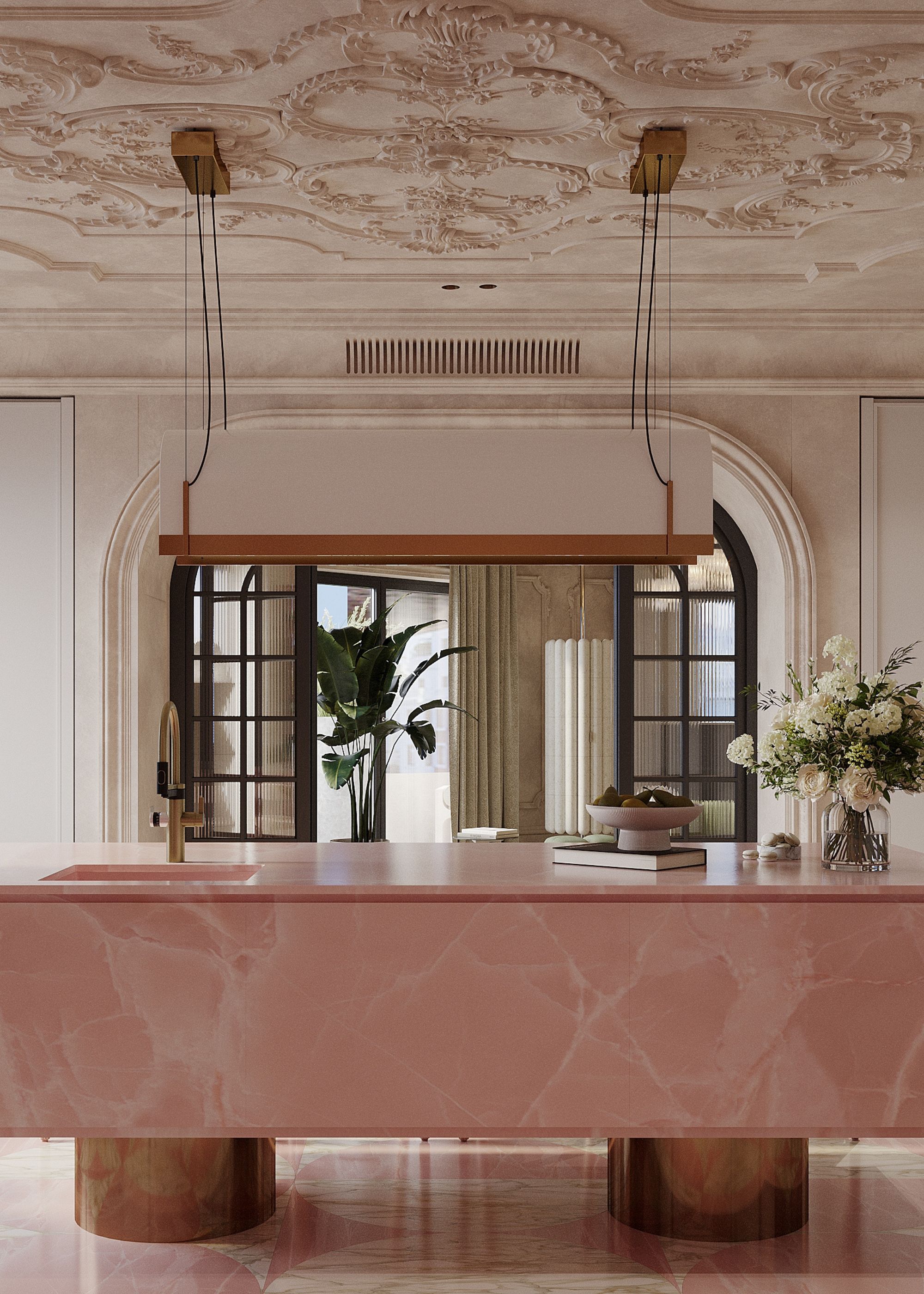
Pink adds a refreshing vibe to the otherwise utilitarian countertop, and injects modernity to the kitchen.
Pink kitchens have been in favor for a while — one of the biggest modern kitchen trends, and the look is set to carry well into 2026 and beyond. As for kitchen countertop colors, pink is a little less common to see, but where you can find a material that works for it, often something like natural stone, colored concrete or even tiled counters, it adds a decorative touch to busy surfaces while maintaining functionality. Think pink marble with dramatic veining, pink quartz slabs, or even pink tiles.
In this kitchen, Alla Koktysheva, co-founder of PK Architects, used the shade to create a welcoming interior with bold accents. She explains: “We used beige as the base color for the walls and ceiling, which are adorned with ornate stucco. To add vibrancy and a touch of warmth to the space, we designed a kitchen island made of rose quartz, featuring a monolithic top supported by round brass legs. This addition brought the interior to life, infusing it with inspiration and warmth.”

PK Architects specializes in designing private homes, apartment interiors, offices, retail spaces, restaurants, and cafés. The studio offers a comprehensive range of services — from concept development to construction oversight and final project completion. A family-run business with 14 years of experience, the founders bring a personal, hands-on approach and deep industry knowledge to every project.
4. Teal
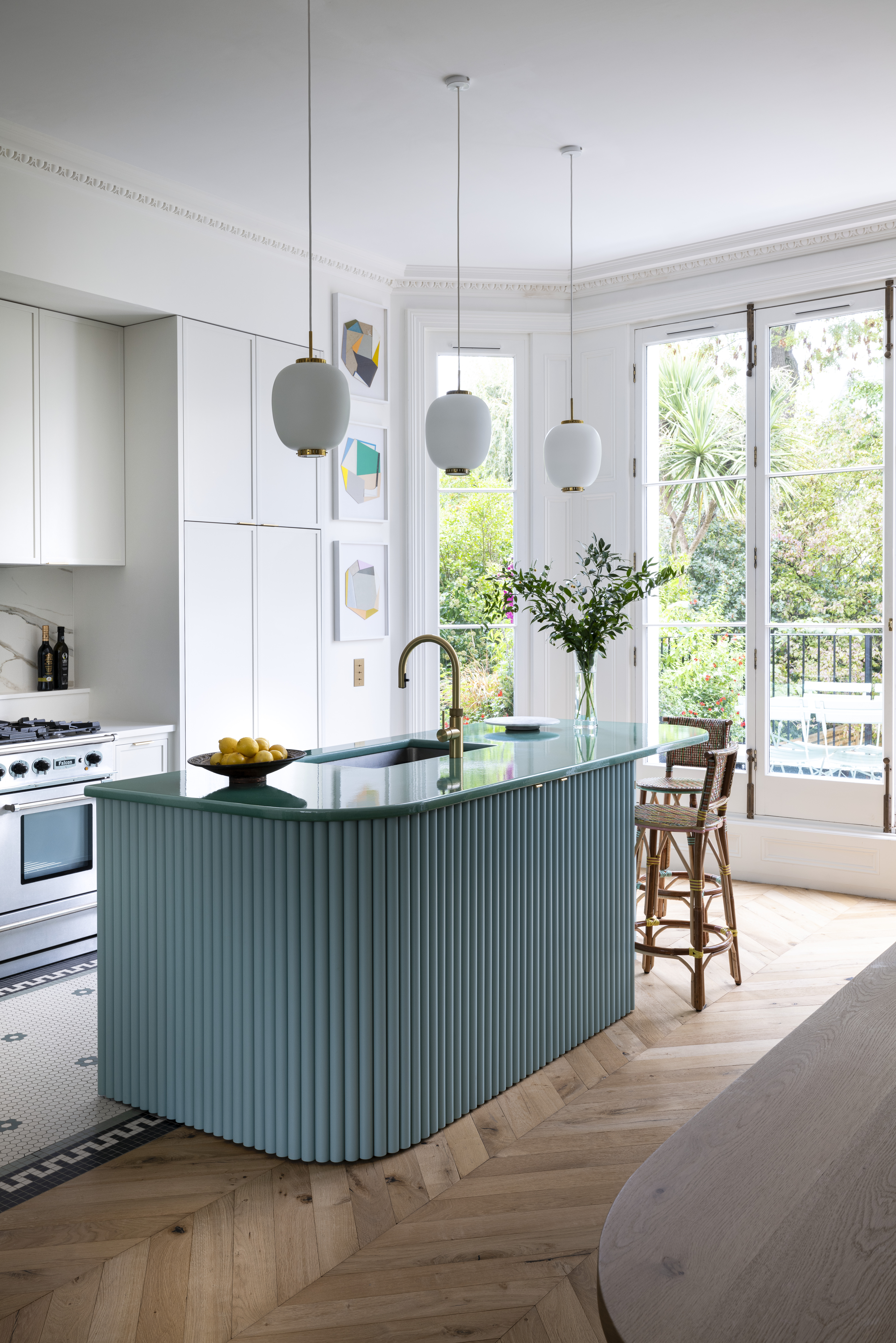
Add a playful touch to the kitchen with an aqua countertop.
Forecasters predict green (in varying shades) will remain one of the top colors in modern kitchens. Within this spectrum, bold turquoise stands out; not just for walls and cabinets, but for countertops as well. Its intensity brings a lively, uplifting visual, and it looks particularly striking when offset with crisp white. And while you might think it's probably more unusual to see, it's a color that we actually see quite a lot, especially with materials like lava stone countertops.
“In this kitchen, a fluted central island topped with green Pyrolave anchors the space, facing a hidden pantry that makes the layout effortlessly functional,” says Amelia Brooks of K&H Design, who created this space in collaboration with Kate Feather Kitchens.

Amelia’s skills span every facet of the practice. A highly artistic and accomplished designer, she brings intelligent energy and glamorous flair to the team. Her curiosity drives her to discover new materials and products, and she consistently delivers K&H’s signature personalized service with exceptional finesse.
5. Burgundy
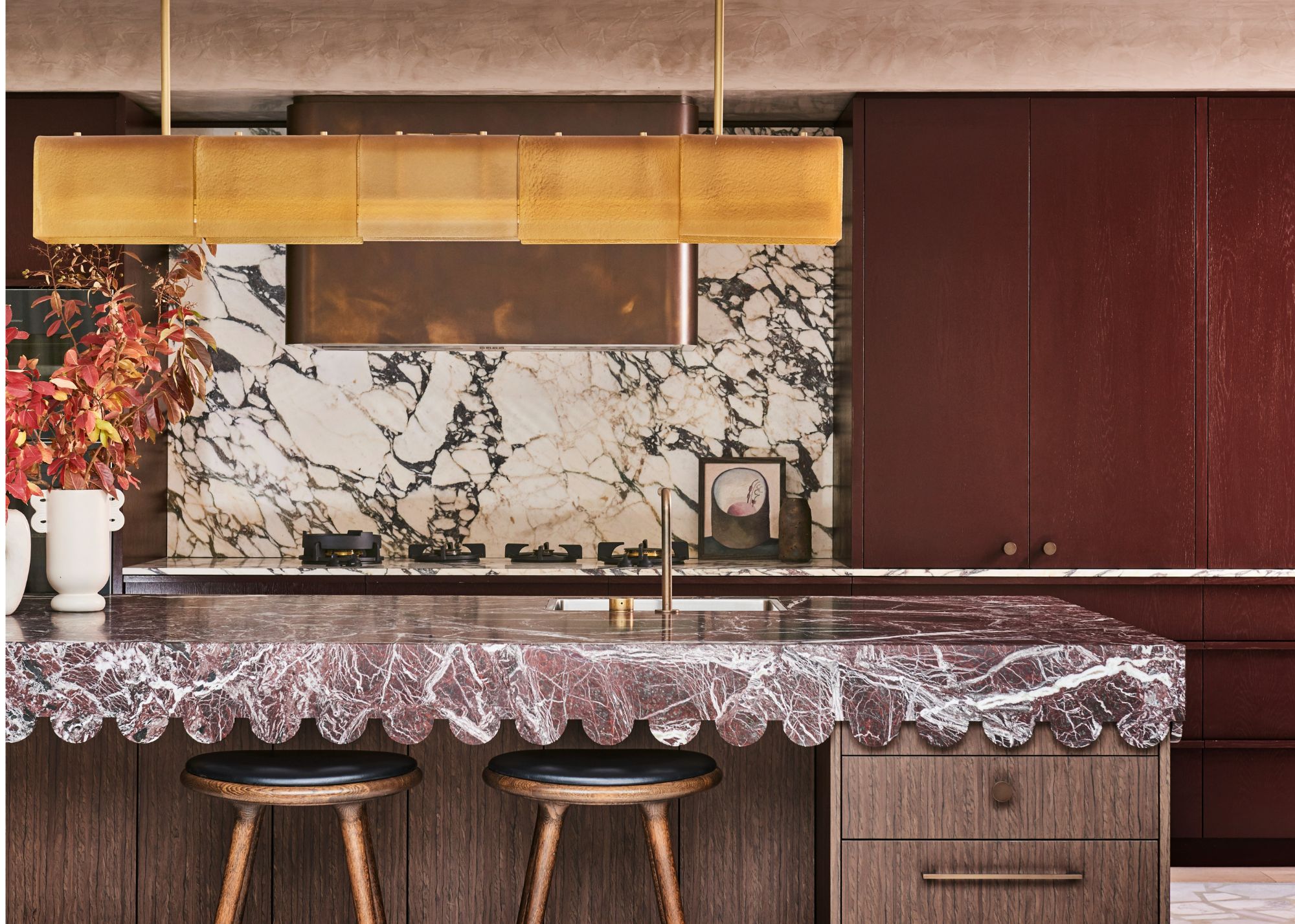
Burgundy is magnetic yet warm and practical; the perfect tone for kitchen counters.
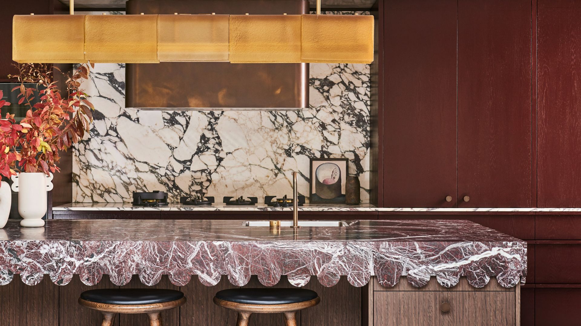
Has the burgundy color trend caught your eye? It’s everywhere this year, and for good reason. This deep hue adds warmth, character, and elegance to a room, while adapting easily to both modern and country kitchens. When it comes to kitchen countertop colors, this particular shade creates a magnetic effect, transforming a practical work surface into a stylish focal point. Burgundy pairs beautifully with neutral shades, wood tones, and metallic accents.
“We selected this stone after sourcing tiles for another project in the stunning Rosso Levanto,” says Rebecca Jansma, creative director of Rebecca Jansma Interior Design (RJID). “We were fortunate to have the complete trust of our clients when proposing the finishes and overall design of this kitchen, particularly the countertop. Their only direction was to create something they hadn’t seen before. The scalloped edge originated as a reference to other arch motifs in the renovation; we flipped that upside down and added a curve to the benchtop to make it even more challenging to manufacture."
Rebecca continues, "The family is full of color and fun, so we leaned into that with the palette throughout the home. The deep burgundy cabinetry was chosen in response to the stone, and for the cooktop wall, we inverted the stone colors to Calacatta Viola, as we often do, to make the composition more dynamic.”
Rebecca Jansma leads every project with a meticulous eye for detail, blending history, art, travel, texture, and color into functional, stunning spaces. Her collaborative approach reinterprets each client’s sensibility through a global aesthetic, rooted in authenticity and refined beauty.
6. Blue
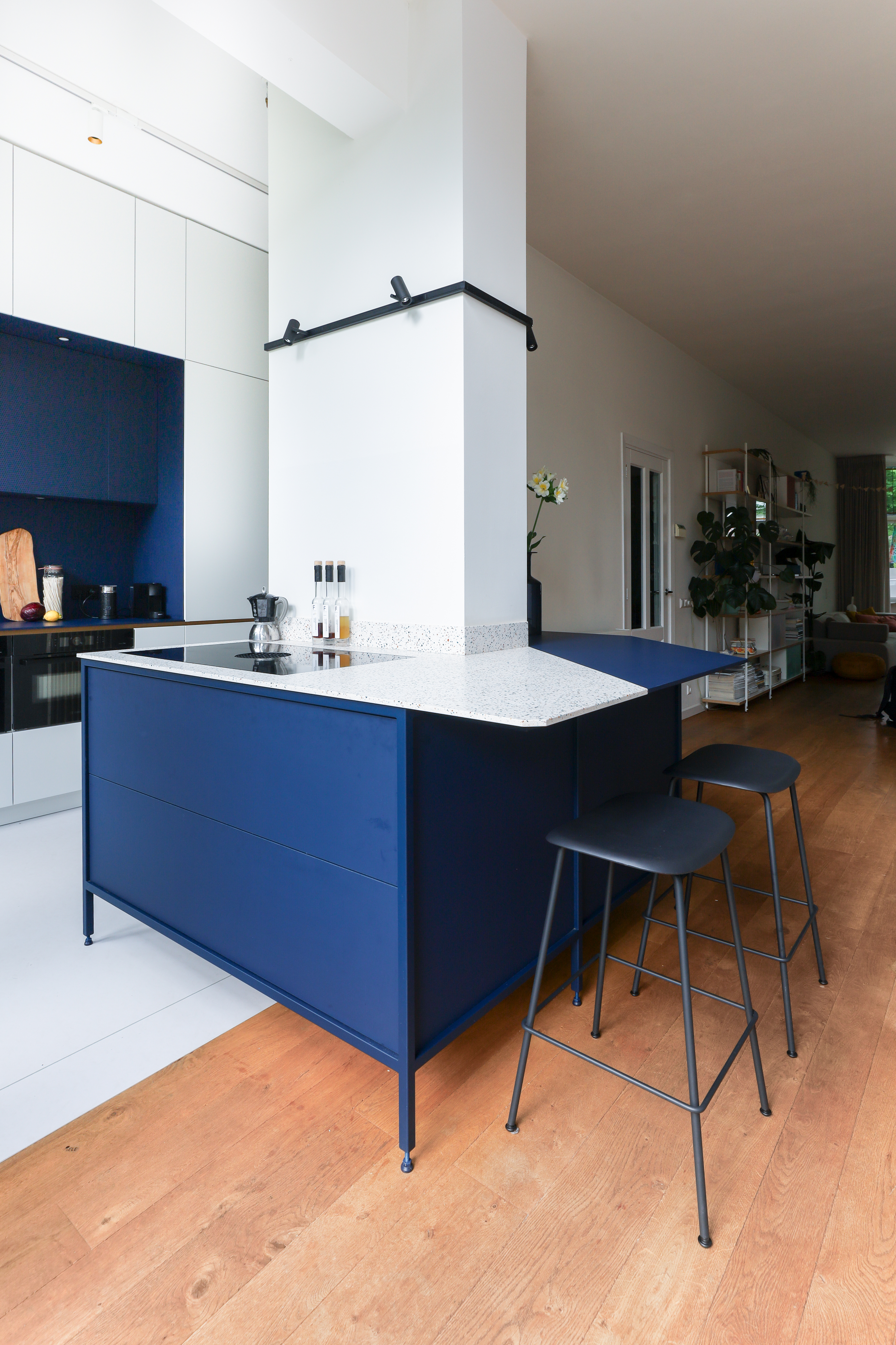
Give the kitchen depth and layering, with a counter designed in two tones.
Blue kitchen counters are a little rarer to see, and usually in lighter, more natural tones. However, for bold modern spaces, you could try an idea like this two-tone kitchen, which softens the look of the counters with a mix of white and bright, cobalt blue.
“For this Amigo project, STUDIO THO was briefed to create a peaceful yet playful kitchen design, allowing better connection to the adjacent living room,” says Kaisa Riikilä of DURAT. “The new kitchen essentially ‘folds’ around an existing wall, creating a more spacious entrance and flow. A balanced mix of color blocks, textures, and materials delivers a playful but not overpowering look. The worktop is made of Durat Palace DP007 Martini, a terrazzo solid surface material composed of 30% recycled plastic.”
Think beyond walls and cabinets; kitchen countertop colors can boost both style and function, adding depth, character, and balance. Whether bold or neutral, the choice should reflect your design vision while ensuring timeless appeal.

Aditi Sharma Maheshwari started her career at The Address (The Times of India), a tabloid on interiors and art. She wrote profiles of Indian artists, designers, and architects, and covered inspiring houses and commercial properties. After four years, she moved to ELLE DECOR as a senior features writer, where she contributed to the magazine and website, and also worked alongside the events team on India Design ID — the brand’s 10-day, annual design show. She wrote across topics: from designer interviews, and house tours, to new product launches, shopping pages, and reviews. After three years, she was hired as the senior editor at Houzz. The website content focused on practical advice on decorating the home and making design feel more approachable. She created fresh series on budget buys, design hacks, and DIYs, all backed with expert advice. Equipped with sizable knowledge of the industry and with a good network, she moved to Architectural Digest (Conde Nast) as the digital editor. The publication's focus was on high-end design, and her content highlighted A-listers, starchitects, and high-concept products, all customized for an audience that loves and invests in luxury. After a two-year stint, she moved to the UK and was hired at Livingetc as a design editor. She now freelances for a variety of interiors publications.
