Do Gray and Beige Go Together? Here's How This Pairing Can Make Neutral Schemes Richer and More Interesting
Subtle though they are, these two hues can make any space all the more stylish. Here’s how to make this color combination work in your home

When it comes to combining colors, you might instinctively think of bolder, zingier hues that sit at opposite ends of the spectrum, rather than two neutrals. While interior designers are increasingly being asked to create spaces that blend gray with beige, the art of combining these subtler tones is a nuanced exercise.
Gray, of course, has been a go-to neutral for a while and is known for giving spaces a contemporary edge. On the other hand, beige has been somewhat overlooked in recent years by those who regard it as a ‘safe’ decorating choice. It definitely doesn’t have to be, and designers are increasingly proving that there are many colors that go with beige.
Together, though, a gray and beige color combination can create a warm, sophisticated look that works equally well in social rooms as well as more restful ones. “The tones both have a muted, earthy quality, allowing them to complement one another,” explains Samuel Pye, creative director of Echlin London. “They can make a space feel thoughtful and timeless.” So, let's explore.
Article continues belowDo Gray and Beige Go Together?
You might think that decorating with these shades is a ‘one or the other’ deal, with gray typically chosen for its more modern, architectural qualities and beige for its warmer, cozier look. Together, though, the balance makes them such an appealing mix.
“Combining neutrals isn’t just a decorative choice, it’s a tool for balance, hierarchy, and mood,” explains Andrew Griffiths, founder of A New Day Studio.
The key is to work out how the two colors will interact with the light in your space. Certain shades of beige paint can appear warmer with yellow or pinky tones, while gray can lean cooler when it features hints of blue or green.
“If you’re looking to create somewhere warm, stick with neutrals that share a similar undertone,” advises Ed O’Donnell, co-founder and creative director at Angel O’Donnell. “For a little more contrast, lay a warmer foundation and accent with a cooler shade.”
The Livingetc newsletters are your inside source for what’s shaping interiors now - and what’s next. Discover trend forecasts, smart style ideas, and curated shopping inspiration that brings design to life. Subscribe today and stay ahead of the curve.
So, how do you combine this neutral color palette? And what are the things to keep in mind if you’re planning a gray and beige interior? Below, leading designers share their favorite ideas.
1. Mix and Match
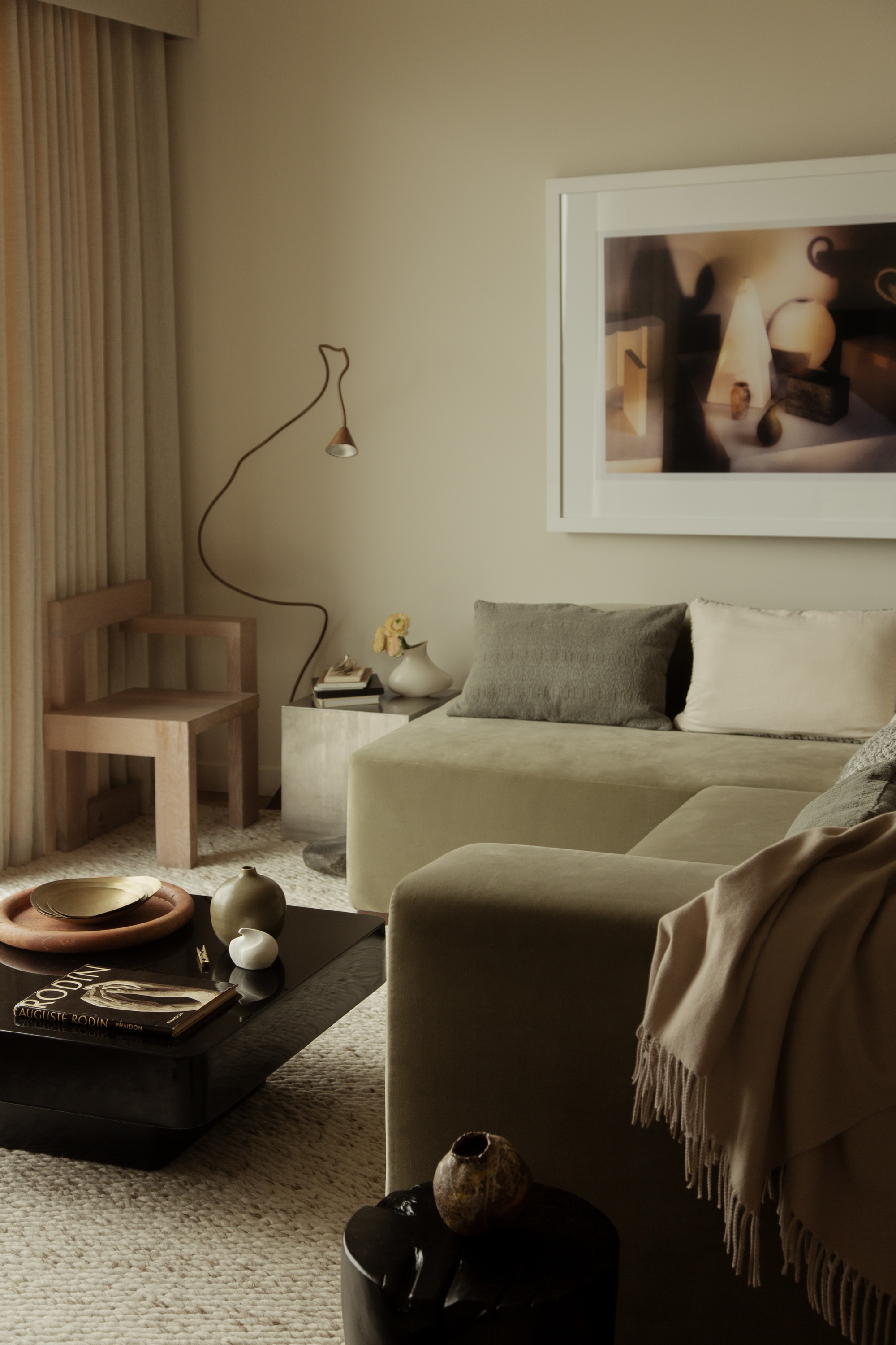
This elegant modern living room combines different shades of beige and gray for a layered look.
Enveloping a space in different shades of beige and gray is an excellent way to make it feel both grounded and sophisticated. “The soft blend of taupe, soft clay tones, and gentle stone hues in this space cocoons rather than dominates,” explains Louise East, founder of Studio Est.
“This beige living room is quietly glamorous, but its mix of subtle contrasts makes it feel lived in, calm, and soulful too,” the designer says. The mix of grays and beiges here may be nuanced, but they create a welcoming feel.
“Using a mix of different neutrals means there’s depth and character as well as harmony. You want to sink into the sofa and stay a while,” says Louise.
Louise founded her own design studio just after the pandemic and has since worked on residential and hospitality developments across the world. She previously worked under Martin Brudnizki and oversaw projects including the private club Annabel’s.
2. Introduce Subtle Motifs
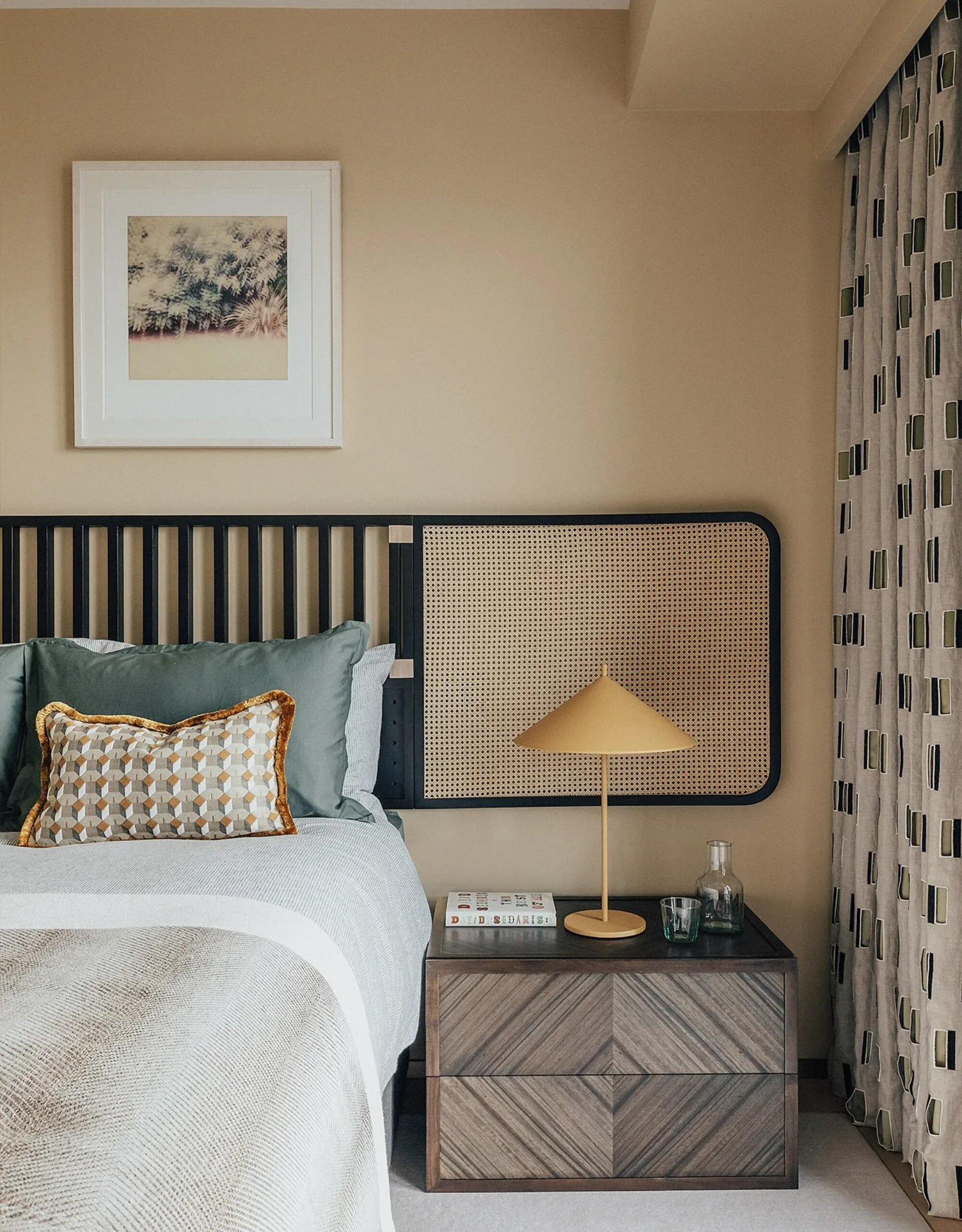
Geometric patterns can add a sense of visual interest to a gray and beige color palette.
Although interior designers typically create gray and beige spaces to feel relatively pared-back, there’s always space for a little pattern. In fact, a motif that combines the two neutrals can bring the whole look together.
“Pattern adds structure and edge,” agrees Ed O’Donnell from London-based design studio Angel O’Donnell. “Crisp geometrics pop up everywhere in this beige bedroom, from the fringed cushions and wicker headboard to the intricate curtains and book-matched bedsides.”
“These regimented elements help to balance the soft, warm gray, and beige palette,” says Ed. That’s the secret to combining neutrals: mixing order and comfort with softness and structure. That’s how a room feels, considered, inviting, and alive!”
3. Layer the Textures
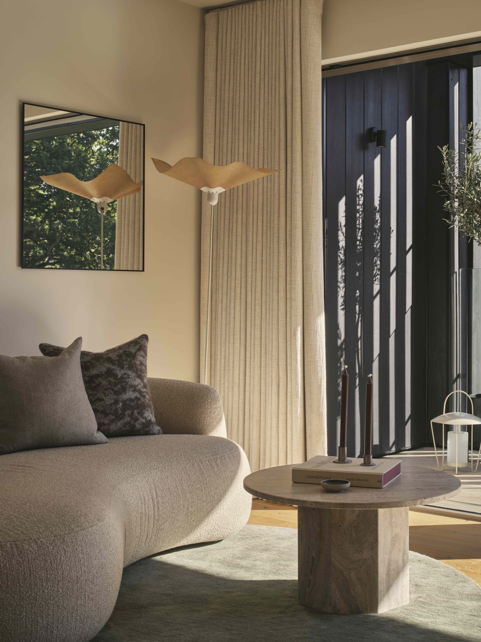
The colors and materials in this living room were inspired by the property’s surrounding landscape.
When decorating in a neutral palette, visual interest can come through in the use of materials. The living room is the ideal place to experiment with natural textures in a beige and gray palette, as you can bring in harder stones and woods alongside softer wools and linens.
“In this living room, we were inspired by its surrounding ancient woodland landscape to create a palette in warm, earthy tones that respond to the changing light and seasonal rhythms," explains Samuel Pye, creative director of Echlin London. "The same philosophy extends to the textures we used across the space.”
“The vintage travertine coffee table has a wonderful contrast to the softer furniture, which introduces a sense of dynamism and rhythm,” he adds. “The mix of textures means that each of the neutral tones in the space has subtle variations. As very few pieces are truly flat beiges or grays, this creates unexpected depth while remaining understated.”
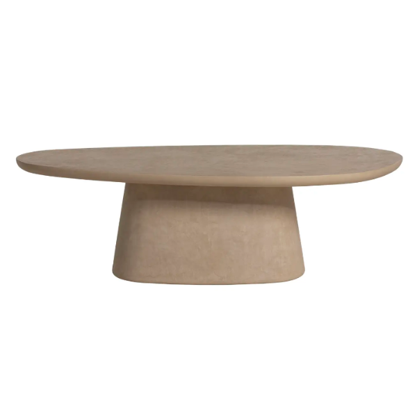
Add a natural touch to your modern living room with this tactile coffee table, made with a smooth microcement layer of Mortex. The sculptural shape and shade are ideal for a soft, organic look.
4. Add a Third Shade
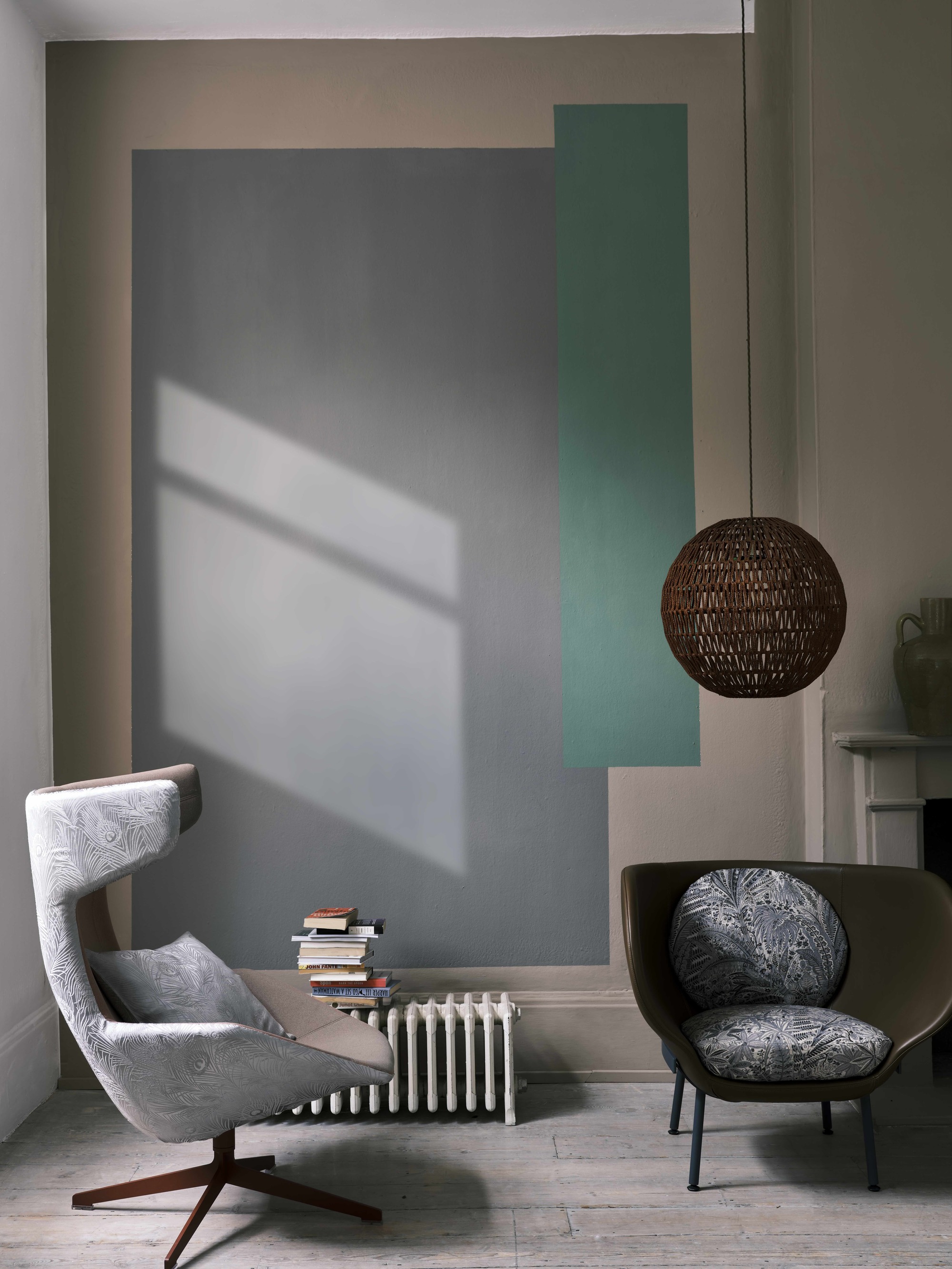
Geometric patterns can add a sense of visual interest to a gray and beige color palette.
While gray and beige undoubtedly make a gorgeous match, introducing just a flash of a third color can enliven your scheme even more. “If you’re feeling brave, inject some vitality and energy to earthy neutrals and stone shades with a single contrasting color,” says Farrow & Ball’s Patrick O’Donnell.
“A wall mural is a fantastic way to introduce this, with geometrics a particularly tasteful way to create this striking effect,” he suggests.
To find the perfect shade to ‘pop’, think about how you use the space — for a sophisticated or more dramatic look, opt for a darker shade of green or blue, while brighter yellows and oranges can add warmth and energy.
If you opt for a calmer pastel shade (perhaps in a bedroom) make sure the undertones match those of the existing gray and beige shades.
5. Introduce the Colors With Materials
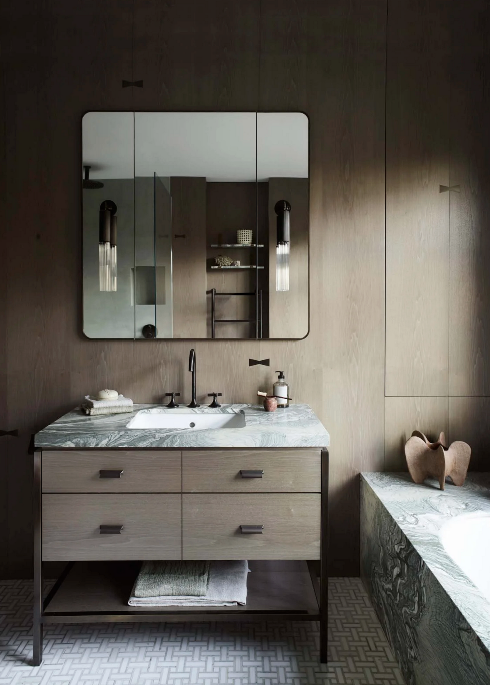
Bring together subtly-hued materials for a texture story that still involves color.
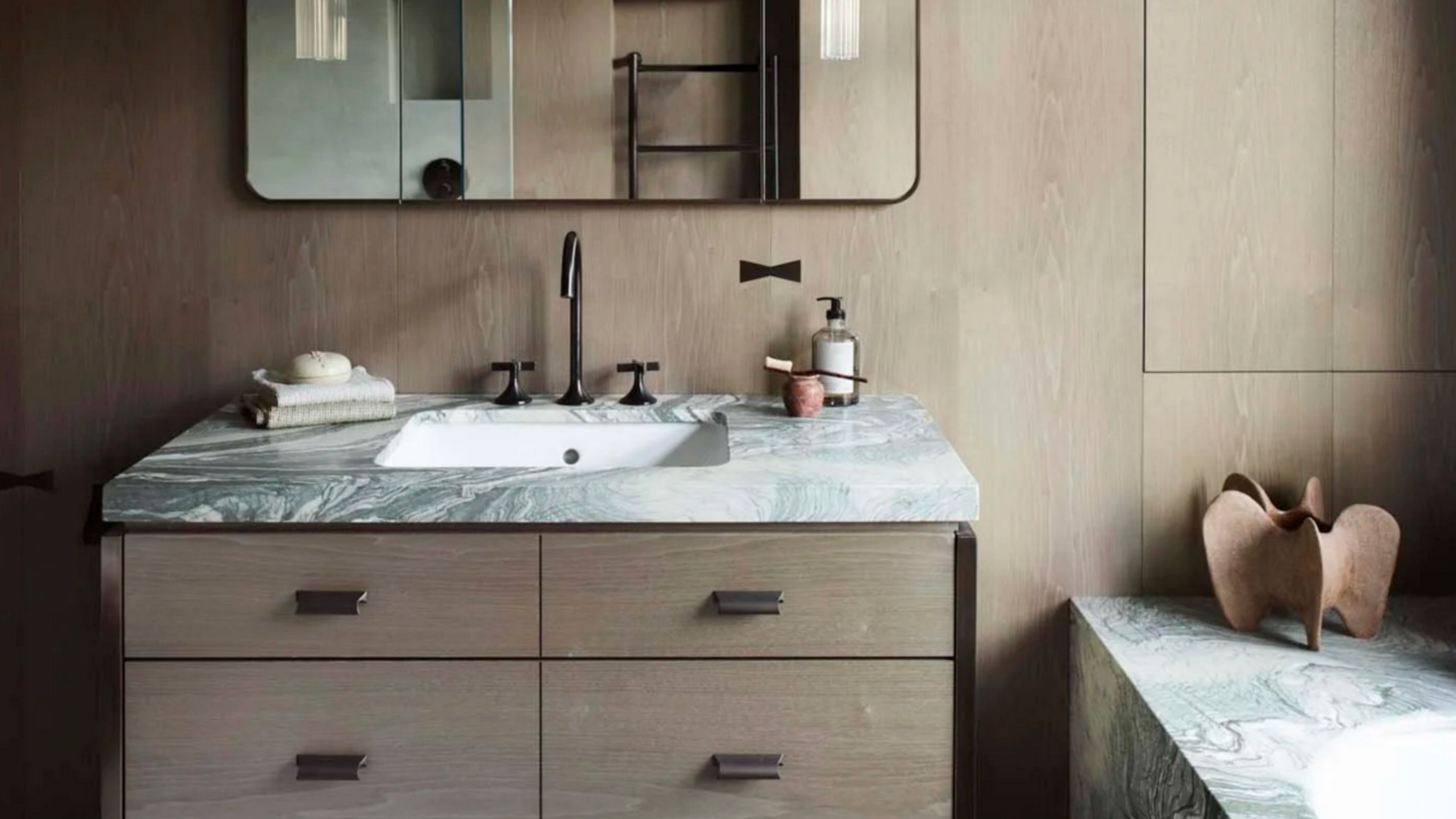
In this London bathroom, the gray and beige bathroom color palette is evident in an elegant combination of grainy wood and veiny marble, rather than through a paint treatment. The result is a space that is at once subtle and richly sophisticated.
“Bathrooms should be sanctuaries and the materials we selected here are key,” agrees its designer Irene Gunter, founder and creative director of Gunter & Co. “We wanted to create a really warm impression, building layers to create a cozy space.”
“To step away from a clinical feel, we opted for wood and marble rather than plain white tiles," she adds. "For extra tactile credentials, the gray-green Verde Antigua marble is in a buttery soft honed finish. This is somewhere you can easily spend a few hours feeling very pampered.”
Irene’s London-based design studio works on ski lodges, apartments and country houses, bringing the same detailed-oriented approach to each project. Her design is informed by historic architecture, contemporary art and everything in between, with travel a key inspiration too.
6. Work With White
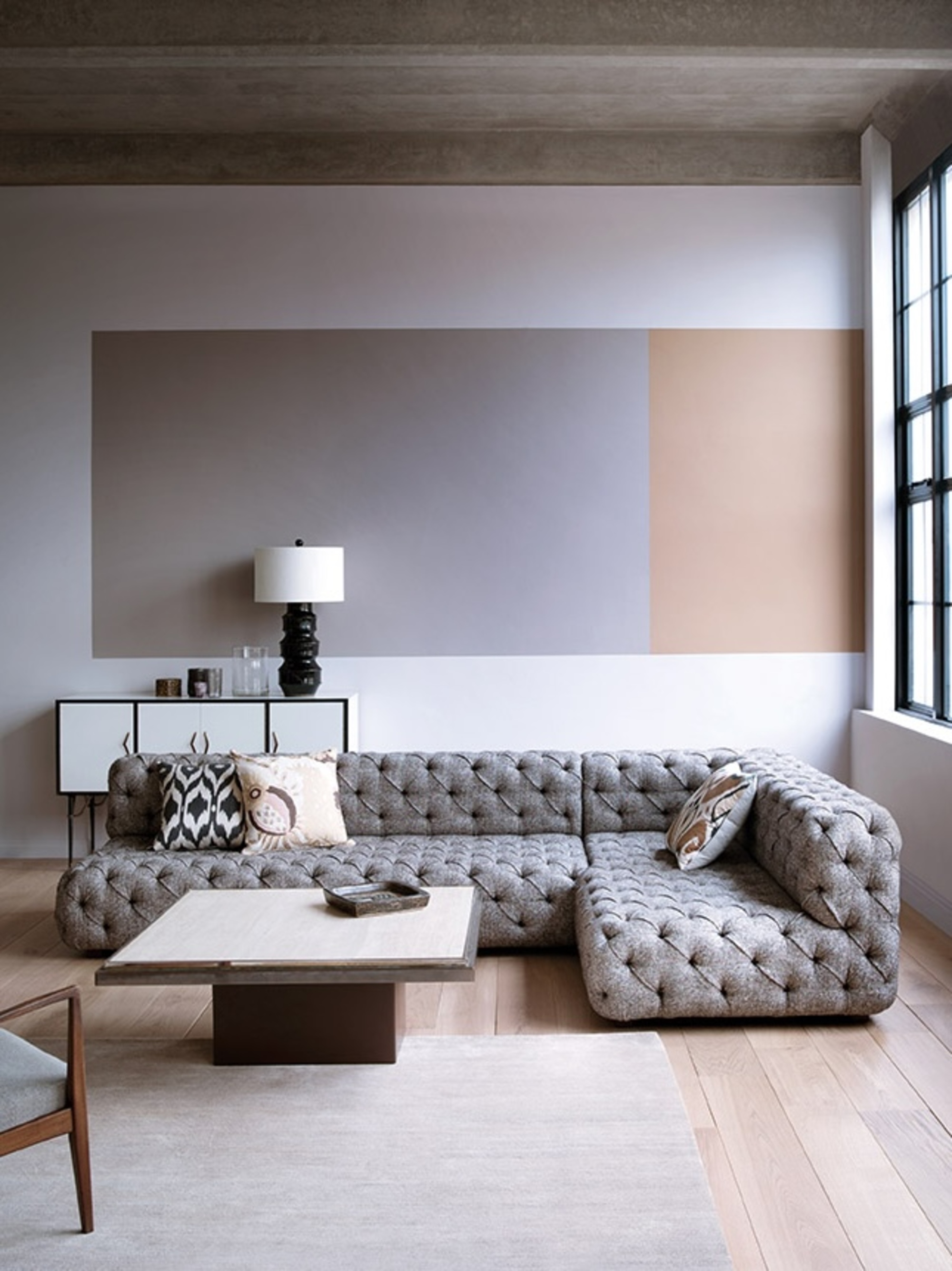
Gray and beige can ‘pop’ against a white backdrop.
The individual qualities of gray and beige become most obvious against a simple white backdrop. “This allows both the gray and the beige to function as colors in their own right,” explains Paint & Paper Library’s Andy Greenall.
“Using white as the main shade in the space will exaggerate the individual tones and definition of the two other neutrals,” he explains. If you’re looking to create a contemporary feel in a light-filled space, take a similar approach to the mural above, which creates a nuanced focal point from colors that might otherwise read as simple neutrals.
“This is an effective way to highlight color tension,” says Andy. “We’ve noticed designers using the gray-beige juxtaposition to create something different and unexpectedly beautiful. Decorating with white is an excellent way to combine these intriguing colors while retaining a sense of harmony.”
7. Make It Calm
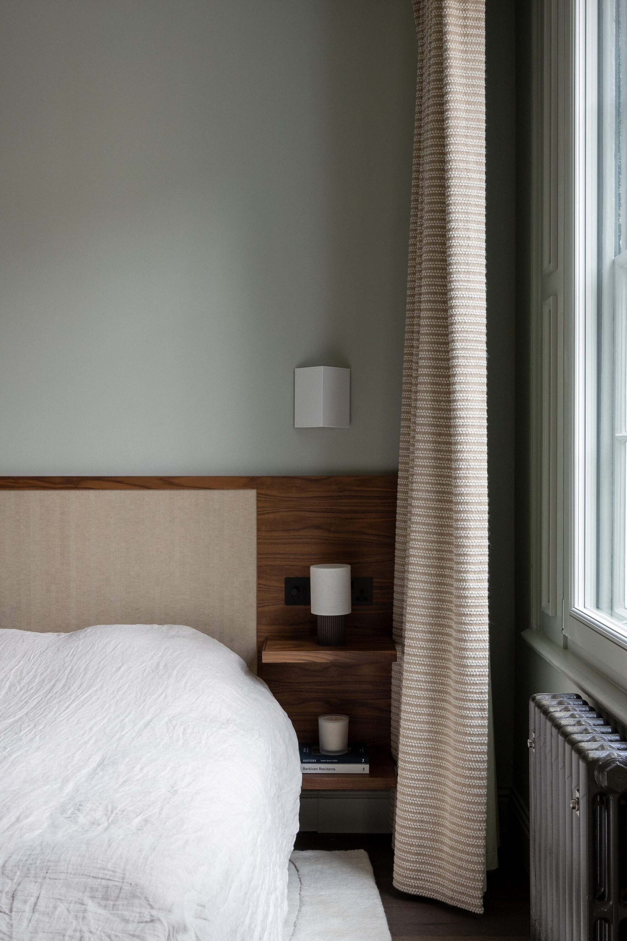
Create a restful environment with a combination of these two neutral hues.
Neutral colors work well to create a relaxed, pared-back mood, especially in a bedroom. This space’s gray walls are instantly warmed up with the introduction of beige textiles. “There’s a calm, composed atmosphere here,” confirms its designer, Stephen Nash, founder of All & Nxthing Interiors.
“What really makes the beige and gray color scheme work here is the layering of different textures to bring warmth,” says Stephen. Fabric inlay on the headboard and tactile beige curtains create a more cozy feel in contrast with the simple painted walls, while the built-in headboard acts as a bridge between the two colors.
“The timber’s grain has the warmth of the beige as well as the cooler gray notes,” says Stephen. “Each surface and textile in the space contributes a quiet depth that’s key to the bedroom’s overall calm, balanced look.”
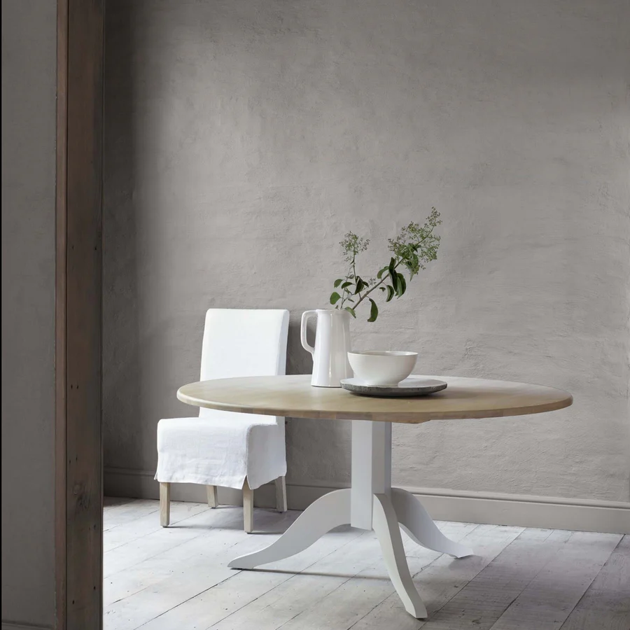
Described as ideal “for people who find classic grays too cool”, this gray paint would pair perfectly with a beige that has warm undertones.
8. Contrast and Complement
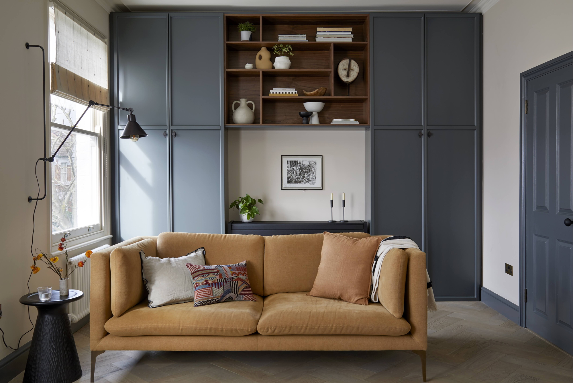
Using the right shade of gray and a harmonious beige means you can create a bold look that still feels neutral.
Darker shades of gray are ideal to highlight architectural details in a space, and pair smartly with lighter versions of beige. Here, the former provides structure and definition to trims and cabinetry in a way that’s complementary to the beige tones rather than in competition with them.
“In this living room, the impact comes from the balance of contrast and restraint,” explains interior designer Andrew Griffiths from A New Day Studio. “The palette works because the undertones of both are harmonious, they’re natural and muted, so there’s calm rather than tension.”
“Use the colors to play different roles," he continues. "The gray grounds this room while the warmer beige lifts the whole space, making the color combination striking without losing any softness or approachability,” says Andrew.
All in all, it’s clear that gray and beige can work together beautifully — it’s all about how you use them. The shades themselves, the textures they’re paired with, and their execution in a space all matter. Whether you’re combining dirty neutral colors together or opting for crisper shades on your palette, these are hues well worth pairing together.

James Cunningham is a freelance journalist based in London. He has written extensively on design and decorating for some of the UK’s leading publications, including House Beautiful, ELLE Decoration, and Country Living, and previously served as Homes and Gardens Editor at Good Housekeeping. When he’s not at his desk, James can be found globetrotting in search of good food, better wine, and the best architecture.
