Best grey paint – 6 alluring shades chosen by interior designers
Zeroing in on the best grey paint can be tough, but our list of designer-approved shades will make things easier for you
When it comes to neutrals, the best grey paint is having a bit of a resurgence. And with a spectrum of shades, from muted tones to deep, atmospheric hues, there's a grey paint for every room and mood.
Light and airy greys can open up a room and make it feel spacious, while shades at the other end of the spectrum can help create a more cozy, cocooning interior. Either way, grey serves as a sophisticated backdrop.
Since it works as a neutral yet versatile shade, several colors go with grey. The shade performs the balancing act with bright hues and keeps the interior grounded. The high-gloss grey paint, on the other hand, adds a sense of luxury and gives the space a soft glow by reflecting light.
Grey doesn't just look great on walls. Baseboards, woodwork, countertops, splashbacks, and ceilings – grey has a place everywhere in home, be it in the kitchen, bathroom, or bedroom.
To find the best shade, however, you need to consider where the room is located and how much daylight it receives. The hues within your choice grey will change based on this, as well as on the indoor lighting it receives. It's best to try a few sample coats on your walls before you choose the one you like. Live with the color for a day or two and finally zero in on the one your heart is set on.
To help you navigate the world of grey paints, we asked top designers to share their favorite shades. Here's what they suggested.
6 of the best grey paints, chosen by interior designers
With so many available shades, the trick is finding the right one for you. So consider this your cheat sheet – our round-up of the best grey shades that are timeless, elegant, endlessly versatile and helpfully recommended by top interior designers.
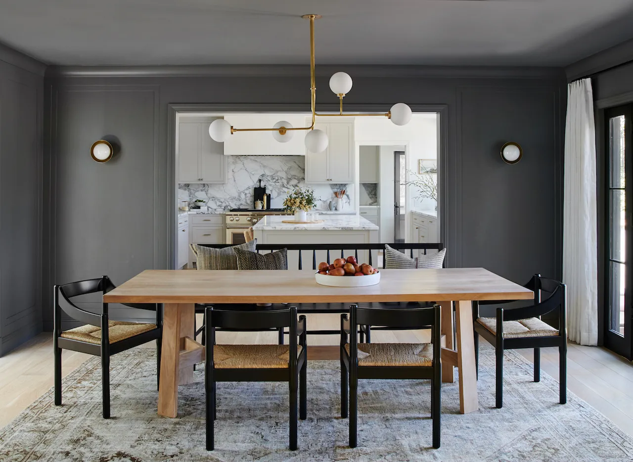
1. Iron Ore, Sherwin-Williams

Charcoal grey paint has all the traits of a true black, yet a personality of its own. It can add subtlety or drama and is an incredibly adaptable shade. It can give an industrial look to a space, pairing well with metal, glass, or brick. Alternatively, it can also soften the interior when paired with wood and other comfortable neutrals. If you plan on using a charcoal grey paint idea, incorporate plenty of whites for an eye-catching contrast, and a bright space.
'We love Sherwin Williams 7069 Iron Ore. Although it's a very dark grey and not a true black, it looks black in most cases. It's the darkest in the black paint shades that we typically use. And it's beautiful in every scenario,' says Brooke Wilbratte, founder, Tribe Design Group.
2. Monument, Paint & Paper Library

Color blocking is a much-loved paint trend, and a wonderful way to create a striking visual. It's a way of mixing colors that don't necessarily go together yet create a fantastic visual when paired next to each other. Grey is usually considered a muted hue and it helps lift other colors without becoming too dominating. Here, the juxtaposition of pink and grey is soothing to look at, where the chosen pink too is subdued. The restrained shades help bring out the clean, sleek lines within the interior and make the space seem neat and well-designed.
'The property has been blessed with lovely high ceilings so to create a more intimate space for dining, we broke up the walls by adding a two-tone paint effect using a blush tone and a moodier grey tone, Monument from Paint & Paper Library, to add that slight masculine contrast and help trick the eye for a cozier space,' says Mimi Pearce, senior interior designer, Run For The Hills.
3. Pigeon, Farrow & Ball

This shade of grey inherently stokes interest. It's a grey with several undertones, and at times make you wonder – is that grey? Or is that blue? Or am I looking at a shade of green?
Pigeon by Farrow & Ball has a timeless quality and a classic appeal to it. The hue has a depth to it yet gives an interior an open, breezy feel.
'We like to look at the pigment and depth of color in paint,' says Tom Cox, co-founder, HÁM interiors. 'Too often a shade will have too much grey or brown as an undertone, which can be challenging when layering a scheme and adding furniture. For us, Pigeon has just the right mineral balance, as it gives a space a calm and muted quality.'
4. Alaskan Husky, Benjamin Moore

An elegant, and easily usable color, this shade of grey can adorn any interior, no matter the theme or style of the home. This hue looks beautiful paired with classic white trim and neutral ceilings. It can also be applied from top-to-bottom to bring a sense of cohesion, or used as a base for wall mural ideas.
'This media room/lounge and spacious home office became the most utilized and loved floor of the house since the pandemic,' says designer Joan Enger, principal, J Patryce Design & Company. 'We flourished the room with Benjamin Moore's Alaskan Husky to give it a cozy feel.'
5. Autumn Day, Asian Paints

This is the ideal background grey: warm and soft. This color can be used both indoors and outdoors because it catches light beautifully and helps create a cocooning landscape. For a deeper effect, consider painting the ceiling in this color.
'There is a certain tranquillity that Autumn Day by Asian Paints brings to the home and the bedroom,' says Mahek Lalan, founder of SML Architects. 'It was chosen after many samples and was decided in combination with other materials and colors in the space.'
6. Integral concrete, Davis Colors

Textured paint finishes create a sense of warmth and depth that traditional paints lack. That's because they give movement to surfaces and make a bolder, longer-lasting visual impact. A bedroom coated in simple grey paint will look nice, but the same room in a textural grey will look transformed.
In this project designed by Mork-Ulnes Architects, to create a more subdued look in the interior, a concrete finish was applied in the bedroom. The walls are covered in Integral Concrete Dark Grey by Davis Colors for a rustic feel.
Is grey paint still on trend?
Paint trends change every year and, different colors take over interiors, becoming the hot new shades to vie over. In the last few years, grey has been going strong, pairing fantastically well with other trending hues such as pink, green or blue. In fact, there was a time when it was impossible to go through a magazine or Pinterest and not see a grey room.
'Grey had a real moment as an interior design trend over the last decade, but so much so that it ended up absolutely everywhere. The reaction to this was a move towards warm neutrals, such as beige and taupe. But of course, trends are cyclical and we're starting to see greys trickle back in modern interior design. If you're not ready to go back to grey completely, choose a grey with strong undertones, especially warmer ones, as a bridge back to this versatile neutral. Use as much or little as you want,' says Hugh Metcalf, Livingetc's deputy editor.
This color is not only seen splashed on walls but used across other elements, such as accessories, flooring, and countertops – there’s no escaping the popularity of grey. However, a shift towards warmer tones has risen, as per our latest paint trend report. Cooler, lighter tones aren't being picked up as much as their warmer versions.
'People are still looking for a bright feel to their homes, but want the painting and lighting to feel warm, cozy, and inviting. I have a client who (on their own) painted their bright airy apartment with grey paint and now are desperate to go lighter and cleaner, and warmer. I do this task by painting what I call “blushes” of color. The softer versions of colors in their lighter tints,' says interior designer Jennifer Davis.
So, there you have it. Love it or hate it, grey paint is here to stay and continues to be treated as a stylish shade.
