Paint trends 2022 – the best colors and finishes to inject style into every room
Paint trends are covering calming neutrals and vivid brights, and here's how to decode the right one for you

The Livingetc newsletters are your inside source for what’s shaping interiors now - and what’s next. Discover trend forecasts, smart style ideas, and curated shopping inspiration that brings design to life. Subscribe today and stay ahead of the curve.
You are now subscribed
Your newsletter sign-up was successful
Paint trends are everywhere. You probably don't realize it but the paints that surround you play a big role in your life, your mood, and even the way you look. Paints are our constant backdrops, dictating the design of our spaces and lifting our moods. And paint trends have become just as important as color trends – with finishes and effects being every bit as important as the shade you choose.
If you're looking to reset your indoors and are thinking about the right paint for your walls, then this is the article for you. Designers who have been time and again refreshing our spaces with new brush strokes that cater to our desires and the collective external world, now reveal to us the colors and finishes of the season that are filled with new opportunities. These choices often draw on trends in culture, technology, fashion, and design.
From neutrals that continue to rule the roost to earthy tones and smile-inducing pastels, there's a whole curated kaleidoscope of interior design trends for 2022. Plus, fun and braver new ways to paint the home. Take plenty of notes.
Article continues belowPaint trends 2022
1. Soft neutrals to create calming interiors
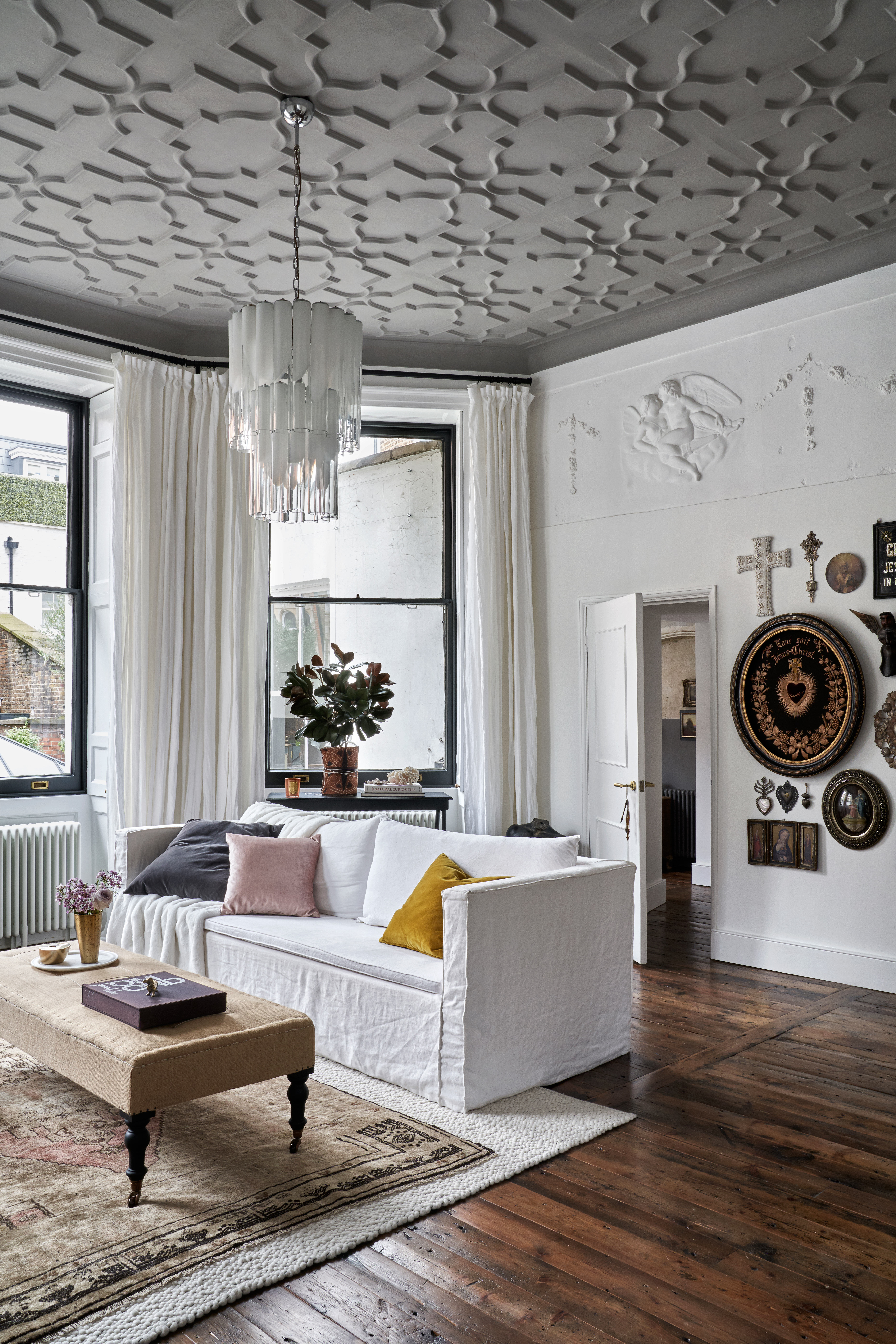
Neutrals haven't gone out of fad, and probably never will. Plus, there's always a great shade of white paint for walls. In the last year, there has been a steady usage of milky whites, off-whites, and creams. These colors help create calm, relaxed interiors and are ideal for conjuring up restful living spaces. Also, these colors are useful for highlighting and lifting other pops of hues in the room.
Neutrals point to more simplified lifestyles with clean lines and a neat palette. These shades also help brighten up spaces, make them more durable and bounce light around the room like no other color. A great tip to keep in mind while choosing neutral shades is to focus on some of the underlying tones of a room. So if the room is largely green, grey, or pink, the neutral color you select should reflect that by being pigmented in that shade.
'Lighter, more netural paint colors are in,' says Stephanie Lindsey of Etch Design Group. 'I particularly like the Festoon Aqua 0019 by Sherwin Williams.'
2. Color blocking for strong visuals
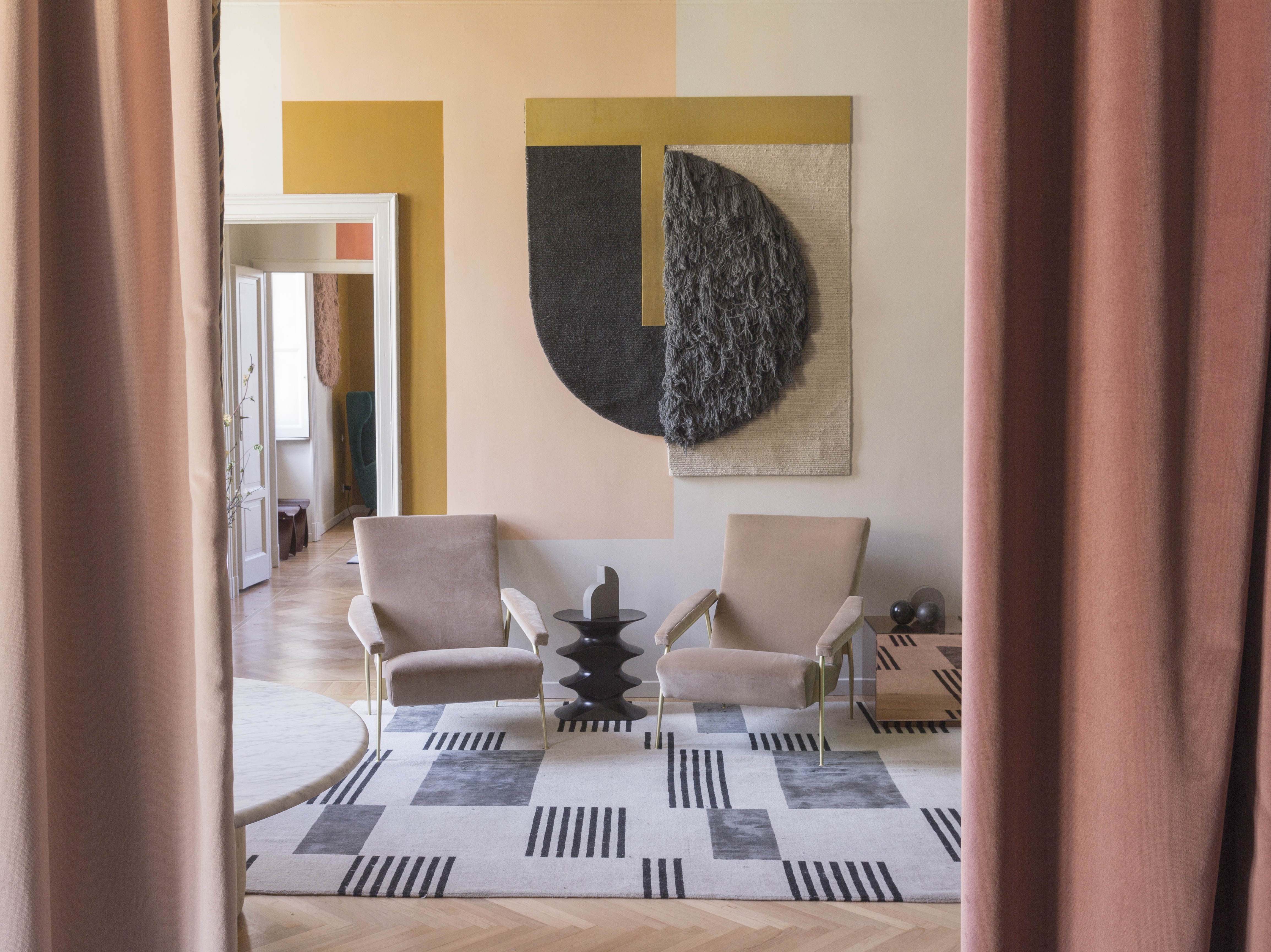
Color blocking - or color layering - is pairing two or more solid hues to create one bold visual. It started on the runways but this trend has very easily made a place in interiors. This year, the trend gets stronger, with unexpected colors coming together with geometric prints.
The Livingetc newsletters are your inside source for what’s shaping interiors now - and what’s next. Discover trend forecasts, smart style ideas, and curated shopping inspiration that brings design to life. Subscribe today and stay ahead of the curve.
'A key paint trend that we’ve noticed this year is adding intentional touches to let your personality come through,' says Helen Shaw, director of Benjamin Moore. 'There are a few different ways to explore this trend. Why not look to complement the main color with detailed stenciling peppered throughout the room? This delicate approach works best with a two-tone room, allowing the secondary neutral color to act as a canvas for intricate work which will seamlessly pull the room together.'
Alternatively, if you’re after a more purposeful finish, look to areas within your home that can be accentuated with color. Is there an alcove that can be turned into a bold statement feature? Or a wall with split texture contrast which can be highlighted with a complementary color? 'Look at the areas in your home which lend itself to detailing for not only an instant burst of color but to elevate the space with creativity and a personal touch,” Helen adds.
3. Nature inspired pairings
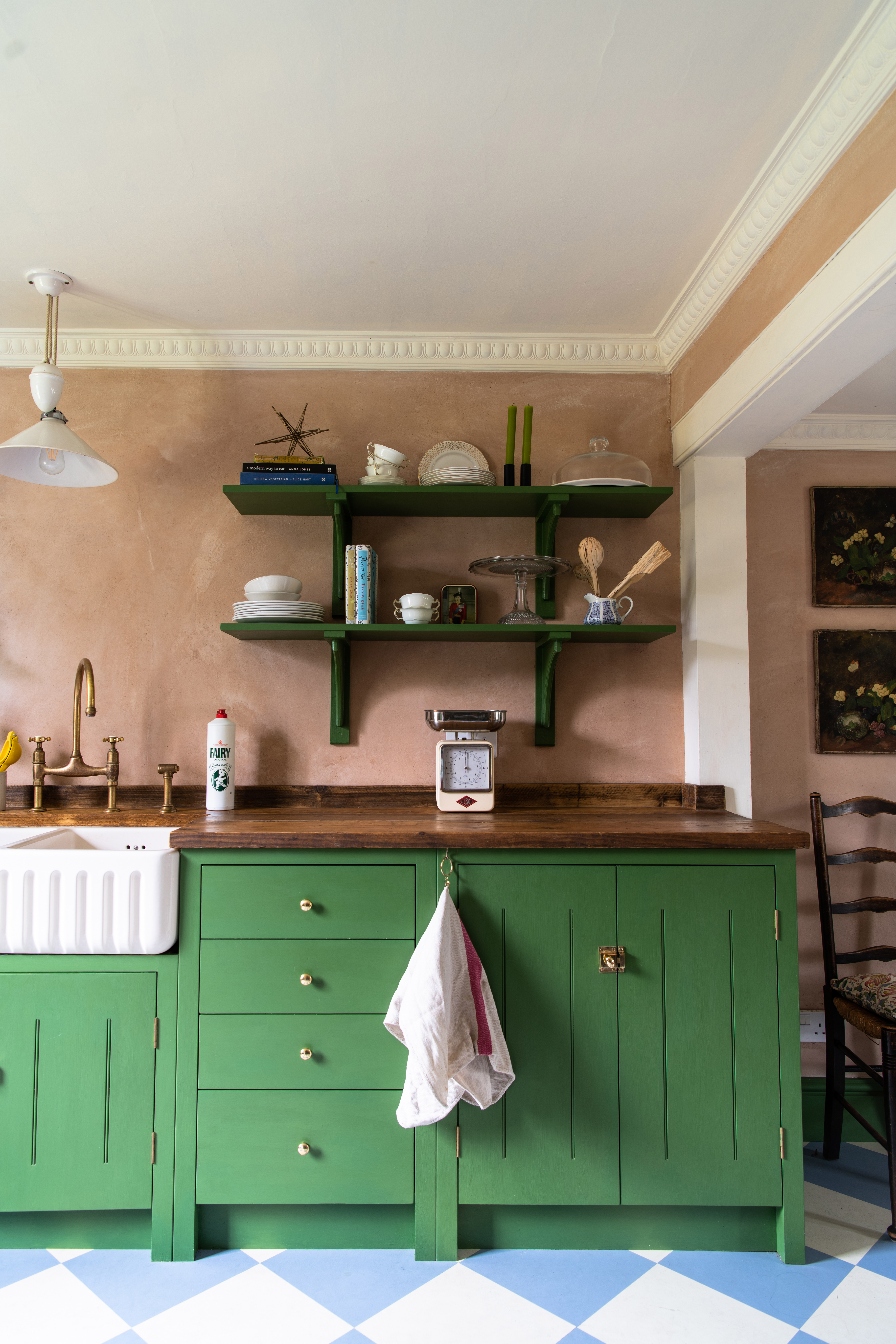
Staying indoors has taught us the value of the outdoors; of nature. It is because of this that earthy tones have now taken over interiors, and spaces drenched in sage green paint shades, to sandy neutrals, terracotta, and mud shades, remind us of the great outdoors.
'Over the last twelve months, we’ve all enjoyed reconnecting with nature, whether during our daily lunchtime walks or having a never-before found appreciation for the garden,' says Helen Shaw. 'Spending time in nature allows us to ground ourselves, relax, recharge our batteries, so let's bring the outdoors in and invite this calming feeling into our homes. When you're experimenting, look to bring earthy tones into your space, play around with different hues of greens, blues and combine these with more grounded colors such as neutrals, browns, and whites.'
Green and browns are also cheerful tones that do not overpower. They can make for great backgrounds and are useful when you're layering in interiors. 'Our favorites are Narragansett Green, Benjamin Moore, and Van Deusen Blue also by Benjamin Moore,' Jennifer Davis of Davis Interiors says.
4. Deep sea blues to comfort and calm
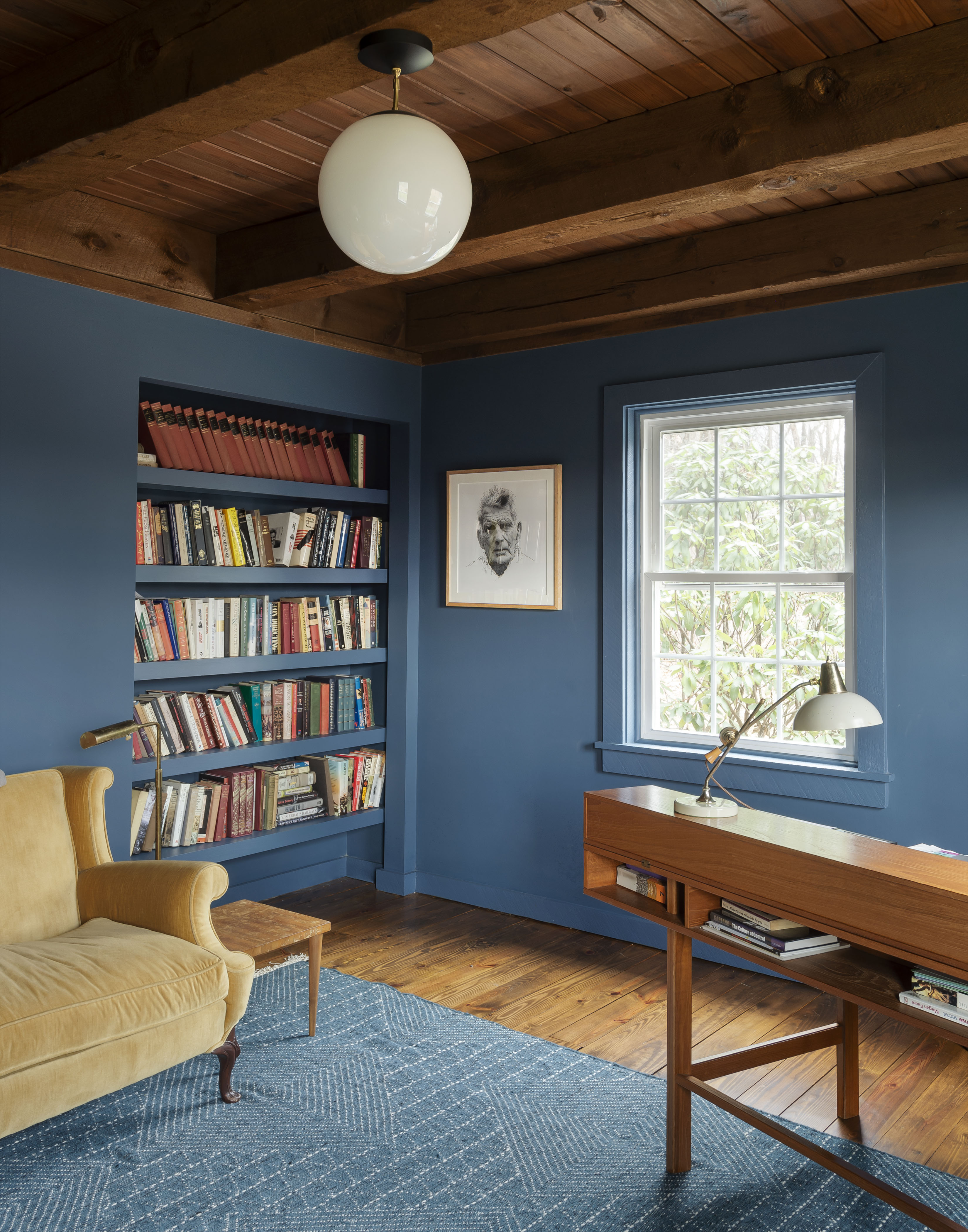
For a soothing, coastal vibe, there's nothing better than blue – any shade of blue. The shade has a natural uplifting quality and even an accent wall in this hue gives an invigorating breath of fresh air to the interior. Plus, there are several colors that go with blue. Reminiscent of clear blues skies or running waters, the color encourages us to think of happy days, holidays, and a promise of peace and rest.
'The last few years have strengthened our connection with the great outdoors. Earthy palettes will reign supreme this year with shades of therapeutic greens and sea blues adorning the walls in our homes. Try Lust Home’s new paint shades Mother Earth, Smashed Avo, Seas the Day and Nirvana,' says Chelsea Clark, Head of Brand at Lust Home.
If painting your entire room one shade isn't your thing, then consider only painting the ceiling, for a dramatic effect. A blue-painted wall will truly remind you of the bright skies and work perfectly well in all rooms.
5. Color drenching for a cocooning effect
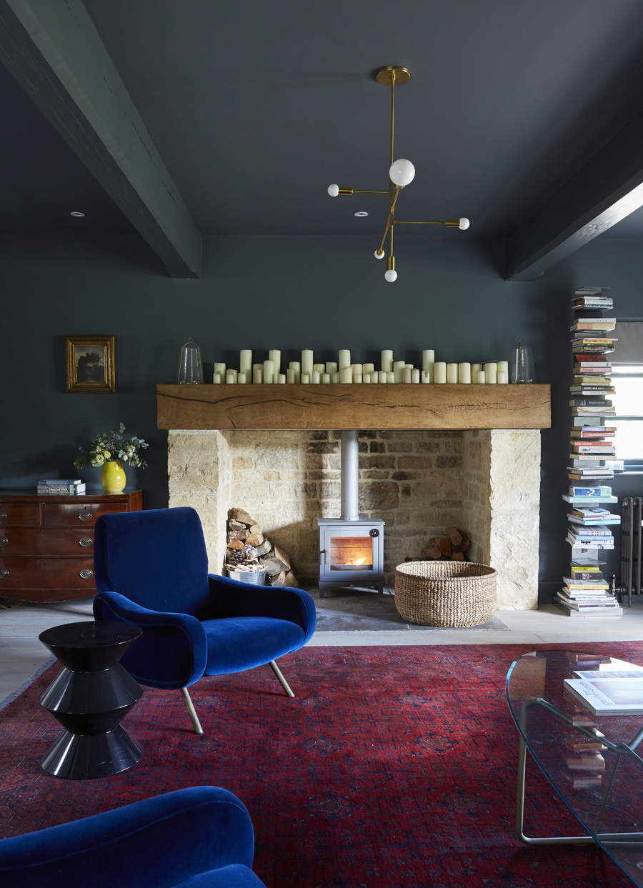
The trend means exactly as it reads – drenching an interior with a single shade. This is a cool and clever paint idea. By coloring walls, ceilings, and even the skirting a single tone, you create considered, cohesive interiors that have more depth. Color drenching makes your eyes travel along the length and breadth of a room, thereby making you feel the room is larger than it really is. Usually, it's best to take a mid-strength shade so the interior doesn't seem too overwhelming.
‘2022 is all about using color creatively whilst maintaining a sense of calm to counteract external influences,' says John Ashton at Albany. 'Exploring different paint finishes in the same hue with color drenching and monochromatic schemes add interest whilst remaining restful and uncluttered. Murals and color blocking in harmonious tones help add character, color, and a sense of cohesion to open-plan spaces.’
6. Pastels with a modern twist
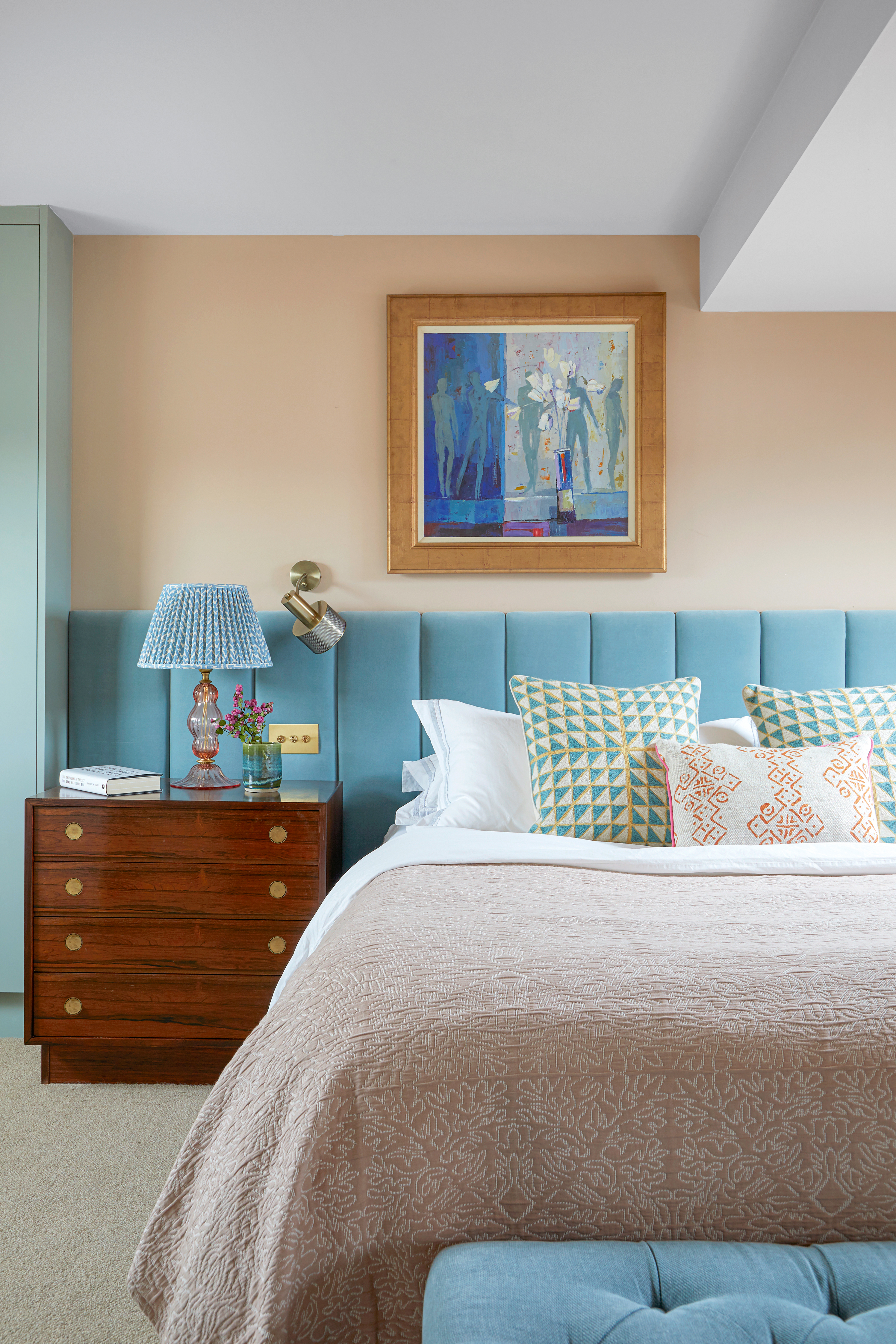
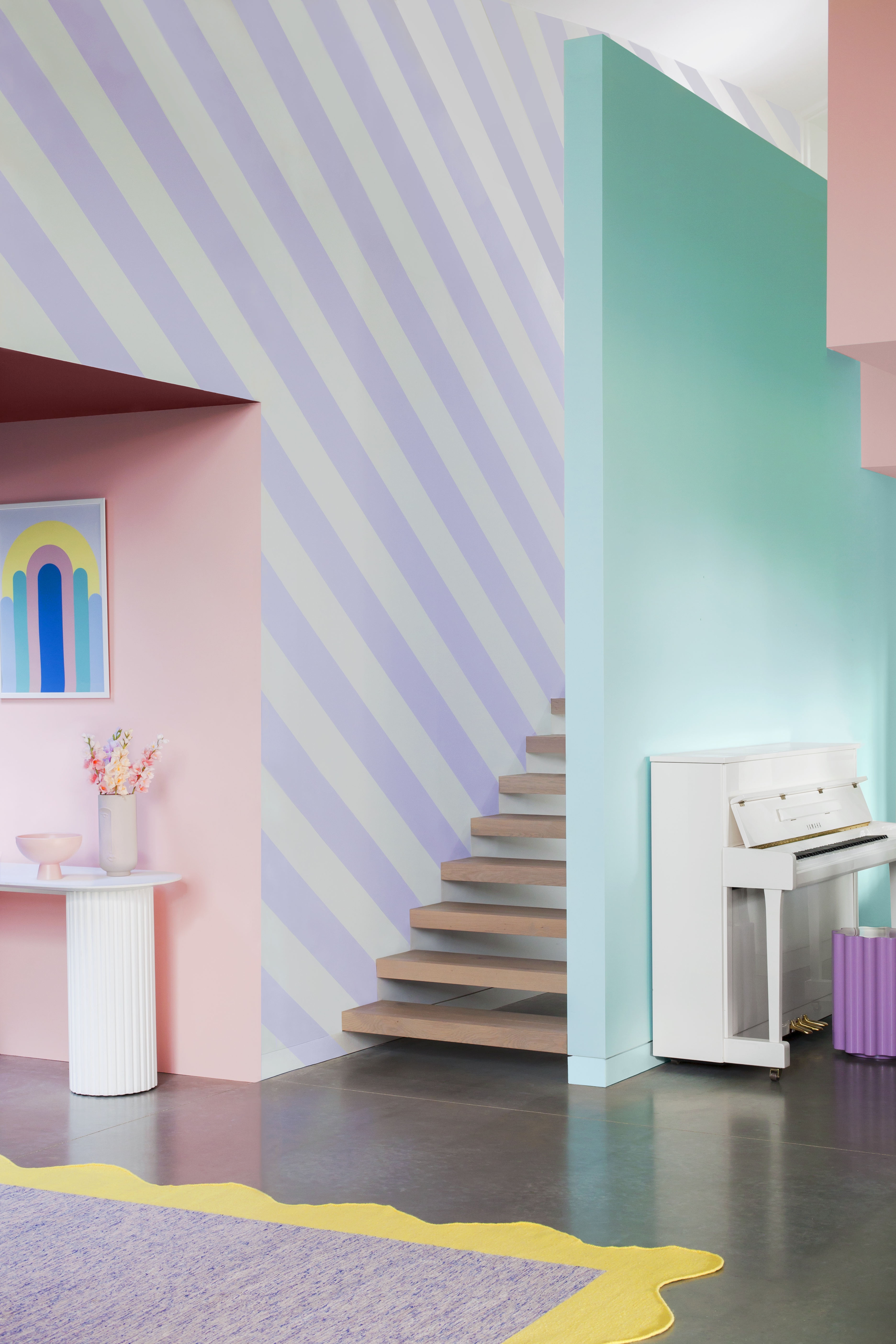
Perfect for those who want a decisive departure from the usual greys and creams, pastel hues create the most luxe atmosphere at home. Think saturated pinks, luscious yellows, deep teals, and delicious lavenders, filling your homes with uplifting energy.
The beauty of pastels is that they are a great middle-ground between dark paint colors and subtle neutrals, and they’re available in nearly all colors imaginable. A striking paint like this is bound to get reactions from visitors! You could even choose light pastels that blend into a room's existing design, even if the room has a more neutral scheme.
'A 2022 twist on an evergreen trend is the popularity of bright pastels,' says Helen. 'The inspiration behind bright pastels is simple; it’s in the name. It’s taking pastel colors and giving them a modern and uplifting twist to bring the spirited feeling into the home. Introducing the best blush pink pastels is a quick and easy way to update and invigorate your space, helping to boost creativity and joy within the home. Or if you’re looking for something a bit different, why not create a color scale for a more playful finish? A color gradient is a great way to introduce color in a striking, eye-catching way, brightening up your home with a striking and impactful twist.'
7. Warmer tones of all colors
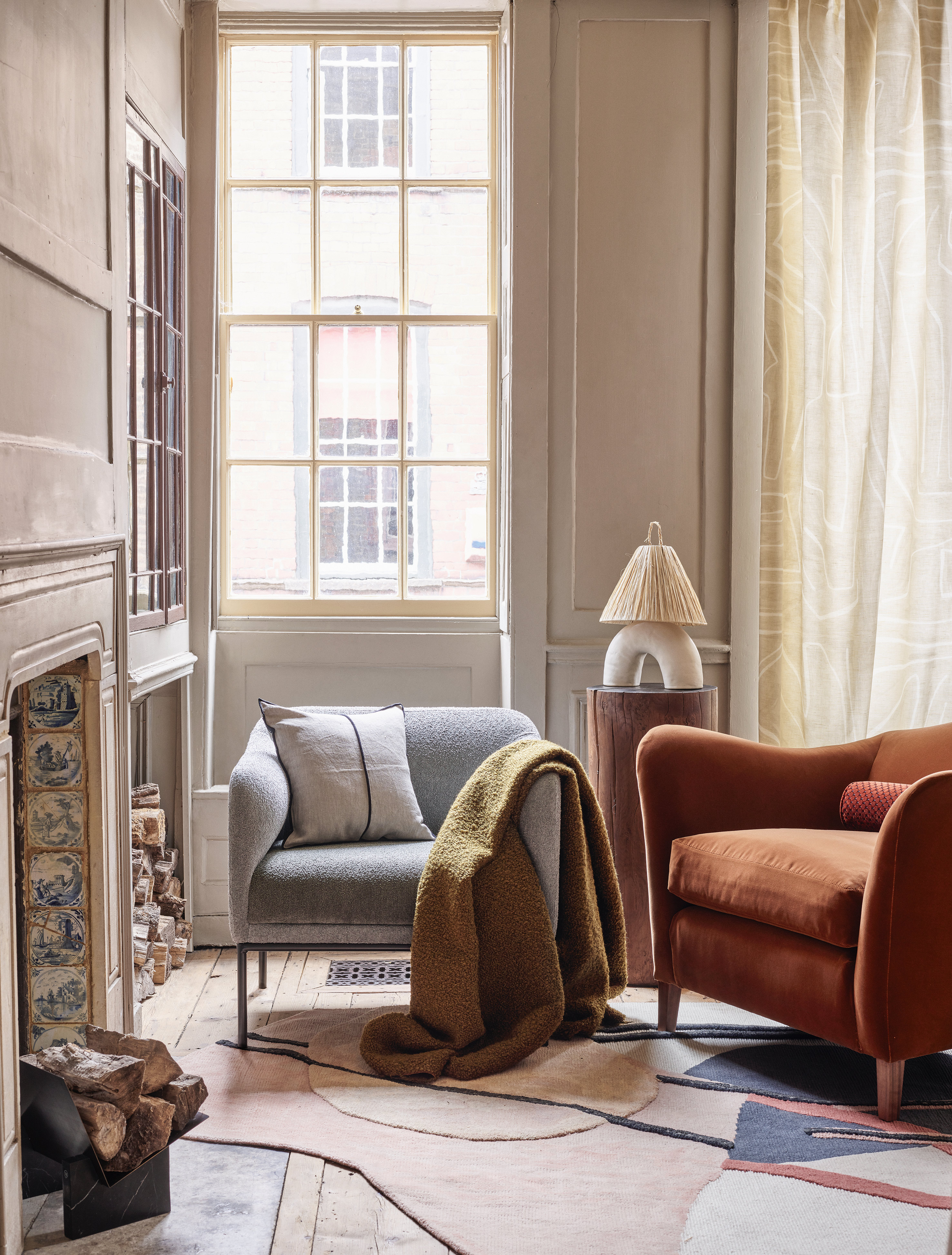
Warmer tones of all paints have a way of making us feel grounded and safe in our sanctuaries. These are comforting colors that remind us of escapism. They are available in a wide array of shades that prove to be both timeless and trendy. One of the key colors are warm whites, tans, browns, and greens. These shades usually do as kitchen colors and to create an instantly cozy living room.
'I will say for paint, I am seeing a shift from cooler whites to whites with a bit of warmth,' says interior designer Jennifer Davis. 'People are still looking for a bright feel to their homes, but want the painting and lighting to feel warm, cozy and inviting. I have a client who (on their own) covered their home with grey paint shade in their bright airy apartment and now are desperate to go lighter and cleaner, and warmer. I do this task by painting what I call “blushes” of color. The softer versions of colors in their lighter tints.'
8. Black is back
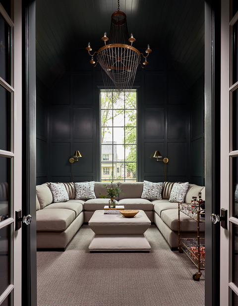
Black paint has, up till now, not had the best reputation. When it comes to interiors, it wasn't a color people would pick up easily. You needed a good, highly convincing interior designer to coax you into giving it a go. While black has always been a preferred color in fashion, in interior...not so much.
All up until a few years ago when people developed a newfound love for their homes, and getting experimental became a huge color trend. From painting accent walls, bedrooms to even entire power rooms, black is now having its time in the sun.
Of course, it's always better to paint a room black when it receives a lot of sunlight or is well equipped with artificial light. Black tends to absorb all the light around and can make a space seem closed-in. As black is a strong, deep color, it matches very well with almost any other shade. In a black room, you can add curios, art, linen or a second color of your choice without hesitation. Usually matte black is a preferred color because it has a warmer, more inviting look than its glossier, sharper counterpart.
'Black paint has categorically become a hallmark of Urbanology Designs, and we certainly have our favorite shades and brands. We love the Rockwood Shutter Green by Sherwin-Williams,' Ginger Curtis of Urbanology Designs says.
9. Textural washes and surfaces
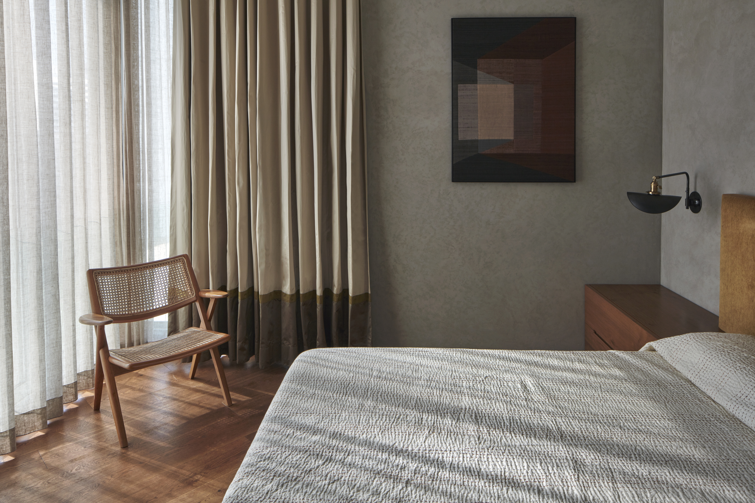
Limewashed walls are another painting technique that gives spaces a very soft, tactical look, much like old-world plaster and stone. This helps enhance an interior and have a natural, lived-in and comforting feel.
Ideally for choosing paint colors it's important to first select the tones that work for your space. Be sure of its undertones and the warmth or coolness of the color. For simple color washing, choose two shades from the same paint chip strip – a lighter and a darker hue. For a bolder look, you could take two paints from different color families.
The next step is to blend. For contrasts, remember to choose colors that oppose each other on the color wheel. The paint is then glazed over which adds a sheen to the finish and gives the space the dimensional look inherent to a color-washing faux finish. The textural wash can also be achieved with different brushstrokes and tools.
10. Wall paints that make you look good
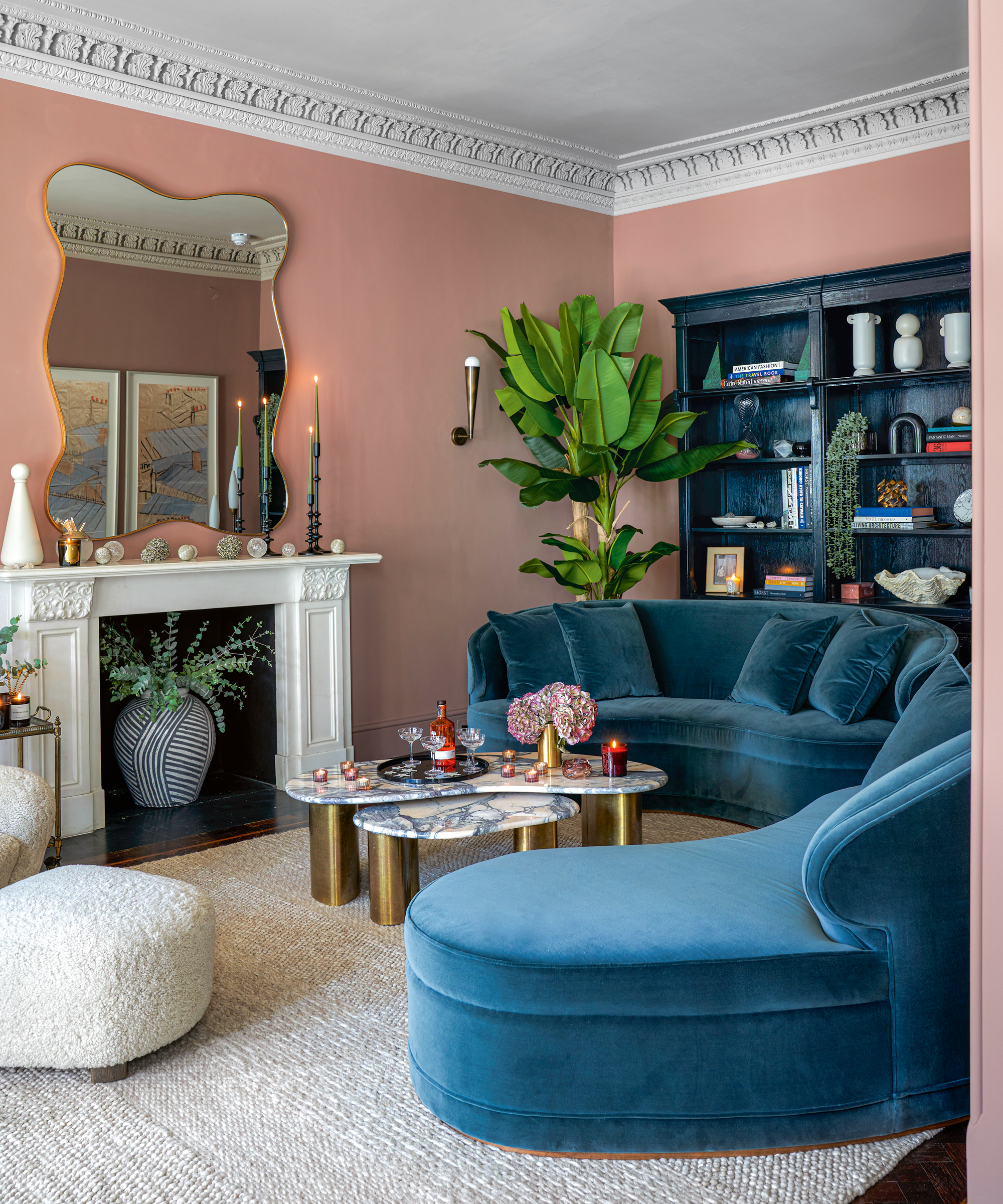
You've probably heard of colors affecting your mood and general well-being. But did you know that colors can also affect the way you look? This of course is dependent on the shade of paint, the lighting in the room, and also the skin tone of the people inside the room. Largely it is believed that blue flatters every skin tone. Teals on the other hand are a great compliment to anyone with pale skin and auburn hair. And decorating with pink is now longer clichéd.
'Pink is a great color to paint with. It is also great on the skin and makes you look healthy and sun-kissed. I find pink a very flexible color and it plays well with almost any shade if you are open,' says Jennifer.
What is the decorating trend for 2022?
Decorating trends for 2022 are about going bold with colors and styles. With a need for more sustainable practices, greener choices, and living with a smaller carbon footprint has taken center stage. People now prefer organic textiles, breathable fabrics, and eco-friendly paints.
When it comes to colors, textural paints are scoring high points because of the warm, cozy interior they create. These also work like artworks, giving the room a one-of-a-kind look. Color blocking – the art of choosing two or more contrasting tones in a room – helps create a dramatic interior.
And of course, the love for the great outdoors continues to be an inspiration for home design and decor. The new neutrals for home colors are natural tones. From forest greens, bark browns, to the sky and ocean blues and cloudy whites, these never-too-stark hues will be taking over homes this year.
What colors will trend in 2022?
This new year is all about loving neutrals and embracing bolder, riskier colors, with of course a sprinkling of earthy tones. From forest greens, sky blues, and browns to pastels (especially pinks), blacks, and yellows, this year calls for new perspectives. Another color that is being picked by the world's best interior designers is lavender. Surprisingly these hues have been doing well on the runways from New York to Paris, and are now big winners in interiors as well.

Aditi Sharma Maheshwari started her career at The Address (The Times of India), a tabloid on interiors and art. She wrote profiles of Indian artists, designers, and architects, and covered inspiring houses and commercial properties. After four years, she moved to ELLE DECOR as a senior features writer, where she contributed to the magazine and website, and also worked alongside the events team on India Design ID — the brand’s 10-day, annual design show. She wrote across topics: from designer interviews, and house tours, to new product launches, shopping pages, and reviews. After three years, she was hired as the senior editor at Houzz. The website content focused on practical advice on decorating the home and making design feel more approachable. She created fresh series on budget buys, design hacks, and DIYs, all backed with expert advice. Equipped with sizable knowledge of the industry and with a good network, she moved to Architectural Digest (Conde Nast) as the digital editor. The publication's focus was on high-end design, and her content highlighted A-listers, starchitects, and high-concept products, all customized for an audience that loves and invests in luxury. After a two-year stint, she moved to the UK and was hired at Livingetc as a design editor. She now freelances for a variety of interiors publications.