5 "trend-proof" colors for your home designers think will be just as popular in 10 years' time
Trends come and go, but designers predict that these five palettes are here to stay

Color trends relate to the wider state of the world and behavioral patterns, so typically, they come and go, but understanding color trends is far more complex than we might initially think. While we often think of trends as fleeting, when it comes to color, there are some that we think have real staying power.
Overall, 2023 color trends have been a mix of calming and soothing palettes, and more dramatic dark hues that feel cozy and cocooning. As we say goodbye to some of 2023's more vivid color trends (Barbie pink anyone?), there are some that have a bit more of a timeless appeal and will certainly flow into the new year and beyond. I've spoken to the interior designers who know a thing or two about paint ideas for walls to find out what five color trends will be here to stay.
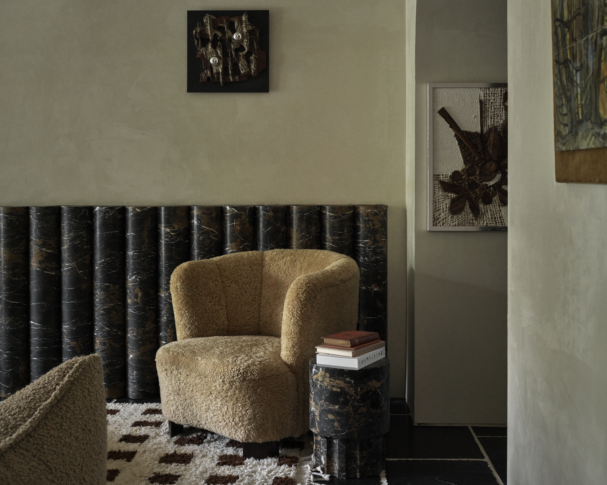
1. Earthy neutrals
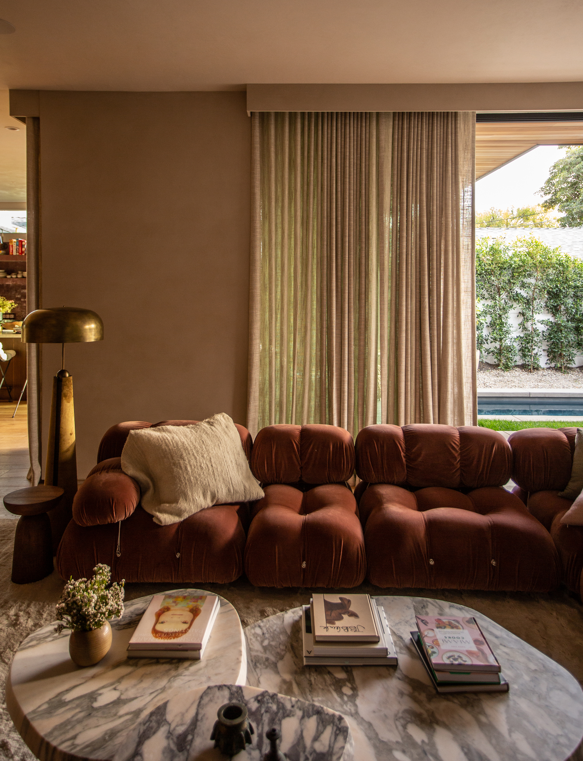
We all love neutral color schemes, and we predict that won't be changing any time soon. Reliable and flattering for any space, used on your walls and in the form of soft textiles and decor, the reason they will still be popular in a decade's time is that you can't really go too far wrong when designing and decorating with neutrals.
'Neutral paint colors are the backbone of timeless design,' says designer, Kelly Hoppen. 'I have a special affinity for calming, versatile shades like warm taupe, soft ivory, and subtle greiges. These neutrals provide a serene backdrop that allows furniture and accents to shine. Top neutral paints create a canvas for personal expression, ensuring your home remains both inviting and effortlessly chic.'
The thing that might change is the undertones of the neutral shades. We're currently enjoying mushrooms and a spectrum of browns, but in the past neutral bases have favored grey tones. ‘Earth-neutral tones are a great way to bring the outdoors in,’ says Nadia Watts of Nadia Watts Interior Design.
‘They work well with a wide variety of styles so they will stay relevant for a long time. Savory and enticing, earth tones pair nicely with organic materials like wood and stone so they will remain popular as we continue to build with natural materials.’
2. Muted greens
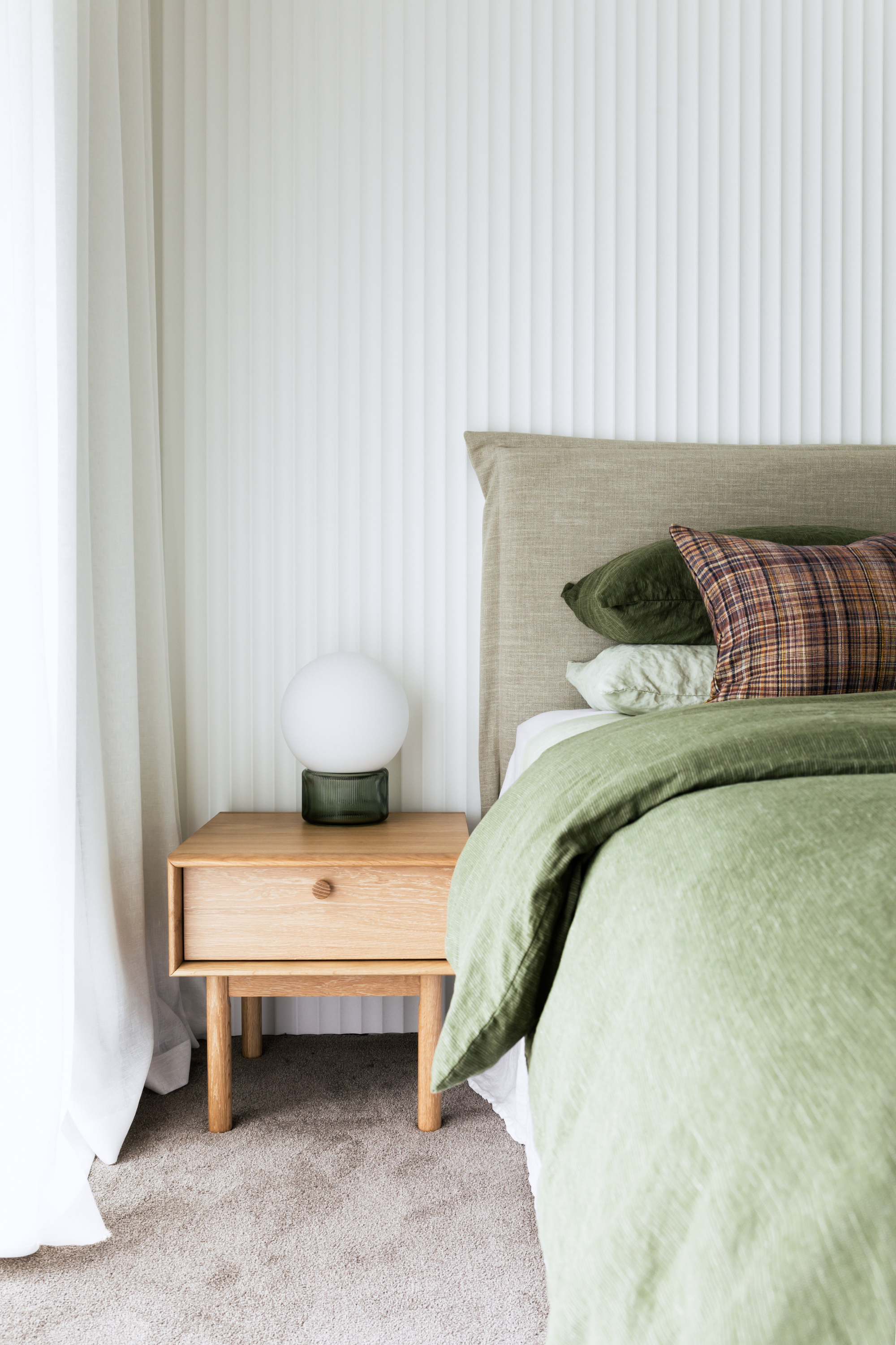
As seasons change and design trends fade, what is consistent is our innate connection to nature. The use of a natural palette of greens will always bring solace to our souls when used in our homes.
The Livingetc newsletters are your inside source for what’s shaping interiors now - and what’s next. Discover trend forecasts, smart style ideas, and curated shopping inspiration that brings design to life. Subscribe today and stay ahead of the curve.
‘As a reflection of nature, green can literally soothe the soul. It's earthy and dramatic,’ says Aimee Wertepny of PROjECT. Interiors. ‘Bold on its own, yet plays nice with nearly every color.'
From decor to paint, green is consistently on trend, but like neutrals, the shade might change. 'One of the types of green that we’re currently enamored with is sage green,' says Sonya Lee of New York-based Sonya Lee Architect. 'It’s a color that we see as being fresh, modern, and yet timeless. It has a soothing quality that is both neutral enough that it won’t tire with age and yet is still fresh and exciting.'
There are a lot of colors that go with sage green too, so as other trends come and go, they can slot in with sage green with ease. We recently completed a Brooklyn brownstone and used Benjamin Moore “October Mist” on the cabinets. 'The natural light bounces throughout the kitchen, creating a wonderful soft glow. Sage is the green shade that we see lasting for a long time.'
3. Bright blues
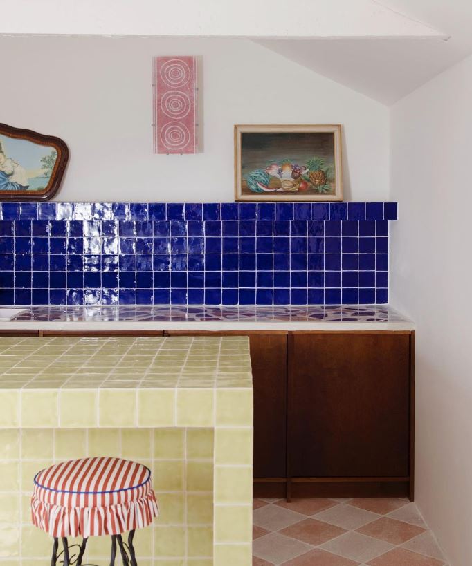
The cobalt blue decor trend is one that I'm loving at the moment. From minimalist homes where a pop of blue brings a bit of life and character, to used on walls with tiles or even paint, it can bring a jolt of electricity to any room in the home.
Yes, it's bold and seriously popular at the moment, so it might not seem like a naturally timeless shade, but we can see over the course of design history that this vivid shade of Yves Klein blue has been used by designers since the 60s, and with that kind of heritage, it's likely it will continue to be adored by designers over the next decade too.
'In all its thousands of hues, hints, tints and tones, blue is still officially the world’s favourite color,' says Marianne Shillingford of Dulux. 'Electric blues are a new dimension to this much-loved favourite for our homes. Clean, crisp, vibrant, and impossible to ignore, these are the digitally inspired switched-on members of the blue family and they are perfect for making a fresh statement in bright modern interiors.
'You have to invest in this color and use it with confidence,' she recommends. 'Try it out color blocking walls and on painted furniture and cabinetry, then throw in some accessories in contrasting bold yellow or orange to enhance the look.'
4. Pale pinks
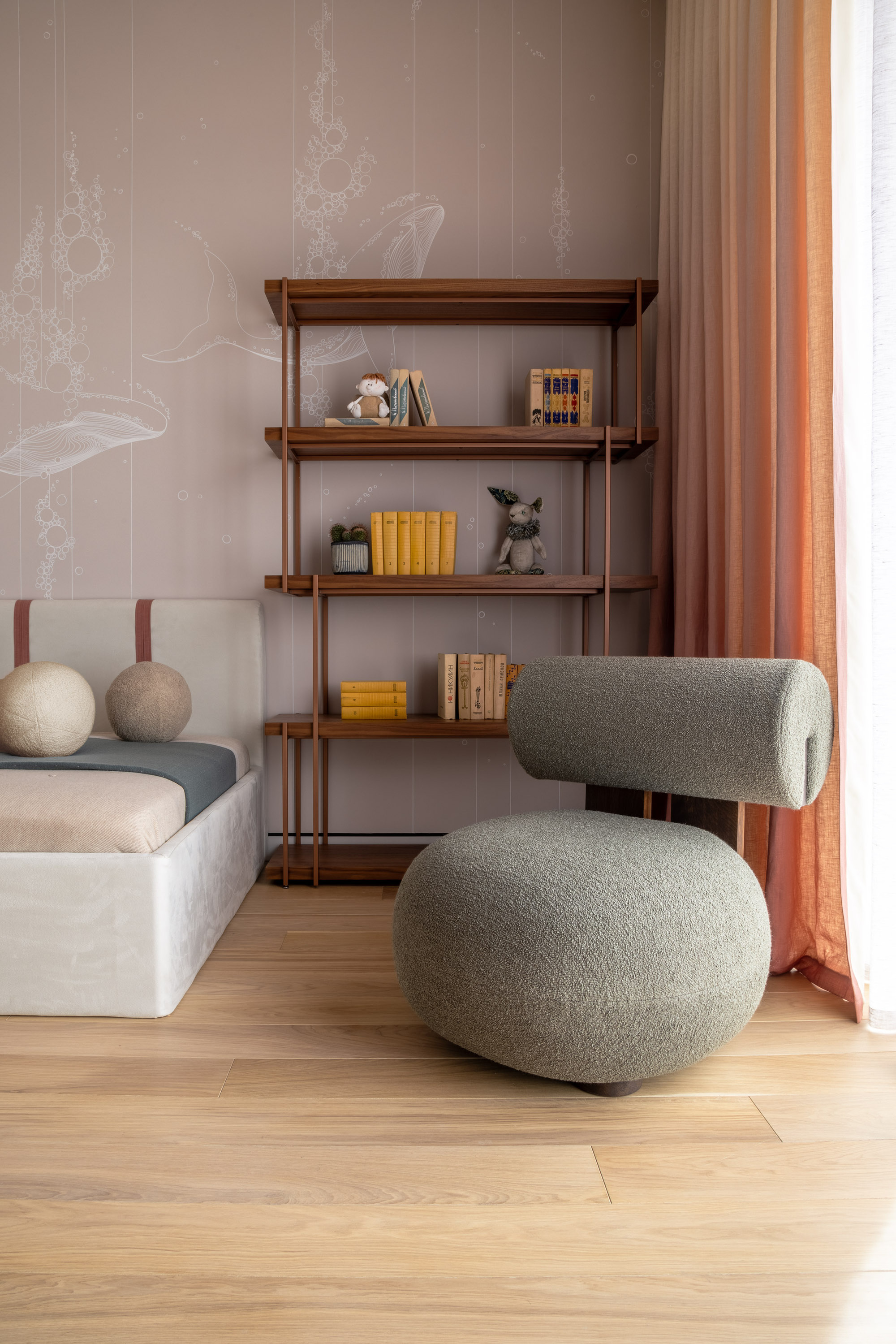
Pale pink has also recently picked up the pace, now considered widely as a neutral tone that can be pale and muted, or with undertones of brown. We don't envision its popularity slowing down any time soon. It is a great color that changes with the light and so can enhance varying moods.
When a room is flooded with light it can feel bright, airy, and not too sugary sweet, but in shadow, it can feel more cocooning. It's super versatile and with an undertone of red there is a positivity and energy to pinks across the spectrum.
'Deep pinks with red undertones immediately up the elegance factor in your home,' says Nadia. 'It’s a brave color that has been used for centuries in the design world. Pink is joyous and optimistic, and it pairs beautifully with so many color palettes.
'It’s the perfect way to add a pop of color and a bit of excitement. When you have a color like pink that works well with such a wide variety of warm color schemes, it tends to stand the test of time.'
5. Off-whites
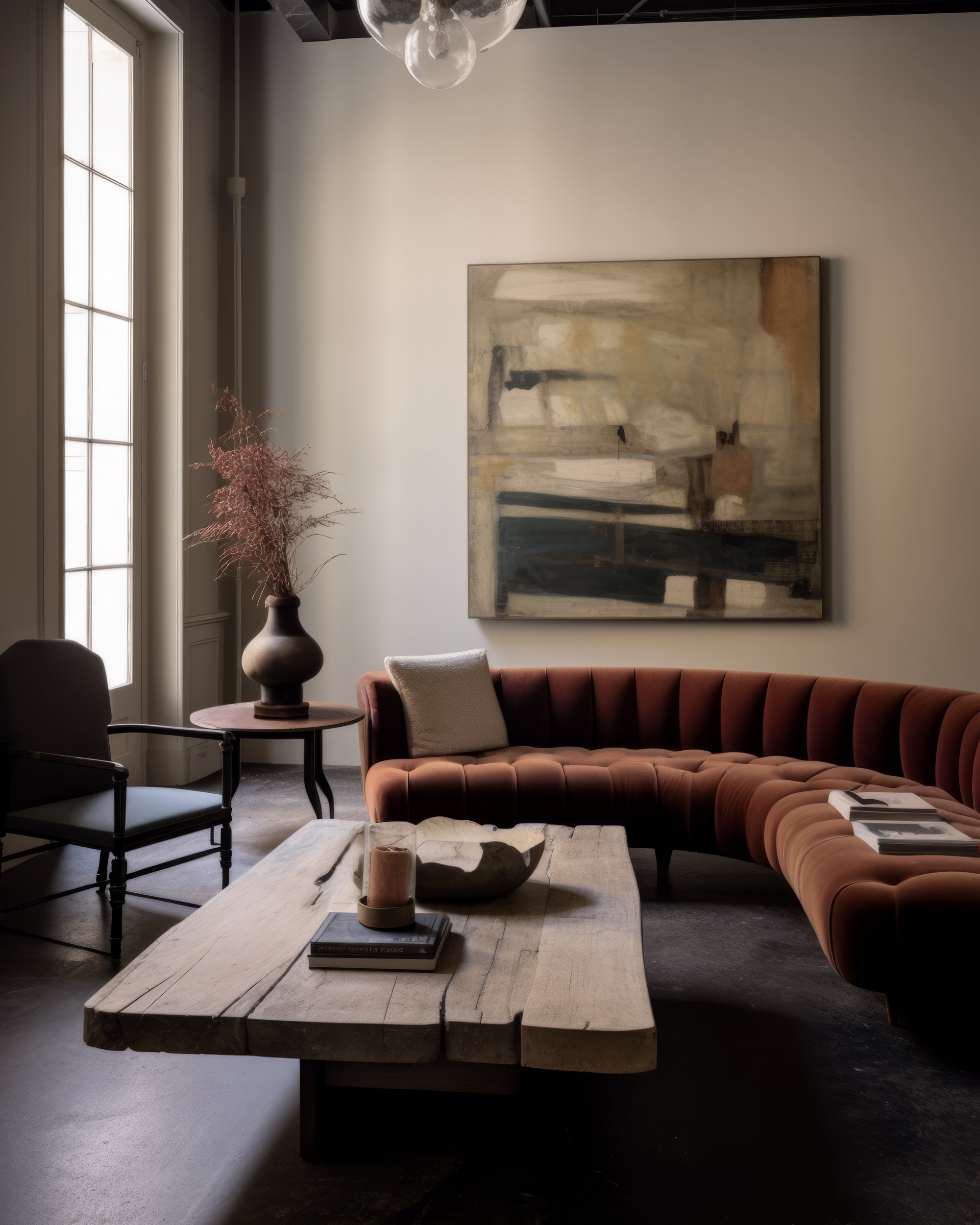
Finally, a subtle off-white shade might feel more like a lack of color than a color trend, but there is a subtle hint of color to off-white that is always a winner for designers. Instead of painting walls a stark white which can feel stark and cold, off-white is always the better alternative.
'My go-to for a white living room is Dulux Natural White,' says Luke Moloney of Luke Moloney Architecture. 'Call me old fashioned but a good warm white never goes out of style. It's adaptable, never dominant, but always chic. It allows other elements (art, views out, furniture, textiles) to come to the fore and give character to a space.'
In this example, Christine Lemieux of Lemieux Et Cie has opted for Farrow & Ball's off-white Shaded White.
3 enduring paint shades to try

Former content editor at Livingetc.com, Oonagh is an expert at spotting the interior trends that are making waves in the design world. She has written a mix of everything from home tours to news, long-form features to design idea pieces, as well as having frequently been featured in the monthly print magazine. She is the go-to for design advice in the home. Previously, she worked on a London property title, producing long-read interiors features, style pages and conducting interviews with a range of famous faces from the UK interiors scene, from Kit Kemp to Robert Kime. In doing so, she has developed a keen interest in London's historical architecture and the city's distinct tastemakers paving the way in the world of interiors.


