The 8 Best Beige Paints Designers Turn to for Warmly Luxe Schemes – "It Evokes a Sense of Calm"
Choosing between the best beige paints is a job for the experts as there are simply so many choose from. So whether you want a soft gray or a warm yellow, designers share their go-to shades
The Livingetc newsletters are your inside source for what’s shaping interiors now - and what’s next. Discover trend forecasts, smart style ideas, and curated shopping inspiration that brings design to life. Subscribe today and stay ahead of the curve.
You are now subscribed
Your newsletter sign-up was successful
The list of the best beige paints is longer than you might imagine. As a color, it has seemingly endless variations, ranging from off-white to an almost-amber, and designers love experimenting with it to bring warmth to neutral schemes.
'We’re allergic to bright white, which often feels too stark and make all the pieces we’ve chosen stand out too much,' says Azar Fattahi, one of the co-founders of the interior design studio LALA Reimagined. Instead, she favors playing around on the beige end of the paint spectrum, imbuing the walls in her schemes with a calming sense of comfort. 'We like a color called Kashmir from Portola Paints which is warmer [than white],' she adds. 'It’s not white, but it’s not quite off white, either.' The perfect summation of what beige is.
As a tone, beige continues to be a popular paint idea for walls for 2024. At the recent Salone del Mobile in Milan, zeitgeist-setters like Cesar were using it as an ombre effect on kitchen islands, while it was seen as the backdrop on furniture stands for brands such as Porada and Minotti. Use these designer-approved beige paints for contemporary yet soothing rooms, where you want a little warmth to feel very, very cool.
Article continues below1. Drop Cloth by Farrow and Ball
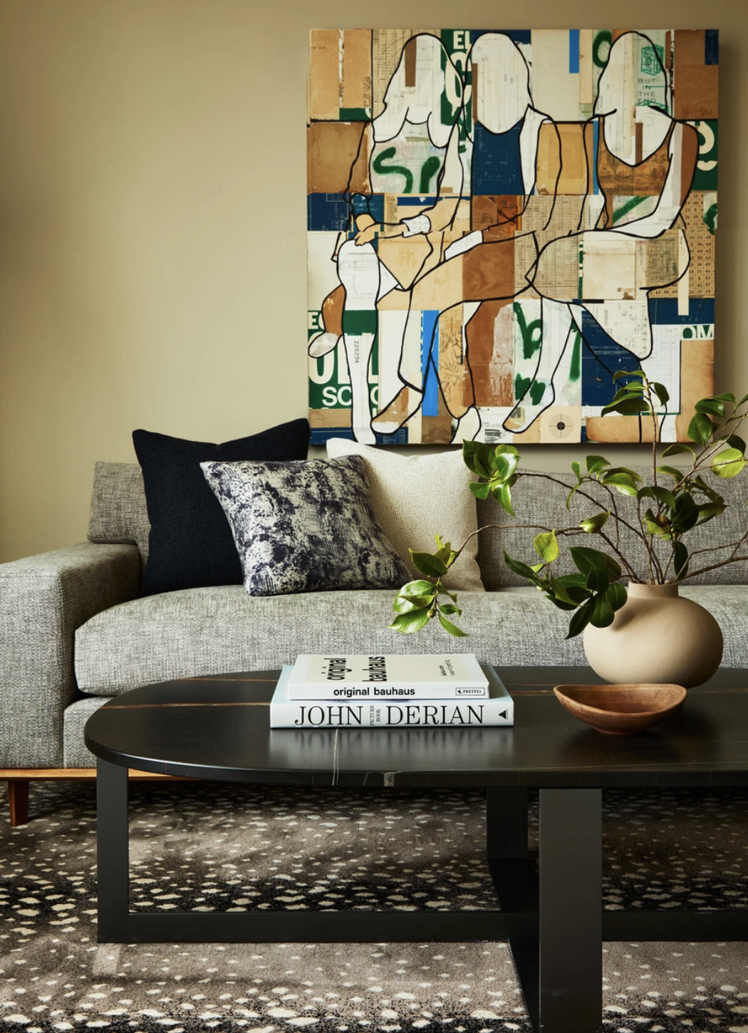
There is a really honeyed tone to this version of the shade, seen in this beige living room by Wolf in Sheep Design. In this light, and with the warmth of the wall color highlighted by the tan shades in the artwork, beige is a joy to be cocooned in.
'It's Drop Cloth from Farrow and Ball,' says Alina Wolhardt, founder of Wolf in Sheep Design. 'We love how it was neutral and warm and so complimentary to all our furnishings. We wanted something neutral but not white and this was the perfect paint to provide a unique color that achieved that.'
Drop Cloth is a mid-gray beige, neither too yellow nor too gray, but perfectly placed in the middle of the two. A comforting, sophisticated and goes-with anything gray-tinted, making it an immensely grown up color.
2. Tree Moss 508 by Benjamin Moore
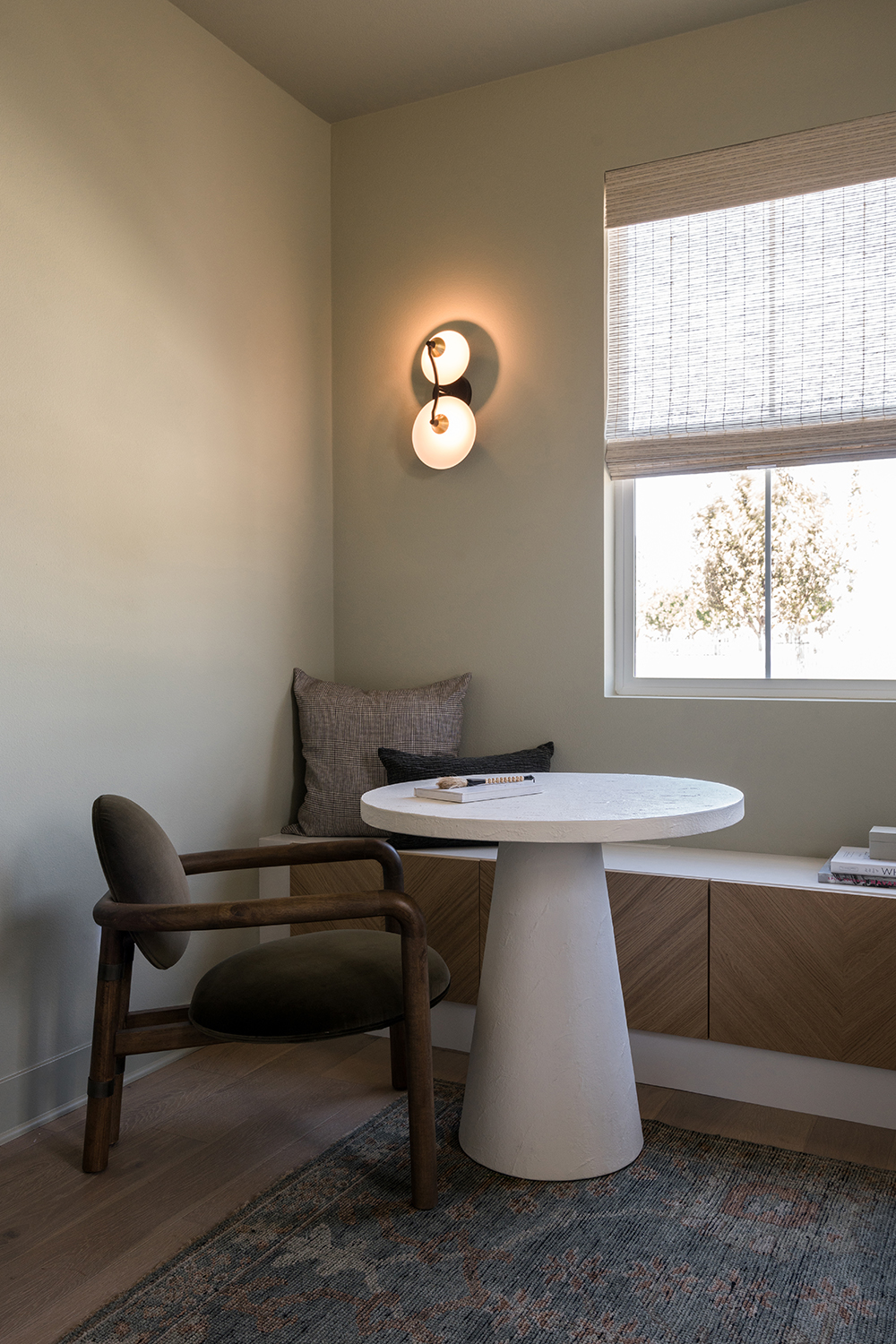
The evocatively named Tree Moss paint by Benjamin Moore conjures up the magic of a quiet and peaceful walk in the woods, and there is a calming serenity to the shade. The hint of green in the pigment - its actually grouped within Benjamin Moore's sages - helps it to be very restful on the eyes, and means there's lot of great colors that go with beige in this tone.
The Livingetc newsletters are your inside source for what’s shaping interiors now - and what’s next. Discover trend forecasts, smart style ideas, and curated shopping inspiration that brings design to life. Subscribe today and stay ahead of the curve.
'The home is inspired by a concept of what we call Old Town Charm,' says Judi Lee-Carr of Jubilee Interiors, who designed and decorated this space. 'We use a clean, modern version of historical colors that evokes a sense of calm and nostalgia. For this room in particular, it is our client's home office. They are a young couple who appreciates the blend of vintage aesthetic in a contemporary environment. We wanted the ambiance to foster creativity and focus, which is why we picked this particular shade.'
3. Light Gray and Salon Drab, both by Farrow and Ball
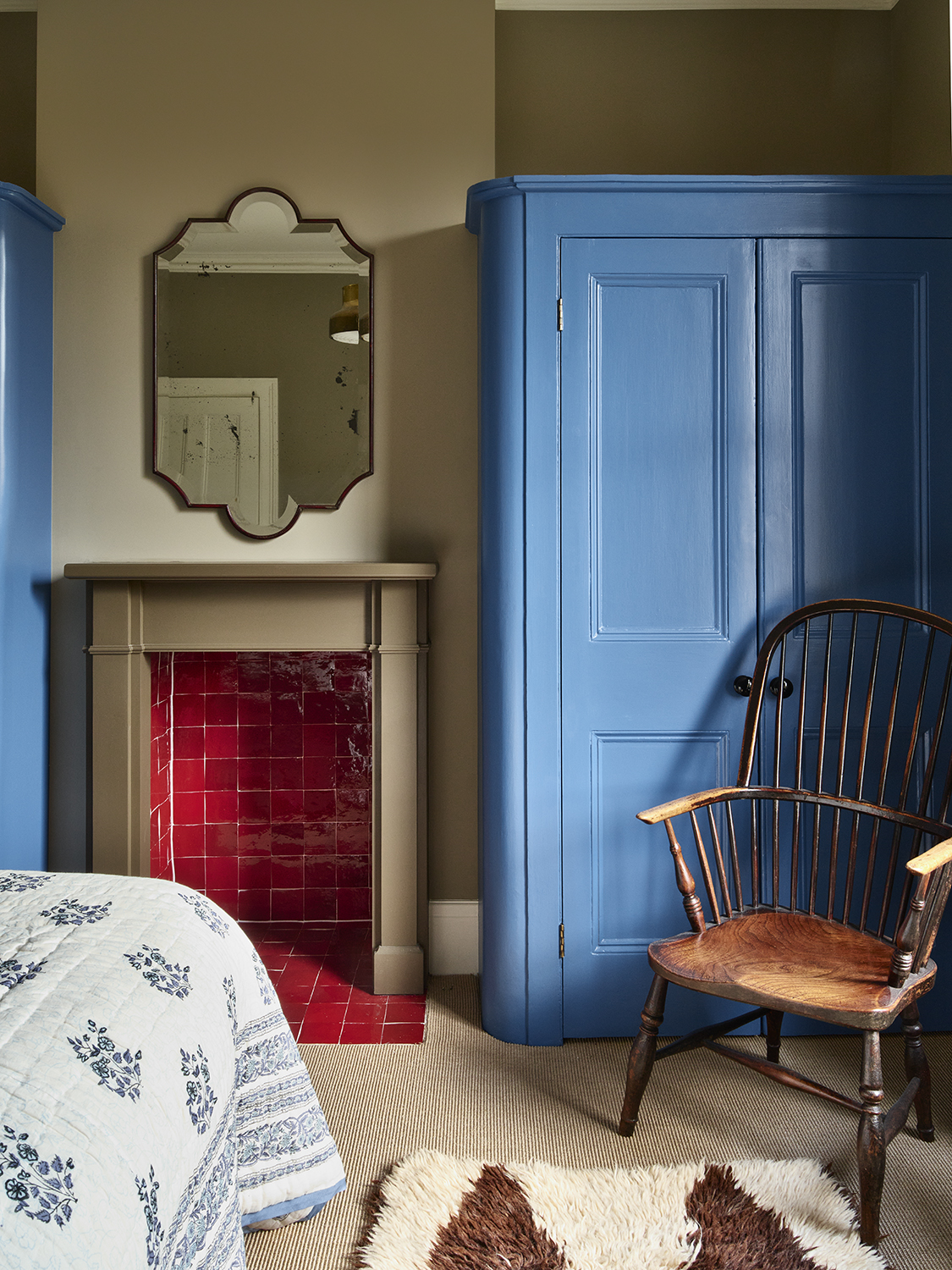
Beige is the perfect neutral bedroom color - it's not stark and startling to wake up to like white can be, and has a richness to it that softer grays tend not to. In this scheme by the London-based designer Tom Morris the wall colour is Light Gray, the fireplace is Salon Drab and they're both contrasted by Ultra Marine Blue on the millwork. All three paints by Farrow and Ball, and the neutrals were used because they corresponded to colors seen in nature.
'The inspiration was a touch esoteric but bear with me,' Tom says. 'We were looking a lot at the Kent coast as touchpoints, which is where the earthy colors came in. My clients favourite color - which we used throughout the house in various parts - was Yves Klein Blue, hence the millwork. And the red in the fireplace was inspired by the rowan berry tree just outside.'
4. Rolling Fog by Little Greene
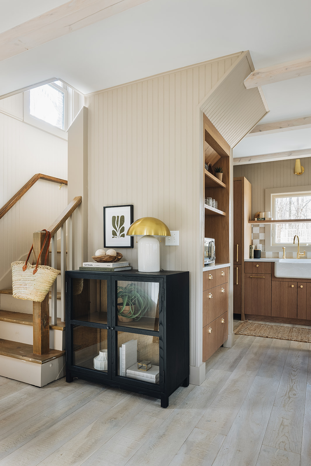
It's an interesting contrast to see this beige paint next to a pure white in a projecty by the Illinois-based studio Kate Marker Inteiors. For Rolling Fog (the beige) was once used as a white alongside darker colors, showing how palettes have evolved and become more crisp over the years.
'Choosing Little Greene's Rolling Fog for the Townie Cottages was a deliberate decision aimed at creating a harmonious blend with the surrounding environment,' says Kate Marker of the lakeside spaces she designed to have a hint of urban elegance. 'The subtle gray undertones of Rolling Fog evoke a sense of tranquility and sophistication, while its versatility allows it to complement the architectural style of the cottages. Its soft hue adds depth and warmth to the cottages, enhancing their charm and character without overpowering their quaint appeal."
See more of Rolling Fog by Little Greene here
5. Skimming Stone by Farrow and Ball
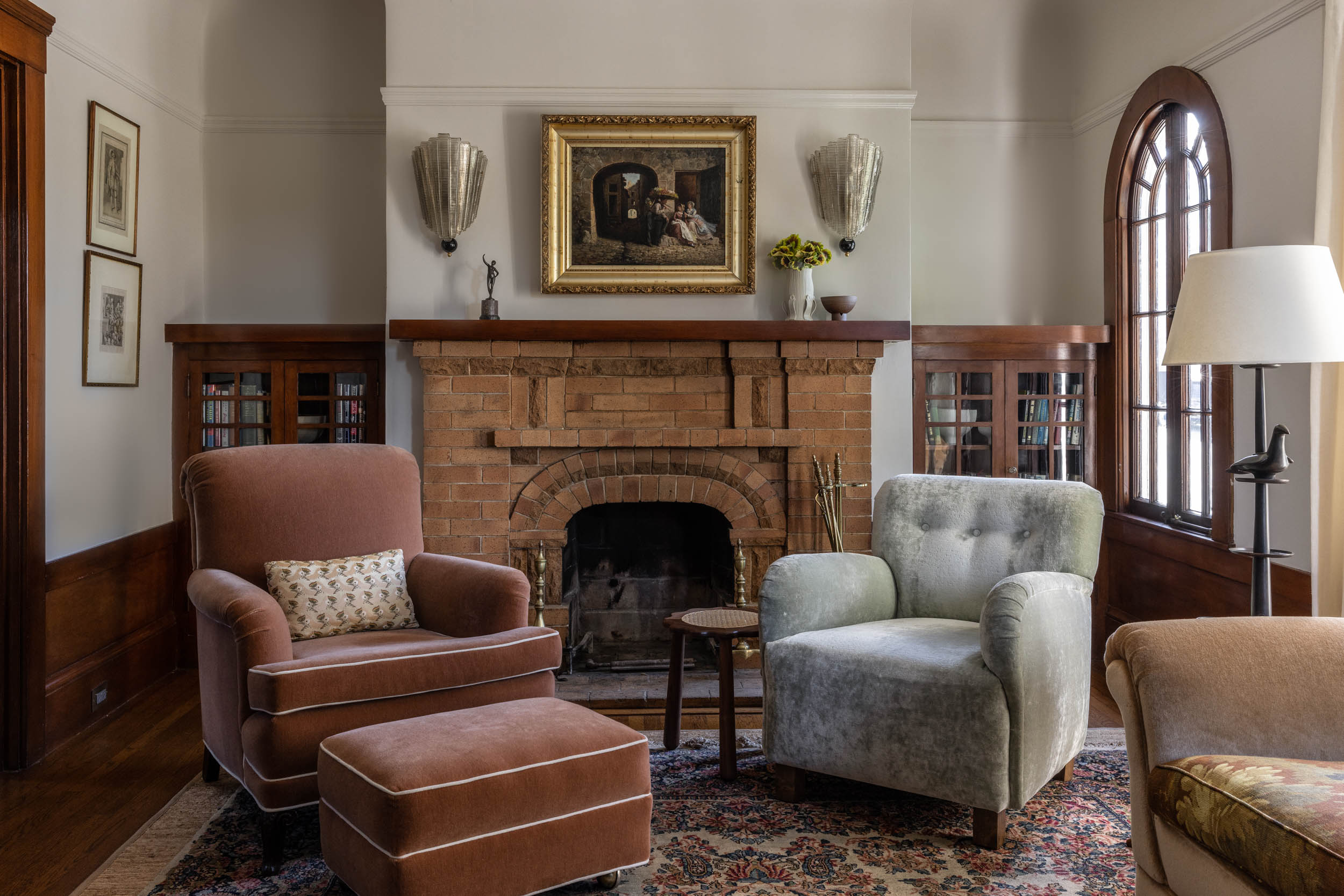
Veering towards the off-white end of the beige spectrum, Skimming Stone takes its names from 19th century skim - or plaster - color used in England at the time. The fact the name conjures up the calm of a lake is surely no coincidence, as like still waters, it has a real depth to it.
'I wanted something calming that transitioned to the existing woodwork effortlessly,' says the San Francisco-based desiger Michael Hilal of why he chose Skimming Stone for this grand-yet-comfortable salon. 'When you have a space that is meant to be soft and cozy, you want transitions in color to feel effortless and not abrupt.
6. Shell White and Oyster White, both by Sherwin Williams
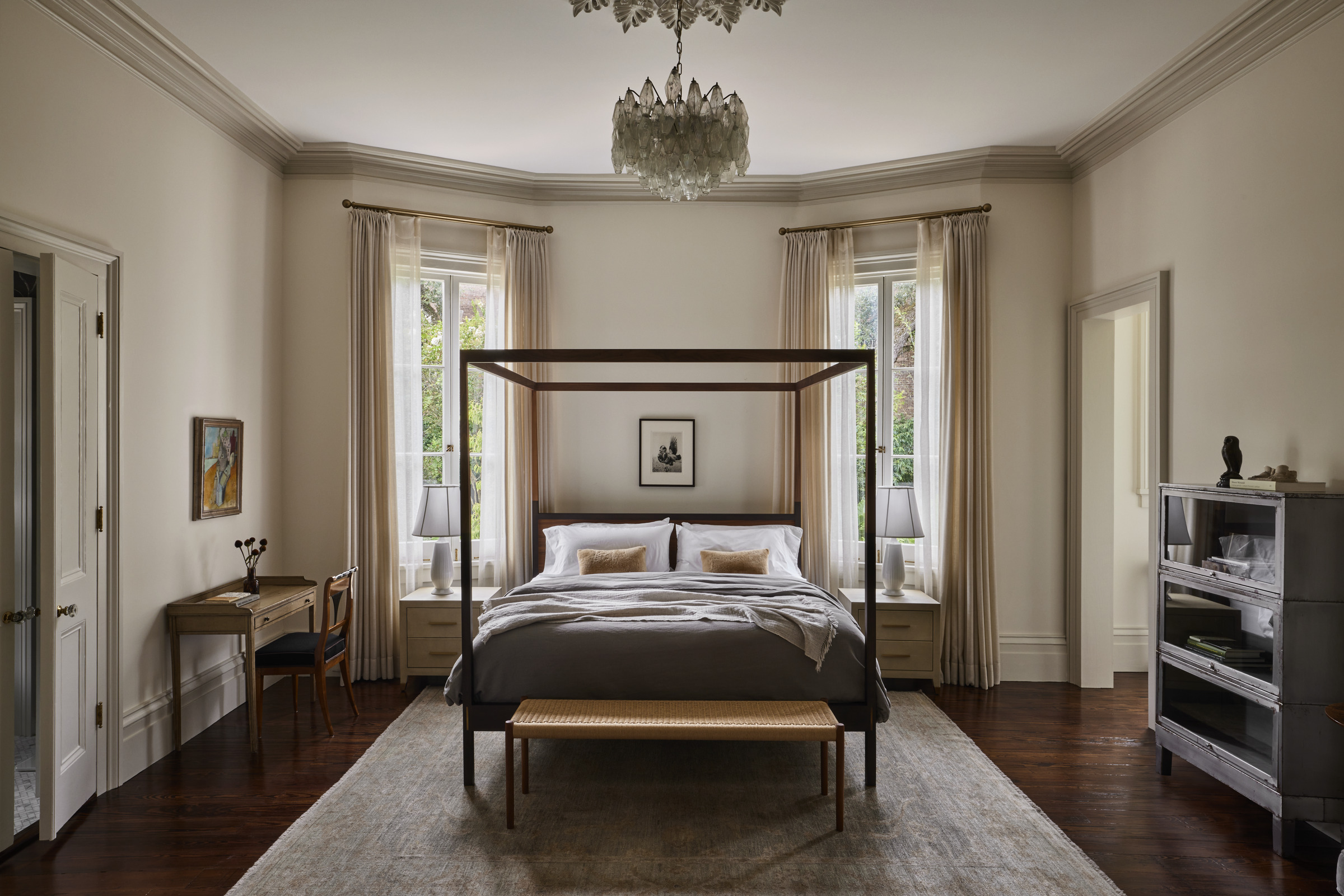
High ceilings, natural light, this bedroom was practically built to take beige paint. A color made from tones of other shades, its able to change throughout the day depending on how the sun is hitting it (or not), its tone deepening and becoming more cocooning as the night draws in.
'The walls are painted in “Shell White" and the trim is in “Oyster White”, both by Sherwin-Williams,' says Morris Adjimi, founder of principal of the New York-based studio MA who created this scheme. 'The combination feels both fresh and traditional.'
Together, they're a perfect beige palette - Shell White has warmer, peachy undertones, which balanced by Oyster White's softer green tones.
7. Ammonite by Farrow and Ball
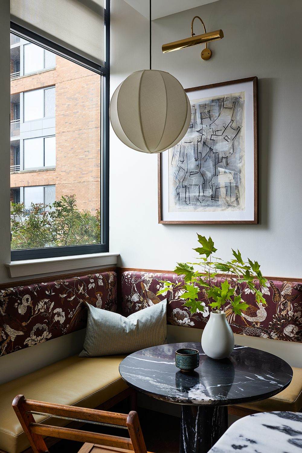
Showing just how many variations of beige there can be, designer Zoe Feldman's option takes on gray-quality thanks to its urban setting and cool daylight. This is a good beige for modern homes where a hint of softness is required, but nothing that verges on the traditional or too rustic.
'We chose Ammonite by Farrow and Ball because it has a crisp, gallery-like quality, making it a great backdrop for art and the decorative banquette upholstery,' Zoe says. 'It also has just enough warmth to prevent the room from feeling sterile.'
8. Sella by Mylands
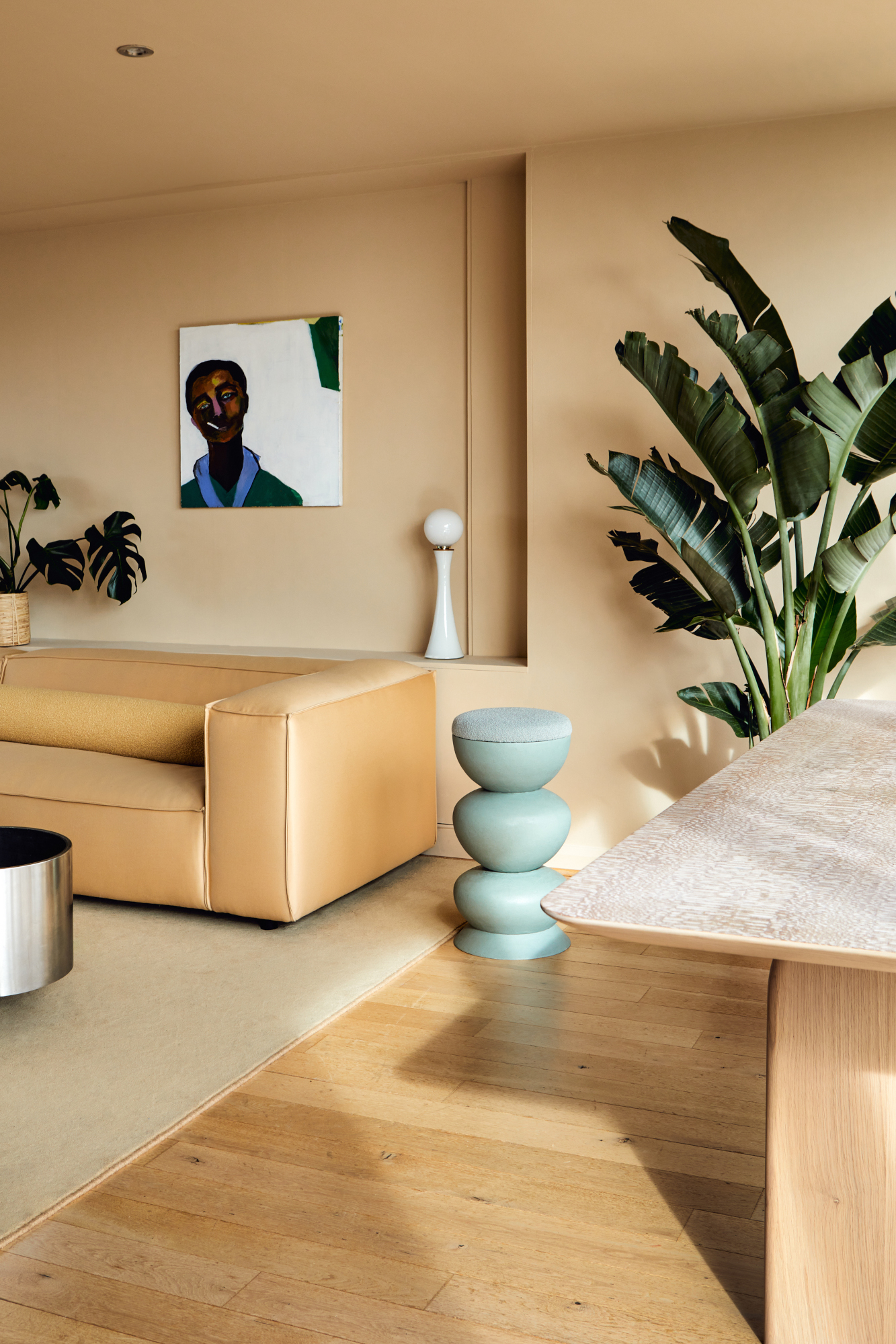
For her own home, Tatjana von Stein, co-founder of London design studio Sella Concept, chose to create her own neutral shade – also called Sella – with paint brand Mylands. It's one of those perfect beige paints that takes on the properties of the colors you pair it with. Add bold shades and it skews bright, but put neutral grays and off-whites with it and it calms all the way down/
‘The rich, warm tone provides a lovely background to our home and we are so thrilled with the overall feeling – all bought together through color,’ she says.
How do I choose the right beige paint?
The secret to choosing beige (or any paint color for that matter) lies in the undertone. Identifying the effect you want to create on the room first of all will help guide you in the right direction to define the mood. While gray-leaning beiges have been the most popular shades in recent years, we're seeing more yellow-based beiges coming through — and it's a good example of how undertone can set the atmosphere. Greige paints can feel minimalist, modern if not a little sombre, while these yellow-beiges have a bit more pep and joy to them.
You'll also need to consider the environment you're putting the beige paint into. The facing of the room will determine how your color reads on the walls. A warm beige in a north-facing room, or cool beige in a south facing room may help to balance the levels a little — where they might feel too warm or too cool in the opposite combination. Factor in how much light your room gets too — and always paint samples before you commit.
The editor of Livingetc, Pip Rich (formerly Pip McCormac) is a lifestyle journalist of almost 20 years experience working for some of the UK's biggest titles. As well as holding staff positions at Sunday Times Style, Red and Grazia he has written for the Guardian, The Telegraph, The Times and ES Magazine. The host of Livingetc's podcast Home Truths, Pip has also published three books - his most recent, A New Leaf, was released in December 2021 and is about the homes of architects who have filled their spaces with houseplants. He has recently moved out of London - and a home that ELLE Decoration called one of the ten best small spaces in the world - to start a new renovation project in Somerset.
