I Thought the Tiled Countertop Trend Might Be a Flash in the Pan — But Designers Are Still Using This Finish in New and Exciting Ways Now
Playful, stylish, and chic, the new take on countertop tiling takes the idea to the next level. Here are the trends in surface tiling that are inspiring kitchen design today

The Livingetc newsletters are your inside source for what’s shaping interiors now - and what’s next. Discover trend forecasts, smart style ideas, and curated shopping inspiration that brings design to life. Subscribe today and stay ahead of the curve.
You are now subscribed
Your newsletter sign-up was successful
Confession: I'm a fiend for a tile. There are very few places I feel a tile doesn't belong. In fact, I am always looking for new nooks and crannies in my home that can be sheathed in a cloak of glossy zellige tiles. I love the way light bounces off its surface glaze, and how the natural bumps of the ceramic beneath bring a softly textured look to my home. All this is to say, when a new tile trend comes around, I'm all ears.
And yet, something about a tiled kitchen countertop didn't quite sit right with me. When I first saw the trend really emerge a few years ago, I had my reservations on its practicality, but honestly if the look is serving enough, I can get over a few crumbs getting caught in the grout lines. However, I will say I wasn't sure it's a trend that would endure, but I was wrong. Not only are tiled countertops still going strong in 2025, but designers are also doing more exciting things with the material to bring bold kitchen designs to life.
These takes on the trend bring warmth, style, and a healthy dose of playfulness to the front and center, making for designs I'll be dreaming of for a while. Without further ado, it's time to get inspired.
Article continues belowStripe Appeal
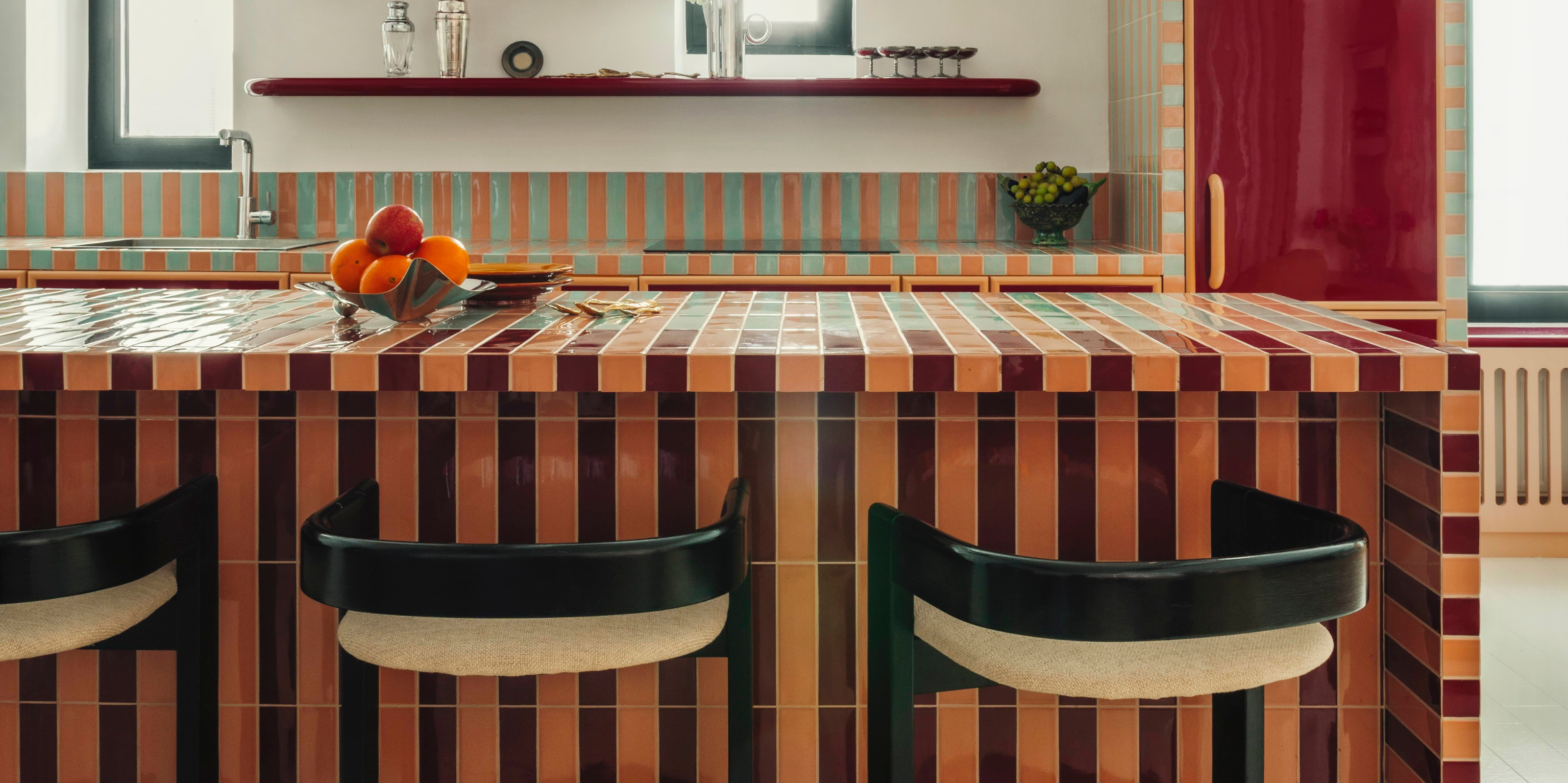
"Tiled countertops have a nostalgic, almost retro quality, yet they can also feel very fresh and contemporary when reinterpreted with the right proportions, patterns, and colors," says Hugo.
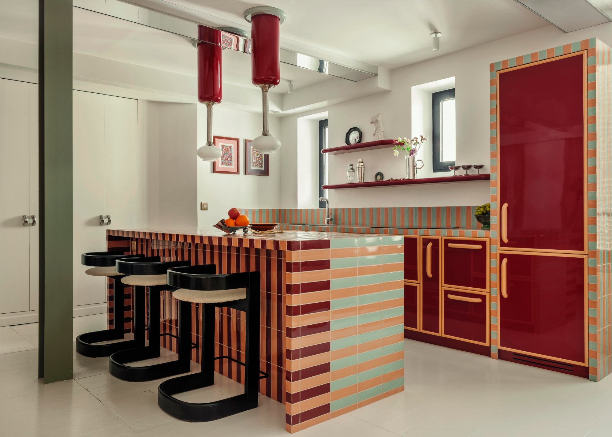
In Paris' red light district, just moments away from the Moulin Rouge, you'll find this colorful kitchen design, complete with a graphic, stripey tiled kitchen island.
Just as with the district in which it sits, here, color means so much more than just decoration; it is part of the identity of the place. "The project in Pigalle was deeply inspired by the idea of color as a structural element rather than a decorative one," explains designer Hugo Vince, of Atelier HA
With a white cube canvas, the designers at Atelier HA had the freedom to let their imagination run wild, playing with color and shapes with an uninhibited ease. Peach and mint colors go with maroon, making for an unexpectedly cohesive pairing for this kitchen's color palette. High-shine maroon cabinets with peachy-orange piping create continuity in the design, allowing the minty, fresh tiles to stand out as a contrasting pop on the island.
The apartment was designed to reflect the vibrant energy of its surroundings, and nowhere is this clearer than within the kitchen. Hugo says, "We wanted the kitchen to feel playful, vibrant, and alive, echoing the eclectic energy of the neighborhood. Tiles offered us both a tactile material and an infinite chromatic palette, allowing us to explore bold juxtapositions and make the countertop a true centerpiece."
The Livingetc newsletters are your inside source for what’s shaping interiors now - and what’s next. Discover trend forecasts, smart style ideas, and curated shopping inspiration that brings design to life. Subscribe today and stay ahead of the curve.
The blend of striking modernism with retro elements is precisely what makes this kitchen quite so captivating; it is at once nostalgic and surprising, bringing a heavy dose of playful character to the neutral base of a kitchen.
70s Gloss
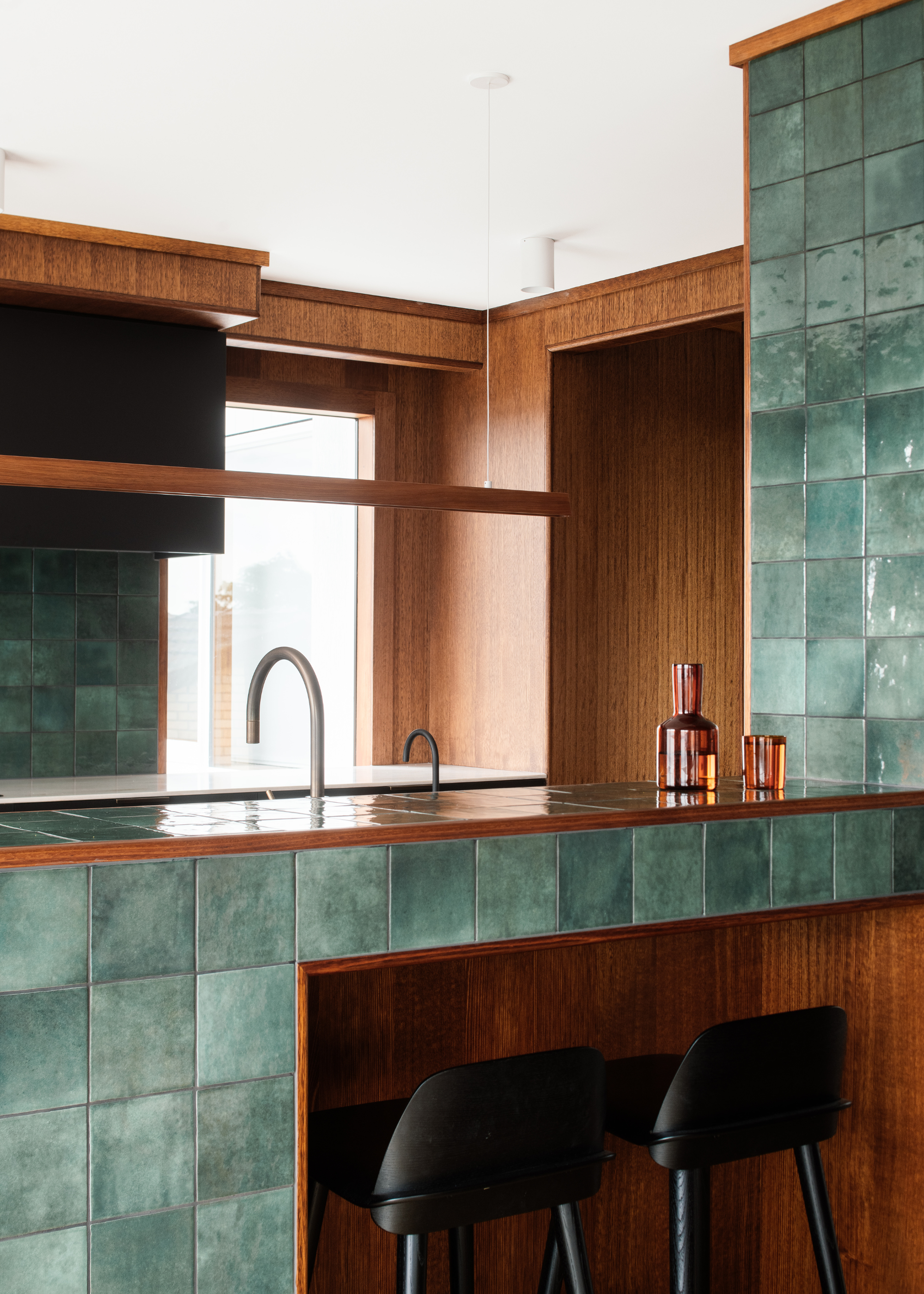
"The patterning and grout lines introduce depth and a subtle rhythm within the kitchen, while the gloss and irregular surface of the tile lend a quiet luxury," says Kate.
Although a tiled countertop may appear undeniably modern today, the trend refers back to decades past, when this style was a regular fixture in modern kitchens.
It was this retro aspect that made the style so appealing to Kate Symons, from Studio Ilk. As she explains, "The design was guided by a desire to celebrate and reinterpret the home’s 1970s architectural heritage, while sensitively adapting it for contemporary living."
The simultaneously retro and modern identity of this style of counter made it a perfect fit for this period property, made modern, where the shiny green tiles beautifully complement the timber-clad kitchen.
"The tiled benchtop is a deliberate material gesture — both a nod to the era and a means of introducing texture, tactility, and crafted detail that elevate the everyday experience of the space. The green tile, selected early in the process, became a defining element: the singular accent of colour within an otherwise timber-rich and muted palette of natural, neutral materials," says Kate.
The combination of green tiles and deep, warm timber makes for a beautifully earthy, inviting color scheme, rich with texture and tonal irregularities.
This was a completely intentional choice, as Kate describes, "The patterning and grout lines introduce depth and a subtle rhythm within the kitchen, while the gloss and irregular surface of the tile lend a quiet luxury. It felt like the perfect way to complement and elevate the home’s 1970s timber-heavy interior palette, sitting harmoniously against the richness of the stained timber elements."
Kate is passionate about the preservation of heritage buildings and particularly the ethos of sustainable principles surrounding the retention of extant built fabric and the embodied energy such buildings contain. She relishes the challenge of complex sites and emphasises supporting and guiding clients through the design and approval processes holistically and rigorously.
Warm Toned Retro
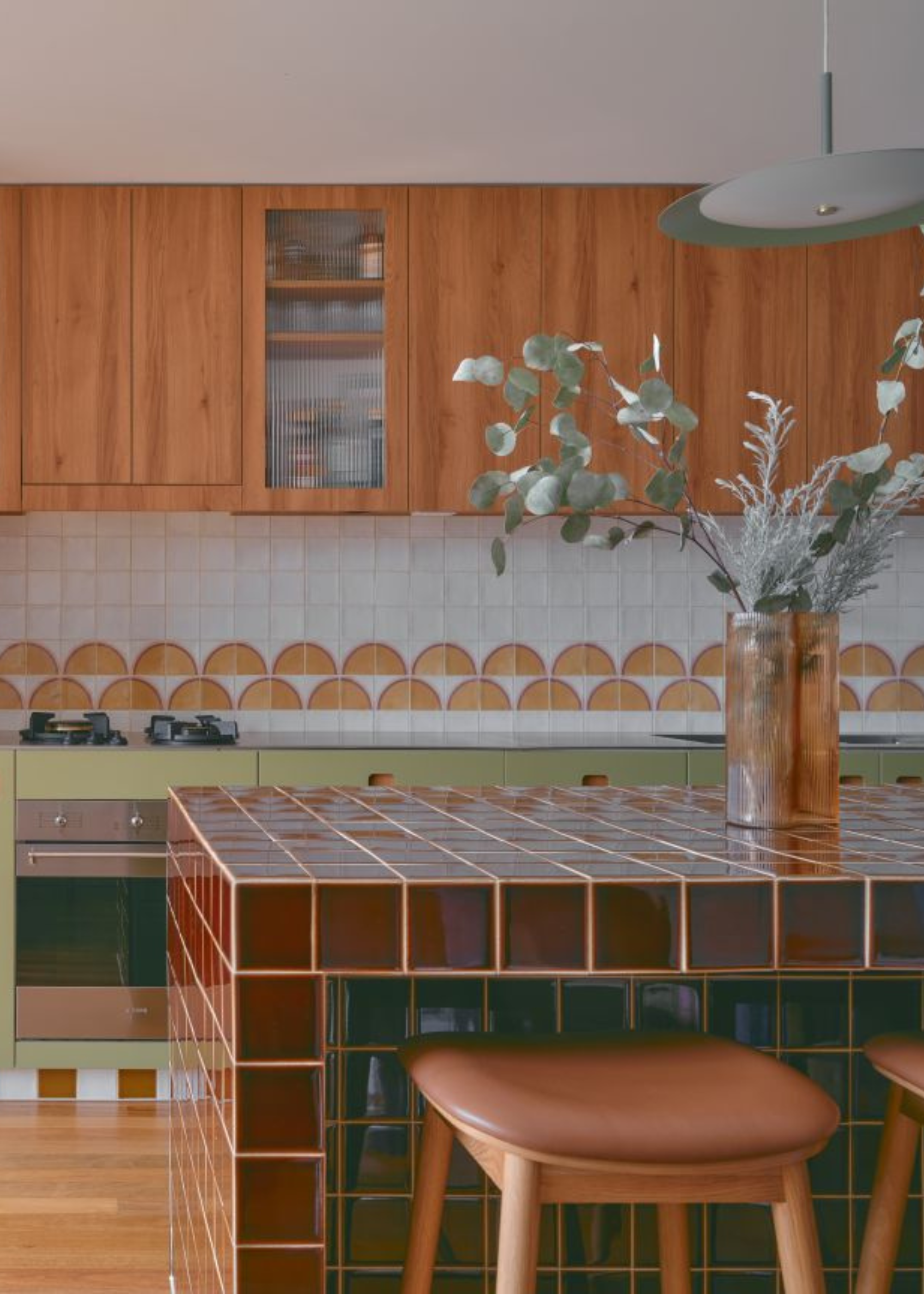
"In this project, the tiles added a vintage-meets-modern feel that complemented the mid-century palette we embraced throughout the home," says Georgia.
2025 has been a good year for dark, warm tones, with practically every interior designer scrambling to include a burgundy color sofa or umber rug in their homes. However, by far my favorite offshoot of the trend has been the rise of moody, red-toned kitchens, and this gorgeous tiled island is one of the best interpretations I've seen yet.
"We wanted a bold focal point that felt handcrafted and grounded," explains Georgia Gregory, from Frankly Interior Design.
An eye-catching, sculptural kitchen island is an excellent way to create a strong focal point in a kitchen. Not only does it physically take up the most central position, but it also often acts as an anchor to gather around.
The deep red tiles supply some contrast to the space, whilst simultaneously making the whole room feel cozier and more welcoming. "The burgundy tiled island brings warmth, depth, and a touch of nostalgia, while balancing beautifully with the timber and sage cabinetry," says Georgia.
While this color could be found in popular marbles, like rosso levanto, opting for tiles instead brings a more unique, surprising feel to the space. "Tile brings a unique texture and richness you don’t get from stone. The glossy surface catches the light, and the grid of grout lines gives the island a sculptural, crafted feel that’s both functional and expressive," explains Georgia.
Named after a delightfully friendly and food-obsessed Cocker Spaniel, Frankly is a Sydney-based interior design practice that turns vision into beautifully executed design. Our approach is thoughtfully people-centric, solution-minded and creatively obsessed. We’re driven by a desire to offer each client a unique dwelling fit for purpose and overflowing with personality and beauty.
What Tiles Work Best for Countertops?
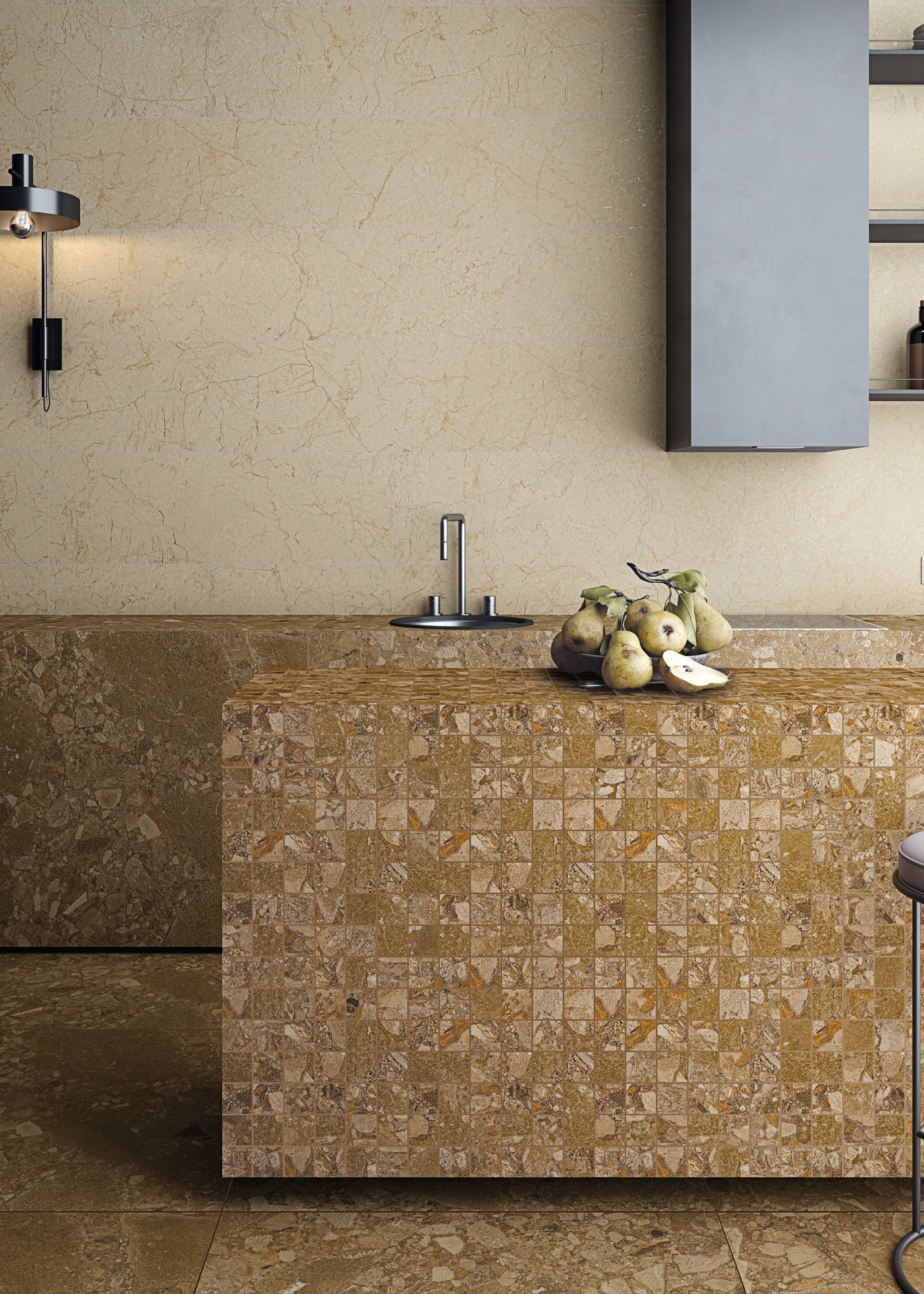
"The key is to choose a tile that balances aesthetics with practicality: resistant to stains, easy to wipe down, and comfortable for daily use," says Hugo.
Now that you've seen enough gorgeous kitchens to get some inspiration from, it's time to consider the type of tiles you should use to achieve this look in your own home.
For many, glazed ceramic tiles are the go-to for this look. As Hugo explains, "We believe glazed ceramic tiles work beautifully because of their shine, depth of color, and durability. Smaller formats allow for rhythm and detail, while larger formats can give a more minimal, graphic look."
Smaller, square tiles can bring a cool mosaic-like look, while longer formats bring a whole new dimension to the style, mainly when used in alternating colors.
Georgia agrees with Hugo's approach, saying, "Glazed ceramic tiles with a smooth, low-porosity finish are ideal. They’re durable, easy to clean, and allow for tight grout lines. A rich glaze, like the burgundy we used, adds depth and character."
The porosity of your material is something you want to consider with some thought before diving into the design. This term refers to the number of minute holes a material contains, which allow for increased absorption of liquids. For your counters, the less-porous the material, the better.
Another good, non-porous option is porcelain. Maria D Arráez, from Tiles of Spain, says, "Ceramic or porcelain tiles are a popular choice thanks to their versatility, durability, and, of course, easy maintenance. Easy to clean, ceramic and porcelain are stain and scratch-resistant, hypoallergenic, non-porous surfaces that can be cleaned and swept easily - while still providing a stunning aesthetic, no matter your style. Ideal for a kitchen!"
Are Tiled Countertops Practical?
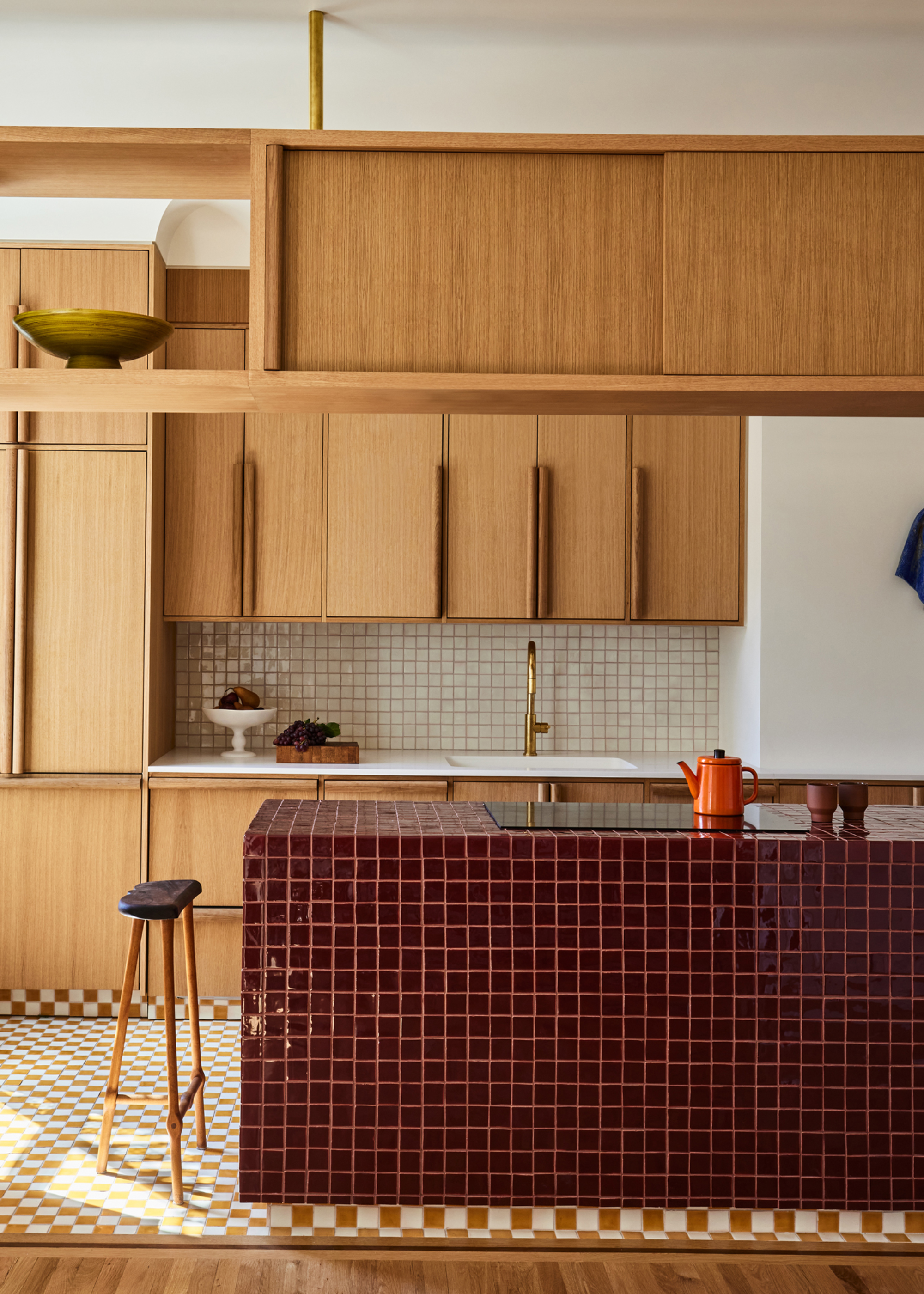
Checkerboard tiling on the floor adds another level of contrast to the design.
It's important to note, though, that as lovely as these counters look, this is not a style that you should buy into blindly. There is a lot of room for error here, and this is not exactly a low-maintenance kitchen countertop.
"It’s important to bear in mind that tiled countertops require a little more care than seamless surfaces, particularly in maintaining the grout lines. Selecting the right grout and ensuring it is properly sealed makes a significant difference to performance and longevity," explains Kate.
The issue of grout lines is most likely the most substantial problem you'll face with this design, so being prepared for the potential for errors here is essential. As Maria says, "A common mistake which can be overlooked is not paying enough attention to the grout and grout lines. If you do opt for small-format tiles for a countertop, bear in mind that these will need more maintenance compared to large-format tiles as there are more grout lines to consider."
Most important of all is remembering to seal your grout. "Grout lines need care, so choose a stain-resistant grout and seal it well. The surface won’t be as seamless as stone, but the texture and charm more than make up for it if you embrace the handmade look," suggests Georgia.
If this design looks like too much hassle for you, but you still want to bring some gorgeous tiling into your home, why not try it out in the bathroom instead? I love the look of these characterful mural tiles, or, for something a bit more out there, the unswept floor trend is a definite favorite.

Maya Glantz is a Design Writer at Livingetc, covering all things bathrooms and kitchens. Her background in Art History informed her love of the aesthetic world, and she believes in the importance of finding beauty in the everyday. She recently graduated from City University with a Masters Degree in Magazine Journalism, during which she gained experience writing for various publications, including the Evening Standard. A lover of mid-century style, she can be found endlessly adding to her dream home Pinterest board.
