'It's the Color of the Moment' — How to Build Your Home's Color Scheme Around Rich, Earthy Maroon
The right colors that go with maroon can help lift this brownish-crimson tone, and build out a layered, sophisticated palette

The Livingetc newsletters are your inside source for what’s shaping interiors now - and what’s next. Discover trend forecasts, smart style ideas, and curated shopping inspiration that brings design to life. Subscribe today and stay ahead of the curve.
You are now subscribed
Your newsletter sign-up was successful
Colors that go with maroon may be limited but the effect they create in interiors is tremendous. Maroon, a signature brownish-crimson tone has a grounded, serious appeal to it. It's not as stark as a bright red, nor is it as muted as a brown. Sitting perfectly in the middle, this color is packed with earthiness.
For those who want to add a bold tone to their interiors but are unsure of what color to go for should consider maroon. Take a look at these colors that go with red, and give your spaces a timeless look.
1. Yellow

When it comes to colors that go with yellow, a lovely, grounding tone is maroon. This combination, in fact, sparks a sense of creativity and excitement. The bright cheeriness of yellow contrasts against the depth of maroon, and you get a well-balanced interior.
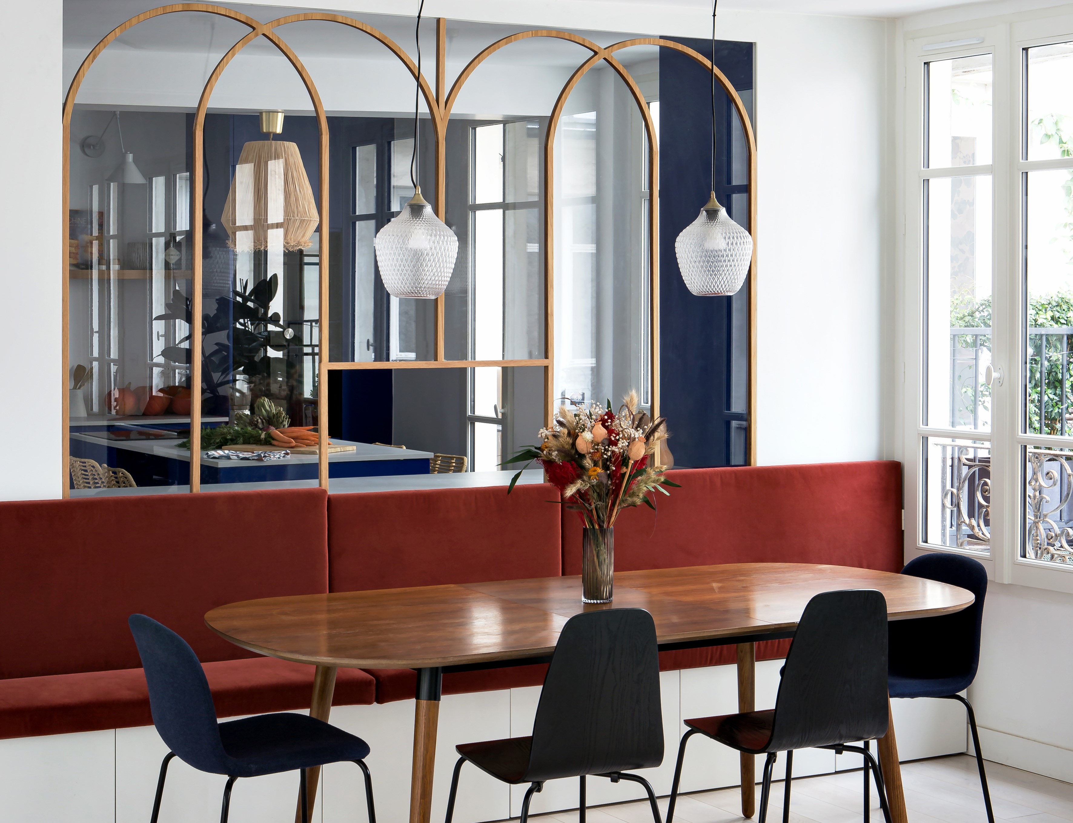
'For the furniture, the client loved the 80s style so we thought these pieces would fit well,' says Hélène Pinaud, founder of Heju. 'During the design process, we wanted to add some colors in the arches but she was afraid she would get bored of it over time so we were a bit frustrated and proposed some bold colors for the furniture instead. We chose pop tones such as maroon and yellow for a modern look.'
2. Gray

A timeless neutral, gray is the easiest color to pair any other shade with. From the bold red to the soft pink, gray offers a lovely backdrop to make any color shine. Perhaps when looking for colors that go with light gray, consider the deep maroon, as the two tones can wonderfully offset each other.
'Maroon is a rich sultry color that can be paired with several hues,' says Jasmin Reese, founder of Jasmin Reese Interiors. 'This color paired with grays works best when the other materials are an eclectic mix like brass, wood, and fabrics. This can make the tones stand out.'
3. Blue

Maroon has plenty of company when it comes to colors go with blue. Pairing these tones together can create a versatile palette. With navy blue and maroon, you can design more grounded interiors. A more grand combo would be royal blue, and for a calm interior, consider light blue.
The Livingetc newsletters are your inside source for what’s shaping interiors now - and what’s next. Discover trend forecasts, smart style ideas, and curated shopping inspiration that brings design to life. Subscribe today and stay ahead of the curve.
'In this specific project, we aimed to define spatial zones by strategically using strong colors,' say Ophélie Doria and Édouard Roullé-Mafféis, founders of Space Factory. 'With the separation between the bench and the vibrant blue kitchen by a large glass panel, our goal was to choose a complementary hue that would accentuate the kitchen's boldness and blend well with the natural warmth of the wood of the table and wooden panel. By selecting a color that complements blue while considering the wooden elements, we achieved a balanced and dynamic interaction between these two key areas.'
4. Pink
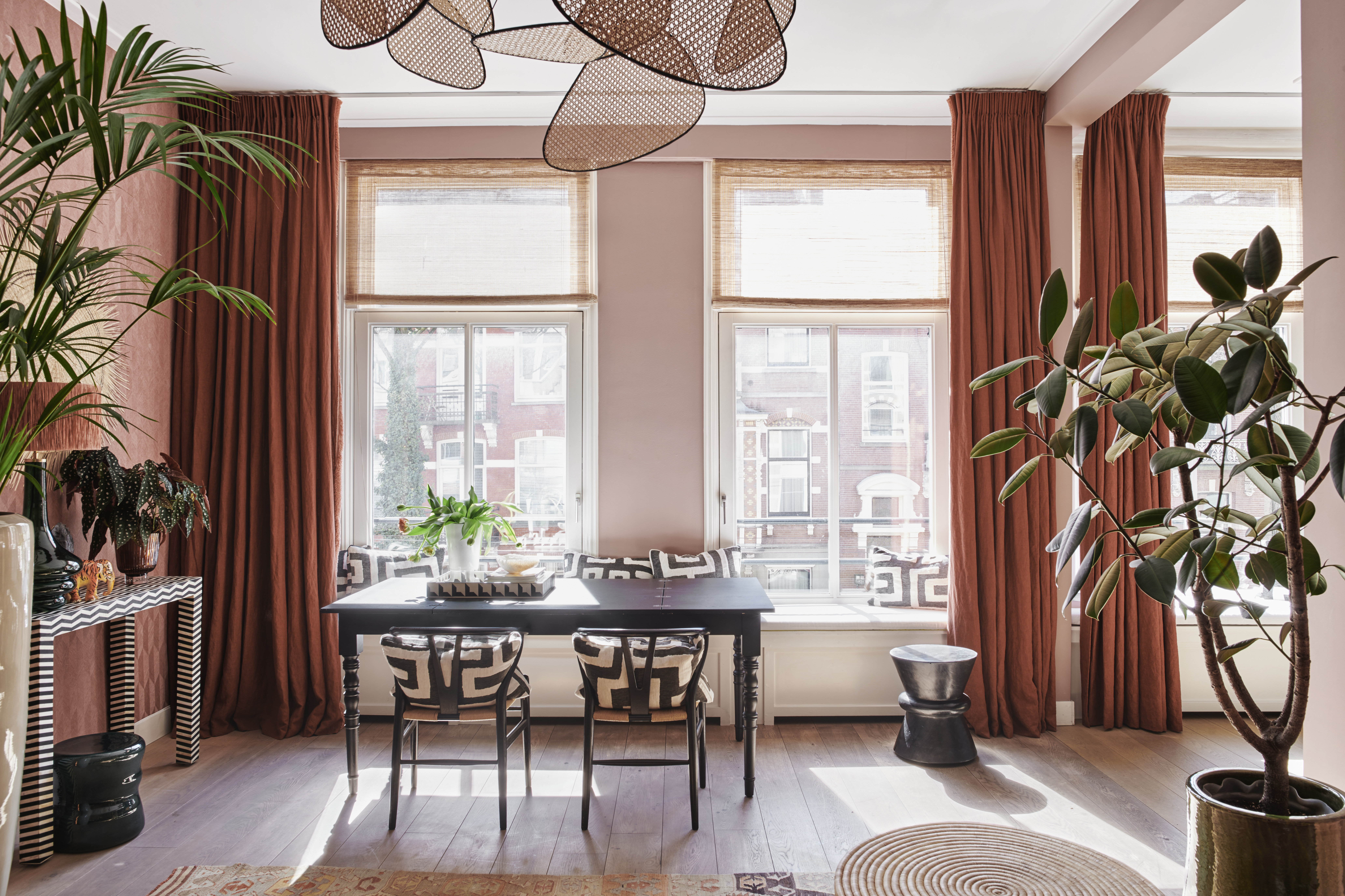
'I am a huge fan of pairing dusty pinks, corals, brick and cinnamon colors together,' says Nicole Dohmen, founder of Atelier ND. 'For the perfect combo, ensure they have the same warm undertones. In this project, I used the peach-colored vinyl wallpaper and combined it with the dark brick-colored linen curtains.'
Since a soft pink can act as a lovely neutral, consider layering in more colors that go with light pink. Think gray, cream, or beige.
5. Green
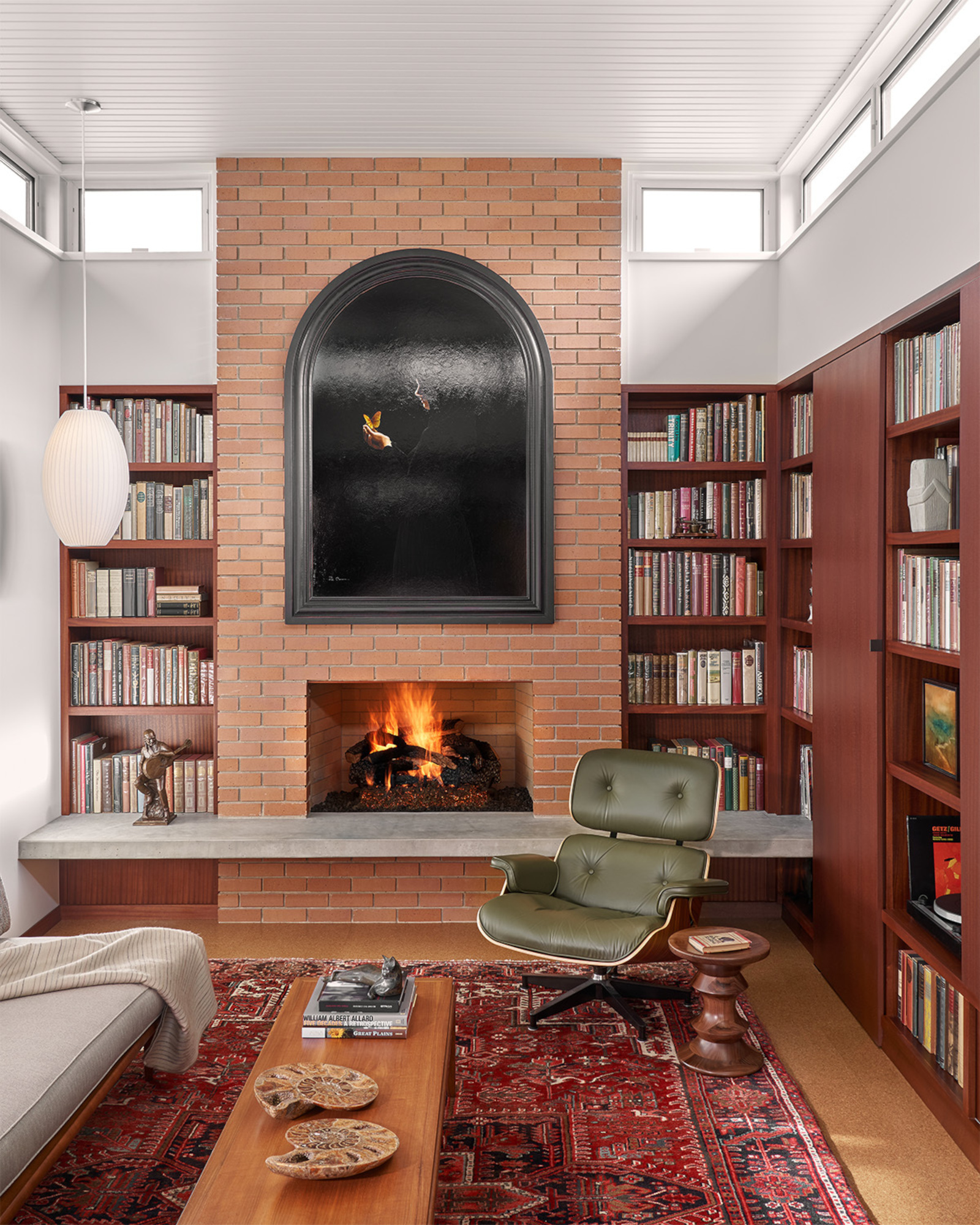
Since many colors go with olive green or sage green, this tone becomes a lovely secondary tone to any space. Consider painting the joinery in maroon, so that the color blends into the architecture of the home instead of standing out or overbearing the scheme. To add a pop, consider an olive green accent chair or pillows.
'I love rich colors and no colors are richer to me than jewel tones,' says Charles Cohen, founder of Charles Cohen Designs. 'There is something luxurious, yet calming about the intense color depths of green and teals together with other tones.'
3 paint colors that go with maroon

Aditi Sharma Maheshwari started her career at The Address (The Times of India), a tabloid on interiors and art. She wrote profiles of Indian artists, designers, and architects, and covered inspiring houses and commercial properties. After four years, she moved to ELLE DECOR as a senior features writer, where she contributed to the magazine and website, and also worked alongside the events team on India Design ID — the brand’s 10-day, annual design show. She wrote across topics: from designer interviews, and house tours, to new product launches, shopping pages, and reviews. After three years, she was hired as the senior editor at Houzz. The website content focused on practical advice on decorating the home and making design feel more approachable. She created fresh series on budget buys, design hacks, and DIYs, all backed with expert advice. Equipped with sizable knowledge of the industry and with a good network, she moved to Architectural Digest (Conde Nast) as the digital editor. The publication's focus was on high-end design, and her content highlighted A-listers, starchitects, and high-concept products, all customized for an audience that loves and invests in luxury. After a two-year stint, she moved to the UK and was hired at Livingetc as a design editor. She now freelances for a variety of interiors publications.


