What Colors Go With Light Blue? 18 Pairings for Pale, Baby, and Sky Blue That Will Make Your Home Look Modern
Light blue is a surprisingly modern trend, but how it reads in your decorating scheme largely depends on what you pair it with

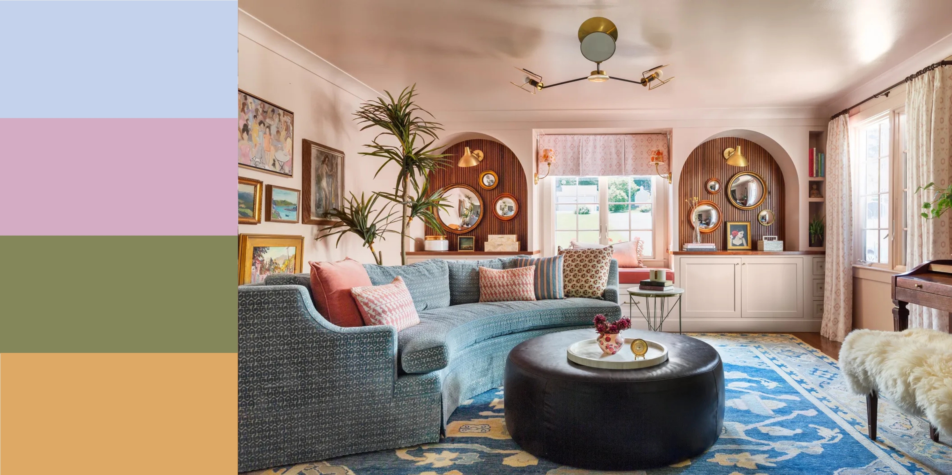
Soft tones of blue have long been associated with traditional coastal cottages and, while that has its place in interior design, colors that go with light blue certainly aren't limited to calming creams and whites.
Light blue is a cool tone that, when paired with other cool tones like lilac, works to create a tranquil, restful space. However, it also makes a great backdrop for punchier accent hues, like hot pink and zingy mustard, that team up to produce a dynamic, vibrant aesthetic. As such, light blue is a versatile and flexible shade that can be weaved into different types of decor schemes, depending on the finish and vibe you're looking for.
Light blue is also an emerging trend in color for 2025, but only when used in certain contexts. The right combinations elevate the shade, and make it feel modern and interesting, not babyish or dated.
Article continues belowWe asked a host of designers to share their top tips on colors that go with blue in its lighter shade, so you know your pairings are on point.
1. LIGHT BLUE AND BURGUNDY
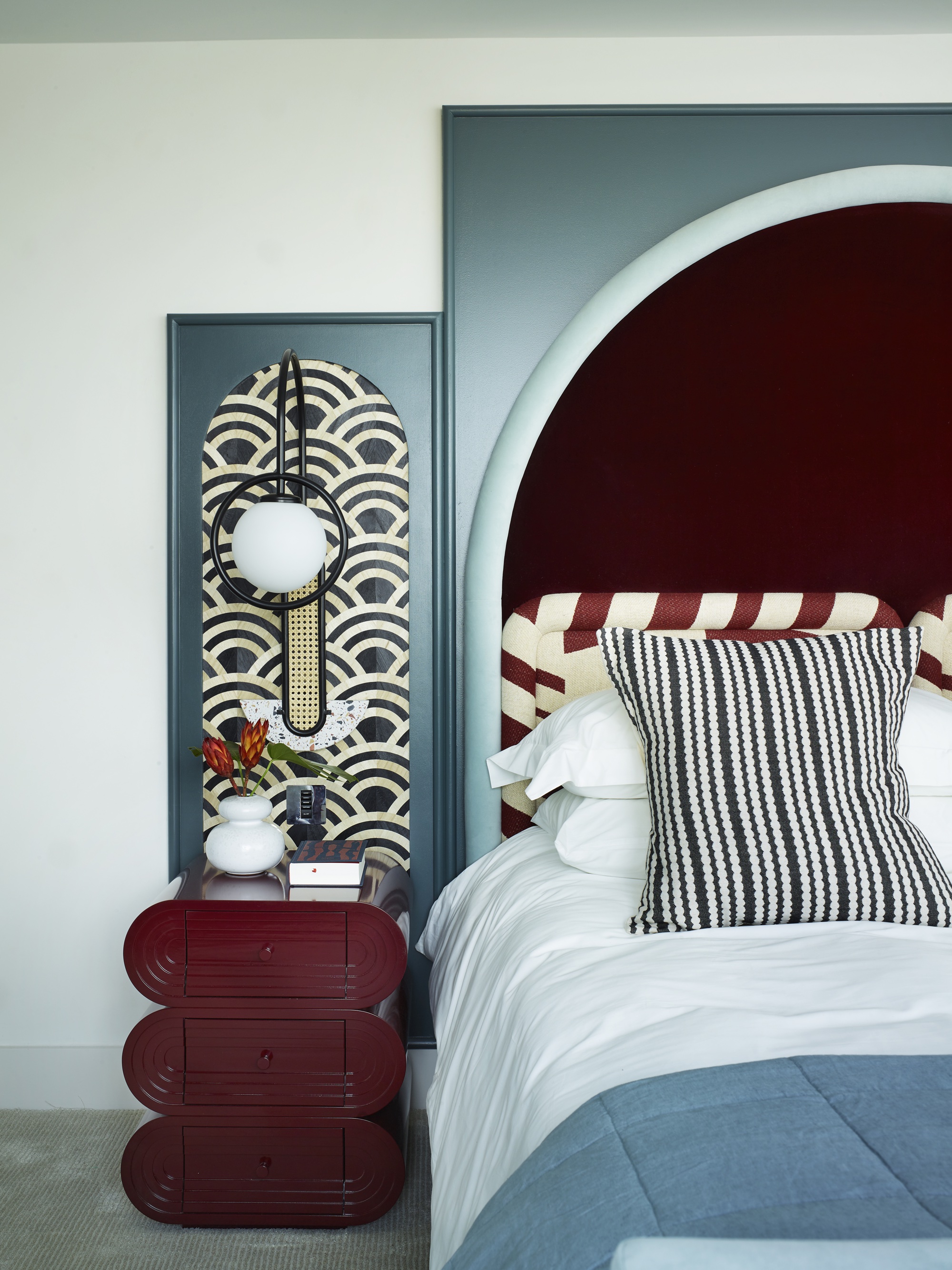
Almost total opposites, these two colors balance each other out.
Burgundy is shaping up to be one of the biggest color trends of 2025, and it also happens to also be a color that goes light blue. The combination is a different take on the light blue and red pairing, but in a more sophisticated and elegant palette.
As burgundy has a slightly blue undertone (as well as a predominant red and green split), it layers harmoniously with pale blues, which provide a softer contrast to more neutral shades like white and cream.
"Light blue and burgundy might not be the first combo that comes to mind, but together they are the perfect match," says Simone Gordon of Owl Design.
The Livingetc newsletters are your inside source for what’s shaping interiors now - and what’s next. Discover trend forecasts, smart style ideas, and curated shopping inspiration that brings design to life. Subscribe today and stay ahead of the curve.
"The cool, calm vibe of the blue really helps to tone down the richness of burgundy, while that deep red brings a lovely warmth and drama to the mix.
"It’s a bit unexpected, but that’s what makes it feel fresh and stylish. In this bedroom we designed (above), the pale blue backdrop makes the bold headboard pop without feeling too heavy – it’s a great example of how opposites really do attract in interiors."
2. LIGHT BLUE AND OLIVE GREEN
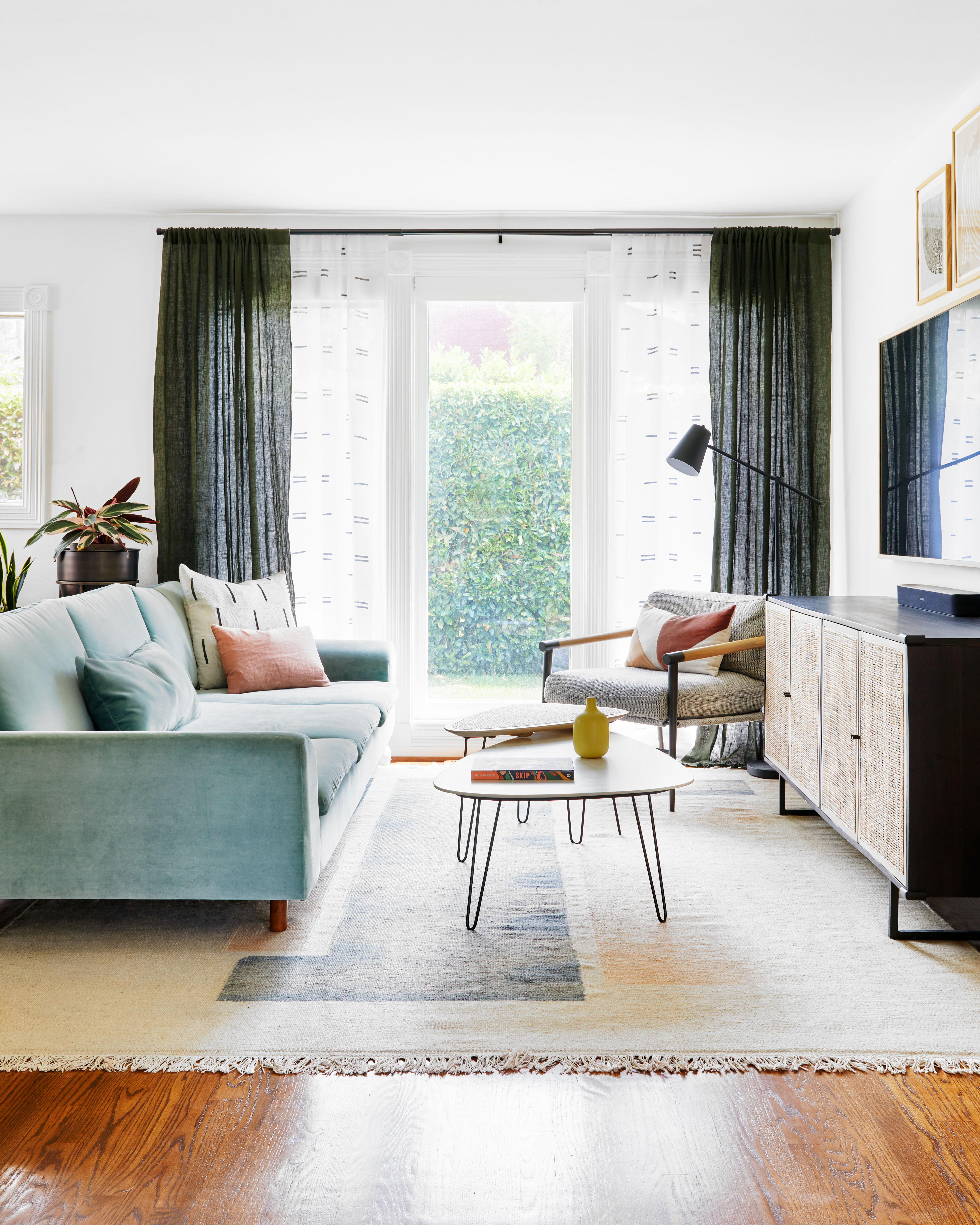
Blue and olive green should definitely be seen, according to the designers at Interior Fox.
Earthy hues pair well with light blue as they work to bring warmth to the blue's cool tones. The modern living room above shows how the olive green in the curtains perfectly complements the light blue sofa.
"That warm, earthy green pairs beautifully with the cool light blue, creating a sense of balance that feels both calming and grounded," explains Jenna Choate and Mariana Ugarte Co-founders and Directors, Interior Fox.
A sparing use of black in the space adds a contemporary edge, while small splashes of terracotta and dusty pink add further warmth.
Mar adds: "Light blue brings calm to a space, and pairing it with black creates contrast and structure without overwhelming. Here, black is used sparingly - in the curtain rod, table legs, and lamp - adding a modern edge while keeping the space light and airy.
"The soft textures and graphic details in the cushions, curtains, and furniture keep the palette cohesive and fresh. Soft terracotta or dusty rose adds warmth and a subtle contrast, making the space feel even more inviting."
3. LIGHT BLUE AND MAGENTA PINK
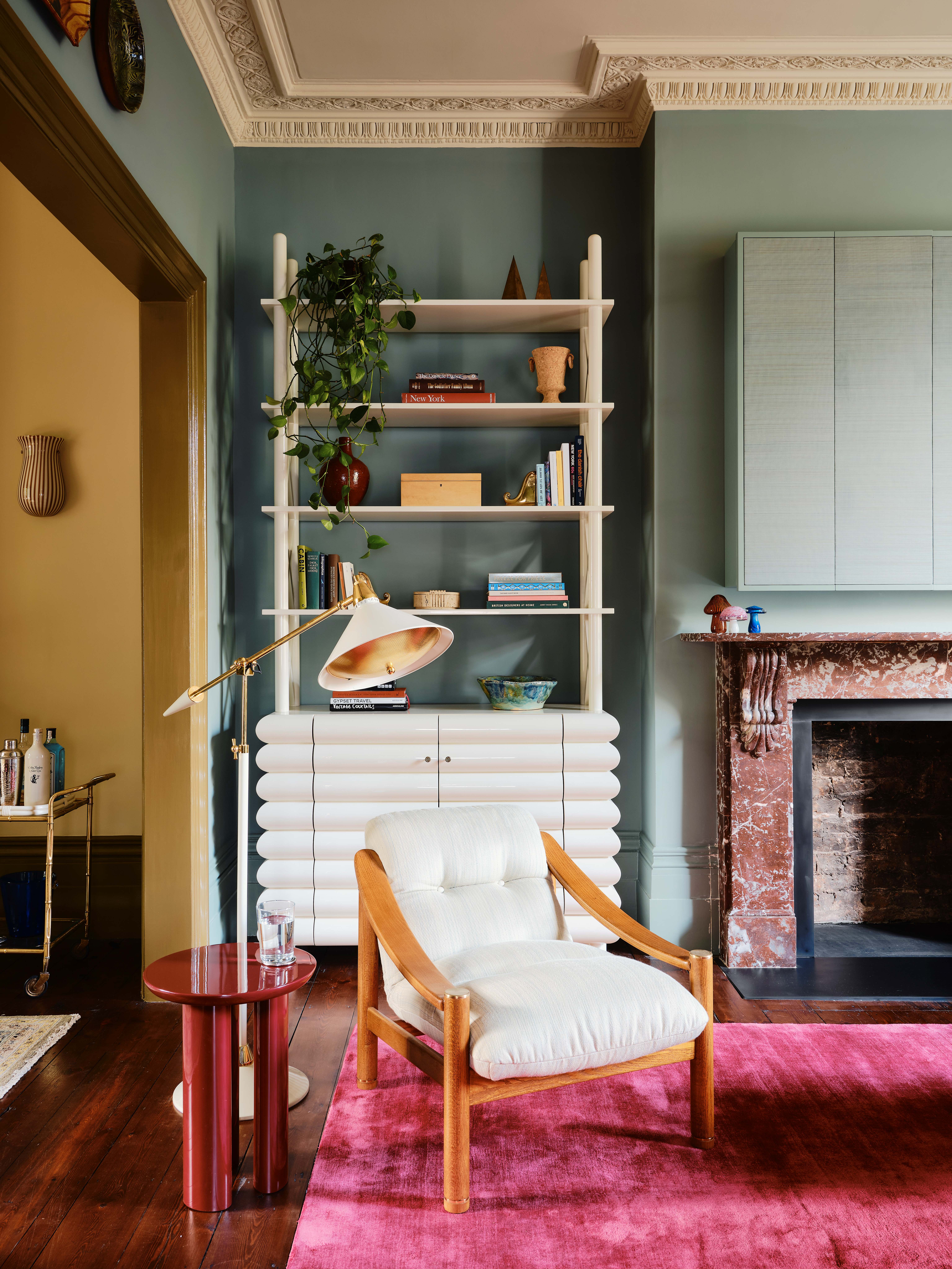
This bold color combination brings out the colorful nature of light blue.
When it comes to colors that go with pink, hot pinks like fuchsia and magenta make a bold pairing with light blue for a dynamic, vibrant aesthetic.
As they're opposite shades on the color wheel, hot pink and light blue are complementary colors that work to balance each other out. The calming nature of light blue dials down the heat of the hot pink for an alluring space that's also full of interest.
The magenta rug in the light blue living room by Studio Duggan above adds a healthy dose of color without overwhelming the space.
4. LIGHT BLUE AND LILAC

Lilac and light blue are quite similar, so it's unexpected that they can actually pair so well.
Light blue and lilac are both cool tones, which allows for a scheme that oozes serenity and relaxation. The pastel hues work together to create a tranquil space in which to relax, making the pairing ideal for bathrooms and bedrooms. They're quite similar tones, so you might not instantly think of light blue as a color that goes with lavender, but this bathroom proves it does.
The lilac Zellige tiles in the bathroom by Imperfect Interiors add interest to the space and "stops the room feeling too perfect", says Beth Dadswell.
5. LIGHT BLUE AND BRONZE
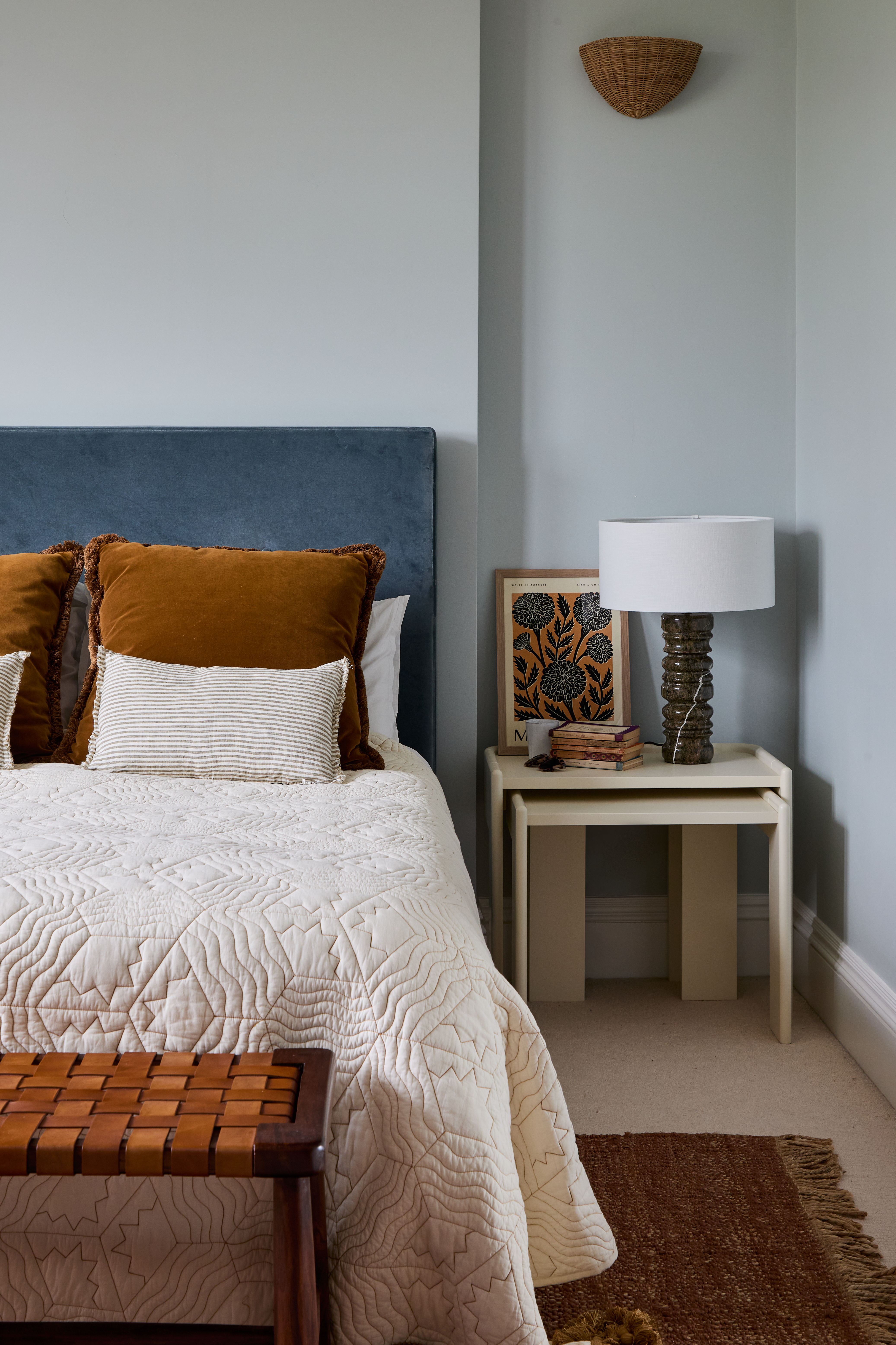
Warm, bronze tones are the perfect foil for a cool color like light blue.
The rich, earthy, saturated hue of bronze makes it a great foil for the cool tones of light blue and works to elevate a space while also adding a touch of warmth.
The cool tone of the light blue bedroom above is tempered by the addition of bronze cushions, and the velvet fabric also offers an upscale and textural element.
"In this project, we wanted to inject warmth to the paler blue guest bedroom, with contrasting textures such as velvet, rattan, leather and marble," says interior designer Beth Dadswell of Imperfect Interiors.
"We stuck to a limited but warm palette of bronze, chocolate browns, toffee and cream in the bedroom, which help the room to feel calm and fresh, but with a nod to coastal colors."
6. LIGHT BLUE AND RED
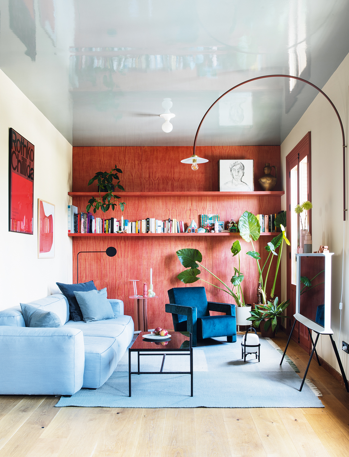
Another warm and cool contrast that feels right for 2025.
Light blue and red has perhaps been the standout color pairing of this year thanks to the 'unexpected red' theory that introduced the idea that, actually, most colors go with red. Sitting on opposite sides of the spectrum, the combination provides a striking contrast and visual impact in a space.
"Nothing beats an allover light blue color palette to create serenity and calm, but keep in mind that the addition of bright red accents can make your space much more interesting," says Brooklyn-based designer Julia Mack, founder of Julia Mack Design. While she recommends introducing textural accents and eye-catching accessories, the living space shown above also proves that committing to the palette with more permanent fixtures also pays off.
7. LIGHT BLUE AND YELLOW
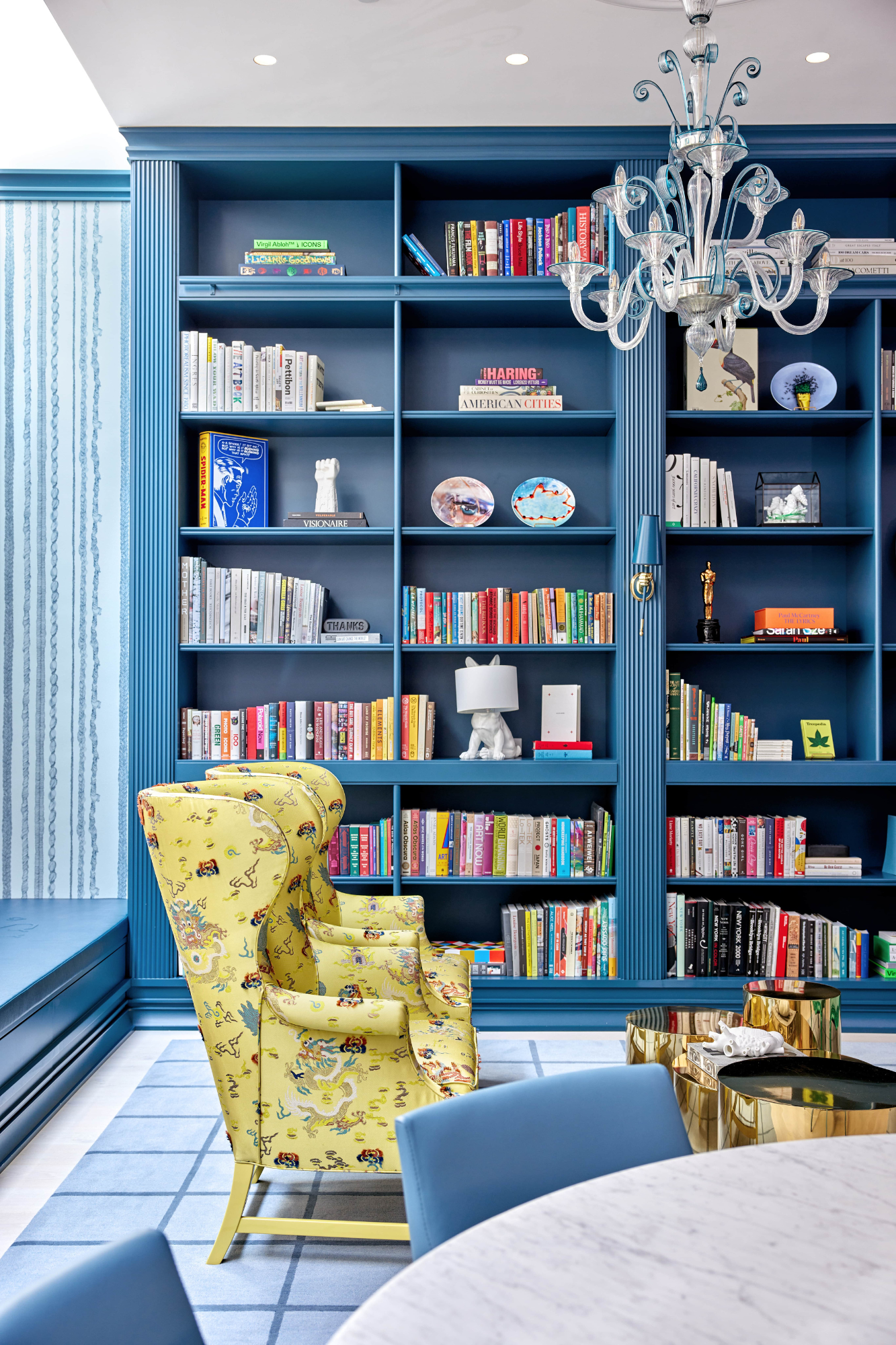
Yellow pops against a light blue backdrop.
Yellow — in all its varying shades — is a tone that goes in and out of style quite often, but when you use it sparingly and carefully, it can inject energy and brightness into a space. "Yellow is a mood enhancer," says Connecticut-based designer Kellie Burke, the founder and principal of Kellie Burke Interiors. "It is energetic, stimulates the appetite, and when paired with other lighter tones can create a visual balance."
Light blue is certainly one of those lighter colors that go with yellow. In fact, it often helps to dial down and ground the, at times, overpowering visual impact of the bright shade.
8. LIGHT BLUE AND MUSTARD
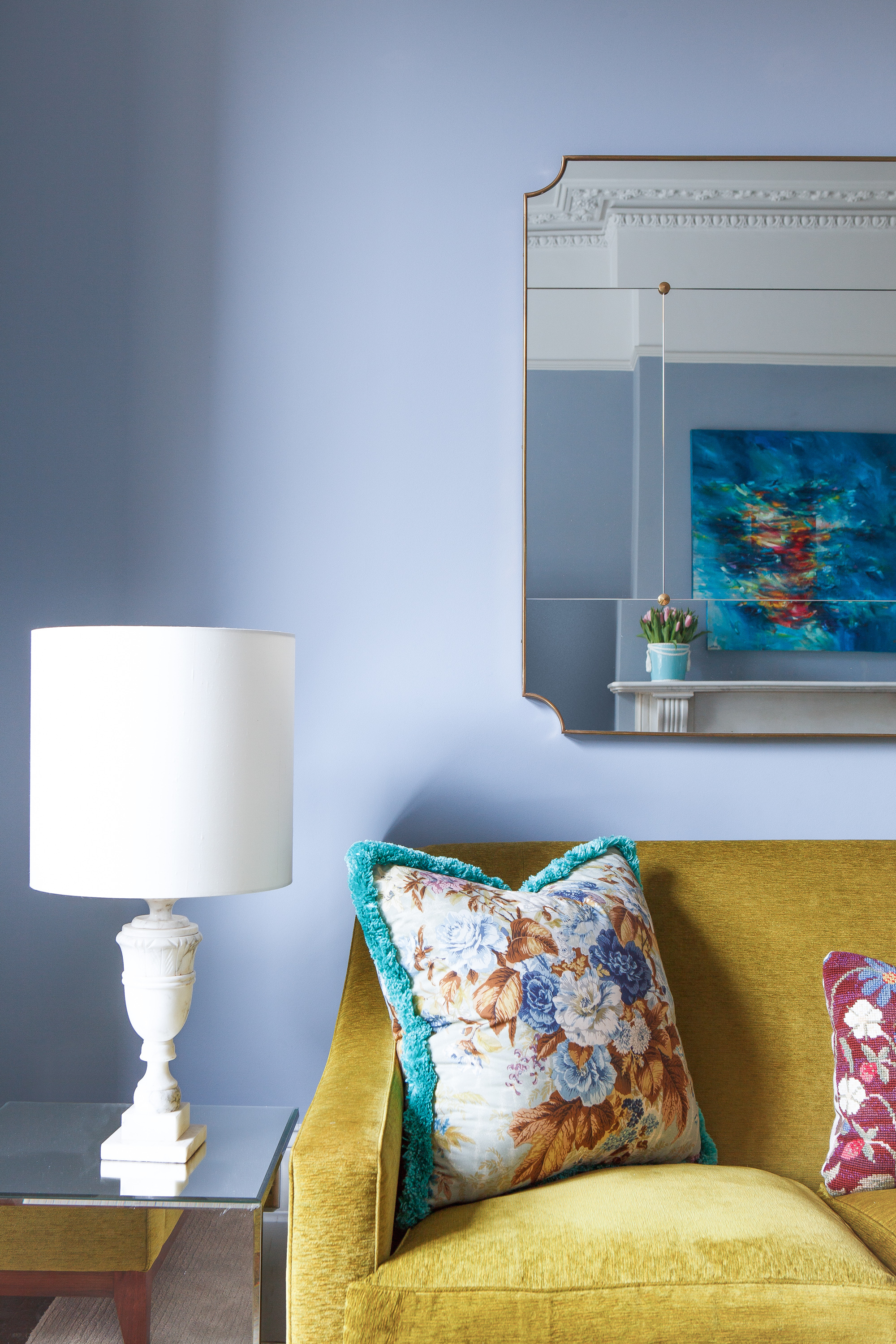
Or how about a richer, more golden yellow tone?
But it's not just soft shades of yellow that go with light blue. When both tones are used in a more saturated form, you can create a vibrant space with plenty of energy. In fact, light blue being a color that goes with mustard yellow has been referenced repeatedly throughout all iterations of design: just look at the work of Van Gogh.
When designing a space, interior designer Natalie Tredgett says she always thinks about "contrasting with complement." In the space shown above, she drew her inspiration from the tones on the pillow, which she "mimicked on the wall in a soft blue, and then contrasted with vibrant yellow furniture." Although, to the eye, these colors stand out against one another, "their tones complement within the space, and therefore make a great pairing," she adds.
9. LIGHT BLUE AND BEIGE
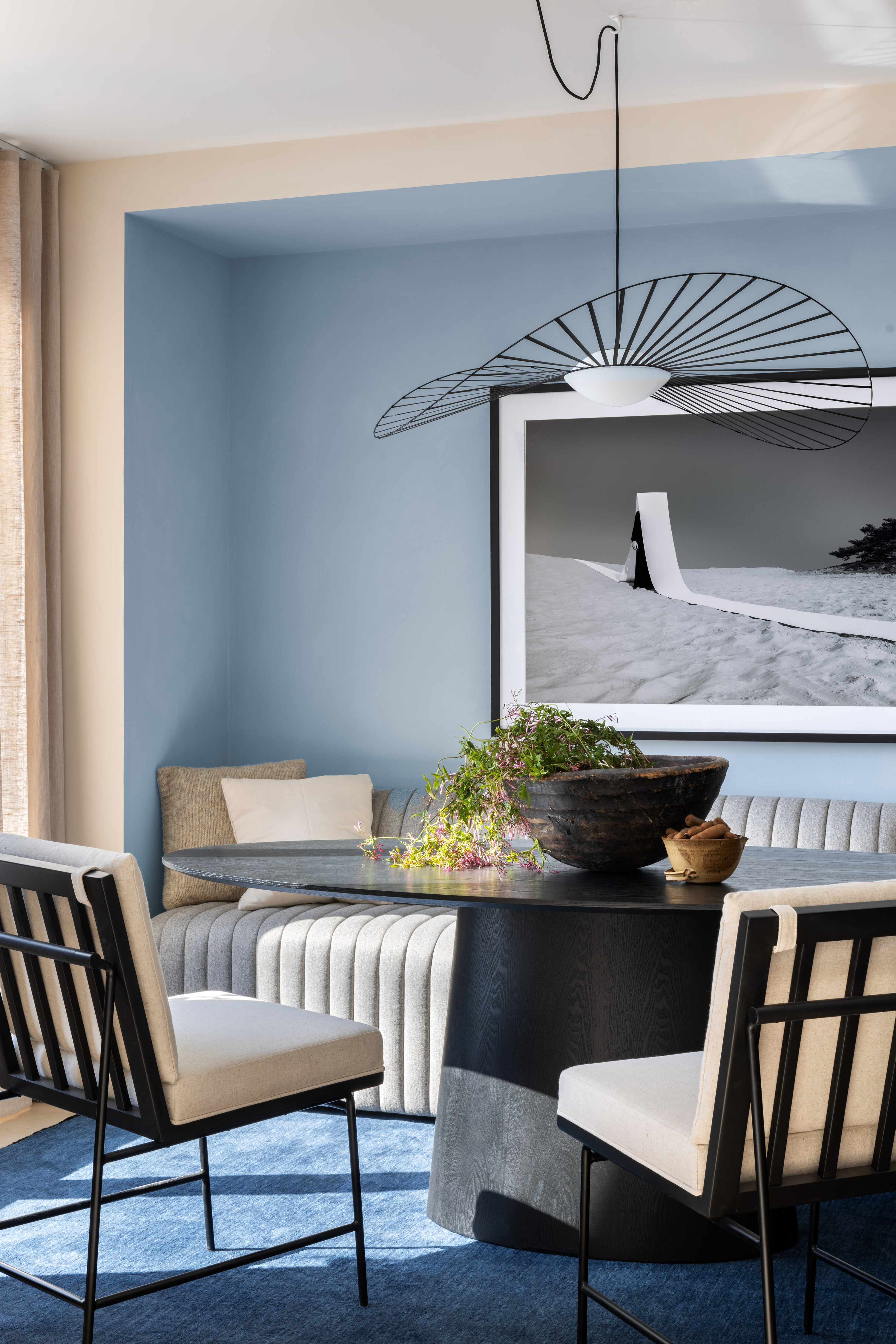
Soft but beautiful balanced, beige works well as a color that goes with light blue.
There are many colors that go with beige, as it's the most warm, inviting, and soothing neutral shade. Colors like light blue, when layered on beige, can help give depth to an interior, create a cocooning effect, or even make space for a third tone to shine.
"Incorporating neutral shades like white, cream, or beige to an interior scheme can create a visual balance with blue," says Ginger Curtis, the founder and CEO of Dallas-based interiors firm, Urbanology Designs. "These neutrals when layered with another soft tone can create a harmonious color palette." Just take the dining space, shown above, as proof.
10. LIGHT BLUE AND WHITE
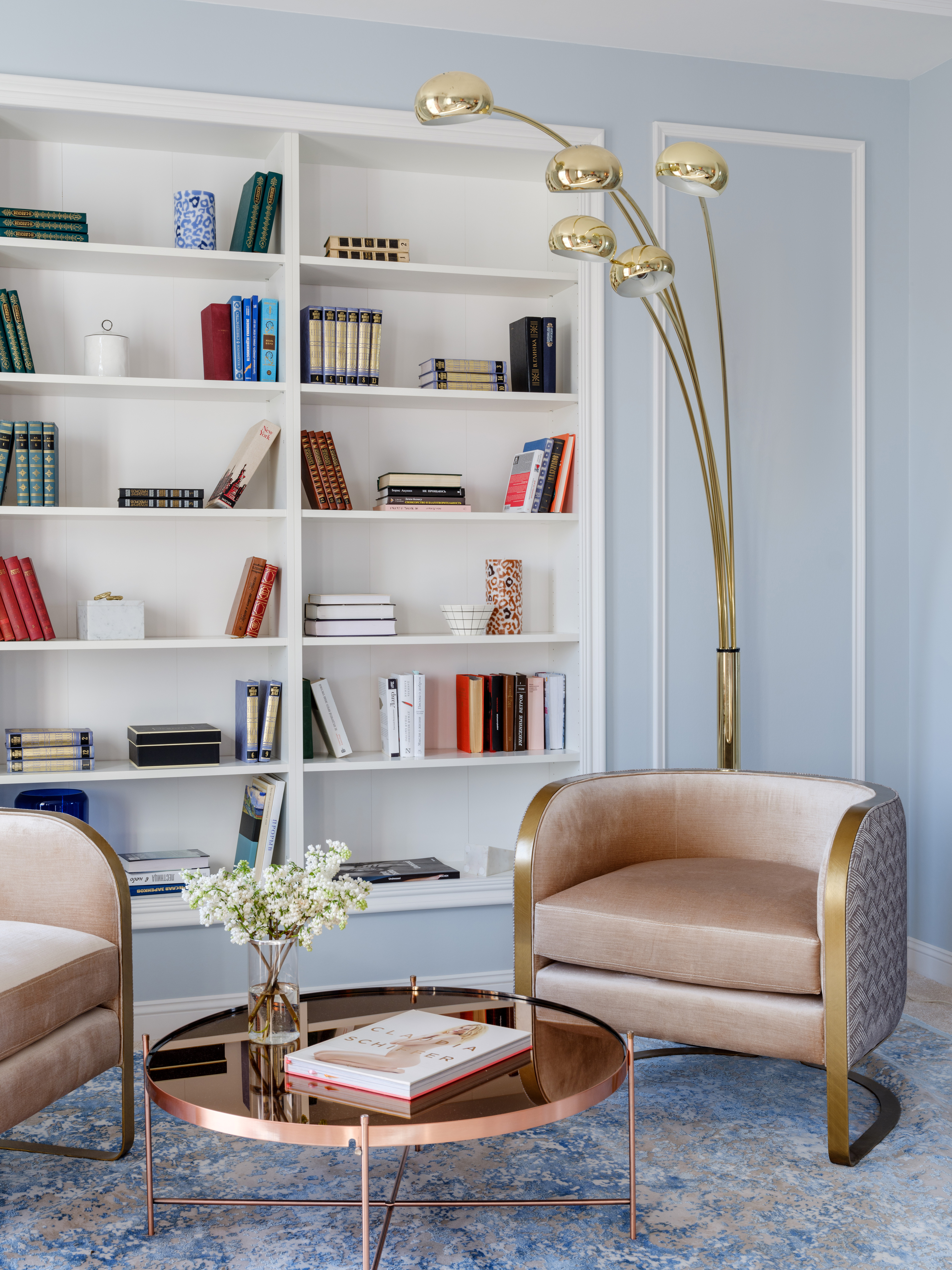
A classic combination for light blue that feels timeless.
Light blue and white is a classic pairing, evocative of seaside schemes and postcards of Grecian islands where white sugar cube villages tumble down to the water's edge. This color associations means light blue and white often come together to create incredibly calming schemes. Plus, decorating with neutrals like white is one of the easiest things to do.
"White and light blue is a match made in heaven," adds Nishita Kamdar, founder of Mumbai architecture firm Studio Nishita Kamdar. "The soft pastel shades work very well for beach-side holiday homes or even warm colonial-style homes in the mountains. With interesting contrasting black styling elements, and hints of gold and silver, you can make the combination work very well."
11. LIGHT BLUE AND BROWN
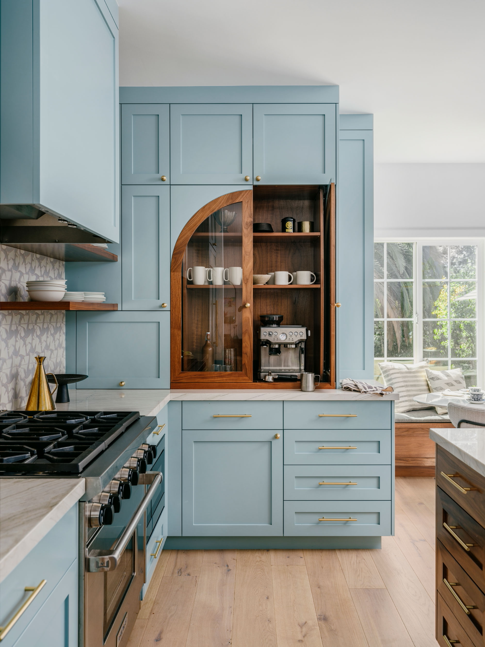
Wood tones bring the warmth to pale blue colors.
Pale and baby blue shades work beautifully when juxtaposed against tan, taupe or dark wood tones. While there are many colors that go with brown, it particularly complements blue, as the hues sit opposite each other on the color wheel.
"Light blue harmonizes elegantly with subtly muted brown shades that carry a delicate gray undertone," says Kashi Shikunova, director at Yam Studios. "The gray adds some coolness, which helps to create a balanced composition with the light blue."
12. LIGHT BLUE AND DUSTY PINK
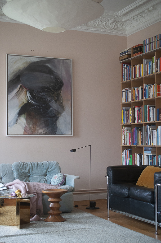
These two paler shades work together harmoniously.
While considered to be one of the most controversial color pairings due to their tendency towards more childish schemes, baby blue is, in fact, one of the colors that go with pink, even in its lighter shades. Although very different hues, they complement one another as the pink warms up the coolness of the blue, while the blue prevents the pink from becoming too vibrant or overpowering in a scheme.
"I love pairing something in the pink family, like raspberry or blush," says New York-based designer Jennifer Hunter, when asked what colors go with light blue. "It adds a pop and fun accent. Light blue evokes a sense of calmness and zen when paired with pink."
13. LIGHT BLUE AND SOFT GREEN
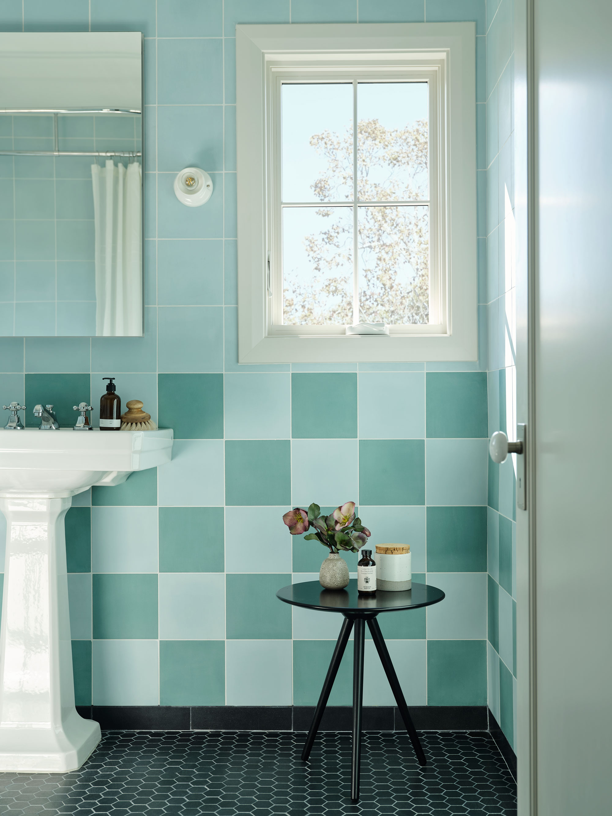
Do blue and green go together? In this context, yes.
The idea that blue and green should never been seen is an age-old adage, but their contrasting nature can make green an interesting color to pair with baby blues (even if they may be clashing colors on the color wheel). Both shades have strong associations with nature, and therefore can complement one another and create incredibly soothing schemes.
"Colors that go together in nature are great to study," says designer Amy Lau, who recommends building palettes for your home around colors that naturally occur together outside.
14. LIGHT BLUE AND BLACK
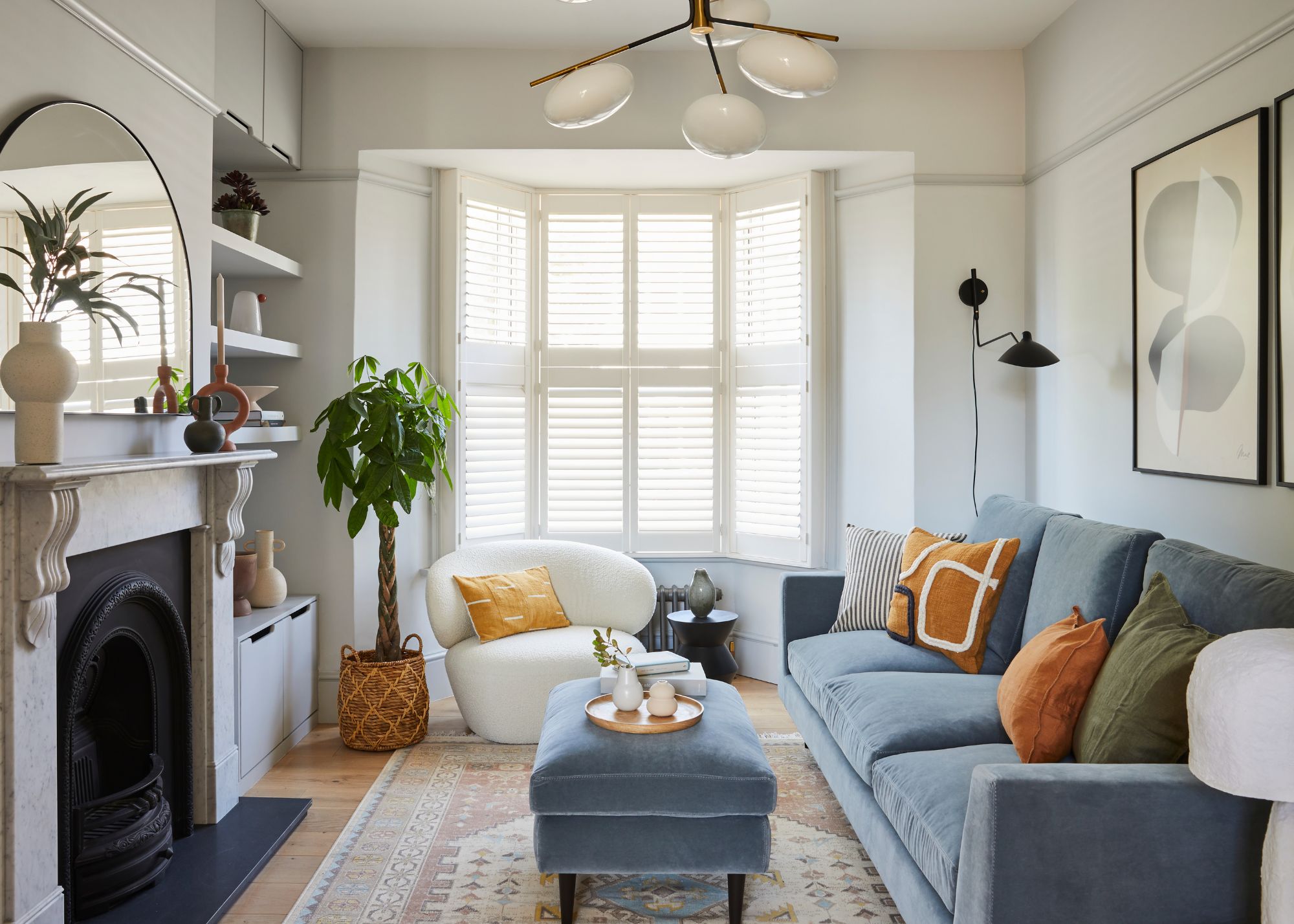
Though a harsh contrast, black makes an interesting color to pair with light blue.
For a more dramatic contrast when choosing colors that go with light blue, you could always consider black. Since both tones act as neutrals, together they can create a pleasing monochrome color scheme.
"This could be a tricky color combination if not done in the right proportions," says Nishita Kamdar. "If you have a light blue room, black styling elements work well, be it candle stands, votives, coffee table books, or your choice of pendant. I would also introduce an element of green, like plants, to cut the high contrast."
15. LIGHT BLUE AND GRAY
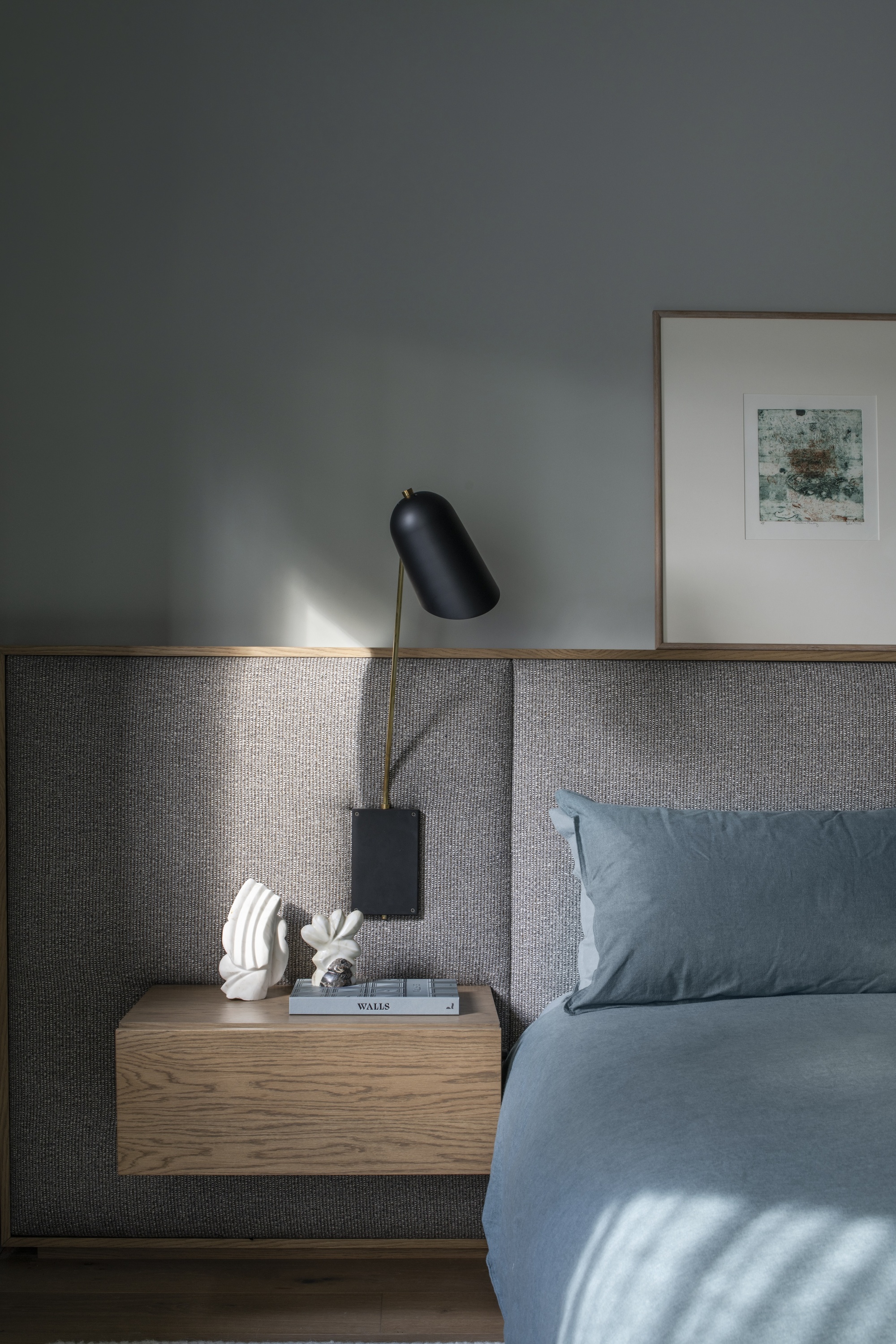
Gray makes for an easy, calm colors that goes with light blue.
Light blue is amongst the many colors that go with light gray. The two offset each other perfectly, and can create an interior scheme that feels light, open, and breezy. "It's a quintessential neutral color," says Amy Krane, an architectural color consultant and the founder of Amy Krane Color. "A true neutral works well with almost every color in the physical world and it also lacks colorfulness. Together, these two attributes make light gray and light blue the perfect color companions."
When it comes to our homes, gray is most commonly incorporated through our choice of tiles or stone finishes, like the backsplash above that features a gray-veined marble, which is why you so often see light blue kitchens and bathrooms.
16. LIGHT BLUE AND TAUPE
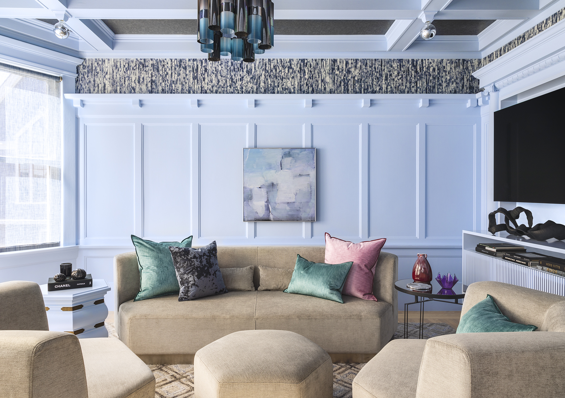
Darker than beige, this combination packs more punch.
Taupe is a popular earthy hue and one of the top neutral paints to pair with a light blue interior. The shade comes in an number of different hues as well, which can help inspire countless decorating schemes.
"Depending on the temperature of the blue, you can add cold or warm accents, or both, to a room," says designer Kevin Sawyers of North Carolina-based Sawyers Design. In the living room shown above, "The light blue of the walls has a touch of red which makes it work with the rose and taupe accents, whereas the teal accents relate to the blue in the paint."
17. LIGHT BLUE AND ORANGE
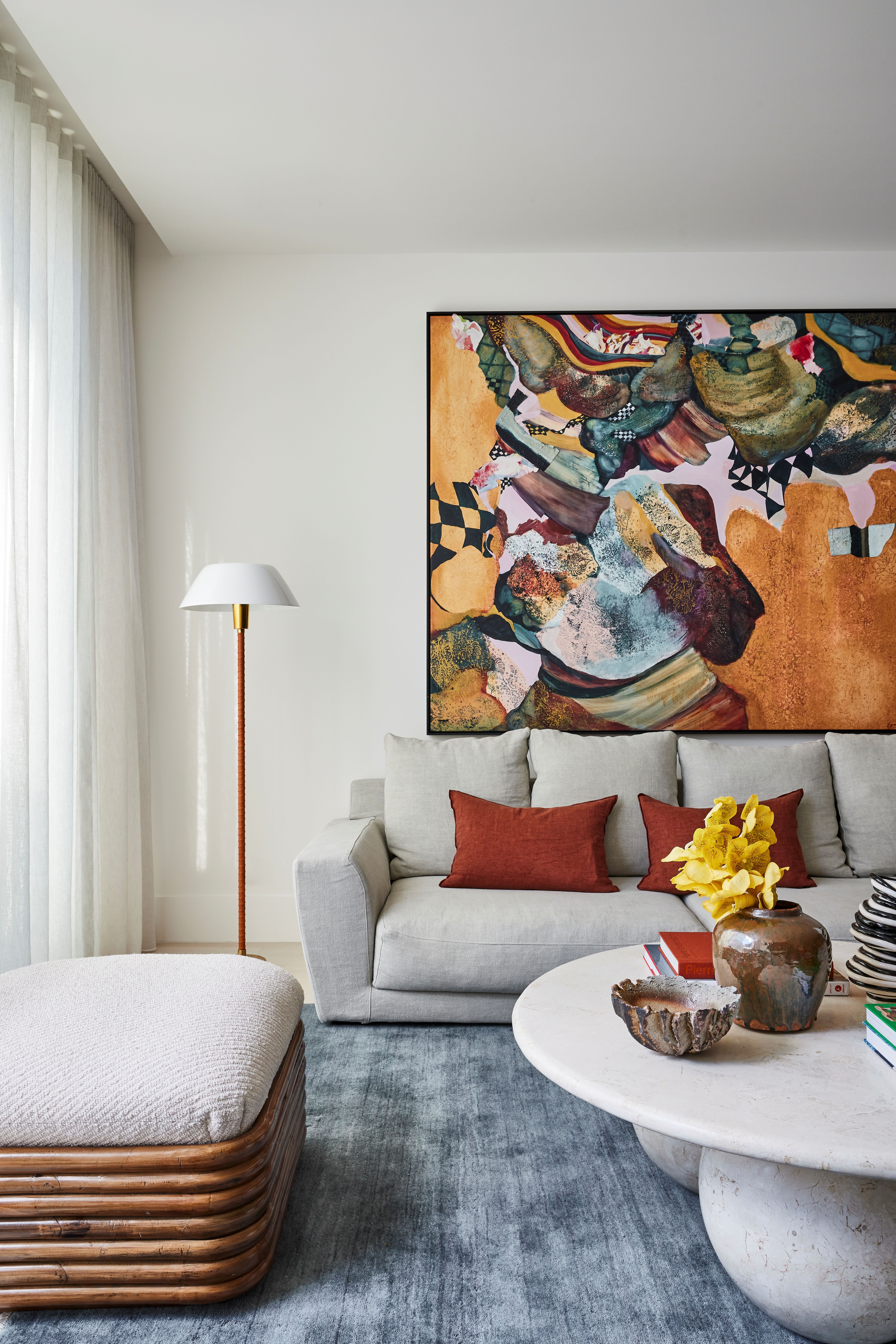
Light blue and orange are complementary colors, so can work in the right combination.
According to color theory, blue and orange are complementary shades on the color wheel, which explains why blue is a color that goes with orange in all its varying hues. Using a lighter blue with a more subtle shade of orange helps to balance your space — the orange warms up the cooler tones of the light blue, while the light blue provides a more neutral base for the orange.
"When choosing which shades of orange to pair with light blue, referring back to the color wheel can give you all the clues you need," says Livingetc's news writer (and a trained artist) Olivia Wolfe. "If your blue has subtle undertones of green, then I would recommend a shade of orange that leaves slightly in the red zone. If your blue has a hint of purple, then a more golden orange would make a lovely complement."
18. LIGHT BLUE AND OTHER BLUES
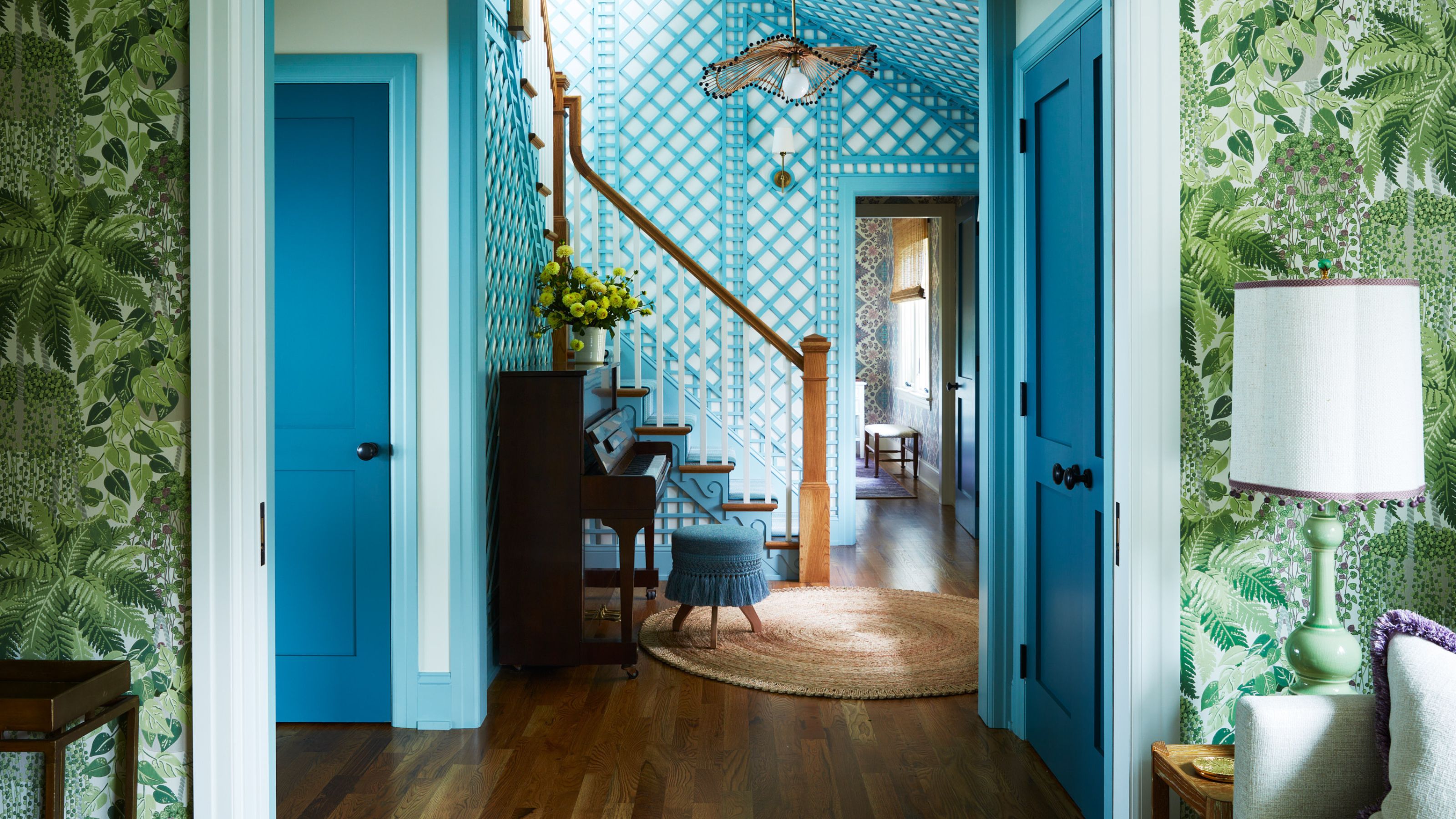
Tonal light blues are always going to work.
One of the best things about colors is how many different shades they come in. When thinking about pairings, you'd be remiss not to first consider layering different hues from the same color family together — it's a particularly fool-proof way of finding shades that will complement one another. .
In the living space above, light blue walls have been accented with panels of patterned wallpaper in a deeper blue shade, while furnishings in others blues — including teal and cobalt blue — further punctuate the space, giving it both depth and interest, even though it features just one 'color'.
FAQs
What are similar colors to light blue?
While technically different shades, light blue is also often referred to as pale blue, pastel blue, sky blue, baby blue and soft blue. When thinking of complementary colors to pair with all of these colors, the shades we've shared above can realistically be applied across all of them.
What is the best way to use light blue in your home?
One of the best ways to use light blue in your home may actually surprise you: it's on your trims and woodwork. Window and door frames become a feature when painted in light blue, and can make an otherwise neutral room feel more dramatic without being overpowering.
Also, consider going monochromatic with your light blue paint colors, covering your entire space in them. Take it across your ceiling and skirting boards to create an enveloping feel, that's still warm even though you're using a cooler toned color.
Light blue is a much more versatile color than we generally give it credit for. In fact, Patrick O'Donnell, a color expert and brand ambassador for Farrow & Ball, says he has painted light blue walls in most of the homes he has lived in, citing it as a shade that's "fun to play with" in the home.
Emma is the Interiors Editor at Livingetc. She formerly worked on Homes To Love, writing about all things design for some of Australia’s top interior publications, including Australian House & Garden and Belle. Before that, she produced content for CULTIVER, where she found an appreciation for filling your home with high-quality, beautiful things. At Livingetc, Emma explores the big design questions — from styling to colors, interior trends, and home tours. She’s travelled to Copenhagen for 3daysofdesign, to Paris for Déco Off and Maison&Objet, and has attended design events in London, including WOW!house and Clerkenwell Design Week. Outside of work, you’ll find her elbow-deep at an antique store, moving her sofa for the 70th time, or mentally renovating every room she walks into.