How Interior Designers Decorate with Jewel Tones in 2026 to Make a Home Look More Expensive, While Avoiding Potentially Tacky Color Schemes
If there’s one set of vivid colors that can be considered truly timeless, it has to be the jewel tones

The Livingetc newsletters are your inside source for what’s shaping interiors now - and what’s next. Discover trend forecasts, smart style ideas, and curated shopping inspiration that brings design to life. Subscribe today and stay ahead of the curve.
You are now subscribed
Your newsletter sign-up was successful
Dawn directly from some of the earth’s oldest creations — rare prizes hidden deep within the planet’s depths — jewel hues give us some of our richest and most brilliant nature-found colors. Luminous emerald, smoldering ruby, oceanic turquoise, honeyed topaz; the palette is a treasure chest of shades that are intense, yet have an alluring dimensionality. Each color carries an organic strength, conveying a this-is-what-I-want-and-I-don’t-care-what-you’re-doing confidence.
In the home, decorating with jewel tones embodies a regal opulence, bringing refinement without an ostentatious aftertaste. These concentrated hues take us back to the history books; the gowns of queens, the crowns of princesses, fluttering heraldic banners, sunlit stained glass, the velvet upholstery of palatial saloons, and the draped silks of cavernous bed chambers. Jewel tones are embedded in our psyche as shades befitting the absolute best.
These dazzling hues have the innate ability to weather the storm of fleeting color trends — well, they do come from stones that merely shrug at the passing of ages. Want that enduring, expensive-looking, full-bodied drama in your home? Here’s how designers make it work.
Article continues below1. Turquoise
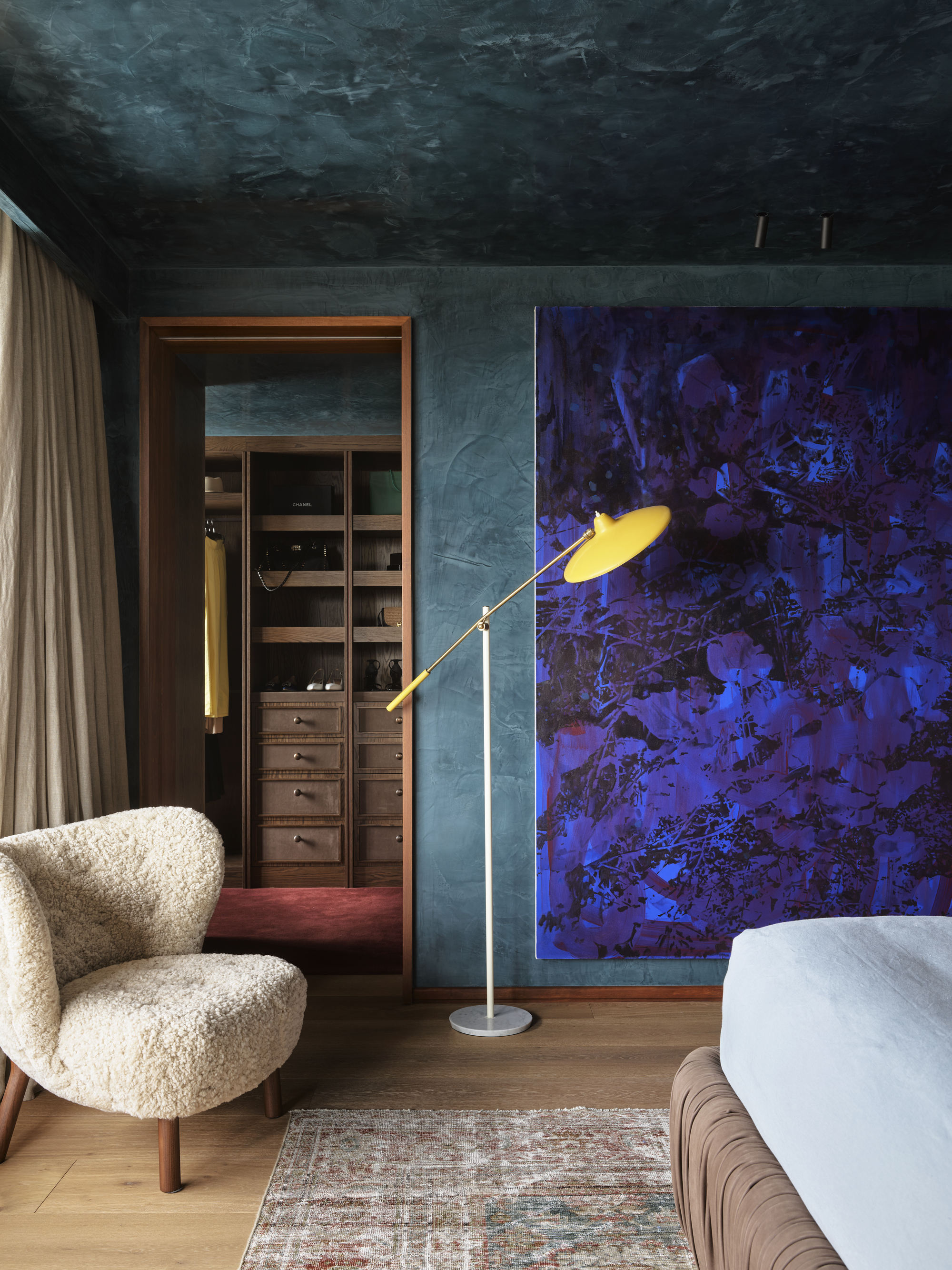
"Balance the shade with warm materials — timber, brass, textiles, vintage rugs — to prevent the turquoise from feeling cold or austere," says David Flack.
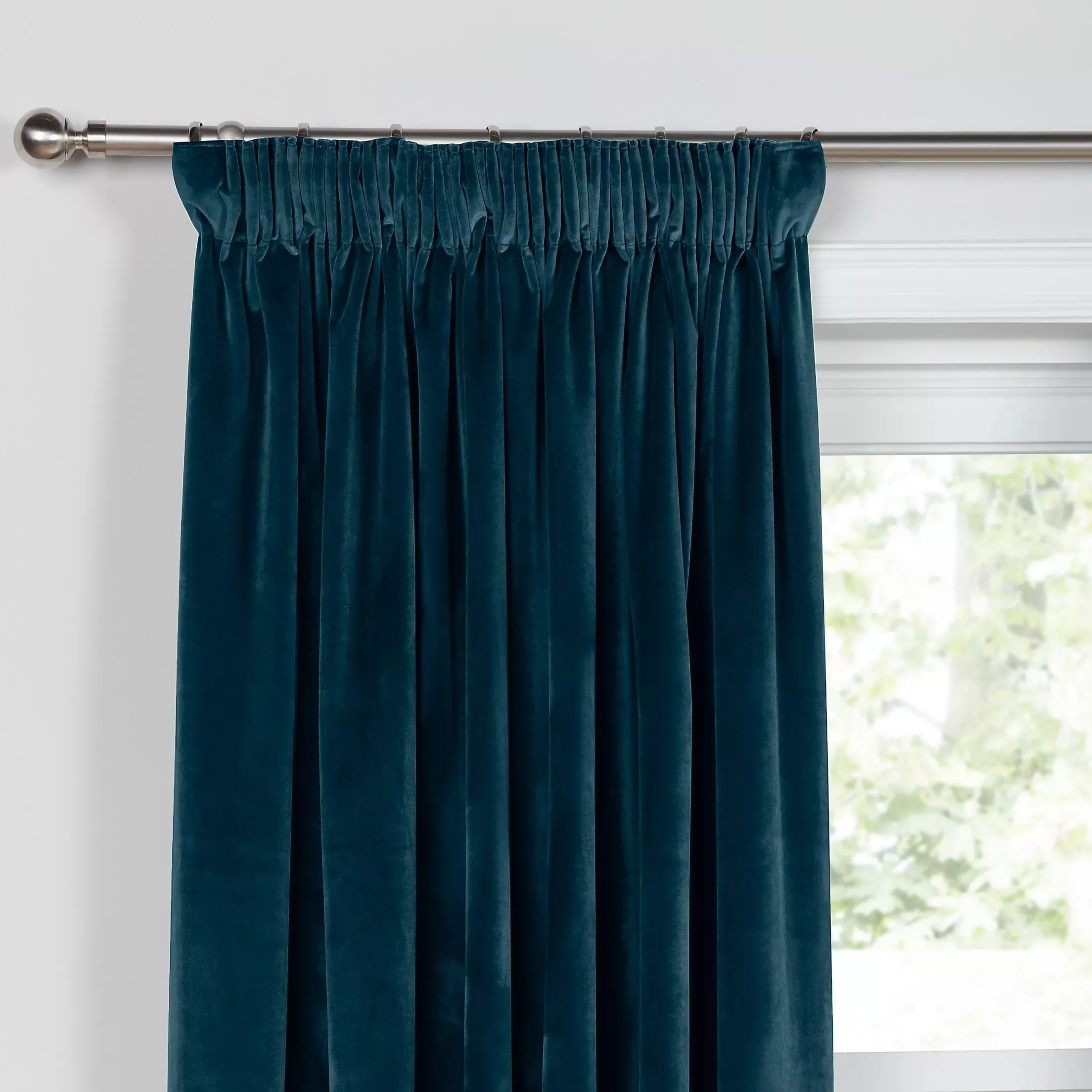
Turquoise stones have been beloved by cultures spanning from the Native Americans to the Ancient Egyptians. The color is a blue-green that can journey through pale aqua to bold teal, evoking the immersive radiance of glimmering seas and bottomless lagoons, along with a sense of refreshment.
In the home, decorating with jewel tones like turquoise creates rooms that feel enveloping and luxurious, as well as bring a watery sense of serenity. "Turquoise feels cocooning and intimate," David Flack, founder of Flack Studio, explains. "The color wraps around you rather than pushing you away. It has a restful, meditative quality, slowing you down and making you breathe deeper."
As for how to use it, think color drenching. "Don't be afraid to commit fully and saturate the entire room, including the ceiling," he says. Infused with the luster and complexity of gemstones, jewel colors draw the eye into shimmering layers of complexity. "Jewel tones possess depth that flat colors can't achieve," says David. "They're saturated but not garish, they’re rich but not overwhelming, and create atmosphere rather than just a backdrop."
"What sets them apart is how they shift with light," he continues. "A jewel-toned room at dawn feels completely different from the same space at dusk, and that transformation creates emotional resonance throughout the day."
The Livingetc newsletters are your inside source for what’s shaping interiors now - and what’s next. Discover trend forecasts, smart style ideas, and curated shopping inspiration that brings design to life. Subscribe today and stay ahead of the curve.
2. Topaz
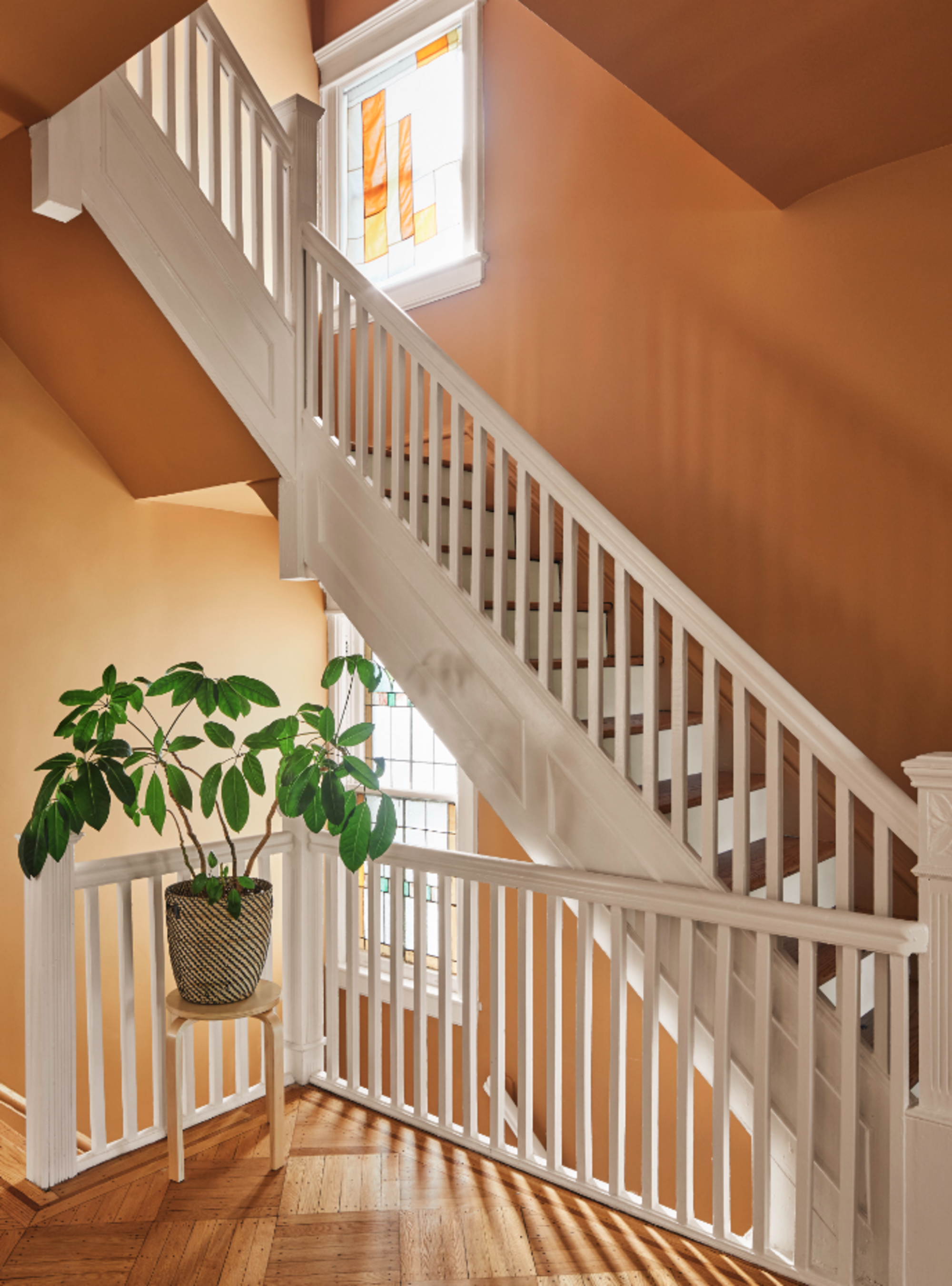
"It makes people want to linger," says Lindsey Wikstrom, on decorating with jewel tones like topaz.
Like melted gold shirred into liquified diamond, topaz spans sunny yellows and honeyed ochres. Echoing burnished gold with none of the harsh metallics, it has an internal glow that brings peaceful warmth into even the darkest of spaces.
"Topaz’s ochre hues feel both fresh and historic," says architect Lindsey Wikstrom, founding principal of Mattaforma. "It sits at the intersection of warmth and depth, creating a sense of being held, and is saturated enough to feel intentional. The mood it creates is quietly potent: grounding and energizing at once."
Plus, it layers surprisingly well in a space. "It doesn't fight with natural materials like wood, stone, and linen — it draws them into conversation, because it speaks the same material language," she adds. "It carries yellow's luminosity without its sharpness, so it responds generously to changing light throughout the day, feeling energizing in the morning and sheltering by evening."
Decorating with jewel tones shouldn't be reserved for mere decorations — they converse with the materials and moods of a room, and find success in their boldness as advancing colors. "Jewel colors carry depth that amplifies both natural and artificial light throughout the day, creating a welcoming blanket effect around a space," Lindsey explains. "Unlike pastels or neutrals, which tend to recede, jewel tones actively participate in a room, creating a sense of belonging without being oppressive and dramatizing everyday life."
3. Garnet
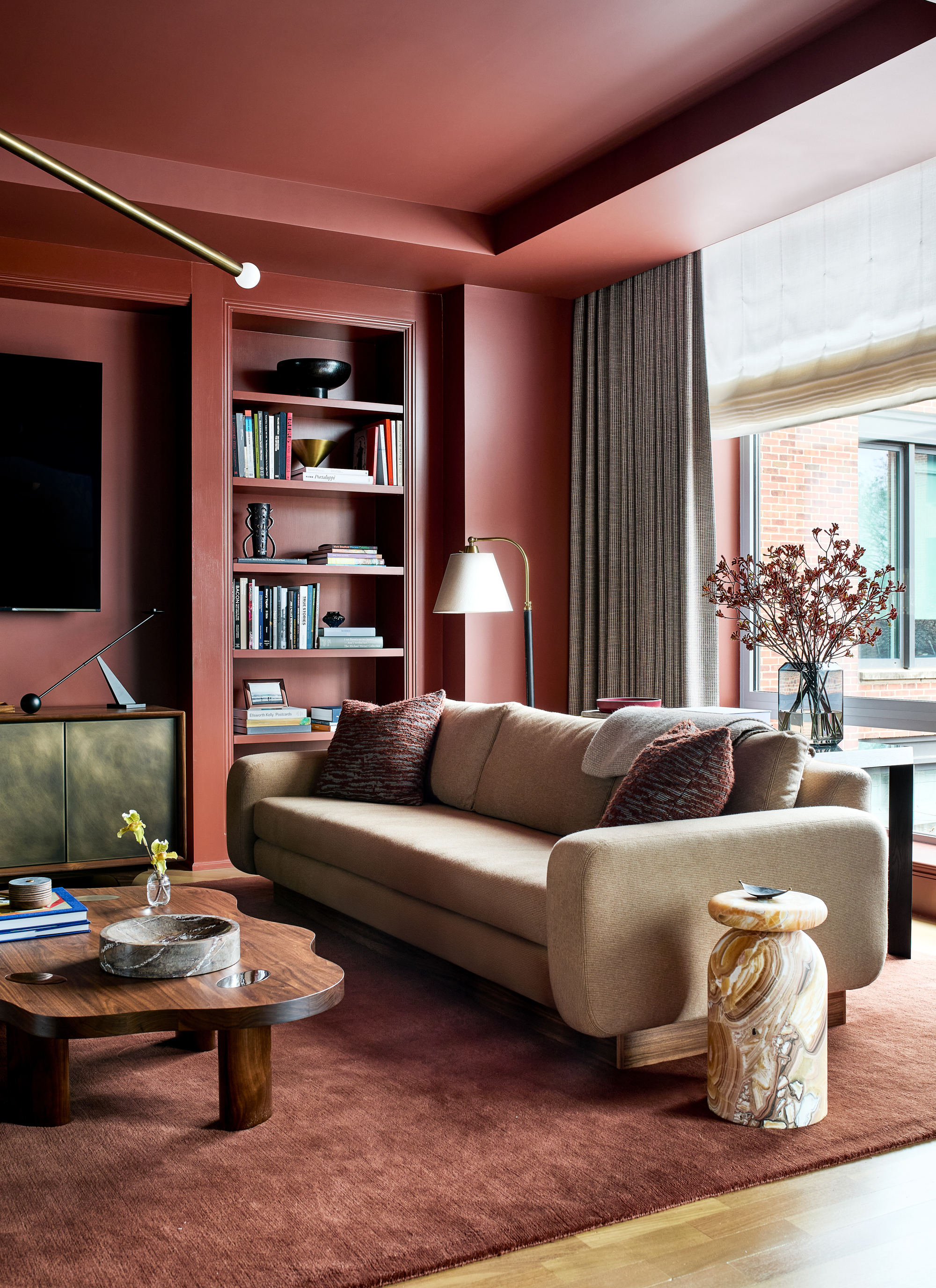
"Jewel colors have a richness that instantly elevates a space — they carry depth, saturation, and a kind of emotional resonance," says Zoë Feldman.
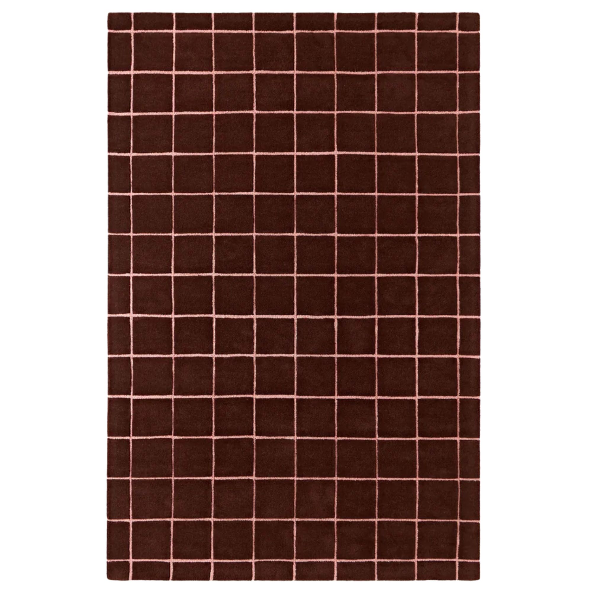
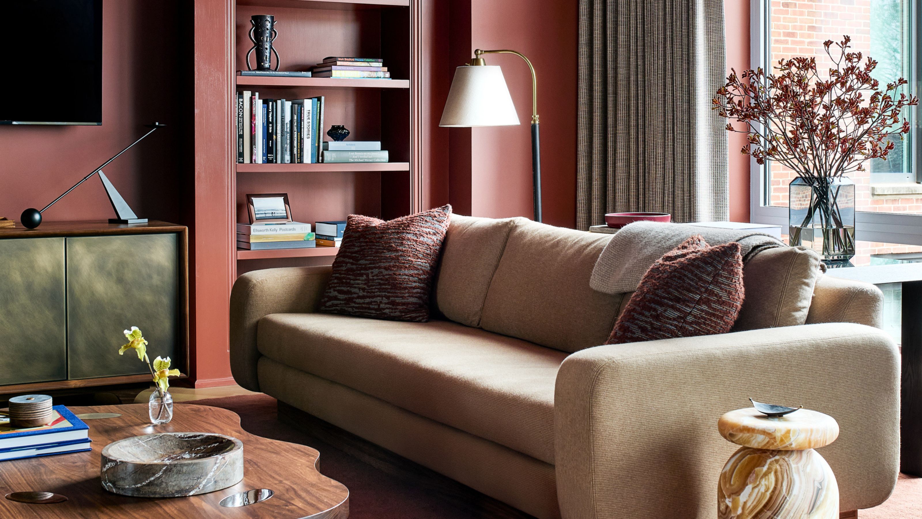
Dense and velvety, garnet can have hints of brown and lean from ruby red to maroon or burgundy. It tells stories of passion, grandeur, and power, with a commanding presence that fearlessly proclaims, ‘I am here, so here is the only place to be’.
"Garnet has an incredible ability to anchor a space," explains Zoë Feldman, founder and principal of Zoë Feldman Design. "It creates a mood that’s warm, enveloping, and transportive. There’s a sense of comfort, but also a tension that makes the space feel considered and memorable."
There’s just no point tiptoeing around it — the sumptuousness and theatre of garnet demand pure scale. "The key is commitment. Garnet works best when it’s given space to breathe and used expansively rather than as a small accent," Zoë advises. "Layer it with complementary textures and tones like creamy neutrals, aged woods, and even unexpected patterns to keep the room from feeling flat."
"Decorating with jewel tones can feel both bold and timeless at once," says Zoë. "There’s a grounding quality to them which gives it sophistication rather than pure intensity."
4. Sapphire
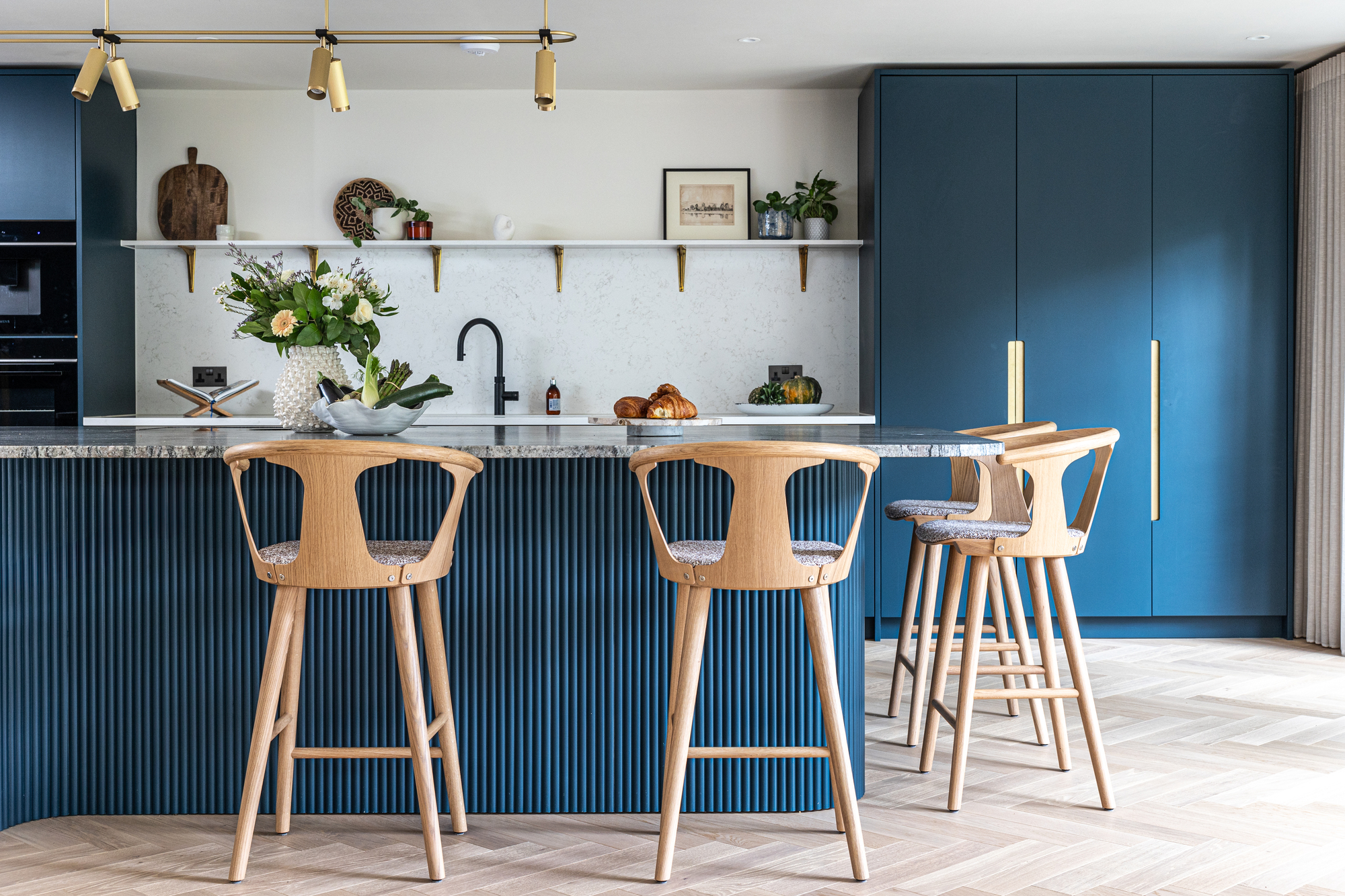
"Sapphire works best when treated as a confident anchor within a softer, balanced palette, creating a space that feels both luxurious and effortlessly livable," says Susie Pfeiffer.
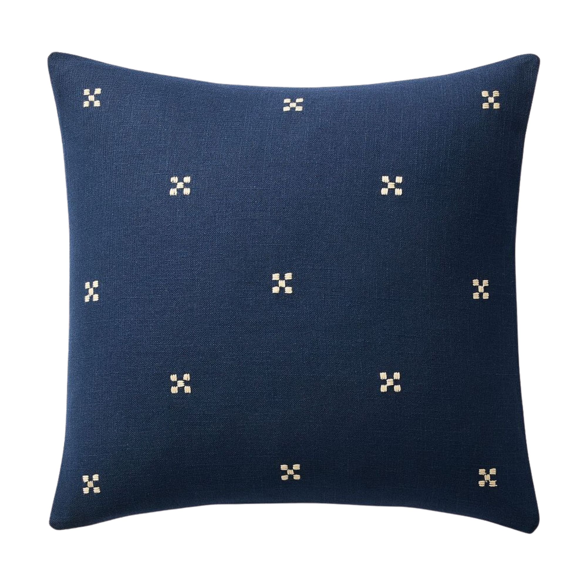
Like the far-down reaches of the sea captured and held up to sparkle in the light, Sapphire is gloriously resonant. A vibrant blue which can span from the royal to the (almost) navy, it combines calmness with weight and introspection, in the home becoming all-encompassing while also inspiring visions of wide watery expanses.
"Inky sapphire is calm, quietly luxurious, and confident," says Susie Pfeiffer, director and founder of Pfeiffer Design. "The hue is deliberate rather than trend-led, creating a lived-in atmosphere while remaining elegant, elevated, and enduring."
Sapphire’s blue density lends itself to interiors that favor clarity over excess. "To incorporate sapphire into the home, balance is essential. Pair it with natural textures to ground it and prevent it from feeling overly dramatic, and keep the surrounding finishes relatively restrained, allowing the sapphire to act as the focal point," says Susie.
Outside of balance in the interior design, "incorporate small tonal echoes elsewhere — perhaps through accessories, upholstery, or artwork — to help the scheme feel cohesive without becoming overly coordinated," she adds.
5. Amethyst
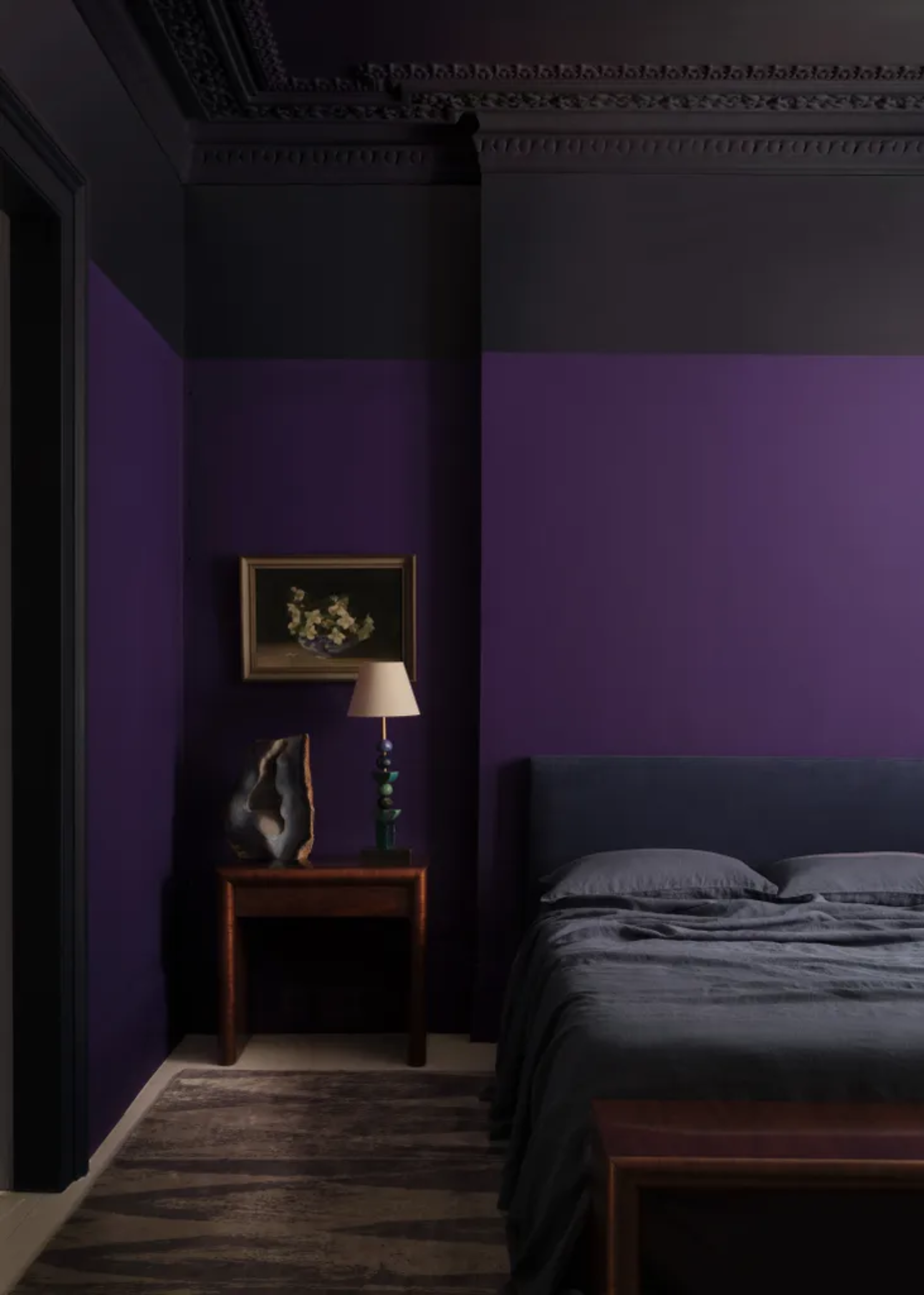
In this bedroom, the walls are painted in Paint & Paper Library's 'Purple Azurite', and the upper wall and ceiling in 'Plimsoll'.
Decorating with purple is a bit like Marmite these days — it’s either for you or it really, really isn’t. If it is, try a splash of amethyst, a blue-based purple with a little smoky gray to it, which is cool as well as wonderfully rich. Unconventional and unexpected, it has a reflective, thoughtful quality that adds an air of mystery and atmosphere without constantly demanding attention.
"Amythyst purples add drama and intrigue to a space," agrees Andy Greenall, head of design at Paint & Paper Library (which actually has a capsule paint color collection inspired by jewels). "It's very easy to be seduced by the idea of jewel-like purple," he adds.
When it comes to decorating with a strong purple like this, Andy recommends darker shades, not lighter ones. "Paint & Paper Library’s luxuriant ‘Purple Azurite’ with the dark ‘Plimsol’ blue delivers an impactful yet tonal scheme that will feel both sumptuous and soothing," he says. "Bringing in another color will give you a much more balanced palette than pairing deep purple with white or pale gray."
For anyone hesitant about decorating with saturated color, "opting to use deep, jewel tone colors in the smallest room in the house is a fantastic way to incorporate them without feeling overwhelming," Andy says. "Although they are bold, they work particularly well in small spaces."
Decorating with jewel tones isn't like working with other colors — they give a space gravitas and a sense of longevity. These are the shades that remind us that intense, soul-searing color at its richest and most elemental has long had a place in the world and is something to be lived alongside as a constant, not a momentary flourish.
For a more literal approach to adding a jewel-like quality to your interiors, take a look at this designer's 'Jewelachite' paint trick DIY.
And for more color inspiration, be sure to subscribe to Livingetc's newsletter.
Amy Moorea Wong is a color authority and contemporary interior design writer who has specialized in all things decorating for over a decade. Amy is Livingetc magazine’s Colour Expert, Interiors Editor at The Glossary magazine and a Contributing Editor at Homes & Gardens magazine, and she frequently contributes to an array of global publications to share her insights on interior design zeitgeist. Her book Kaleidoscope: Modern Homes in Every Colour explores a collection of cool colorful homes fizzing with creativity, surprises, and inspiration.


