How to use clashing colors – explore these bold palette ideas from interior designers
Interior designers explain how clashing colors can be embraced for a bold and energising scheme

The Livingetc newsletters are your inside source for what’s shaping interiors now - and what’s next. Discover trend forecasts, smart style ideas, and curated shopping inspiration that brings design to life. Subscribe today and stay ahead of the curve.
You are now subscribed
Your newsletter sign-up was successful
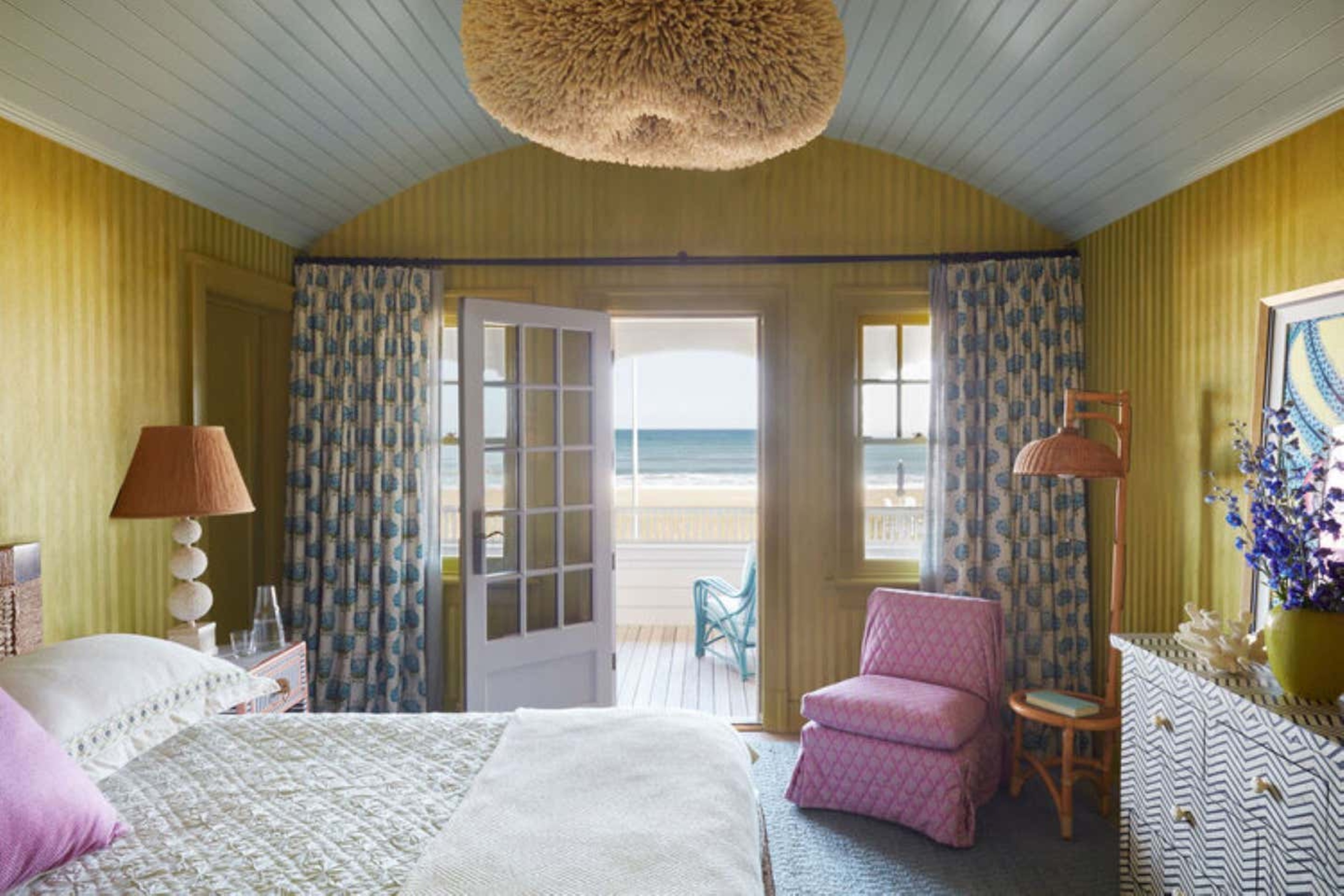
Using clashing colors as part of your interior scheme can be hard to master, but get it right and your interiors will pop.
While color theory rules imply that clashing colors should be avoided, they can add a certain boldness and element of fun to a scheme and can go a long way to bring energy to a room.
'Colour clashing adds a fun, uplifting backdrop to an interior space,' says Emma Bestley, co-founder at paint brand, YesColours. 'You can either choose to make a statement with rich bold colors or tone it down a little with a softer tonal palette. Color blocking is regularly seen in fashion and the same creative twist can be applied to your home.'
Article continues belowRead on to discover our favorite examples of color clashing and bold and unexpected color combinations to try at home for yourself.
How to use clashing colors in the home
Clashing can be provocative but also demonstrate originality in a scheme. When picking your clashing combination, Emma Bestley of YesColours advises studying the color wheel. 'Look at theory and assess the complementary colors, for example, yellow and purple, blue and orange, red and green. This is an effective way of providing inspiration for a color clash, but you are safe in the knowledge that scientifically, these colors go together.'
To get the color clashing spot on, think about adopting the 60-30-10 rule, advises Martin Waller of Andrew Martin. 'Contrasting interior elements such as plain fled walls with vibrant patterned wallpaper or bright shades produce harmonious diversity and pace in a room. Selecting a dominant color acts as the foundation of your room, so it's key to get this right.'
The secondary color adds contrast to the room. 'Take one piece, whether it be your favorite cushion or singular flick of color in a painting on your wall and play around with materials and color,' he says.
The Livingetc newsletters are your inside source for what’s shaping interiors now - and what’s next. Discover trend forecasts, smart style ideas, and curated shopping inspiration that brings design to life. Subscribe today and stay ahead of the curve.
If you are considering adopting color clashing in your interiors, think about the intensity of the tone. Contrasting colors work well when the intensity is the same level – like a vibrant yellow with a similarly bright purple shade.
Another aspect to think of in the rules of color clashing is undertones. 'You can use colors that are traditionally seen as clashing by experimenting with the tones of the colors,' says Candy Murray of Soho Home. 'Pink and orange can absolutely work together if the tones are similar.' Mixing colors with warm undertones with colors with cool undertones create contrast too. Red and green is a great example of this mixture in action.
1. Orange and mint green
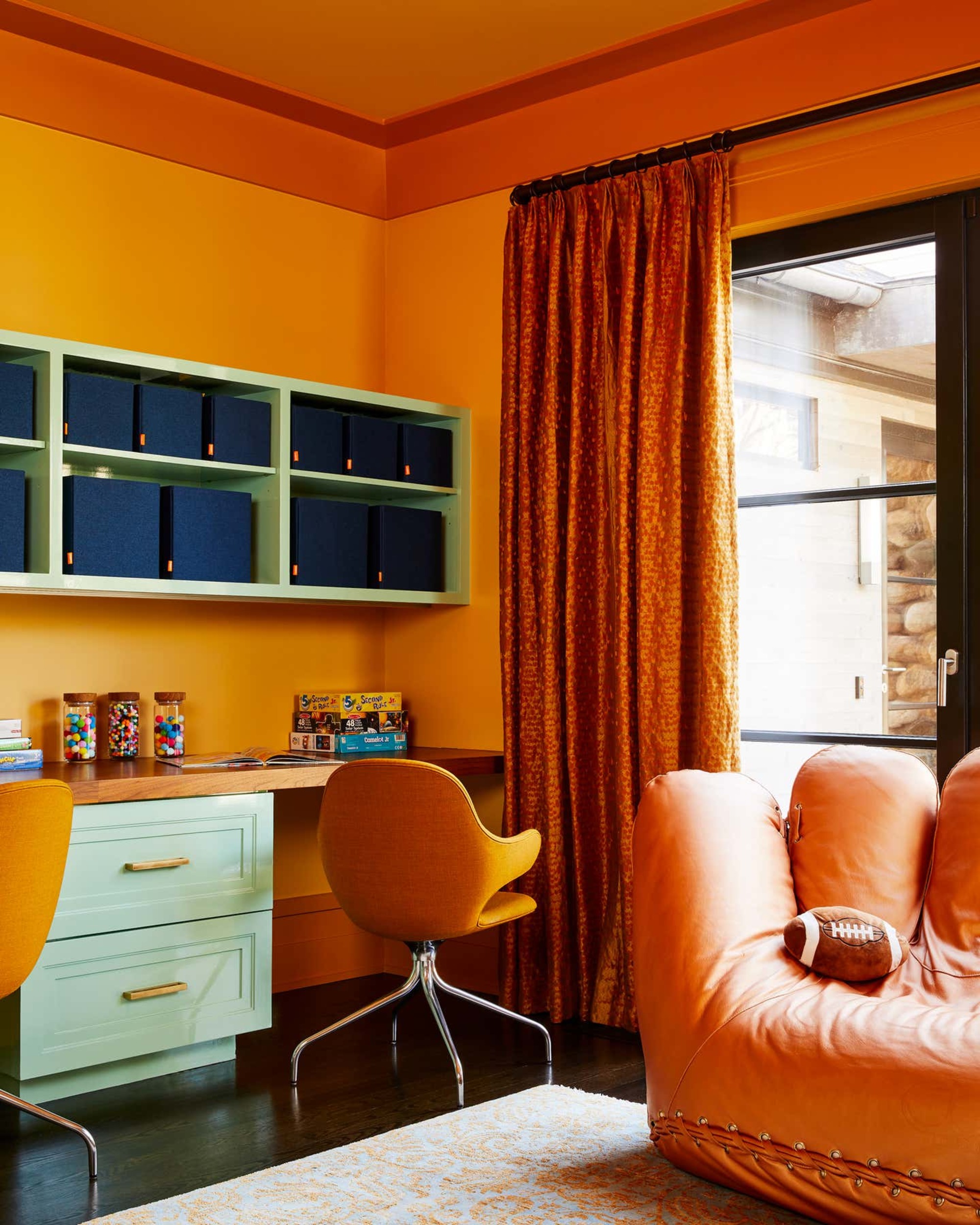
Play with warm and cool colors from across the wheel for an interesting clash. In this example, a vibrant pop of orange is a color that goes with mint green in an unexpected way. The design is from interior studio Evan Edwards .
'The kids' study is located close to the formal dining room which is full of rich shades of gold, honey onyx and emerald green,' explains Josh Edwards, co-founder of Evan Edwards. 'We carried this palette into the study but wanted to make it feel more playful as the clients have two boys under six years old.'
'Overall, this project is a study in color. We took a beautiful home that happened to be a blank canvas and created unexpected color combinations throughout.'
2. Yellow and blue
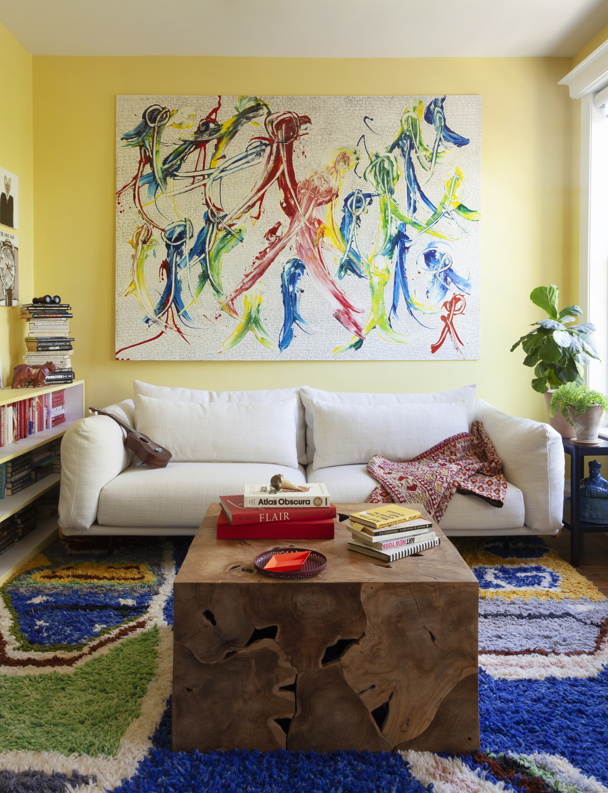
When used in interiors, yellow and blue can make for a strong clash. Located diametrically opposite each other on the color wheel, the pairing has the backing of color theory. Introduce this clashing scheme subtly through texture to achieve impact.
In this example at a Brooklyn townhouse designed by Studio SFW, blue is introduced in the form of accents on the wall art and the texture of the rug. The overall look adds energy to the light yellow wall.
'Our client is an artist and has a lovely collection of artwork that needed a backdrop to highlight each piece. We worked with the bright yellow living room walls and incorporated a plush vibrant Beni Ourain Moroccan rug which created a great backdrop for the art allowing it to glow in the space,' says Erin Fearins, the partner at the New York-based architecture and design firm.
'We tend to work with lots of layers of pattern, color, and texture in our projects, and often incorporate contrasting colors in some way, from large statements like drapery or upholstery that is brightly patterned all the way down to the introduction of a small accessory, like a brightly colored tray.'
3. Orange and white
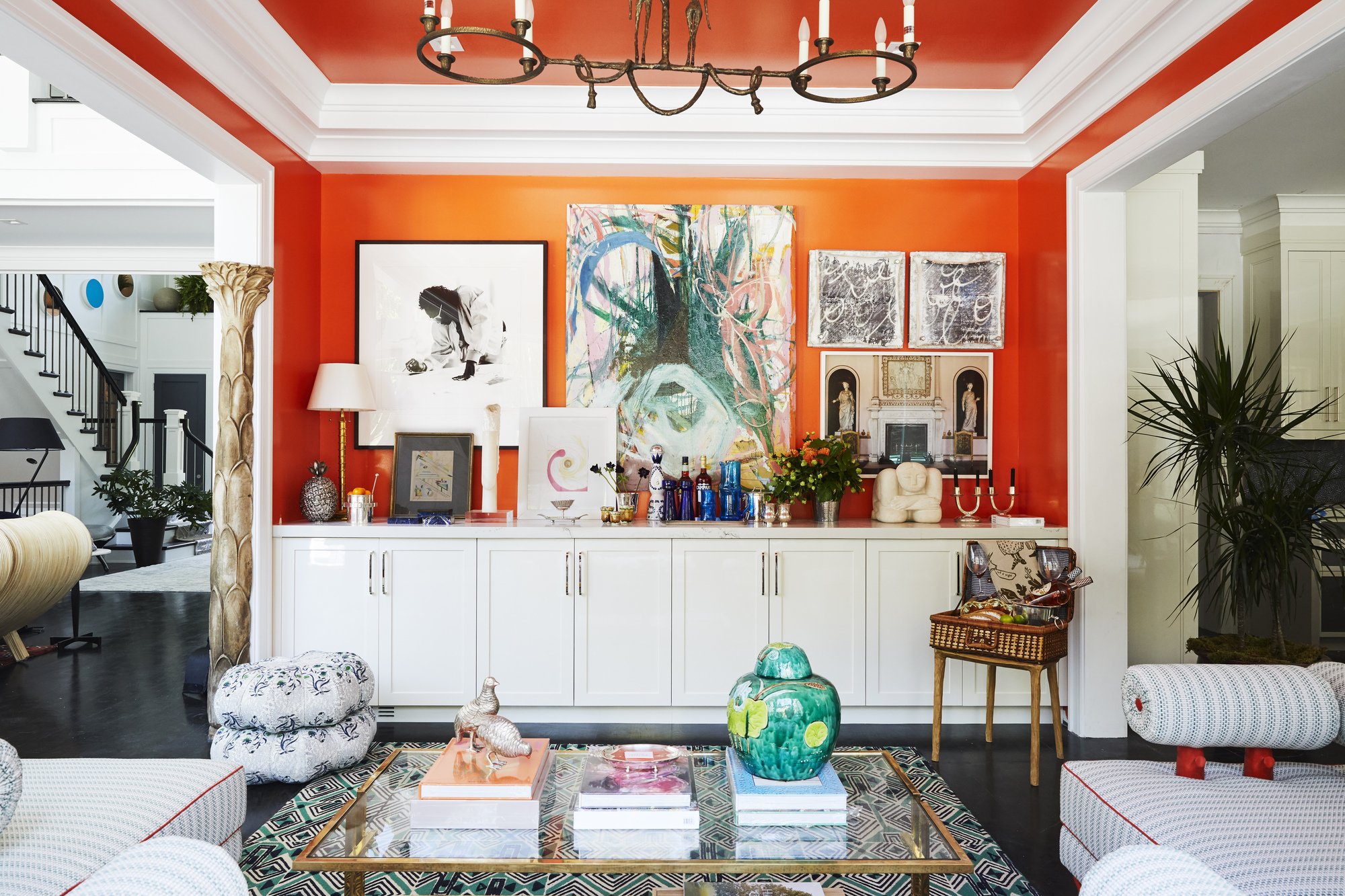
You might not imagine white as a color that could possibly clash with anything, but a bright white creates such contrast that it can be really impactful when used in the right way. 'I love to use clashing colors for a real pop and statement,' says designer Christina Neilsen, who designed this colorful living room scheme in the Hamptons.
'For this project, I painted a vibrant orange in semi-gloss on the walls and ceiling, keeping the trim white. The colors clash because white is quite severe and stark and orange is quite bright.
'The two of them could be overkill for some people but I find they go together really beautifully, and you can layer in softer tones throughout the space rather than color blocking solids to create a softer atmosphere,' she adds.
3. Dark green and yellow
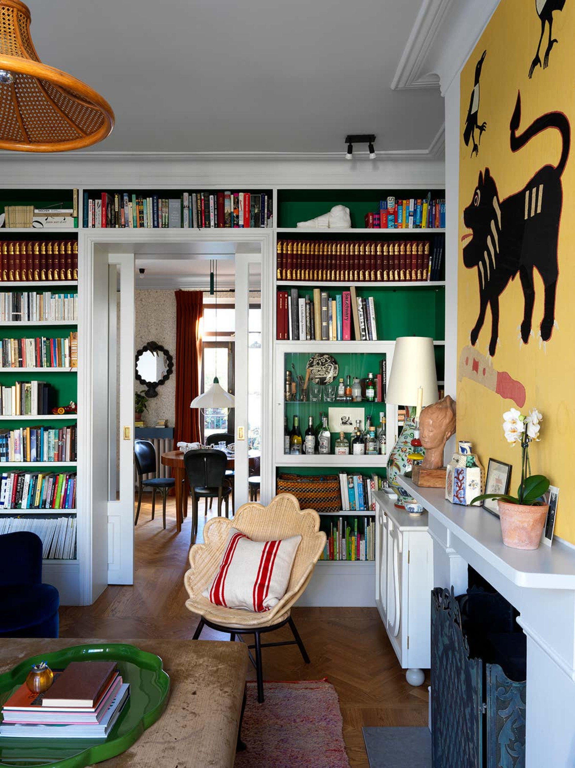
Green and yellow is another bold combination that should be approached with caution. When executed well, the result is a bright and uplifting interior. The two colors are adjacent on the color wheel, green being a cool color while yellow is warm.
This means that mixing the two together helps to balance the two shades, as is evident in this scheme by designer, Beata Heuman, in her London home.
4. Red and green
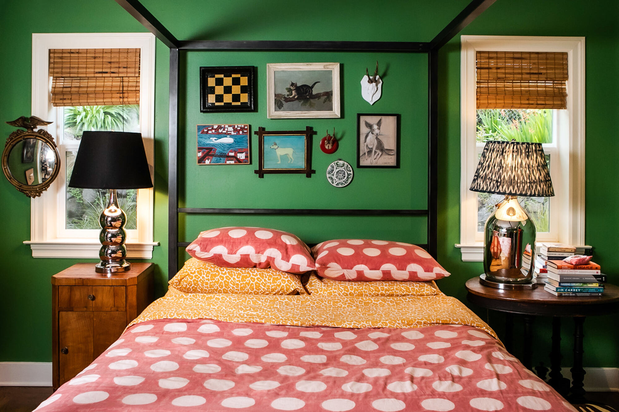
Red and green are hard to get right when used together in interiors. The combination has immediate connotations of Christmas festivities, but when used carefully and with other colors in the mix, this association can be toned down.
In this bedroom, adding enough mustard, natural browns and hints of blue, black, and even white work to offset the red and green to avoid the Christmas association.
5. Burgundy and blue
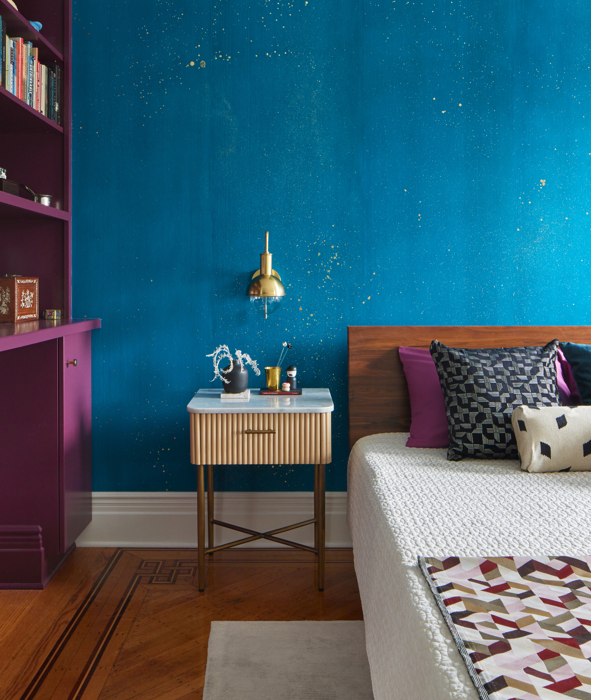
Purple and blue is an unexpected color combination that can clash if used in an intense way, given where they sit on the color wheel. When embraced, as seen in this example by Frederick Tang Architecture, the effect is vibrant.
In this colorful bedroom in a Brooklyn townhouse, an accent wall was created with Cosmos gold-flecked hand-painted wallpaper and the millwork was painted in Benjamin Moore's Dark Burgundy. 'The two colors are adjacent in the light spectrum so it reads like a color transition with a vibrant end result,' says Barbara Reyes, director of design at Frederick Tang.
'Typically, opposites work as pairings, something light against something dark, something bright against something desaturated. In this case, the two saturated colors clash and add a jolt of color in the townhouse bedroom.'
6. Red and pink
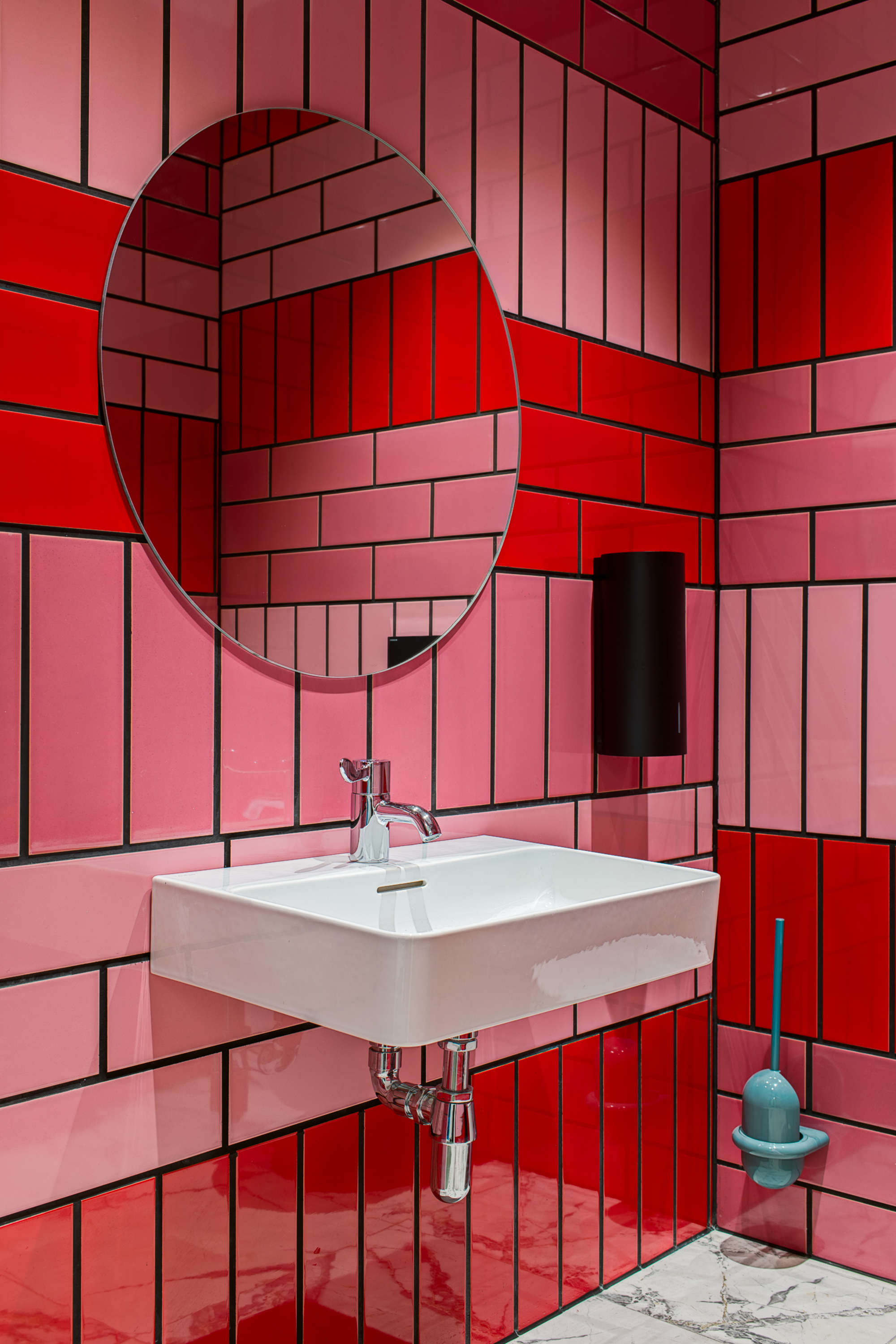
Red and pink are close to each other on the color wheel which can make them sit uncomfortably together. Yet, if you embrace the clash, the result is bold, with red and pink marrying wonderfully to make for a pleasing design statement, as in this bathroom tile idea.
'If you’re looking to experiment with bold colors and decor, the bathroom is the perfect space to make a statement that is uniquely individual,' says Diane Hyde from artisan tile brand Craven Dunnill Jackfield, 'and this brilliantly bright clashing color combination made from tiling sparks individuality and immediately transforms a space.'
7. Blue and lime green
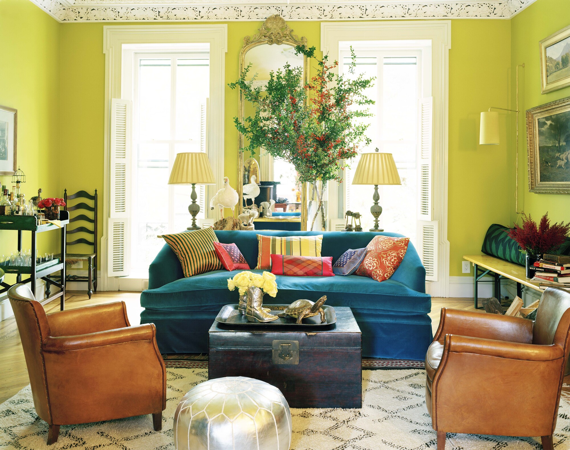
It's said that 'blue and green should never be seen', but this scheme from interior designer (and lover of the color clash) Ellen Hamilton proves otherwise.
This green living room is an invigorating scheme of turquoise and a very intense chartreuse, working well because of the texture and character of the neutral items in the room. 'A black and white Berber rug and caramel old leather chairs and some silver cowboy boots - this kind of composition gives your eyes something to get excited about and this ultimately creates energy through visual stimulation,' she says.
8. Red and blue
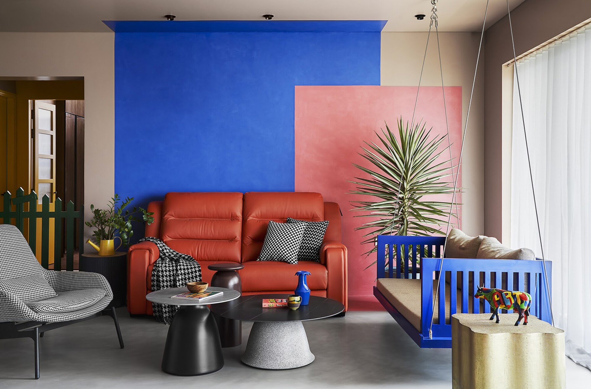
Red and blue are two strong primary colors that can create a bold look when used against each other. In this apartment design created by Zero9, clashing color-blocking paint ideas have been used to create a playful scheme.
'The pandemic showed some of us the most grey times we have seen in our entire lifetimes, and right after this period these clients approached us to make a self-sustaining, happy and cheerful home which reflected their panache for colors,' explains Prashant Chauhan of Mumbai-based design studio Zero9.
'In this particular home, we used salmon pink and juicy orange, a bright red sofa recliner and the backdrop of blue wall forms an interesting clash in colors which is well complemented by the green plant.'
'The living room is a visual treat right from the entrance door with its pop of colors and an experimental color blocking which uses the walls and floor as the canvas for this art expression.'
Where should I use clashing colors in the home?
A clashing scheme can bring a real vibrancy to a space, so think carefully about the rooms where you'd like to inject this level of energy.
'A downstairs toilet is a great place to experiment with your decoration ideas by using bold and contrasting colors,' explains Suzanne Duin, founder of Maison Maison. 'These spaces are often small so if the scheme isn't quite right, it is easy to repaint with an alternative color,' she says.
Christina Neilsen agrees. 'A larger room with contrasting wall colors can feel overdone and overwhelming, where a small room is the perfect place to make a statement and really experiment.'
'Clashing colors are playful and relaxed all at once, says Candy Murray, interior design manager at Soho Home. 'They work well as accents - scatter cushions on a sofa or a bed or clash a bold canvas print with some cushions. Apply color elements that you can change depending on the season. You might want to add more colors in the summer months then pair things back in fall,' she adds.

Former content editor at Livingetc.com, Oonagh is an expert at spotting the interior trends that are making waves in the design world. She has written a mix of everything from home tours to news, long-form features to design idea pieces, as well as having frequently been featured in the monthly print magazine. She is the go-to for design advice in the home. Previously, she worked on a London property title, producing long-read interiors features, style pages and conducting interviews with a range of famous faces from the UK interiors scene, from Kit Kemp to Robert Kime. In doing so, she has developed a keen interest in London's historical architecture and the city's distinct tastemakers paving the way in the world of interiors.