Forget Color Drenching, 'Color Capping' Is the New Way to Decorate That Adds 'Dimension' and Can Make a Room Feel Bigger
Benjamin Moore's color expert, Helen Shaw, breaks down how to achieve the almost-ombré effect you're about to see in rooms everywhere

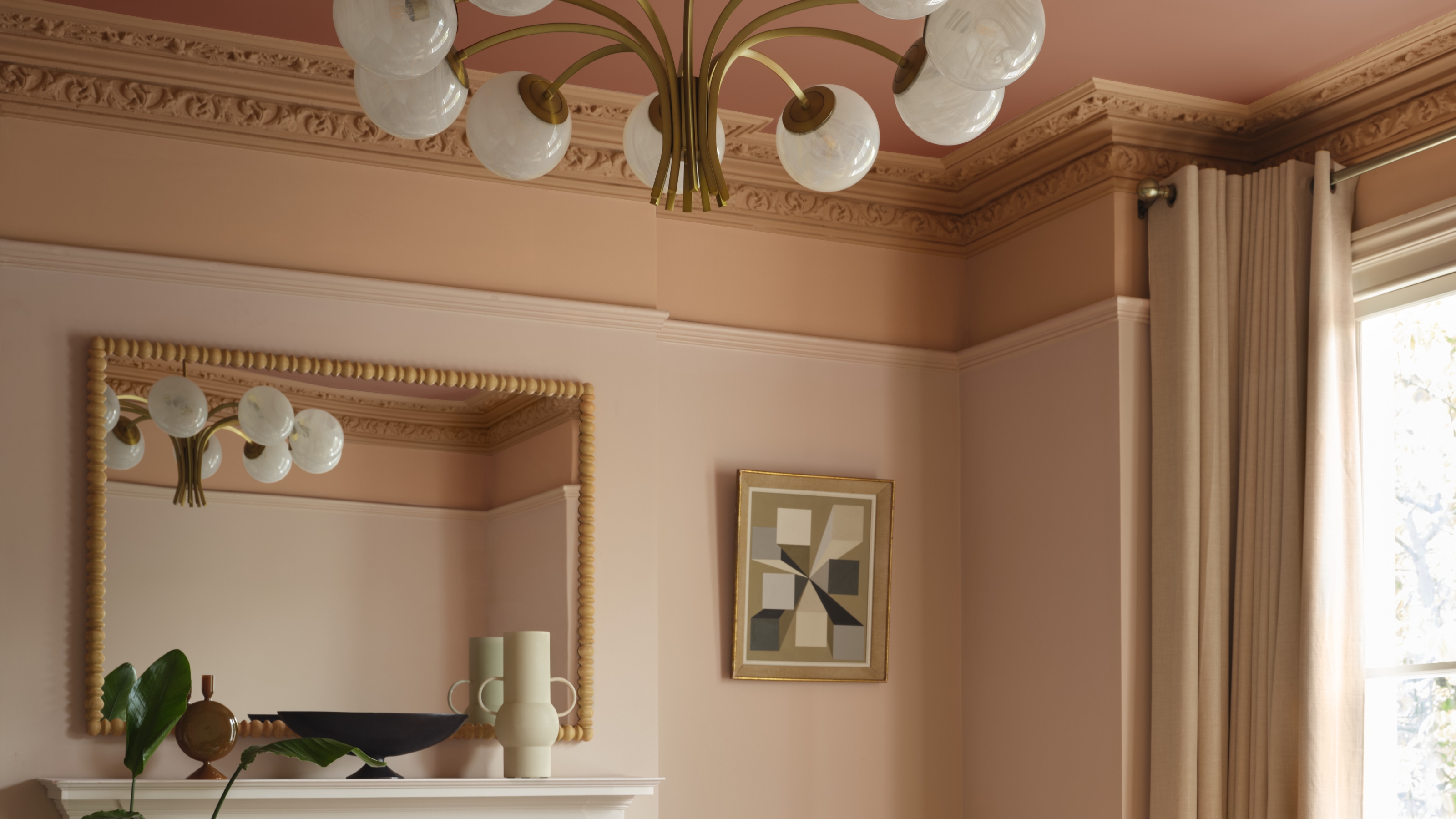
Drenching a room in all one color has been the go-to with paint for a few years now. And while it's trendy, in truth, it doesn't work in every space. If you've been looking for something different to try — that feels just as interesting and design-forward — Benjamin Moore may have just found the answer: it's called 'color capping'.
The popular paint brand dubbed the soon-to-be trend as part of its AW2025 lookbook, describing it as a bold yet refined take on tonal palettes. "Color capping involves enveloping a space in a tonal wash that gradually deepens the further up it goes, incorporating the often-overlooked fifth wall (the ceiling) into the design," the brand's color expert, Helen Shaw, explains.
Unlike color drenching, which uses a single hue across all surfaces, color capping plays with multiple tones from the same color family to achieve a layered, polished look. The result is a more defined ombré-like effect that adds depth to the space, plays with proportion, and, most importantly, color.
Article continues belowSo, How Do You 'Color Cap' a Room?
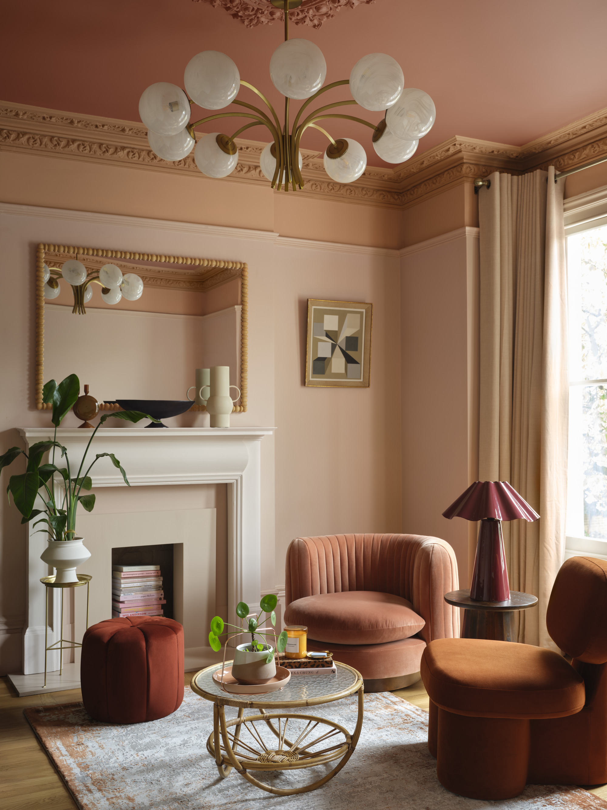
Though the colors in this living room are quite bold, the gradient allows the contrast to feel smoother.
How does color capping work exactly? Typically, you will want to choose three shades of a single color with the same or similar undertones that vary in value. For instance, as shown in the room above, you could select a light taupe pink, a warm terracotta, and a bold red.
From there, you want to "Paint the ceiling in the deepest shade, the cornicing in a mid-tone, and the walls in a lighter tone," explains Helen Shaw. "This creates a subtle sense of cohesion and elegance."
In terms of spacing, if you have architectural features such as cornicing, let that guide where you start and stop colors to accentuate the design; otherwise, you can stop just short of the ceiling with one color and save the third for the painted ceiling.
And just because we are talking color, doesn't mean this color trend can't be neutral, too. "This is a finish that can be quietly impactful, even in a palette of neutrals, where an off-white wall color is capped with a slightly more saturated hue in the same tone, gently drawing attention to the ceiling as an integral part of the decor," says Helen.
The Livingetc newsletters are your inside source for what’s shaping interiors now - and what’s next. Discover trend forecasts, smart style ideas, and curated shopping inspiration that brings design to life. Subscribe today and stay ahead of the curve.
There are plenty of colors that make a room look bigger, and the list may surprise you.

Helen Shaw is a color expert and the international marketing director at paint brand Benjamin Moore. Helen and her husband Craig are the founders of Shaw Paints, acquired by Benjamin Moore in 2020.
What Rooms Does 'Color Capping' Work Best In?
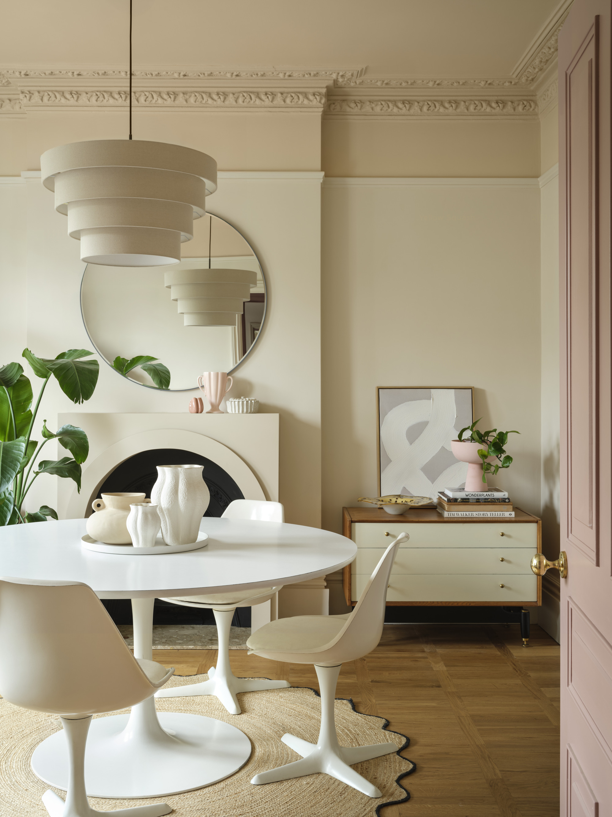
A neutral color scheme becomes cozier with a color capped ceiling.
Just like drenching, color capping is a clever way to make a room feel more enveloping. It works beautifully in living rooms and bedrooms, as it enhances a sense of intimacy and comfort.
"By carrying color onto the ceiling in a slightly deeper tone, the room feels cocooned and inviting, perfect for relaxation," says Helen. This approach also unifies the design, ensuring the ceiling feels like an intentional element rather than an afterthought, and introduces a touch of subtle drama that elevates the space.
Especially in rooms with high ceilings, painting above the picture rail and around the molding in a slightly deeper shade will draw the eye upward and celebrate the room’s height.
Additionally, this paint technique can play with proportions and could be used to help make ceilings look higher. "Extending the wall color onto the ceiling in a slightly darker shade creates a seamless, enveloping effect that not only gives flat surfaces a sense of dimension, but it can trick the eye into making the space feel bigger — the top half of the walls seamlessly blend into the ceiling, making it appear further away," adds Helen.
Color Capping in Modern vs Period Homes
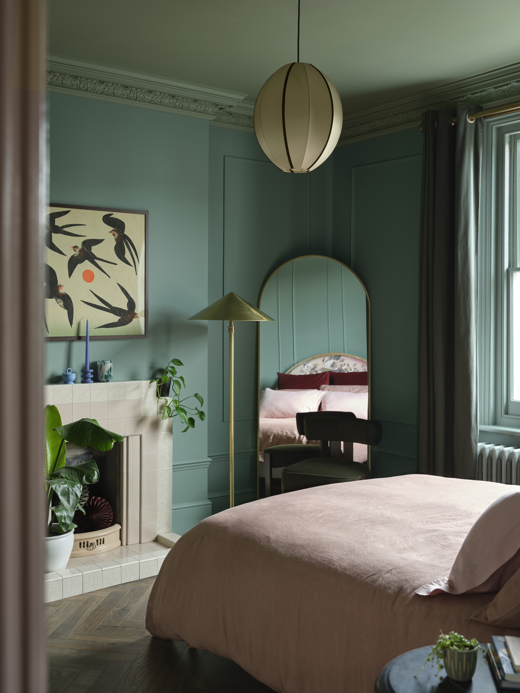
Color capping also works with just two shades, where it feels more subtle. But the effect is calming and still more grounding than a full drench.
Sometimes owning a period or historical home can feel like a barrier to trying more modern trends. But that shouldn't be the case.
In fact, "In period homes, color capping can beautifully enhance original architectural features," says Helen. This technique highlights intricate cornices and decorative plasterwork, allowing it to stand out as part of the overall scheme rather than be lost against a white canvas.
In more contemporary settings, color capping can be highly effective for adding depth and interest through color. Rather than relying on molding to guide your gradient, you can use more experimental paint techniques, like hand-painted trims, and play around with perspective.
But no matter the style of space you try color capping in, "follow through via soft furnishings and window treatments to create a fully cohesive look," notes Helen.
What to Avoid When Color Capping Your Interiors
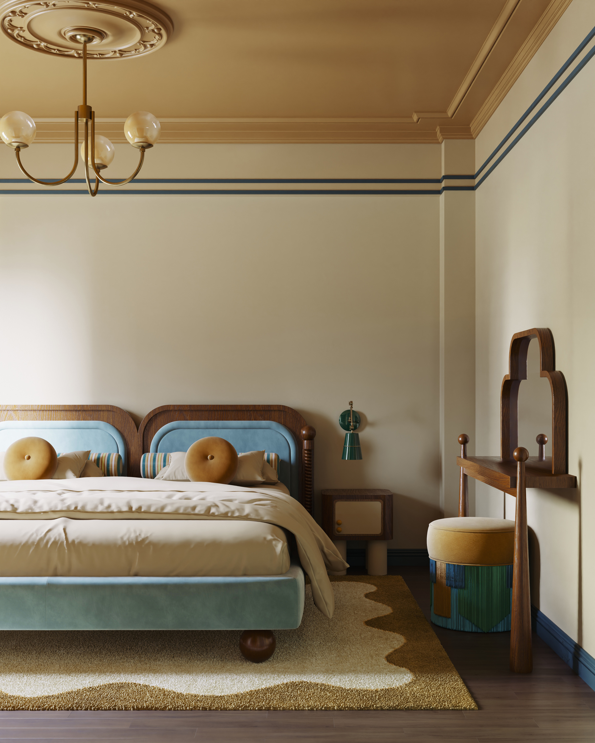
The stripes and other colors blend harmoniously with the color capping technique for a unique spin on the trend.
As with all trends, there are going to be circumstances where it just doesn't quite work. When it comes to color capping, Helen says it's best to avoid using clashing colors or strong contrasts that lack harmony.
"The transition between wall and ceiling shades should feel intentional and cohesive, not accidental or mismatched," she notes. "Opt for tones within the same color family or hues that naturally complement each other on the color wheel to ensure the look feels balanced and considered."
Color provides a perfect opportunity to play with your interior scheme, and a simple refresh can be enough to completely change the feel of your space. But before you pick up your paintbrush, be sure to scrub up on the colors designers warn will date the fastest in 2025.

Olivia Wolfe is a Design Writer at Livingetc. She recently graduated from University of the Arts London, London College of Communication with a Masters Degree in Arts and Lifestyle Journalism. In her previous experience, she has worked with multiple multimedia publications in both London and the United States covering a range of culture-related topics, with an expertise in art and design. At the weekends she can be found working on her oil paintings, reading, or antique shopping at one of London's many vintage markets.


