How to Create a Calm Color Palette Without Skimping on Character — 8 Interior Designers Share Their Tips
Wondering how to achieve a serene and soothing scheme without straying into blandness? We asked the experts for some calming color inspiration
The Livingetc newsletters are your inside source for what’s shaping interiors now - and what’s next. Discover trend forecasts, smart style ideas, and curated shopping inspiration that brings design to life. Subscribe today and stay ahead of the curve.
You are now subscribed
Your newsletter sign-up was successful
A neutral palette can seem like a quick and appealing fix if your home is in need of some visual calm, but implementing it isn’t always as effortless as it might initially appear. Unless your house has really great bones, architecturally speaking, then you might find that decorating with pale and natural shades can result in an interior that feels a bit, well… beige.
So how do designers achieve that much-coveted balance of tranquility and interest when working with calming colors? When choosing the most relaxing colors for the eye, it turns out there are more than a few tricks that can help to turn a bland space into one with depth and personality.
What's the secret to a calm color palette?
Many of the experts we spoke to state that leaning on shades found in nature is a fail-safe route to a feel-good scheme. ‘A comforting or soothing color palette can be created in several ways, but deriving a palette from the natural landscape can be very helpful,’ says Kara Mercer, principal and design director at Seattle studio Brio Design. ‘For example, layering neutral earth tones can be really effective for developing a sense of calm.’
Article continues belowWe've pulled together 8 schemes that feel calm, each in their own way, and asked the designers behind them to explain how they created this relaxed atmosphere.
1. Choosing paler hues
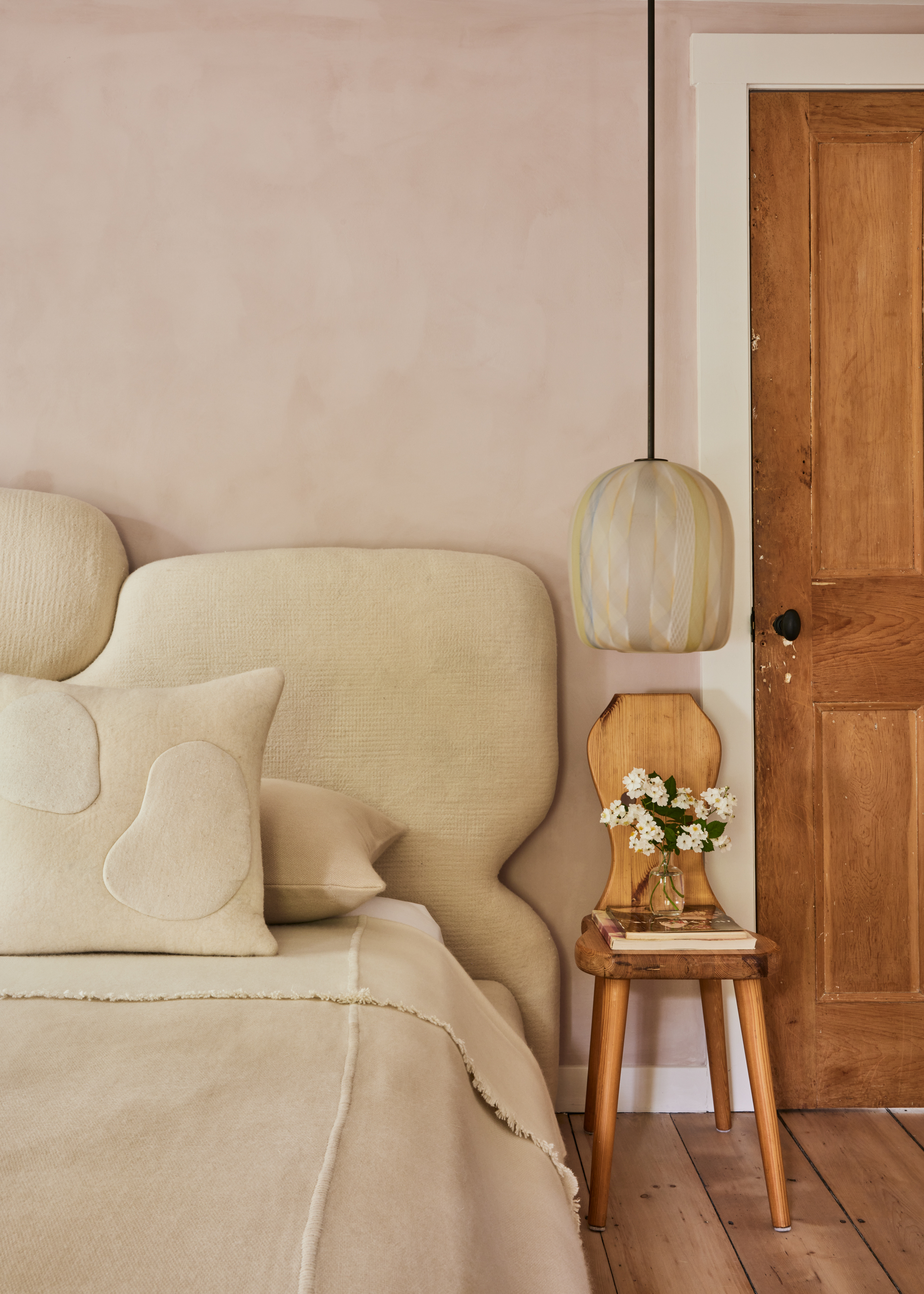
When interior designers Kristin Fine and Analisse Taft-Gersten set about transforming this 1800s Greek Revival house in The Hamptons into a destination for interiors enthusiasts, they wanted the bedroom to be both uplifting and timeless. ‘The 1818 Collective is an antique space with a mix of vintage and contemporary furnishings, which can feel very modern, so we created this bedroom as bit of a counterpoint,’ explains Kristin.
‘Pale pink tones help create a warm glow which feels calming. It can be the perfect base for layering creams and neutral textures, resulting in a room that simply makes people feel good,’ she adds. ‘It’s the layers and varied textures that make all the difference. This room has lime-washed walls, ceramics, handblown glass lighting, a hand-felted wool headboard, cashmere blankets and old flooring: lots of subtle details.'
The use of beige as a color that goes with light pink gives the space an intriguing quality. ‘The tones are quiet, but it’s far from boring.’
The Livingetc newsletters are your inside source for what’s shaping interiors now - and what’s next. Discover trend forecasts, smart style ideas, and curated shopping inspiration that brings design to life. Subscribe today and stay ahead of the curve.
2. Make sure there's enough pattern and texture
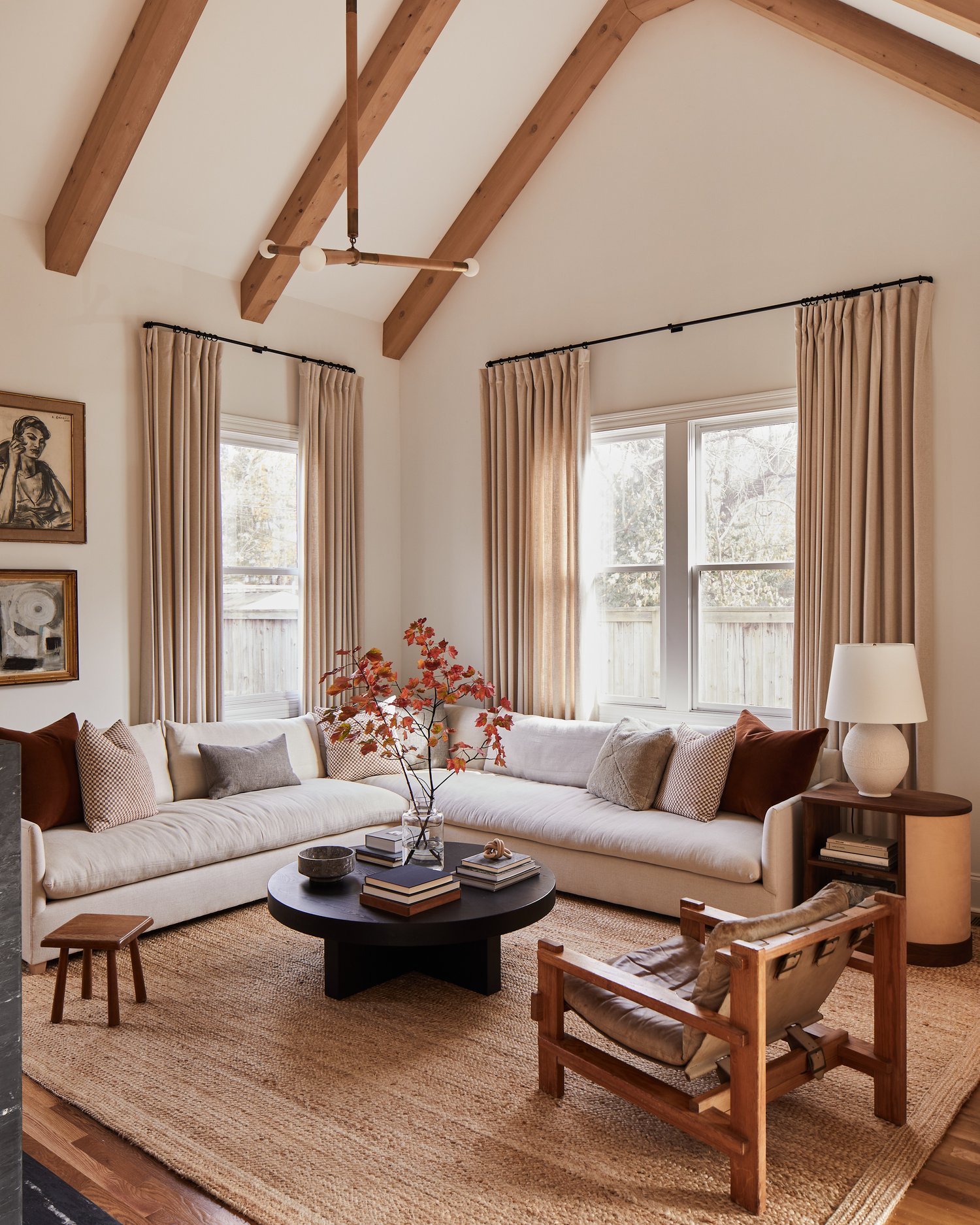
'We wanted to keep the home visually calming but interesting,’ says Nashville interior designer Lauren Bradshaw of this warm and peaceful abode. ‘We started with a white room and added the oak beams and marble fireplace. For the furnishings, we worked in a lot of textures, including the worn vintage leather chair, velvet and mohair fabrics in various locations, as well as the small-scale pattern on some of the pillows.’
Lauren carefully selected fabrics that would provide a hint of color, without detracting from the neural palette. ‘I found copper and rust to be really great shades since they fit well with the other textures, and tie into the nature right outside the windows. The heft of the black oak coffee table grounds the space, and ties in with the marble we selected for the fireplace.’
3. Look to pale blue for a color injection
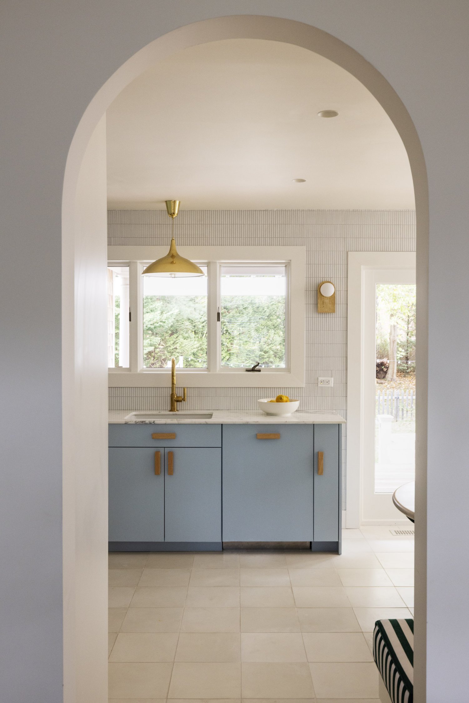
If you’re looking for ways to reconcile a love of color with a need for calm, then pale, powdery blues are a great place to start. ‘This is a blue called ‘Hazy’ from Farrow & Ball’s collaboration with Kelly Wearstler,’ says White Arrow’s Keren Richter of the shade she chose for the kitchen of this Amagansett beach house.
‘Kelly cites her inspiration as the marine layer that brings drifts of fog inland, capturing the fresh feeling of early mornings on the coast. I chose the shade as part of a palette that captures that feeling of freshness,’ Keren continues. ‘The home is a beachy retreat where the family spends their summers, and I leaned into a summery palette with tropical and coastal elements.’ The beachy color palettes of whites and beiges are perfect as colors that go with light blue.
4. Brave dark colors for surprising calm
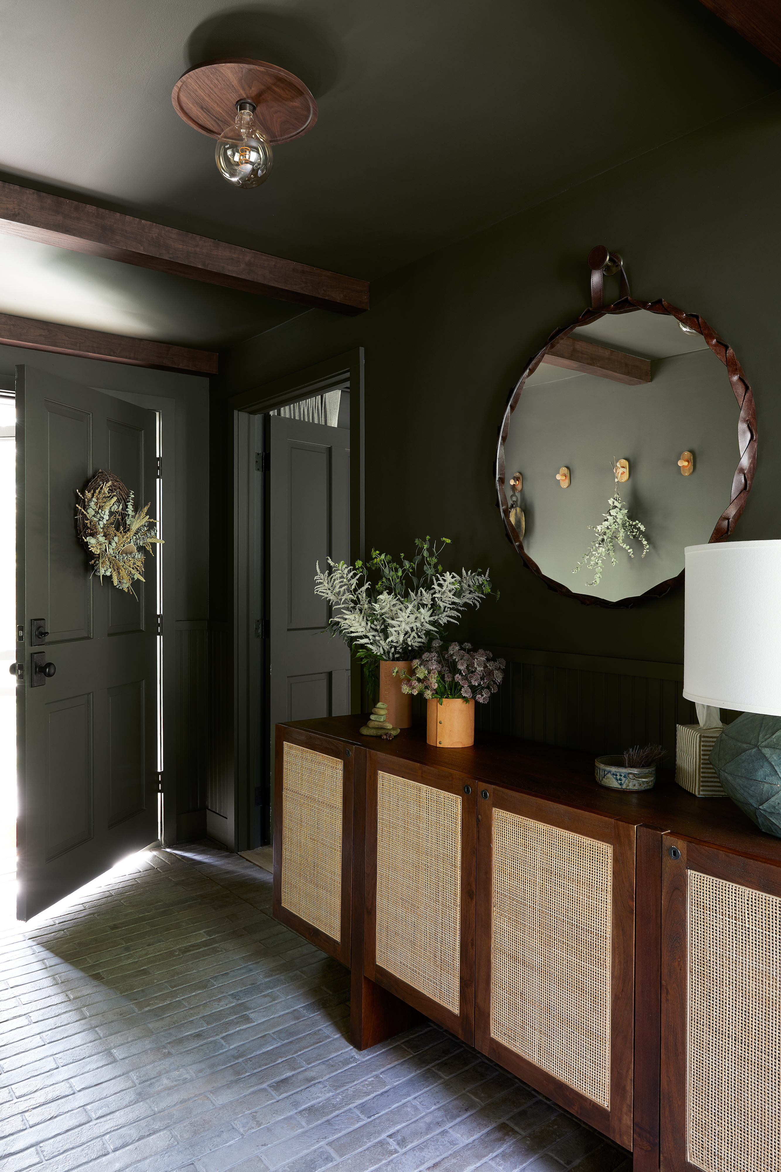
'This cozy entryway mudroom welcomes you to our personal sanctuary nestled in the southern Catskill mountains,’ says interior designer Becky Shea, who chose ‘Dakota Woods’, a dark-olive shade by Benjamin Moore, for the space. ‘It exudes a rich, moody aura that’s amplified by the deep walnut wood and lighter porcelain-tiled floor, which sets a tranquil tone as you step through the door.’
Becky opted to paint the base, casing and ceiling in the same shade for an enveloping feel. ‘It creates a cozy embrace, making the room feel like a warm hug,’ she says. ‘The staple piece of furniture is our walnut sideboard with caned doors, which was picked due to how well it works with the paint shade.’
5. Soften color contrasts
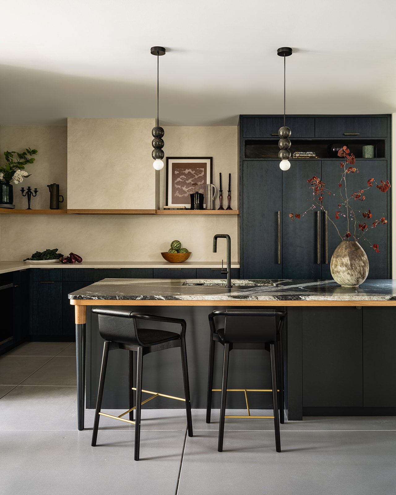
One way to create calm without compromising on character is to soften the contrast between the colors in your palette. For example, instead of a black-and-white scheme, choose shades that are more tonal and less dramatically opposed. This kitchen by Seattle studio Brio Design is a perfect example of how effective this method can be, with inky blue kitchen cabinets set against a textural taupe backdrop.
‘We took our cues from a forested mountain scene surrounding a river for this space,’ says studio principal Kenna Stout. ‘The deep, blue-green tone from the river inspired the cabinets, and we used soft, neutral earth tones on the countertops, hood surround and backsplash. The paint finish was pulled from the rugged stone mountains surrounding the river in the nature scene we referenced.’
6. Use warming tonal colors
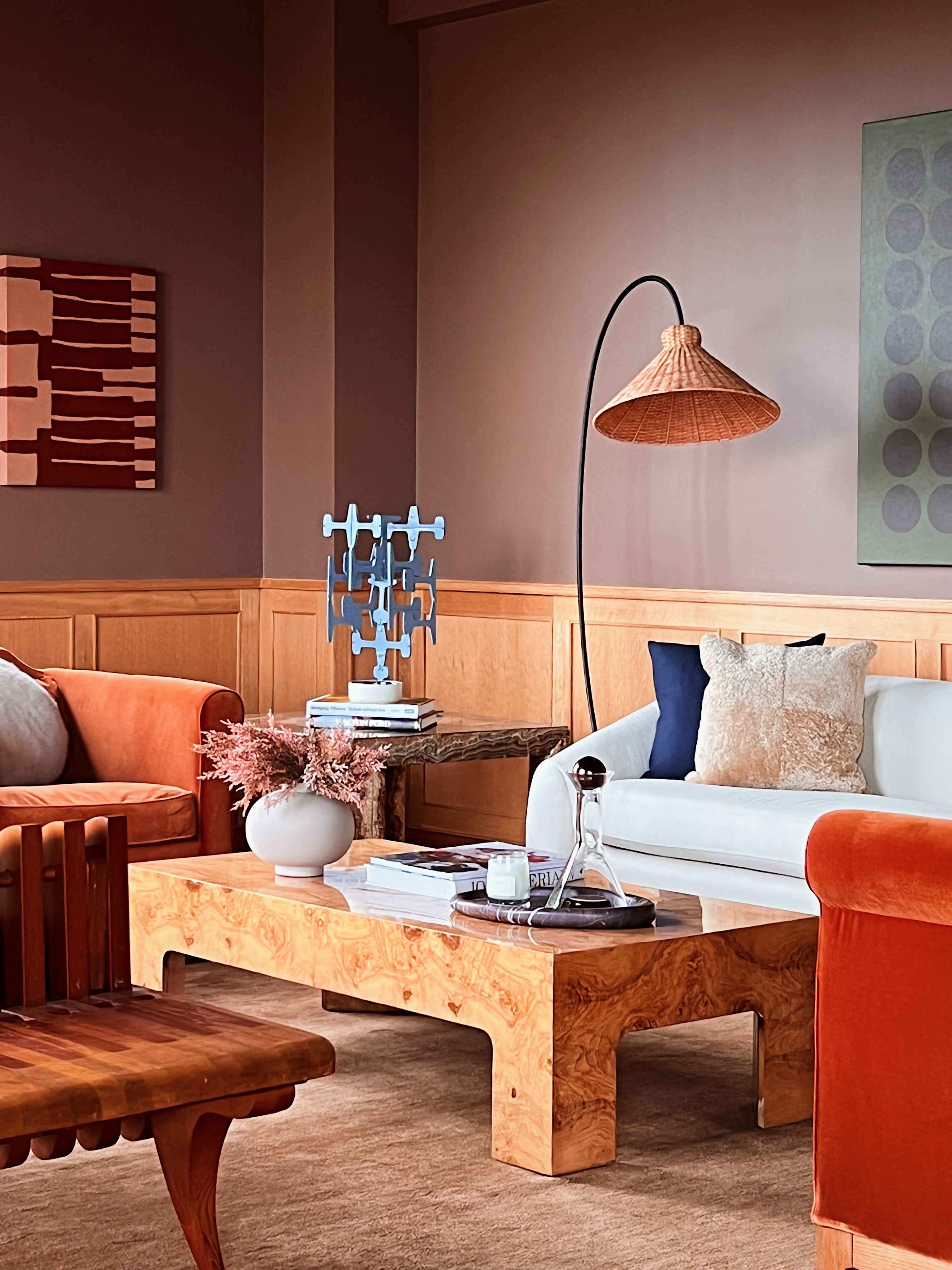
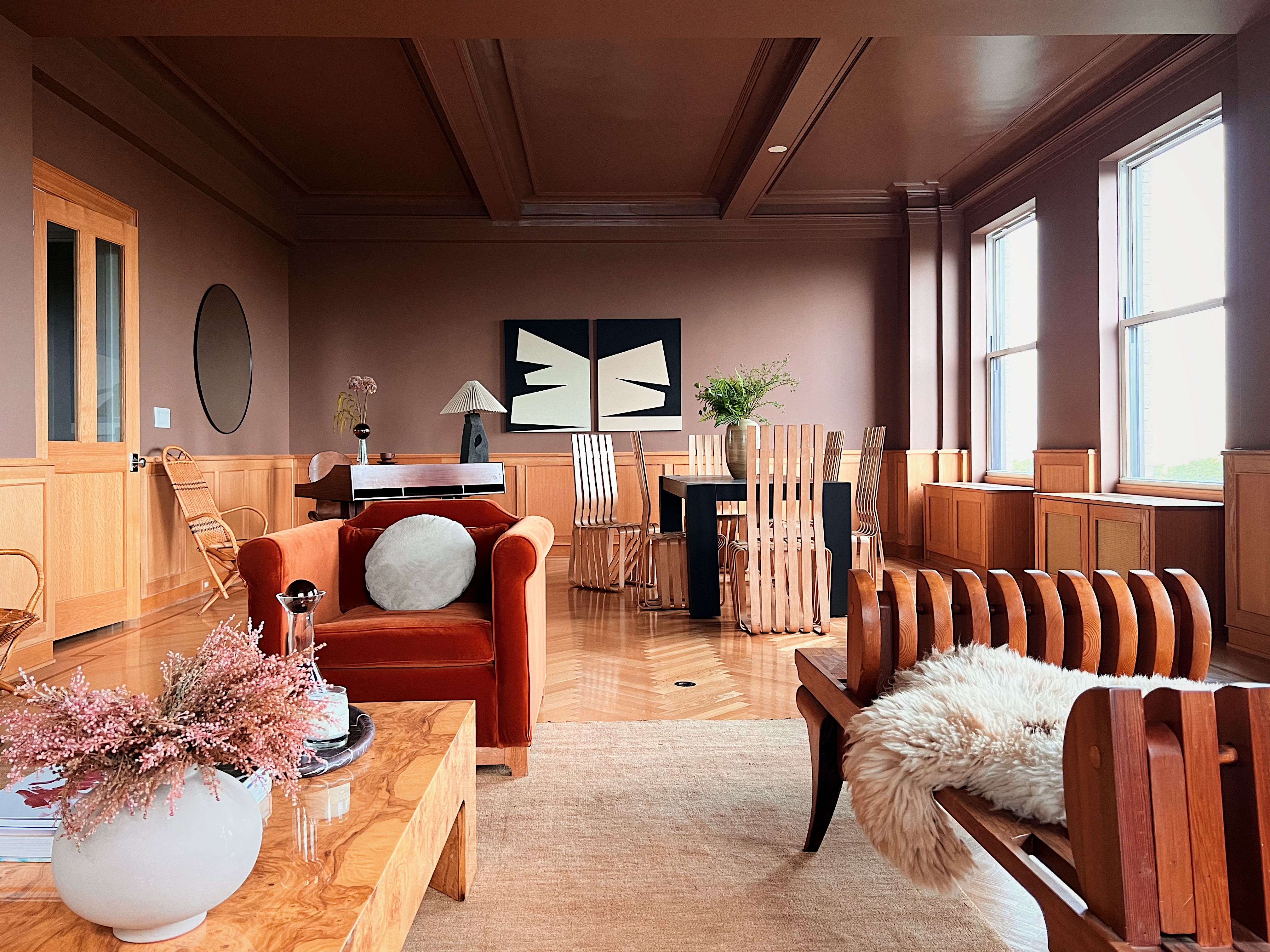
‘The upper walls of this great room overlooking Central Park been painted in a tawny shade with a contrasting white ceiling that featured tan elements in the molding details,’ recalls Hollister Hovey, co-founder of Hovey Design. ‘It was a banal backdrop that brought out the yellow in the oak wainscotting, made the very tall ceilings appear lower, and did nothing to draw the eye out to the coveted park views.’
Hollister and her sister Porter rectified the situation by painting the walls and ceiling the same color of Benjamin Moore’s ‘Carob’. ‘It’s a medium brown with mahogany undertones that skews like a rich mauve and captures light really beautifully,’ Porter explains. ‘We designed the rest of the color palette around the shades of fall, then added some sharp blacks and whites to add modernity and contrast.’
7. Use natural materials in your palette
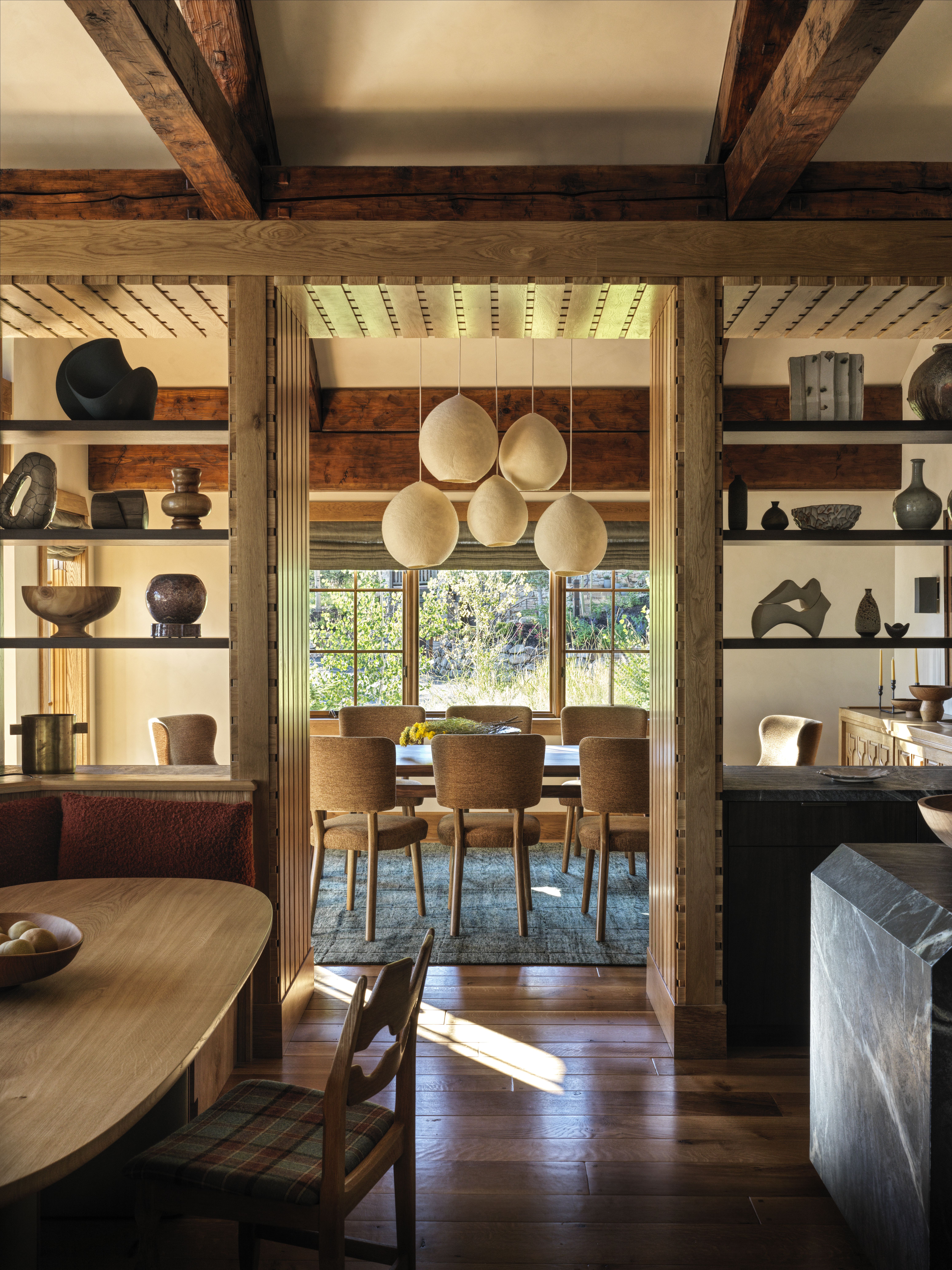
When L.A. studio Electric Bowery designed this Deer Valley home, they devised a complex and varied material palette inspired by the tones of the landscape outside. ‘Drawing from the natural colors of the high mountain desert, we blended a palette of earthy tones, such as evergreen-tinged soapstone, cedar, sage and blue spruce,’ says Lucia Bartholomew, the firm’s co-founder. ‘For contrast, we added tones like slate and coal, and dark-hued flooring.’
Electric Bowery were also inspired by Swiss and Austrian ski chalets for this earth tone living room’s mix of materials. ‘This resulted in an atmosphere that serves as both a tranquil mountain retreat with a touch of Japanese ryokan elegance, as well as a compelling visual story.'
8. Choose a classic off-white for a base
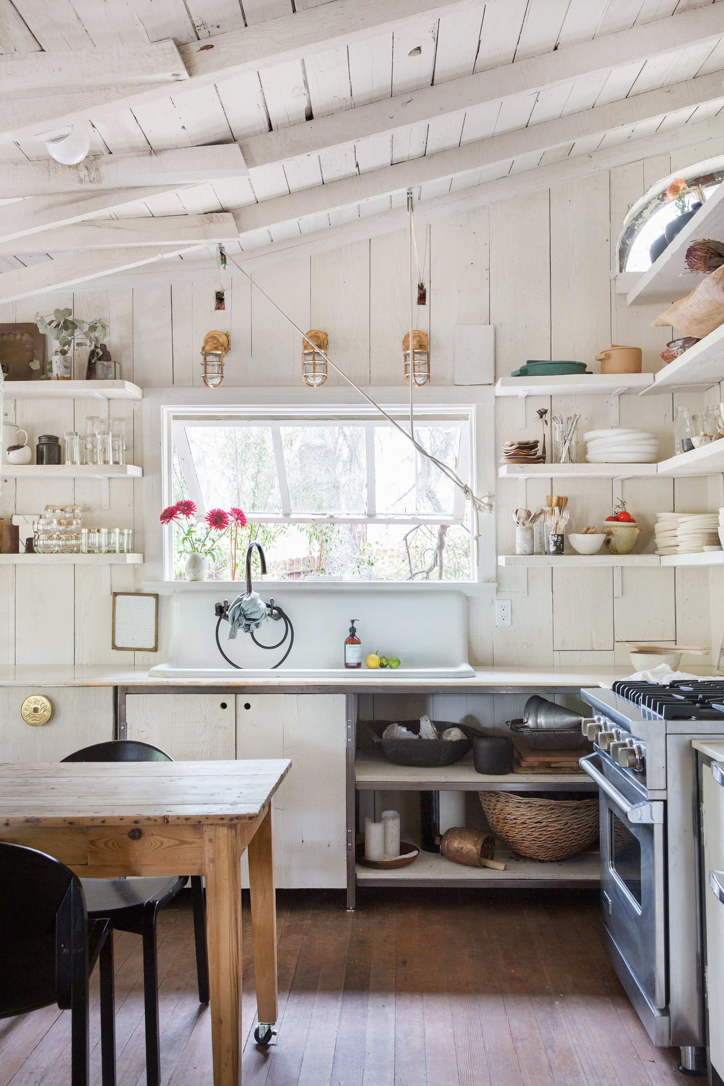
If your home is already steeped in character, then you can't go wrong with white. Interior designer Leanne Ford fell in love with this 1900s former hunting cabin in Echo Park due to its history and tree-lined plot. She set about decorating it with an all-white scheme that would lift and brighten the wood-clad interior, without spoiling the building’s original charm.
‘This cabin looks older now than when I got my hands on it,’ says Leanne, who salvaged and reused every piece of wood and painted the interior in a soft, chalky shade of white. ‘The paint that I used is a creamy white, as I wanted it to feel really warm. I love white paint in all shades, but bright white would have been too modern in here, so I used an antique shade that felt like a natural match for the cabin.'
Tessa Pearson is an interiors and architecture journalist, formerly Homes Director at ELLE Decoration and Editor of ELLE Decoration Country. When she's not covering design and decorative trends for Livingetc, Tessa contributes to publications such as The Observer and Table Magazine, and has recently written a book on forest architecture. Based in Sussex, Tessa has a keen interest in rural and coastal life, and spends as much time as possible by the sea.
