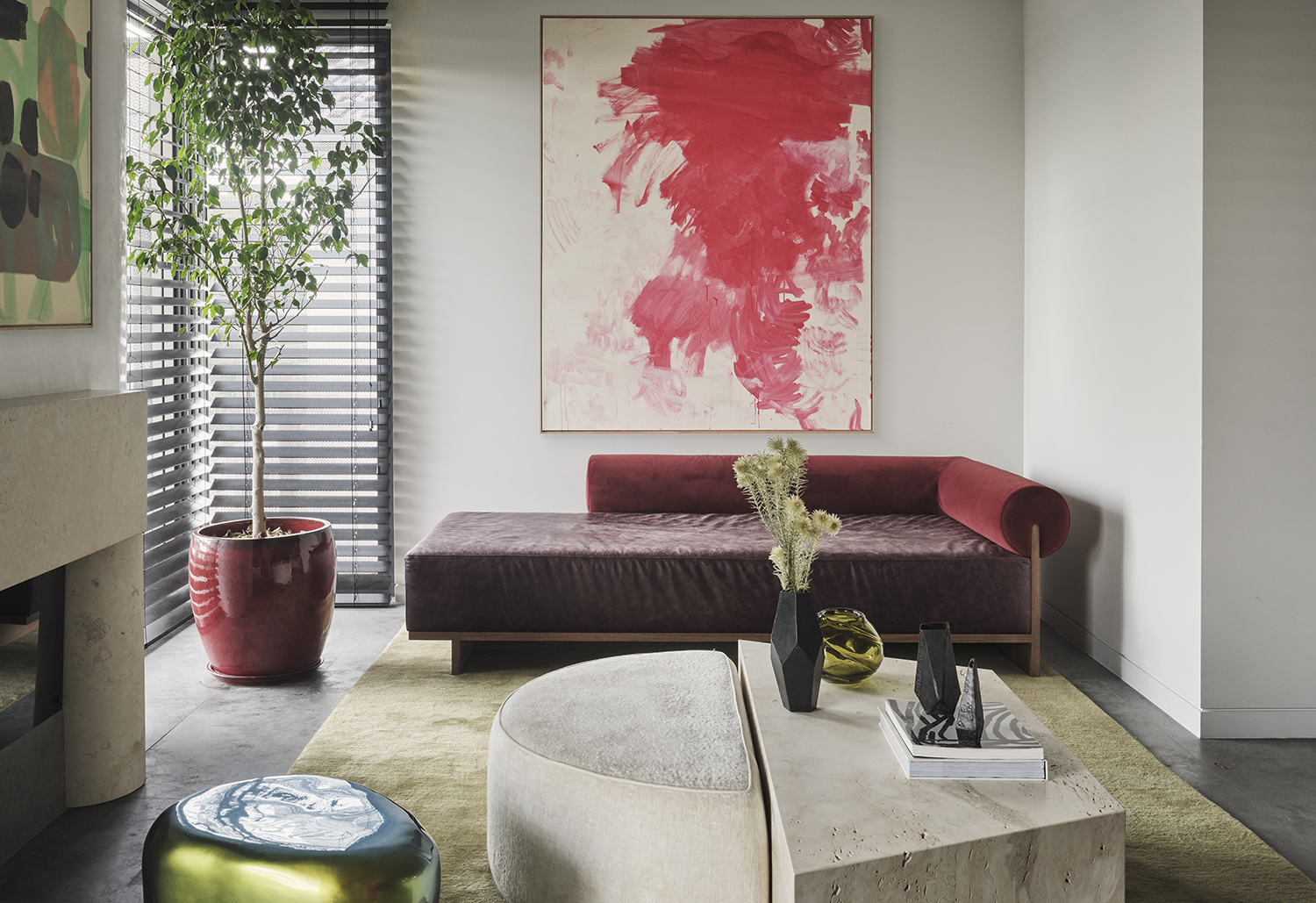
I interview a lot of interior designers, and what they talk about has changed dramatically since 2020. Now, questions like 'what is the most relaxing color for the eyes?' and 'what colors will make you feel most comforted?' are forefront in their minds, whereas before the pandemic they tended to focus on what colors looked best in whatever natural light the room had, or what palettes worked best together.
It's become a key point, as don't we wall want our homes to be relaxing on the eyes? To soothe us as soon as we walk into the door? To do this, designers tend towards paler shades. 'Drawing from nature and its materials is a clear way to create a soothing space,' says Lucas Golbach, Partner and Design Director of the Chicago-based studio En Masse Architecture and Design.
That being said, the studio's founding partner Mike Shively had this caveat to bear in mind when creating a relaxing palette: 'Neutrals, natural tones, and natural materials can fall flat if there is not some contrast to allow the eye to rest.'
Article continues belowHappily, some of the best designers have agreed unanimously on what color is most relaxing on the eyes, helping to guide your living room color schemes. That color, in its many forms, is gray.
What is the most relaxing color for the eyes?
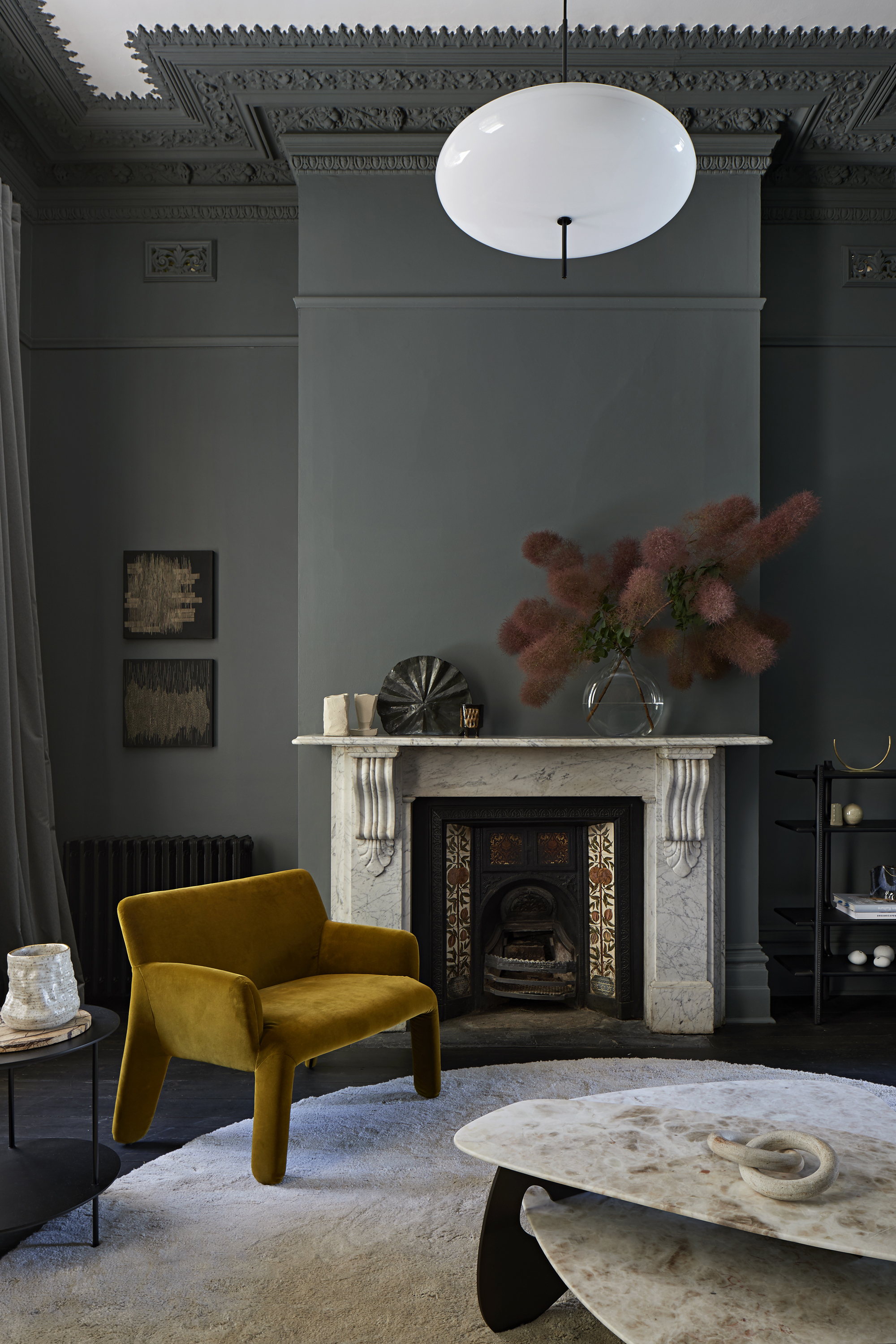
Australian designer Simone Haag has a way with dark color schemes, using rich grays and even blacks to create rooms that are very relaxing on the eye. The wall color in this palette instantly envelopes you, soothing your soul as it allows the brighter colors in front of it — such as the yellow chair — to almost glimmer.
'This room in the original part of the house features original period elements, an intricately detailed and beautiful pressed-plaster ceiling and cornice details, so the styling of those rooms was very important as it is the first impression of the home,' says Simone. 'Maintaining the formality of these original spaces was paramount, along with leaning into the darkness of the room to create a library or retreat sensibility.'
Her aim was to create a space that was as sophisticated as it was relaxing on the eye. 'The palette on the darker side, was classic and grand, it set the tone for the house and helped highlight the heritage features such as the stone fireplace and surrounding tiles,' she adds. 'The gray had plenty of depth and gave a feeling of warmth, allowing the rich jewel colors in the furniture to really shine.'
The Livingetc newsletters are your inside source for what’s shaping interiors now - and what’s next. Discover trend forecasts, smart style ideas, and curated shopping inspiration that brings design to life. Subscribe today and stay ahead of the curve.
What is the most relaxing gray paint?
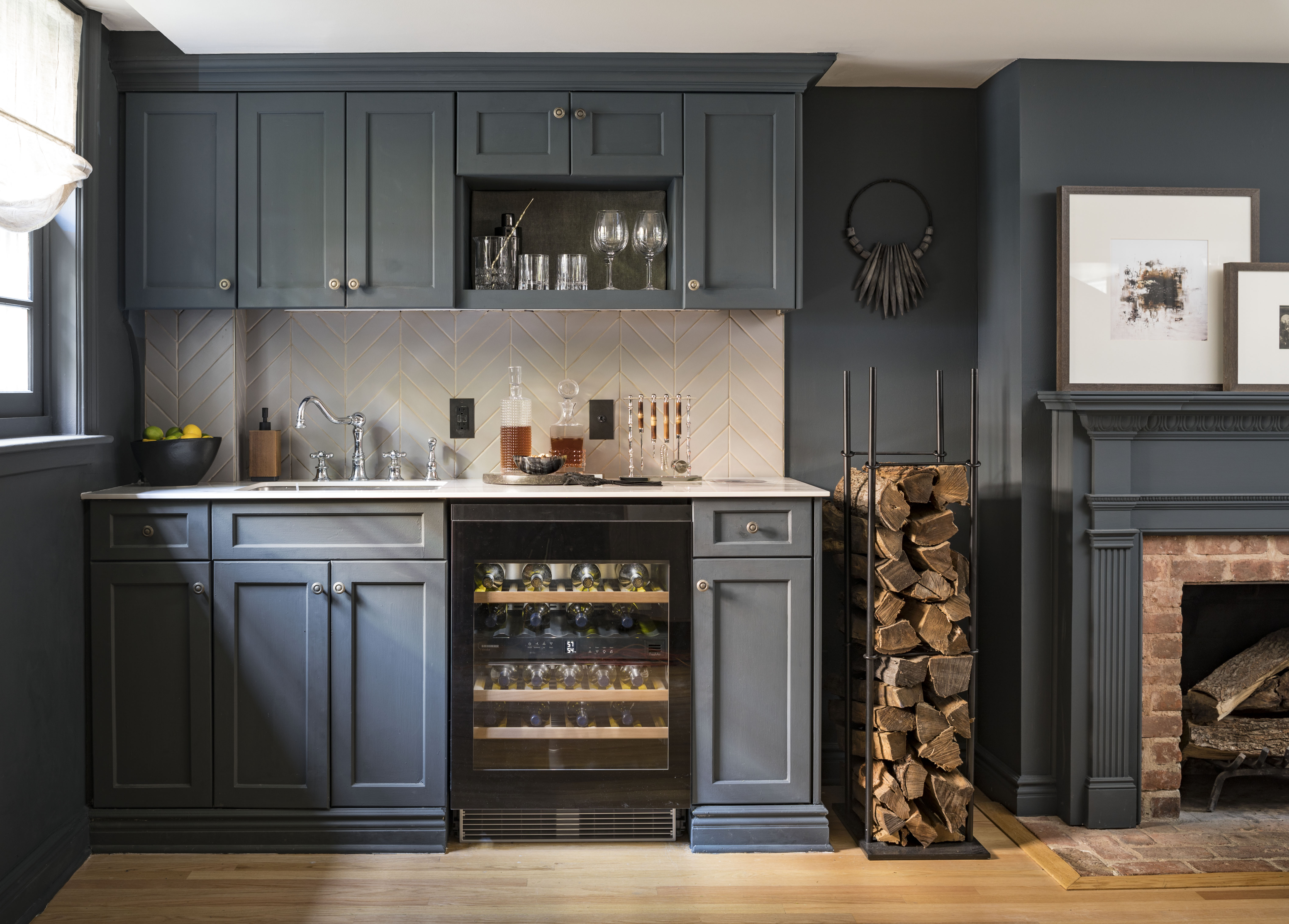
TV presenter and New York-based interior designer Mikel Welch agrees that this darker gray is a perfect color to relax the eyes, using it to great effect on this kitchen's walls, cabinets, and trims.
'When it comes to creating a relaxing vibe, Abbysse by Ressource Paint is a go-to with its moody blue and hints of gray,' Mikel says. 'I love how it instantly sets the mood, making the space feel cozy and inviting. I prefer decorating with neutrals, letting the walls and cabinetry do the talking with their calming hue.'
How to work with grays to make them relaxing on the eye
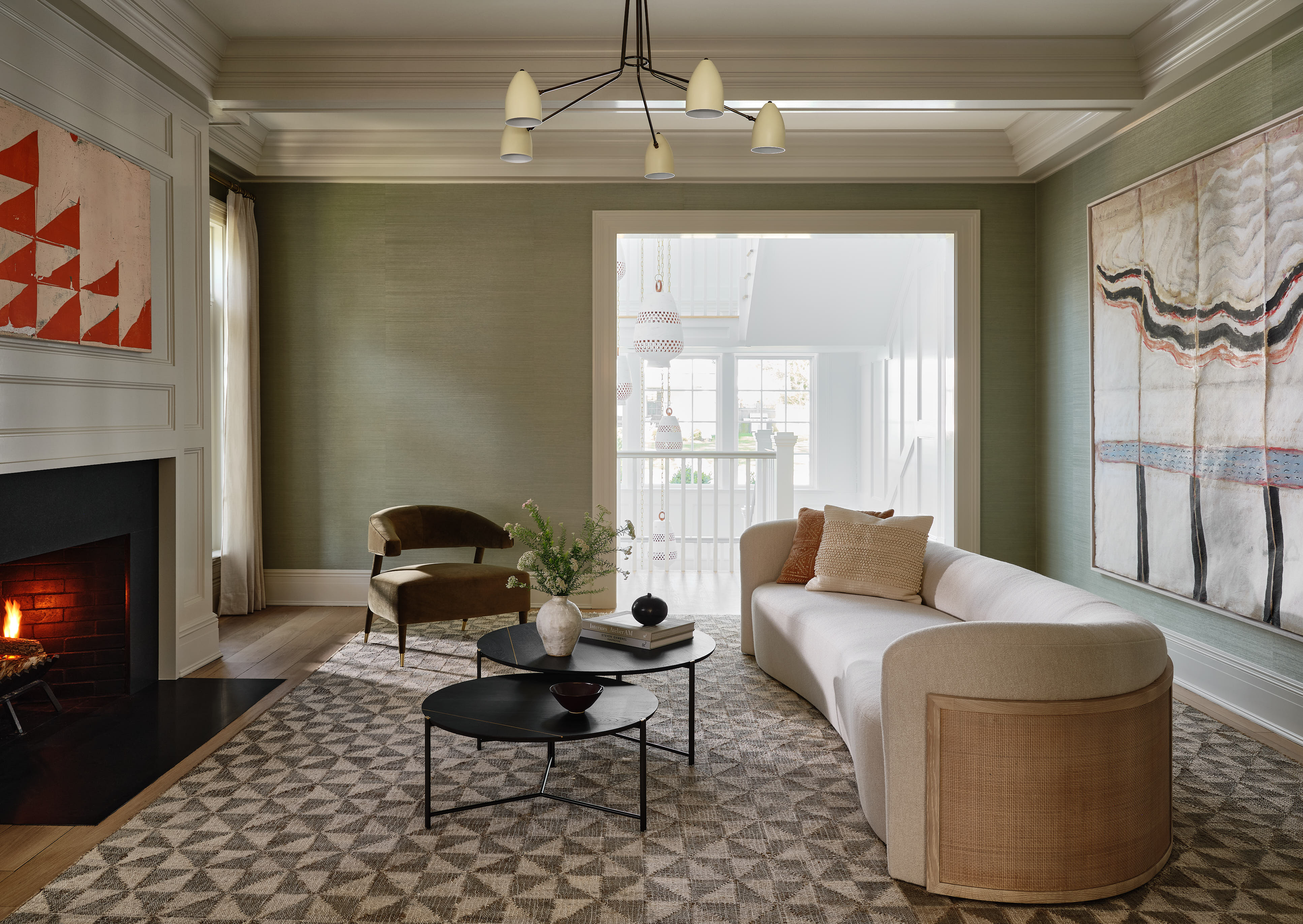
When using grays to make a space relaxing on the eye, it's not just a case of covering the room in them and hoping for the best. A little bit of contrast within the space is needed to highlight just how soothing the gray is, creating a moment of push and pull that benefits the gray and manages to make it even more relaxing.
This cozy gray living room was created by the New York-based studio Chango, and may use a lighter shade than Mikel or Simone, but is no less soothing for it.
'When using greys, we're always mindful of mixing in some contrast with warmer colors and tones, as well as natural materials and textures, like a rattan or woven element,' advises the studio's creative director Susana Simonpietri. 'Grays with blue or green undertones make the color feel more restful, and not so one note. Incorporating pattern when using gray can also add interest to a space. If a pattern has a smaller-scale or repetitive pattern, the gray helps calm the busyness. We focus on softer lighting within those spaces, so that it doesn't feel cold - usually with one standout overhead fixture or a few strategically placed sconces.'
Where should gray be used to make it feel most relaxing?
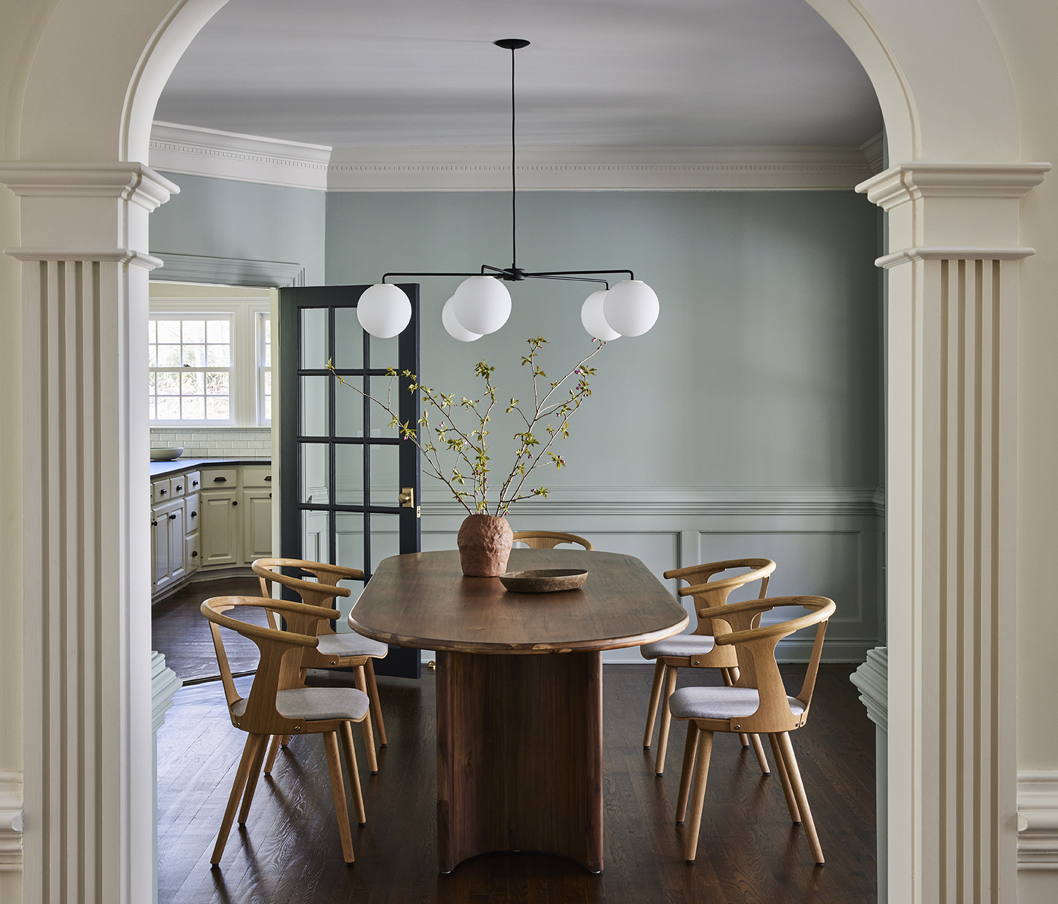
The ideal rooms for gray walls are living rooms, dining rooms and kitchens — anywhere you want people to feel at ease and spend a lot of time in. Though be mindful that designers tend to steer away from using gray as a bedroom color, tending instead to go for warmer tones that wrap you up.
This dining room was created by the New York-based studio Bespoke Only, using a lighter — but still blue-toned — gray to create a very relaxing space. The walls are painted in Light Blue by Farrow and Ball, a color misleadingly named as it errs towards gray.
'We love how the paint gives a nod to the colonial architectural background of the space, but with a translucent quality in this particular hue,' says the studio's founder Melissa Lee. 'When responding to the soft natural light, there's a palpable sense of clean modernity balancing out the otherwise traditional wainscoting details.'
The editor of Livingetc, Pip Rich (formerly Pip McCormac) is a lifestyle journalist of almost 20 years experience working for some of the UK's biggest titles. As well as holding staff positions at Sunday Times Style, Red and Grazia he has written for the Guardian, The Telegraph, The Times and ES Magazine. The host of Livingetc's podcast Home Truths, Pip has also published three books - his most recent, A New Leaf, was released in December 2021 and is about the homes of architects who have filled their spaces with houseplants. He has recently moved out of London - and a home that ELLE Decoration called one of the ten best small spaces in the world - to start a new renovation project in Somerset.
