"Double Drenching" is the Trending Decorating Technique That Offers a More Refined Approach to Color Drenching
This bold new paint trend is a play on the familiar favorite, allowing for an even more playful color application

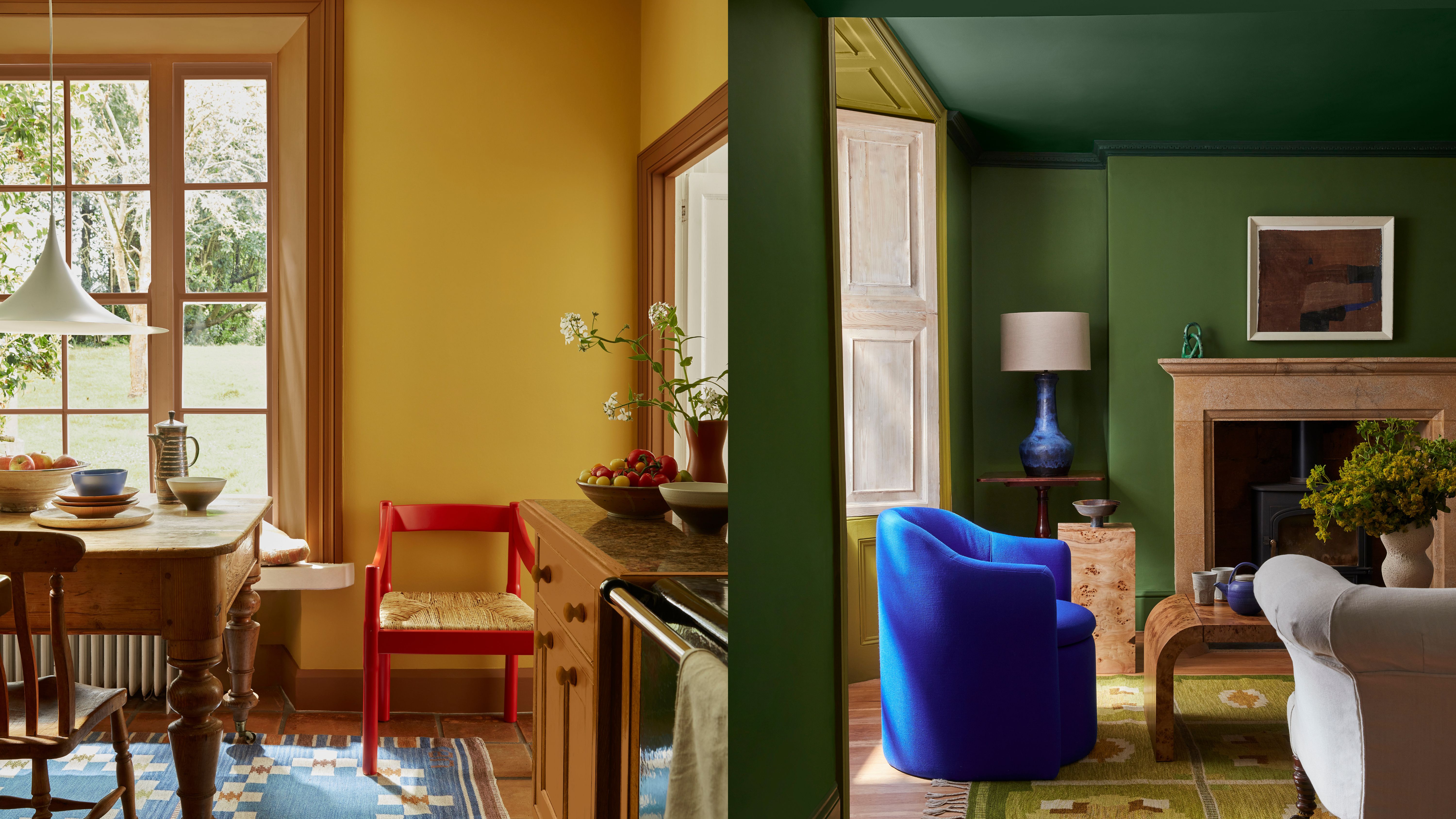
We should all now be well aware of color-drenching: the interior paint trend that took our traditional interiors and allowed us to experiment with boldly enveloping our rooms in monochrome tones. Well, the time has come for a new variation of the beloved paint technique in town, and it's here to make an even bigger statement.
Double drenching is like the cool older sister of the original color drenching trend. Its daring double nature is a playful evolution of sticking to a single shade. It encourages us to venture even farther into the complex world of color with a tonal scheme, using two shades of the same hue to cocoon a room. Maybe you are someone who already loves a bold pop of color and wants their trim to stand out, or maybe you want to add more depth to your existing color-drenched spaces. Either way, this is one of the top color trends to be on your radar.
If you're anything like me, making a singular, definitive decision is a troubling ordeal. The idea of embracing multiple tones of the same color within a space gives me greater scope for decorating. But according to experts, it is not a technique for the faint of heart.
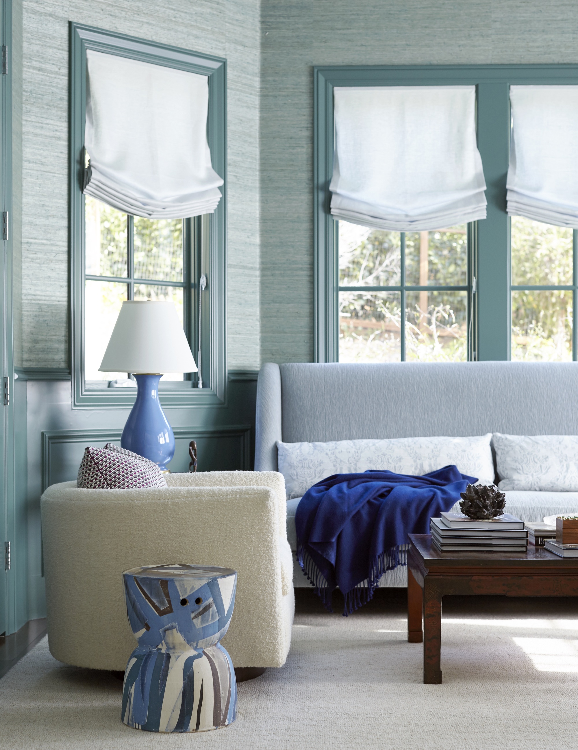
Ruth Mottershead, Creative Director at Little Greene, talks about their company's coining of the double-drenching approach. Ruth explains that "double drenching" is the more sophisticated evolution of the color drenching paint technique. "Rather than enveloping a space from ceiling to skirting and every surface in between in one single color, double drenching utilizes two or more related colors to drench an interior," says Ruth.
This trend is not as simple as painting every nook and cranny in your favorite color, it is a bit more complex to achieve. In order to execute this look effectively, Ruth recommends opting for "a combination of equally powerful colors that vary in hue rather than tone." What does this mean exactly? Simply put, tone refers to the lightness or darkness of a color. So rather than playing it safe with just a lighter variation of the same blue, double drenching is about going bold and mixing up the hues and undertones. This would look like trying out bright teals (which have a more green undertone) next to royal blues (where the undertone leans more purple).
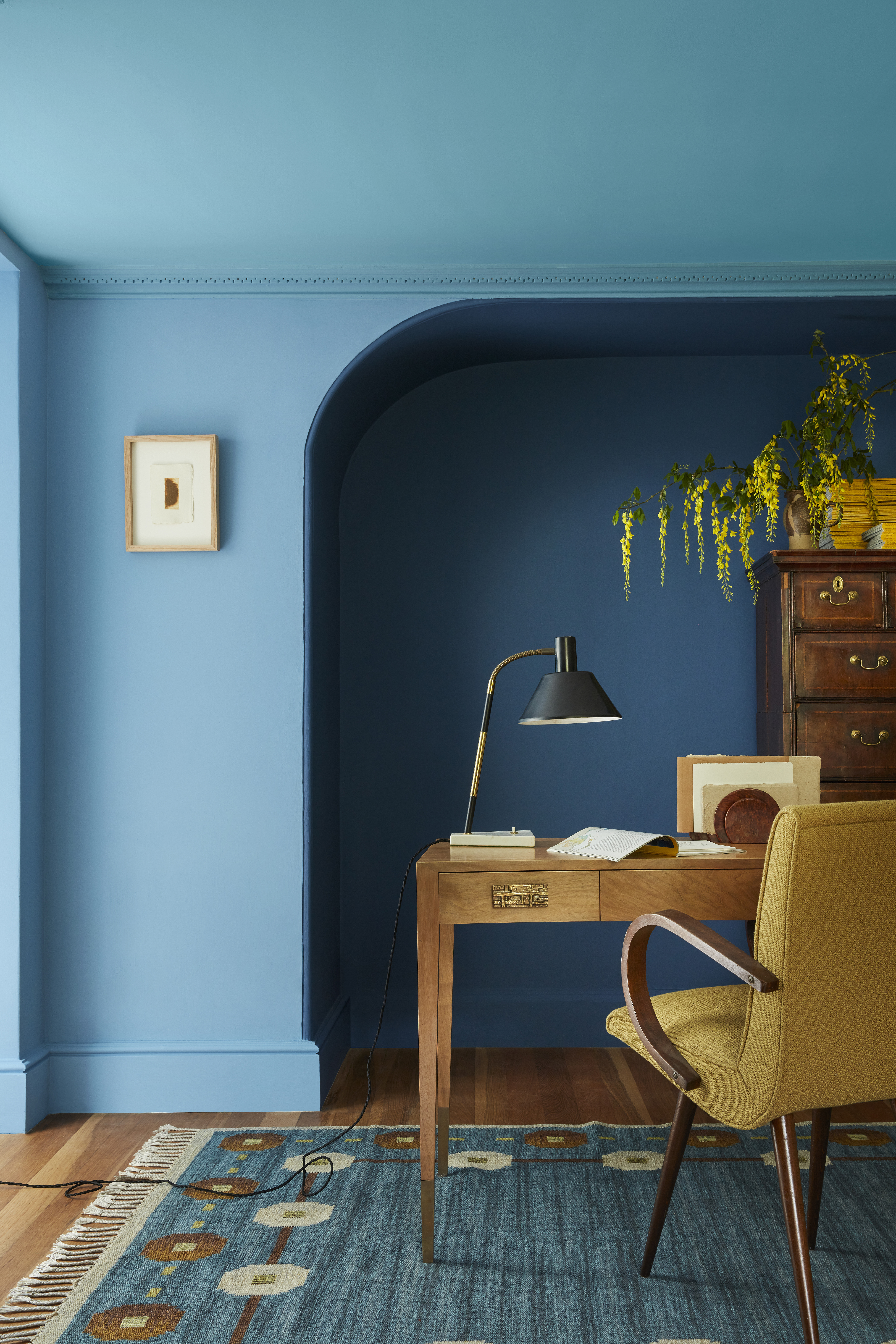
"Heretofore, mixing undertones in one setting was considered a decorating no-no," says Architectural Color Consultant, Amy Krane. "Generally speaking the most harmonious spaces are ones which mix both warm and cool colors in it. A space which employs this technique does not." But the deterrent here is also the inspiration. The goal is to consider controversial color pairings and how they can actually work very stylishly together.
Some people will find that the color mixes involved in double drenching will result in clashing colors, but others will find them highly stimulating and a whimsical touch to a room. Amy says the technique is better saved for a few rooms around the home, rather than the whole house. "I would not only vary up the undertones, I would also mix up the value and chroma so there is more balance in the room," she says.
The Livingetc newsletters are your inside source for what’s shaping interiors now - and what’s next. Discover trend forecasts, smart style ideas, and curated shopping inspiration that brings design to life. Subscribe today and stay ahead of the curve.
Mixing yellow-greens and blue-greens is a safe place to start with double painting as this combination imitates what we see in nature so it will feel familiar, natural, and most peaceful. Then adding little pops of colors that go with green in your decor will play even more into that bold and eccentric feel. "A double-drenching approach is about fully enveloping a space with color, there is no space for white ceilings or skirting with this decorating style," says Ruth.
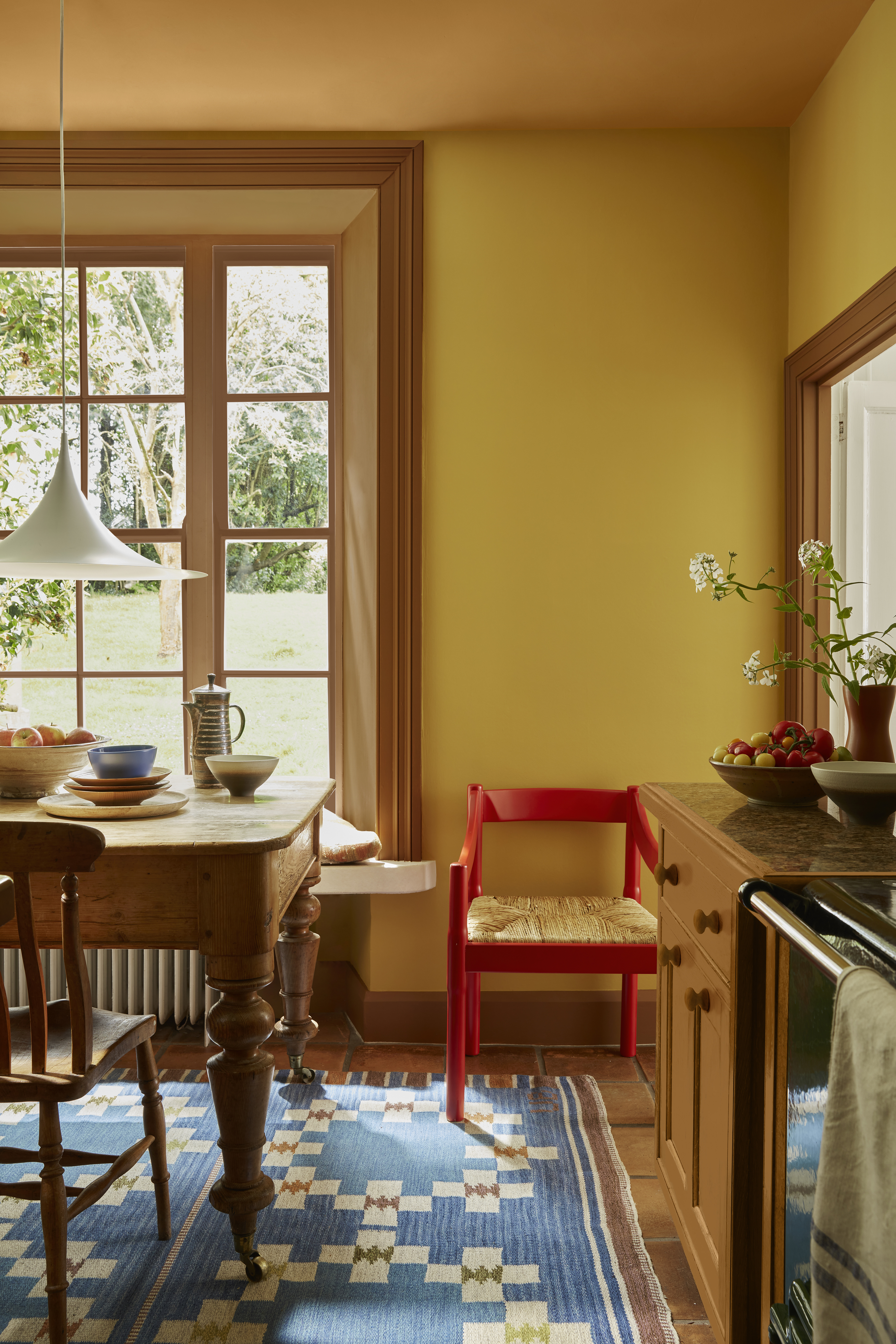
The best thing about this new color trend is it's openness to creativity while simultaneously making your home feel more sophisticated. As Ruth says, "this decorating approach allows for differentiation while maintaining a cohesive aesthetic. The subtle use of incorporating related colours together will create a layered look, with subtle contrast which feels dynamic and visually intriguing."
Start slow with just a couple colors in the mix, then you can slowly experiment with more decorative touches and let your bold color dreams run wild.

Olivia Wolfe is a Design Writer at Livingetc. She recently graduated from University of the Arts London, London College of Communication with a Masters Degree in Arts and Lifestyle Journalism. In her previous experience, she has worked with multiple multimedia publications in both London and the United States covering a range of culture-related topics, with an expertise in art and design. At the weekends she can be found working on her oil paintings, reading, or antique shopping at one of London's many vintage markets.

