"I Like to Call This Home a Charming Collision of Color, Character, and Considered Design," Says the Designer of This Federation Home That Combines Postmodern Italian Design With Memphis-Inspired Color
Italian postmodern design — and Greg Natale's vision — has brought new life to this heritage Sydney home
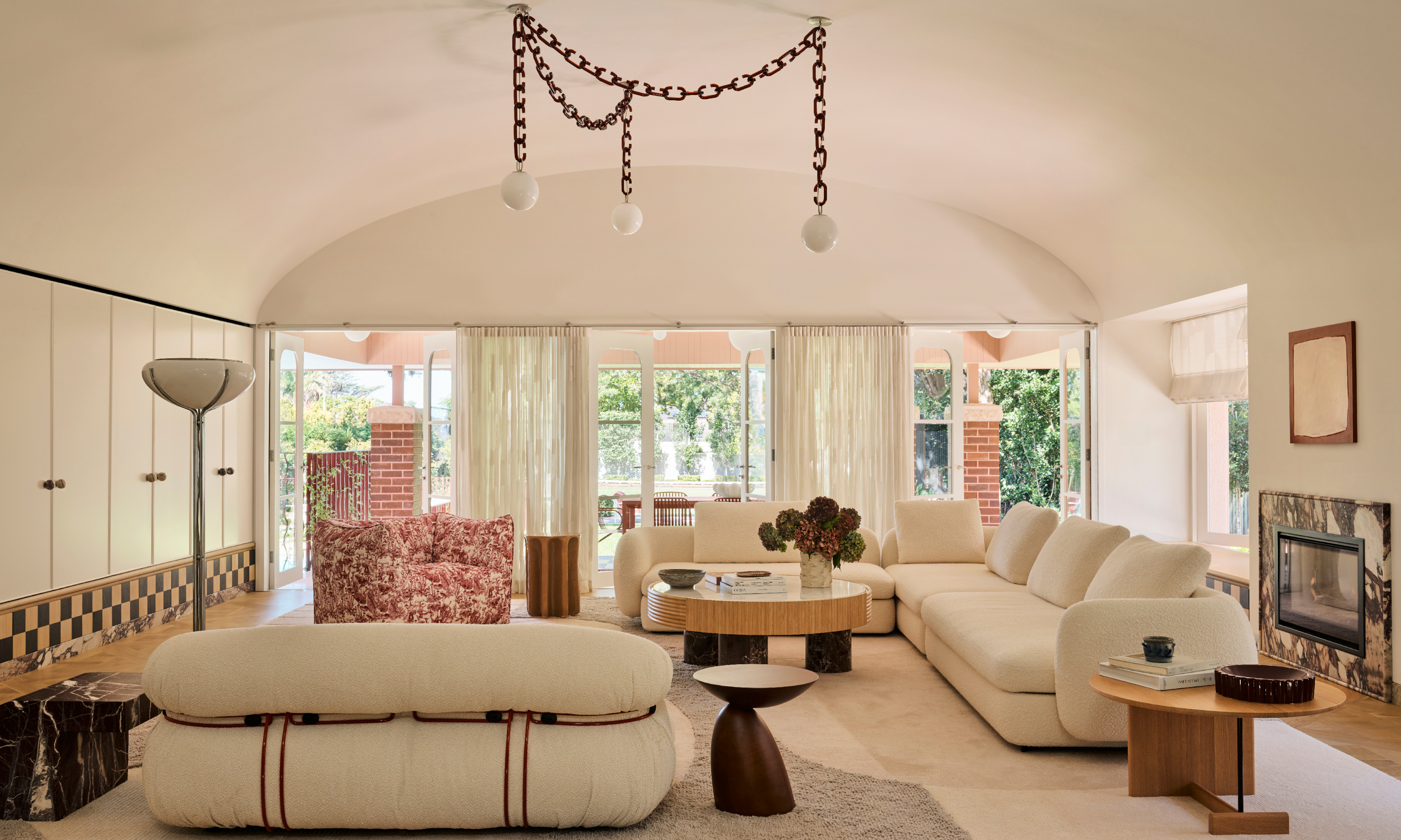
"I like to call this home a charming collision of color, character, and considered design," says Greg Natale, the man who brought this Federation-era dwelling back to life, imbuing it with lost grandeur and adding a reviving mix of eclectic furniture and decorative details with a strong emphasis on Italian design.
The owners of the 1918-built house on Sydney’s Upper North Shore are a couple with four young children and two cats. He works in the tech and investment space and, as is evident from this modern home, they both have a strong appreciation of design.
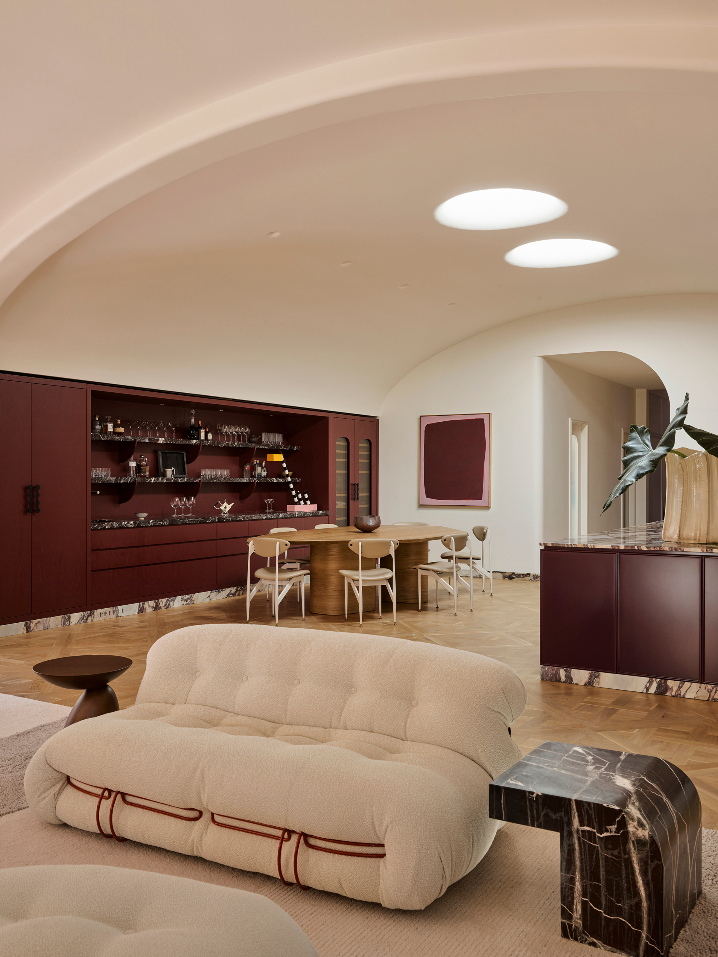
The kitchen, dining, and living areas are in the new open-plan extension. The long, sleek home bar in merlot red unifies the space through color.
They approached Greg Natale’s design practice after seeing a previous project where the heritage architecture of a home had been restored. "Honoring the house’s Federation roots was critical, but they also wanted to bring a fresh perspective to the refurbishment," explains Greg.
"As long-time admirers of Italian design, they were also drawn to our experience with Italian materials such as marble and tiles, which became an important part of the design language."
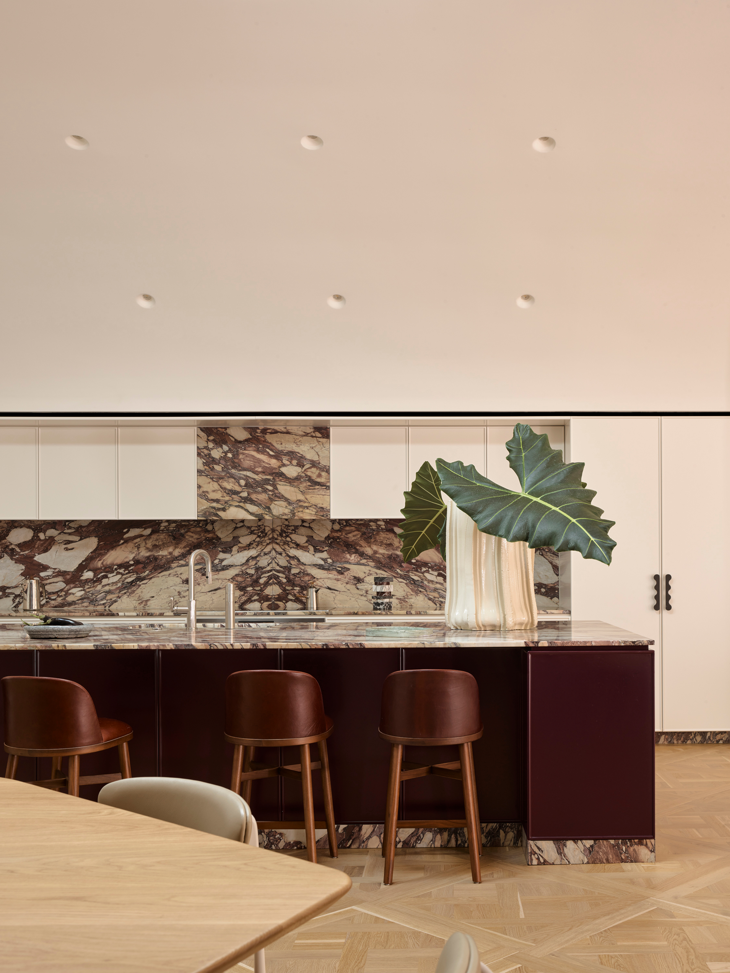
The brief was to design a space that felt bright, open and full of life. Beneath a vaulted ceiling and generous skylight, the large island serves as the heart of the room.
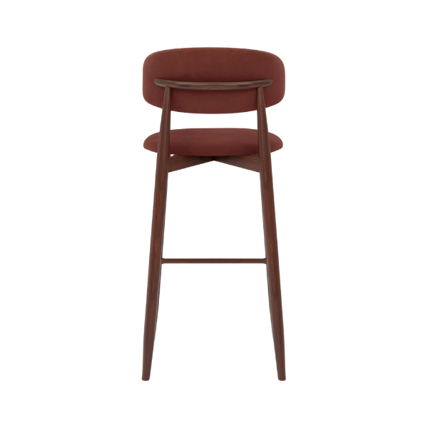
For a similar look, this bar stool from Cult Furniture is the perfect combination of materials for a luxe look.
Like many heritage homes in Australia, this property had undergone clumsy renovations in the 1970s, during which all of its original 1918 details were lost. "When we came on board, none of the Federation character remained, and we made the decision to essentially gut the home and start afresh, reintroducing key architectural details such as parquet flooring, fluted wall paneling, and custom moldings to honor the spirit of the home’s original iteration," explains Greg.
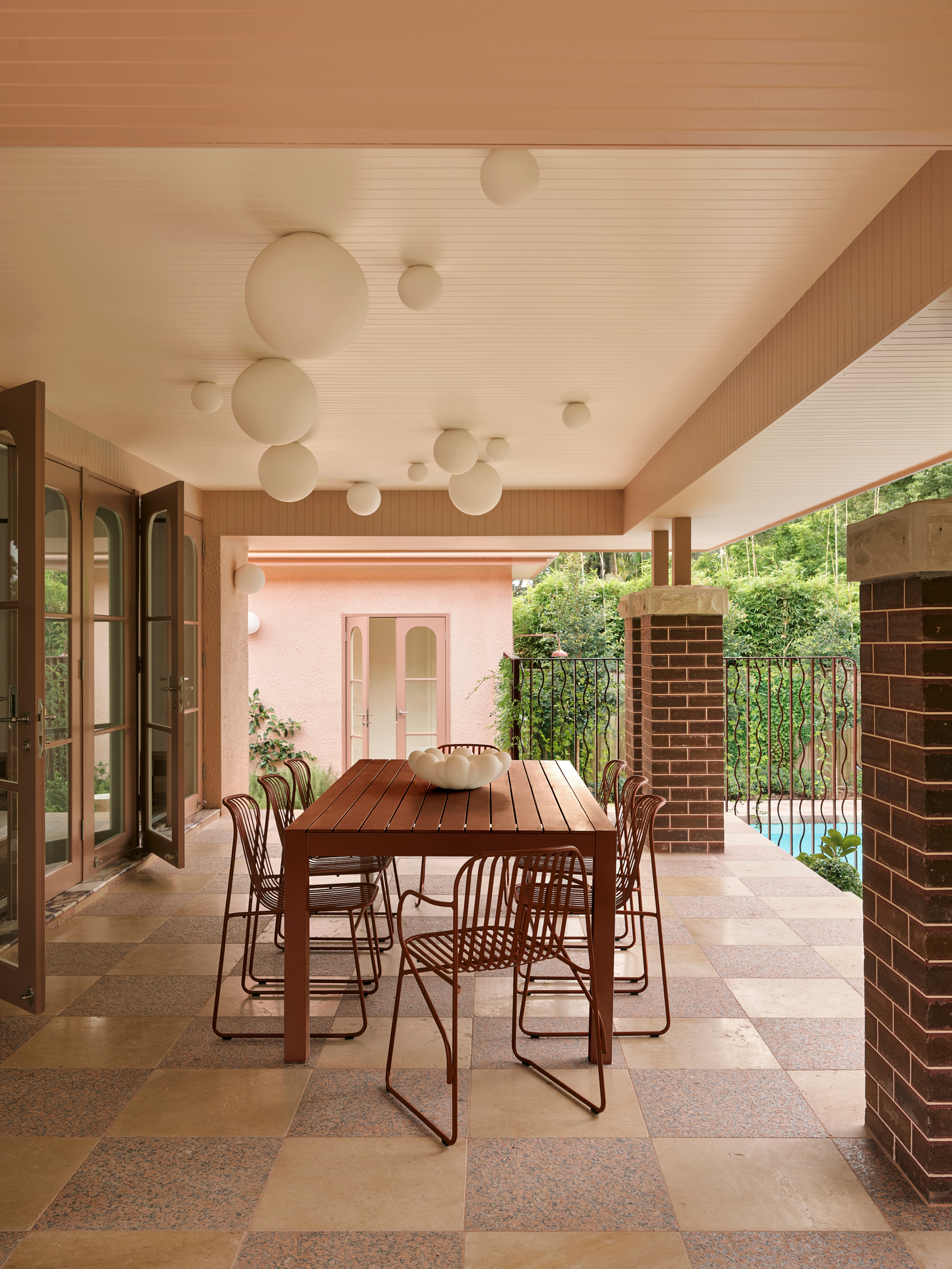
The outdoor terrace was conceived to function both as its own destination and as an extension of the new interior. When the doors are opened, the lounge flows seamlessly onto the terrace, forming a generous zone for entertaining or quiet relaxation.
Beyond the home’s heritage, Greg and his team drew inspiration from modern European design — particularly Milanese style. From Mediterranean-inspired citrus-banded ceilings to bold graphic chandeliers, the vision was to embrace a joyful approach to living, while grounding it in craftsmanship and detail.
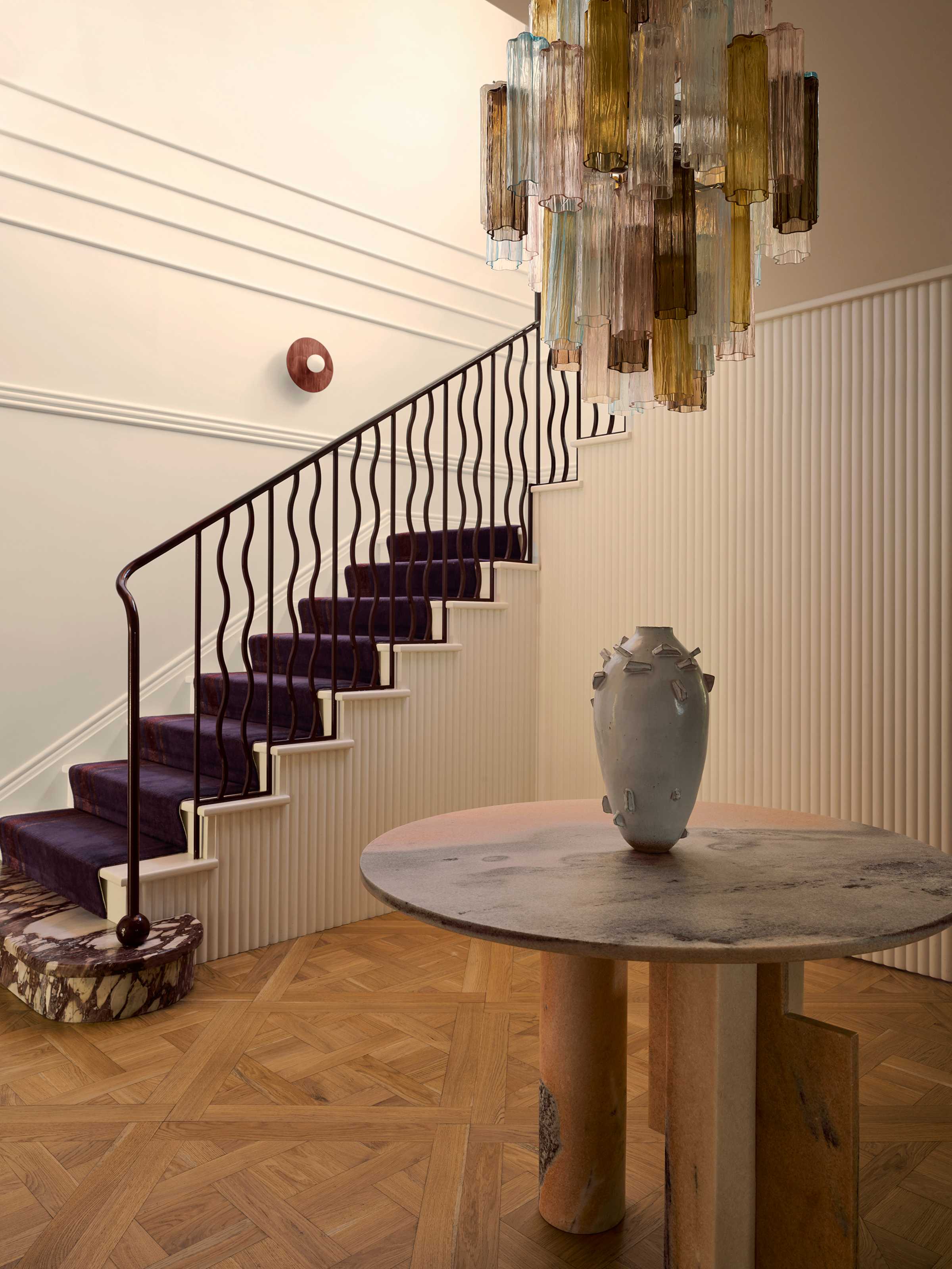
"We added all the fluting and wall paneling to reflect how the house would have been originally," says Greg.
Murano glass chandeliers became a key touchpoint. "One of my uncles had an extraordinary collection in his home, and I’ve always admired how colored glass brings such vibrancy and energy to a space," Greg explains.
The Livingetc newsletters are your inside source for what’s shaping interiors now - and what’s next. Discover trend forecasts, smart style ideas, and curated shopping inspiration that brings design to life. Subscribe today and stay ahead of the curve.
"That influence felt perfectly aligned with the owners’ own appreciation for postmodern artifice, which is an era I love exploring in my work."
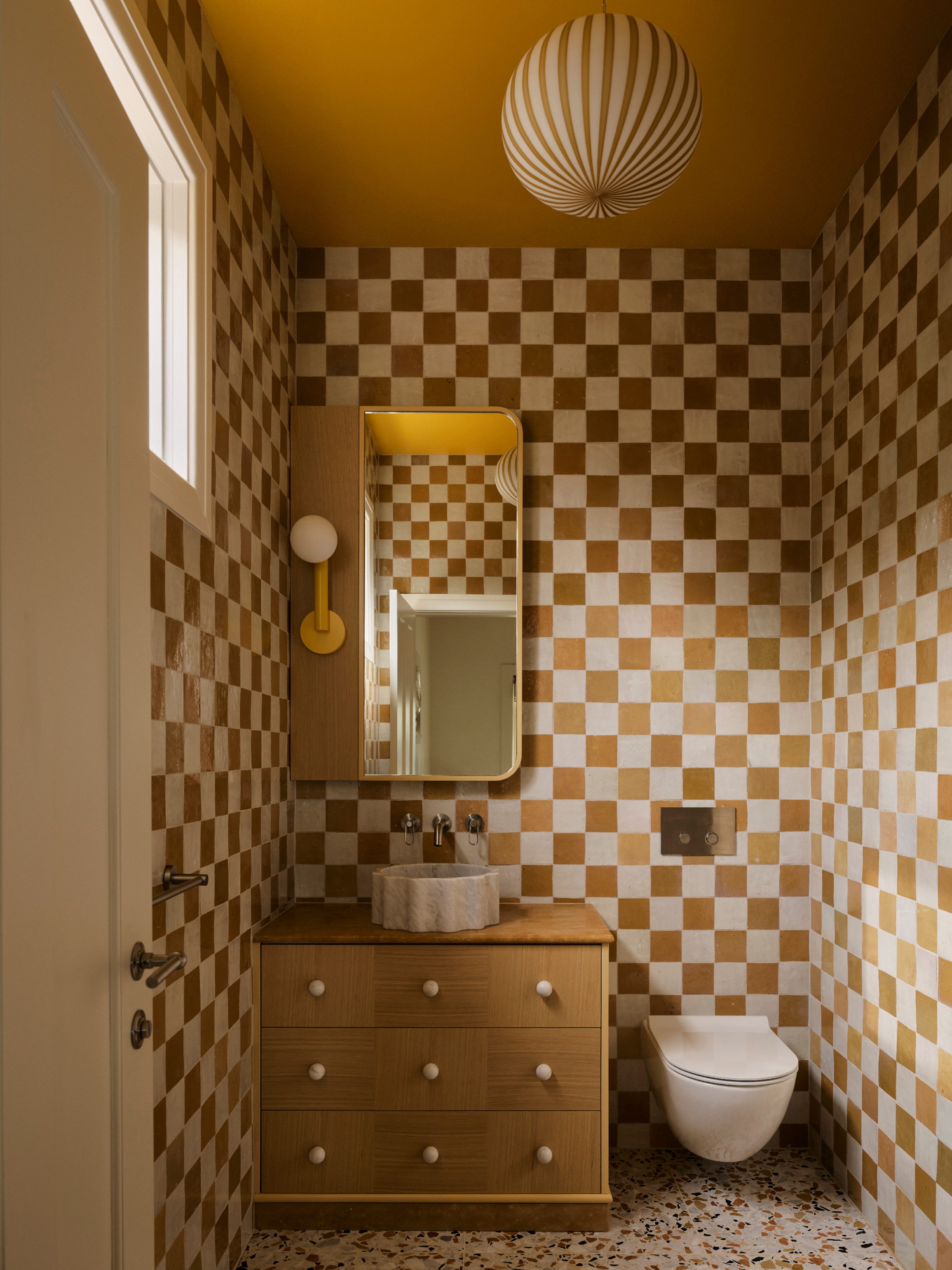
"The terrazzo floor draws color cues from the adjoining bedroom," says Greg. "Just like the bedroom, the space is fun, unexpected, and full of personality."
Bold primary colors root the design — red, green, and yellow — layered with secondary tones such as purple and deeper greens, and all inspired by the Memphis Milano movement with its playful, blocky use of pigments.
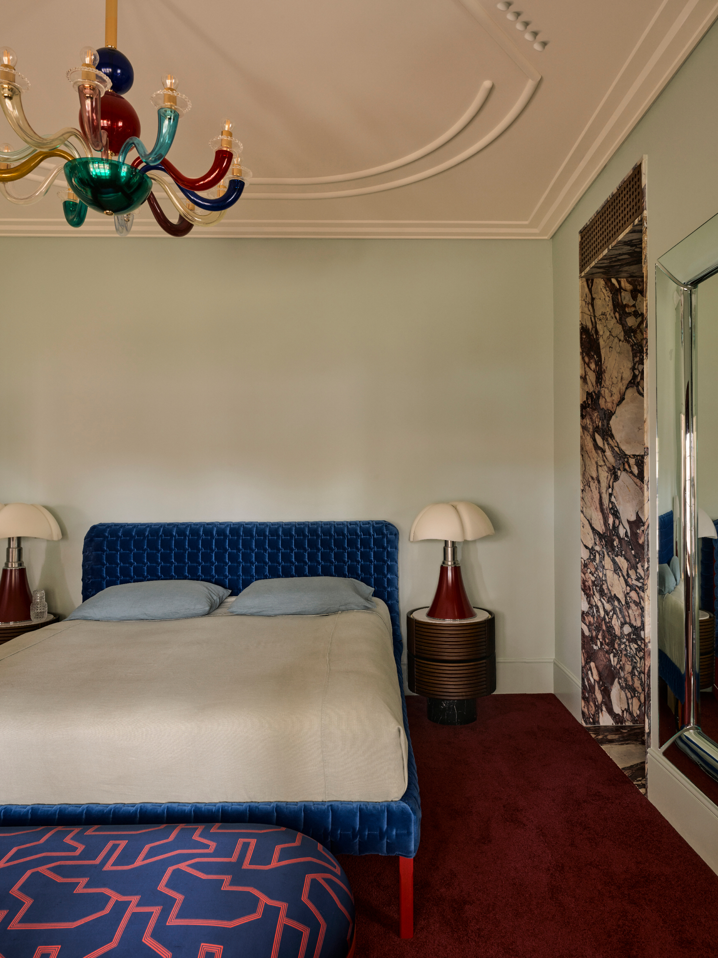
"This is one of my favorite bedroom designs — defined by a palette of jewel-toned, heritage colors that honor the home’s period character while reintroducing a sense of grandeur," says Greg.
The house was reconfigured with the addition of a ground-floor extension, affectionately referred to by the owners as their "great room", which includes the living area, kitchen, and dining space. Their bedroom suite and a nursery for the youngest child are also on this floor, with three bedrooms and bathrooms for the older children upstairs.
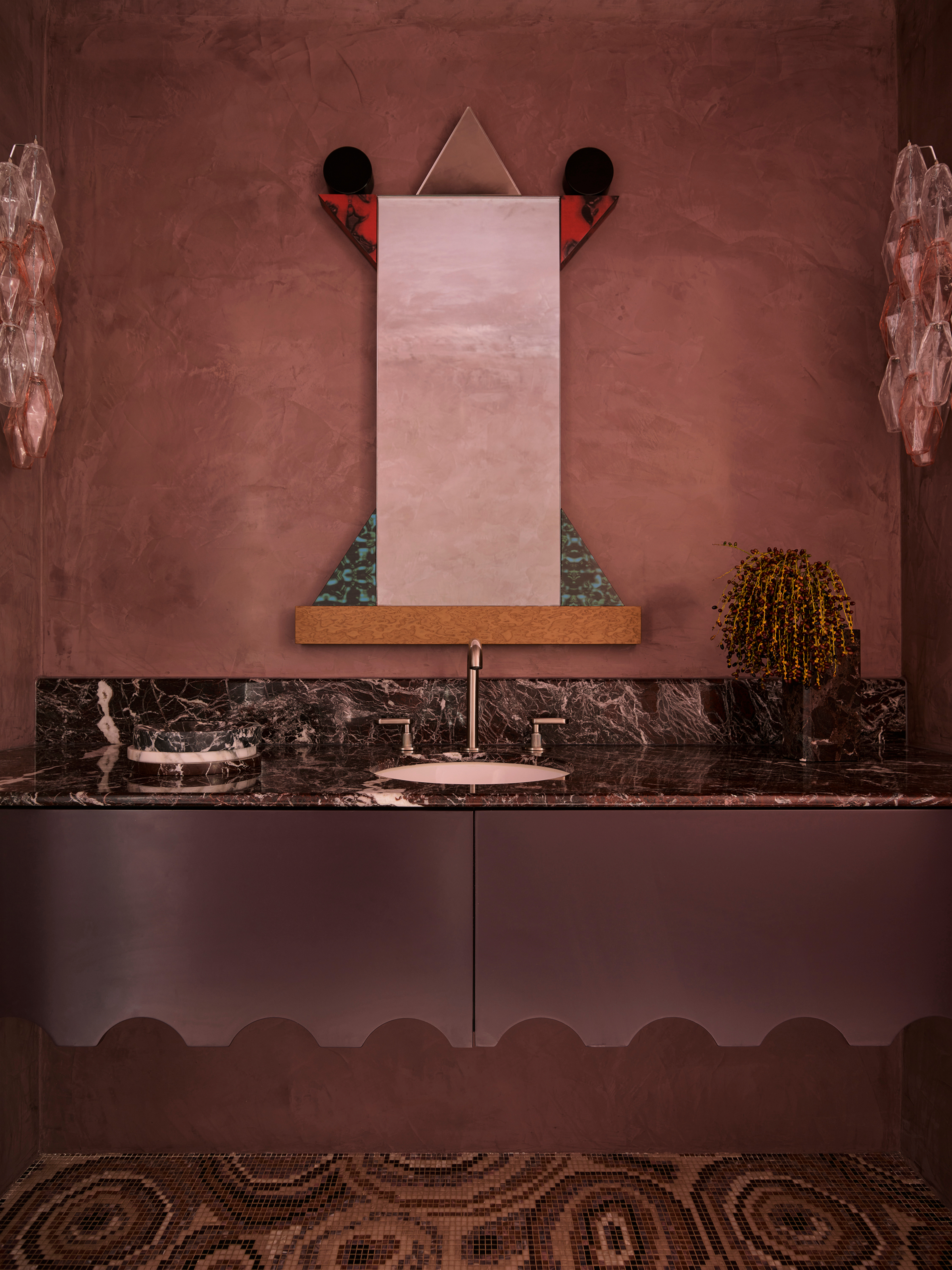
"A sense of theater and drama was the brief — a true 'wow' moment that felt memorable and highly designed, yet still playful and whimsical," says Greg.
From the outset, the brief from the owners was music to Greg’s ears: "a home that was vibrant, full of personality and playful, yet also sophisticated and timeless." They sought theater and drama, but equally warmth and comfort. "In essence, they needed a home that was durable and spacious enough to raise their four children, while still feeling expressive, elegant, and enduring."
A legendary houses editor, Mary Weaver, held the job of homes editor on Livingetc for over a decade. She set the aesthetic for which the brand has become known. She is now a freelance stylist, art director, and writer, regularly contributing to Livingetc and overseeing the brand's successful House Tours franchises of live and webinar events.
