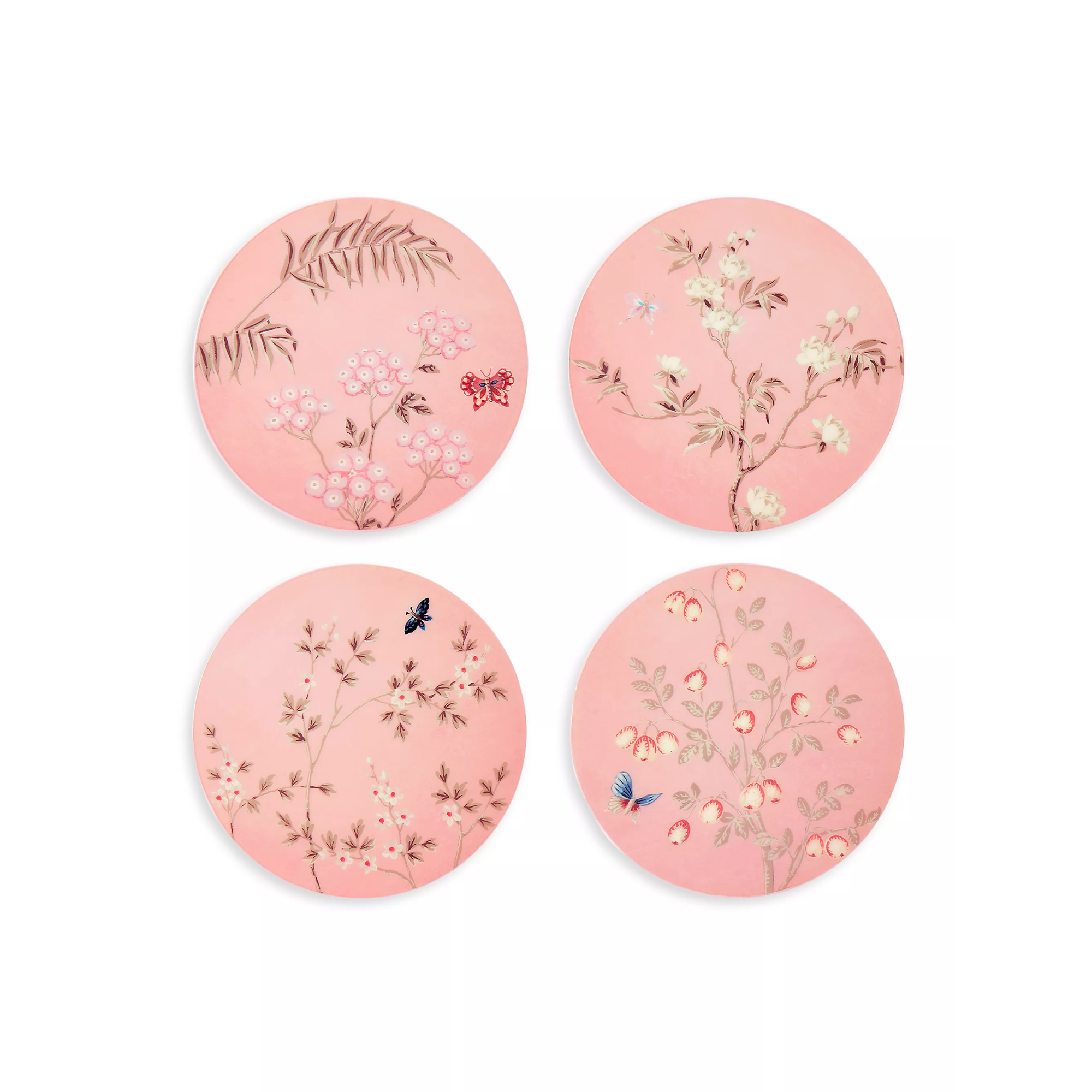
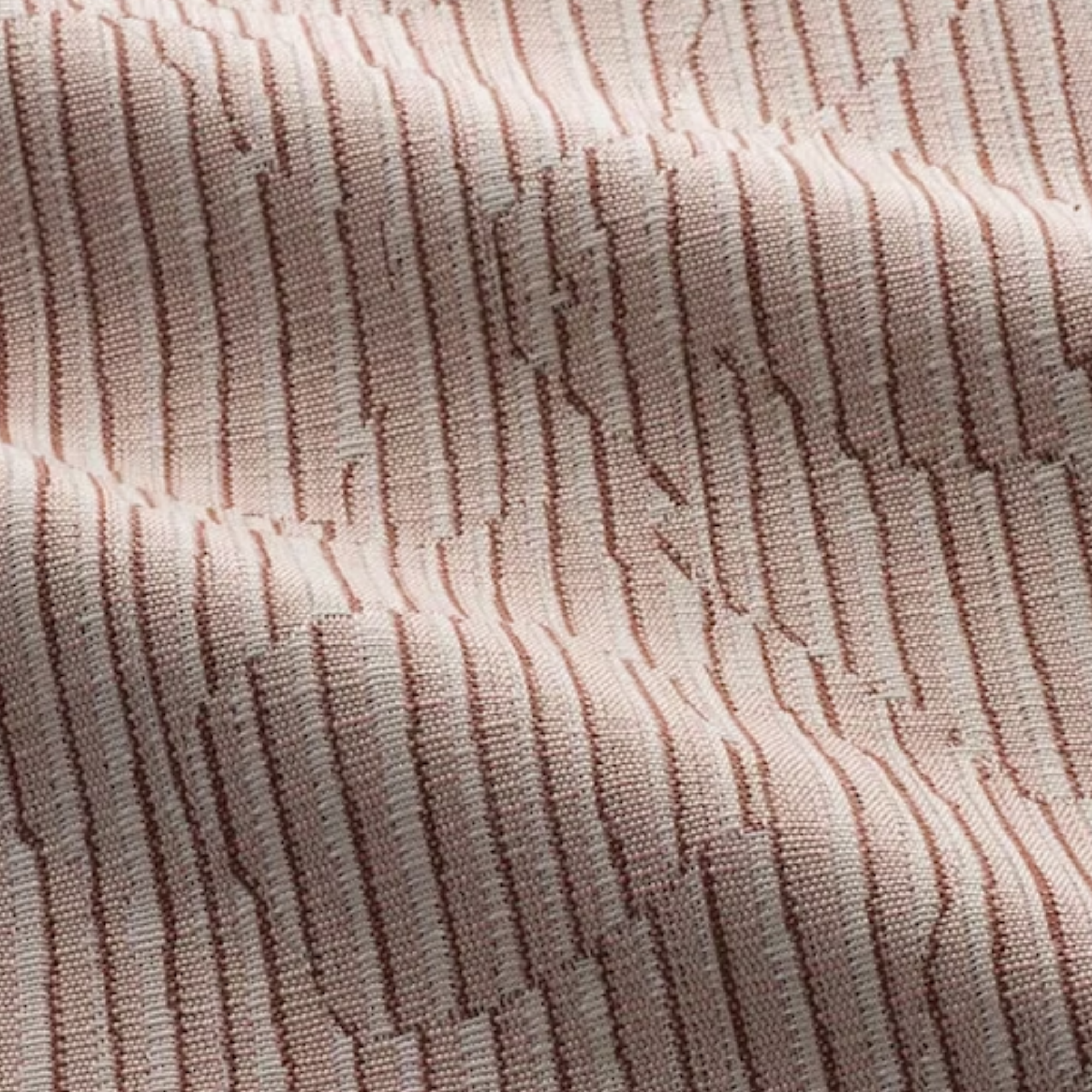
Color Crush! 'Sakura Blush' Is the Rosy Shade That Challenges the Idea That Pink Is Too Childish
Our May Color Crush, Sakura Blush, is the perfect balance of depth and delicacy, and can completely transform your interior design — here's how

The Livingetc newsletters are your inside source for what’s shaping interiors now - and what’s next. Discover trend forecasts, smart style ideas, and curated shopping inspiration that brings design to life. Subscribe today and stay ahead of the curve.
You are now subscribed
Your newsletter sign-up was successful
May is one of my favorite months for many reasons. The spring season is in full swing, the weather is finally starting to get warmer, and, of course, the flowers are beginning to bloom after a long winter's rest.
It's this idea of springtime rebirth that inspired the Livingetc team to select a sweet, light shade from the pink color palette as our Color Crush for the month of May. We're calling it Sakura Blush — a name that instantly evokes images of Japanese cherry blossom trees coming to life, with light pink petals delicately painting the sculptural branches.
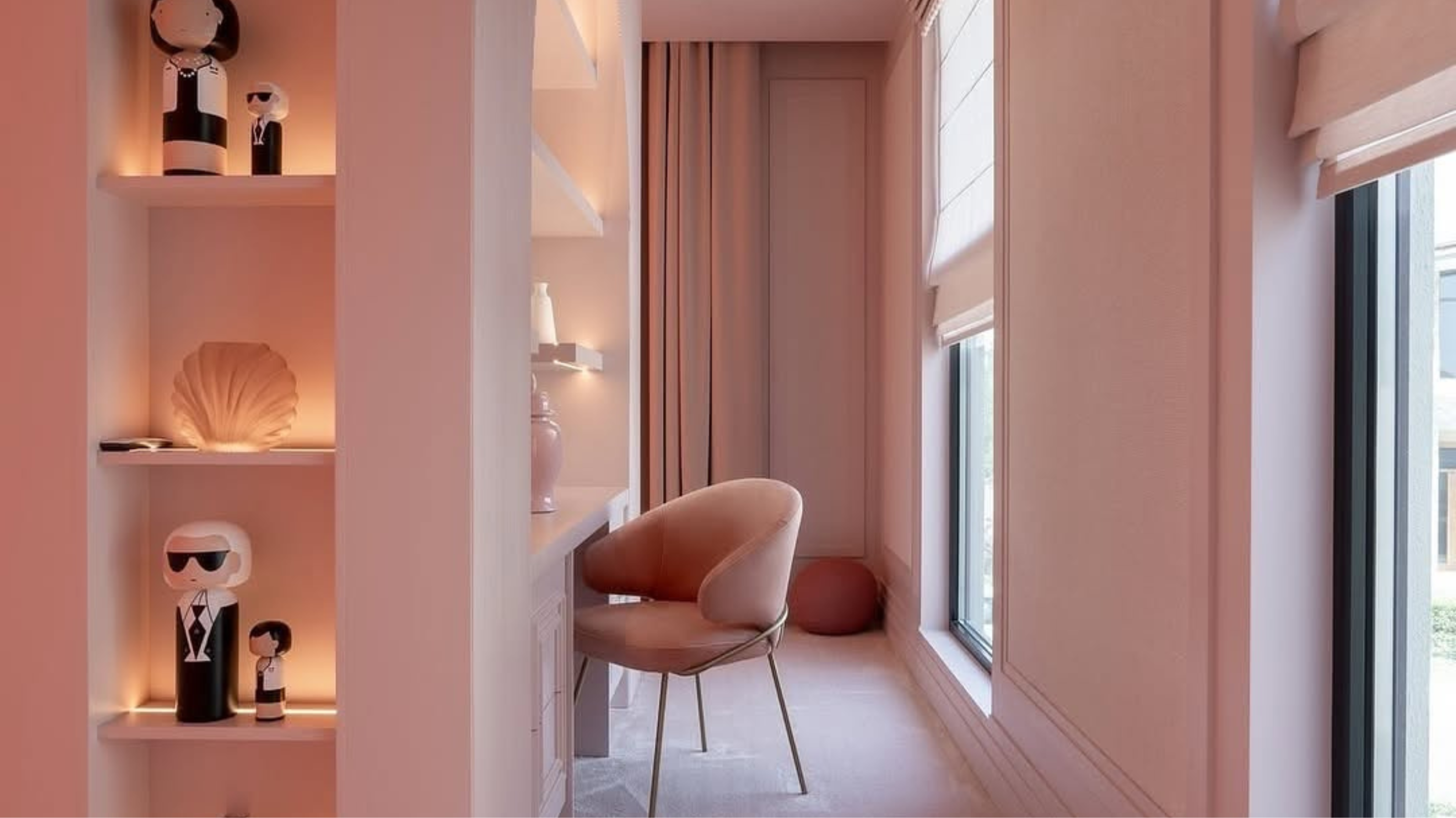
In interiors, color trends around pink hold an innate softness, but also bring an element of depth — and Sakura Blush does the same. "It’s a calming color that can soften a space and make it feel more expansive," Jen Baxter of Baxter Hill Interiors says. "There’s also something quietly flattering about pink — it casts a gentle warmth that makes skin, and materials, glow."
Article continues belowSakura Blush is dusty, yet deep. Bright, but not overwhelmingly bold. It's a modern take on a classic color, and it can transform any room of your home.
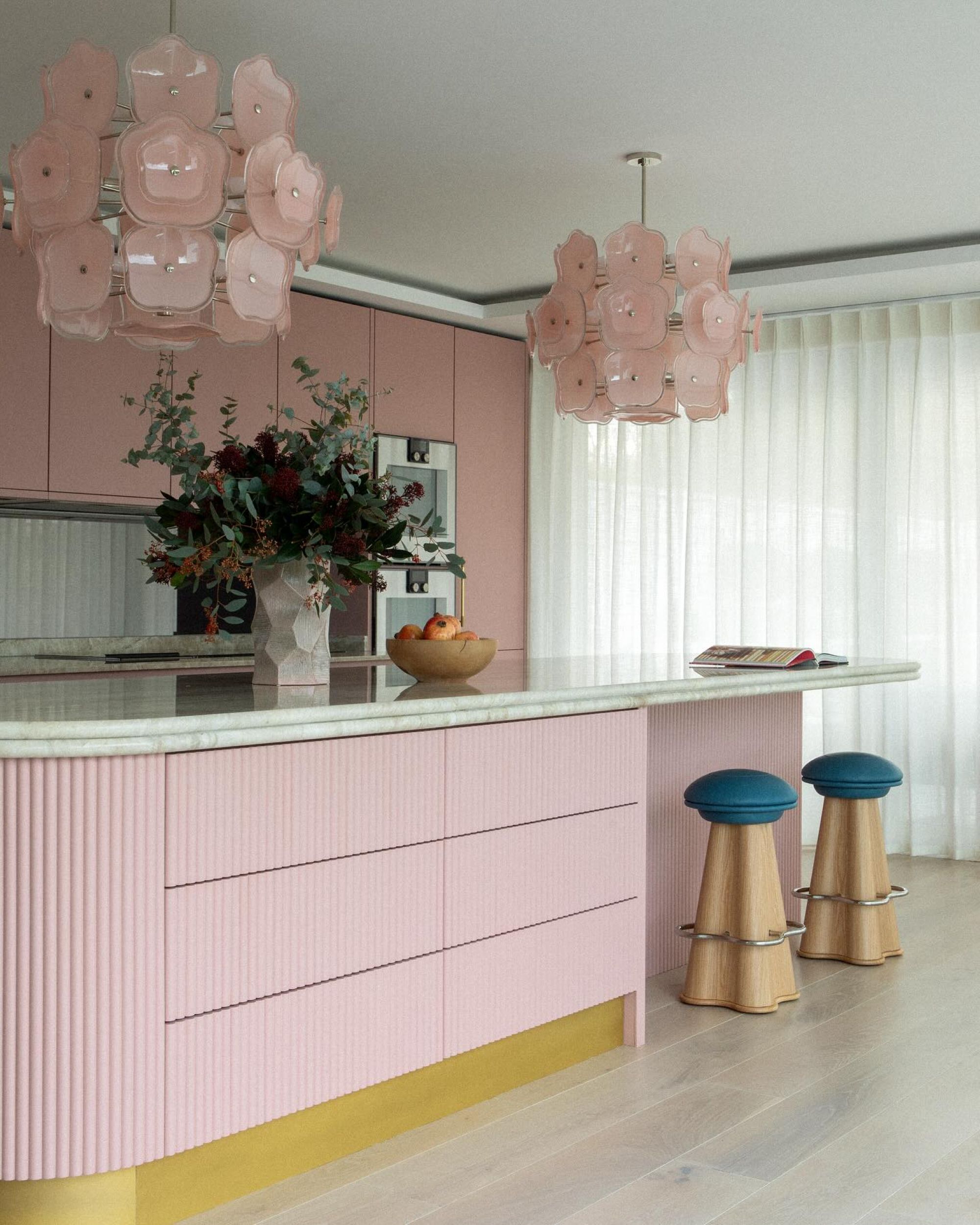
Using this light shade of pink in a kitchen design brings a sense of freshness and modern appeal to the space.
Shades of pink like Sakura Blush have long been dismissed as too juvenile for modern spaces. But, the perception of pink is slowly starting to change, and for the better.
"Though it was once regulated to nurseries or little girls’ room, light pink is now showing up in unexpected spaces, as homeowners become more bold in their use of the color," interior designer Olma Fuentes, founder of Deni + Dove Interiors, tells me.
And it's true. Interior design trends are pointing us in a direction of expressiveness. Because of this, we're beginning to understand the versatility of certain colors that may have been neglected in the past, like soft pinks.
The Livingetc newsletters are your inside source for what’s shaping interiors now - and what’s next. Discover trend forecasts, smart style ideas, and curated shopping inspiration that brings design to life. Subscribe today and stay ahead of the curve.
Jen says this light shade of pink can adapt to really any room, "it all depends on what you pair it with." So — what colors go with a light pink like Sakura Blush?
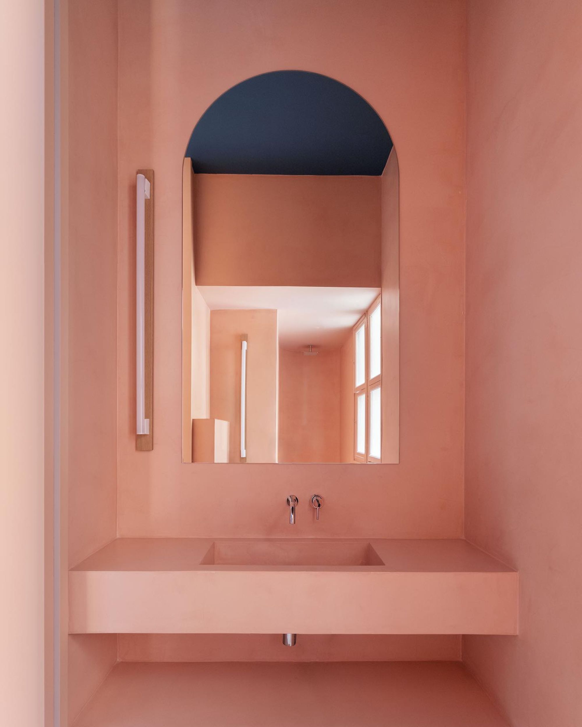
Color drenching a bathroom in Sakura Blush can create an unexpected statement in a home.
By itself, Sakura Blush can certainly make a dramatic statement. "It can be striking as a monochromatic wall color that envelops the room," Olma explains. "Or, used as a ceiling color to provide a dash of warmth and softness without overwhelming the space."
Color drenching with Sakura Blush can add elegance and depth to a room. If you're looking for complements, try pairing it with neutral colors like white, tan, or beige. According to Olma, this light pink color looks stunning with neutrals in tactile fabrics like jute or bouclé — creating a sophisticated and modern look.
There are many colors that go with pink, so the design opportunities for Sakura Blush are seemingly endless. Pair it with a deep green, rich brown, or a hazy orange for a captivatingly bold look. For sleek sophistication, style Sakura Blush with metallic decor in both gold or silver.
But don't forget about the importance of texture. According to Volodymyr Piurko, co-founder of PK Architects, "Matte and glossy finishes together keep it from falling flat." Opt for materials like marble with decorative veining in shades of light pink to bring your space to life.
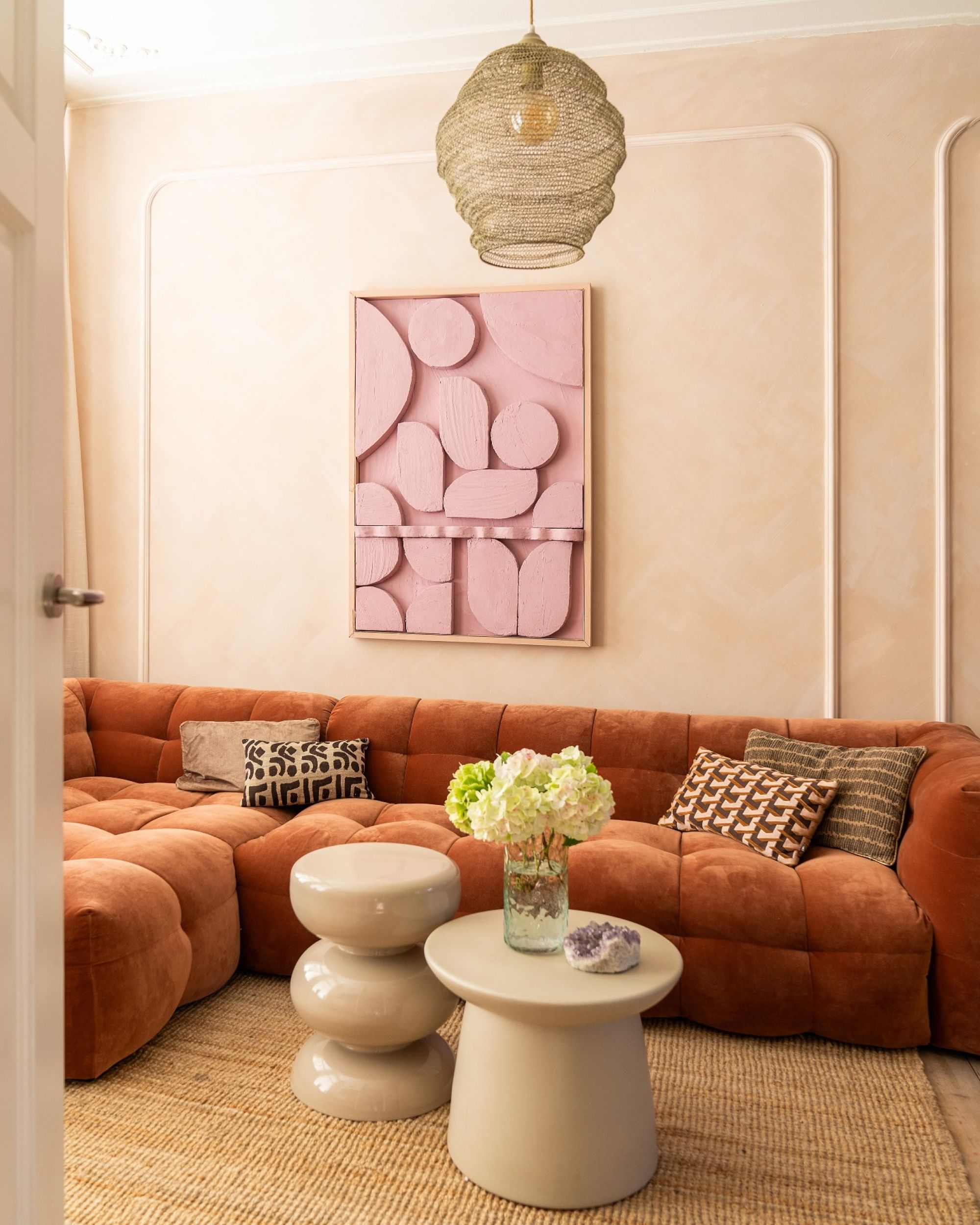
This living room features Sakura Blush artwork — it tastefully contrasts with the neutral woven rug and hazy orange sofa.
Decorating with Sakura Blush offers a world of opportunity. "Done thoughtfully, pink becomes not a theme — but a tone," Jen Baxter suggests. "It’s expressive, inviting, and quietly bold."
Whether you choose to incorporate it through paint, furniture, or small decor pieces, Sakura Blush's versatility makes it easy to create a space that is effortlessly stylish.
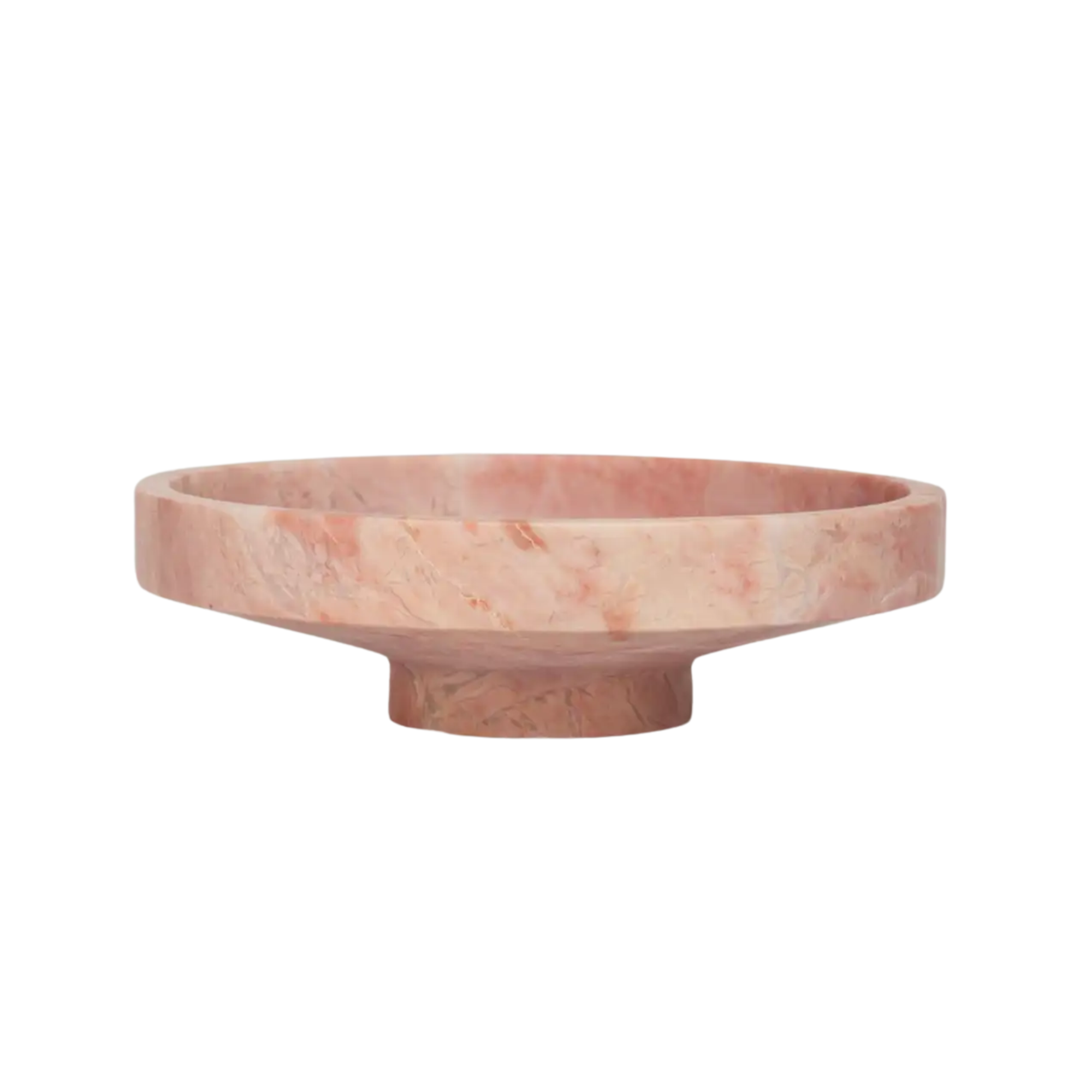
To bring Sakura Blush to life, look for the color in alluring materials like marble. This bowl features a unique veining detail that adds color and a slight texture to the shade of light pink. This piece could make for a stunning spring table centerpiece.
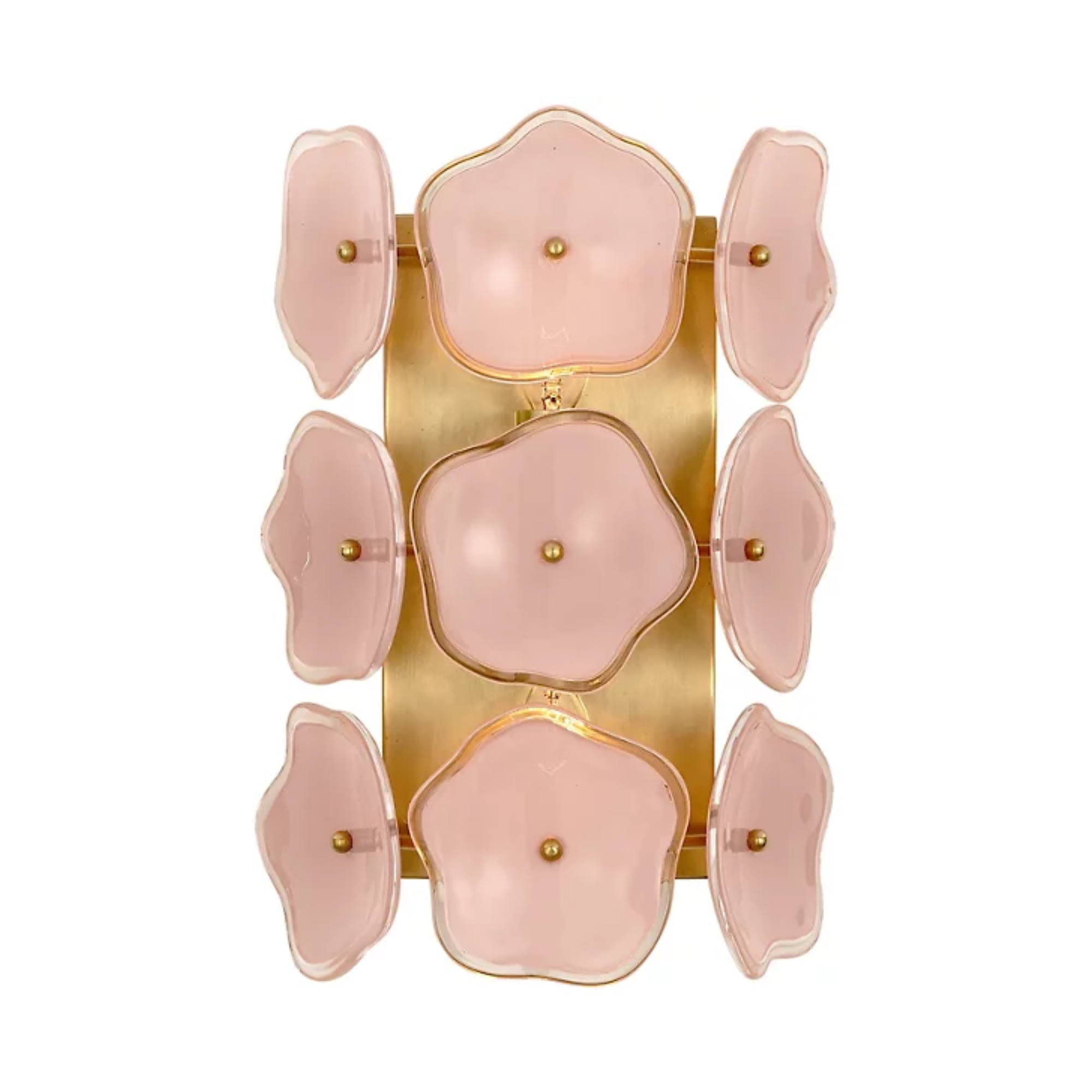
This wall sconce takes the Sakura Blush inspiration quite literally, featuring a repeating floral motif that's reminiscent of blooming flowers. These flowers are tastefully accented with a gold backing, which can conveniently mount to your wall. Opt for two of these sconces to elegantly style on either side of your bed.
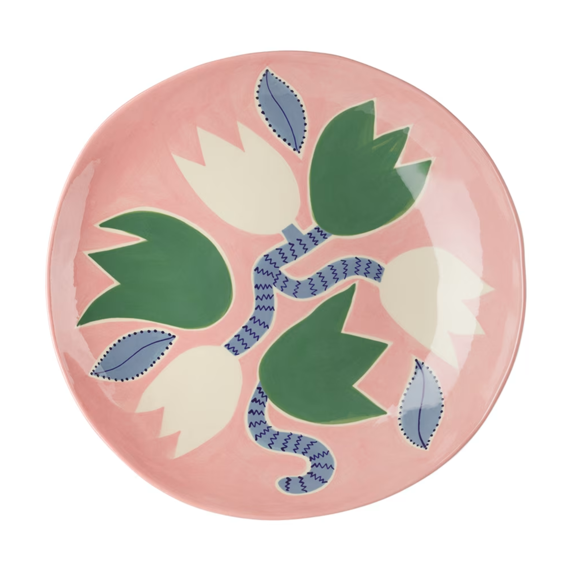
Looking to host a dinner party any time soon? Decorate your table with this stunning platter in Sakura Blush — accented with green and white flowers and blue stems and leaves. This platter is whimsical with its design and could easily tie into the maximalist table decor trend.
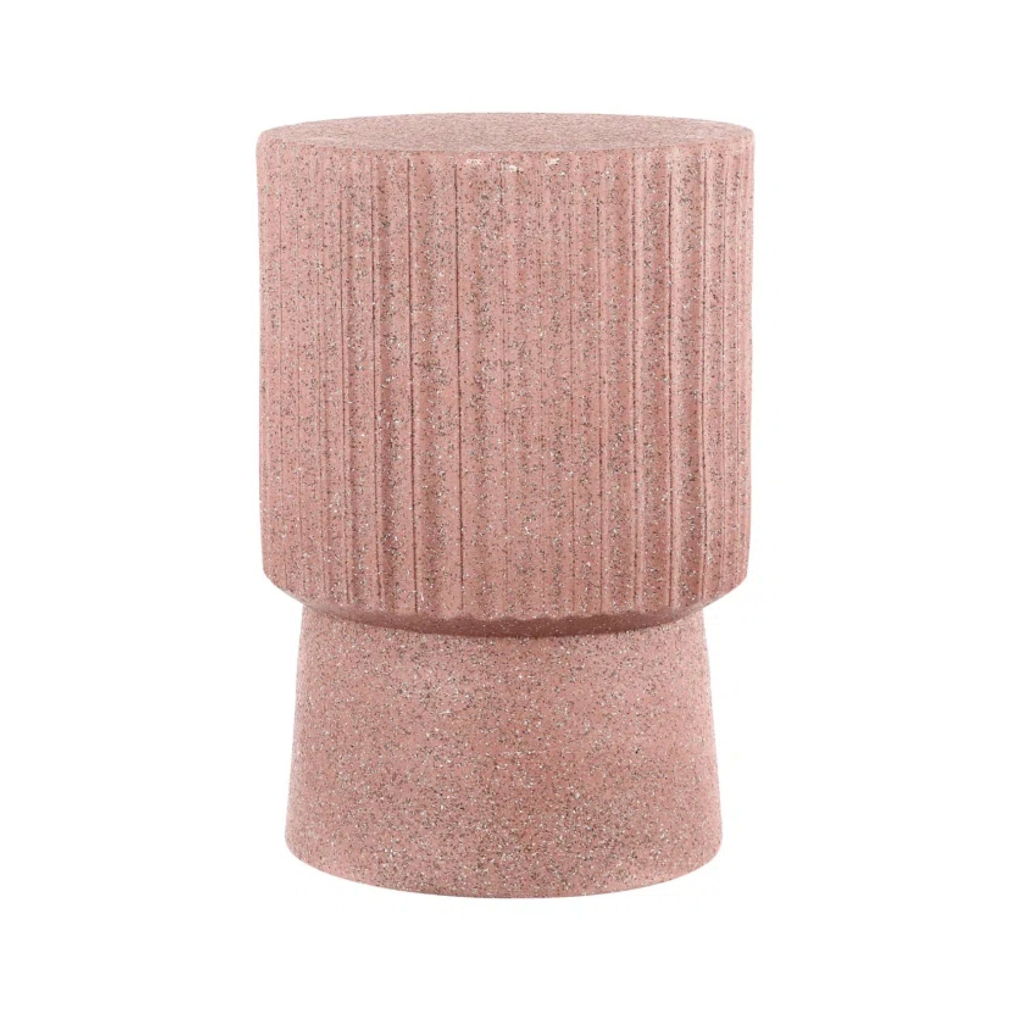
Your small patio could use some Sakura Blush charm. And this side table can help you achieve that. It has a grainy, terrazzo finish that gives the illusion of texture, and it also features fluted detailing around its side. It's completely water resistant, so this table can easily become a key feature of your outdoor decor, but it could also serve as a pop of color in your living room set up.
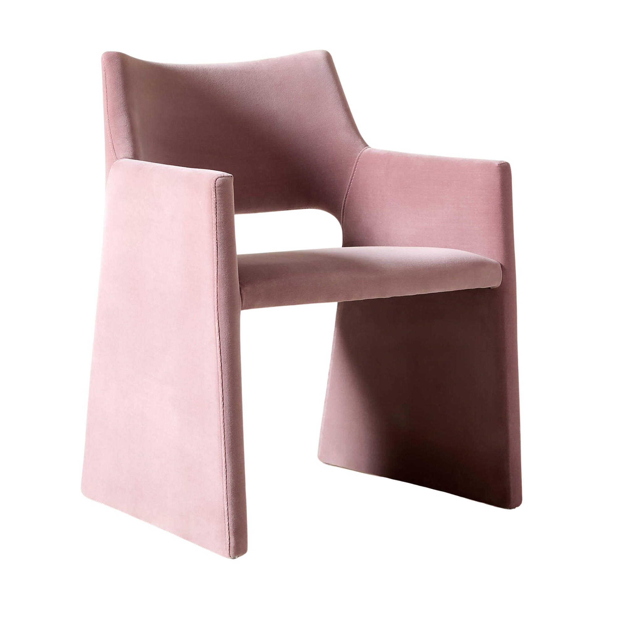
Complete your dining room decor with a chair in Sakura Blush. This model is made from a velvet material that not only looks luxurious, but feels as soft as a cloud. Style two of these chairs at opposing ends of your dining table for a gorgeous and ultra-luxe statement.
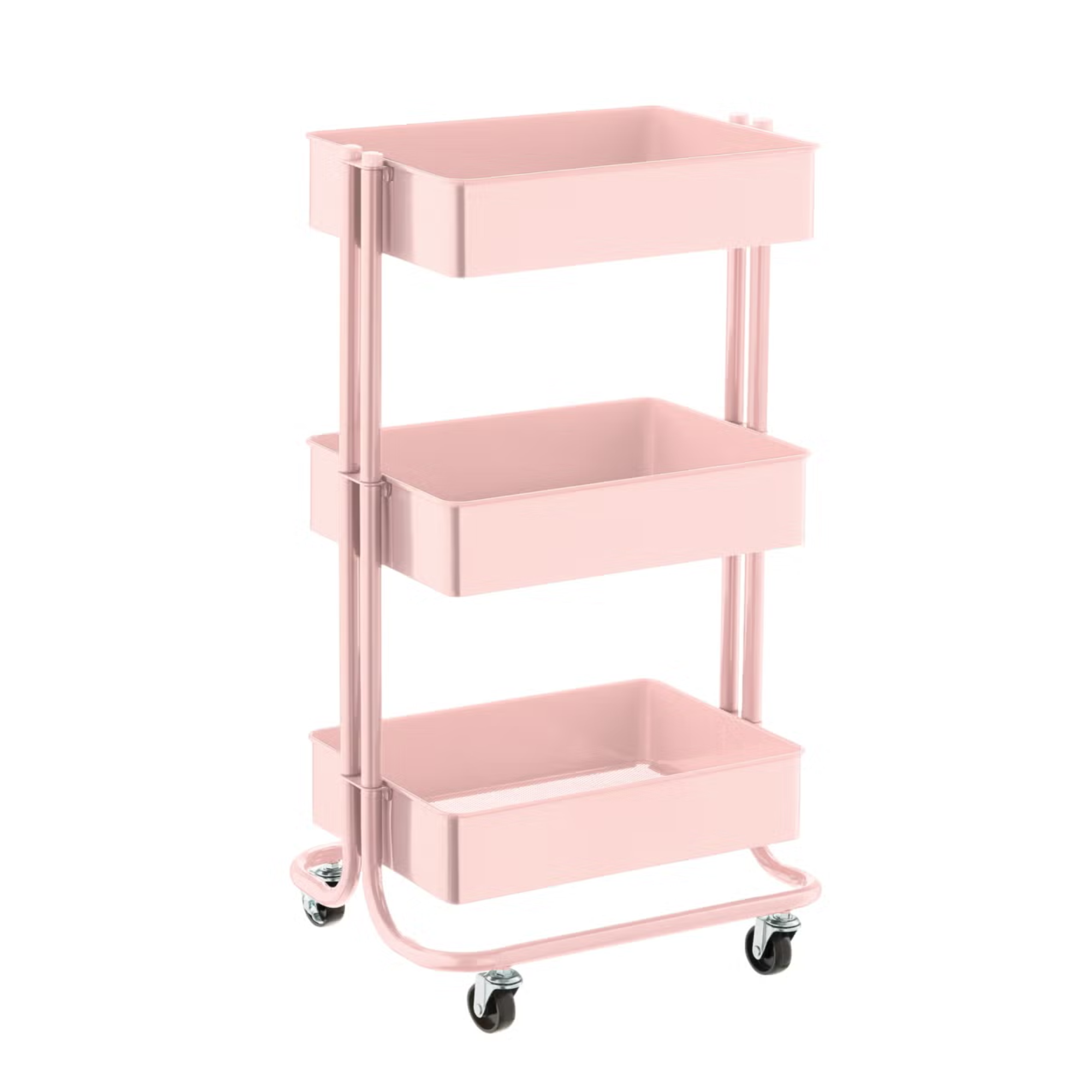
Everyone needs practical storage in their home. If you're looking for the perfect solution, opt for a rolling cart in Sakura Blush. This model features three shelves — perfect for holding makeup essentials in your bathroom or non-perishables in your pantry. Plus, its fresh and attractive shade will make for a fun pop of color.
If Sakura Blush has you crushing hard, there are so many modern ways to decorate with pink that challenge the stigma it's a childish color.
From lighter shades to bolder tones, pink is such a versatile color that deserves the spotlight in interior design.

Devin is a New York-based style editor for Livingetc who is keen on all aspects of personal style. From a young age, she was drawn to the design world, and she loves sharing design choices with her readers, from explaining how to incorporate trends into interior spaces to sourcing the best products for your home. Devin believes style should be inclusive, exciting, and at its core, fun.
