'They're new and intriguing!' Digital colors are the design trend you'll be hearing a lot about - here's how to use them
Digital colors are coming to a home near you — a varied palette of soft and strong shades, pastels and bolds. Color and design experts explain how to get them right
The Livingetc newsletters are your inside source for what’s shaping interiors now - and what’s next. Discover trend forecasts, smart style ideas, and curated shopping inspiration that brings design to life. Subscribe today and stay ahead of the curve.
You are now subscribed
Your newsletter sign-up was successful
If you’re reading this article, you already have a grasp on digital colors – they’re staring right back at you. But a growing list of trend forecasters are positing that digital colors are making their way offline, too, casting their signature glow in exciting ways throughout modern interior design.
“The artificial tones that were confined to product and screen, are now unapologetically moving into the built environment with boldness and confidence,” says Caroline Guilbert, head of creative content at Coloro, a next-generation color coding system.
Coloro, alongside trend forecaster WGSN, predicts that tech-inspired colors and shades like Digital Lavender (a surreal purple pastel plucked from online dreamscapes) and Galactic Cobalt (a bold blue that burst from the new space age) will influence this year’s fashion runways, products, and interior design trends with a sense of online escapism – the metaverse is landing right on our doorsteps.
Although true ‘digital’ colors remain locked in our screens, digitally influenced colors have a glowing quality typical of backlit graphics, where virtually every color and intensity is possible. “We have seen the rise of ‘illuminating colors’ that seem to carry a digitally derived quality, as if illuminated from within,” explains Guilbert.
These digital colors tend to be bright and full of positive energy, both familiar and quite literally unreal – the types of color reserved for digital art and renderings, now putting a shine on real materials, surfaces, and interiors.
The digital color trend explained - and how to use them
What is a digital color in interior design, and which digital color trends are breaking into new dimensions this year?

Caroline Guilbert is a color alchemist, delving deeply into how human's respond to color to help create and enhance the Coloro system. They have a Master's Degree in Color from the Institut Supérieur Couleur Image Design, and has worked with brands such as Armani and Nike, helping them to use color in new and creative ways.
WHAT ARE DIGITAL COLORS IN INTERIOR DESIGN?
As if airdropped from our screens, digital colors are finding a new home in the real world, bringing hyper-bright shades and near-neon hues to materials, finishes, and walls. Color effects once reserved for renderings and digital landscapes are increasingly within reach.
The Livingetc newsletters are your inside source for what’s shaping interiors now - and what’s next. Discover trend forecasts, smart style ideas, and curated shopping inspiration that brings design to life. Subscribe today and stay ahead of the curve.
And while you can approximate digital colors by choosing hues with a certain intensity and saturation, most of these colors aren’t possible without taking light into consideration. Similar to seeing colorful graphics through a backlit screen, transformative light is leading toward these dynamic applications of digital color.
“Surfaces take on intriguing glow, especially with plays of ombré shifts, light and ‘digital transparency’, letting light shine through, or if finished with a highly reflective liquid-like gloss, layered lacquers and iridescent coatings,” explains Guilbert. “All of these surface treatments interact with the color and alter its perception to achieve new and intriguing effects whether on a single product or on the overall interior space.”
WHERE DO DIGITAL COLORS COME FROM?
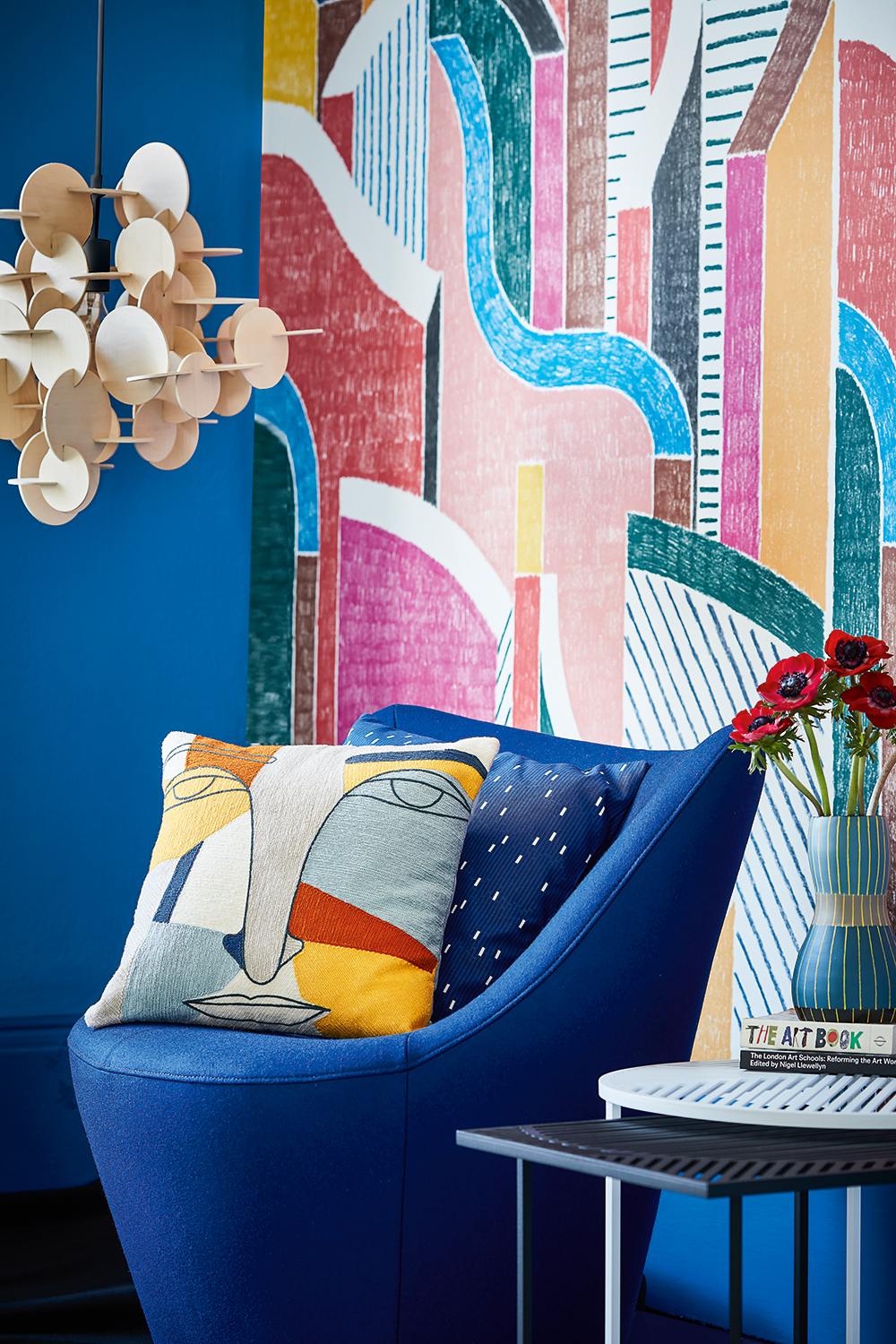
It’s little surprise that digital colors arrived as our digital lives expanded, and even less of a surprise that the pandemic pushed them over the edge. “In a pre-pandemic world, our physical and digital lives were merging increasingly,” explains Guilbert. “As physical experiences became limited, extended reality allowed consumers to escape into new entertainment and e-commerce worlds. The pandemic broke open that door towards digital escapism and experiential color like never before.”
Our escape into technology – and the metaverse, if that’s your world – influenced this new palette of glowing colors and near-neon brights, making our physical world otherworldly, like the ones we've grown comfortable in online. “Colors now need to be selected to traverse easily between these different environments: A growing meta economy will result in a wide spectrum of colors being used across the virtual world, and this will accelerate the popularity of clean, bright and chromatic colors to impact the sensorial experience,” adds Guilbert.
WHAT ARE THE MOST POPULAR DIGITAL COLORS, AND HOW CAN YOU USE THEM?
Below, we spoke with Coloro to understand these vivid new palettes, along with interior designers using similar hues throughout their shiny new projects.
1 Balance ‘Digital Lavender’ with warm yellow tones
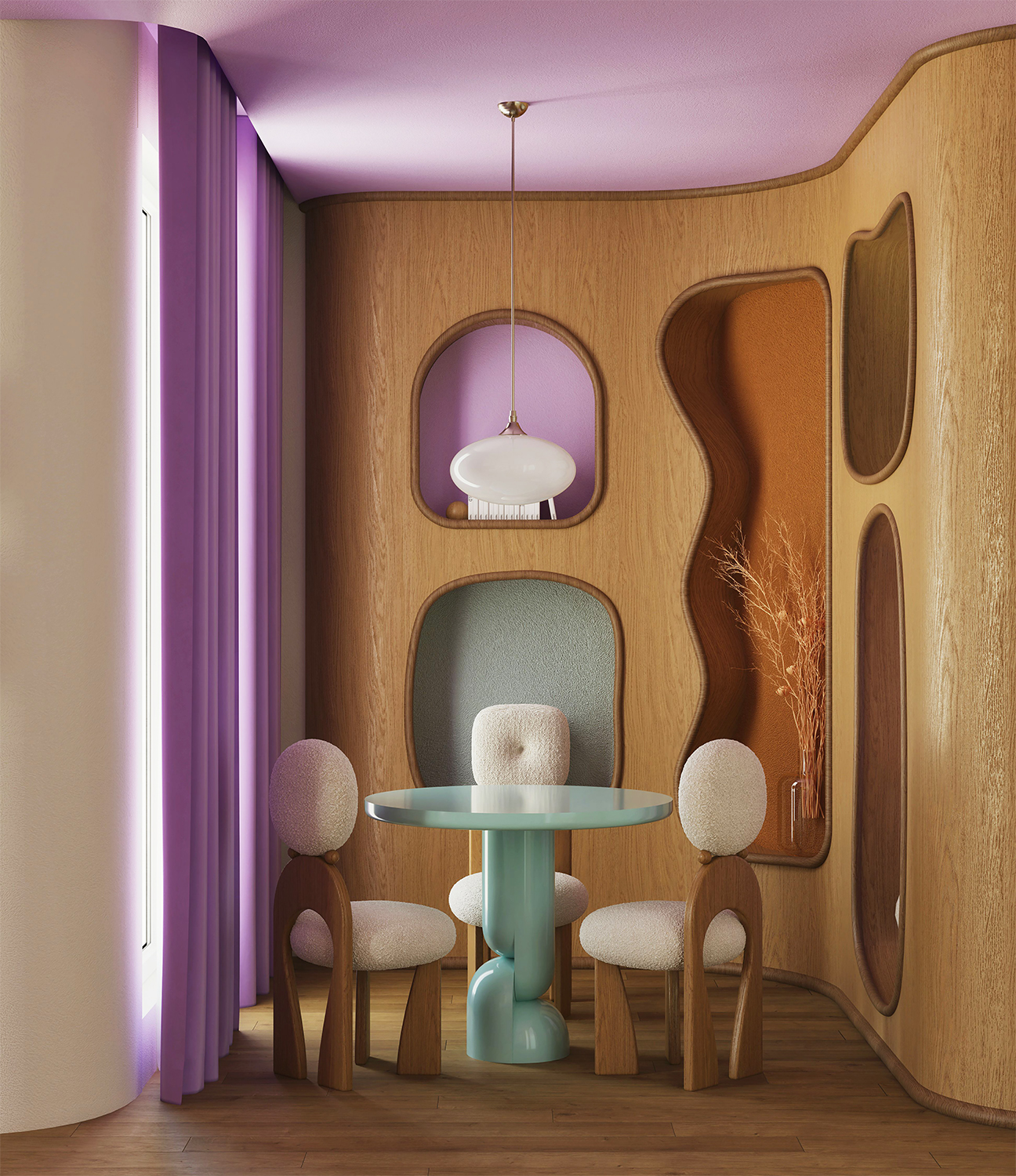
If there’s one illuminating color that’s positively lit in 2023, Digital Lavender (Coloro 134-67-16) ranks high. In fact, Coloro picked this particular hue as its Color of the Year, noting how consumers are seeking out ‘digital health and wellness experiences’ with a heavy dose of online escapism via the metaverse. Here at Livingetc, we've also picked this as a key hue, looking at the colors that go with lavender to help you fold it into your schemes.
“Digital Lavender has transformative, soothing and balancing properties that are ideal for addressing the growing demand for health-boosting wellness spaces, wellness-focused routines and 'calm-tainment,’” adds Guilbert.
Digital Lavender, Coloro swatch 134-67-16
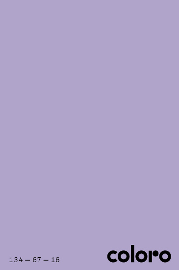
In the dreamy rendering above (part of the trend of fantasy interiors created by 3D artists that rose in popularity during the pandemic as a form of digital escapism), Turkey’s interior architecture firm Gülmen Interiors experimented with their own digital lavender, making this curious color work with a tried-and-true design trick. “We usually use the 3-color harmony principle in our colorful designs,” says co-founder Şeyma Gülmen, noting their use of mint green and orange. “In this way, we can use bold colors together and in harmony.”
When it comes to picking other colors to help balance out this type of lavender, Gülmen has just the trick. “Using lavender alone creates a cold feeling, so you should definitely add yellow tones, which are the opposite and complementary color of purple,” she says. “If you use yellow tones in wooden furniture, the naturalness and warmth of the wood texture will completely balance the feeling of coldness in the space.”
2. Use ‘Apricot Crush’ to inject interiors with positive energy
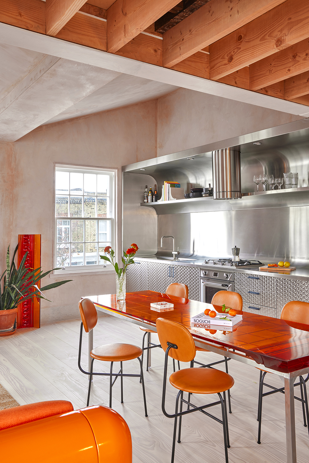
Pure orange isn’t a color most designers squeeze into interiors lightly (although they’ve been known to favor the soft orange aesthetic). Nevertheless, Guilbert points to Apricot Crush (Coloro 024-65-27), a highly saturated orange with medium lightness that’s bursting out of the metaverse. “It is emerging in the wellness sector as an inclusive, youth-led alternative to decorating with pastels and is the perfect fruity injection of energy to bridge the digital and physical realities,” notes Guilbert.
If Coloro is right, we might just see more designers using this type of illuminating orange to lift our spirits – a move London’s Holloway Li has embraced outright.
Apricot Crush, Coloro swatch 024-65-27
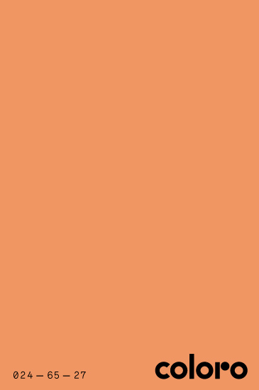
“It’s 2023 and we’re all (understandably) innately drawn to colors that make us feel more positive and optimistic,” says co-founder and creative director Alex Holloway. “This digi-orange hue definitely does just that.”
Holloway used a similar orange with a tangerine glow throughout the modern kitchen above, especially with a resin dining table that shines in direct light. “We like to experiment with color and texture in all of our projects – pushing the boundaries of expectation in our pairings whilst ensuring they still feel comfortable and ‘liveable’ in this case,” says Holloway. “It’s important to find the right balance in order to do this – here we used stainless steel and exposed plaster to offset the punchy, playful apricot tones and complete the scheme.”
3. Use ‘Luscious Red’ for bold and empowering interiors
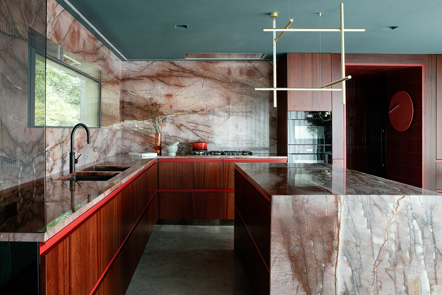
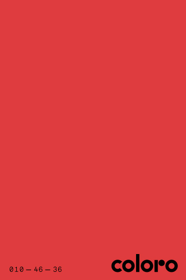
Red tends to make the heart stir, and Guilbert points to bright hues like Luscious Red (Coloro 010-46-36) with an almost fiery glow guaranteed to give you all the feels.
“This color signifies the return of digitalised and emotionally engaging brights,” says Guilbert. “It also taps into feelings of desire, passion and empowerment.”
An apt choice for the heart of the home (otherwise known as brilliant kitchen ideas), a similar and sensual red was piped through the interior above, where a red pigmented quartzite sets the tone.
Luscious Red, Coloro swatch 010-46-36
“To compliment this vein enriched stone we populated the kitchen throughout with subtle hints of vibrant red tones,” says interior designer Fiona Stone of Dublin’s Kingston Lafferty Design, noting how red accents offset rich tones throughout the space. Colors that go with red tend to be used more liberally than the red itself, like this.
In line with Coloro’s prediction, Stone recommends using this type of color when you want to infuse a bit of vigor into your interior. “Color is powerful and subconsciously evokes emotions,” says Stone. “Choosing the red tones here encourages people to act and feel differently within the space; sexy and powerful.”
4. Add a splash of ‘Pollen Yellow’ for a sunny disposition
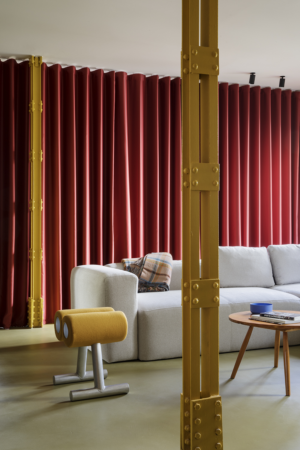
Like an injection of light, golden and sun-infused yellows will cast an unmistakable glow into modern interiors. Hues like Pollen Yellow (Coloro 037-77-37), according to Guilbert, can uplift a room with just a splash here or there. “This eye-catching yellow is best suited to directional and statement pieces and on innovative materials to reveal its surreal power,” says Guilbert. “It is best used for color-blocked interiors, iconic furniture and decorative accessories.”
Pollen Yellow, Coloro swatch 037-77-37
Proving a little goes a long way, Madrid’s EstudioReciente applied a similar yellow throughout the colorful home above, a palette that references the warm colors throughout Rotterdam’s iconic Sonneveld House. A masterclass in color blocking, the interior features a range of solid, contrasting colors throughout the space.
“In our case, as the yellow was brighter, we decided to use it in small doses in the house,” says studio founder Carlos Tomás, noting how this type of energetic yellow can be used as an ‘attention’ mark for key elements in your space. In this way, the color pops in this interior as an accent: it goes vertical, painted on a structural metal column, and is repeated on a statement accent chair to brighten the overall mood.
5. Go positively virtual with ‘Glowing Green’
One of the more visibly online greens (just have a look at Spotify’s logo, or the iMessage icon) might move offline to freshen interiors and decor with a nature-derived – yet totally surreal – glow. “As digital experiences and interactions become embedded in everyday life, brighter chromatic greens like this energetic vegetal and playful green are growing appeal,” says Guilbert, noting how colors like Glowing Green (Coloro 062-72-33) in particular have a foot in both worlds.
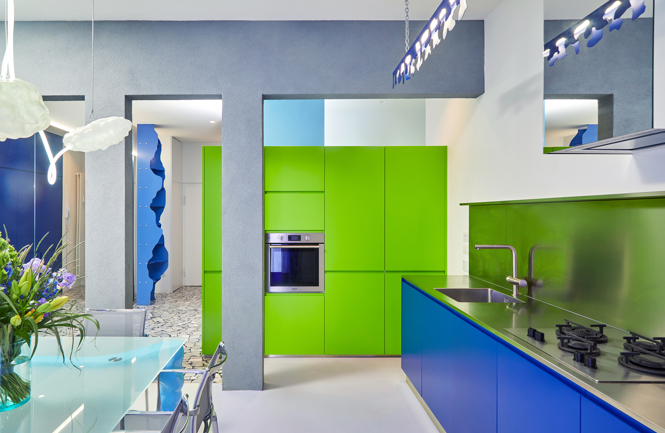
On the brighter side, Spain’s Mario Montesinos Marco used a similar digital vibe for a green kitchen which creates a dreamlike palette in the Bologna apartment above.
Glowing Green, Coloro swatch 062-72-33
“What interests me most about ‘digital green’ is as a mediating color between virtuality and reality that short-circuits the distinction between nature and culture, as a trans nature in constant denaturation and artificialization,’ explains Marco.
Back on earth, Marco recommends playing up this idea by using digital green with other mixed materials and colors to create vibrant, disco-like atmospheres, playing with things like light, texture, steel, plastic, and deformed shapes to blur the line between the living and nonliving world - there's a whole plethora of colors that go with green. “I love to use this type of green along with other cool temperature colors like blues, lilacs, and purples,” says Marco. “Feel free to use it on various materials like lacquered wood in matte finish or metal.”
6. Create exciting tension with ‘Cyber Lime’
While neons aren’t common in home interiors, Guilbert points to dopamine-inducing colors like Cyber Lime (Coloro 051-76-36) as proof that near-neons are finding material use at home. “This zesty hyper bright green will signify the powerful connection between nature and technology, connecting to the development of bio and plant based materials, dyes and pigments,” she says.
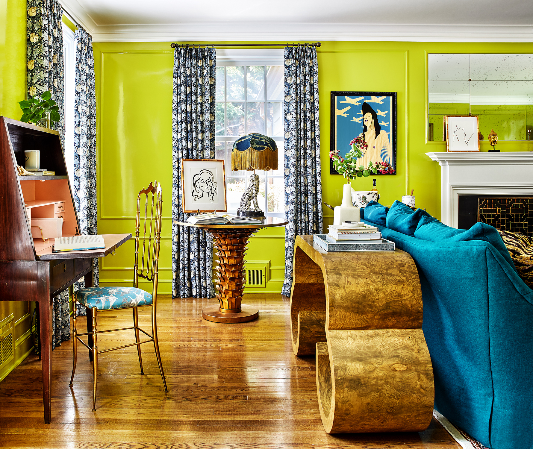
And while it might seem like this extreme green isn’t an obvious choice at home, Washington D.C.’s Zoe Feldman thinks it can create eye-catching juxtaposition.
Cyber Lime, Coloro swatch 051-76-36
“This green, particularly with a glossy finish, provides beautiful tension with more traditional architectural features,” explains Feldman. “It’s unexpected and playful, which keeps a space with buttoned-up elements from feeling stuffy.”
In the maximalist living room above, Feldman chose an energetic green to create dialogue with the space’s more classic furnishings – a surefire conversation starter. “When using these tones, be thoughtful about the other materials, shapes, and textures in the space,” adds Feldman. “If you’re going full maximalist, as in this living room, rein it all in with things like formal upholstery and classic furniture styles.”
7. Highlight a focal point with refreshing ‘Mint Bud’

On the aquatic end, Guilbert recommends Mint Bud (Coloro 078-80-25), a vivid tone between blue and green that brings a certain artificial, biophilic design perspective to modern interiors. “This eye-catching menthol hue is a great choice to uplift and lighten contemporary furniture while still creating a soothing glow,” says Guilbert.
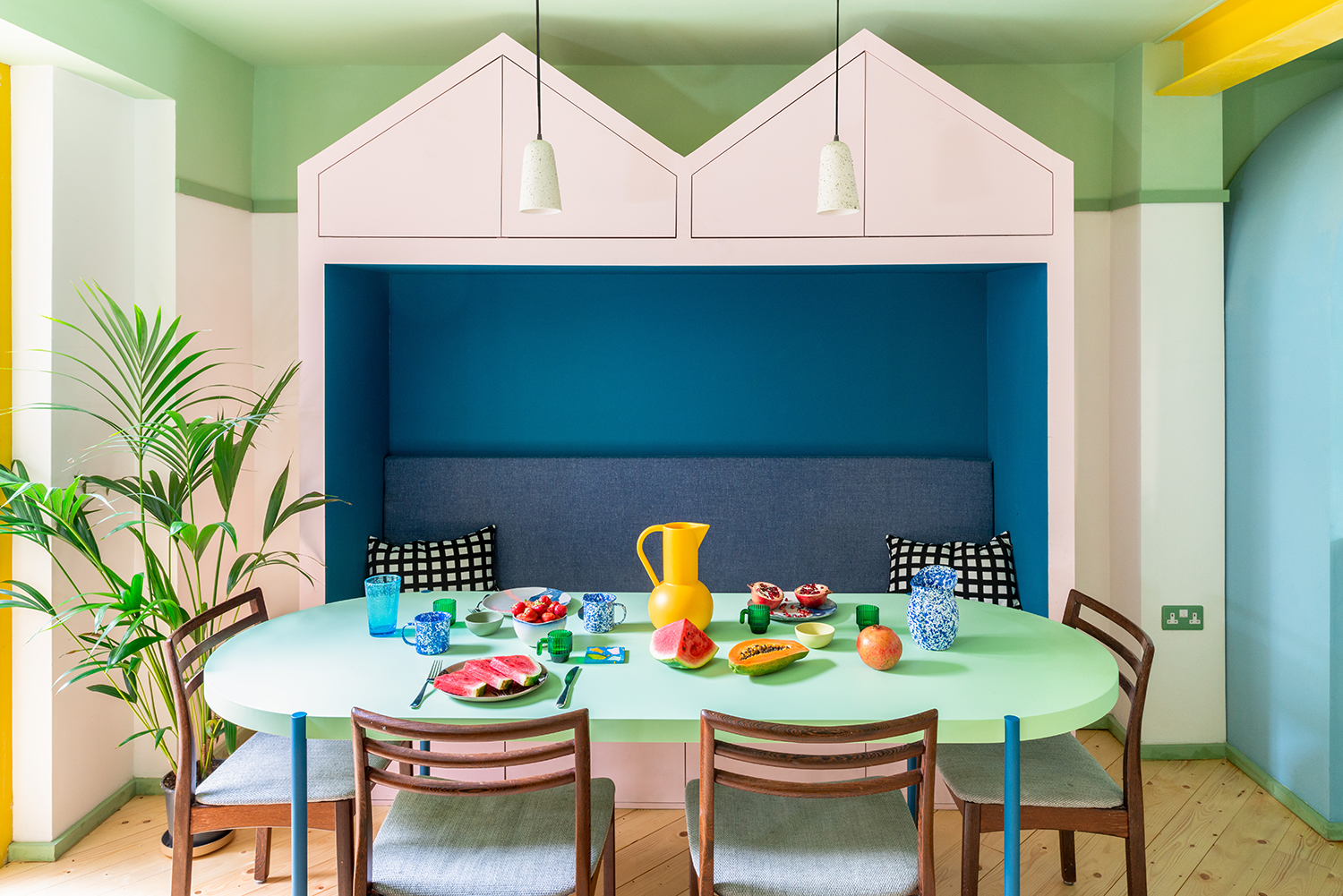
In the colorful home above, London’s Office S&M used a similar green to make the dining table pop within the pastel-packed space.
Mint Bud, Coloro swatch 078-80-25
“A digital color, such as mint green, when combined with lighter shades or warmer tones can help make a space feel both calming and fresh and energising at the same time,” explains co-founder Catrina Stewart.
Stewart also recommends using digital colors to highlight architectural features like exposed structural beams or staircases. “This allows you to really celebrate these elements as focal points in your home,” she says. “We often use fresh pastel greens and blue colors on ceilings, to reflect tones found in nature and to encourage people to gaze upwards and assume a positive posture.” Do blue and green work together? In this realm, they definitely do.
8. Use ‘Galactic Cobalt’ for statement pieces and features
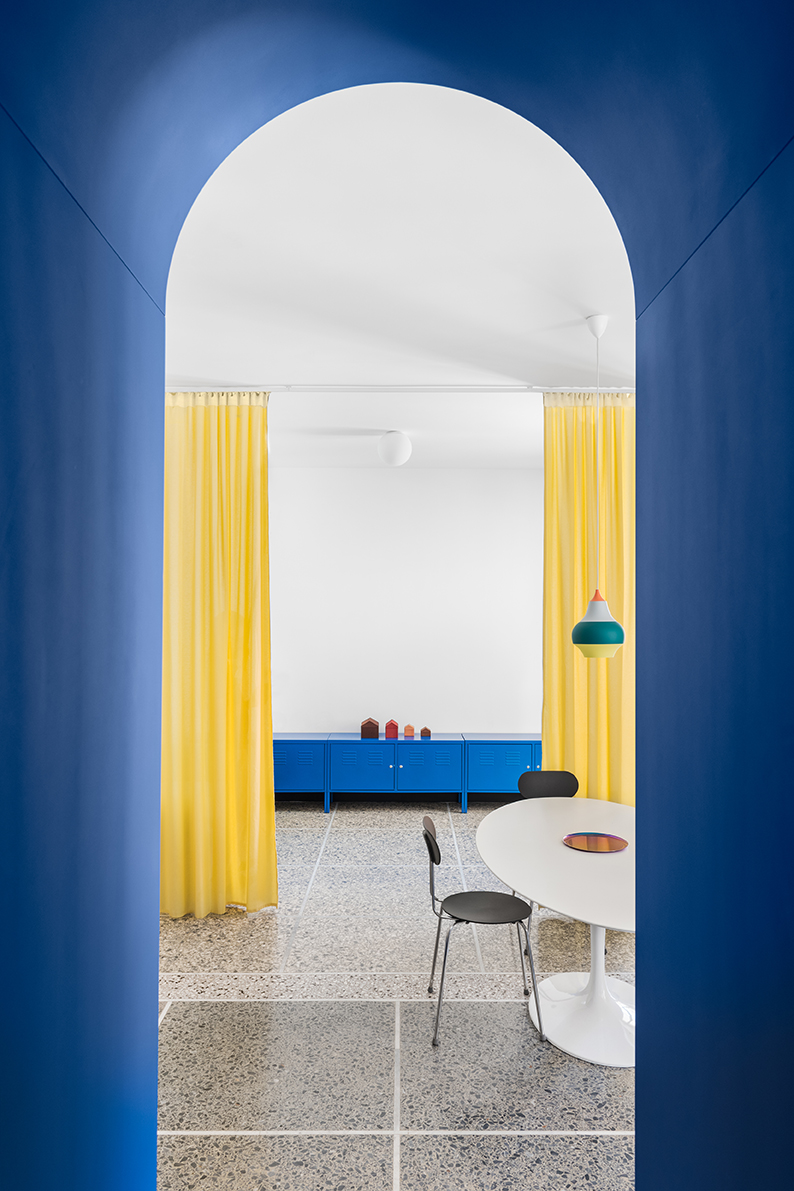
Guilbert points to the rise of hyper-bright colors – all influenced by new color technologies – with energetic blues like Galactic Cobalt (Coloro 120-28-32) leading the charge. “This intense and dynamic medium blue also takes inspiration from the new space age and the evolution of the metaverse, where extended reality experiences will influence the rise of this intense and dynamic blue,” she says.
Saturated and bold, it’s among the more versatile digital colors, and you’ll find a similar hue used by Rome’s La Macchina Studio in the renovation above, a choice inspired by existing blues found in original marble floors.
Galactic Cobalt, Coloro swatch 120-28-32

“Starting from this, we chose a bright but also deep shade of blue, intense but flat, opaque but which could change according to the light,” say co-founders Gianni and Enrica. “A new shade of blue that looks to the past but is projected to the future in a present that is a white room.”
As an attention-grabbing color, Gianni and Enrica recommend leaning into the striking shade, applying it to unique features that will make a bold statement. “We think that this type of blue can give emphasis to single elements – such as arches, wardrobes or kitchens – thanks to its attractive power,” they say.
9. Aim for ‘Tranquil Blue’ for a touch of serenity
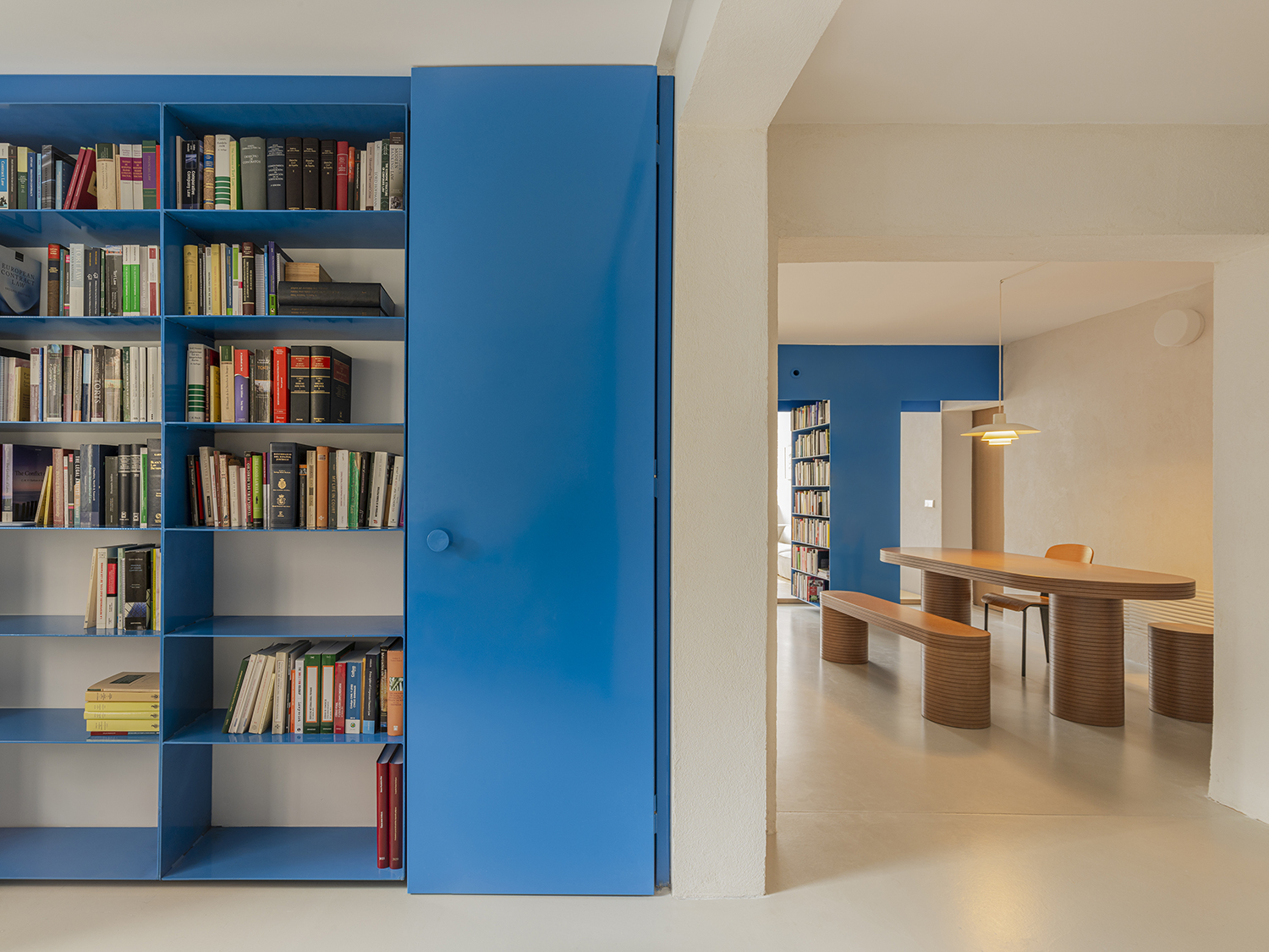
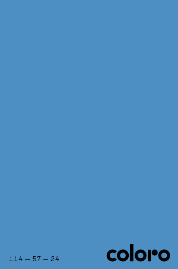
For a digital color that’s long been used to represent air and water online, Guilbert points to Tranquil Blue (Coloro 114-57-24), a mid-level hue that’s true to its name. “It represents stillness and tranquility, which consumers will be seeking to counterbalance overwhelming emotions,” says Guilbert.
In the airy renovation above, Madrid’s BURR Studio chose a similar blue to highlight built-in metal bookshelves; their goal was to bring a sense of clarity and function to the space.
Tranquil Blue, Coloro swatch 114-57-24
“Our ambition is to provide new ways of using spaces, new equipment or simply a different way of understanding a space,” says BURR. “These plain, pure color coatings help us mark these elements and tell the visitors/inhabitants that it is the key element to interact with the space they are in.”
In this way, the bright blue bookshelves help anchor the space with a tranquil feel, backdropped by an otherwise bright and white palette. But Guilbert also recommends applying this color across key materials that might give your space a lift. “This color will elevate contemporary home designs and create a serene atmosphere in interiors, especially used across acrylic and glass design to bring a weightless feel,” she says.
10. For pastel-packed interiors, ‘Fondant Pink’ plays well
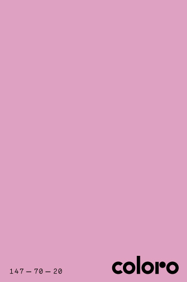
Driven in part by Gen Z as a genderless tone, according to Guilbert, immersive hues like Fondant Pink (Coloro 147-70-20) are primed to spark the imagination, an understanding that modern ways of decorating with pink often utilizes. “More specifically for interiors, this color can connect to wellness and be used to bring delight, feelgood and mood-lifting color into interior spaces,” adds Guilbert. “It can also be used for playful design, paired with other pastels, saturated brights or mid-tones for furniture, decorative accessories and textiles.”
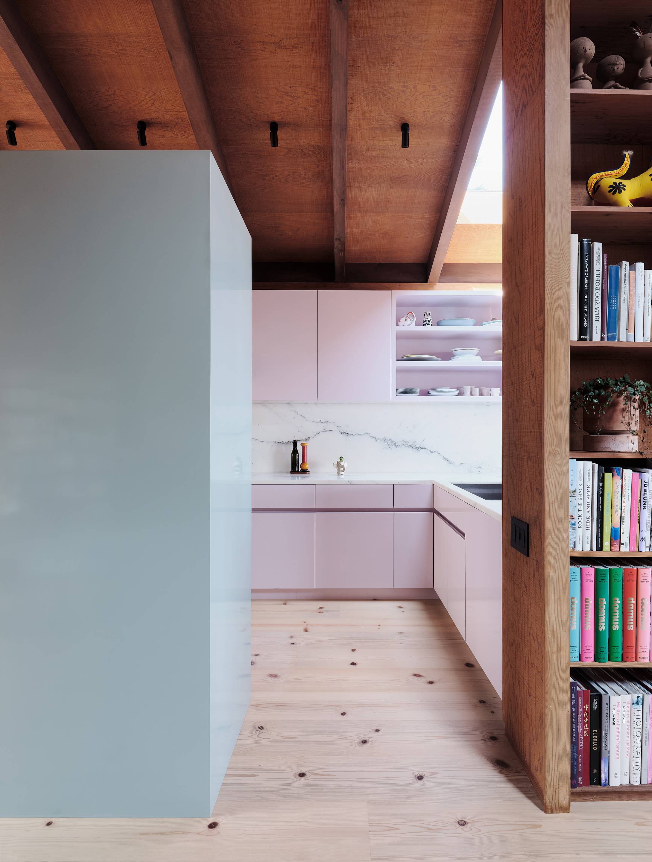
Playing well with other pastels, San Francisco’s Studio Terpeluk worked with color expert Beatrice Santiccioli to bring a similar pink into the Noe Valley project above.
Fondant Pink, Coloro swatch 147-70-20
“The color pink is uplifting and always brings a positive energy to the space,” says Santiccioli of this pastel kitchen, noting how natural light can illuminate pink surfaces, making the room palette all the more inviting and enjoyable.
But pink can also steal the spotlight, if you’re open to making a statement. “If, on the other hand, the choice is for a more expressive palette, the Pink color can be applied over a large surface, becoming the protagonist of the space, interacting vibrantly with the objects and other elements of the room,” adds Santicciolil.
11. Color-drench your room with accents of ‘Pink Flash’
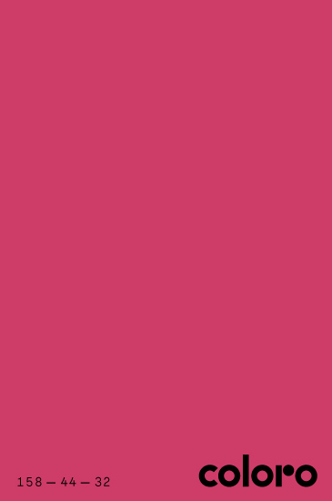
While Fondant Pink plays nice with others, Guilbert says colors like Pink Flash (Coloro 158-44-32) might demand a little more attention. “For interiors, this rich pink takes form used as a disruptive accent,” she says, noting how digital creatives are using "hyperreal effects to make pink feel glossy and illuminating.”
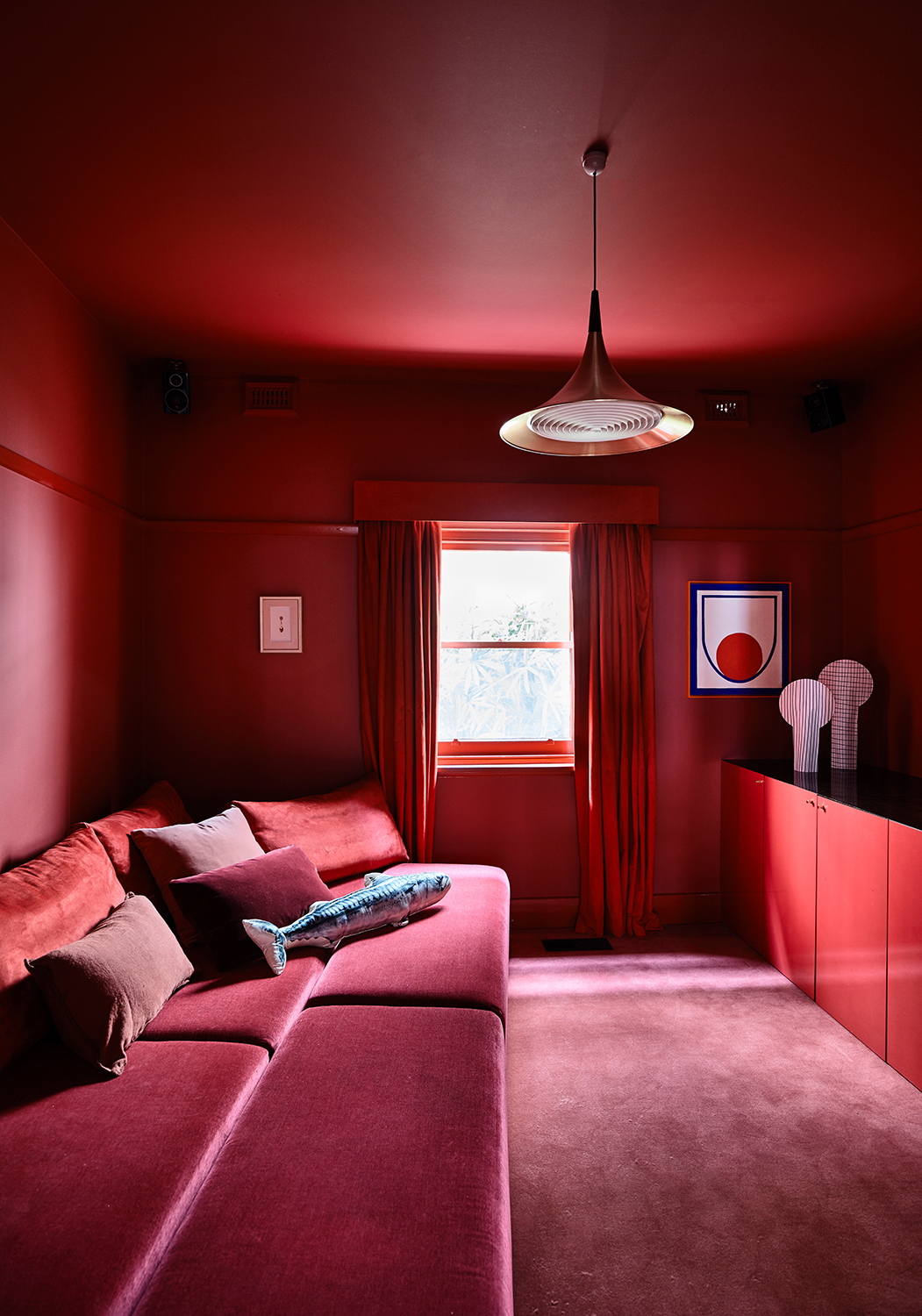
In the home interior above, Australia’s Studio Doherty embraced accents of this startling color in a red-and-pink palette. “Digital red/pink can be a tricky color for people to get their heads around,” they say.
Pink Flash, Coloro swatch 158-44-32
“Some clients are open to it, whereas others simply won’t entertain the idea of introducing it in their home.”
To make this daring color work, the studio embraced color drenching (a.k.a. a monochromatic color scheme). “
Digital pink/red can sometimes come across as quite harsh and jarring and is a tricky color to pair with other colors,” they say. “However, blanketing a whole room in this tone (free from other juxtaposing colors) makes it feel really approachable and, we found it helped to create a sense of calm in the space, which is not a word you’d typically associate with red/pink.”
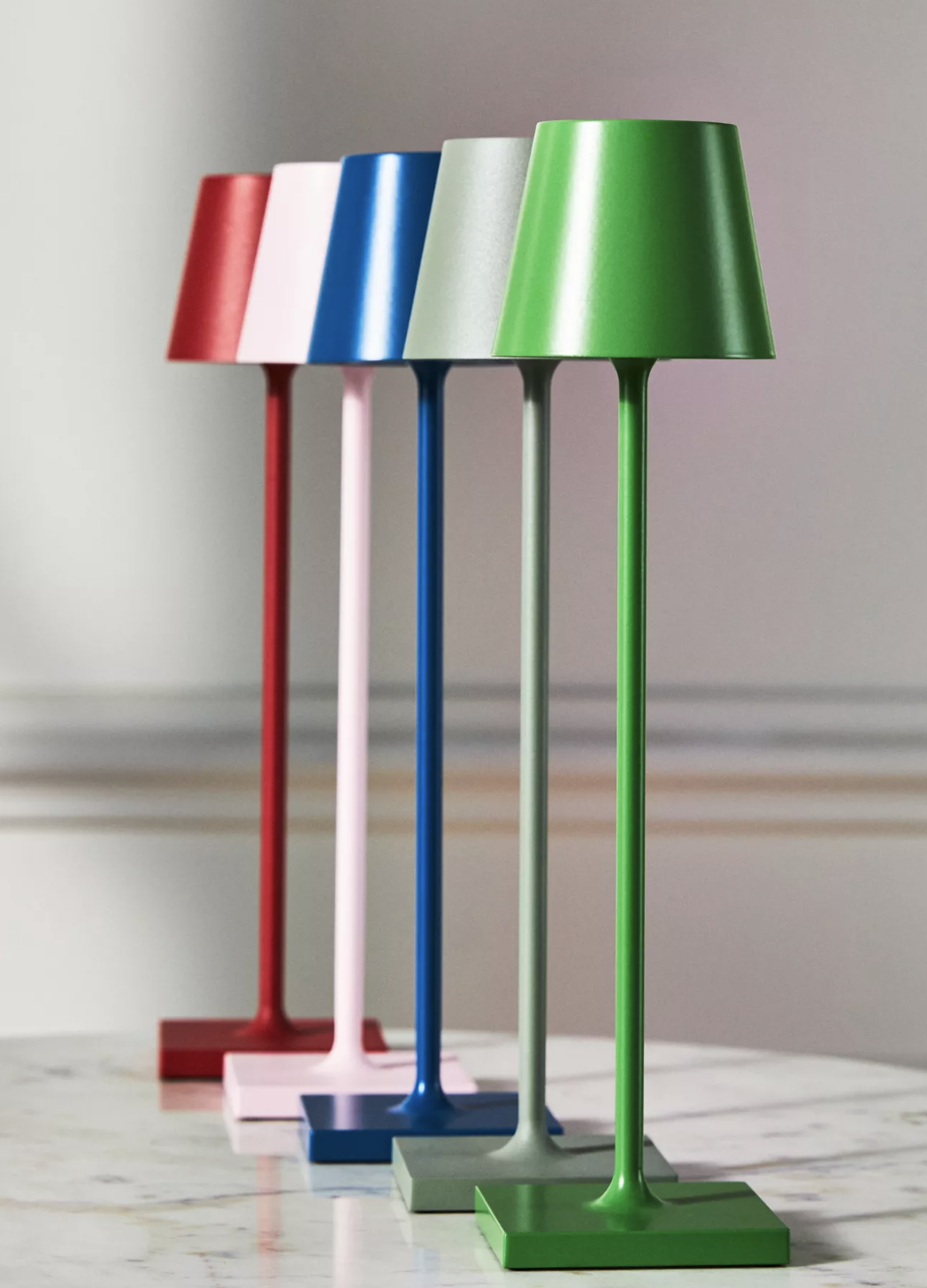
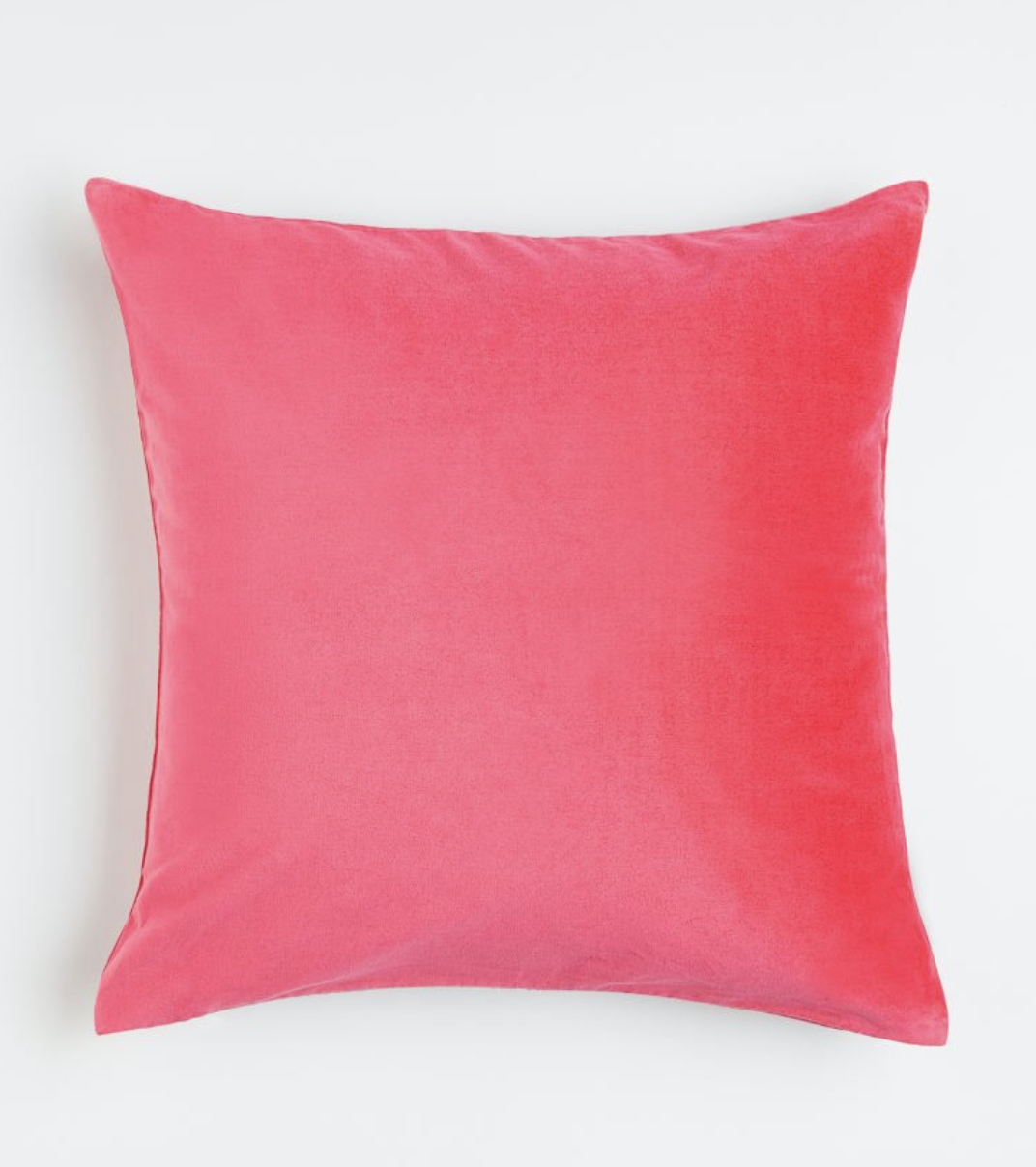
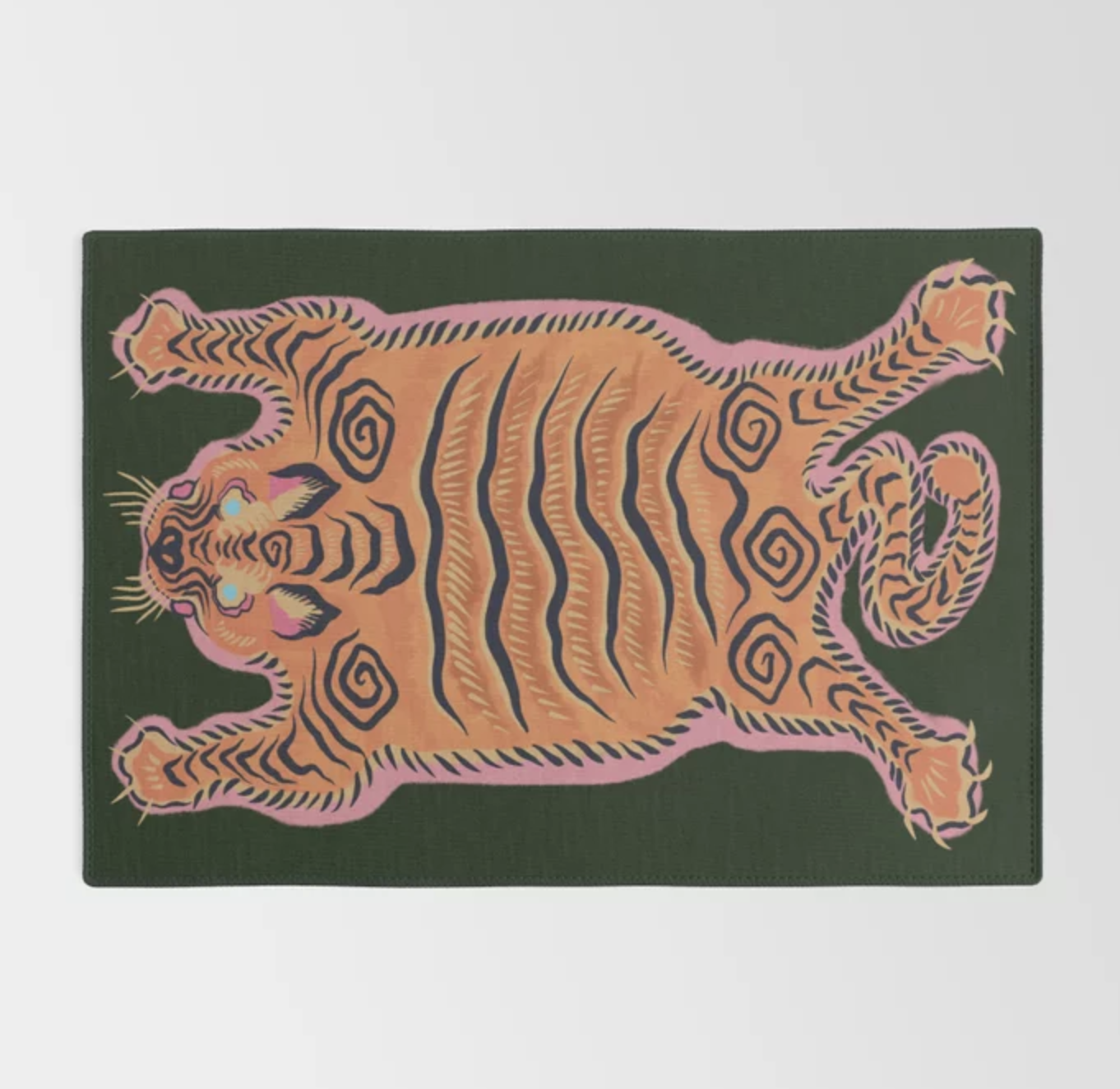
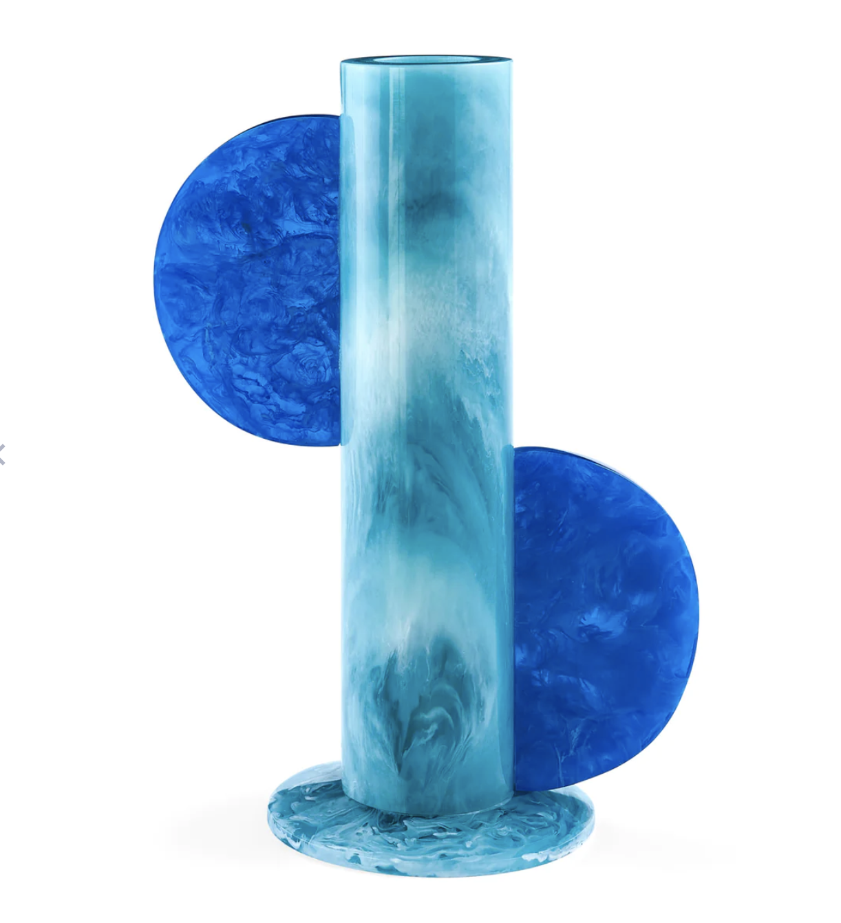
Our shopping editor picks the best accessories in digital colors to give your home an instant uplift
Keith Flanagan is a New York based journalist specialising in design, food and travel. He has been an editor at Time Out New York, and has written for such publications as Architectural Digest, Conde Nast Traveller, Food 52 and USA Today. He regularly contributes to Livingetc, reporting on design trends and offering insight from the biggest names in the US. His intelligent approach to interiors also sees him as an expert in explaining the different disciplines in design.
