What Are ‘Bauhaus Colors’? How This Famous Design School Used Color to Emphasize Craft and Clarity (so You Can Recreate It at Home, too)
The Bauhaus color palette may be the primary colors we've known since childhood, but they represent a modern approach to art and design

The Livingetc newsletters are your inside source for what’s shaping interiors now - and what’s next. Discover trend forecasts, smart style ideas, and curated shopping inspiration that brings design to life. Subscribe today and stay ahead of the curve.
You are now subscribed
Your newsletter sign-up was successful
What comes to mind when you think of the Bauhaus movement in design? Sleek, modern spaces? Clean lines and geometric forms? Industrial influences? Simplicity without excess? Bauhaus design emerged in early 20th-century Germany as a revolutionary study in harmoniously blending art, purpose, and mass production. While all of these attributes are central to the movement's lasting influence, none stands out more than the Bauhaus color palette.
In true step with the core principles of the entire school of design, the Bauhaus approached color as a spatial tool for defining space, meaning it turned to shades that could be distinguished from one another quickly and easily: enter strong, simple, primary hues. Livingetc's color expert, Amy Moorea Wong, explains, "This is functional color, characterized by high contrast used for clarity, rather than beauty or aesthetics, and employed carefully to organize form and define space."
This interior design style's color palette is striking (read: harsh, in some scenarios). However, using Bauhaus colors teaches the importance of the fundamental building blocks of design: contrast, balance, simplicity, and beauty. In other words, decorating with primary colors in modern interiors is a high-risk, high-reward game: here's everything you need to know.
Article continues belowDefining Bauhaus Colors
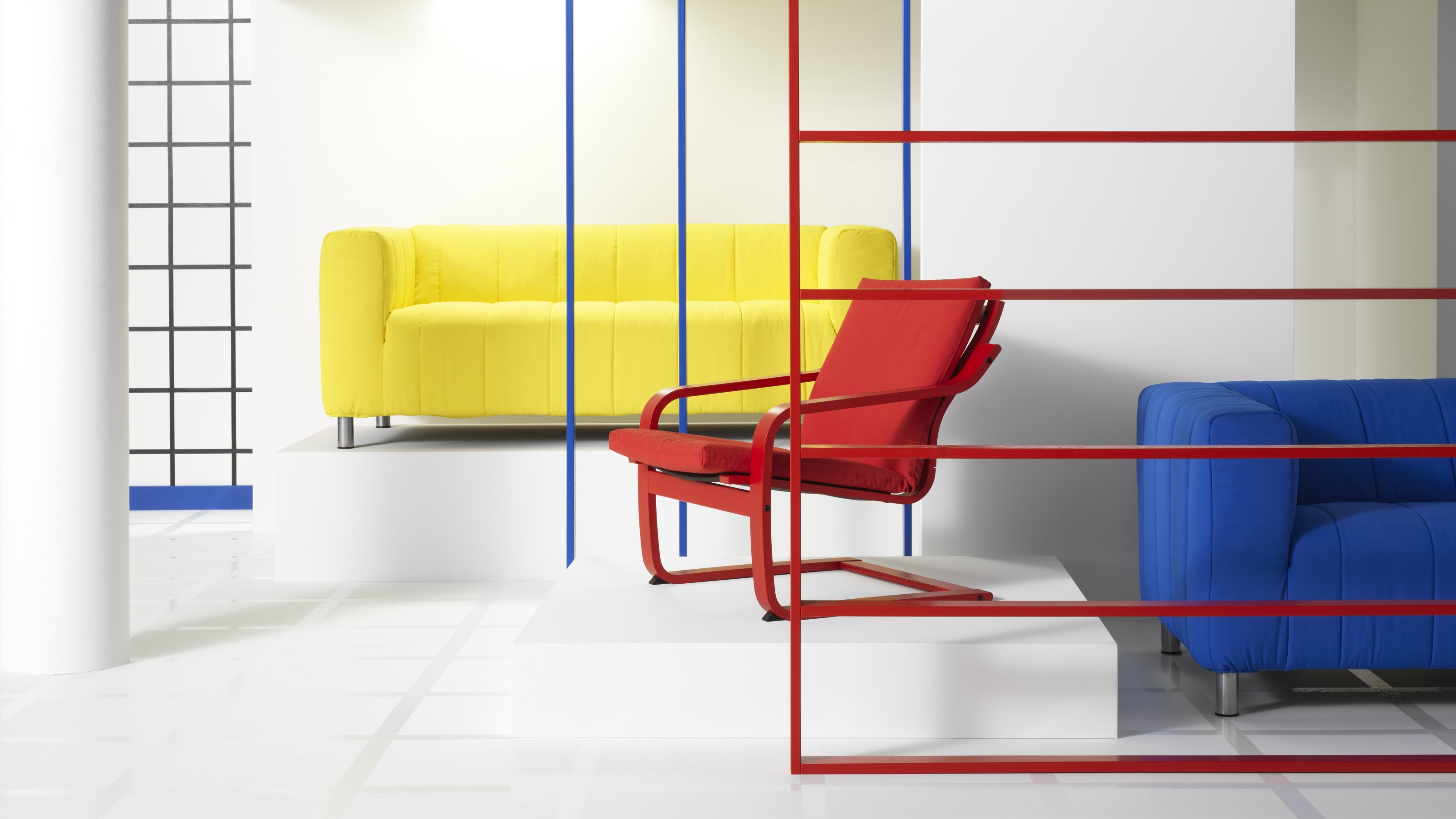
How you use the Bauhaus colors will affect the aesthetic of the design as well. Here, the modern, geometric application emphasizes the Bauhaus ethos.
Beyond simply pairing red and yellow and yellow and blue, what is the Bauhaus color palette? And what makes Bauhaus colors an iconic, trend-defying scheme? Definitively speaking, the core palette consists of primary red, yellow, and blue, along with black, white, and sometimes gray.
"In the traditional school of Bauhaus, the hues were used flatly — no shading, gradients, textures, or the like — and were generally tied to specific geometric shapes; triangles were yellow, squares were red, and circles were blue," explains Amy Moorea Wong.
The neutrals then tend to play on the sidelines, more for structural emphasis — "Black's job is to outline, white acts as a background and a way to create negative space, and gray is the support, balancing and filling spaces unused by the primaries," says Amy. Sometimes, secondary colors, such as green or orange, are mixed in, but always within the context of the primary colors used.
Amy Moorea Wong is Livingetc's resident color expert, and no one can describe colors quite like her. She has specialized in all things decorating for over a decade, and has even written the book on it: Kaleidoscope: Modern Homes in Every Colour, which explores how and why color impacts our homes.
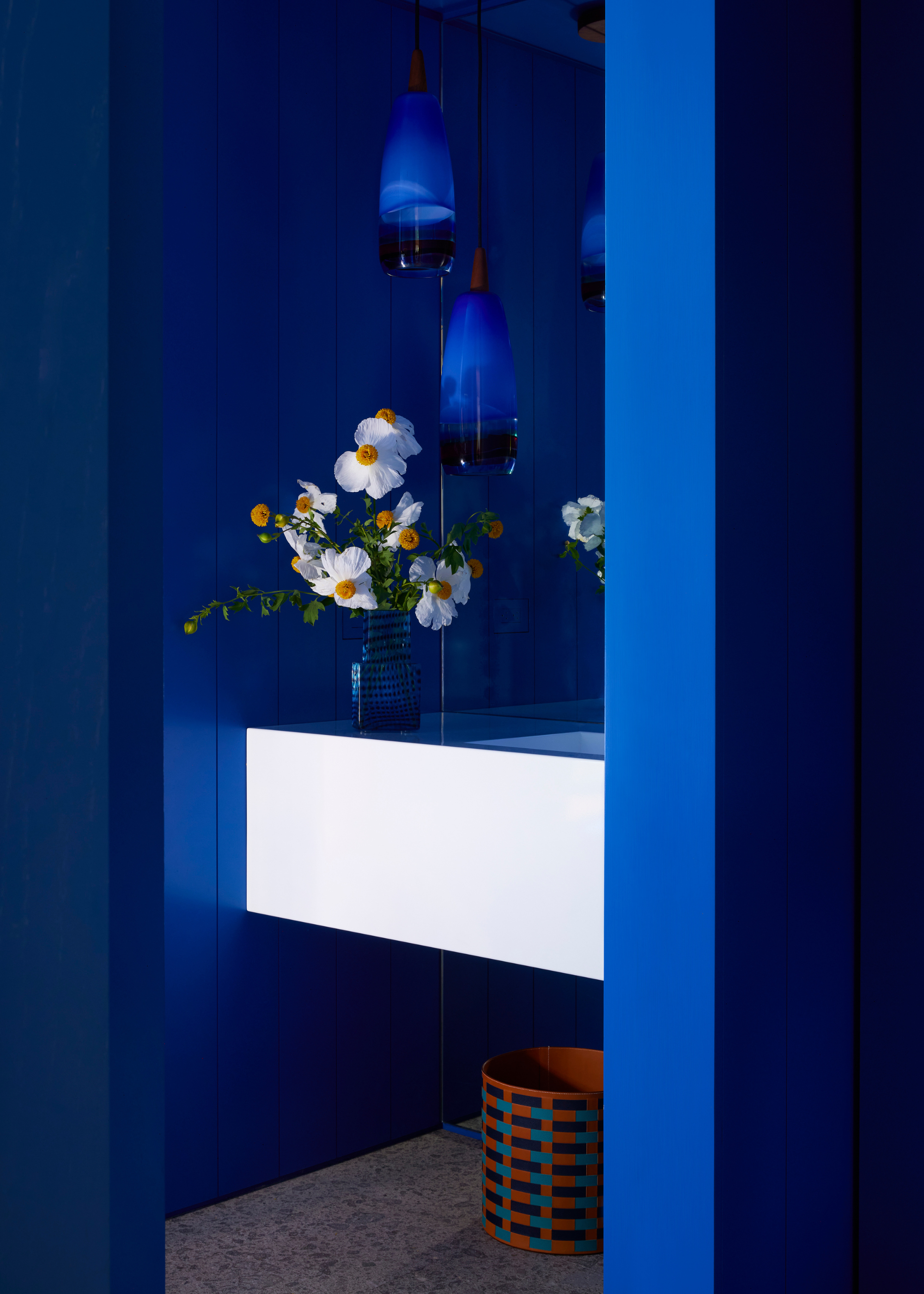
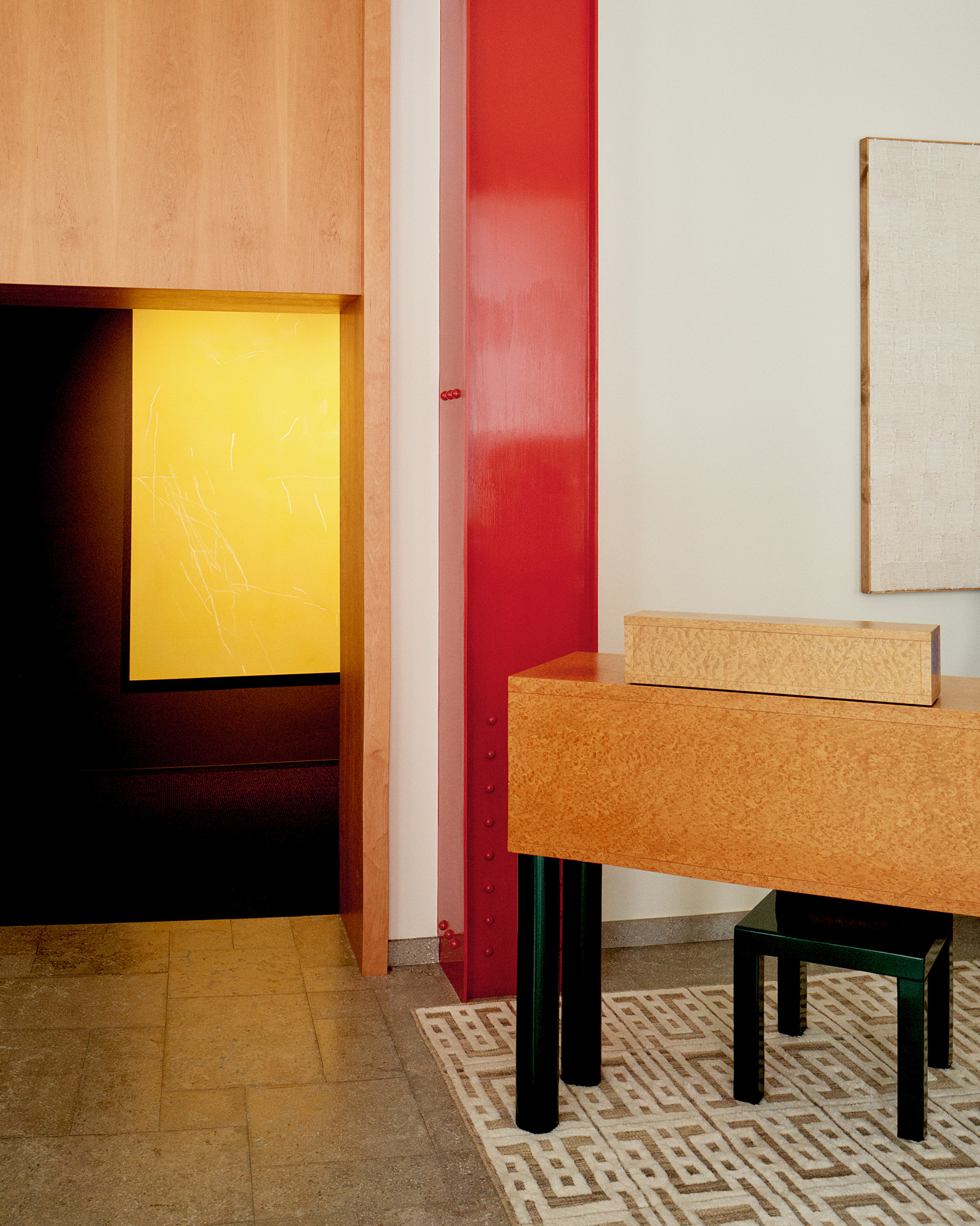
You can use the staple colors in varying degrees for a more modern take.
Image credit: Yoshihiro Makino. Design: Jamie Bush + Co
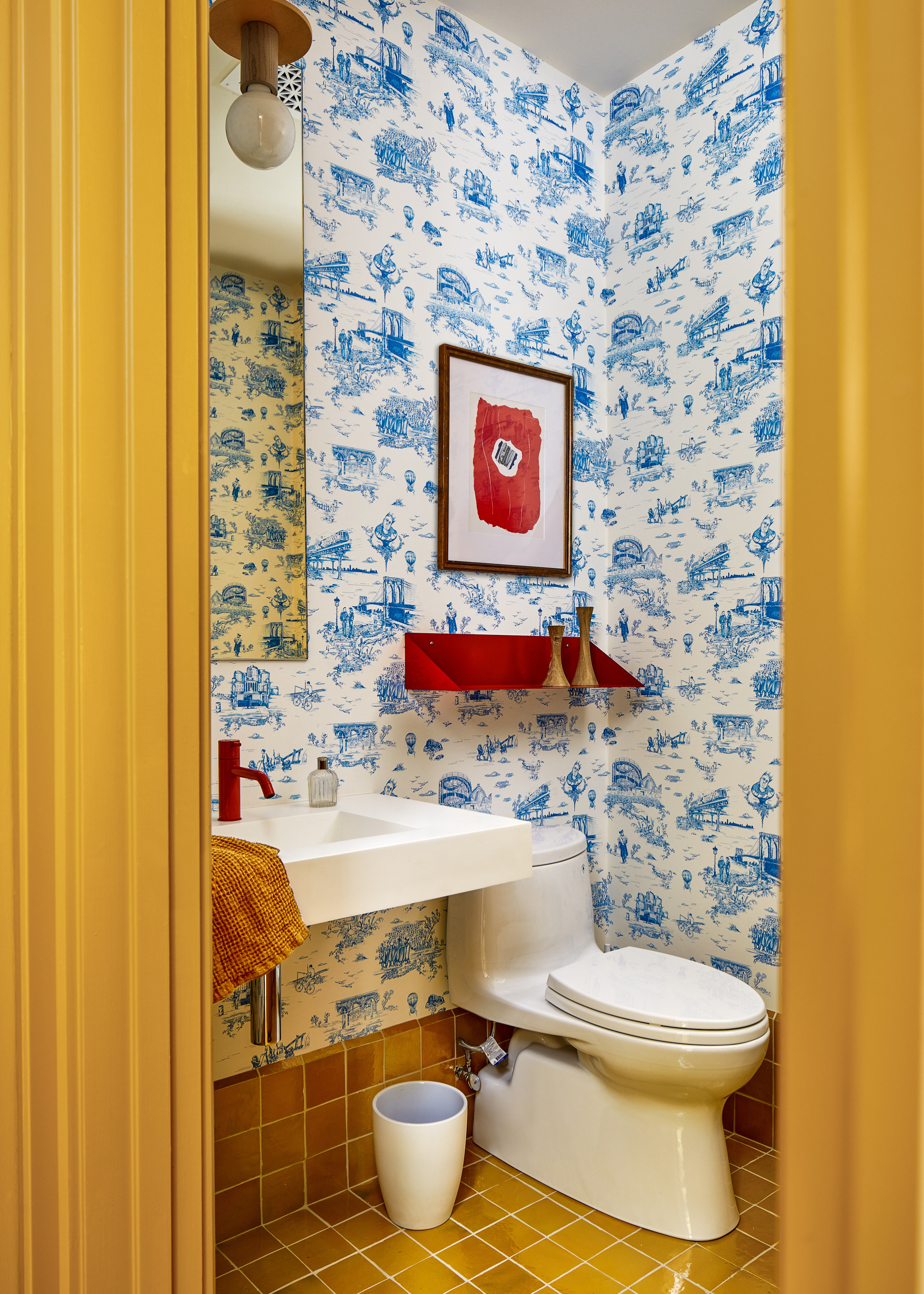
Here, the primary colors shine while the white provides a much-needed base.
Image credit: Stacy Zarin Goldberg. Design: Zoë Feldman
In action, the primaries work as a team, all pure, high contrast, and balanced on the color wheel. "Each has its own personality and role, and as a trio, they cover all bases and create their own small spectrum — red is energetic, yellow illuminates, and blue calms," says Amy. The neutrals, therefore, provide breathing space between the brightness, somewhere for the eyes to rest amid all of the excitement.
The Livingetc newsletters are your inside source for what’s shaping interiors now - and what’s next. Discover trend forecasts, smart style ideas, and curated shopping inspiration that brings design to life. Subscribe today and stay ahead of the curve.
When using Bauhaus colors, it's all about creating balance in interior design. The primary colors bring energy and personality, while black and white ground the scheme and give the room a restful contrast. "When each color has its own role, the overall look feels intentional rather than busy," says Daria Zinovatnaya, product and interior designer specializing in Bauhaus design.
In summary, as a set of triadic primaries and neutrals, "The Bauhaus color palette is a clever mixture of impact and structural definition, deftly balancing dynamism and stability," says Amy.
Daria Zinovatnaya is a Ukrainian-born designer specializing in product and interior design. She founded her studio in Saint Petersburg in 2017, and some of her main influences come from the Bauhaus school of design.
How to Use the Bauhaus Color Palette in Interiors

This space uses Bauhaus colors in a true blend of heritage and contemporary. The color-blocking feels true to the design style, while the furniture elevates it.
The Bauhaus movement has a very modernist edge to it, meaning, "It's very graphic and can come across as overly harsh or stark, so in a 2026 interior, it needs to be done carefully," says Amy. The best (read: easiest) way forward is to use a neutral as a foundation and bring in red, yellow, and blue as accents so that the latter shades don't take over the space in large chunks.
Amy recommends, "A white or gray base (only go for black if you're up for a challenge) that can be accented with textures, natural materials, and softness to make it all more comfy." Red, yellow, and blue work well, popping in here and there in furniture and decorative objects.
Adopting a more 'unexpected red theory' mindset helps bring the Bauhaus palette into the contemporary design world. You can create a rather cozy, neutral space that becomes exciting and visually interesting through pops of bright red, yellow, and bold Ultra Azures.
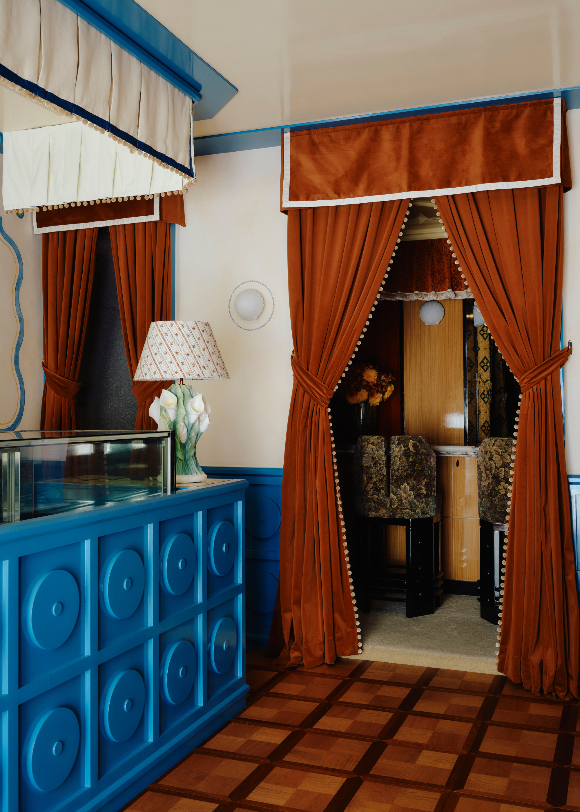
This room leans away from the exact shades of traditional Bauhaus colors, which is what makes it such an excellent interpretation.
However, I believe Bauhaus colors work best in a contemporary home when a bit of individual interpretation is applied. Perhaps the original use of this palette is not one for rooms you want to feel especially warm or cozy, but "Bauhaus can feel just as at home in more relaxed spaces when used thoughtfully," says Daria.
"Rather than keeping color to small accents, these shades can be used across walls, furniture, and architectural details to shape the space as a whole," Daria adds. Choose one primary to lead boldly and engagingly, and then use the other two more sparingly as highlights. "Black adds a linear Bauhaus feel to areas such as frames, chair legs, and door trims for definition," notes Amy.
Daria says, "I like to think of decorating with color as something that defines how you move through a room — one color might highlight a living zone, another mark transitions or focal points, while black and white create contrast and rhythm." When color is used this way, even strong primary shades can feel surprisingly comfortable and livable.

Electric blues are becoming a popular choice in contemporary interior design trends, and this piece definitely has that modernist aesthetic. Tone down the boldness of this blue with more natural, ochre yellows and burgundies.
Decorating with Bauhaus colors is less about holding back when it comes to pigment and more about using these striking reds, blues, and yellows with confidence and clarity.
Feeling inspired? Here's how designers are decorating with blue, yellow, and red, so that you can bring the Bauhaus color palette into your space in style.

Olivia Wolfe is a Design Writer at Livingetc. She recently graduated from University of the Arts London, London College of Communication with a Masters Degree in Arts and Lifestyle Journalism. In her previous experience, she has worked with multiple multimedia publications in both London and the United States covering a range of culture-related topics, with an expertise in art and design. At the weekends she can be found working on her oil paintings, reading, or antique shopping at one of London's many vintage markets.
