This Mossy Green Dining Room Is an Instant Mood Changer — Here's How the Color Scheme Works to Set a Beautiful, Intimate Atmosphere for Hosting Guests
Our resident color expert on a dining room made for moody, candlelit feasts

Design journalist and author Amy Moorea Wong is an expert on color in interior design. To help decode the secrets behind a successful palette, she picks her favorite schemes and breaks them down, from the wow moments to the hidden details, and everything in between.
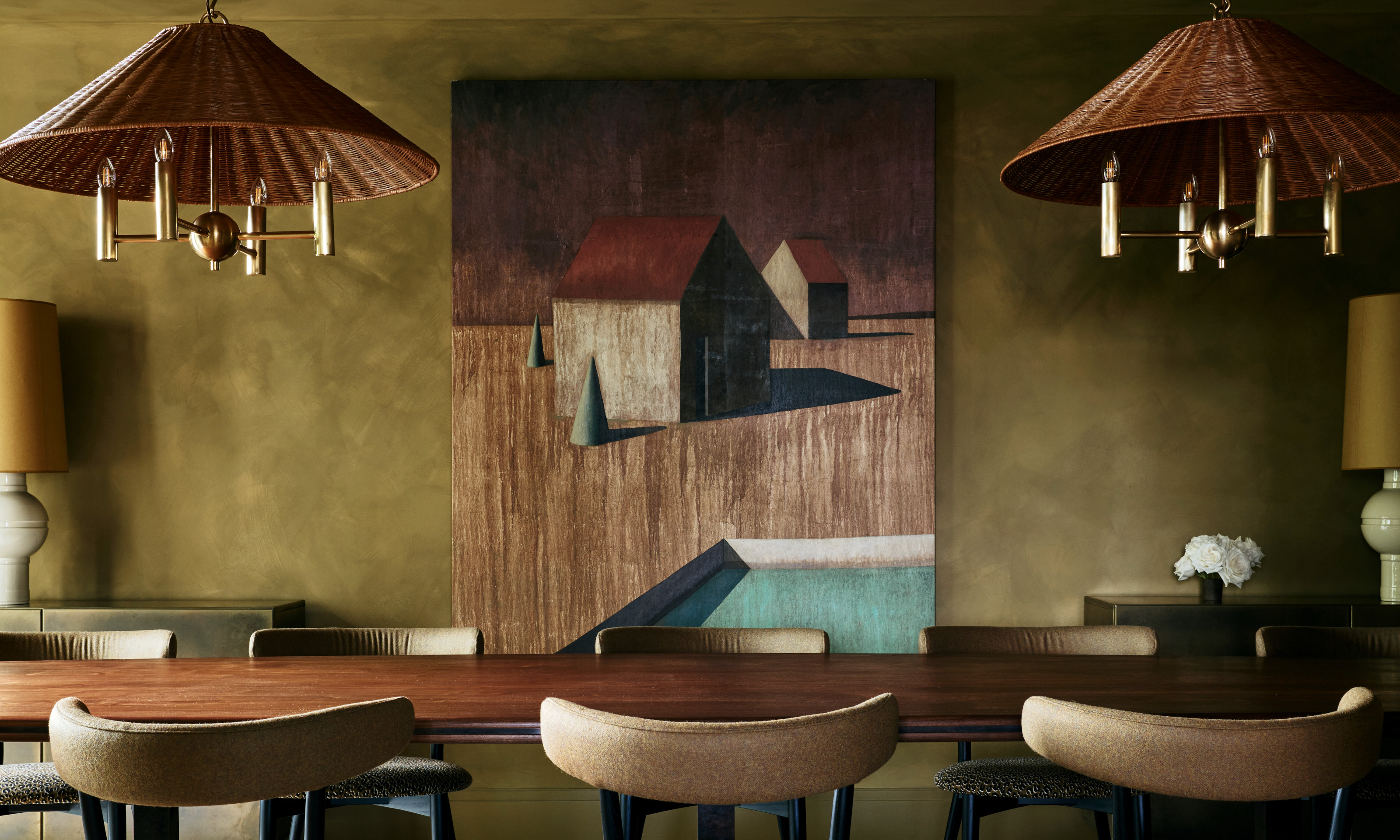
Am I about to sit down to dine or wade through a magical, mossy wilderness at sundown? This space’s two-in-one combination is an adventure in decorating with color; its textured, murky green-yellow walls, merging the exhilaration of 'midnight in the forest' with the decadence of 'dinner-is-served, madam'.
This is when a painted ceiling comes into its own. With immersive color. With a mottled has-it-always-been-like-this texture. The hero shade here is both subtle and soul-squeezing, and as a 360-degree, all-around tone, it becomes not only more striking but transportive. Am I still indoors? Am I still on planet Earth? Am I still even alive, or am I just floating in a sea of color in some new dimension? (It’s true, the abstract art may nudge you towards the more detached conclusions.)
Article continues below 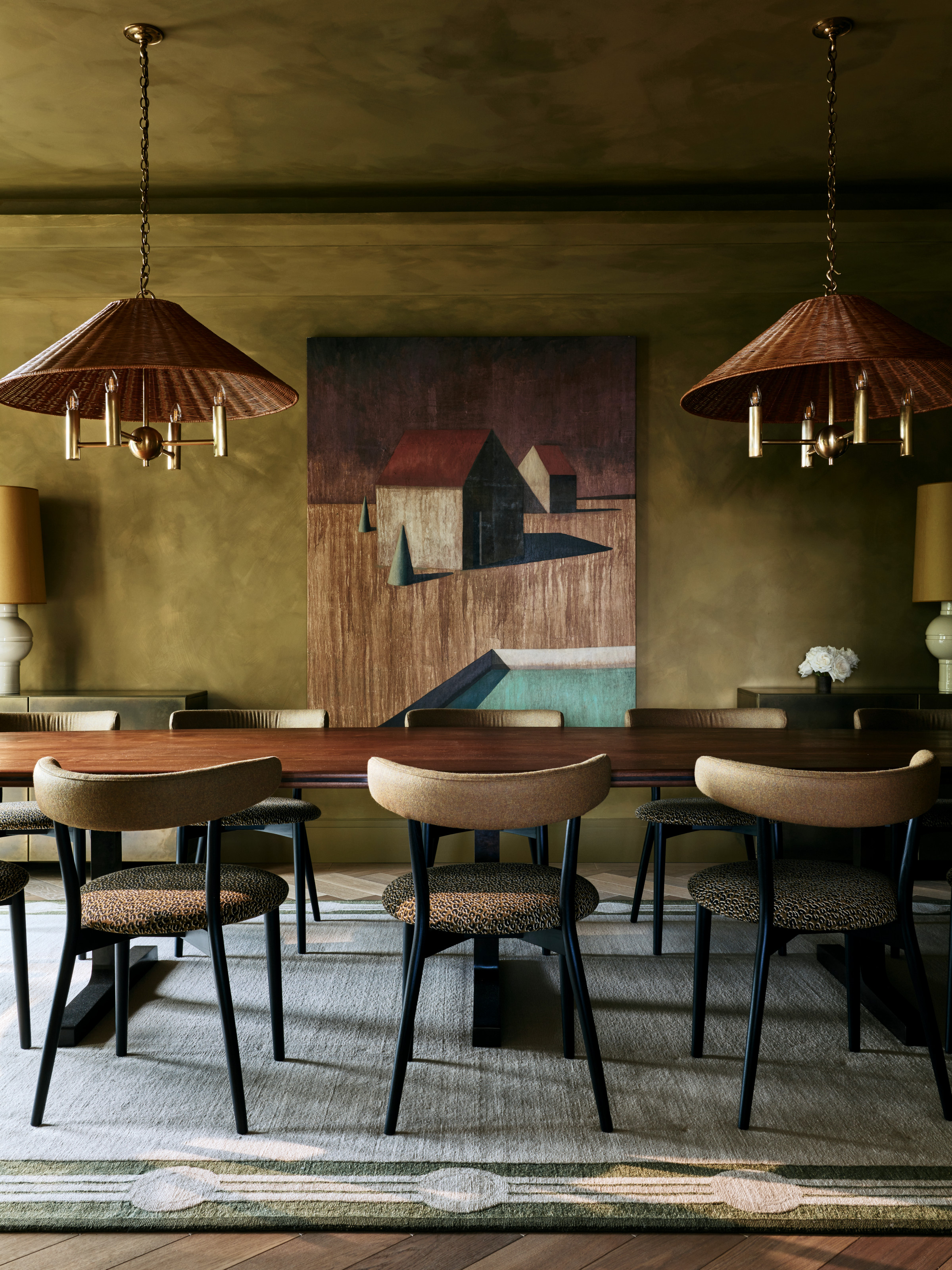
The space is a visual feast, your eyes dancing from one interest to another.
Whatever your mood was when we walked into this dining room, it’s changed now. Covered in the earthiness of Bauwerk Color’s Moreton Bay Fig limewash, the space makes you instantly feel introspective, edgy, and like you might start penning some kind of poem.
"The palette is moody and atmospheric. We wanted something rich and bold, knowing that the space would mainly be used in the evening with candles or low-level lighting," say the home’s creators, Angelica and Richard Squire, founders of London-based interior design company Studio Squire.
"The coloring makes the room feel cozy yet decadent. Dark green is a very likable, easy color to be surrounded by, and it imbues a calm and peaceful mood while delivering on impact."
Supporting colors are brought in gently and in a way that’s — almost — under the radar. Our eyes can’t help but lead us into the dream-like world of painter Ramon Enrich, which gives us the most vivid color in the space, a slice of aqua blue.
The Livingetc newsletters are your inside source for what’s shaping interiors now - and what’s next. Discover trend forecasts, smart style ideas, and curated shopping inspiration that brings design to life. Subscribe today and stay ahead of the curve.
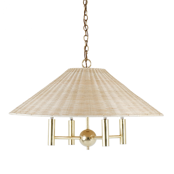
The tone is fresh, lifting the room’s heaviness and injecting a shot of life. Then there’s the other non-moss-green hue, the mustard of the shy lampshades. While they only peek in a little, they bring colorful depth as spots of much needed warmth and coziness for that welcoming quality.
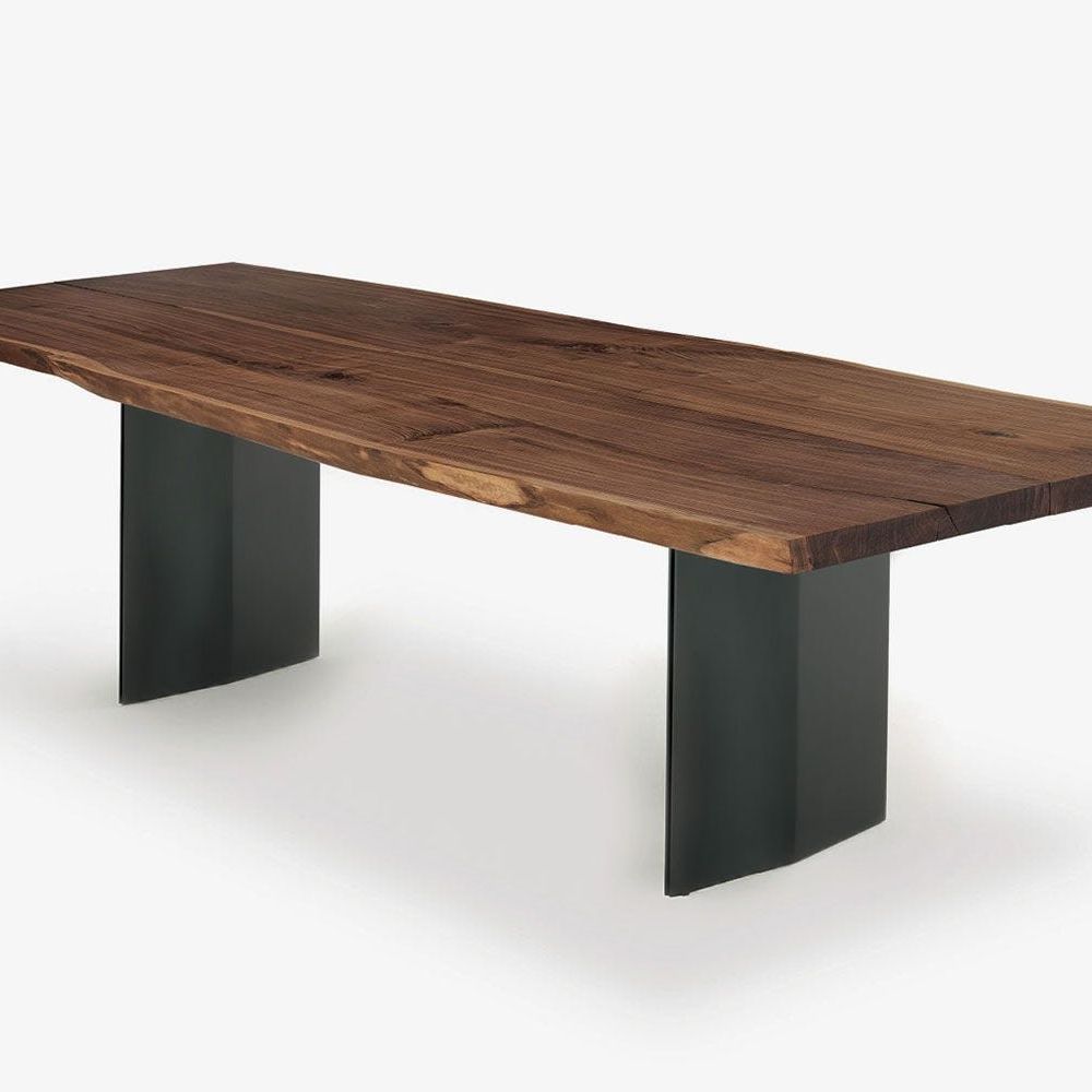
The medium-dark-toned natural materials, while not ticking the color box, certainly qualify as a personality in this room. The walnut table (by Ed Keyser) sets the tone, a slab of deep walnut dissecting the space into upper and lower, and imparting a sense of sumptuous sophistication.
The choice to decorate with brown comes into its own, with the earthen landscape of the art acting as another panel of rich brown, this time on a different plane, while the coordinating chocolatey brown of the rattan lampshades pulls the hue into three-dimensions to give it dominion over the space.
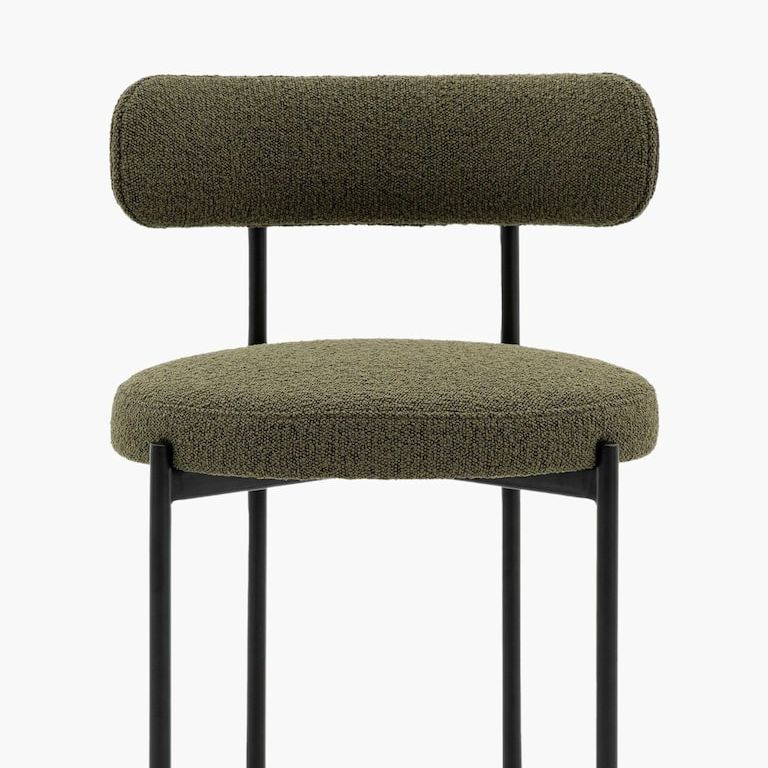
Black and white both play key roles here, but they are practically unnoticeable. Slimline though they are, the chair and table legs create a sea of black sticks, conjuring linearity and dancing with the dark corners hidden throughout the space and their own shadows.
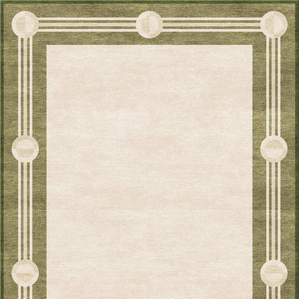
White’s biggest presence is from the rug, the shade mostly hidden from direct light, and so tempered and given a similar dappled effect to the walls. The single, small presence of true, bright white feels strangely fake, like it’s from another time entirely. The roses. Compared to the rest of the space, their gleaming vividity stands out like some kind of AI trick.
Surfaces: bold. Art: bold. Accent colors: bold. Even the brown wood shade: bold. And, yes, the room overall feels wonderfully, powerfully bold, too, but running alongside that feel is also one of serene design and color harmony. And this is exactly the kind of delightful decorative duality you’ll find yourself in, if you approach the colors and materials of nature with such badass aplomb.
For more inspiration on using color and contrast in your space, I also explain how to use the color wheel in interior design so you can "unlock the unexpected" in your next design project.
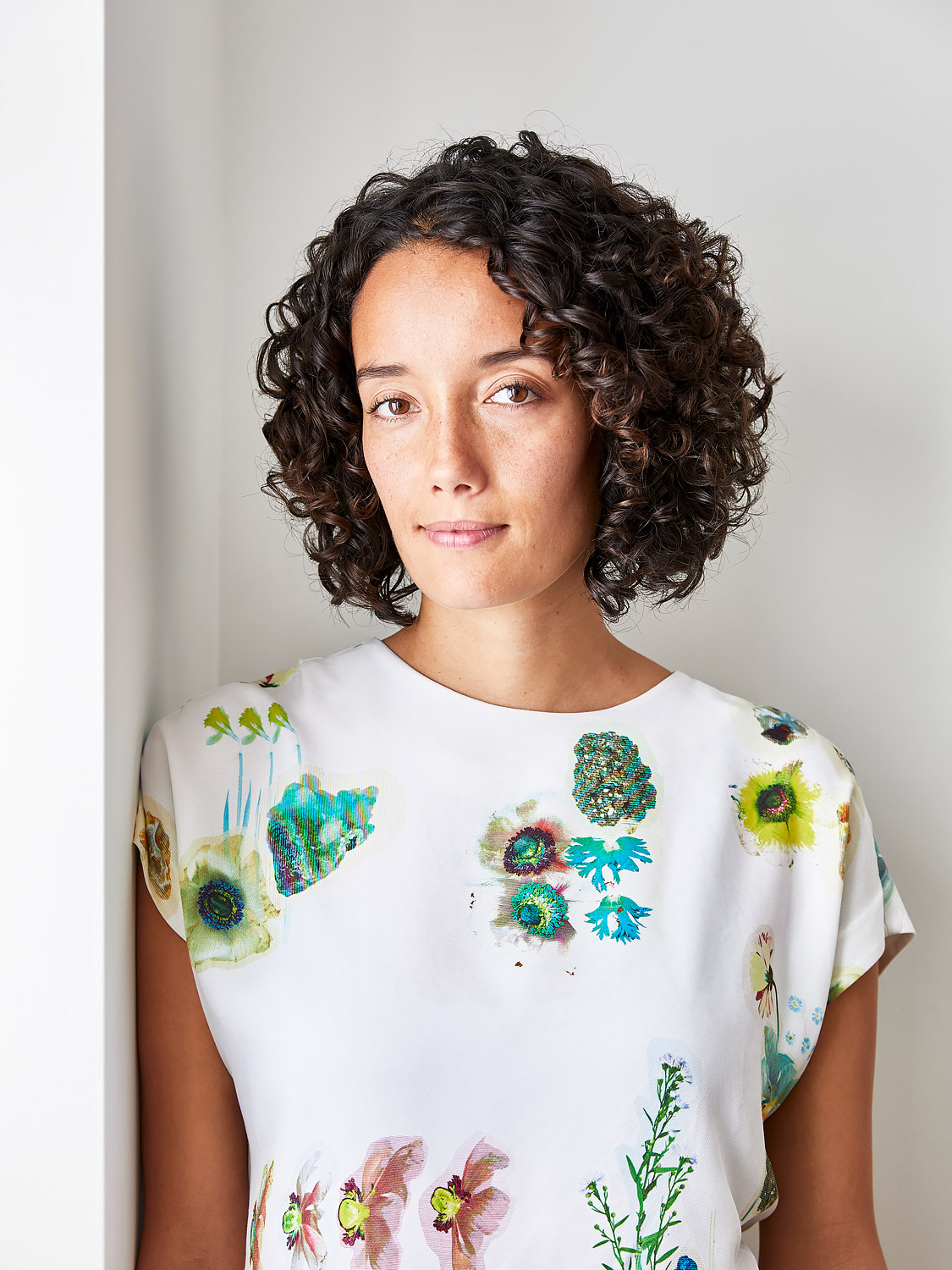
Amy Moorea Wong is a color authority and contemporary interior design writer who has specialized in all things decorating for over a decade. Amy is Livingetc magazine’s Colour Expert, Interiors Editor at The Glossary magazine and a Contributing Editor at Homes & Gardens magazine, and she frequently contributes to an array of global publications to share her insights on interior design zeitgeist. Her book Kaleidoscope: Modern Homes in Every Colour explores a collection of cool colorful homes fizzing with creativity, surprises, and inspiration.
