A Victorian townhouse in London that's packed with punchy hues and modern art
This cleverly co-ordinated south London family home celebrates the inspiring impact of color, pattern and art
The Livingetc newsletters are your inside source for what’s shaping interiors now - and what’s next. Discover trend forecasts, smart style ideas, and curated shopping inspiration that brings design to life. Subscribe today and stay ahead of the curve.
You are now subscribed
Your newsletter sign-up was successful
‘Be brave and boldly go’ was the mantra Ruth Anderson employed when she created this happy modern home for her family of five, plus two labradors, Indi and Juno. She wasn’t consciously referencing Star Trek but she did want to avoid anything bland and boring.
‘I needed to go out of my comfort zone to make this home resonate with color, texture and pattern,' says Ruth of the late Victorian townhouse that backs onto a common, in south London. ‘Our former home was tasteful shades of grey, all very well, but not exactly pushing boundaries.’
When Ruth - previously a lawyer, now a stay at home mum to nine year old twin girls, Lara and Neve and seven year old son Jack - and husband, Mike bought the house over four years ago it had been renovated by the previous owners, but badly so.
Article continues below‘We spent a lot of time and effort redoing their basement work and reconfiguring the entire house to ensure it flows fluidly and is filled with light,’ she says. Let's have a peek...
Living room
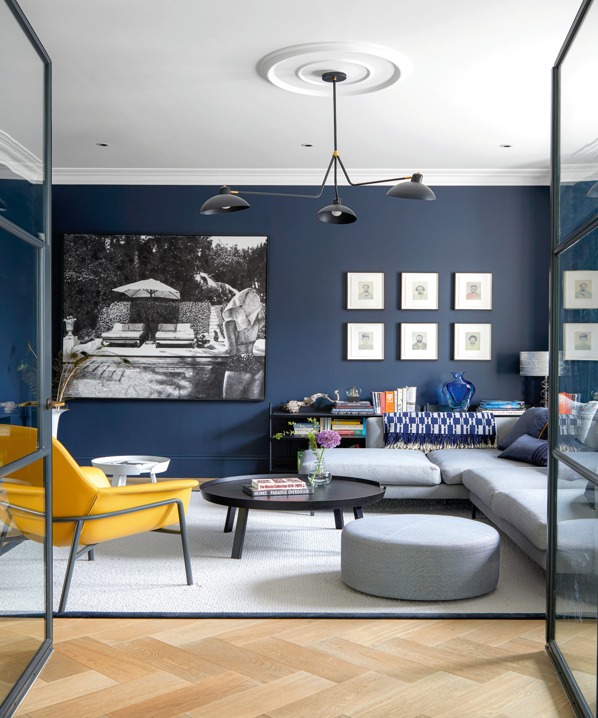
The ground floor living room is split into two sections. The ‘blue room’ has a bit of a gentleman’s club vibe with a tv set into its cantilevered wall.
‘I deliberately put a television there so we use the room every day,’ explains Ruth.
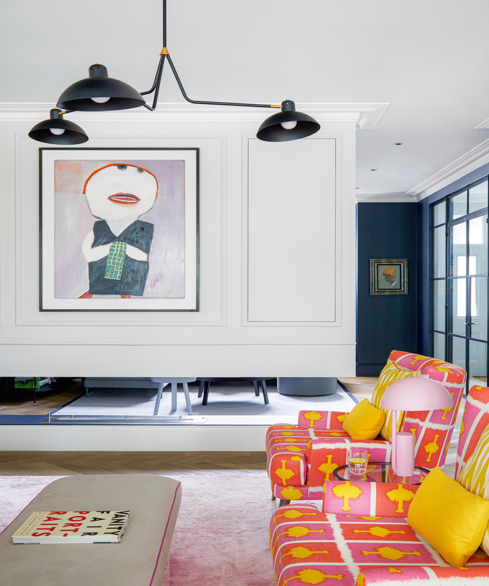
The ‘pink room’ is where guests gather for drinks and piano practice takes place, ‘but the children drift in and out all the time too,’ says Ruth.
The Livingetc newsletters are your inside source for what’s shaping interiors now - and what’s next. Discover trend forecasts, smart style ideas, and curated shopping inspiration that brings design to life. Subscribe today and stay ahead of the curve.
Metal framed doors, which echo the ceiling pendants, were chosen to keep the rooms light and modern. Although this is a period house, Mike in particular, was keen that it should reflect a contemporary lifestyle.
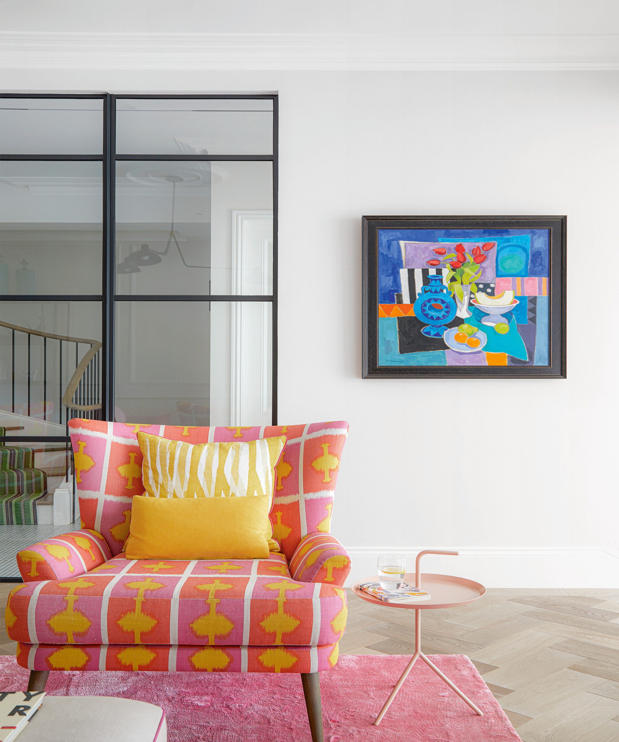
Importantly, the house had to tick lots of boxes for the varying needs and tastes of the family and function so that every inch is used.
Much of the house is decorated with what many people would not exactly class as child-friendly design such as the fabulous pink Christopher Farr fabric covered armchairs, pink living room rug and precious art on the walls.
Art consultant, Louisa Warfield came onboard. ‘We started by asking for a bit of advice and ended up relying on her expert knowledge and brilliant eye for pushing us into new directions where art is concerned,’ says Ruth.
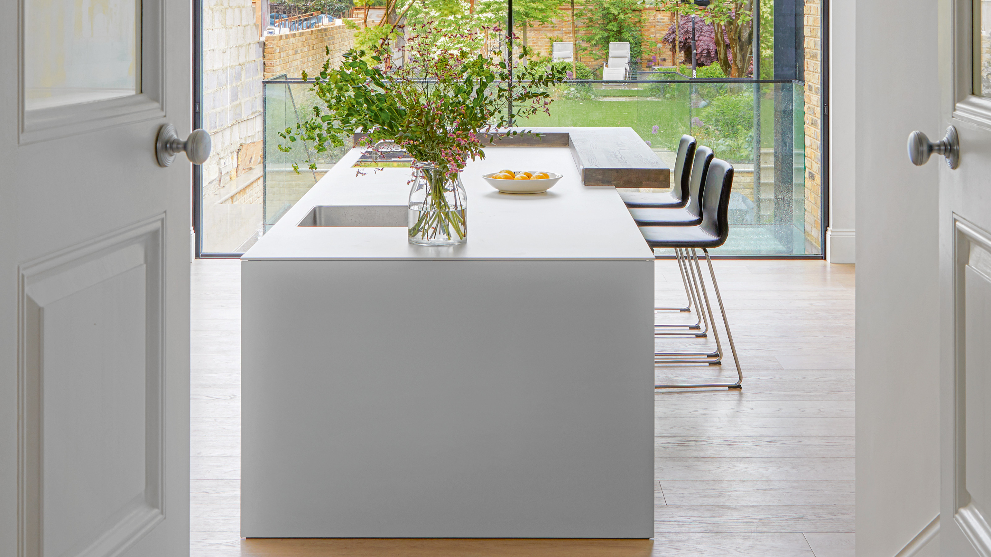
Kitchen
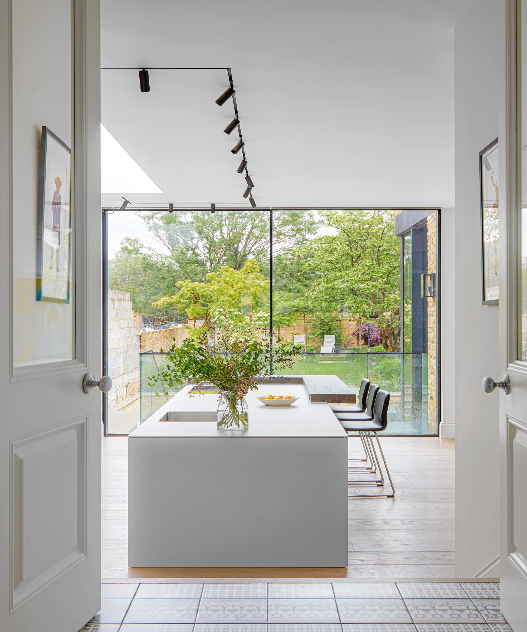
When the renovation was well under way, Ruth began to struggle with design decisions and was introduced to Karena Clayton via Ade Architecture who she was using for the build.
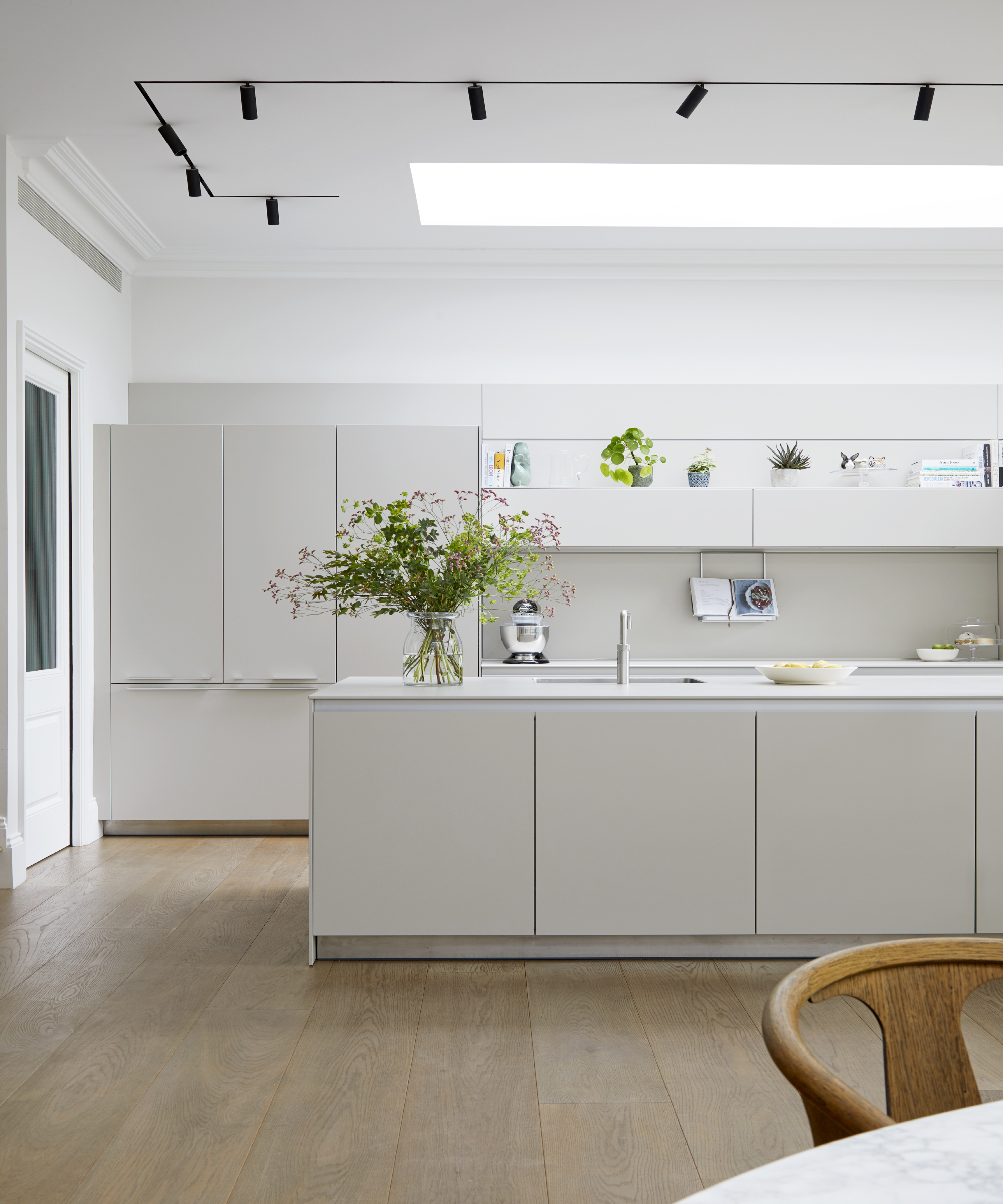
‘Karena ended up being really key in the project, from spatial planning to choices about colors and fabrics,’ says Ruth. ‘Previously we thought that if you more or less know what you want there is no need for a designer, but without her this house would be nowhere near as exciting, nor functional.
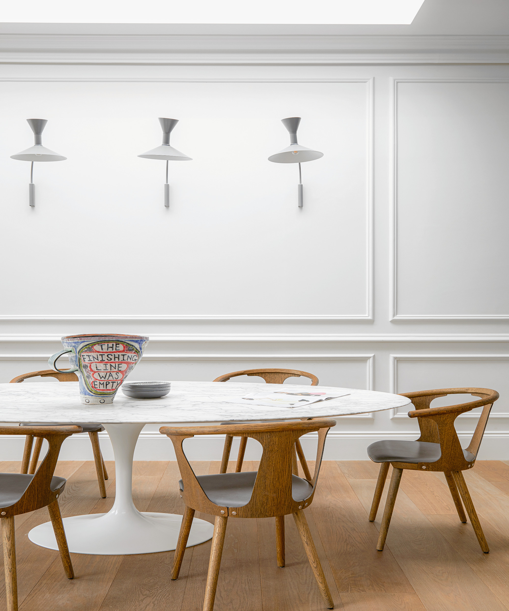
Of the magnificent Saarinen oval marble dining table, ‘friends told me I was mad, that it would stain or chip, but we all eat there every day and it’s still looking good,’ says Ruth. And despite those luxurious fabrics and design classics, nowhere is out of bounds... even for the dogs.
Hallway
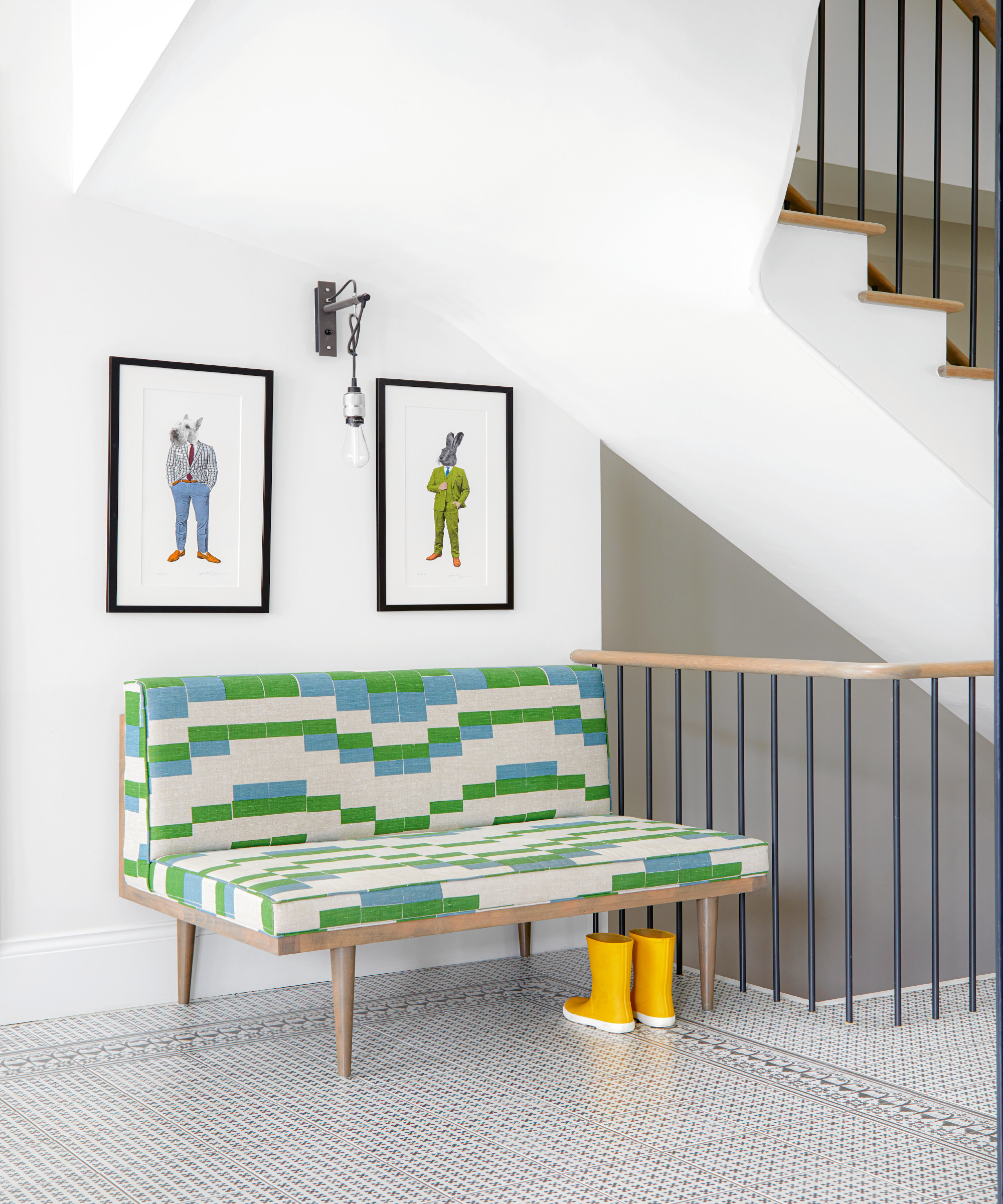
The wide, welcoming hallway is thanks to the repositioning of the striking staircase which previously dominated its centre.
Landing
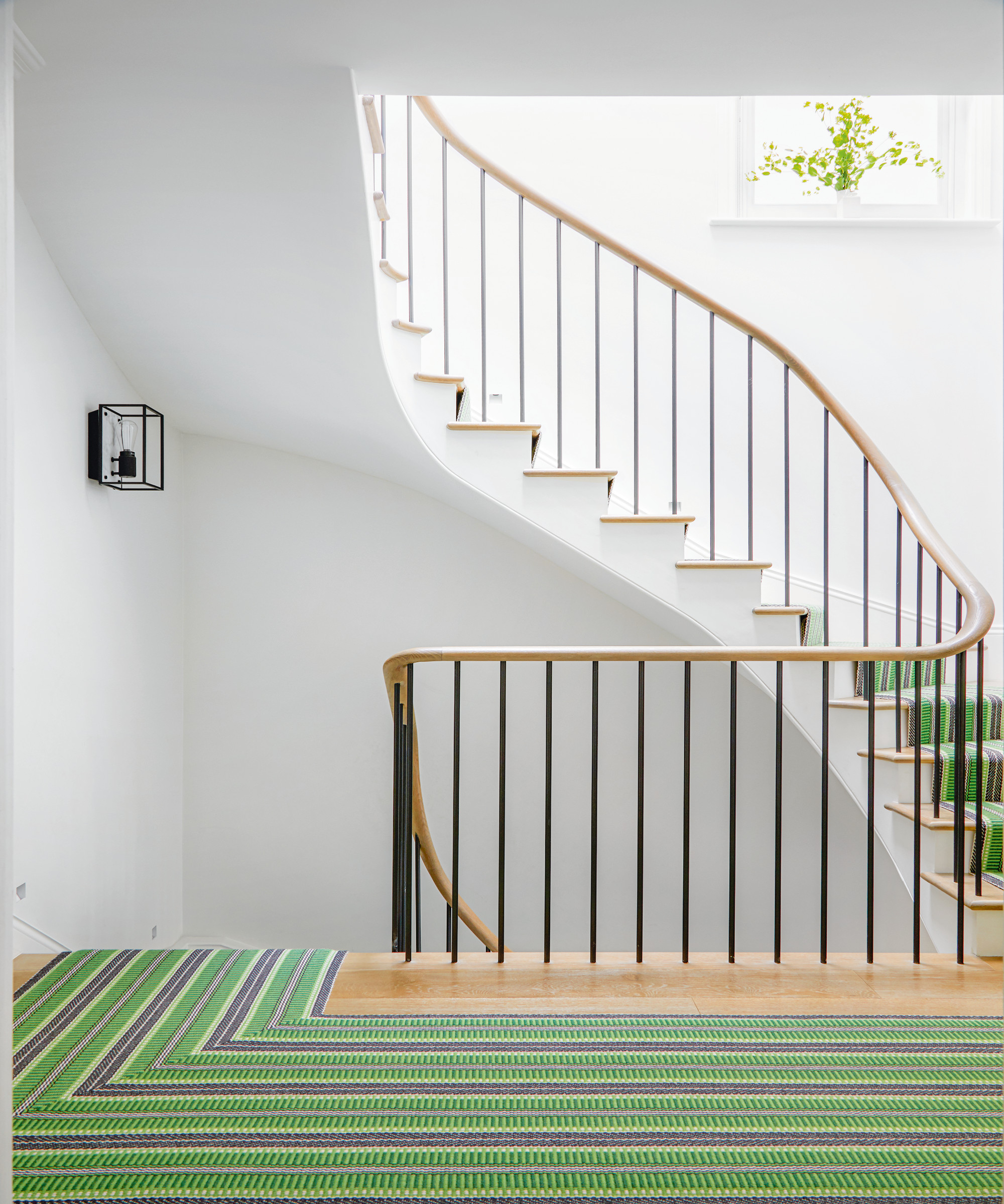
‘The green runner was a scary decision at the time but it’s turned out to be one of the best and connects the colors through the whole house,’ says Ruth.
Bedroom
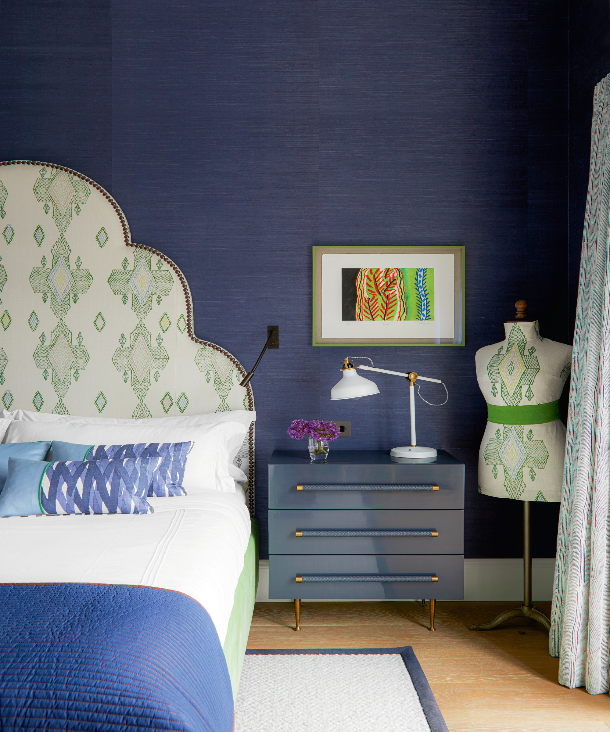
Ruth took inspiration from her design hero Kit Kemp, whose hotels she stayed in when traveling back to London from the US, where she used to live.
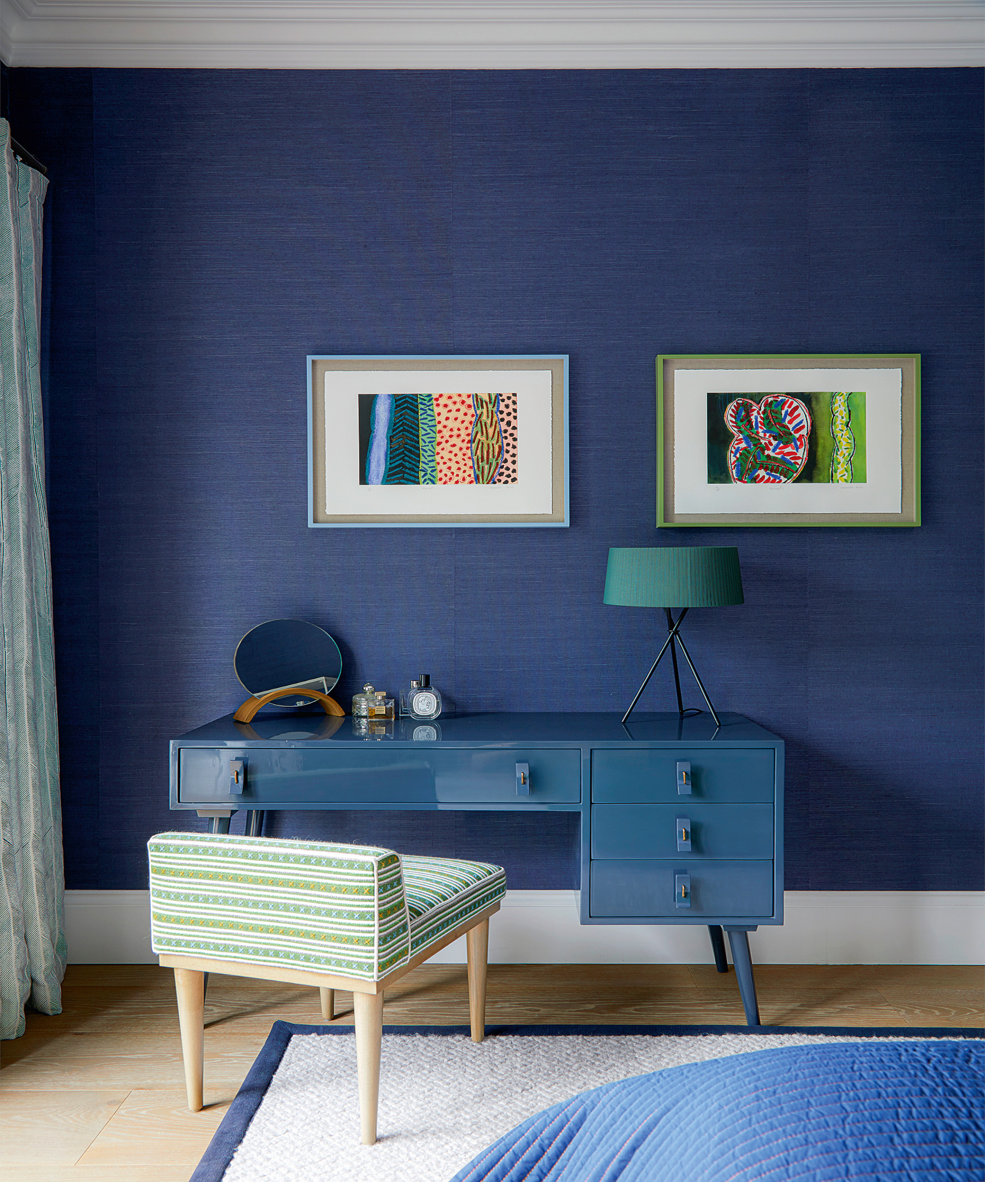
The wallpaper from Stereo Interiors has a woven sisal surface that provides a lustrous texture to the space.
Bathroom
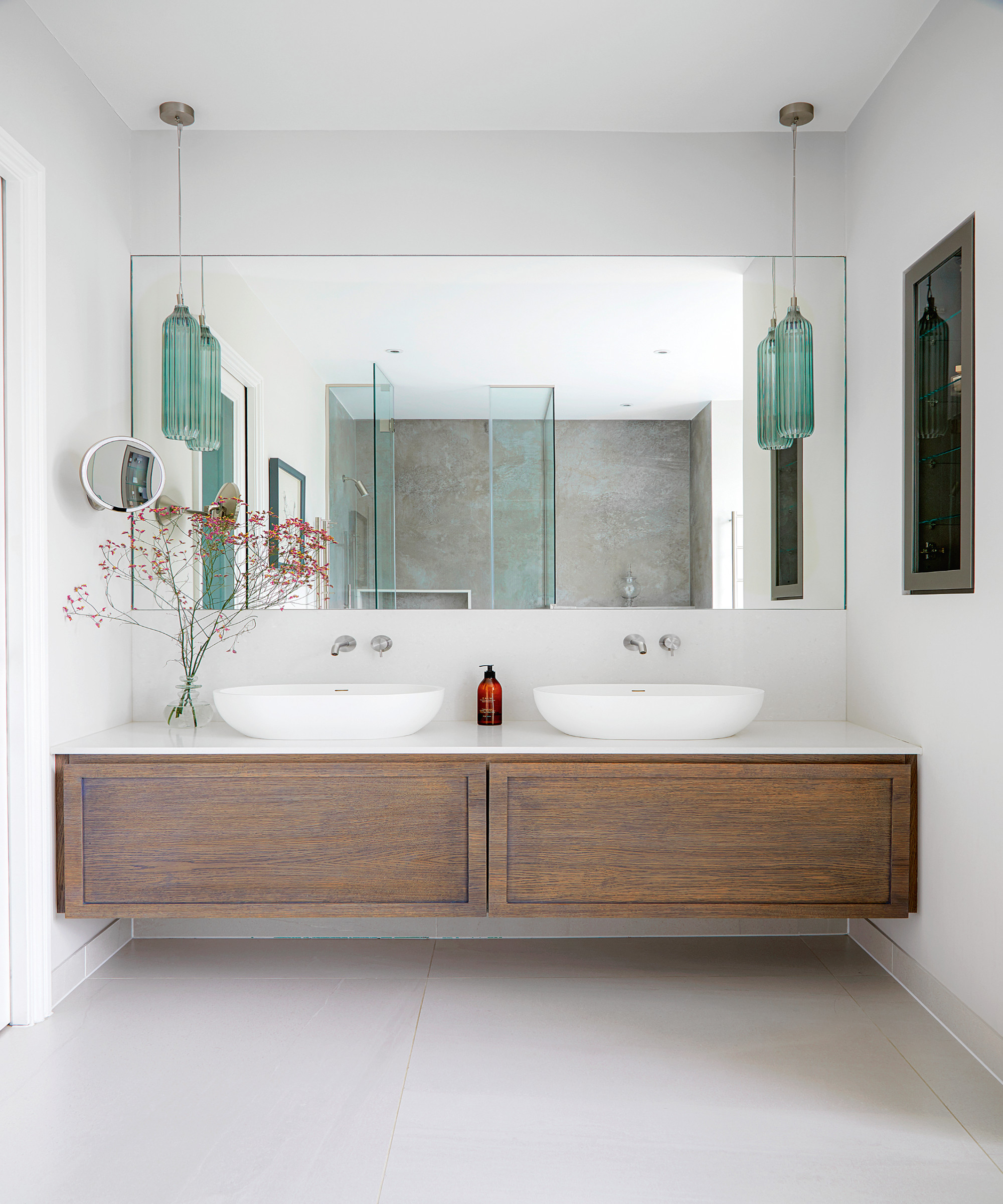
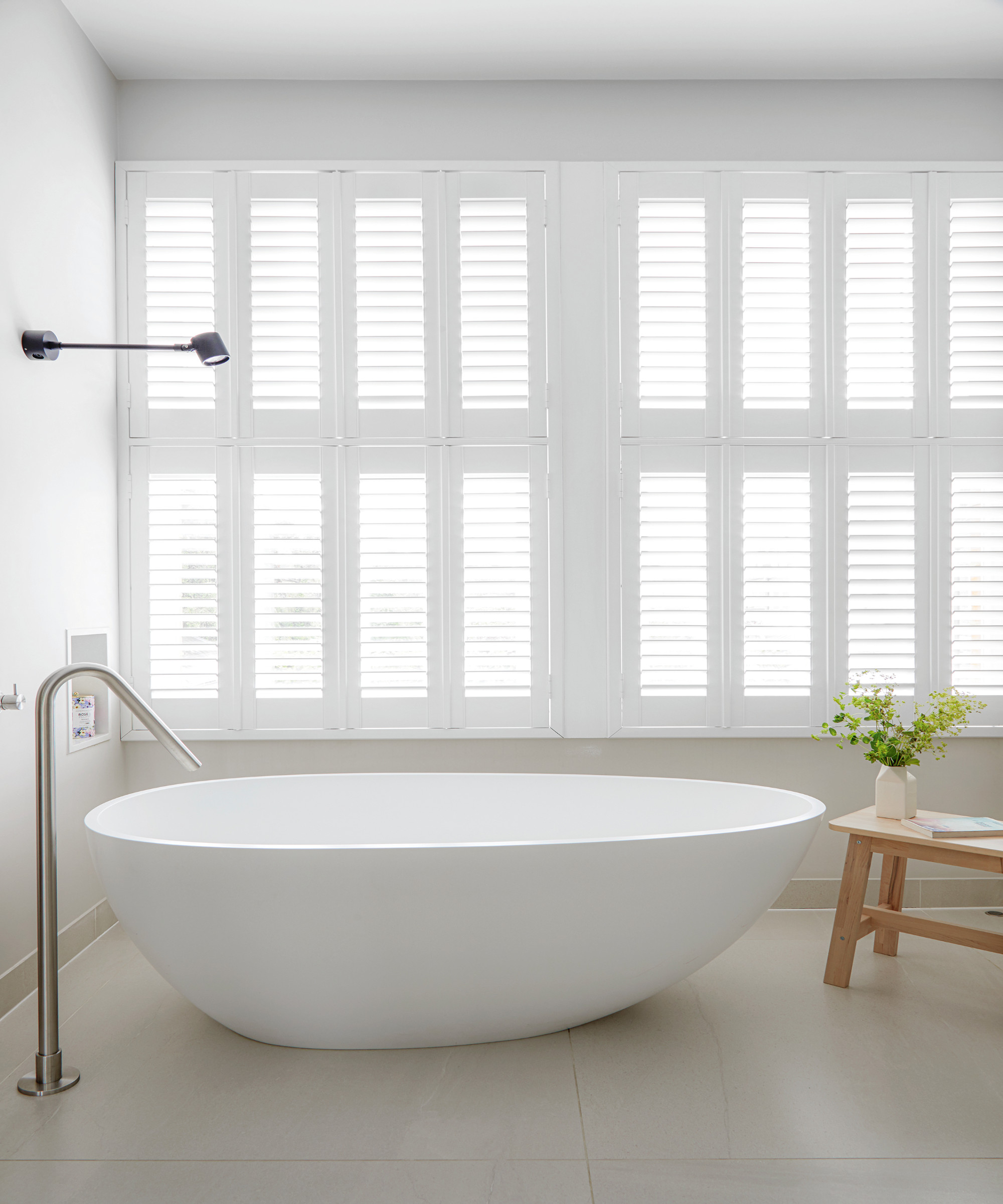
A large his and hers bathroom was a necessary luxury in a home that's always busy and full of children.
Ruth concludes, it was all the various talent, from the architect, designer, builder, gardener, as well as Louisa, who helped make the house the happy home it is today.
See more: this traditional townhouse in NYC has been turned on its head with a radical revamp
A legendary houses editor, Mary Weaver, held the job of homes editor on Livingetc for over a decade. She set the aesthetic for which the brand has become known. She is now a freelance stylist, art director, and writer, regularly contributing to Livingetc and overseeing the brand's successful House Tours franchises of live and webinar events.