How to Plan a Bedroom Around Awkward Angles, Sloped Ceilings, and Weird Windows — 5 Design Dilemmas Answered
Interior designers explain why architectural quirks don’t have to cause sleepless nights

The Livingetc newsletters are your inside source for what’s shaping interiors now - and what’s next. Discover trend forecasts, smart style ideas, and curated shopping inspiration that brings design to life. Subscribe today and stay ahead of the curve.
You are now subscribed
Your newsletter sign-up was successful
Nobody but the most ardent minimalist would want to live in a uniform white box — good news, then, as most of our homes are typically full of strange angles, structural irregularities, and other peculiarities that make such a set-up impossible.
One space where this really matters is the bedroom. A properly considered bedroom layout, despite a sloped ceiling here or a jutting-out wall there, impacts not only how the space looks but can also allow you to sleep better. The key is not to let any architectural constraints undermine comfort. “These elements are often seen as challenges,” says interior designer Valeria Fervorari, “but when they’re thoughtfully considered, they can become a room’s most personal and meaningful moments.”
So, how do interior designers plan a bedroom around awkward angles, sloped ceilings, and weird windows? Below, they share the shortcuts to a well-designed, restful space — quirks and all.
Article continues below1. Make It Work
Clever thinking can turn awkward spaces into features that enhance your space.
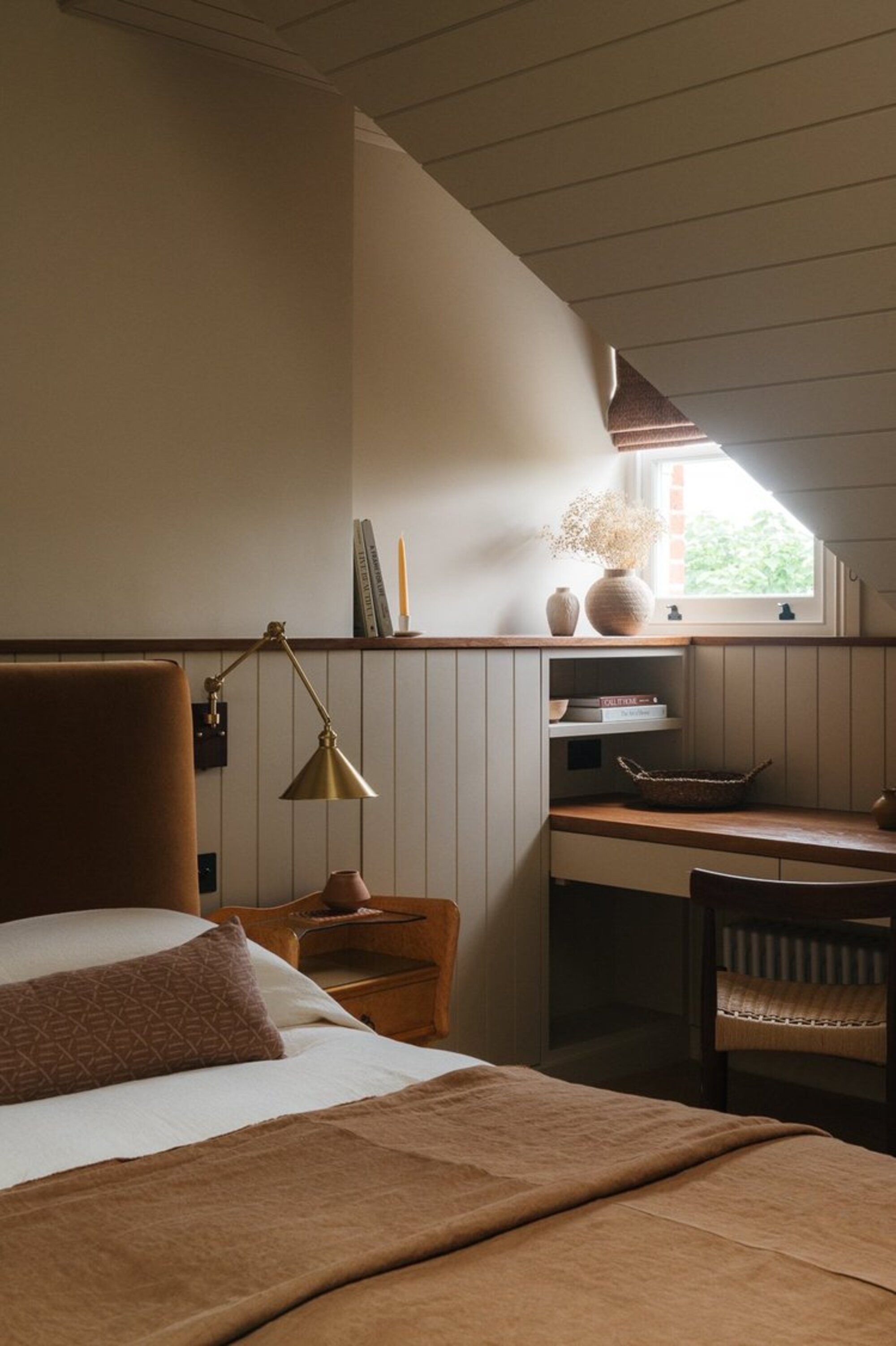
“This bedroom definitely came with a few challenges,” admits Emma Shone-Sanders, founder of Design & That. “We decided to view the sloped ceiling, slightly awkward shape, and small, tucked-away window as starting points for the whole design rather than as problems to hide.”
To maximize the space around the window, the design studio paneled the space with wide groove boards and created a shelf to store books. “This was also a lovely opportunity to build in a desk space, which made the awkward angles feel purposeful and intentional,” she reflects. “This is highly effective in a room where every inch of space really matters.”
When fashioning a desk area around a sloped ceiling, go for a shallow depth (a more compact surface area is, after all, perfectly acceptable for laptops and tablets) and keep furniture similarly scaled. High-backed or bulkier pieces can look out of place and feel awkward when you’re sitting down.
2. Scale Down
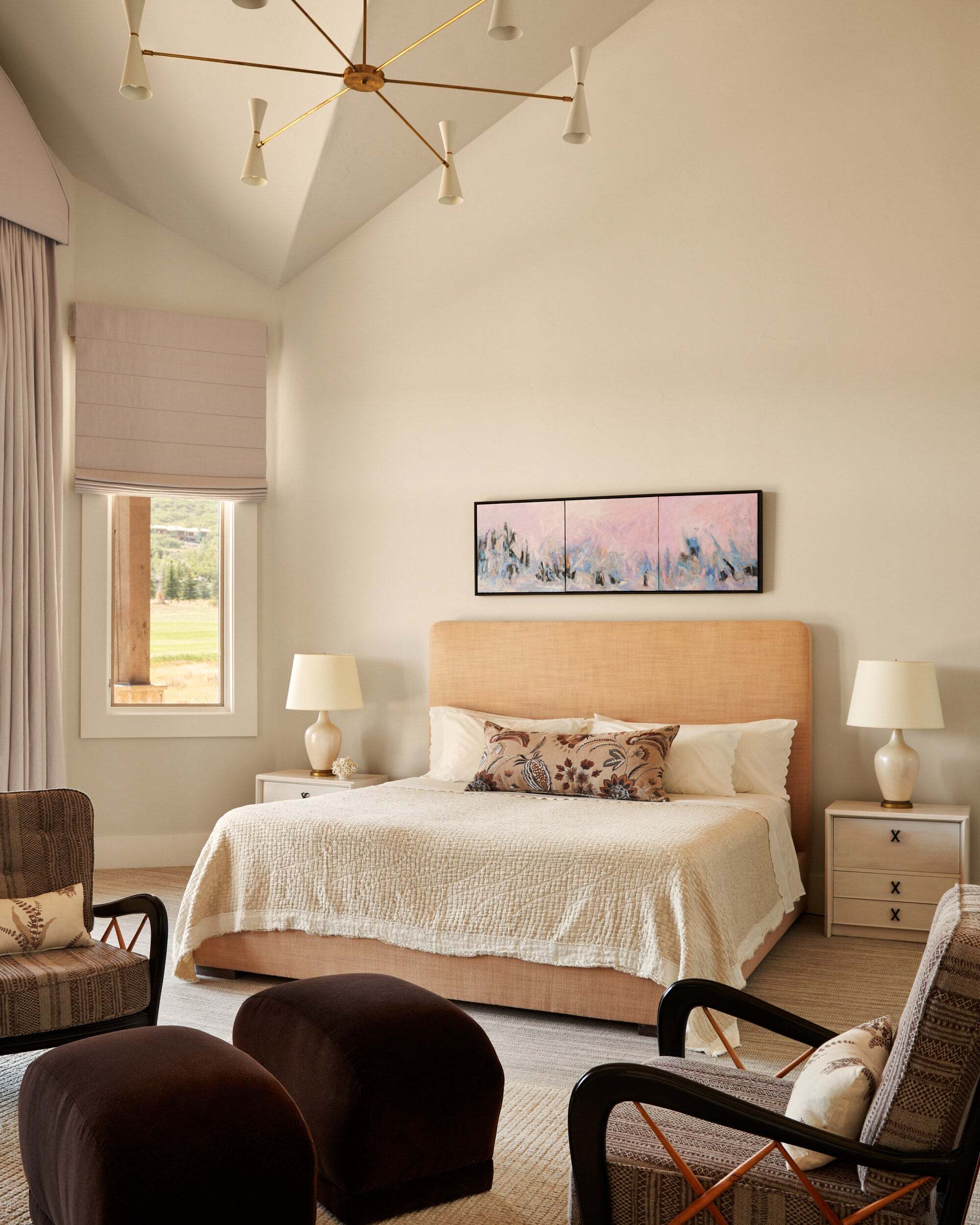
Balance tall, angled ceilings, and sharp corners with softer elements to make them more liveable.
It’s not just smaller bedrooms that have awkward or irregular architecture, as this space by New York City-based interior designer John Bambick so beautifully demonstrates. “The angular ceilings here rise to nearly twenty feet tall at the highest point, and the bedroom has many opposing geometries,” he shares.
The Livingetc newsletters are your inside source for what’s shaping interiors now - and what’s next. Discover trend forecasts, smart style ideas, and curated shopping inspiration that brings design to life. Subscribe today and stay ahead of the curve.
To balance the diagonal lines of the ceiling and the sharp corners of the walls, the studio took the same decorative approach for both. “We painted the ceilings the exact same color as the wall, so everything blended,” explains John.
Making the bedroom more intimate was a priority. To humanize the room’s proportions, the team made the headboard much taller than it would normally be. “It feels appropriately scaled to the space now,” he says. “I also added Lawson-Fenning’s oversized chandelier to draw the eye downward and used window treatments in lavender-tinted gray linen to further soften the space and create a more intimate setting.”
Internationally acclaimed designer John is based in New York City, but brings his vision to residential projects across the United States. While he’s known for creating timeless interiors, his work does often reflect his appreciation of twentieth-century design.
3. Go Bespoke
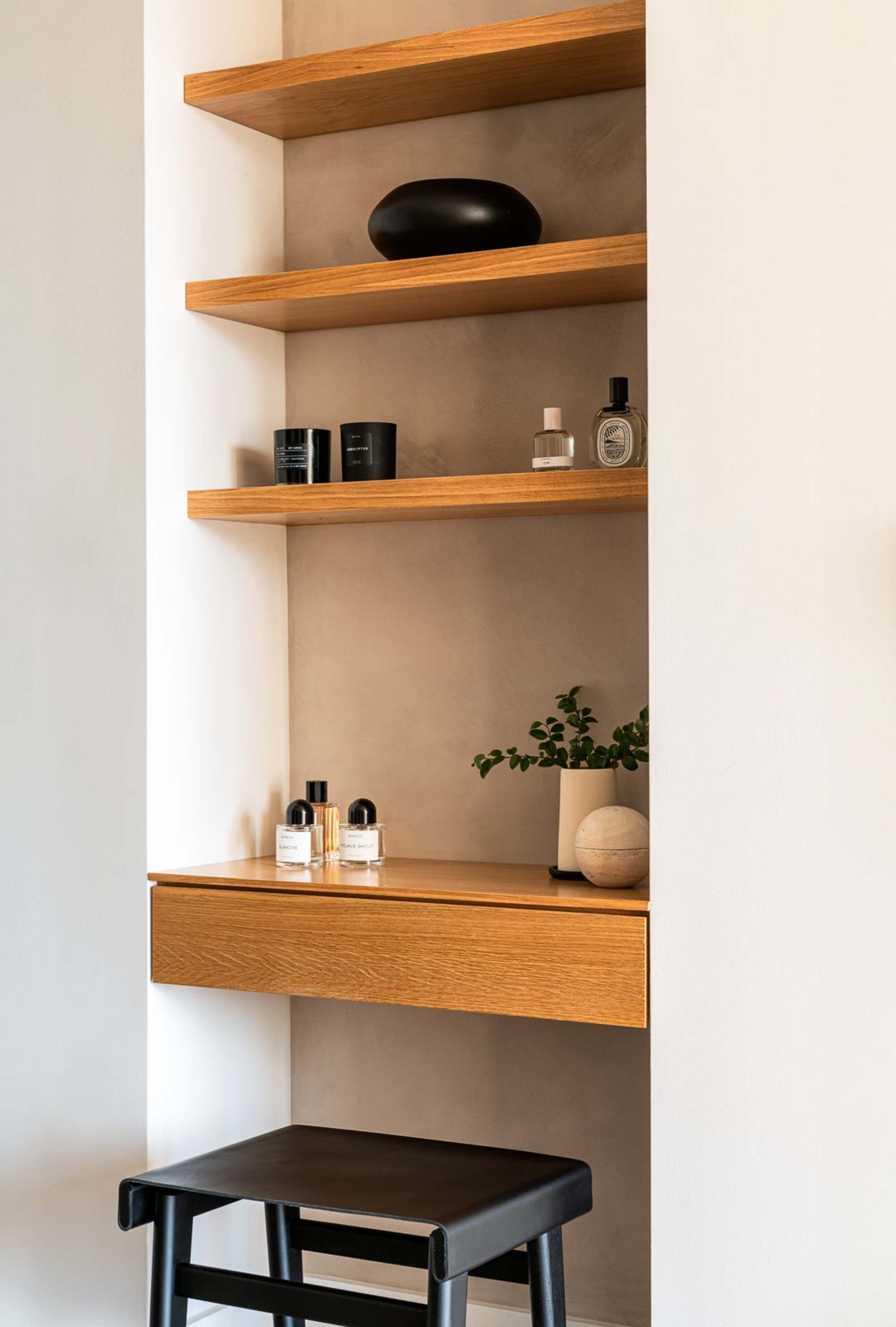
Integrated solutions can turn an otherwise unused area into a bedroom’s seamless gem.
“Unexpected architectural corners and in-between spaces are almost inevitable when you are decorating an existing space,” says Valeria Fervorari from Studio Ocra. “In this bedroom, we re-imagined a niche framed by a closet on one side and doors to the ensuite on the other, giving purpose to somewhere that originally felt transitional and unresolved.”
To maximize the opportunity presented by tight gaps like this, a tailor-made solution is usually best. “While a freestanding piece could perhaps have filled this space, it would never have felt truly integrated. Bespoke millwork is central to our approach, and means we fully customized the space to elevate its quality and functionality.”
In a bedroom, a small workstation or cosmetics area makes perfect sense, as a seat-height table can be utilized as a surface while integrated shelves above provide much-needed storage. “This previously awkward empty space now enhances everyday living while adding depth and character to the overall design,” reflects Valeria.
4. Create a Moment
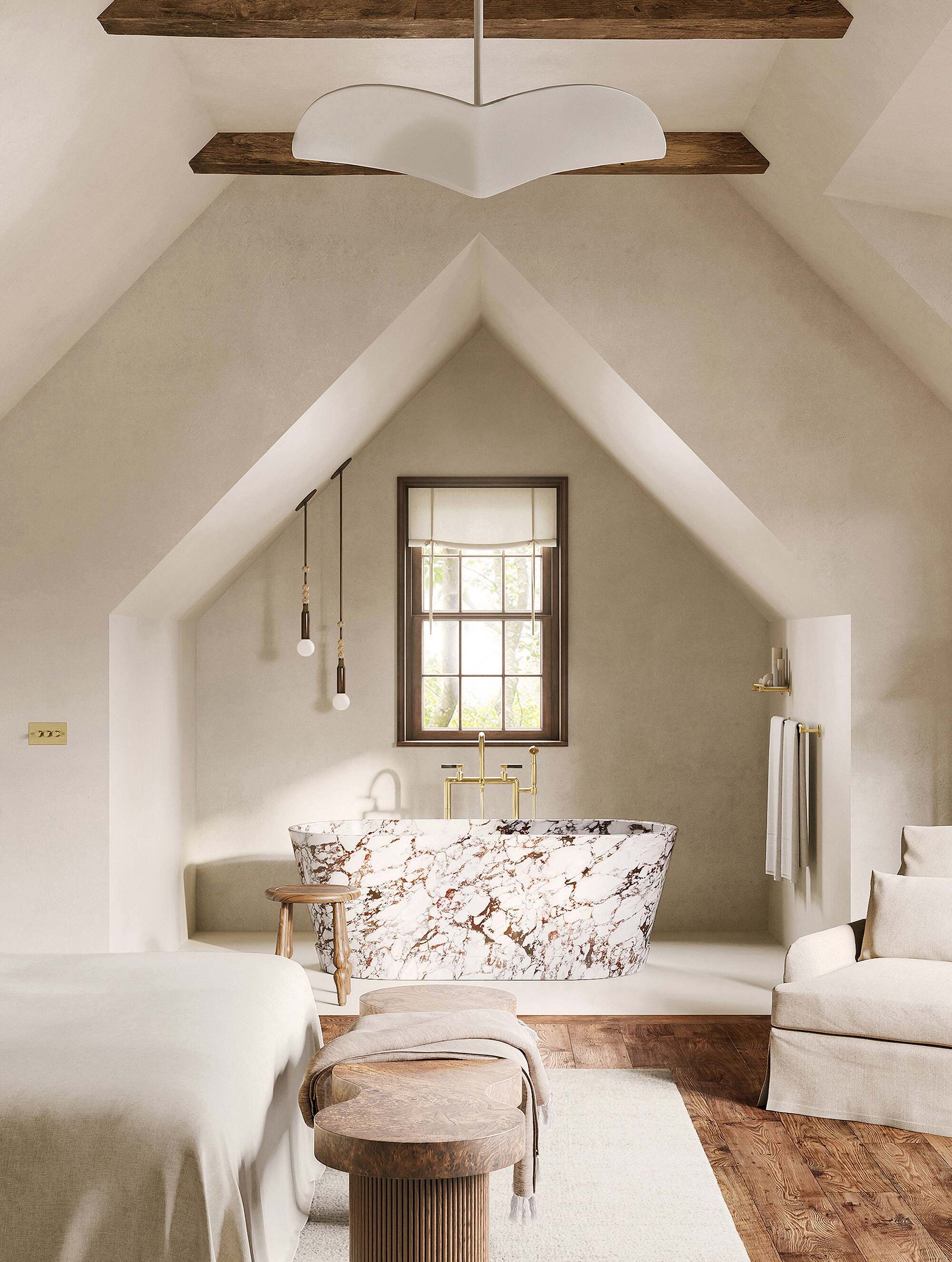
Embrace the shape of a space — and its quirks — by echoing its proportions in a wow-factor way.
In some spaces, architecture can feel imposing. “The vaulted ceilings and asymmetric geometries in this space have such a presence that the most respectful gesture was restraint,” reflects Dorothee Junkin, founder and principal of DJDS. “Instead of forcing a space into a conventional layout, we looked for ways to highlight its inherent geography.”
To respond to this bedroom’s angles, Dorothee echoed the ceiling’s sloped lines to create a sculptural recess for an open bathroom. “By far the most challenging aspect of the project was creating this tub alcove, but it was ultimately the most rewarding,” she says. “We converted a small walk-in closet to carve out the space and make it feel both intentional and serene.”
“Architectural quirks don’t have to be an obstacle, but rather an invitation," she adds. "The best design decision is sometimes simply not to compete with them. Work with the volume, not against it, and consider whether smaller adjacent spaces can be repurposed to create moments that feel custom and unexpected.”
Originally from Switzerland, Dorothee is a trained architect and New York-based interior designer who applies her methodical instincts to create spaces that beautifully blend function and form.
5. In Doubt? Do Less
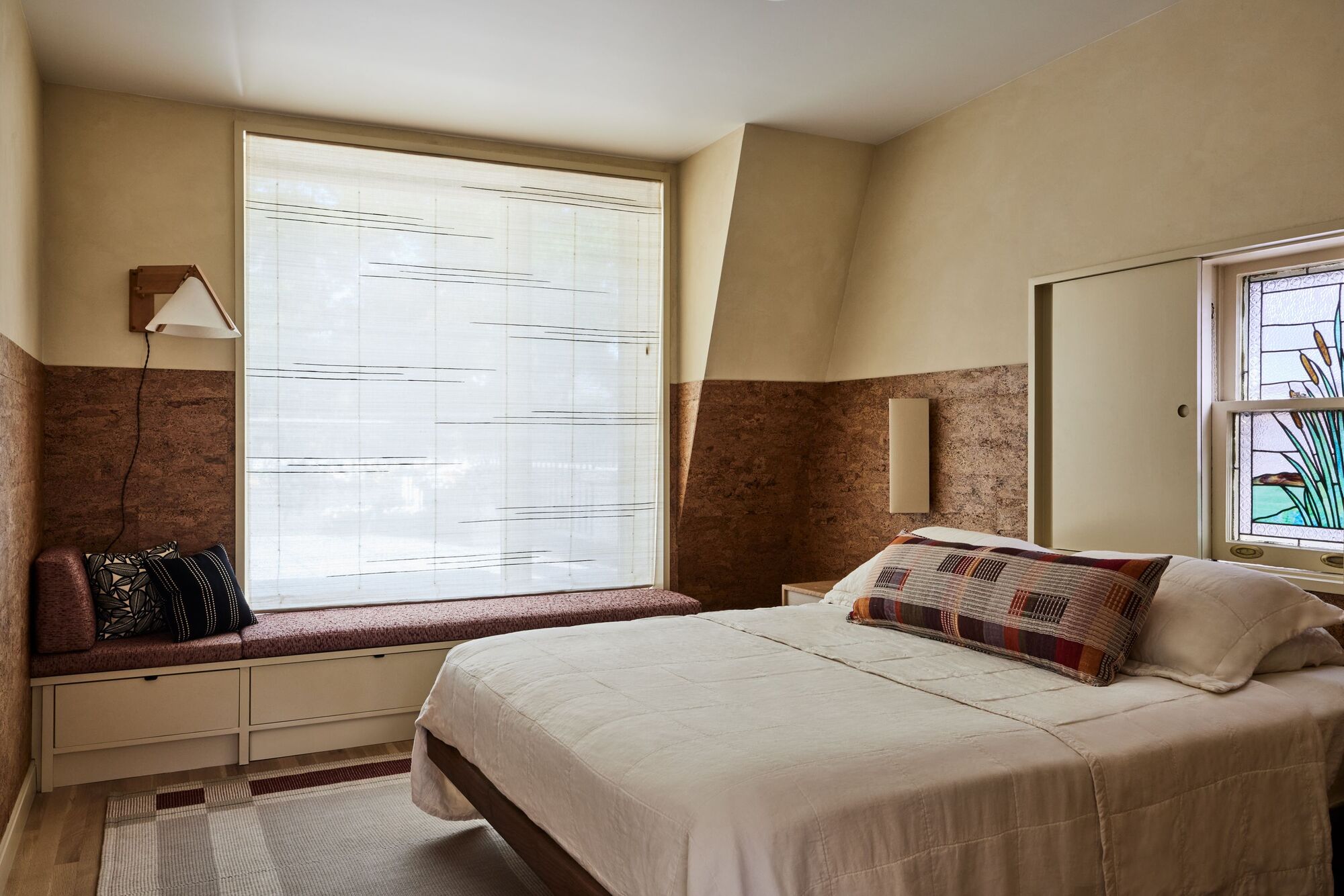
Less intervention, rather than more, is sometimes the best solution for awkward corners.
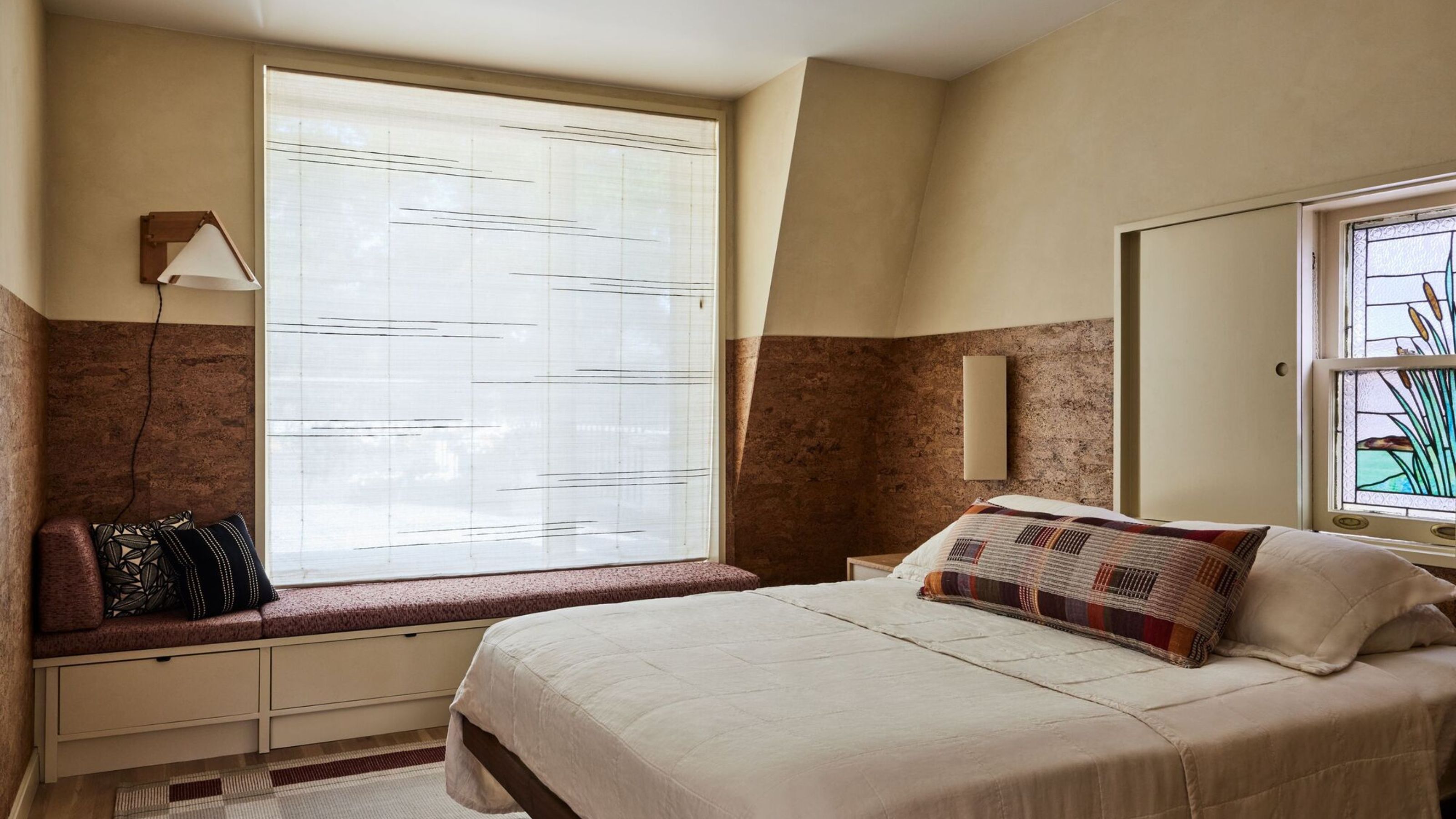
Not every architectural irregularity needs to be remedied. “We created this window seat to look out onto the roof terrace, but the dormer led to this odd corner condition,” remembers Claire Leavengood-Boxer, the lead architect on this project by The Brooklyn Studio. “We initially wanted to cover it up.”
However, the team decided to leave things as they stood, working with the awkwardness rather than overcorrecting it. “When extra space is at a premium, embracing the odd condition can be more beneficial than covering it up.”
“Leaving the corner alone actually draws less attention than it would otherwise,” Claire explains. “Plus, there’s the added bonus of it giving some breathing room between the bedside table and the window bench itself.”
While uneven corners, awkwardly-placed windows, and quirky ceilings might present initial challenges, particularly in a bedroom, they don’t have to go on to define your space.
Thoughtful tweaks and larger-scale interventions can, in fact, transform them into a design feature — just look at the ways designers have managed to hide structural pillars in living rooms, transforming them from obstacles to 'oh-wow' moments in the space.

James Cunningham is a freelance journalist based in London. He has written extensively on design and decorating for some of the UK’s leading publications, including House Beautiful, ELLE Decoration, and Country Living, and previously served as Homes and Gardens Editor at Good Housekeeping. When he’s not at his desk, James can be found globetrotting in search of good food, better wine, and the best architecture.
