The Color Trend Forecast — 10 Colors That You'll See People Decorate With More in 2026, and the 'Emotional' Cues Guiding the Way
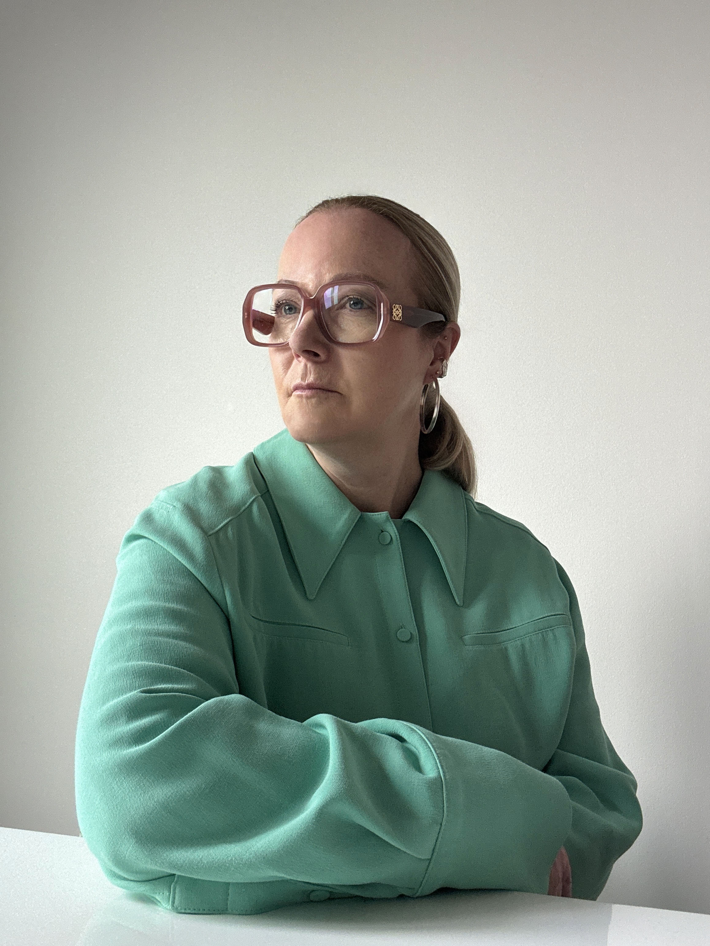
Trend forecaster Jane Boddy offers her predictions on the colors that will resonate with us emotionally and culturally in the year to come

The Livingetc newsletters are your inside source for what’s shaping interiors now - and what’s next. Discover trend forecasts, smart style ideas, and curated shopping inspiration that brings design to life. Subscribe today and stay ahead of the curve.
You are now subscribed
Your newsletter sign-up was successful
In 2026, color takes on deeper meaning. It is no longer just a backdrop or a trend but something that supports how we live, feel, and connect. We are learning to see color as a quiet form of care — one that responds to our moods, restores balance, and brings warmth to the everyday.
The senses are one of the biggest talking points in the world of color trends, and we are beginning to connect them more consciously. Touch, taste, and scent all influence how we experience color, taking us deeper into its emotional impact. Many of the shades emerging as interior design trends now draw on this connection — inspired by food, nature, and fragrance — making color something we can almost feel and taste as much as see.
From soft, cocooning neutrals to energizing brights, color is becoming part of how we look after ourselves and our spaces. It can comfort or inspire, ground us or give us lift, changing how a room feels and how we feel within it.
Article continues belowThis year, we move beyond decoration to experience color as something personal and purposeful. It is emotion made visible.

A pivotal figure at the Pantone Colour Institute, Jane contributes to trend publications and serves as the European Creative Director for Pantone’s Interiors annual trends publication, Pantone View Home and Interiors. Her approach to forecasting color focuses on observing current events and cultural trends to understand how perceptions of color are evolving.
1. Solar Yellow
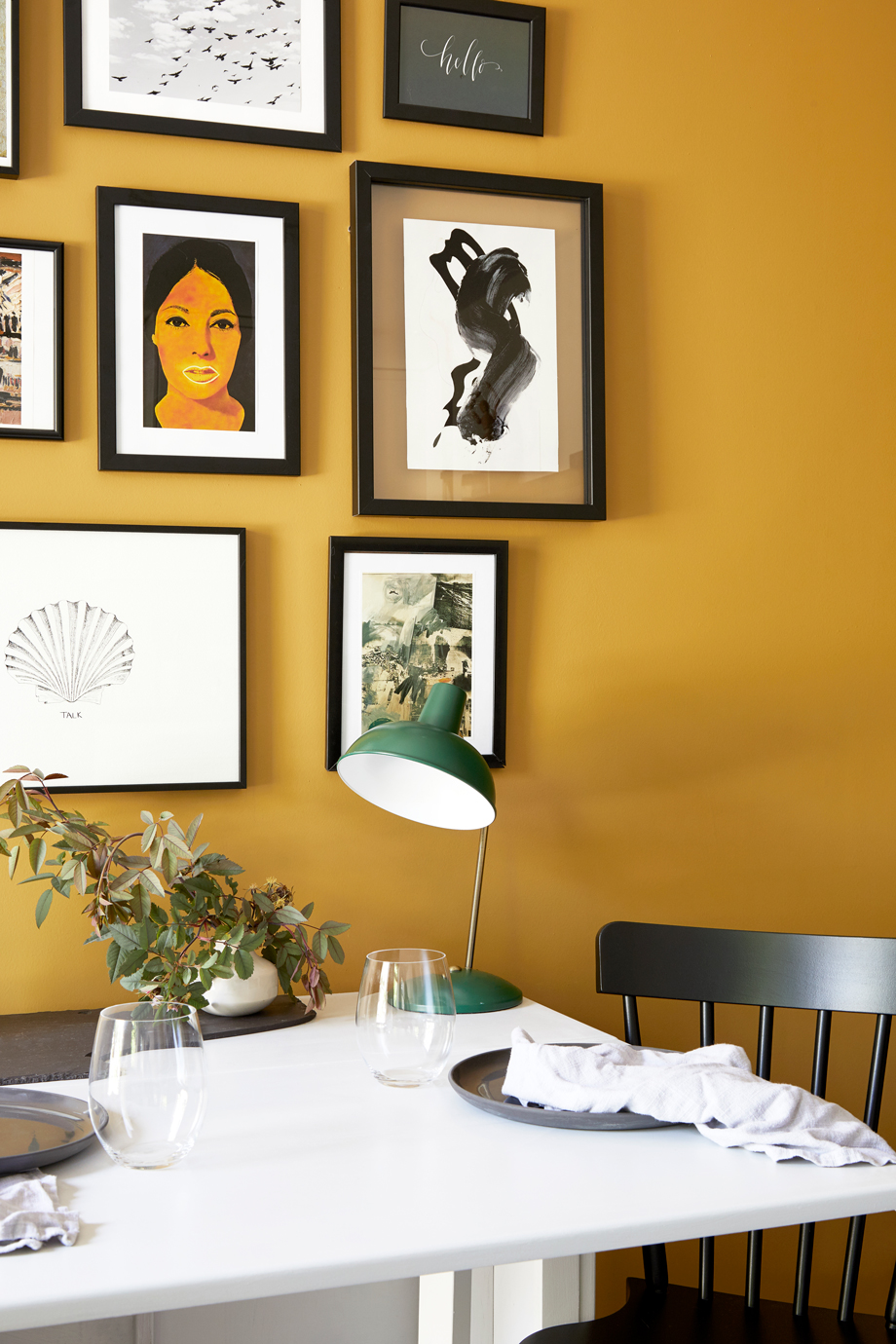
It may be a classically happy color, but that doesn't mean Solar Yellow can't be sophisticated, too.
Solar Yellow channels the energy of pure light. Bright yet refined, it glows with a warmth that feels both invigorating and calm, radiating optimism in a quietly sophisticated way. Decorating with yellow captures the essence of sunlight and translates it into modern design — uplifting, intelligent, and full of life.
Its brilliance lies in its balance. Solar Yellow carries the freshness of lemon, the richness of honey, and the clarity of morning light, evoking that unmistakable hit of Vitamin D for the home. There’s also a gentle lean toward the 1970s in its mood, a sun-drenched nostalgia reworked through a modern lens. It feels active and energizing but also soft enough to live with every day, a tone that sparks both focus and joy.
In interiors, Solar Yellow works beautifully on hard, light reflective surfaces such as lacquered furniture, glass, and smooth finishes that amplify its glow. Used across larger expanses, it creates a sun-washed energy that feels positive and alive. As an accent, it adds a playful spark that instantly lifts the mood of a space.
The Livingetc newsletters are your inside source for what’s shaping interiors now - and what’s next. Discover trend forecasts, smart style ideas, and curated shopping inspiration that brings design to life. Subscribe today and stay ahead of the curve.
This is color for fun, modern design — expressive, radiant, and self-assured. It captures the mood of a new optimism in interiors.
2. Sensorial Brown
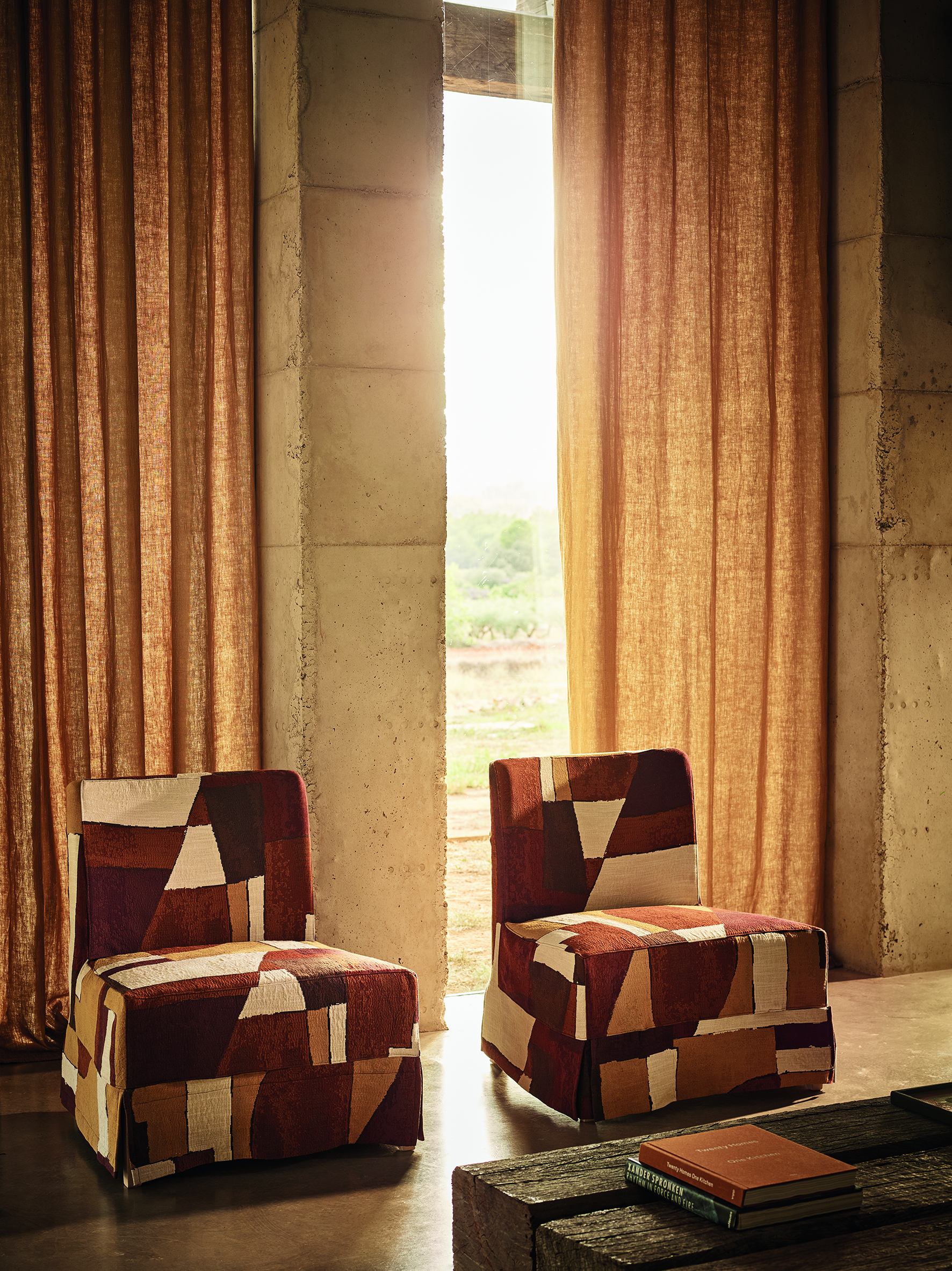
Clay-like Sensorial Brown, similar to the this textural linen from Zinc Textiles' Juego collection, has a warmth and softness.
Sensorial Brown embodies a sweet, soft depth that feels both intimate and strong. Rooted in the earth’s natural palette, it evokes the warmth of soil, the richness of timber, and the quiet calm of sun-baked clay. More than just a color, decorating with this earth tone is a tactile invitation, balancing raw authenticity with nurturing softness to create interiors that feel grounding, safe, and profoundly human.
Brown is shifting in mood, moving away from polished glamour toward something more earth-driven and instinctive. It reconnects us with natural materials and organic imperfection, finding beauty in tones that feel lived-in and real. This new direction gives brown an honesty and quiet strength that speaks to slower living and deeper connection.
Within sensorial design, Sensorial Brown bridges primitive inspiration and contemporary refinement. Its versatility allows it to shift effortlessly between minimalist and rustic settings, enhancing both texture and detail. When paired with creamy neutrals, it conveys quiet elegance; with terracotta or deep copper, it takes on a rich, natural depth.
This color trend celebrates touch, warmth, and material honesty, shaping interiors that are not only visually striking but emotionally restorative — a reminder that true comfort often lies in what feels most natural.
3. Maximalist Pink
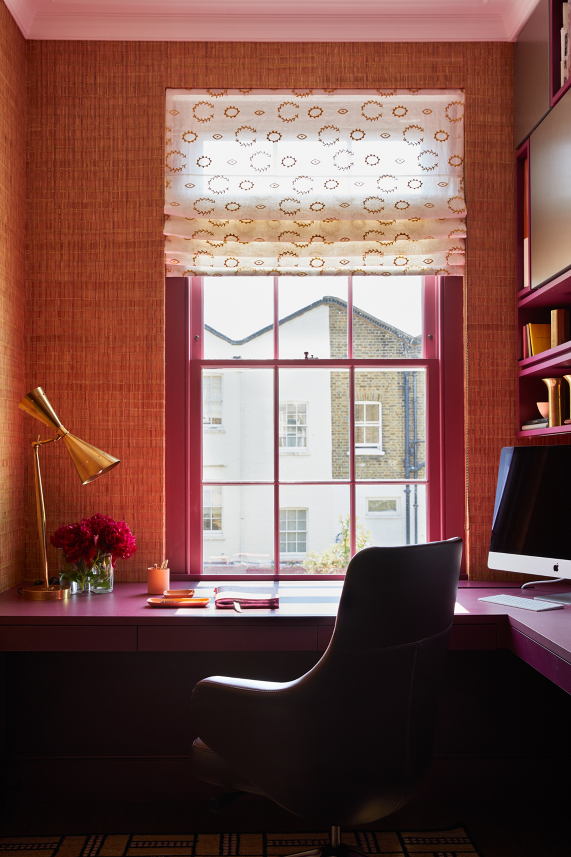
This particular shade of pink leans more towards deep, rich magenta.
Maximalist Pink captures the exuberance and joy of color in its purest form. Leaning towards the vivid pinks found in nature, think big tropical blooms, their sweet smell filling the air, during a pink sunset, sunlit coral reefs, it radiates warmth and optimism. Immersed in this shade, spaces feel alive and celebratory, transforming the everyday into an experience of joy and escape.
Unlike softer blush tones, this pink color trend revels in its intensity. It commands attention yet pairs effortlessly with lush greens, vibrant oranges, and deep purples, echoing the richness of the natural world. Layered with woven textures, natural fibers, and organic materials, it finds balance and tactility, turning boldness into something beautifully grounded.
More than just a statement color trend, Maximalist Pink speaks to a collective craving for pleasure and positivity in our surroundings. Its energy uplifts, its saturation invigorates, and its sweetness softens even the most daring design choices. Whether splashed across walls, expressed in textiles, or used as a striking accent, it brings warmth, vibrancy, and a sense of unfiltered happiness, a color that celebrates living fully and freely.
4. Red Orange
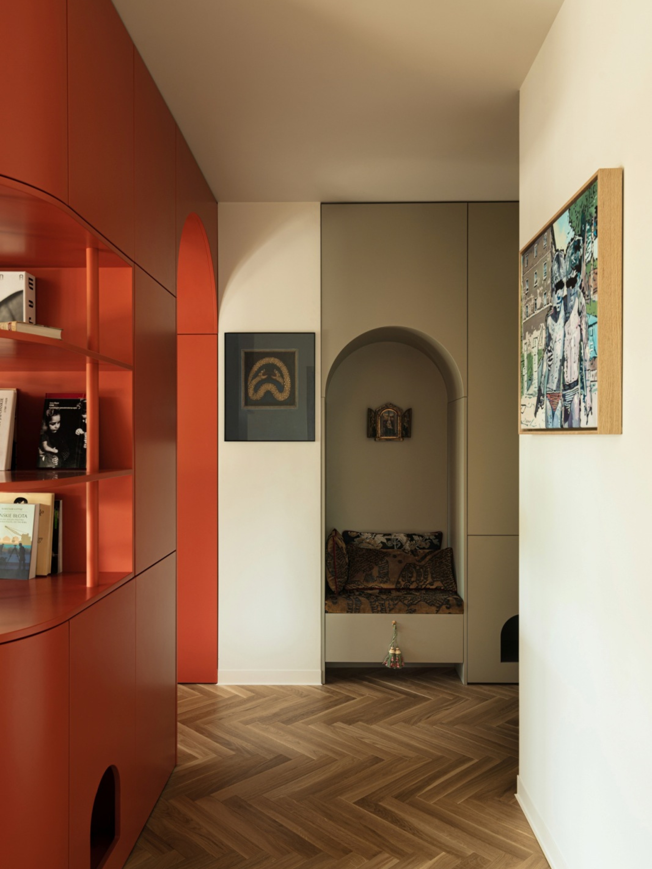
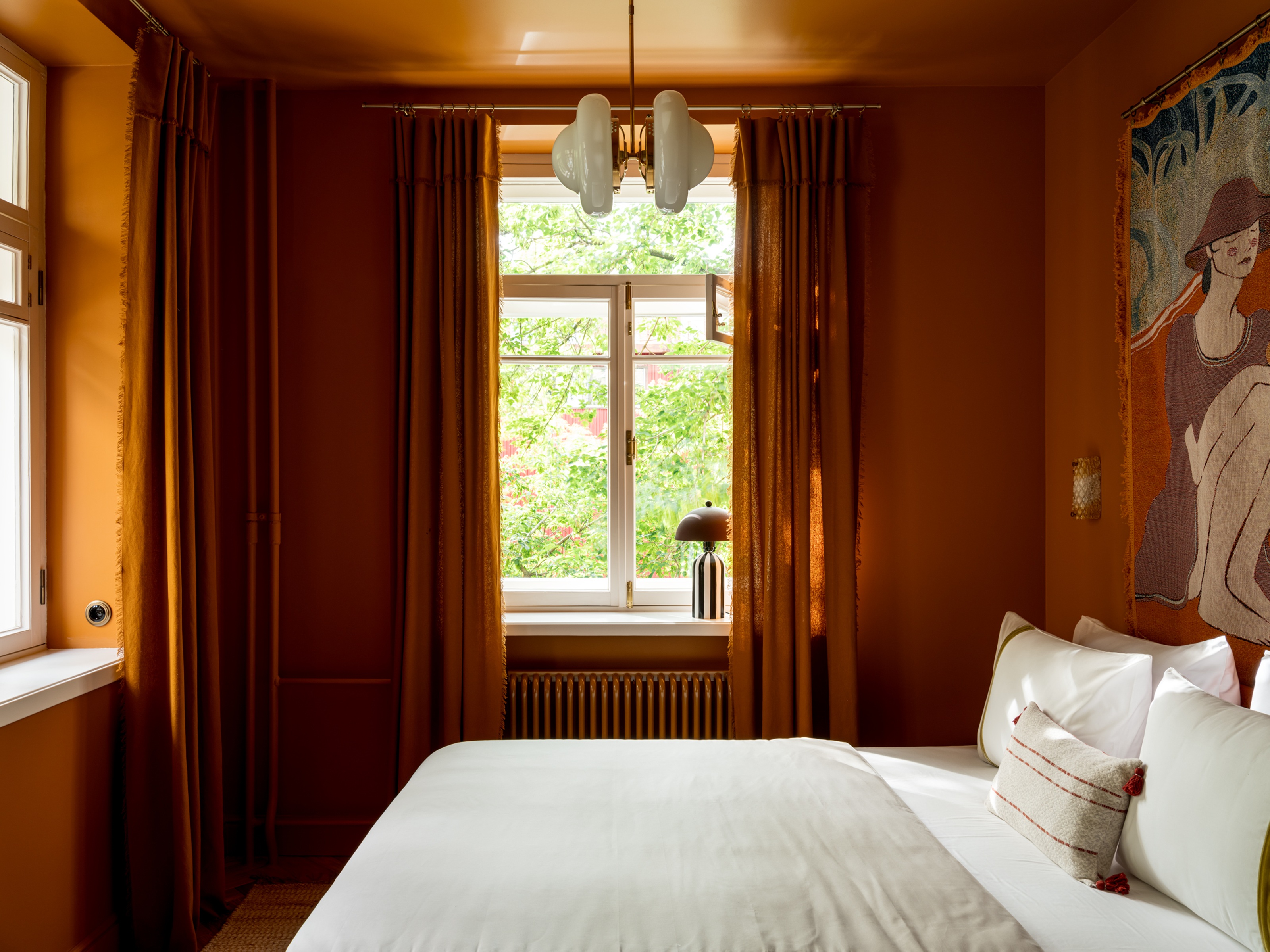
The red orange used in this apartment designed by Monika Michalowska brings a certain dynamism to the space.
Red Orange is a color trend coming to the forefront, bold, expressive, and full of life. Depending on light and surface, it shifts between glowing orange and vivid red, bringing movement and intensity to any space. Once associated with alarm and urgency, decorating with red is being reimagined for a new era, one defined by warmth, optimism, and human connection.
Blended with orange, it feels joyful yet sophisticated, carrying confidence without the drama. It aligns itself with a sense of futurism, sleek, modern, and effortlessly upbeat, working beautifully with contemporary silhouettes and sculptural forms. A modernist aesthetic paired with this dynamic hue is a winning combination, giving interiors both energy and clarity.
On light reflective surfaces, it gleams with a modern edge that leans towards a futuristic glamour, while on soft texture,s it becomes warmer and more grounded. Used as an accent or as a single statement piece, Red Orange brings vitality, fun, and optimism, making modern spaces feel unmistakably alive.
5. Sensual Off White
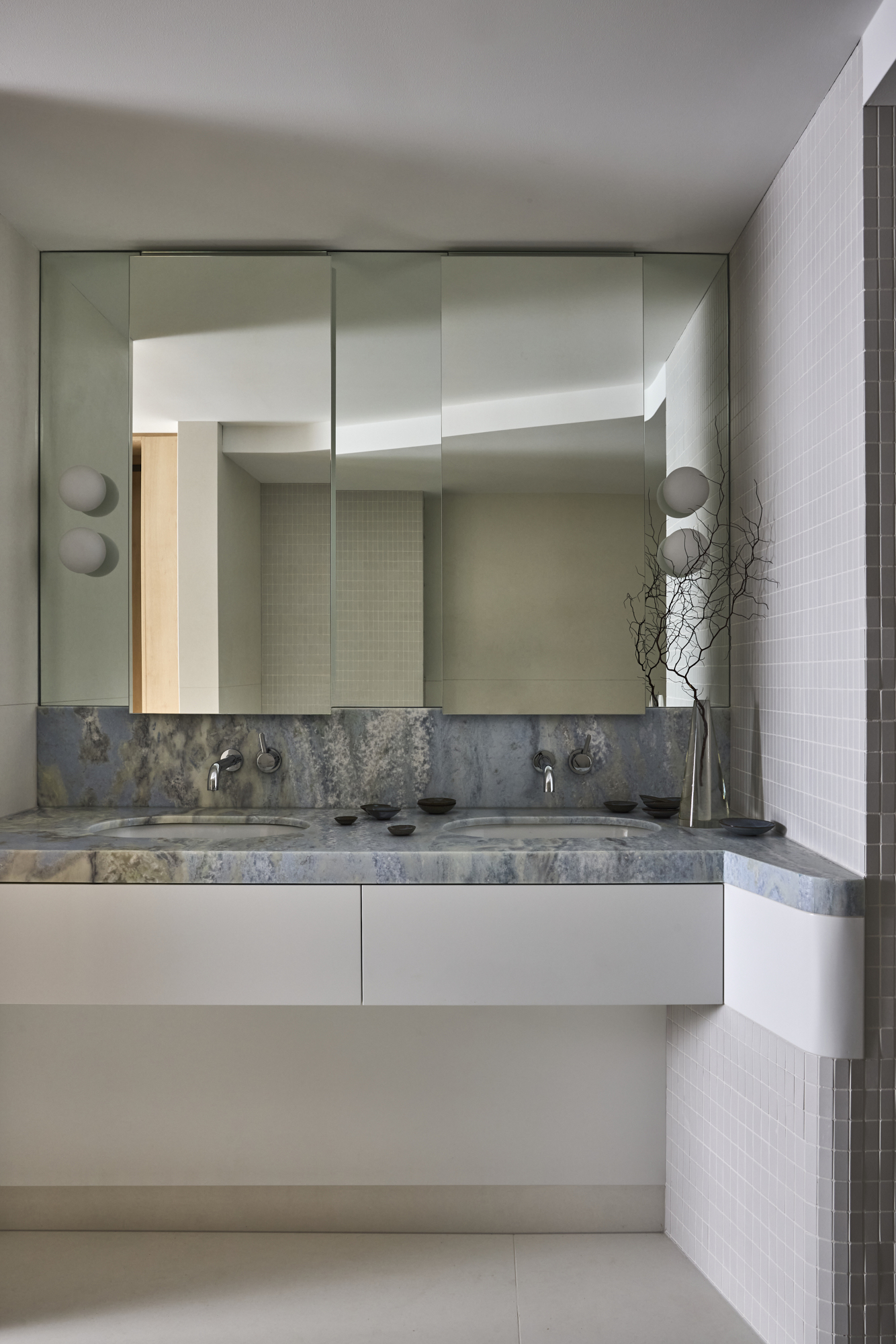
You can be emboldened that a good, intentional off-white can still be the color trend confident people decorate with.
Sensual Off-White redefines minimalist interior design with warmth and emotion. Once seen as purely functional, off-white is now emerging as a tone of softness and sophistication, bringing a quiet sensuality to modern interiors. It sits at the center of a new neutral palette, calm, luminous, and deeply tactile, creating spaces that feel refined yet reassuring.
This is off-white with depth and presence. Layered across natural materials and soft, rounded forms, it feels inherently human. It works beautifully on tactile surfaces such as boucle, ceramics, and leather, where light plays gently across texture, creating subtle shifts in tone and shadow. The result is an interior that feels lived in, elegant, and effortlessly modern.
Sensual Off-White celebrates the beauty of restraint, proving that simplicity can still feel expressive. It reflects a move toward design that connects through touch, light, and material, a palette that whispers calm and radiates quiet confidence.
6. Denim Blue
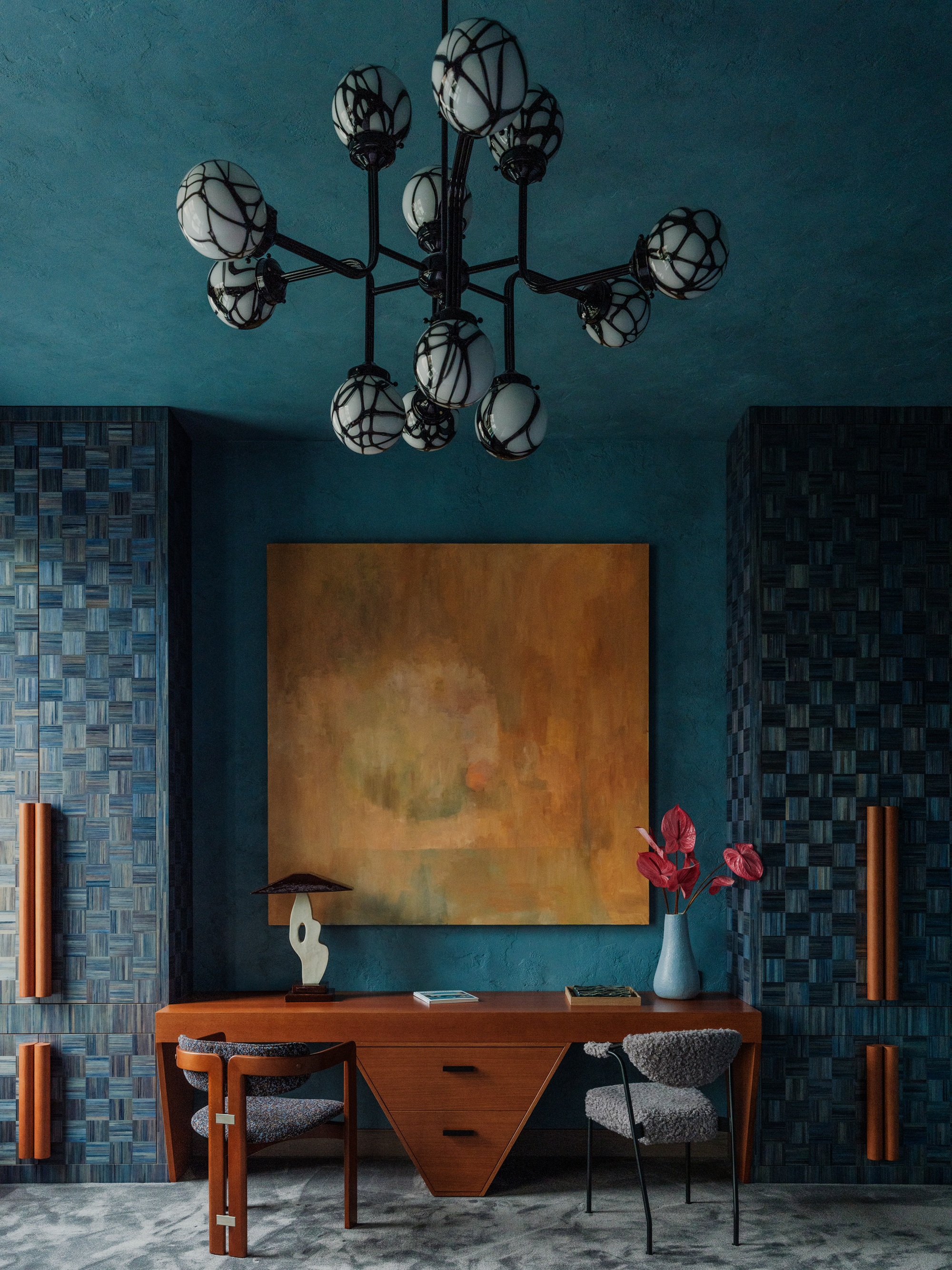
Denim blue is comforting and enveloping, as in this color drenched bedroom designed by Tim Veresnovsky.
Denim is having a moment — again. From fashion runways to relaxed home styling, it’s proving its status as a true modern classic. Those same washed, comforting blues that make denim so wearable are now shaping interiors that feel effortlessly lived-in and full of personality.
Decorating with blues creates a softness that instantly puts you at ease. Whether pale chambray or deep indigo, denim-inspired blues bring calm and familiarity, grounding a space while giving it quiet confidence. They work beautifully in modern eclectic interiors — where vintage finds meet contemporary design and contrasting textures play side by side. Think velvet with rattan, brass with linen, all tied together by the easy versatility of blue.
Just like denim in fashion, these hues adapt to any setting. They can look cool and contemporary in a minimal apartment or warm and nostalgic in a period home. Layered with warm neutrals, worn woods or sun-faded fabrics, denim blues create rooms that feel collected, comforting and completely individual — the kind of spaces you want to sink into and stay awhile.
7. Stormy Graphite Gray
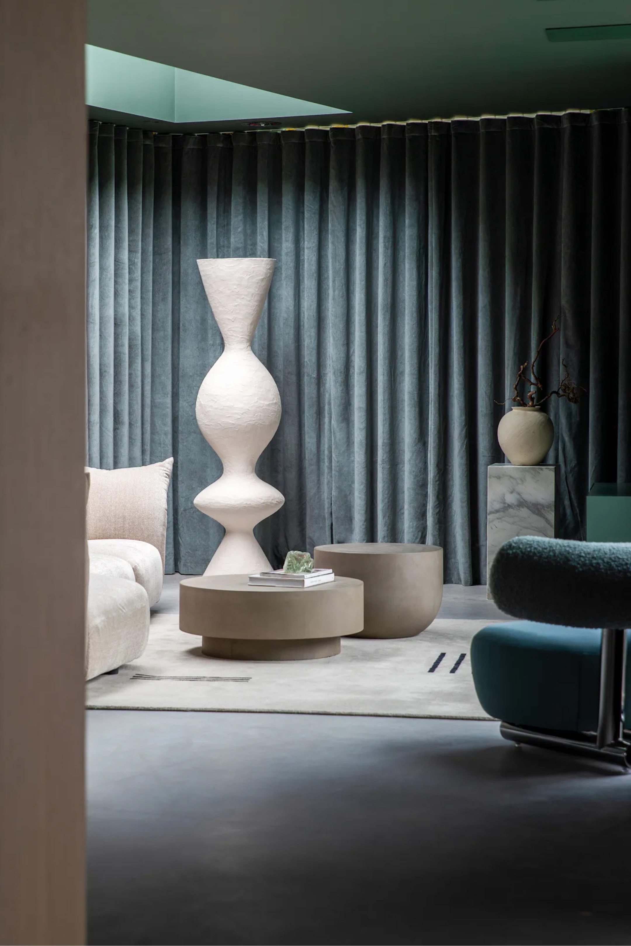
'Cave-like' might be the new 'light and airy', when it comes to color trends, anyway.
Stormy Graphite Gray draws its strength from stone and natural materials, bringing a sense of depth and permanence to modern interiors. Inspired by weathered rock, mineral layers, and the raw beauty of the earth, it feels both grounding and refined. Shifting subtly with the light, it reveals undertones of blue, charcoal, and slate, creating a surface that feels alive with quiet movement.
This is decorating with gray with a natural soul. It pairs beautifully with tactile finishes such as polished plaster, stone composites, and textured fabrics, creating spaces that feel rich and balanced. Used directionally across an entire interior — on walls, furniture, and soft furnishings — it creates a cave-like depth and modern drama, enveloping a space in warmth and sophistication. Equally, when applied to a single area or feature, it brings focus and contrast without overpowering.
Stormy Graphite Gray captures the essence of nature’s durability with a modern sensibility. Calm, enduring, and effortlessly elegant, it brings depth and atmosphere to contemporary design.
8. Ripe Berry
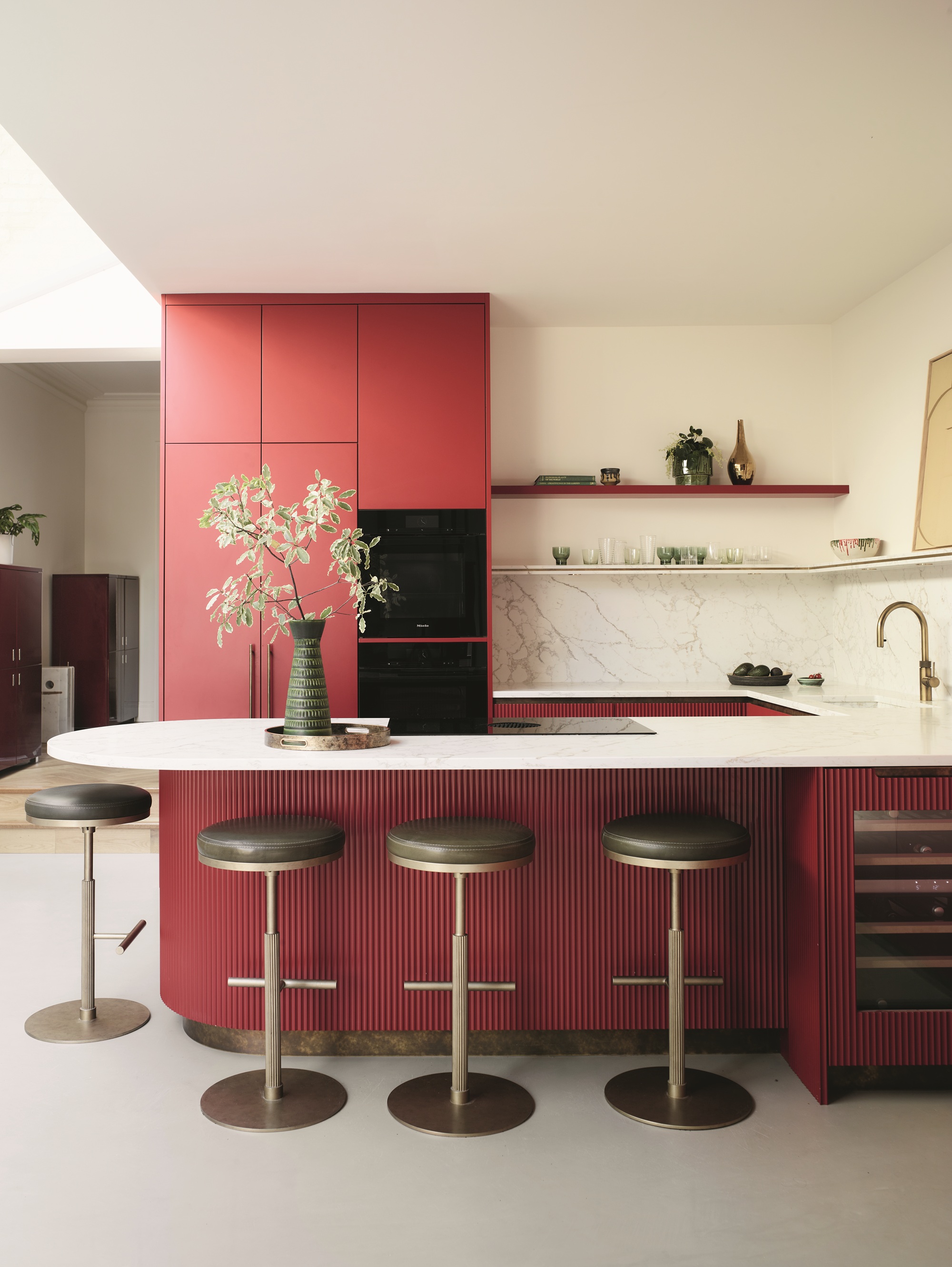
This chameleon-esque color sits across rich pink and red hues, while still feeling naturally grounded.
Ripe Berry is a color trend that speaks to the senses. Deep, luscious, and full of life, it captures the richness of ripened fruit, from blackberries and raspberries to cherries with a hint of blue. There is a joy in its edible quality, a reminder of how color can stir appetite and emotion at once. Its warmth feels familiar and comforting, while its depth adds a refined touch of modern glamour.
In interiors, Ripe Berry is both enveloping and expressive. Layered with soft neutrals, it brings a feeling of comfort and intimacy. On velvets, cords, and plush surfaces, it becomes even more tactile, adding a sense of luxury that feels grounded and inviting. Combined with reflective finishes, it takes on a confident, contemporary edge, working beautifully alongside natural materials to balance indulgence with restraint.
Ripe Berry has heart. It is bold without shouting, uplifting without force. This is color as emotion, as atmosphere, as a way of creating spaces that feel alive, generous, and beautifully human.
9. Moss Green
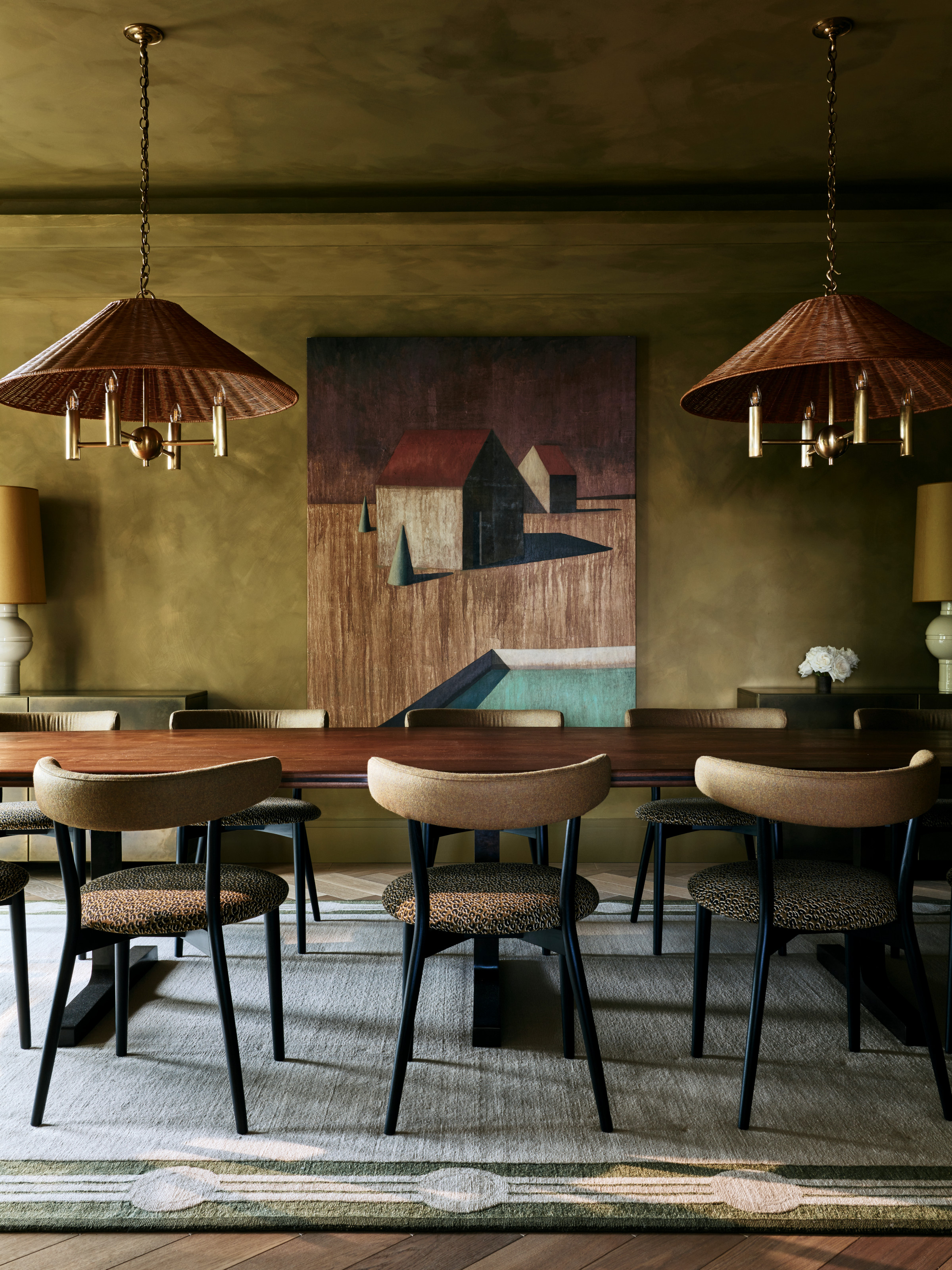
This mossy color might be the most comforting and warm shade of green.
Moss Green is a shade full of life. With yellow and brown undertones, it captures the quiet complexity of the forest floor — warm, organic, and deeply grounding. This is nature in all its subtle richness, where light filters through leaves, textures overlap, and color shifts with every surface. It brings a sense of depth and vitality to interiors, connecting the natural world to modern living.
In design, Moss Green comes alive through texture. Layered across materials like stone, clay, wool, and suede, it mimics the irregular beauty of the forest floor. There’s a handmade quality to it — raw, unrefined, and real — that gives spaces authenticity and soul. It pairs beautifully with glazed finishes and natural tactility, where imperfection becomes part of the story.
This new direction for decorating with green pushes into the territory of so-called ugly design, where the imperfect, the uneven, and the organic are celebrated for their honesty. Moss Green embodies this spirit of organic eclecticism — instinctive, textural, and full of life. It thrives in spaces that mix the natural with the crafted, the refined with the raw, creating depth, comfort, and character that feel beautifully human.
10. Cosmic Silver
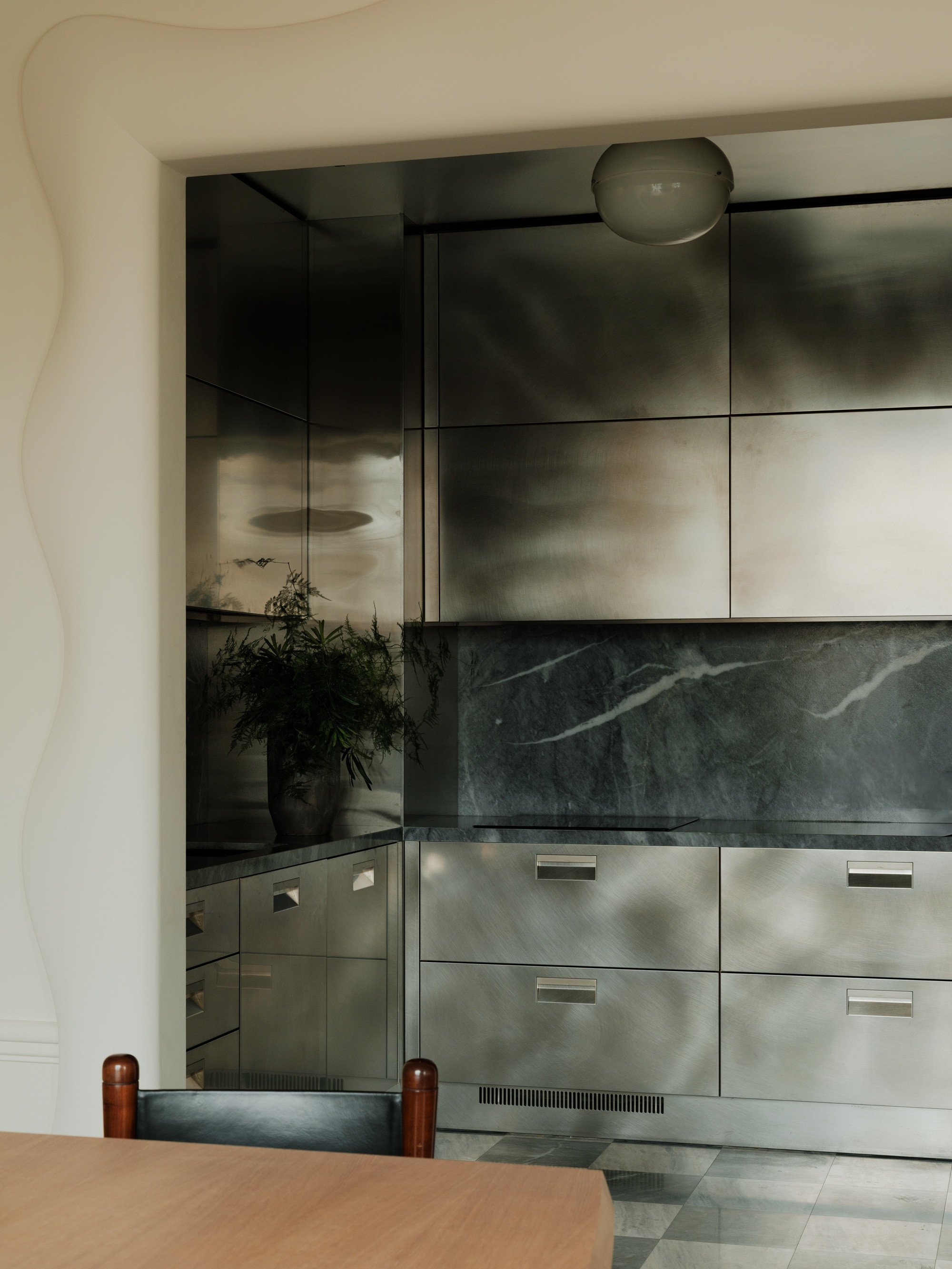
This stainless steel kitchen showcases how this reflective finish plays with light.
Cosmic Silver looks forward rather than back. Sleek, reflective, and full of intent, it captures the growing fascination with metallic surfaces and their power to redefine space through light. This is silver as statement, decorative, directional, and deeply modern. It feels engineered yet elegant, the color of innovation and imagination.
In interiors, Cosmic Silver celebrates reflection as design. On lacquered surfaces, mirrored furniture or architectural details, it bends and amplifies light to create movement and atmosphere. It is futuristic but not sterile, combining clarity with sensuality in a way that feels alive and contemporary.
Like jewelry for the home, Cosmic Silver brings a sense of art to modern spaces. Sculptural, luminous, and precise, it embodies a forward-looking futurism that is bold, technical, and beautifully refined, finding beauty in reflection, precision, and light itself.
Which Is the Biggest Color Trend for 2026?
Ripe Berry is one of the key color stories for 2026, capturing the growing desire to connect more deeply with the senses. It feels joyful and indulgent, like a treat for the eyes — color that invites touch, taste and emotion all at once. Its richness recalls ripened fruit, evoking warmth, appetite and comfort in equal measure.
This is a color that celebrates pleasure and tactility. Used as a full statement, it creates a sumptuous, cocooning effect; in smaller doses, it acts as a visual delight, adding moments of warmth and surprise to a space. On velvets, cords and plush fabrics, Ripe Berry becomes even more sensorial, full of texture and depth, while reflective finishes bring a contemporary edge that feels confident and modern.
Ripe Berry has heart. It is bold without shouting, uplifting without force. This is color as emotion — a reminder that design can be both indulgent and deeply human.
