What Colors Go With Brown? 12 Complementary Pairings for This Earthy Neutral
Brown can be a tricky shade to get right, but combine it with these expert-approved colors and the rich and sophisticated hue will come into its own

Rory Robertson
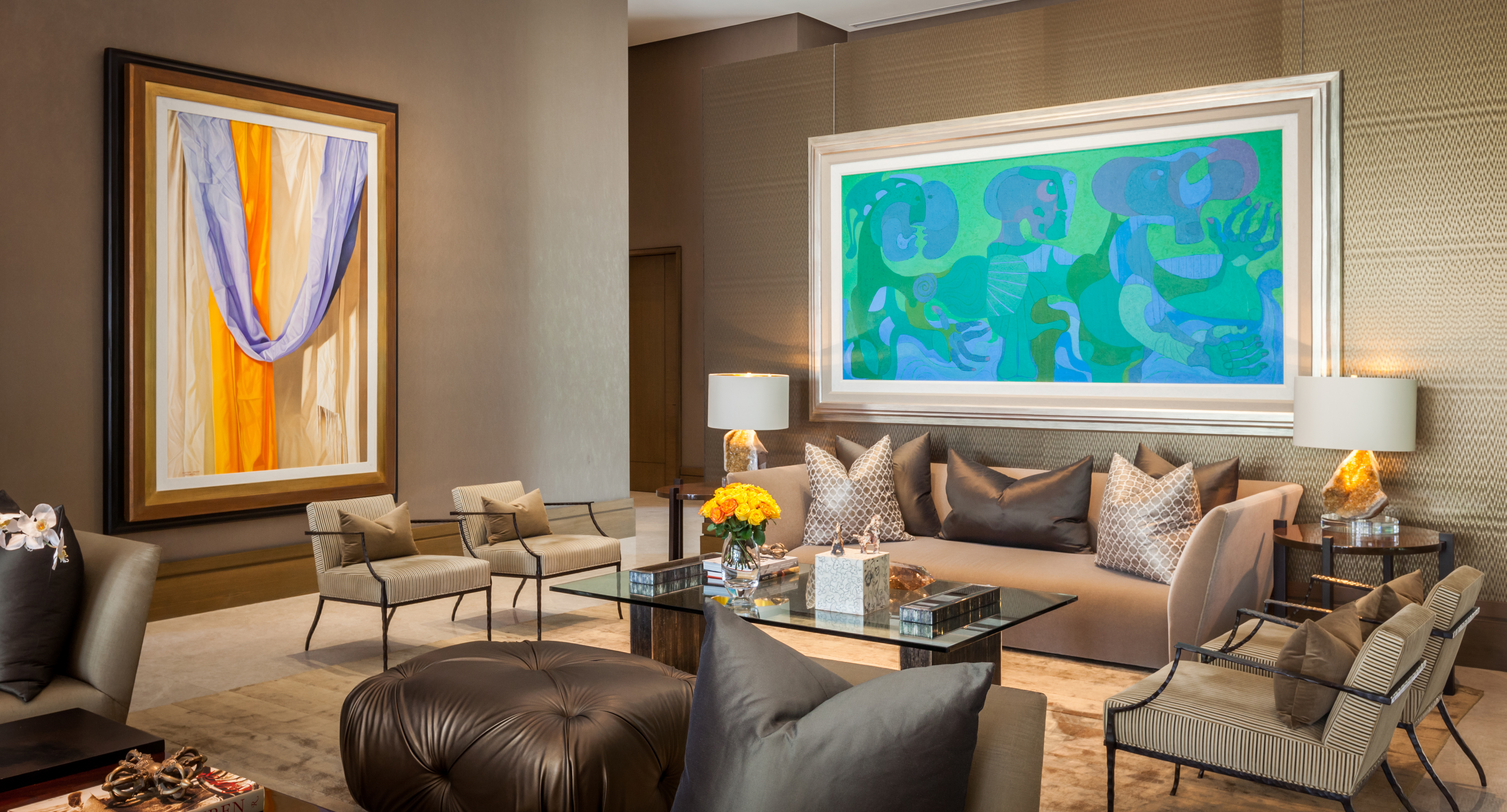
Until recently, brown has been a relatively unsung hue in the world of decor. Only in the last few years have people truly started to appreciate the power of this rich, earthy shade as 1970s decor enjoys a modern-day resurgence. But in order to pull it off properly, you'll need to know what colors go with brown — and if you want to avoid the kitsch combos of the 70s, you'll need to think carefully.
Paired with complementary shades, brown can be a real showstopper. This sumptuous tone knows no limits when it comes to bringing depth to a decor scheme and decorating with brown is easier than first thoughts would have it. This is largely due to its inherent links to the natural world —think about all the varieties of lustrous woods available — that make it a versatile and liveable color choice no matter where you use it.
It also pairs beautifully with an array of shades. "Brown, with its earthy undertones and natural warmth, offers a rich foundation for a variety of color pairings," explains interior designer, Nina Lichtenstein. "Whether you prefer a light, sandy brown or a dark, chocolate hue, the versatility of brown allows it to complement many different colors and styles." Here are 12 colors that go with brown that are guaranteed to bring stylish sophistication to your interiors.
Article continues below12 brown color combinations
1. Brown and Red
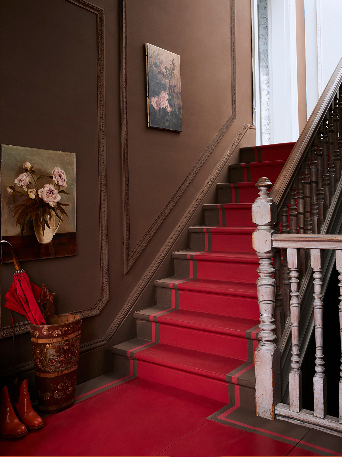
Chalk Paint in Honfleur and Emperor's Silk, Gloss Lacquer on stairs, all from Annie Sloan
Bright pops of primary red have really captured the mood of the moment in 2024, and there are few colors it pairs as brilliantly with than brown. This paint color combination is a match made in heaven since both shades feel rich and luxurious, but it certainly falls on the bolder end of the design spectrum.
"Rich, chocolate brown and bold red create a cozy yet dramatic pairing," explains Nina Lichtenstein, founder of design Nina's Home Design. "This works well in living rooms or dining rooms where the warm, grounding feel of brown can be enhanced by vibrant red accents like pillows, artwork, or rugs." To embrace this year's "unexpected red trend", you could also pepper your brown room with bright pops of red in smaller accents like trim, lampshades, or hardware.
The best red for the job is bold and bright according to chalk paint specialist Annie Sloan, responsible for the wonderful modern staircase idea above which mimics a red carpet runner by painting it onto the stairway. This immediately creates a stairwell that has drama, all the while allowing the rich brown tone to appear bolder and more daring thanks to its bright red neighbor. This is decor, proverbially escalated.
2. Brown and Cream
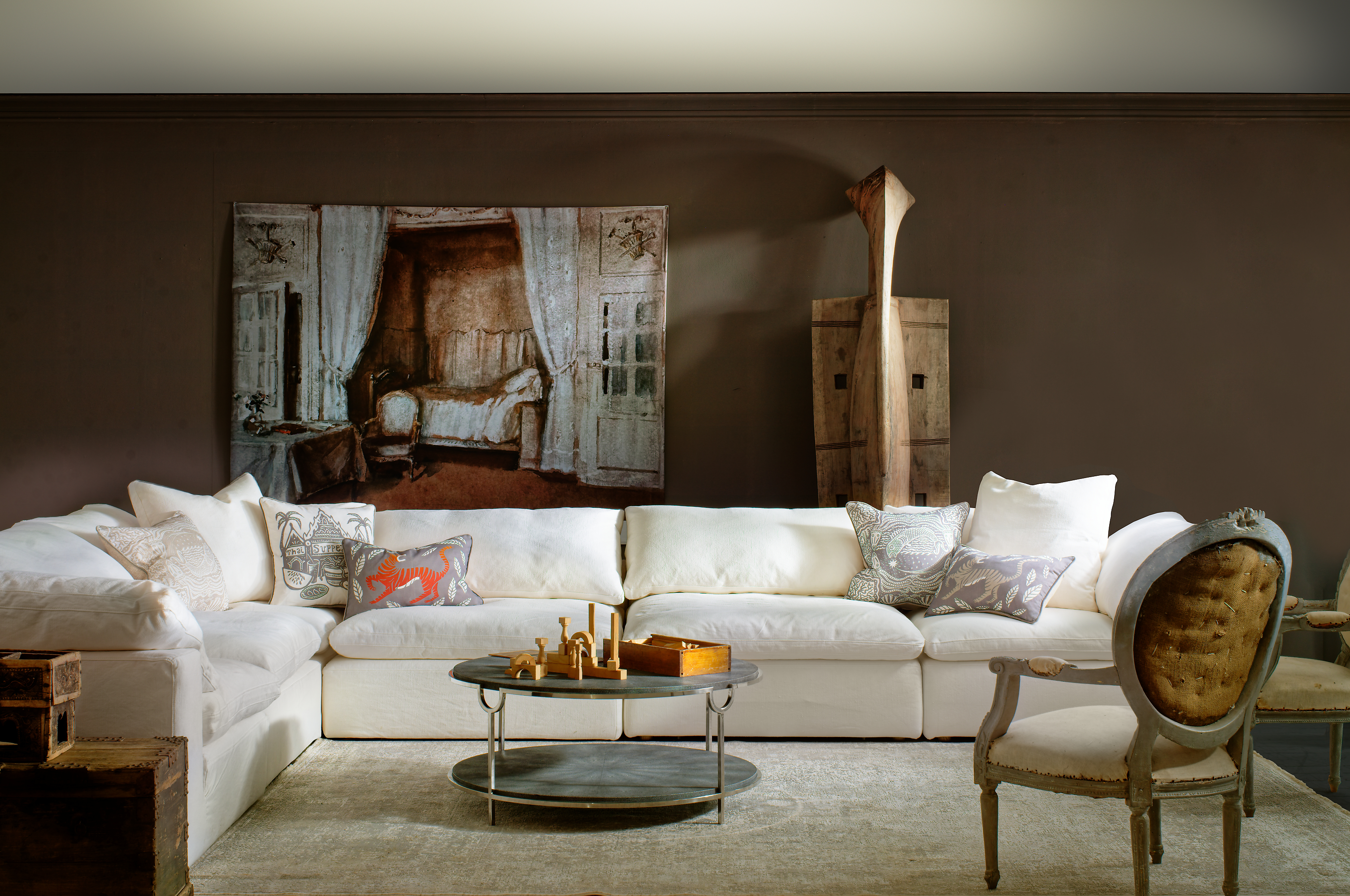
Zulu Mask, a warm tone of brown, from Andrew Martin
Brown and cream can be considered two sides of the same coin. Both are sumptuous shades with connotations of richness and silkiness so, when paired together, they offer a luxurious color pairing like no other. They're also timeless shades that won't age, so your brown and cream living space will have just as much relevance in ten years as it does today.
The Livingetc newsletters are your inside source for what’s shaping interiors now - and what’s next. Discover trend forecasts, smart style ideas, and curated shopping inspiration that brings design to life. Subscribe today and stay ahead of the curve.
These elegant colors work especially well in brown living room ideas. Think rich leather sofas, a soft cream rug, and lustrous wooden furniture or wall paneling. "Use cream as the main wall color to brighten the space, and introduce brown through furniture, wood accents, or textiles," says Isy Jackson, interior designer and founder of Cheltenham Interiors. "Consider a textured wall finish, like a stucco or plaster effect, in cream, with rich brown furniture and artwork to add depth."
3. Brown and lavender
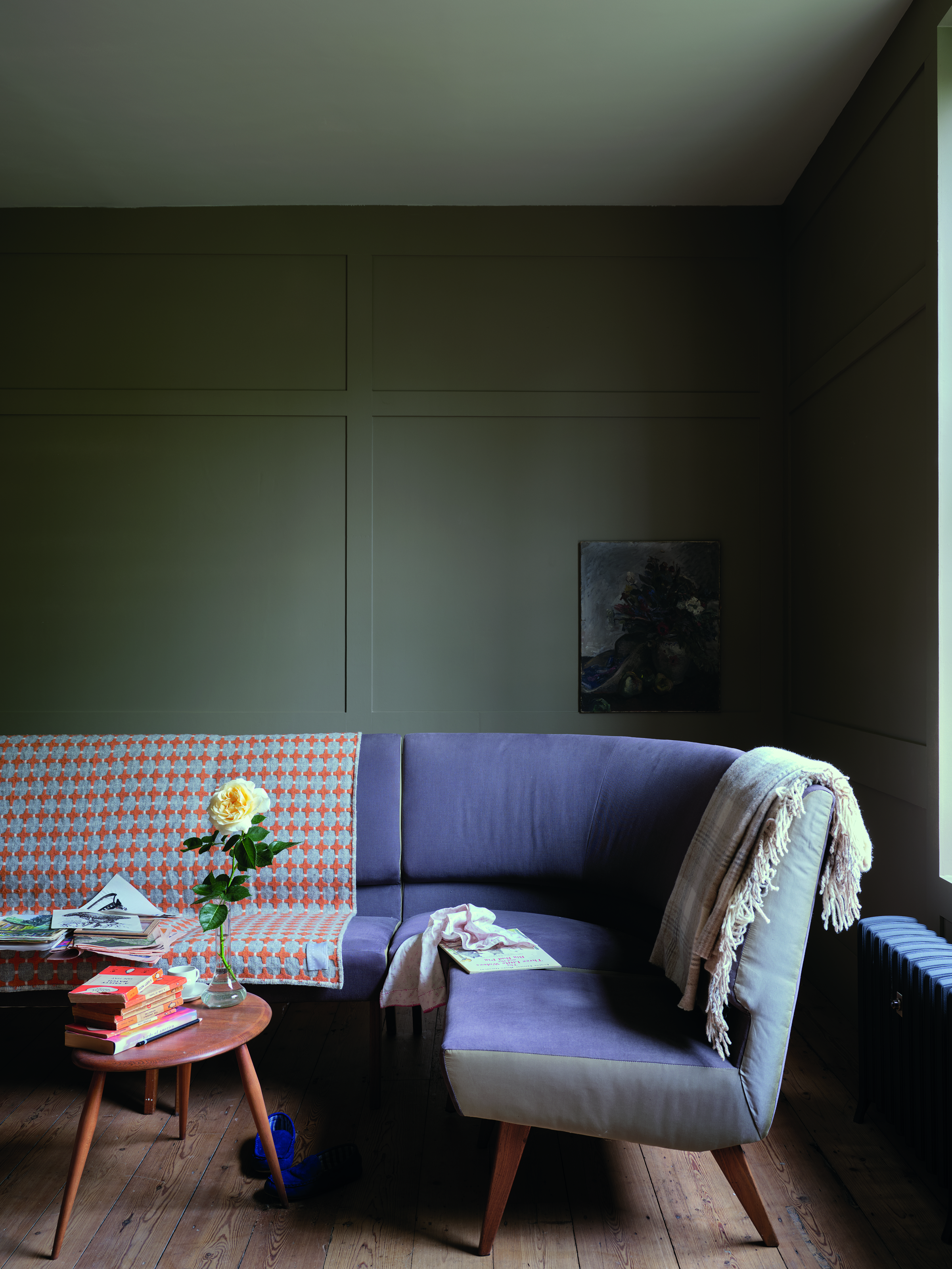
To soften the richness of brown, consider pairing it with soft lavender accents. Lavender is one of the colors that go with dark brown, specifically, and works best when used in small doses through furniture, upholstery, or decor accents.
That doesn't mean you can't pair this gentle pastel shade with lighter brown tones. "Taupe, a softer brown, pairs beautifully with the subtle elegance of lavender," explains Nina. "This combination is ideal for bedrooms or bathrooms, where it creates a calm, serene atmosphere. For a trendy finish, consider using lavender as a painted accent in the form of a stenciled border or a small feature wall."
4. Brown and Olive Green
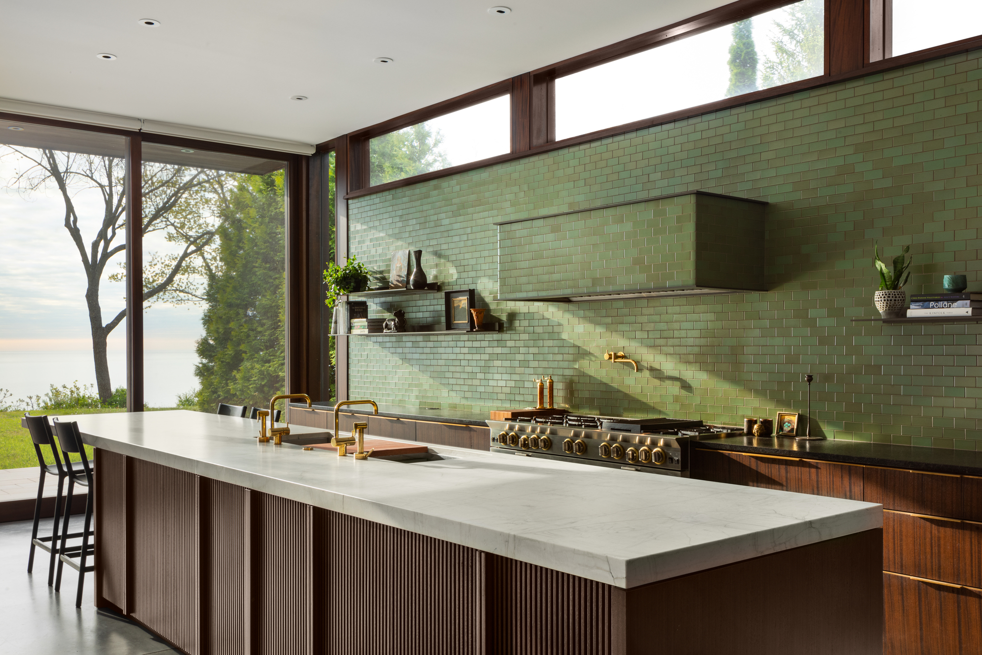
Nature is one of the best sources of inspiration when it comes to decorating our homes. Green therefore works as a statement in many brown color palettes, replicating the pairing seen in green pastures, the trunks of trees, or muddy river banks.
"This earthy combination brings a natural, organic feel to interiors," says Isy, who recommends a nuanced olive tone. This deeper shade of green will feel more sophisticated than lime, avocado, or saturated emeralds which run the risk of looking garish or cartoonish next to brown (and also conjures images of less tasteful 70s decor).
Besides the particular shade, you also need to ensure you balance the two tones carefully. The trick is to avoid overusing just one shade. "Use olive as a wall color or in larger furniture pieces, with brown in smaller accents like cushions," recommends Isy.
5. Blue and Brown
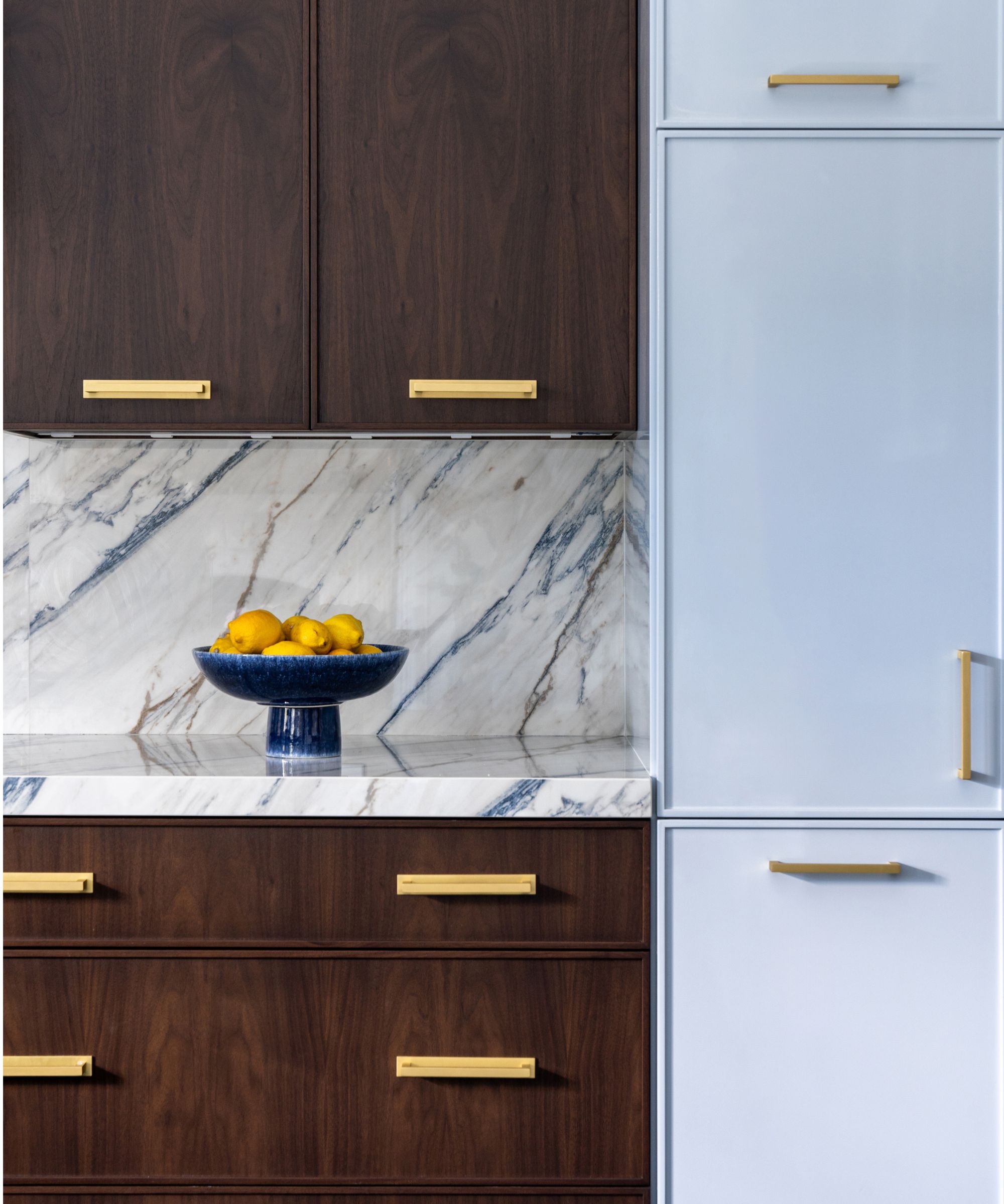
Blue can have vastly different effect on brown depending on the shade used. A cool light blue will offer a breezy, contemporary look, while deeper navy tones will look more timeless and elegant. Whether you embrace this color combination through paint ideas, a patterned configuration of zellige tiles, or furniture alone, it can have a great impact on a space.
Nina suggests falling in the middle with a denim blue. "Espresso brown and denim blue make a chic, modern pairing perfect for casual yet stylish spaces," she says. "To bring this combination to life, consider denim blue upholstery, such as sofas or armchairs, paired with espresso brown wooden furniture. Denim blue walls or textiles can also bring a laid-back element to the room, offsetting the darker tones of brown."
Isy, on the other hand, adds that soft blue creates a calming contrast to brown's warmth. "Use light blue as the main tone for walls and integrate brown in furniture, trim, or decor," she says. "Consider painting an accent wall in soft blue while keeping the remaining walls a lighter shade of brown. This creates a serene focal point, perfect for bedrooms or cozy reading nooks."
6. Brown and Mustard Yellow
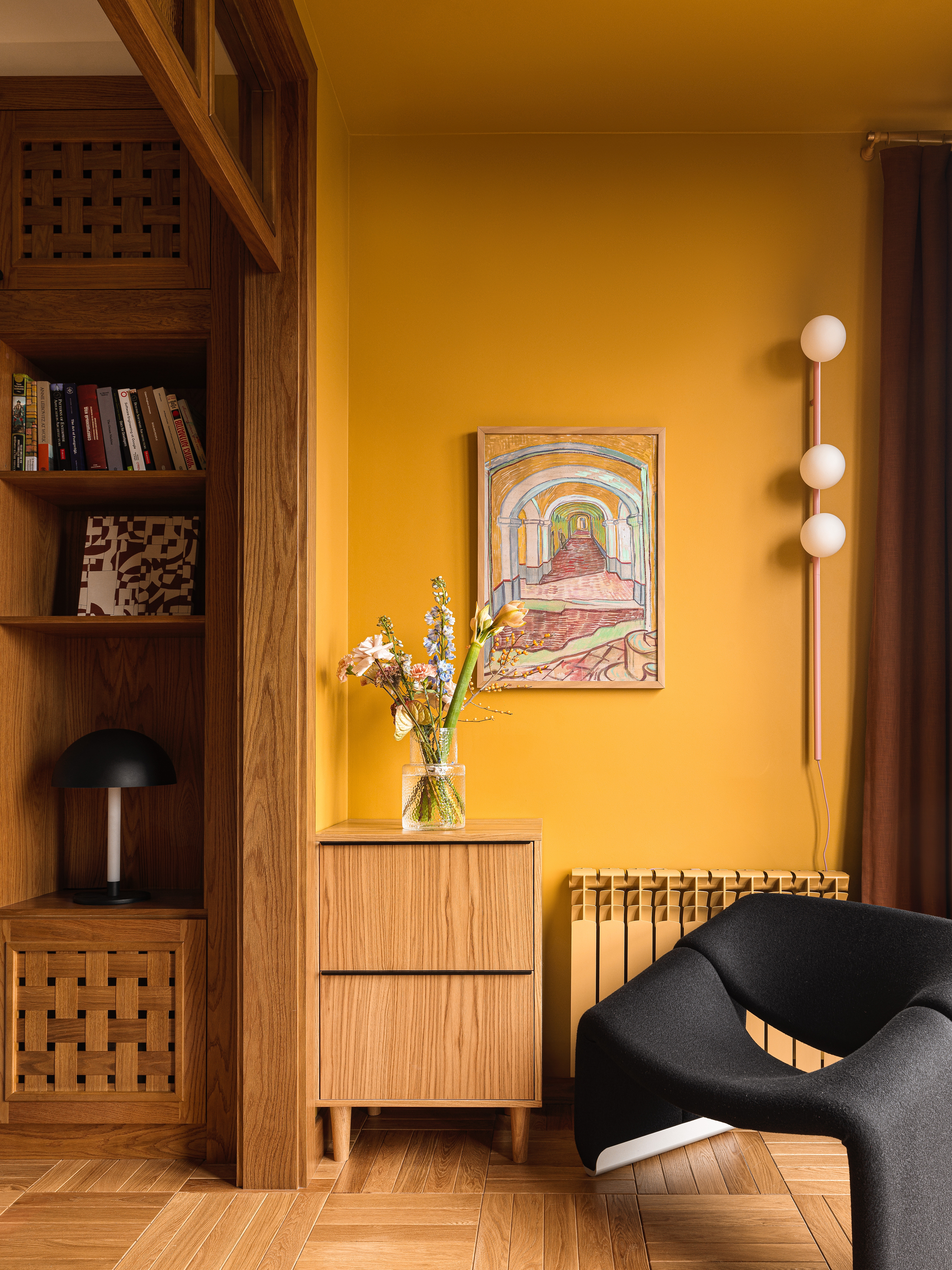
If you want to create a color palette reminiscent of the 1970s, consider using brown alongside mustard or ochre. As some of the best colors that go with brown, these warm yet earthy shades make for a dusky scheme that looks almost sepia-toned. "Use brown in larger elements like sofas or cabinets, with mustard in accents such as cushions, throws, or artwork," says Isy, who also suggests geometric patterned wallpaper or textiles for a nod to its retro uses.
A warm umber is the best accompaniment to these yellows. "Cognac brown, with its warm, amber undertones, complements mustard yellow in a way that feels lively and rustic," explains Nina. "For a creative trend, use mustard yellow on the ceiling and keep walls brown to give the room a grounded, earthy feel with a surprising pop overhead."
That said, Patrick O'Donnell from Farrow & Ball encourages us to stick to small doses and steer clear of overly sunny yellows altogether. "Nobody wants a room to look like a ripe banana," he says.
7. Brown and pale pink
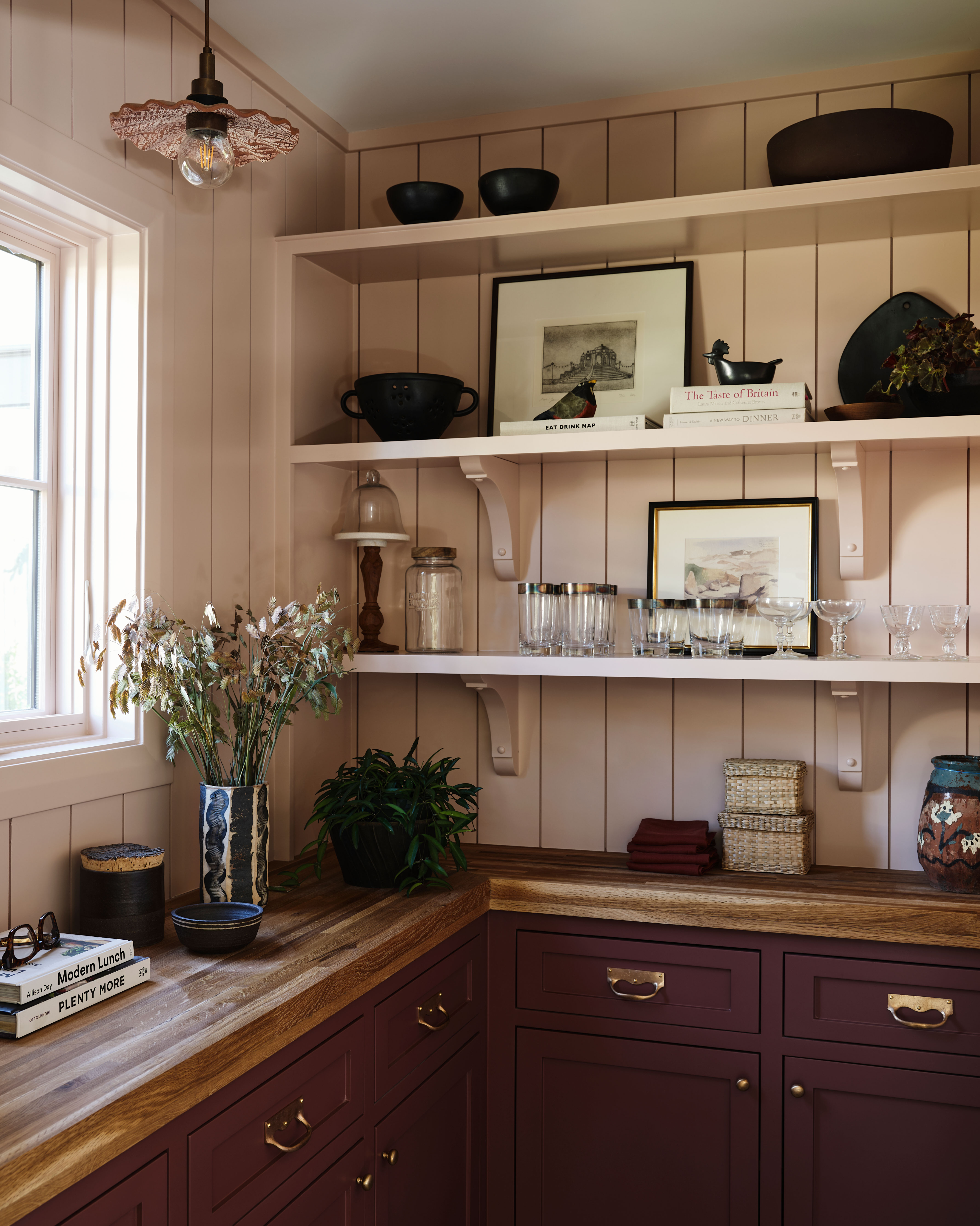
While brown pairs wonderfully with rich sumptuous shades, it works just as well alongside more gentle colors, too. One of those is pale pink, a leading color trend this past year. The delicate qualities of this shade offer a soft, romantic contrast to brown, meaning the pink works more like a neutral. "Use blush as the main wall color, and complement it with brown furniture and accessories for a balanced aesthetic," suggests Isy.
"This combination is perfect for nurseries, bedrooms, or living rooms, where light tones create a peaceful and welcoming atmosphere," Nina says. "To incorporate a trendy paint technique, consider a gradient wall that transitions from sandy brown at the base to pale pink at the top, creating a dreamy ombré effect."
8. Brown and burnt orange
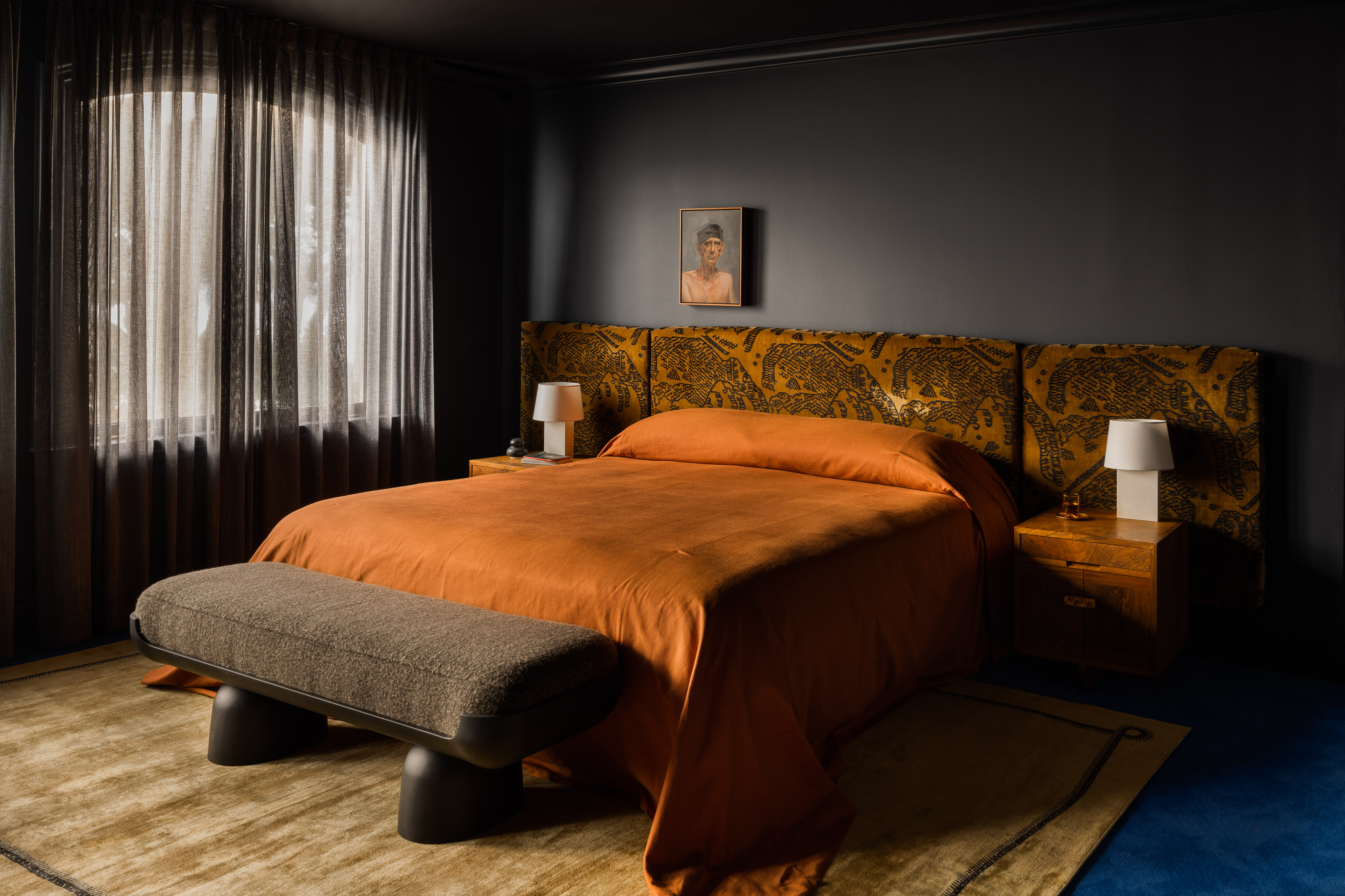
When pondering what colors go with brown, orange might be one of your initial thoughts. That's because this somewhat controversial color pairing was everywhere in the 70s, and with the right nuanced shades, it can really bring a space to life.
By that, we mean burnt orange or sienna paired with a warm-toned brown. "This classic fall-inspired pairing brings warmth and richness to any room," says Nina. "Use this combination in libraries, dens, or living rooms where cozy textures like leather or wool come into play." To evoke a nostalgic mid-century modern vibe, use brown on the walls with burlwood furniture and orange patterned textiles on sofas, chairs, or a bed. To modernize, use white on the walls, with brown and orange mixed in the decor.
9. Brown and forest green
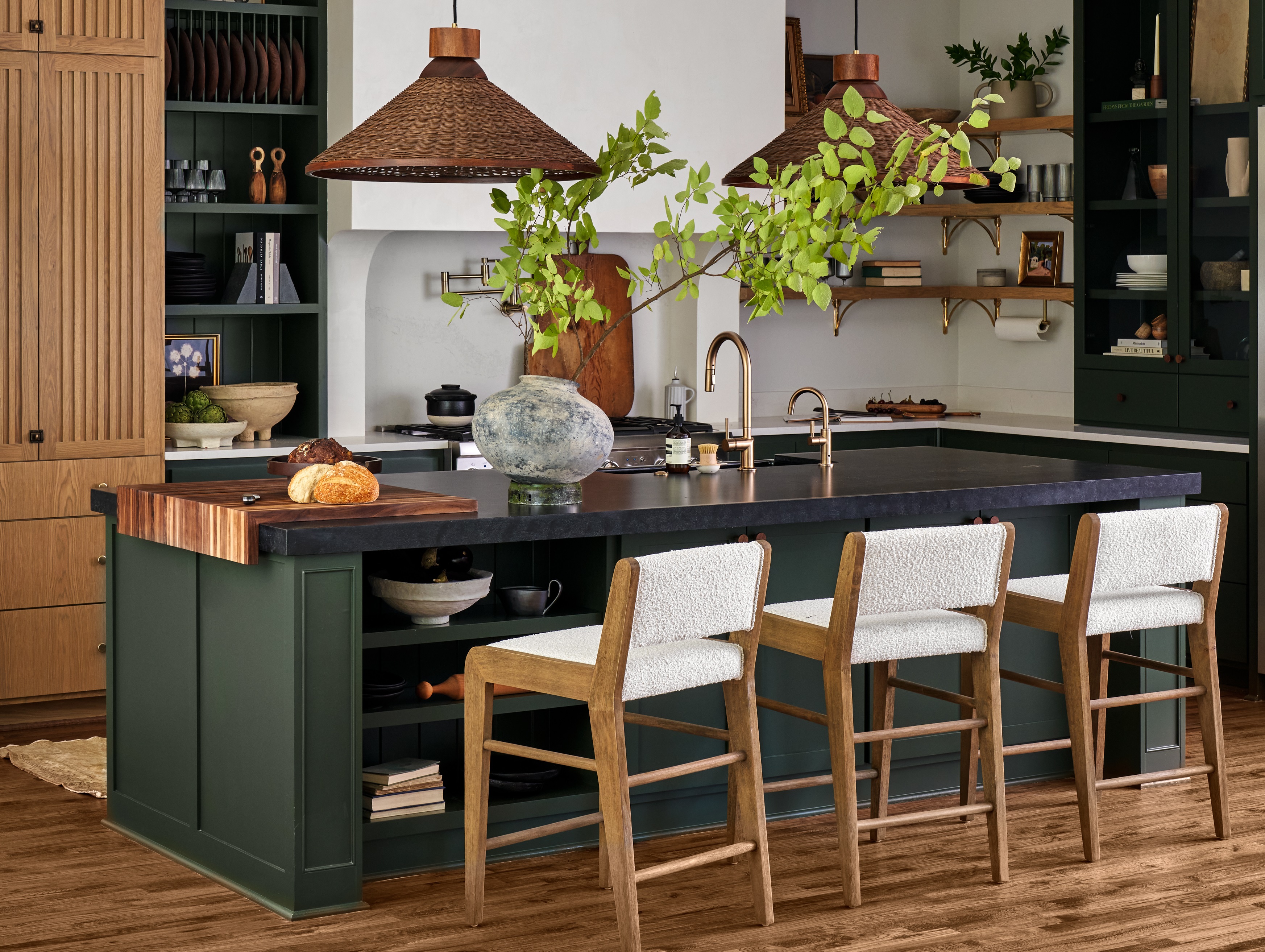
Green is one of the wall colors that goes best with brown furniture. Whether a deep forest green or a subtle sage, this hue works brilliantly with brown tones like wood and rattan, as shown in the kitchen above. Both colors resonate with nature and, as such, result in a harmonizing color scheme.
"When colors occur organically together, they will not only pair well but will lend your scheme an easy on the eye, restful feeling," explains Helen Shaw, color expert and director of marketing at Benjamin Moore. "Together, these two colors can work in tandem to bring a sense of calm because of their familiarity. The combination of sage green with a soft taupe, for example, offers a subtle and whimsical aesthetic."
Since brown is a relatively neutral color, don’t be afraid to experiment with bolder shades of green, either. We love a deep forest green alongside walnut shades for a truly organic look. "Woodwork presents the perfect opportunity to draw the eye to a specific area within a space; whether that's by painting a picture rail, wooden beam, or simply adding color to your baseboards," says Helen.
10. Brown and brown
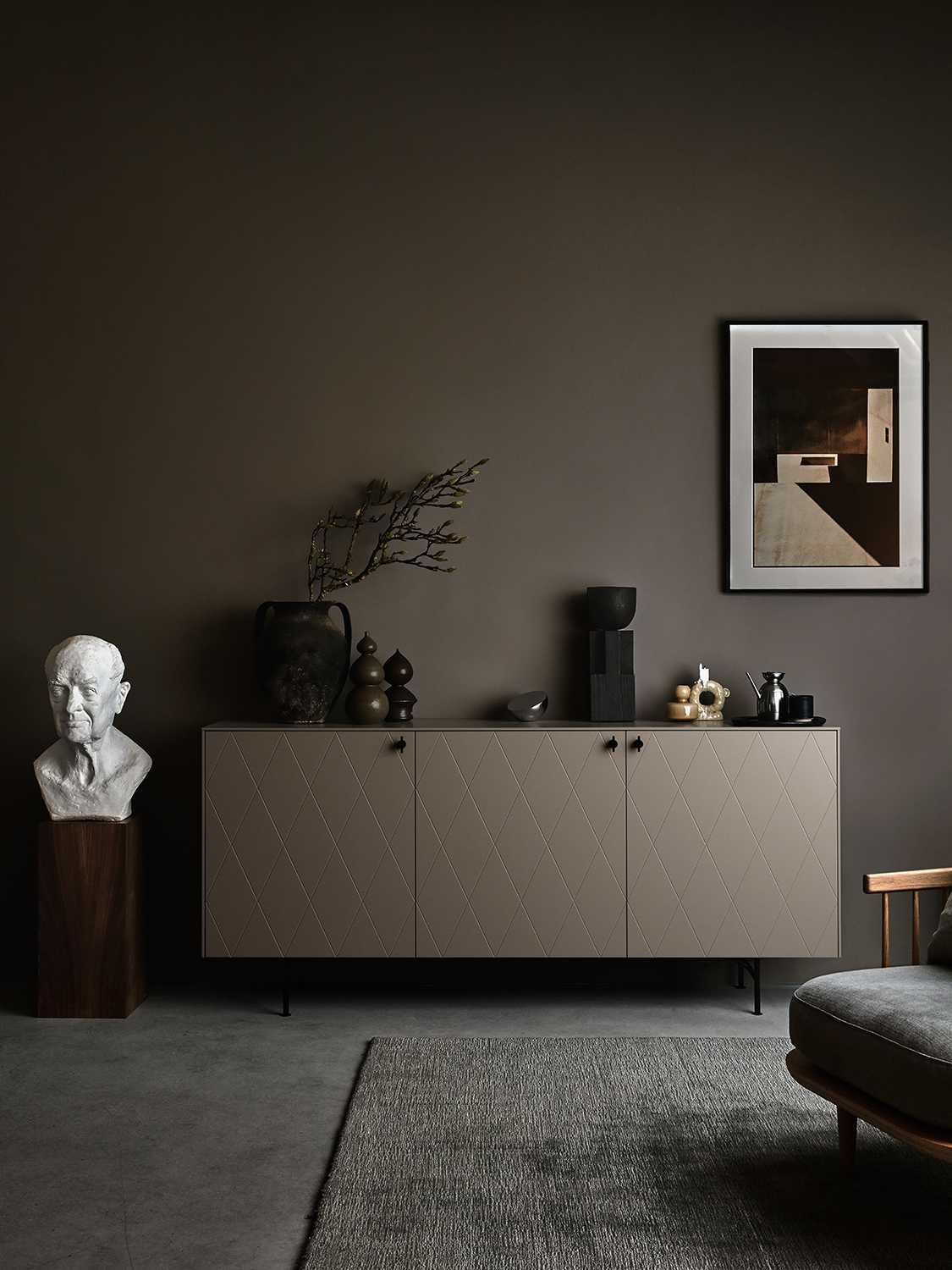
Superfront’s sideboard with Harlequin fronts in Silent Greige
The best colors that go with brown tend to be natural tones, so layering a scheme with a spectrum of browns can work really well. A tonal monochromatic color scheme can add depth and dimension to a space, and makes for a seriously luxe feel in the case of brown.
Founder of specialist limewash paint company Bauwerk, Bronwyn Reidel, says there’s no such thing as too many shades of brown together. However, too much of one brown tone (particularly a darker tone) isn’t necessarily a good thing. The richness can be overwhelming, so it’s important to note Bronwyn’s point about complimenting brown with a variety of brown shades.
"Opt for layering different tonal brown colors which will harmoniously blend in," she says. "Everything natural — like linen, jute, plywood, and other woody-type tones will all work beautifully and effortlessly with brown paint and decor shades."
11. Brown and black
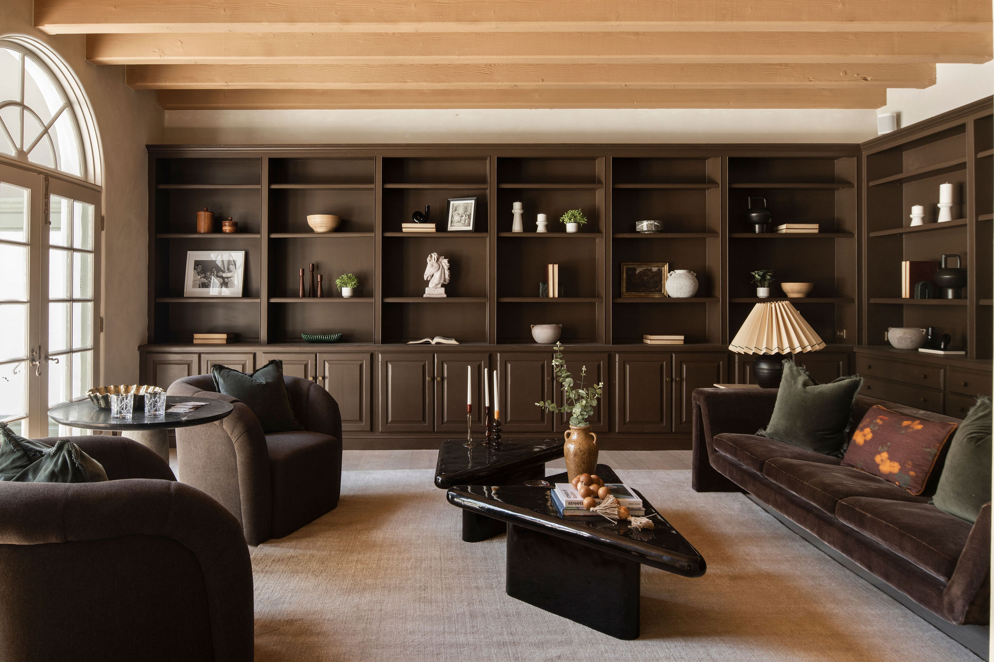
In a similar vein, brown and black work well together, too, but you should use the darker of these tones sparingly. Pops of black really enrich a brown color palette, but you don't want to overdo it. "The addition of black also helps to create interest and build a bridge between the darkness of the walls and the lightness of wood, bringing these two elements together," says Bronwyn.
Consider moody brown walls with lighter wooden furniture, choosing oak or birch to lift the space, then pepper with black accents like hardware, throws, or furniture (like the coffee table seen above).
12. Brown and Greige
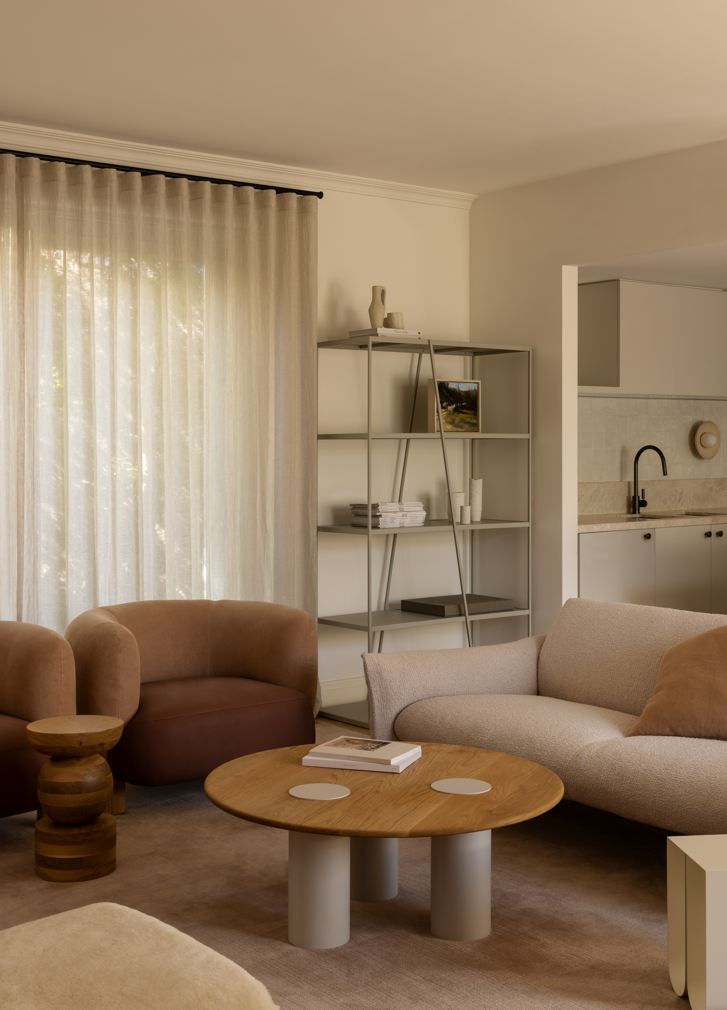
Rich brown is a wonderful color, but en masse, it can become a little overbearing. For a similar color-drenching effect but with some nuance, layer deeper brown shades with paler tones of fawn or greige. These work similarly to lighter browns, but the hint of gray gives them a lightness that feels more airy.
"They are very good neutrals that will create warmth in a multi-brown toned room," explains Camilla Clarke, creative director of interior design firm Albion Nord. "You can also contrast furniture and artwork in front with other, deeper brown tones."
FAQs
Is brown a warm or cool color?
Brown can be both a warm and cool color, according to the experts. It comes down to pigment and tone. A warm brown will have a hotter color within it like yellow, ochre, pink, or red, while a cool brown will have a grayish or blueish undertone within it.
If you’re worried about your brown shade being too cool or warm, don’t be. Matched with a striking, warm furniture color, cooler brown shades immediately spring to life, resulting in an energetic and rich decor scheme and vice versa. You can also match warm browns with other warm colors to dial up the heat or cool them down as needed. Just don't forget to take the lighting conditions of your room into account, too. (For example, we suggest warmer browns for north-facing spaces, which tend to feel cooler.)
How do you choose the right brown for a space?
It's a common misconception that brown is a simple "dull" color. There are so many nuanced brown shades that choosing the right one for your space can be a challenge. If you're undecided on where to start, Patrick at Farrow & Ball suggests starting in the middle.
"Mid browns can be a joy for a bedroom — cozy and restful — think Mouse's Back with its note of empathetic green," he says. "Try the sexiest of rich cacao browns for kitchen cabinetry or in a high sheen for a super glamorous living room or dining room — the latter in full gloss would be just delicious."
Generally, standard color rules apply. Go darker for a more moody feel, and lighter for a more delicate, subtle decorating idea. That said, the beauty of brown is its versatility, meaning it's hard to go wrong in most cases. Rest assured your brown space will be a sight to behold.

Lilith Hudson is a freelance writer and regular contributor to Livingetc. She holds an MA in Magazine Journalism from City, University of London, and has written for various titles including Homes & Gardens, House Beautiful, Advnture, the Saturday Times Magazine, Evening Standard, DJ Mag, Metro, and The Simple Things Magazine.
Prior to going freelance, Lilith was the News and Trends Editor at Livingetc. It was a role that helped her develop a keen eye for spotting all the latest micro-trends, interior hacks, and viral decor must-haves you need in your home. With a constant ear to the ground on the design scene, she's ahead of the curve when it comes to the latest color that's sweeping interiors or the hot new style to decorate our homes.
- Rory RobertsonDesign Expert

