Designers turn to brown color palettes when they want to create neutral rooms that are both rich and inviting. For brown is a color that can skew dark and warm or light and airy - if you choose the right tones and pair it with the right shades, it's perhaps the most versatile decor shade there is.
In fact, these tones exist in all the most sophisticated schemes as there are a wide range of colors that go with brown. 'I always think that whatever color you choose, it should have a hint of the earth in it,' says the acclaimed British designer, Russell Sage. 'Instead of, say, a banana yellow, go for one that has a more brown pigment. Or instead of a bright red, tone it down a few notches with some brown.'
This is just the starting point for a world of brown color palettes in which rooms seem both minimalist and uplifting, both pleasingly rustic and charmingly contemporary. Designers explain how to get them right.
1. Brown with off-white and amber
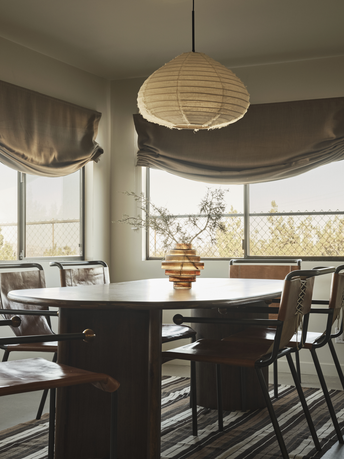
A light-filled dining room with dual-aspect windows, design studio Design Hutch knew they could afford to go sludgier on the tones used within. The amount of natural light beaming in was sure to lift the palette.
'In this space that looks out over the desert, I aimed to keep everything super neutral and tonal to make the entire space feel like a calm, chill area that would actually make you be able to do just that,' says Brooke Spreckman, the studio's principal and owner. 'I layered warm paint on both the wall and ceiling, upon loosely fitted, burnt amber window shades, to keep the space feeling relaxed and comfortable. The soft neutral fabrics balance with the artisanal leather chairs, that are beyond comfortable to sit in.'
2. Brown with various blues
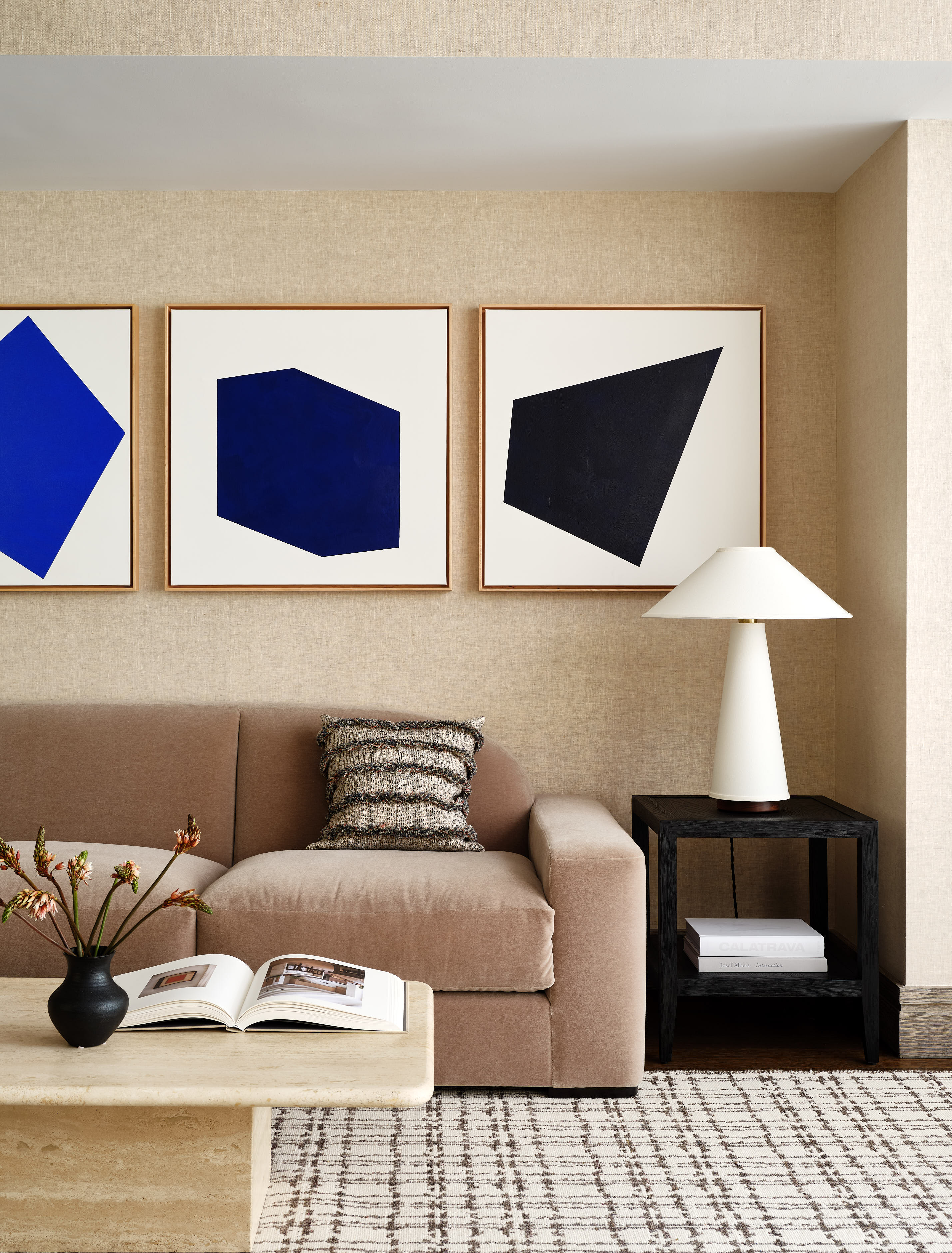
Erring towards the beige end of the color spectrum, this brown living room by Chango is enlivened by the addition of three blues - one jewel-toned, the others with brown pigments in them. It's a contrast which works because it acts like a jolt, an unexpected non-tonal pop of sapphire, which in turn is paired with the blues that are more similar in shade to the rest of the room. A super-smart approach.
'The key to mixing browns is to select beautiful hues to start with, whether that's a deep chocolate or a warm taupe,' says Susana Simonpietri, principal designer at Chango. 'We like to mix and match different shades of brown which instantly feels more modern, and to play with different textures and weaves for added contrast. Here, we chose a sofa with a bit more gray in its brown, which nicely breaks up the tones of the travertine coffee table and textured wall covering.'
The Livingetc newsletters are your inside source for what’s shaping interiors now - and what’s next. Discover trend forecasts, smart style ideas, and curated shopping inspiration that brings design to life. Subscribe today and stay ahead of the curve.
3. Brown with red and off-white
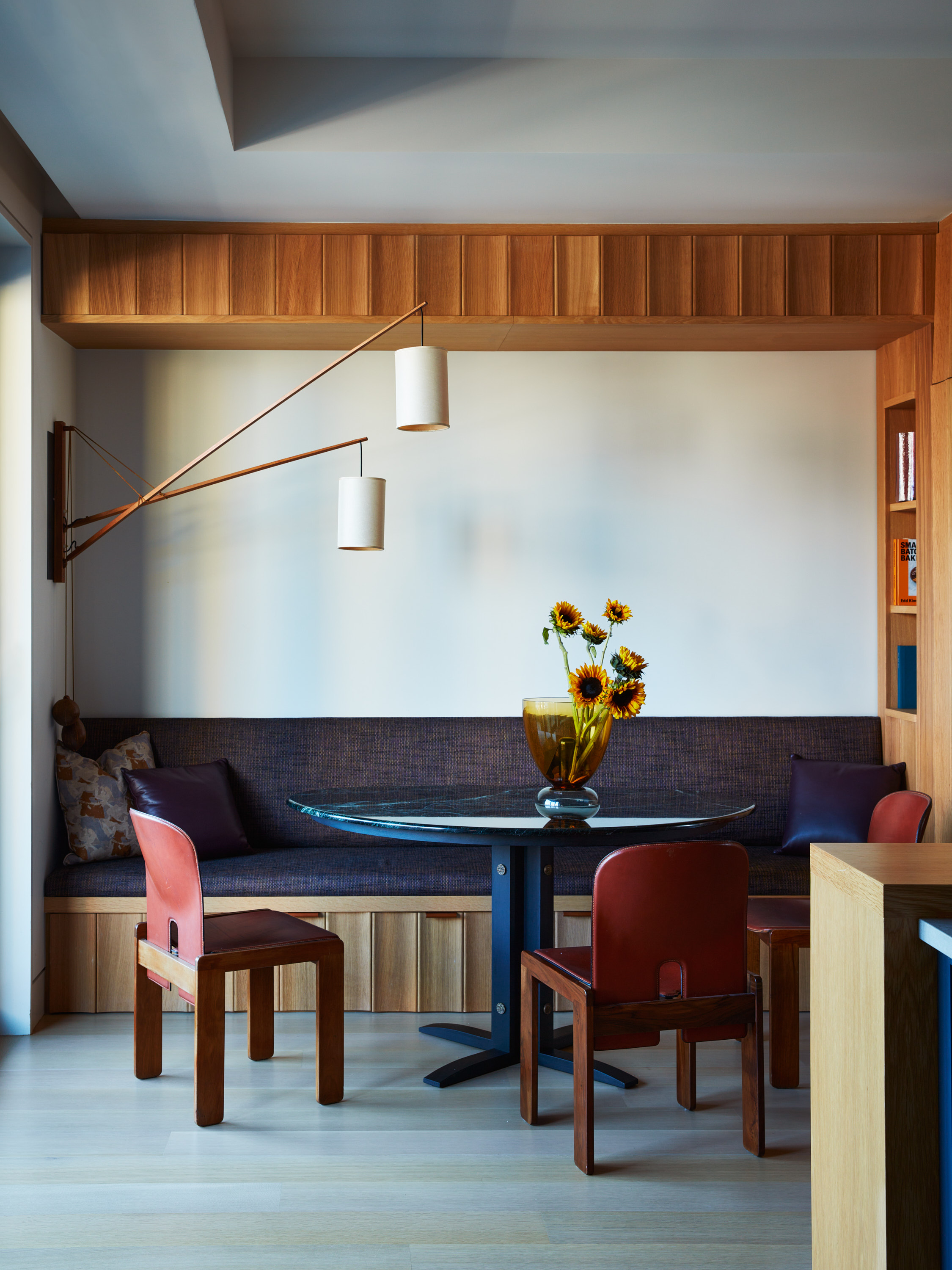
The oakier tones of the wood paneling in this dining area by MK Workshop are highlighted by the dark red chairs, and softened by the use of off-white instead of bright white paint for the walls.
'Although working with the color brown may pose challenges, the key to mastering its use is incorporating organic elements,' says MK Workshop's co-founder Jonah Kilday. 'For example, the white oak paneling crafted by Barlis Wedlick Architects is paired with vintage model "121" chairs designed by Afra & Tobia Scarpa for Cassina. The dining table designed by MK Workshop has an emerald marble table top and shou sugi ban-style wooden base.'
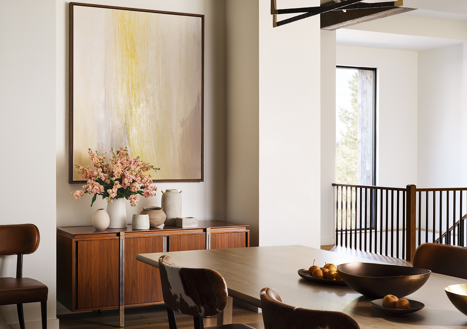
4. Brown with hints of yellow and blush pink
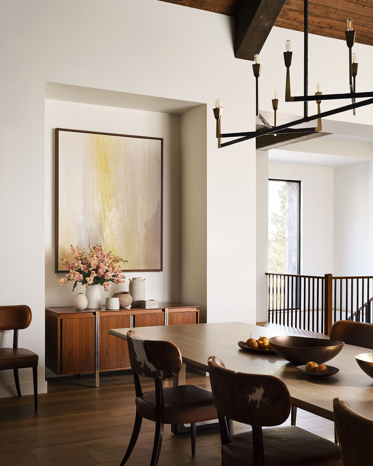
Want to know how to add a unexpected delicacy to brown? By working in tiny hits of blush pink and sunshine yellow, as seen in the artwork and floral arrangement here. They give the brown shades elsewhere a prettiness you'd possibly never have thought possible, picking out the more golden tones inherent in browns and wood whorls.
'When working with browns, I like to pair materials with subtle differences in the red, yellow, and black pigment spectrums,' says the Nevada-based designer Daniel Joseph Chenin, who created this dining room. 'This allows the material’s specular color to react differently to light within the same space depending on what type of light falls upon it. I find that these subtleties affect the intensity of highlights, which allow a space to be more transformative and warmer in nature under direct and indirect light.'
5. Brown with terracotta
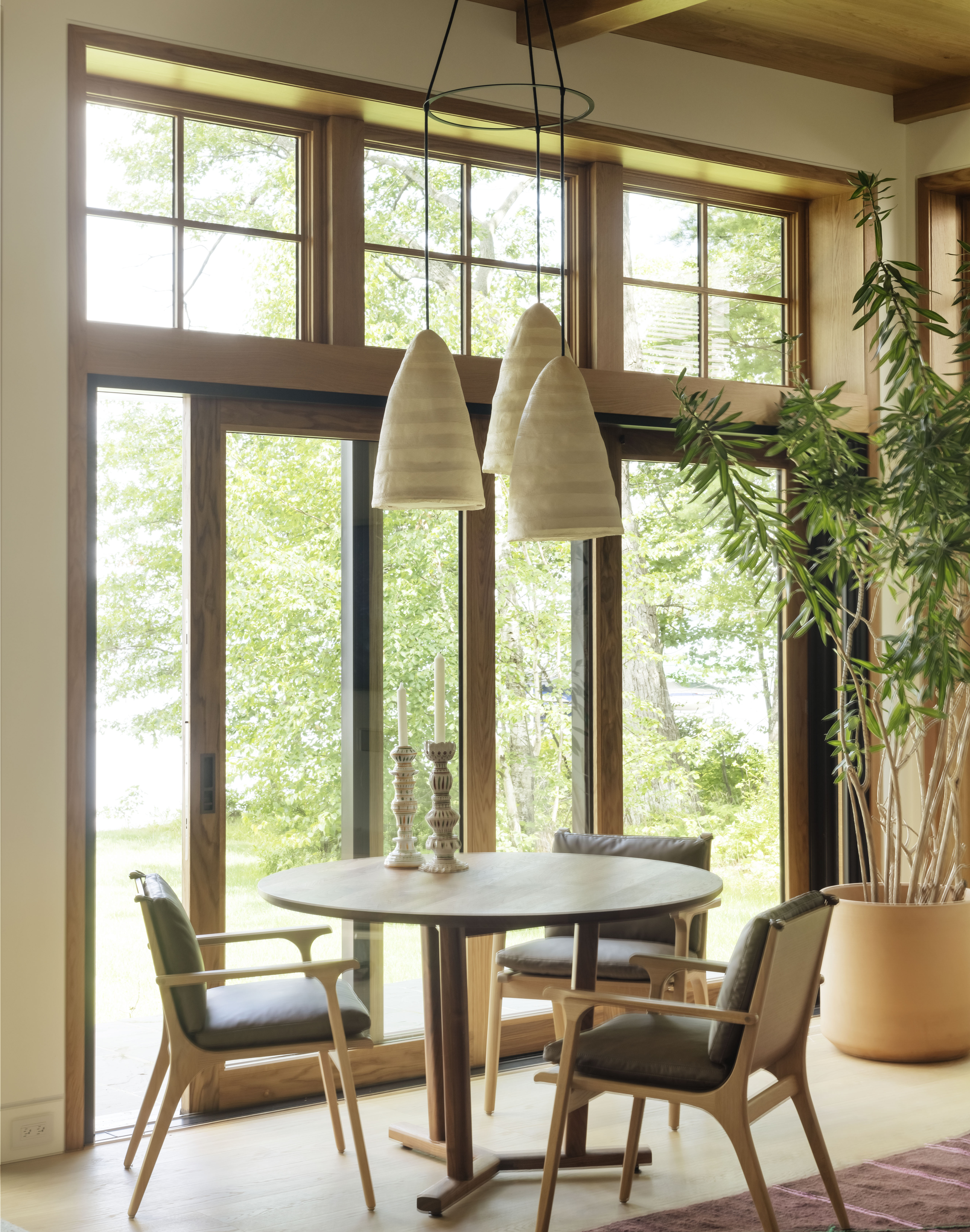
Squint, and brown and terracotta could be seen as variations of the same color. But to the trained eye, terracotta is a bleached, sunnier shade, while browns are more forest-like, speaking of the dappled tree canopies. Brown naturally complements terracotta, and together it's a classic combination of light and shade.
'Consider the grain of the rift sawn floors compared to the plain sawn framing of the window jambs,' says Victoria Sass, founder of Prospect Refuge Studio, and the visionary behind this dining nook. 'The rich walnut table paired with the light oak chairs. Sculptural versus more rustic applications. The list goes on. Throw in a living tree and we've rounded out the whole experience! It feels so natural and comfortable, easy and inviting. Wood has that way of making us feel "at home".'
6. Brown with beige
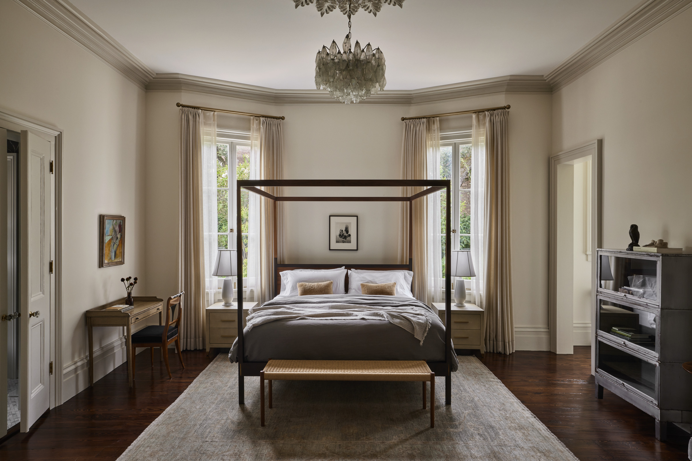
Beige is one of the key color trends for 2024, filling homes with a richness, a sense of light, a subtle cocooning warmth. In one of its many forms, beige is a light brown, so it's only natural the two colors work together to create a very soothing palette.
'This combination of colors is used throughout the home to imbue it with historic resonance,' says Morris Adjmi, architect and founder of the design studio MA. It's a classic pairing that works to highlight period details - use beige on the trim to make a connection to brown wood flooring - or to give character to modern homes, where wood furniture can stand out richly against beige walls.
7. Brown with gold
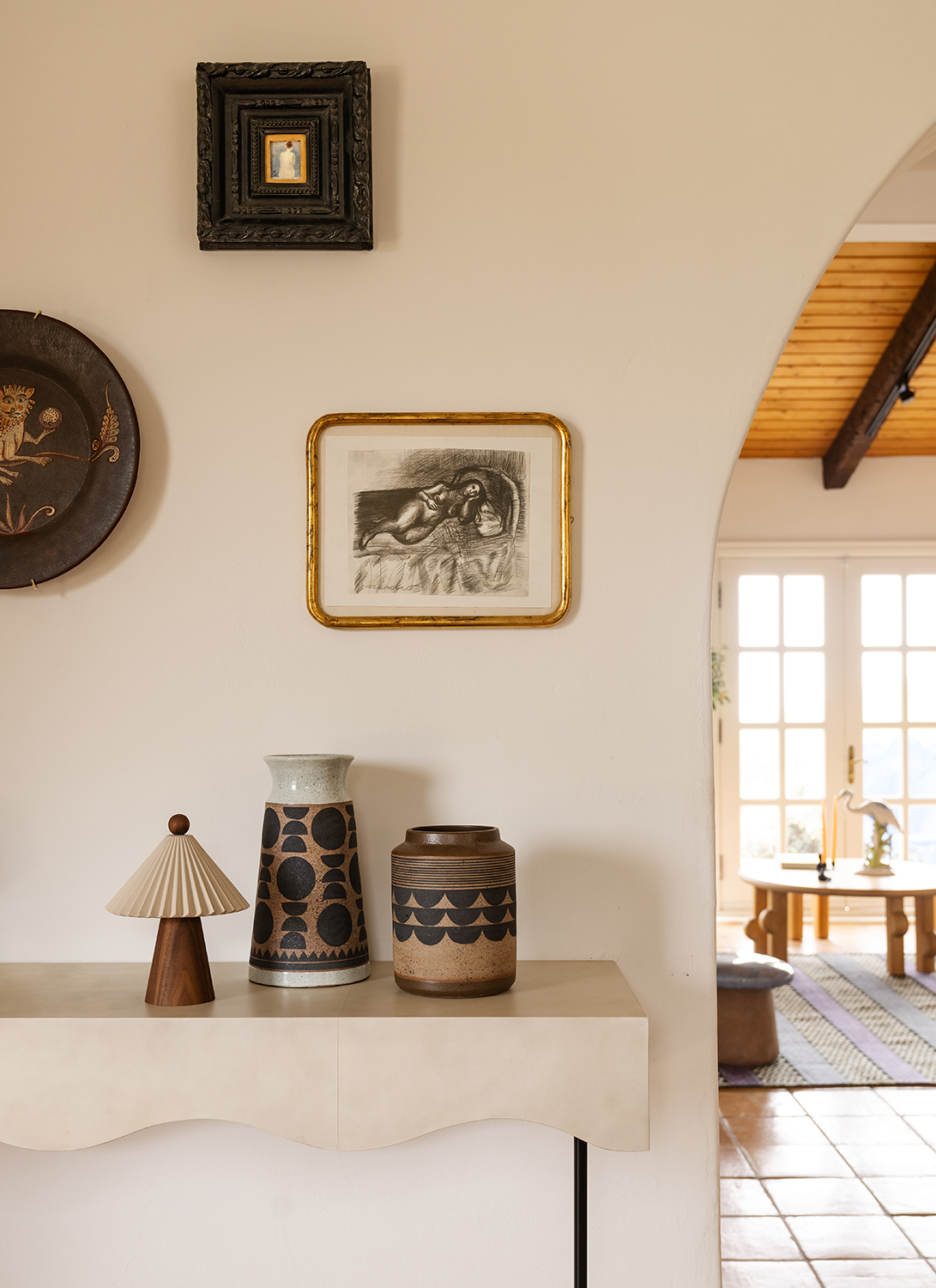
'Putting together a palette is like being an artist,' says Azar Fattahi, co-founder of the design studio LALA Reimagined, who created this tonally brown entryway idea. 'The trick is in the background, and then curating and pairing on top of it.'
Here, the browns in the home decor choices take on an earthiness, a pleasing 1970s retro handmade vibe, next to the off-white walls. But it's thanks to the gold frame that the look feels as contemporary as it does, the little hint of a gleam layering on top of and lifting all the browns. A flash is all you need.
8. Brown with blue and red
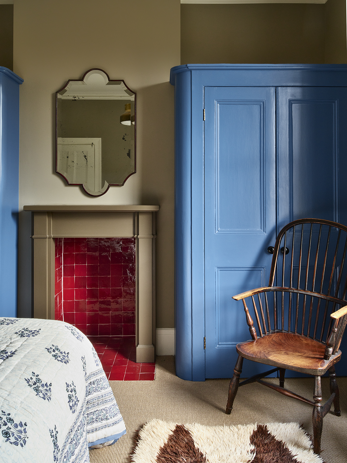
If you pay any attention to the design end of TikTok, you'll have heard about the 'unexpected red theory'. It's the belief that a sudden pop of red within an otherwise very non-red room gives the whole space a sense of elevated and well-considered design. It's meant to be an elevating finishing touch, like a flash of red lipstick that completes the outfit.
And of course, brown is a color that goes with red. Brown has red tones in it, so together it's an unbeatable force.
'Primary colors are tricky, but you can get a balance if you put them next to earthy tones,' says the British designer Tom Morris, who decorated this bedroom. 'There's a richness and a purity [in this palette] which feels so luxe.'
What's opposite brown on the color wheel?
A complementary color scheme is a palette based on opposites on the color wheel. In color theory, these are the colors that work together best, though they're not always the most suited for subtle decor schemes — think blue and orange, yellow and purple.
But which color sits opposite a color like brown? Well, you can think of brown as orange with the dials cranked up. It's a super saturated, less bright version of the shade in many instances, so it tracks that its complement is blue. Think darker teals as a natural pairing for a classic brown shade.
The editor of Livingetc, Pip Rich (formerly Pip McCormac) is a lifestyle journalist of almost 20 years experience working for some of the UK's biggest titles. As well as holding staff positions at Sunday Times Style, Red and Grazia he has written for the Guardian, The Telegraph, The Times and ES Magazine. The host of Livingetc's podcast Home Truths, Pip has also published three books - his most recent, A New Leaf, was released in December 2021 and is about the homes of architects who have filled their spaces with houseplants. He has recently moved out of London - and a home that ELLE Decoration called one of the ten best small spaces in the world - to start a new renovation project in Somerset.

