Cottagecore color palettes - 9 restful decor schemes with the perfect amount of modern design flair
Cottagecore color palettes center around warm neutrals with daring pops of brighter shades. Experts explain the ideal decor choices
The Livingetc newsletters are your inside source for what’s shaping interiors now - and what’s next. Discover trend forecasts, smart style ideas, and curated shopping inspiration that brings design to life. Subscribe today and stay ahead of the curve.
You are now subscribed
Your newsletter sign-up was successful
Cottagecore color palettes are making their way urban homes. Borrowing the best of rural life and updating the vibe for townhouses is a romanticizing of a simpler time, a way to create a cottage-like homely feel no matter the size and location of that home.
As one of the continuing interior design trends, cottagecore can be pretty florals and sink skirts but it can also be beautifully dressed beds and neutral palettes. It evokes a sense of peace and cosiness, and tends to revovle around pale colors with warm pigments in them - red-tinged yellows and pinks, for example, are perfect.
‘Calm but warm was the feel I wanted to achieve,' says interior designer Taline Findlater of Olivine Designs, whose work features here. And that aim and effect sums up cottagecore palettes to perfection.
Article continues belowThe best cottagecore color palettes
1. Terracotta, yellow and pink
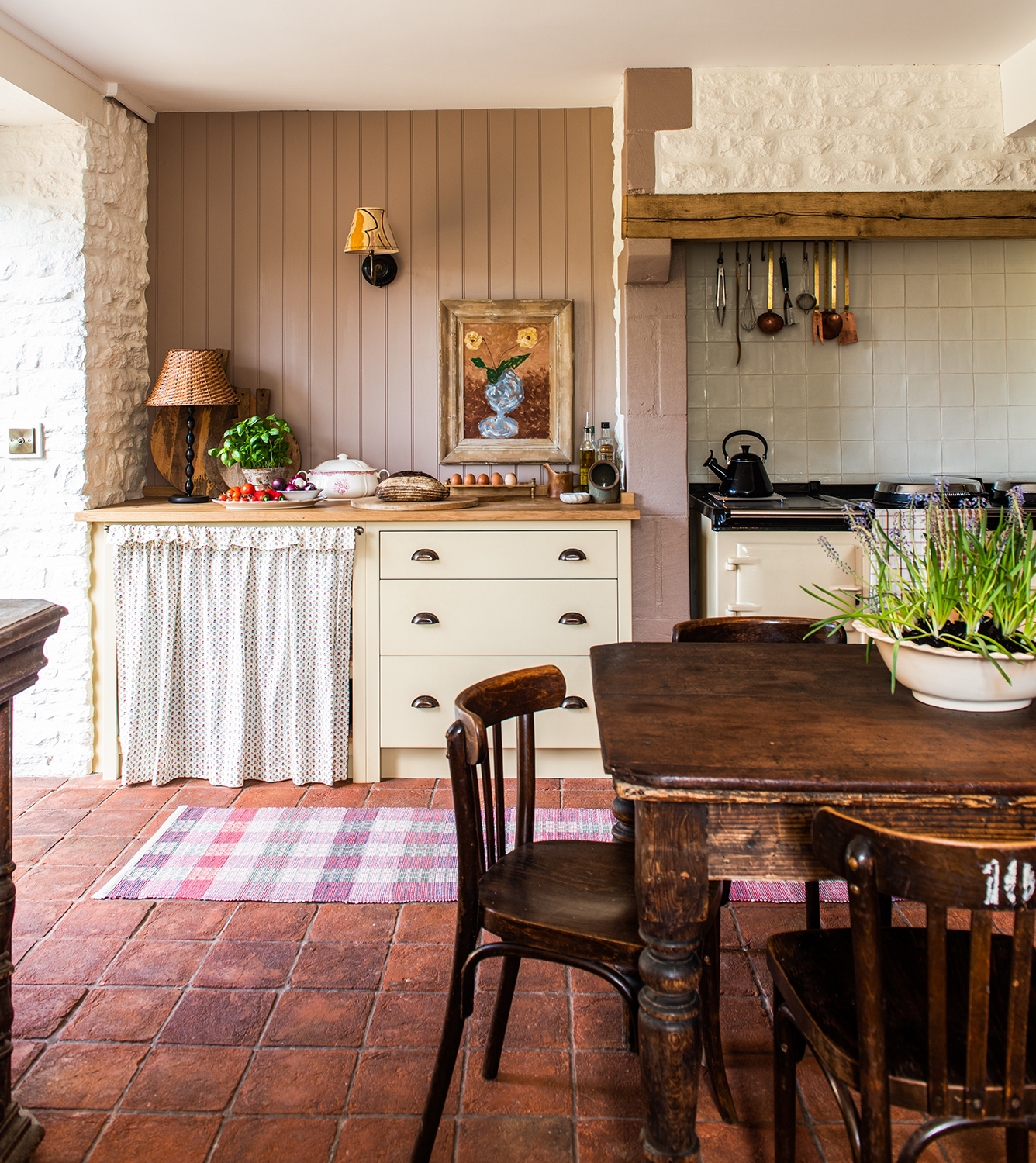
An image that so perfectly illustrates this trend is from the designer Lisa Mehydene of Edit58. Her home radiates a fresh take on cottagecore, blending the best of the current kitchen trends into a modern take on rustic. The modern farmhouse kitchen is full of layered textures including the cupboard skirt, the wall paneling and the aged table - all of which contribute towards the modern nostalgia of this room.
‘In terms of the color palette for the space, I took inspiration from the warm tones of the terracotta floor,' Lisa says. 'I wanted a continuation of the earthy, rustic, countryside atmosphere but also needed to have an injection of color as the ceilings are the lowest anywhere in the Barn in this room - so I thought the mustardy yellow units would be a timeless and sunny choice, against the terracotta floor, preventing it from feeling gloomy in the dark winter months. I love the introduction of another color to stop it feeling too matchy -matchy overall. ‘
2. Grey with warm red and pinks
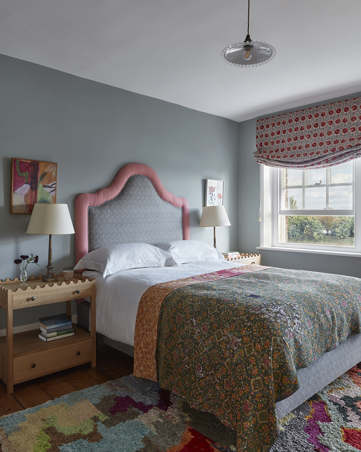
The fabric choices in this decorative yet modern bedroom design is what really transforms the space. The color on the walls is the perfect backdrop allowing the headboard, throw and curtain to sing. The wooden bedside table helps to ground the design and the color in the artwork ties in the whole scheme.
'We find this grey the most restful color for a bedroom,' says the interior designer Kate Guinness, who created this space. 'While the brighter warm reds and pinks keep the room fun and warm.'
The Livingetc newsletters are your inside source for what’s shaping interiors now - and what’s next. Discover trend forecasts, smart style ideas, and curated shopping inspiration that brings design to life. Subscribe today and stay ahead of the curve.
3. Cream, rust and and blue
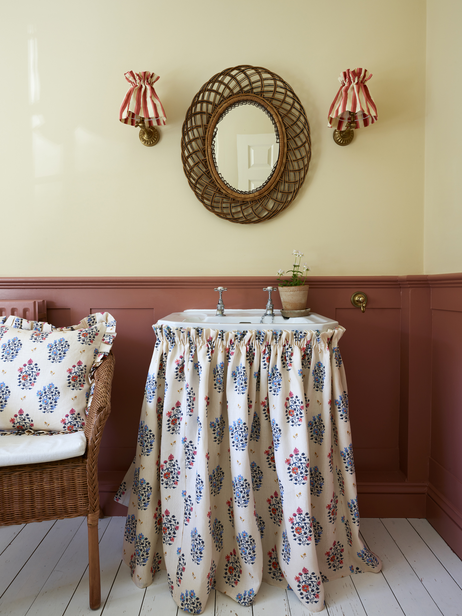
The two colors that make up the foundation of this modern bathroom scheme is a warm stone neutral on the walls and a lovely rust color on the paneling. The colors compliment each other perfectly, partly because there is a little red in the wall color so it sits comfortably alongside the more saturated hue below. The colors are really brought alive by the introduction of the blue in the sink skirt fabric and the matching cushion, however.
This is the home of surface pattern designer Sophia Frances. ‘We knew we wanted a sink skirt as the feature in the bathroom,' Sophia says. 'We chose the warm wall colors to complement and bring out the colors in the floral linen fabric. We wanted to create a warm and inviting space.’
4. Warm green with floral accents
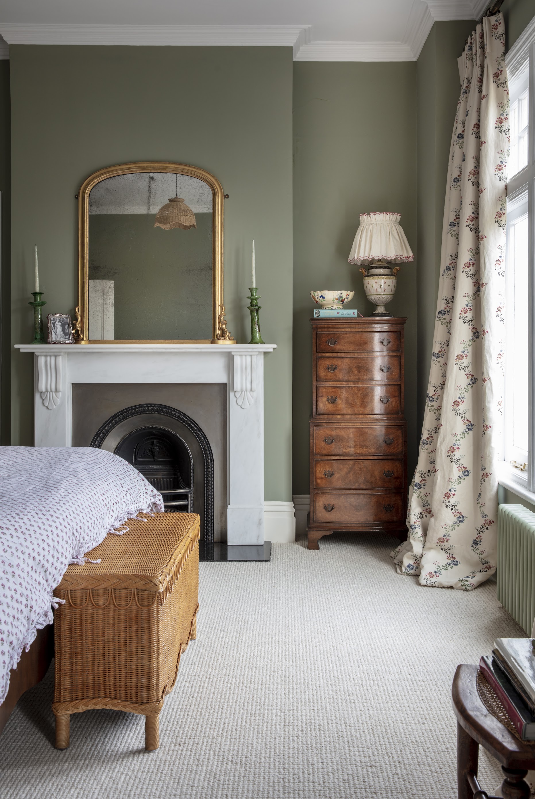
If you like florals but don’t like a room that feels too chintzy then this approach could be for you. The warm green on the walls is complemented by the softer rattan trunk at the foot of the bed and these graphic floral curtains. This isn't a farmhouse bedroom, but its urban take on cottagecore is ideal for city life.
‘The walls are a warm and rich green, very soothing!' says the tastemaker Louise Roe of her bedroom. 'I love touches of rattan and antique wood for more warmth, and then I wanted to bring some florals.’ This approach shows how to take country tropes and invert them for an urban home.
5. Yellow and green

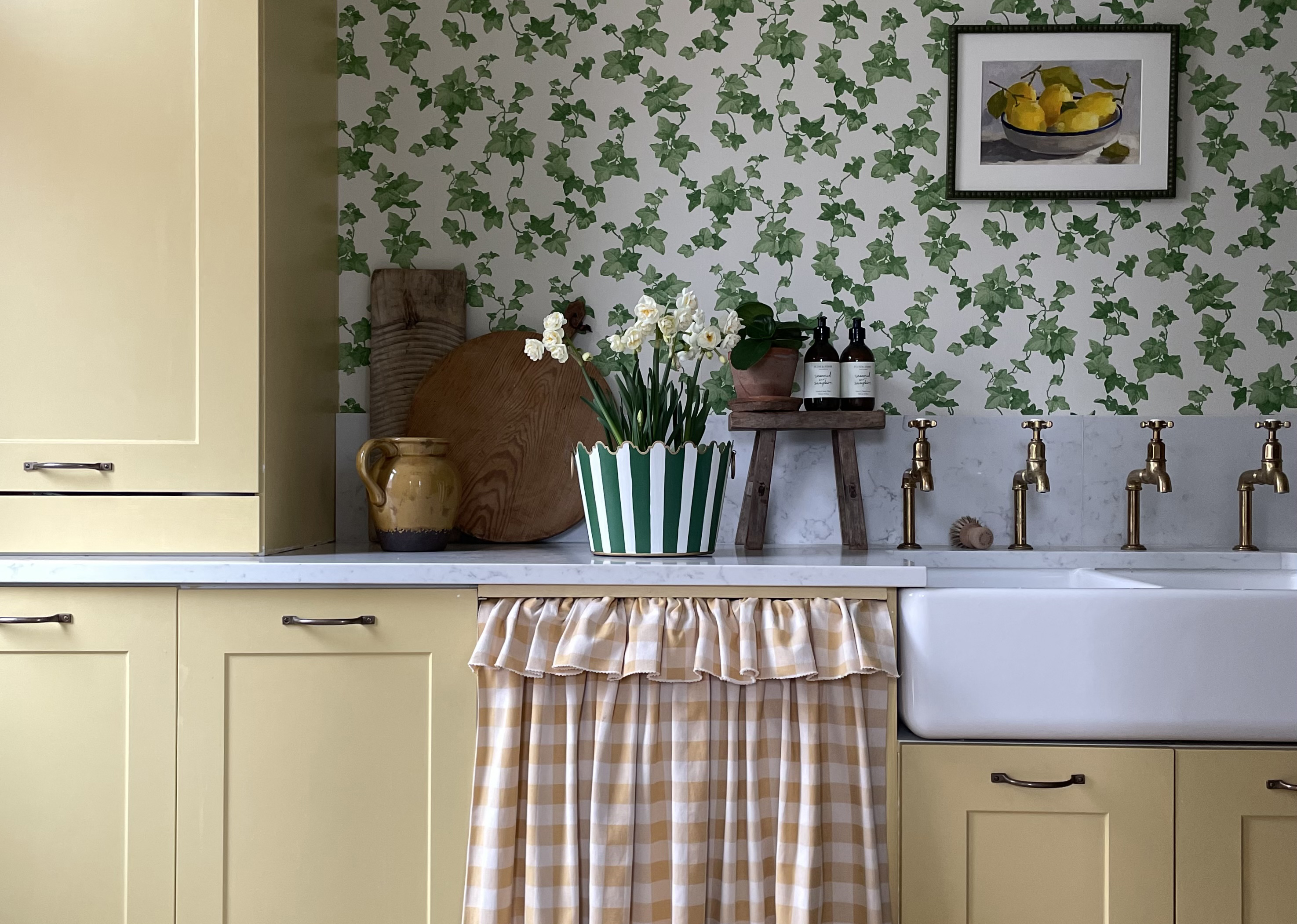
The modern farmhouse aesthetic is known for its use of yellow, and it's a hue that carries over to cottagecore, too. In fact, green and yellow together are the perfect combination, adding a playful yet grown up nod to meadows in the sunshine. The colors are tied in with the cupboard skirt, the art, and even the lovely earthenware jug. The wooden touches and brass taps in the home of Megan from the popular instagram account @kitandco_ add further warmth to the design.
'I love color and how it impacts the way you feel,' Megan says. 'A varied mix of color and pattern, not sticking to set rules, but about living with what brings you joy. I paired my favorite yellow with the clambering Ivy wallpaper by Sanderson, bringing a little bit of the outside in.'
6. Red and white
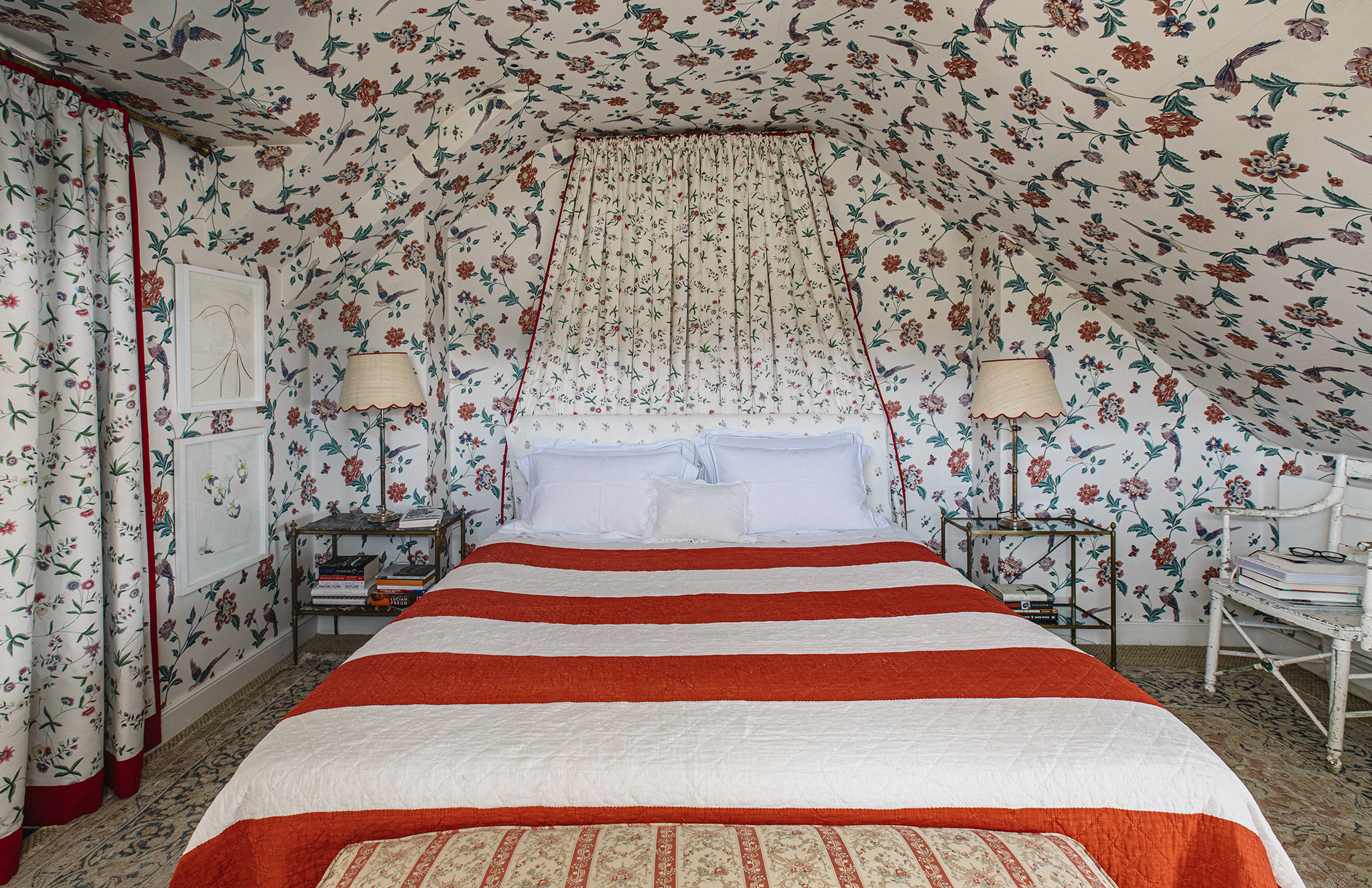
If neutral color schemes aren’t for you then why not go all in and wrap a whole room in a beautiful floral wallpaper? And then follow the color palette through with matching curtains and a bed canopy? This maximalist take on a cottagecore color palette is full of nostalgia and modernized with the simple stripe throw and the scalloped rattan lampshades that sit proudly either side of the bed.
‘I decided to wallpaper the room because the sloping walls and ceiling made it difficult to hang pictures and it was very boring when just painted,' says the interior designer Joanna Plant of this space. 'The red trim on the curtains helps to define the patterns as the scale is quite similar. Red is my favorite color and whilst it isn’t an obvious shade for a bedroom what I like about it here particularly is that it stops the whole effect being too pretty and sharpens the look of things right up - it’s a little bit sexy and subversive and like sleeping in a wonderful tent.’
7. Soft green and a rich red
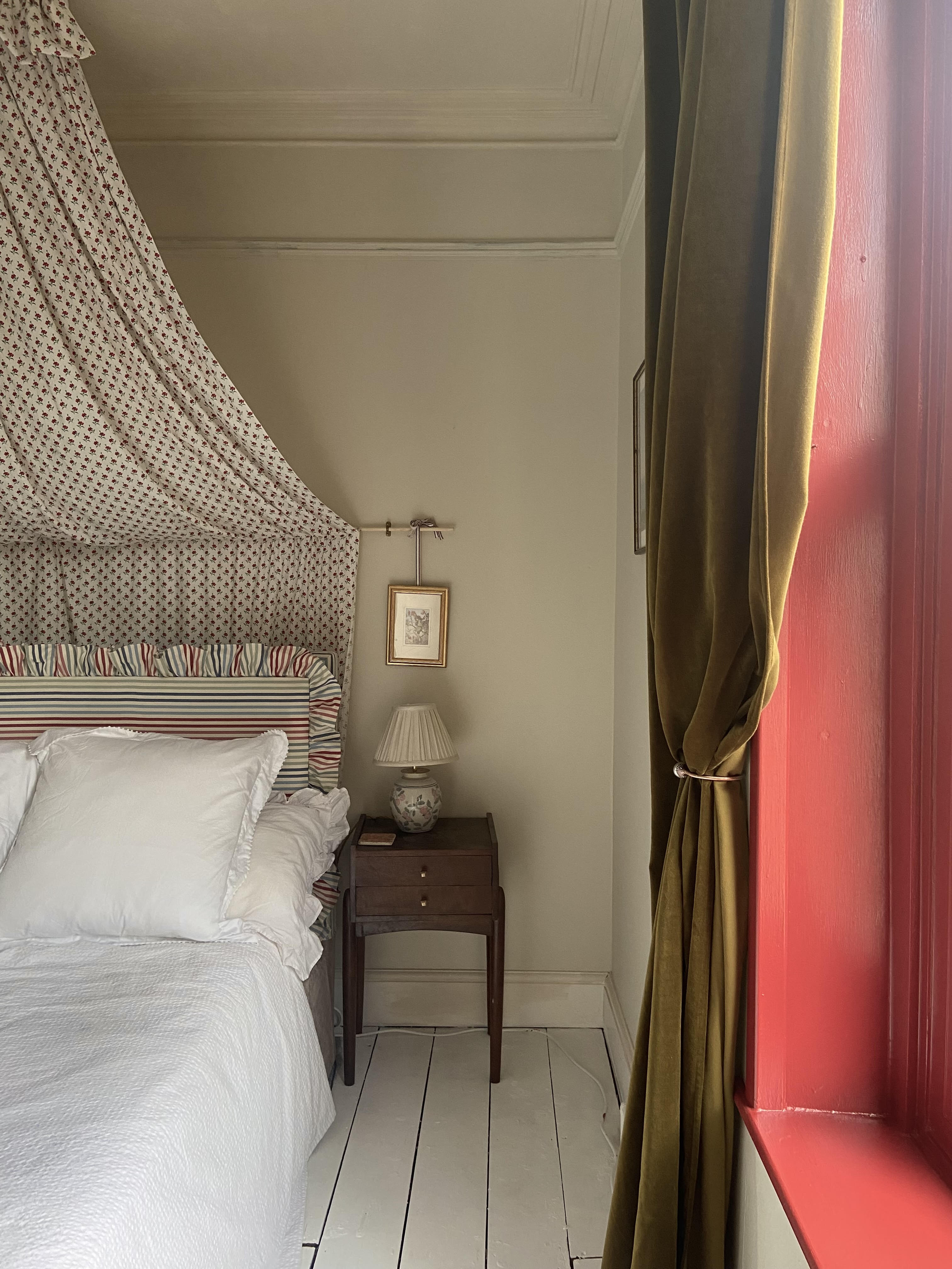
If you like the idea of incorporating a rich red into your bedroom color scheme but aren’t quite brave enough to wrap the whole room in the color then you could paint the woodwork around a window in red. It comes alive against a neutral backdrop as tastemaker Anna Hope has done here. The red is also picked out in the striped ruffled headboard and the romantic canopy and is softened by the mossy velvet green curtains.
Anna’s instagram page (@forever_home_in_bristol) is full of cottagecore inspiration.
‘I wanted to create a tranquil yet cosy sleep space and the color scheme stemmed from some gorgeous vintage fabric I found on eBay to make a bed canopy,' Anna says. 'The chalky walls and exposed floor boards form a dreamy backdrop while the colors in the canopy are picked up with a rich red on the large window and green curtains. A headboard I upholstered alongside frilly bedlinen provides added softness in the space.’
8. Off white with layers of red, yellow and blue
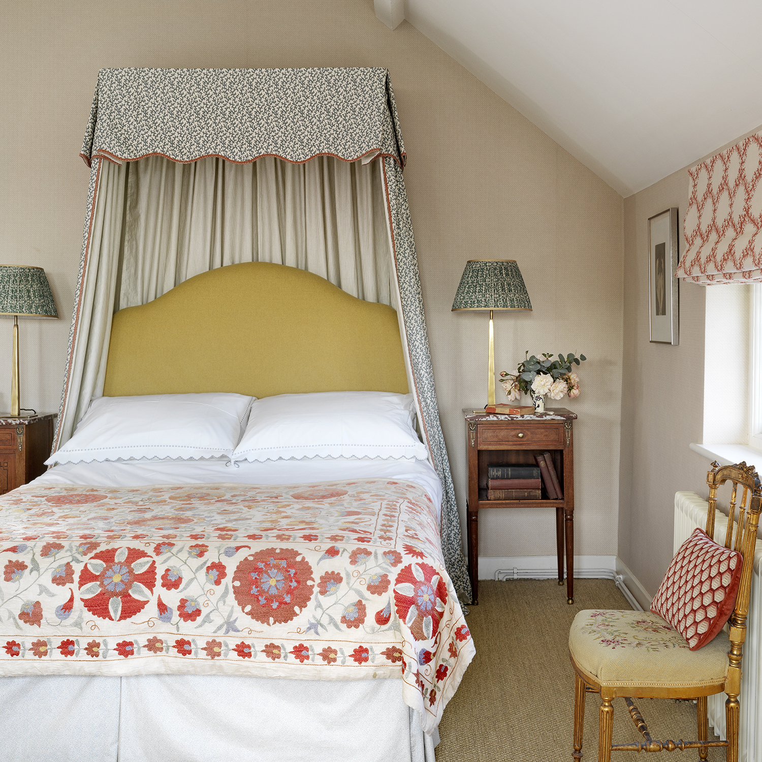
Looking at fabrics can be a brilliant way of getting inspiration for room color schemes. That is what happened with this design where Taline Findlater, the founder of Olivine Designs, was led by the quilt that she picked up while traveling in Istanbul.
A touch of yellow in a design is often very uplifting, which is why it's been a bedroom trend for a while. And then the red additions in the fabrics add interest and warmth to the neutral backdrop.
‘The colors are soft and gentle, nothing fights with each other,' Taline says. 'And the yellow headboard keeps it refreshing!’
9. Pale blue and pale green
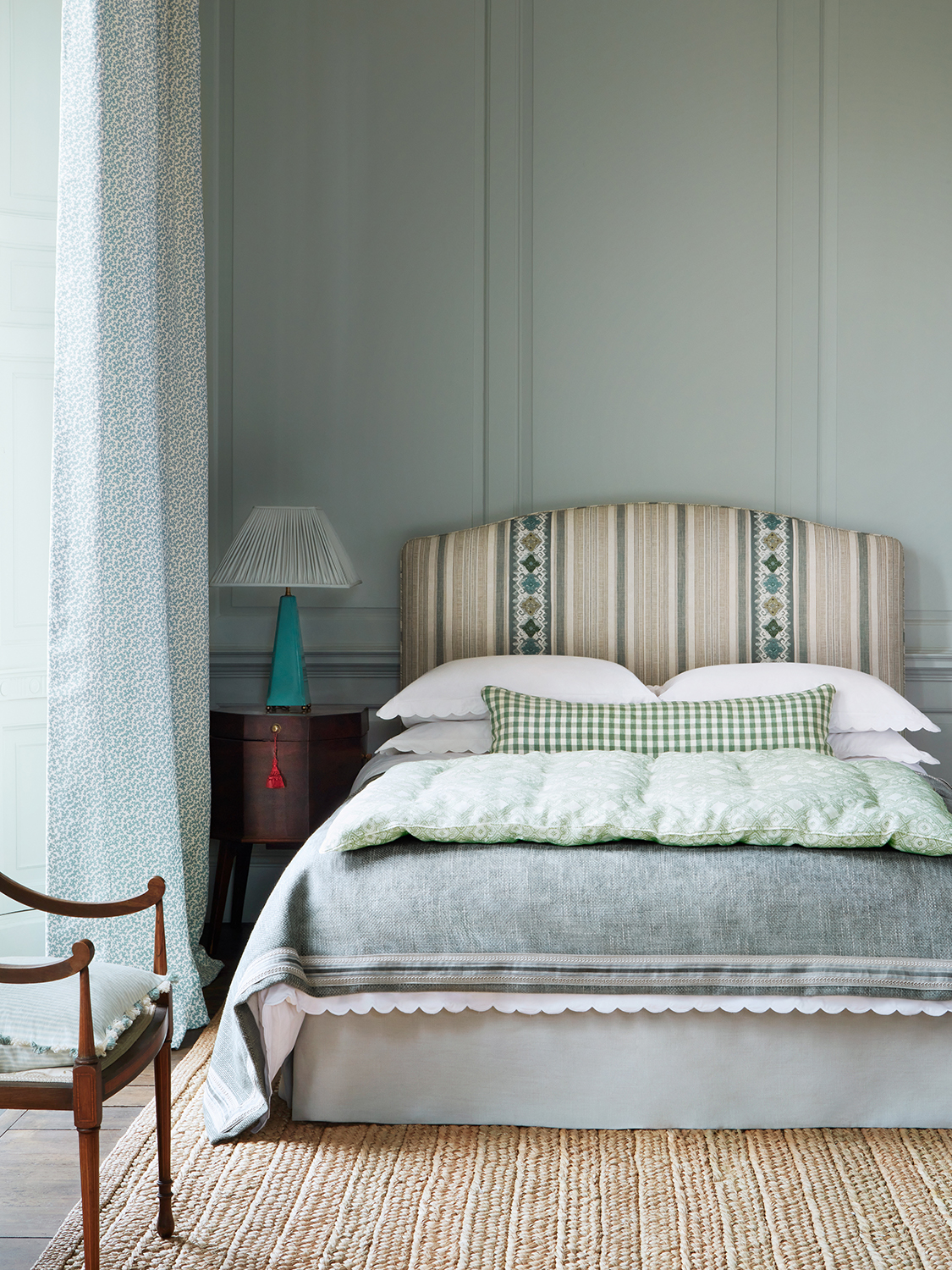
Contrary to the popular saying, blue and green should indeed be seen together. The color scheme feels like a breath of fresh air from the muted sky blue on the paneled walls to the sunny green gingham bolster on the bed. The fabric choice is varied and rich in terms of texture but the colors all sit comfortably alongside each other and the headboard helps to tie it altogether.
This color combination works particularly well in a bedroom where you get a real sense of calm, and could work in both a north or south facing room as the colors are light and bright enough to work with either aspect.
Charlotte Alldis started her interiors Instagram account Thrifted Abode nearly five years ago. Since then she has renovated two properties and has been passionately learning about interior design along the way. She has just launched her interior design consultancy whilst also continuing to work as a Marketing Director for a hotel. Her work as a marketeer over the last decade has given her great foundations to appreciate good aesthetic design and the power of fantastic photography. She is beyond excited to finally kick start her interior design business.