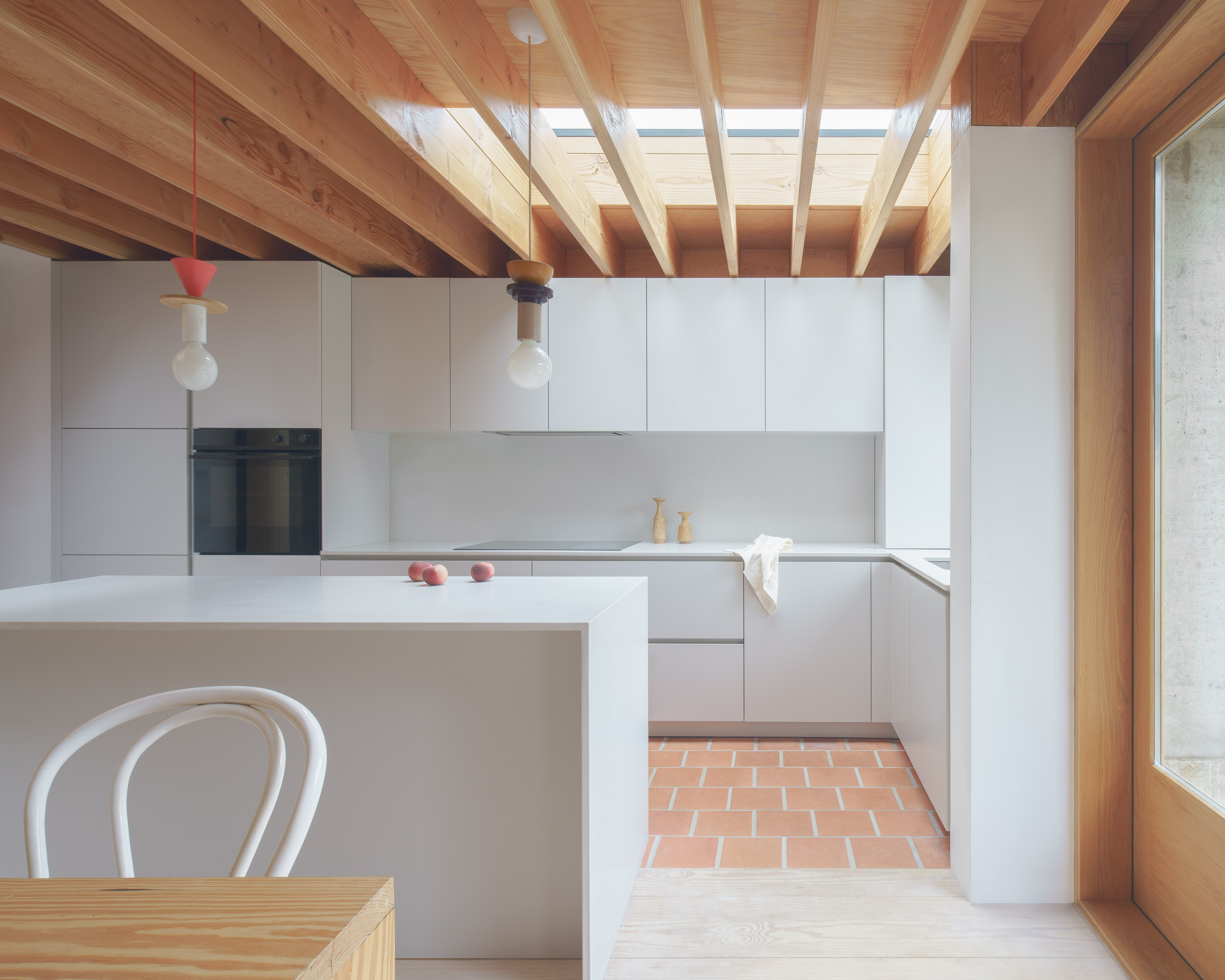
Minimalism is about having nothing - or very few - things in your home, right? Well, not exactly. Instead, it's about having what you need - and love - on display, and trying to keep on top of the rest of life's necessities creeping in.
Minimalism is not a discipline. It's really a celebration of great design. It's about choosing pieces and finishes and textures carefully because they're the best or the ones you love most, and not surrounding them with other things that detract from their beauty. And this is why minimalism works so well in modern homes. It's not a mean-spirited doctrine, but a way to quietly and considerately decorate your space in a way that makes you feel calm, even uplifted. When done well, minimalism can feel warm.
That was the approach taken by the architect Grant Straghan of DEDRAFT for his own home, referred to as CG Residence, and now a masterclass in a decorative approach to minimalist interior design.
'The interiors were kept natural and simple, inspired by Alvar Aalto's home/studio,' Grant says. 'We've eliminated the need for complex and visually jarring details.' The result is a space where an abundance of light picks up on texture, where the shape of the air surrounding the furniture is as interesting as the furniture as itself.
Pared back purity
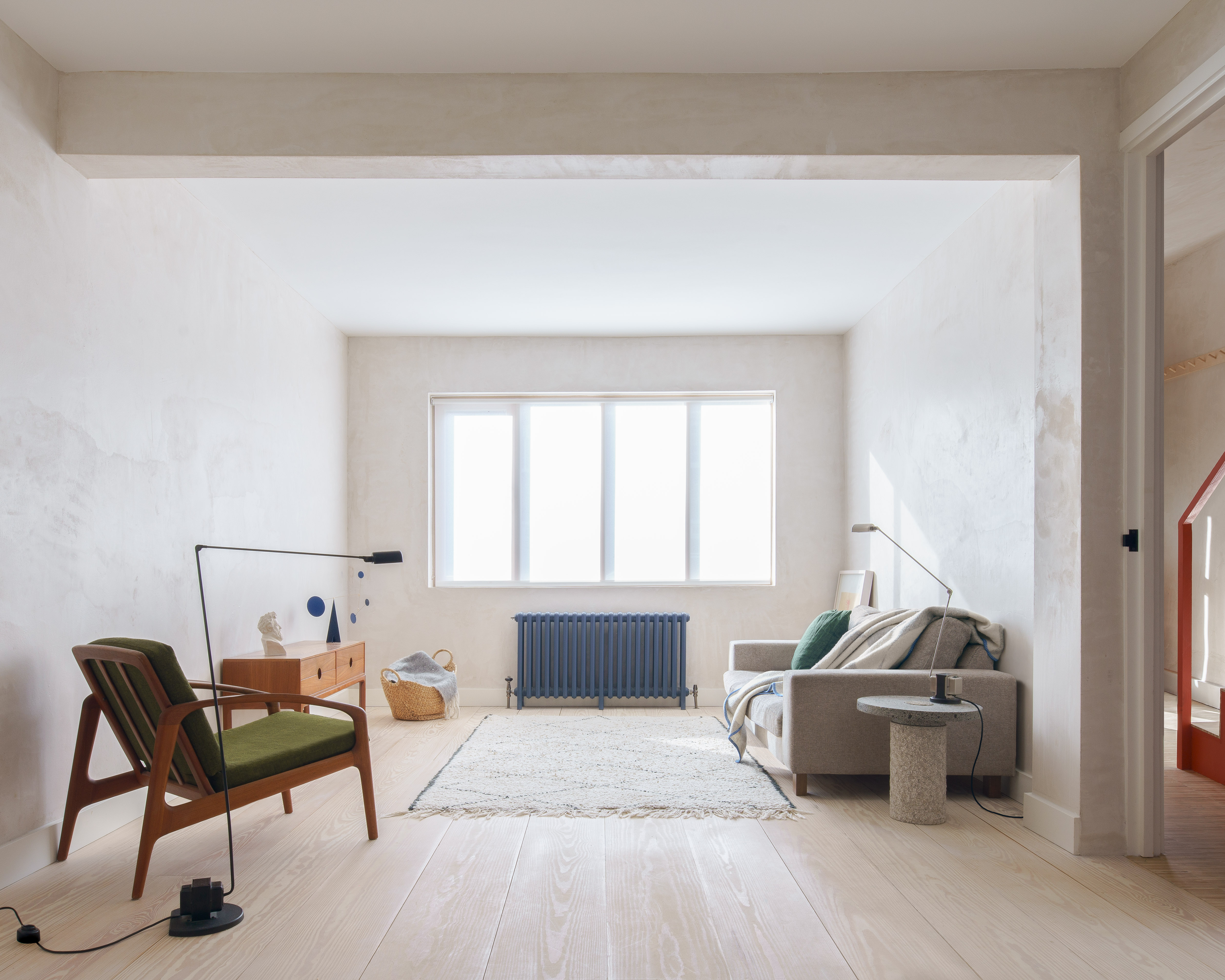
The house had been built in the 1930s, but modified over the the years. The layout had been opened up, to create a footprint that was more rectangular. So Grant's approach was to heighten this sense of space.
'It was about creating open, naturally lit, well-articulated space that offered the potential for flexible living,' he says.
To create a sense of cohesion, floors are a combination of natural materials - large-format, solid, whitened Douglas Fir floorboards from French Forest Floors forming the backdrop 'and unifying the internal spaces,' Grant says.
The Livingetc newsletters are your inside source for what’s shaping interiors now - and what’s next. Discover trend forecasts, smart style ideas, and curated shopping inspiration that brings design to life. Subscribe today and stay ahead of the curve.
This is particularly evident in the living room, where the addition of the area rug makes for a soft and tactile section to relax in, but doesn't cover too much of the floor - it's allowed to be the hero.
Gather round
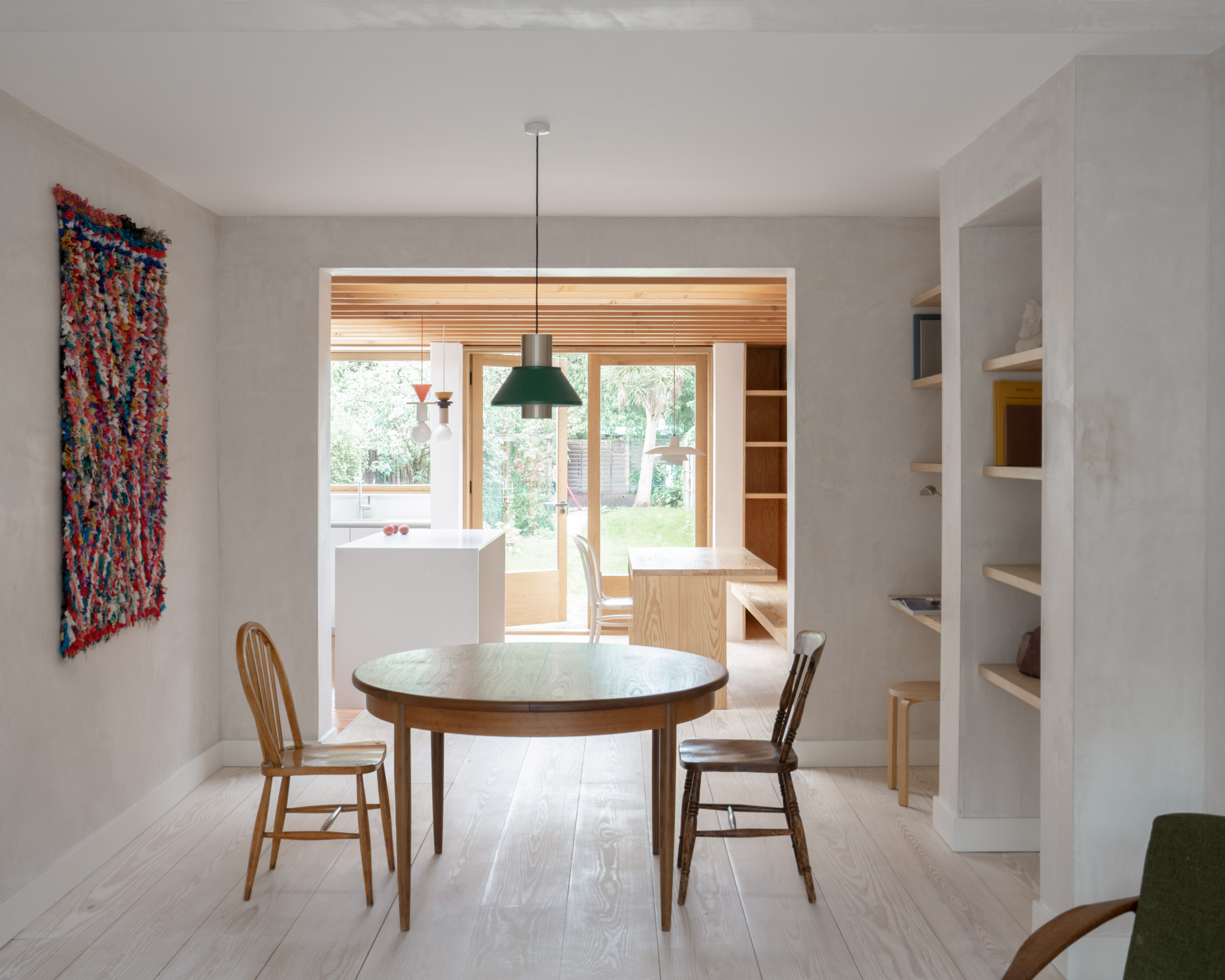
Between the living room and kitchen is a dining room, all part of the open plan space. 'A freestanding bamboo screen is used to partition off the living space, introducing curves that give temporary division and privacy,' Grant says.
However, when that room divider is removed, there is a flow of light that enhances the lime plaster walls, showcasing the simple bentwood chairs being used as dining furniture.
A circular dining table is another clever introduction of curves, once again contrasting with the sharp corners of the home itself. It's here that the minimalist dining room really comes into its own, allowing the eye to pick up on that contrast because there is nothing - or at least, not much - in between the two.
Take a seat
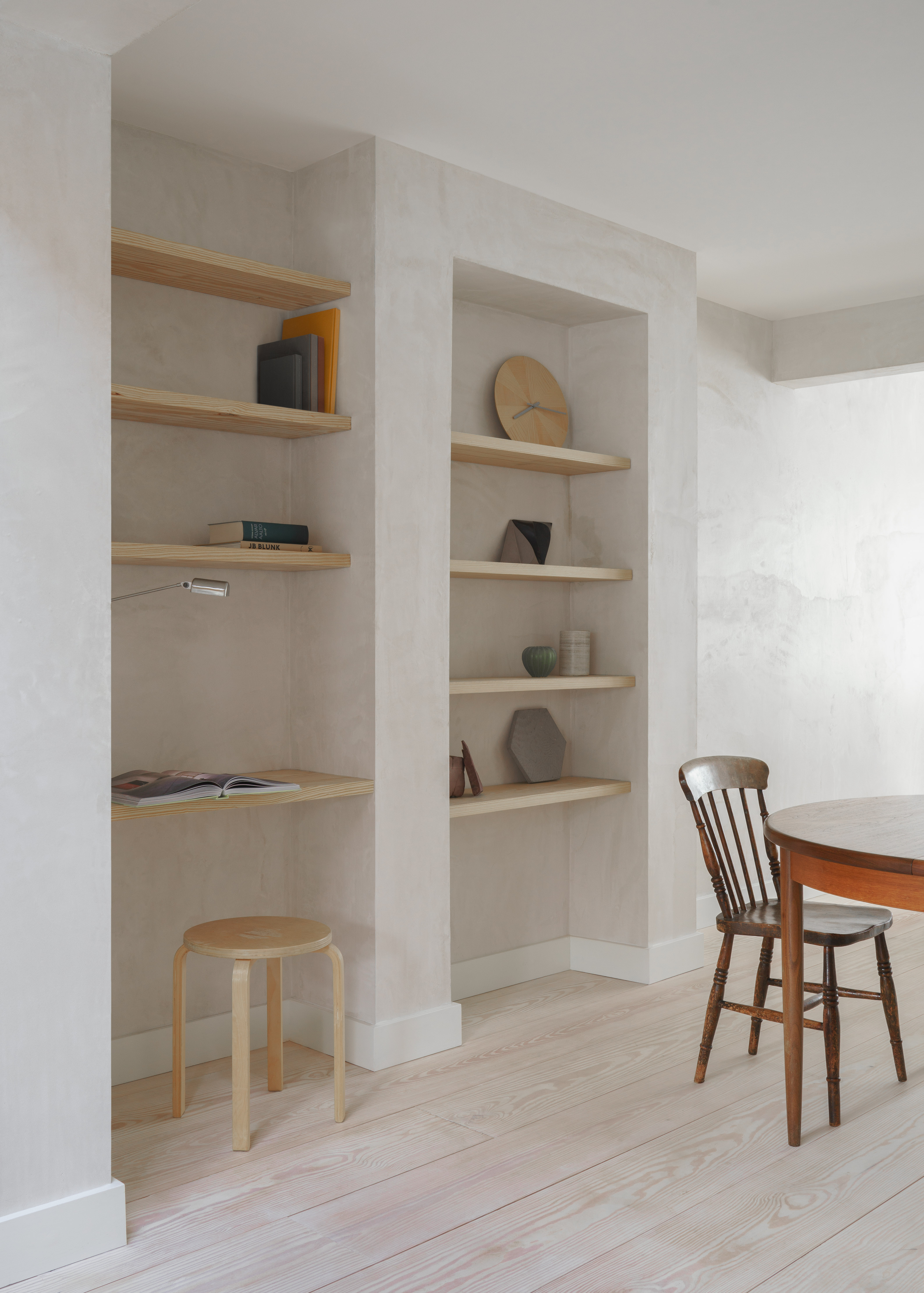
Nestling into the corner of the dining space is a clever little desk set up. It becomes all that is needed to create a reading area or home office.
This is another shining example of minimalism at work. Stripping back the concept of what it takes to have a space to work at, Grant has realised that all it really takes is something to sit on, something to sit at, and some light.
Minimal materials
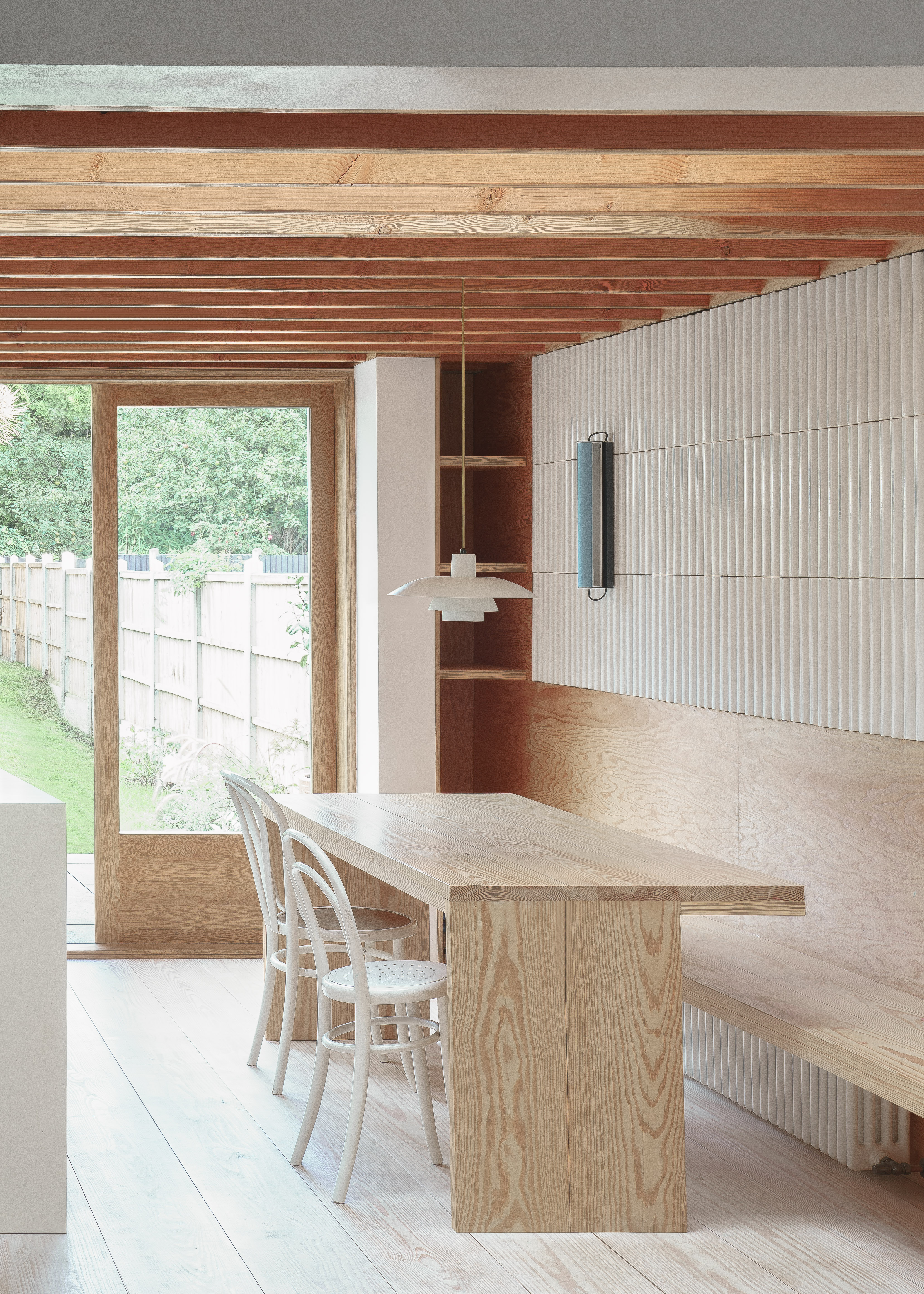
Notice the asymmetry of the kitchen table, a subtle detail that again shows how every corner has been considered. By only having a lip on one side, to go over the built-in seating, the table is ever so slightly more narrow, taking up just slightly less space.
As elsewhere in the home, this is not minimalism in its purest sense. The ridged tiles add an extra element of relief, the kitchen lighting - including the PH 4/3 pendant by Louis Poulsen - is architectural in its shapes. What's particularly clever is how simple the palette is kept - the pale wood table matching both the beams above it and the Douglas Fir floorboards below.
Decorative elements
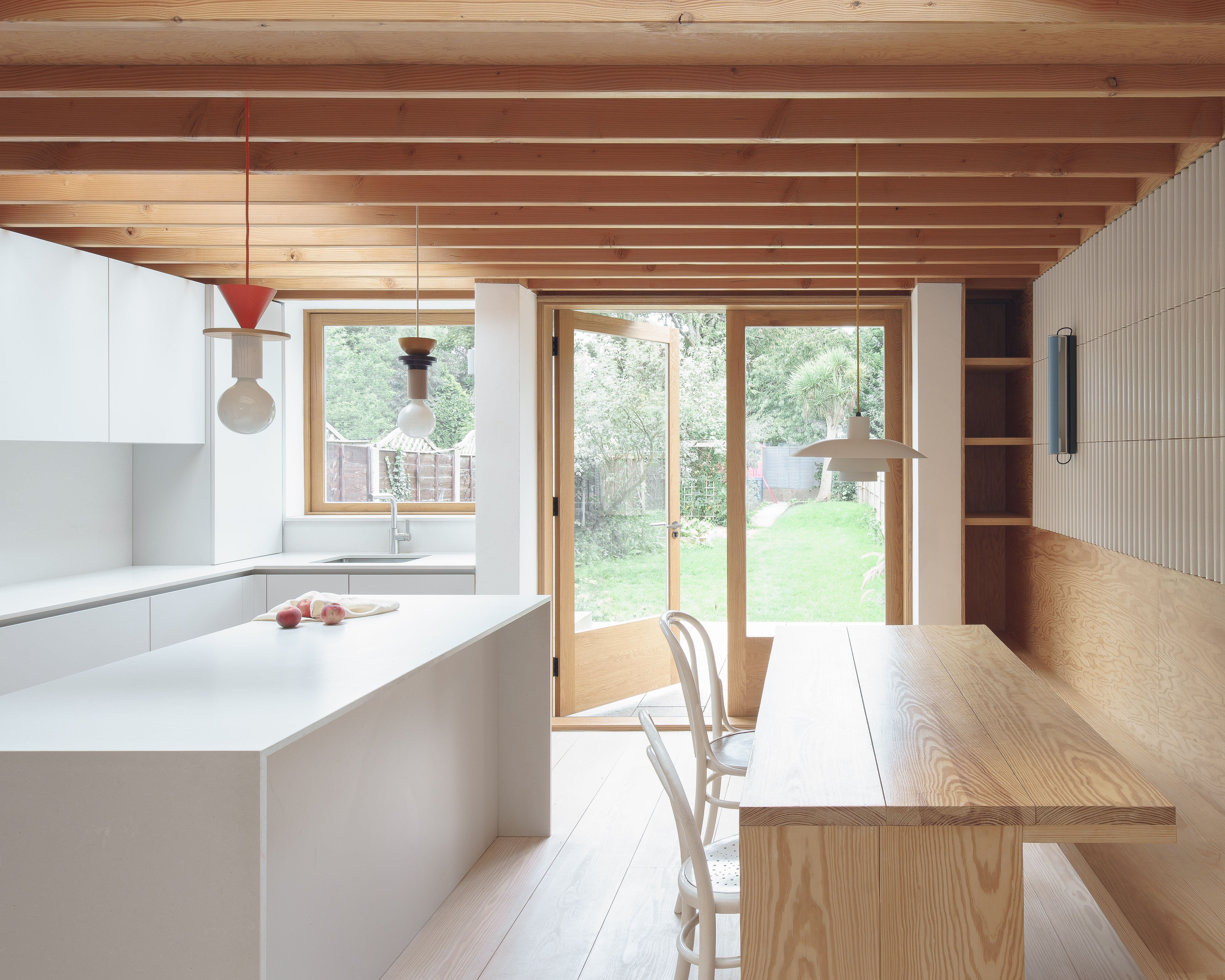
The pendant lights above the kitchen island from Schneid Studio could never be described as minimalist, but they don't detract from the calm sense of space in this design. Flashes of color and a hint of an unusual angle only serve to highlight the simplicity of the rest of the room.
The kitchen is by Halcyon Interiors and worktop is by My Kitchen Worktop.
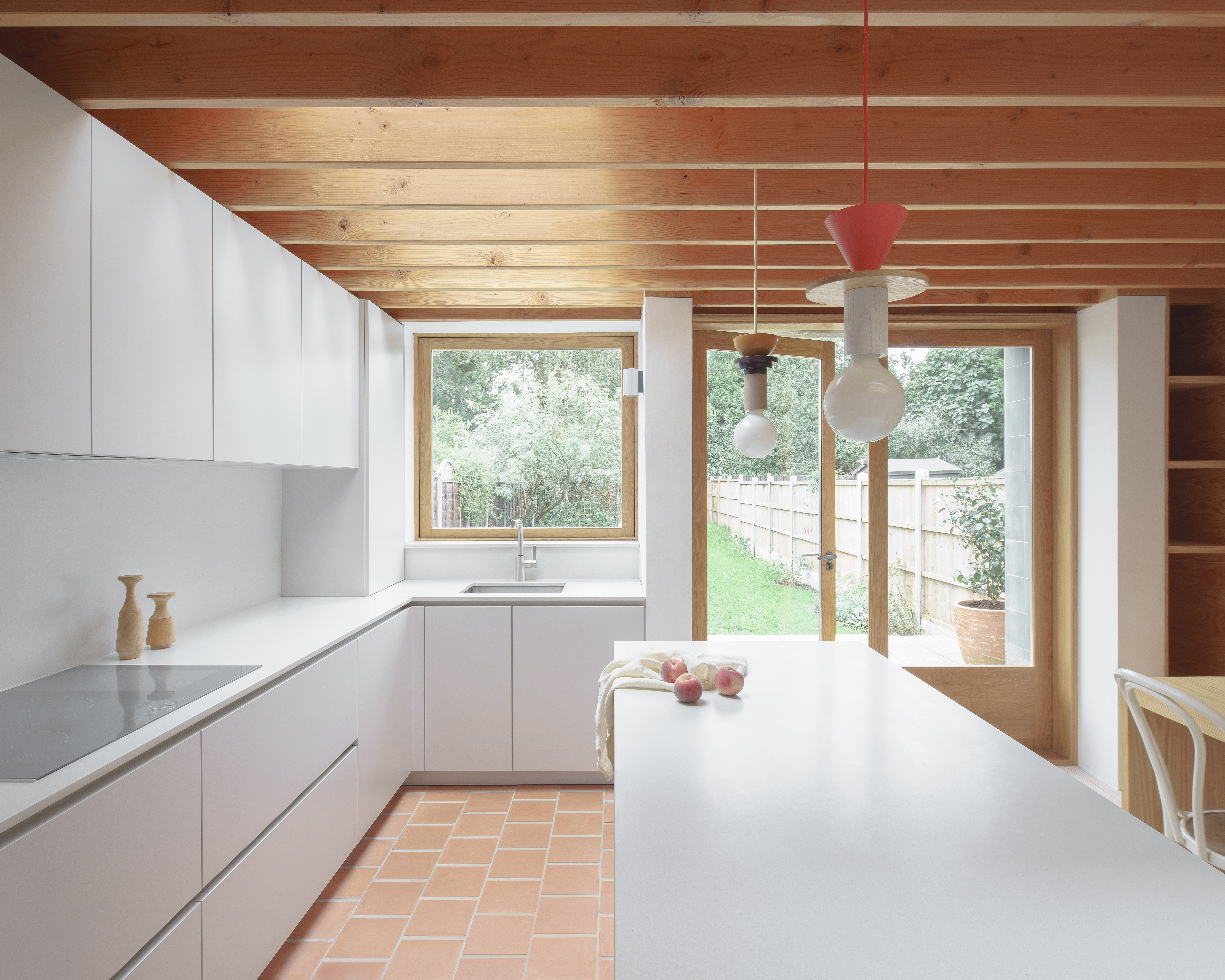
We've seen brick flooring become one of the biggest rising kitchen trends of 2022, beloved for how it brings an earthy warmth to a functional space. And because of its subtle color, it works beautifully in Grant's minimal home.
'The handmade terracotta tiles give a soft, tactile feel underfoot,' Grant says.

Flash of red
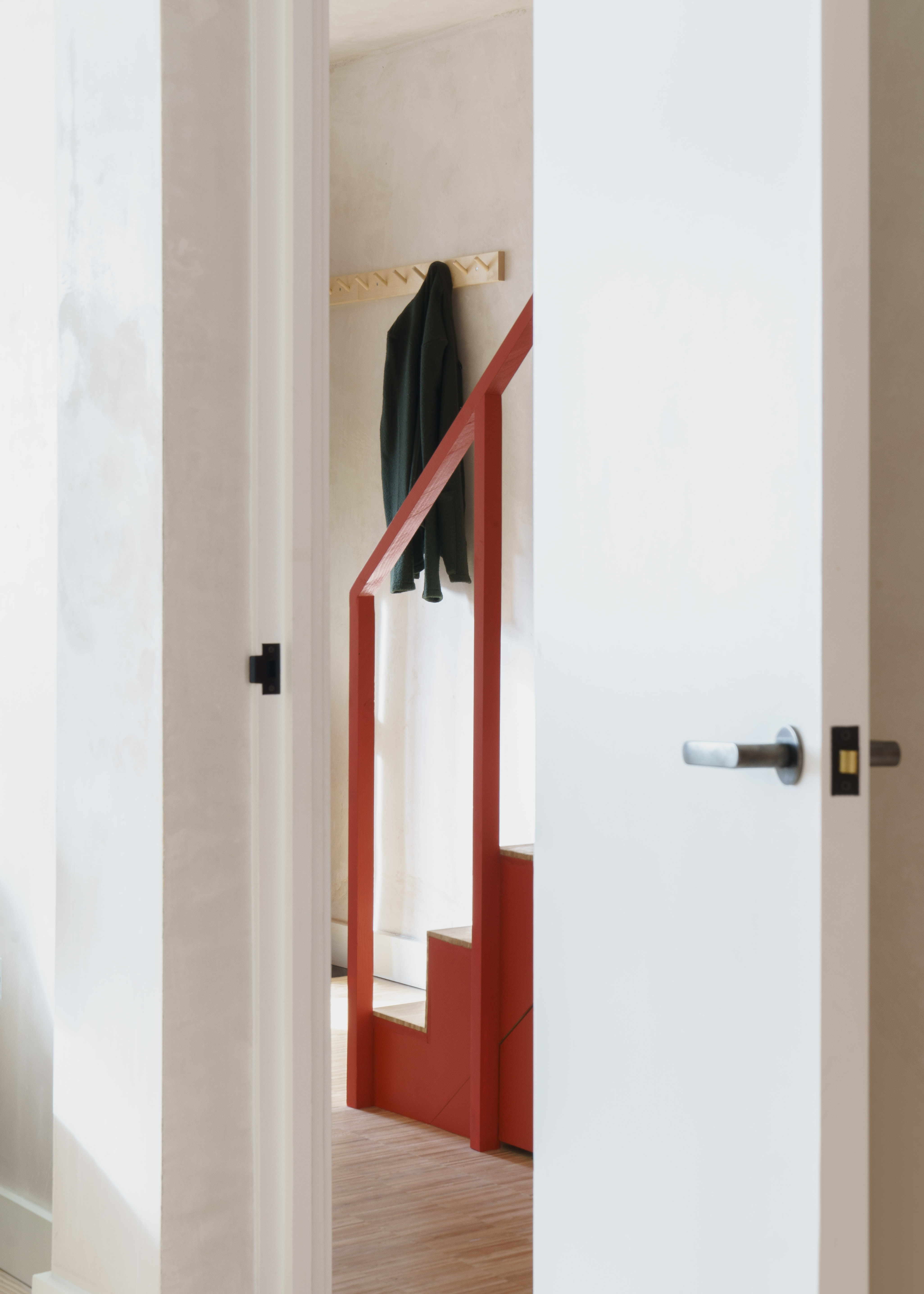
Throughout Grant's home, most of the walls are finished in lime plaster. 'It catches and soaks up natural light, adding texture and depth,' Grant says.
It is also the perfect backdrop to yet another unexpected decorative element, the crimson staircase in an otherwise unadorned hallway. The stairs are made from micro-offcuts of solid ash parquet.
On the up
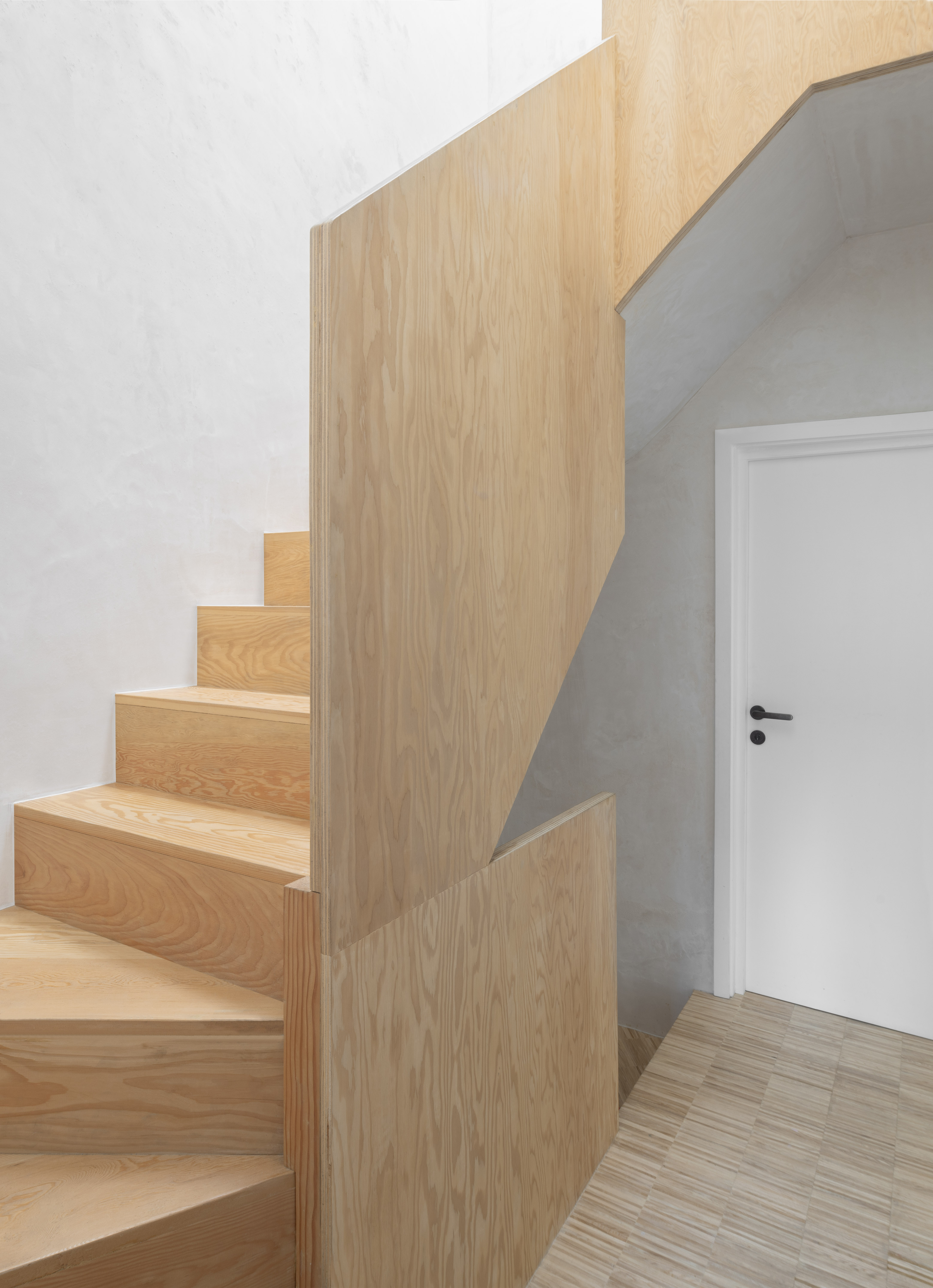
Grant's love of statement stairs continues, with a Douglas Fir staircase leading up to what was once the attic.
'Rising vertically, the balustrade folds to produce a naturally warm and cocooning entry to the main bedroom,' Grant says.
Circle of light
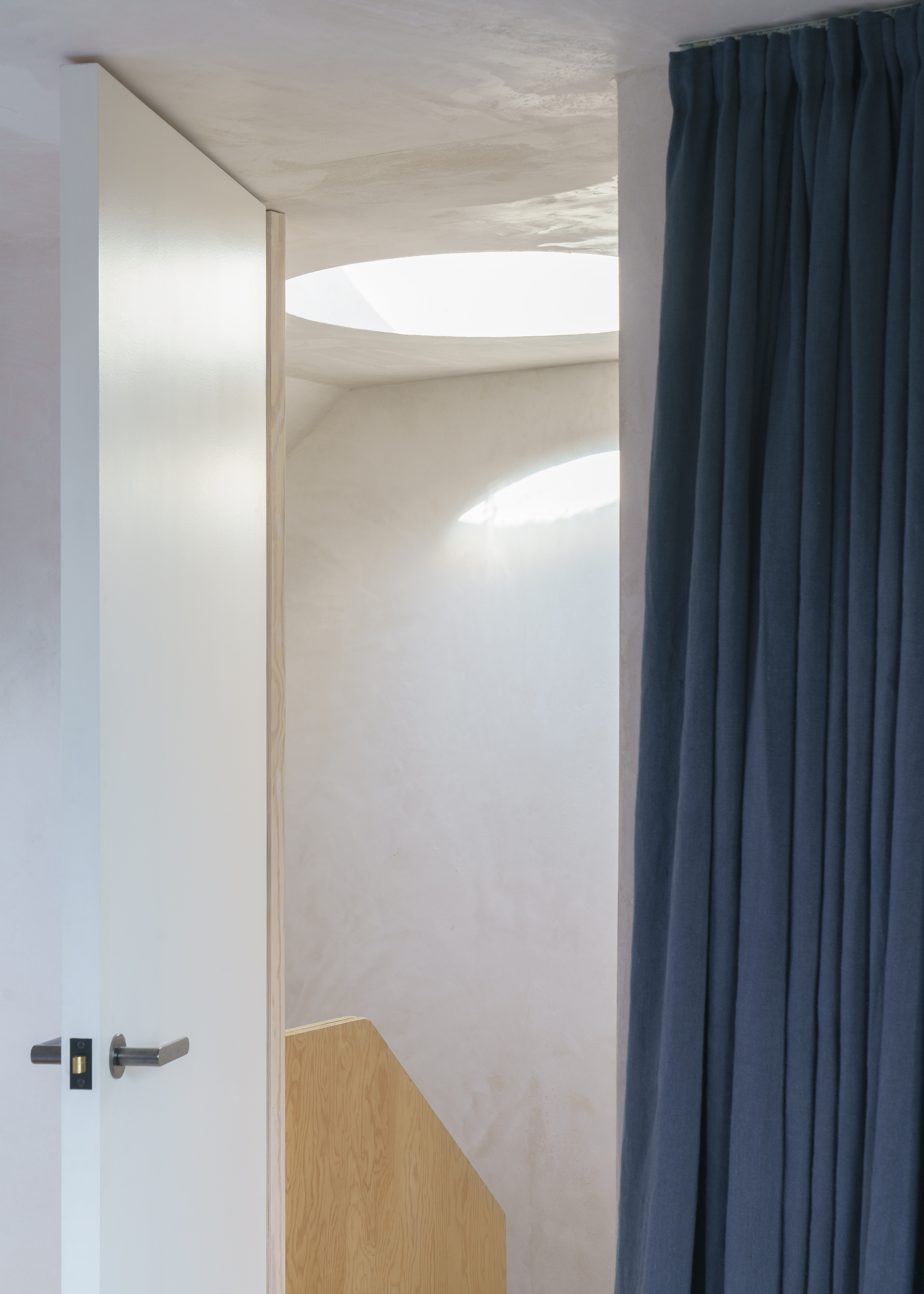
At the top of the second staircase, a circular roof light opens up above, flooding what could have been a dark space with light. 'It punctures the upper volume of the house, and offers protected views out,' Grant says.
Cover up
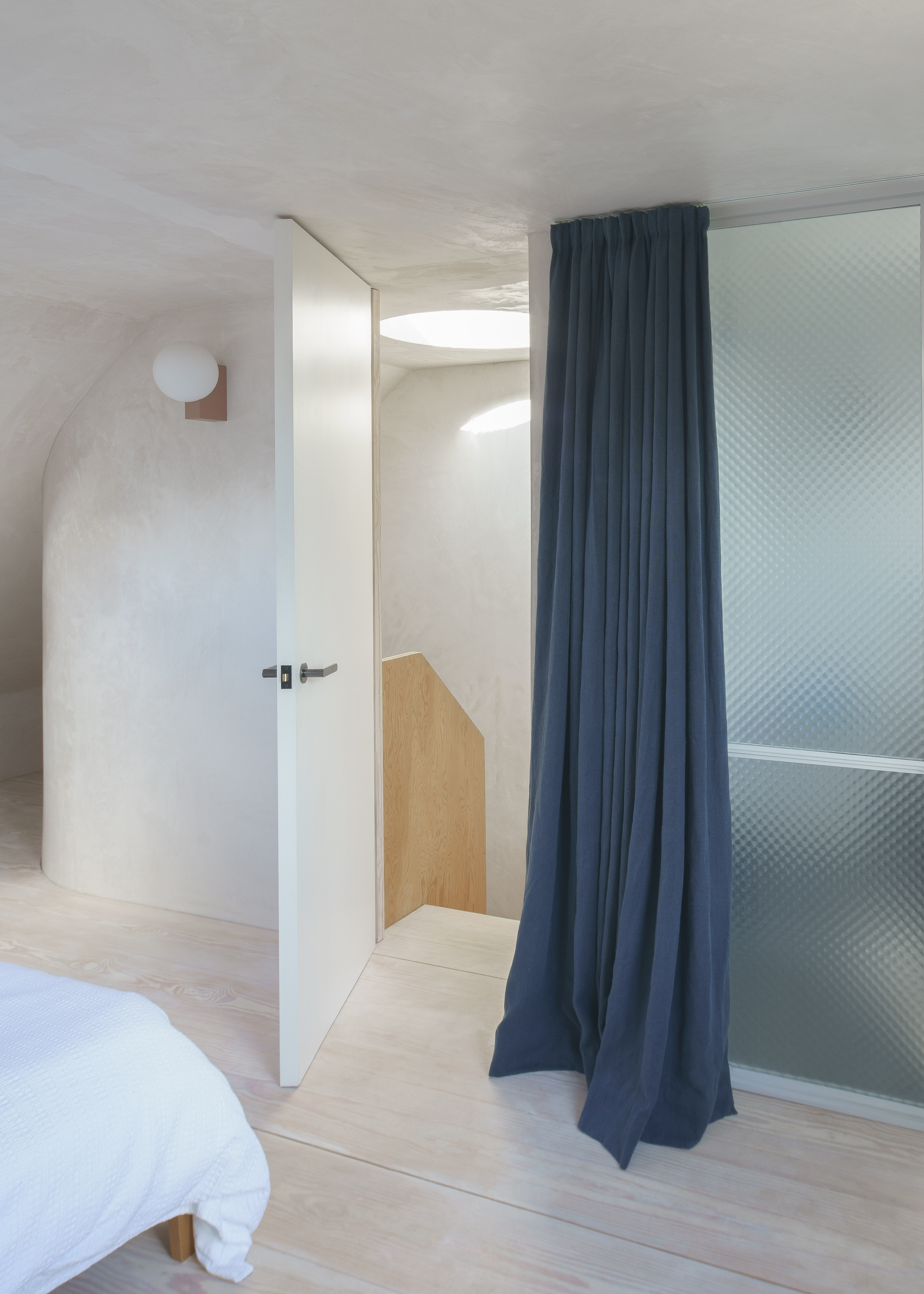
A flash of navy in the bedroom curtains as the drapes are used for the privacy of the en suite bathroom.
The wall light is from &Tradition.
Peace and quiet
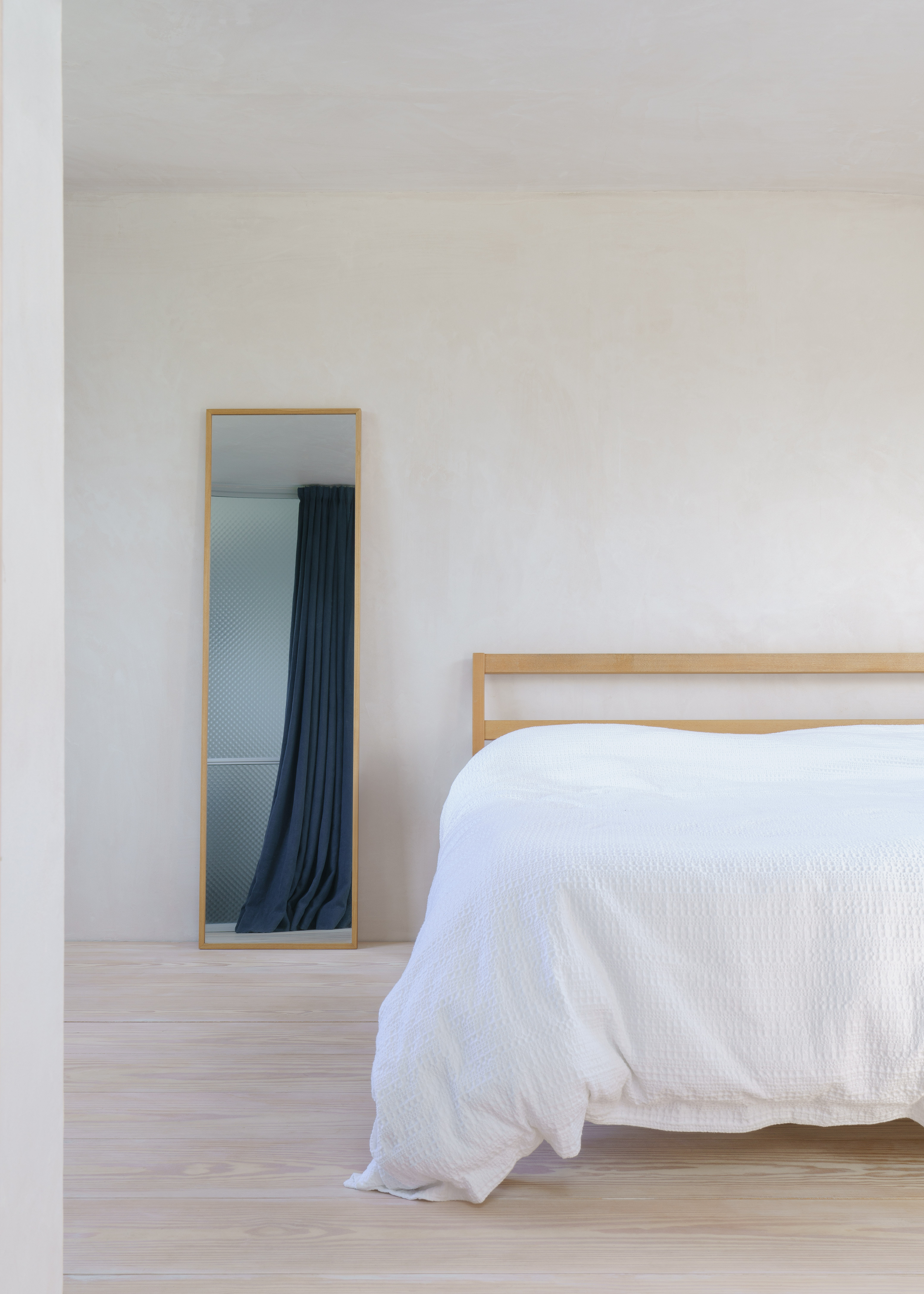
'The previously un-used loft was converted to form a master suite,' Grant says.
And despite its colorful ensuite, the bedroom is a haven of minimalism, with only a mirror hinting that it is used for anything other than sleep. The effect of this space, of stripping out all non-essentials - though admittedly nice-to-haves - such as area rugs, bedside storage or art, is to create a soothing scheme ideal for sleep.
On the tiles
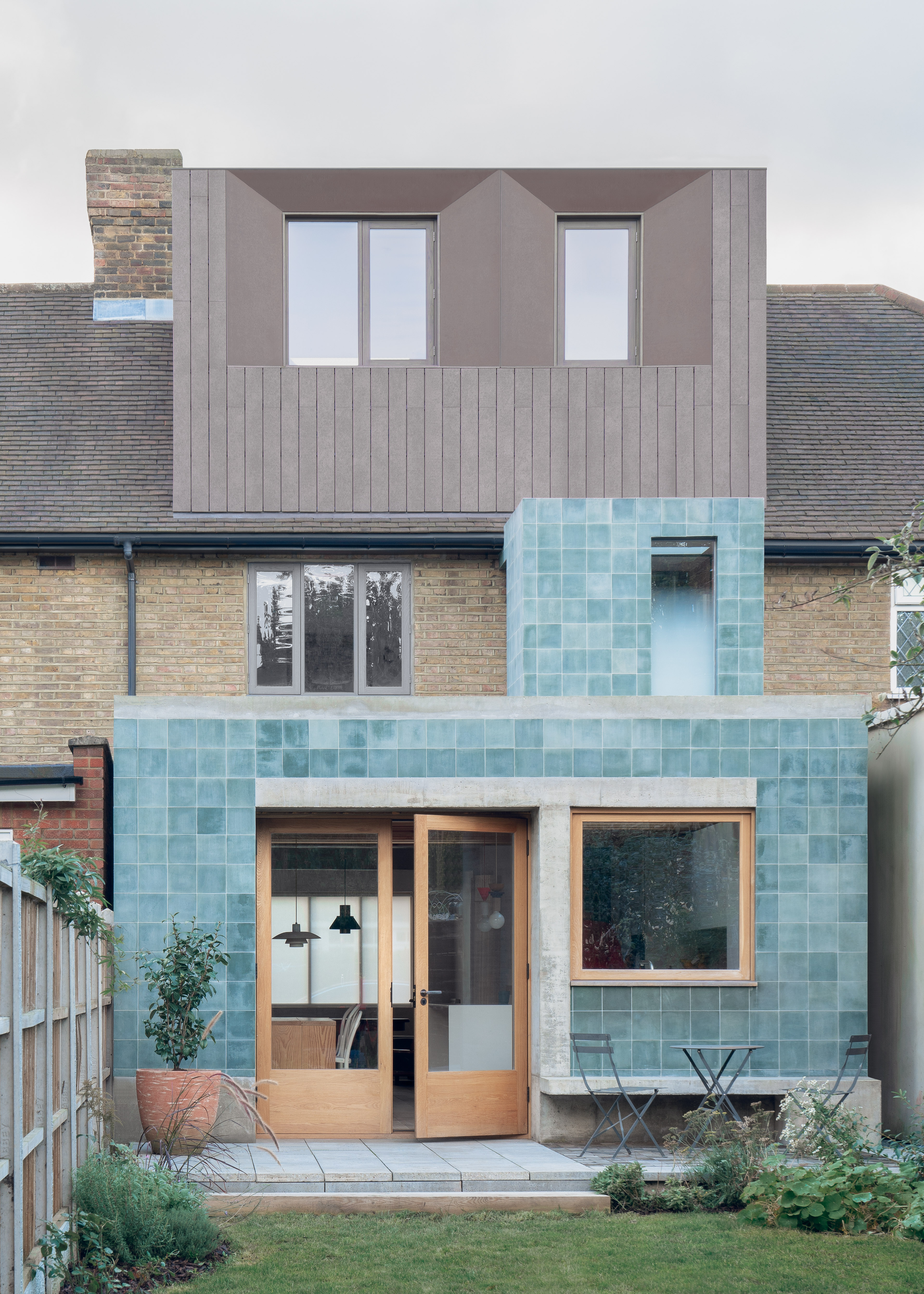
As with all modern extensions, a choice needs to be made as to whether they should be sympathetic to the exisiting build, or stand out.
Of the decision as to how to cover the back of the home, Grant says 'both monolithic rear additions are clad in in square, bold green encaustic cement tiles that have faded slightly with exposure, leaving a soft, dusty aesthetic.'
See more of Grant Straghan's work heading up architectural studio DEDRAFT.
The editor of Livingetc, Pip Rich (formerly Pip McCormac) is a lifestyle journalist of almost 20 years experience working for some of the UK's biggest titles. As well as holding staff positions at Sunday Times Style, Red and Grazia he has written for the Guardian, The Telegraph, The Times and ES Magazine. The host of Livingetc's podcast Home Truths, Pip has also published three books - his most recent, A New Leaf, was released in December 2021 and is about the homes of architects who have filled their spaces with houseplants. He has recently moved out of London - and a home that ELLE Decoration called one of the ten best small spaces in the world - to start a new renovation project in Somerset.
