In Emilia Clarke's New Spy Thriller 'Ponies', "Tangible" 1970s Interiors Are Your Cue to Solve the Mystery, Says Its Production Designer
The plot twists and relationships in the Cold War-era series are "teased by the use of palette, materiality, and iconography," Sara K White reveals to us
It is not every day that two young women get to simultaneously take the lead in a TV series, let alone in a Cold-War era thriller. But if there's one thing instantly apparent from the moment Bea and Twila appear on screen for the first time, it's that the female agents Emilia Clarke and Haley Lu Richardson so vibrantly portray in the newly released TV show Ponies don't just bring emotion into the game, but tons of style, a pinch of humor, and — yes — you read it right: nerves.
Created by Susanna Fogel and David Iserson, Ponies, which stands for 'persons of no interest', premiered this Thursday, January 15, on US on-demand platform Peacock. It traces the adrenaline-fueled adventures of two widows who, following the disappearance of their American spy husbands, Chris and Tom, go to Moscow where they lived under cover, and become CIA operatives themselves, searching for the truth.
Packing the full range of emotions and a handful of intricate, at times puzzling storylines into eight electrifying episodes already available to stream online, Ponies sheds new light on an epoch whose reality has long been distorted by countless preconceptions and stereotypes. To drive its plot forward, then, which frames seasoned actors like Adrian Anthony Lester (Dane) alongside fresh faces like Ukrainian newcomer Petro Ninovskyi (Sasha), is the desire to restitute the manifold textures — cultural, political, emotional, and architectural — of 1970s Soviet life.

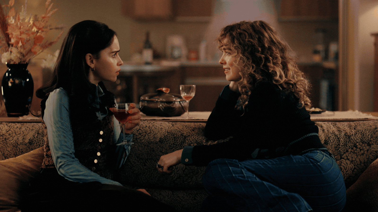
"I knew what the comedy and the drama and the thriller nature of everything in Ponies was, and so I was super excited to support the vision of the show." — Sara K White. Pictured: (l-r) Emilia Clarke as Bea, Haley Lu Richardson as Twila.
It is a desire that Ponies' Emmy-nominated production designer Sara K White (Tallulah, A Kid Like Jake, Bushwick, Obvious Child, Mrs. Fletcher) has satisfied in crafting the series' universe so tangibly. A trained interior designer with a minor in creative writing, she turned to cinema and TV to let her appetite for storytelling run free after befriending some Tisch School of the Arts film graduates at the start of her career.
A long-term collaborator of Fogel, White looked to her contribution to Ponies as "a production designer's dream," she tells me of the 1970s-inspired design brief, joining me on a video call from her sketches-clad, sunlit studio in NYC. "I knew what the general tone — the comedy and the drama and the thriller nature of everything — in Ponies was, and so I was super excited to support the vision of the show."
How Did Ponies' World Come to the Fore?

Pictured: (l-r) Emilia Clarke as Bea, Artjom Gilz as Andrei.
"Something important to Susanna Fogel and David Iserson from the very beginning was that this is a world that has vibrancy to it. The 1970s in the Soviet Union are often depicted as a cold environment; truly, the Cold War becomes the palette. So desaturation, cool tones, and an overall sadness inform the aesthetic of most shows shot in this region in this time period.
"We wanted to represent the breadth of the human experience, even in moments of political upheaval and restrictive social environment. That's a theme that's key to both Susannah's and David's work, and is particularly important to me, especially considering the challenging times we're living through. But we still have birthdays, we still go on first dates. We still want to experience the joy in life.

Pictured: Vic Michaelis as Cheryl, the American Embassy office manager and wife of senior agent Ray (Nicholas Podany), captured during the Christmas party in Episode 01.
"And that was crucial to aesthetically get across to the audience — that there's color, there's pattern, and that the crossover between the Soviet and the American world is a lot more porous than people would have known. The idea that the curtain fell — it was perhaps more sheer, that curtain, than people gave it credit for. And that the influences that went both ways across that Iron Curtain were a lot more numerous than some might assume."
What Helped You Bring That Nuanced Reality Back — And Capture It Faithfully?

"And that was crucial to aesthetically get across — that there's color, there's pattern, and that the crossover between the Soviet and the American world is a lot more porous than people would have known." — Sara K White. Pictured: The Elton John concert location in Ponies.
"One thing I was surprised to dig into was a tremendous archive of films made in Russia at the time that I found on YouTube. Mosfilm, the country's largest and oldest film studio, was certainly pumping out more propaganda films than not in those years. But they did show Moscow with a much broader palette, reflecting the true life of people in the clothing and some of the decor elements they had back then in a way that we don't see in American films, a color palette I have definitely drawn from in Ponies.
"There was also a fair number of photographers who had crossed into Moscow from the West as the city began opening up to capture what the real living experience was like. And it wasn't all bread lines — it was also discos. Things that were starting to be profiled by news outlets as they became increasingly intrigued by what was happening on the other side of the world. On the other side of the Cold War."
What Role Did Local Architecture Play During Both the Research and Filming Stage of the Series?

Pictured: (l-r) Haley Lu Richardson as Twila, Lili Walters as Ivanna.
"Brutalism was a huge inspiration for the making of Ponies, but that's something that immediately jumps out when people think of late 20th-century Soviet architecture, being so specific to both the era and the region. Going way back into the history of Russian architecture and the socioeconomic forces behind the revolution that allowed communism to take hold in my research, though, I realized there is a variety of architectural movements that preceded brutalism that are even more linked to the 1970s and the Soviet Union.

Pictured: Haley Lu Richardson as Twila, moments before one of the most suspense-filled passages of Ponies Season 1.
"It was fascinating to discover that those buildings were not all torn down immediately upon the rise of communism, but that, instead, we still had this grand, beautiful Russian architecture that came about in the czar era, some of which we were able to feature in Ponies further down the line.
"Location scouting started as soon as I got to Budapest, where we filmed. Throughout my time there, I was informed by the materials in the edifices around us, most of which were built between the 1960s and the 70s or in the late 1800s. We had a 60% out-on location to a 40% built-set shooting ratio, and needed to marry those two aesthetics.

Pictured: (l-r) Petro Ninovskyi as Sasha, Emilia Clarke as Bea. Sasha, we find out, is covert Russian collaborator of the CIA in Moscow.
"Some crew members had grown up under Soviet rule, which gave me a better understanding of that reality and lifestyle. I relied on them to define the textural palettes, based on the resources available in the region and the buildings that the local Muscovites would have been living in. Oh, and to remove any trace of Hungarian from street signage!"
How Does Color Relate to Ponies' Plot?

Ray and Cheryl's dining room and kitchen in Ponies.
"One of the things we paid attention to was that, although there were certainly concrete and gray tones in the metals used in many of the buildings of the time, we also had a bunch of local stones and marbles, which could be woven in to obtain a very rich, ruddy aesthetic. Lots of deep oranges, reds, and pink tones that could help us push our palette into something we could support with the practical locations we had chosen.

One of production designer Sara K White's original sketches for Ponies. Pictured: the layout of Bea's diplomatic apartment.
"This distinction gave us a better-defined distance between what was meant to be a Soviet space, or an environment characterized by those warm red tones, which obviously worked thematically with the Russian flag and so forth, and the American experience, which we'd represent by layering in the cool tones across the decor.
"In Ponies, different characters have distinct color palettes based on their proximity to being more American or more Soviet. It doesn't matter whether those characters come from Russia or not — some Russian characters' home environments have a palette that is a bit more American-inspired, because their closeness to the American experience is stronger than the KGB would have liked."
Can You Give Us an Example of How Palette Reveals More in the Show?

A peek inside the space-y American Embassy office in Ponies.
"One of the first episodes of Ponies features a scene that we shot inside an old university gym, which we redressed for Sasha (Petro Ninovskyi)'s workshop. From the moment we walked in, it had a teal-y, turquoise-green aesthetic to it, but it also embodied a fun crossing of the two spheres.
"This is where Sasha, a local collaborator of the CIA, develops secret Soviet gear intended for Russian spies. What I find most fun about it is how a quick look at his work and involvement with the US reveals just how mediocre tech was on either side of the Cold War. There were plenty of American-developed things that worked beautifully or didn't work at all, and the same was true of what the Soviets created.

Pictured: (l-r) Emilia Clarke as Bea, Haley Lu Richardson as Twila.
"Having said that, not all of the color palettes that appear in Ponies are necessarily loaded, and that is intentional. What we were trying to convey with the look of the series is that the two cultures were a lot more connected than people want to believe. And that, while America's and the Soviet Union's socioeconomic and political structures looked like they were, at least in principle, radically different, functionally, they impacted society in a very similar way.
"The tone of the spaces inhabited by the protagonists of Ponies reflects that blending of perspectives. With the benefit of hindsight, we are now able to see how linked human nature makes every social and political system to another, whether or not we want them to be."
What Specific Interior Elements Embodied the Soviet and the American Sphere in the Series?

Pictured: Emilia Clarke as Bea in the American Embassy office.
"The US world was probably best represented by all of the Steelcase furniture that was so iconic of that American era, which was so hard to source while working in Budapest that we actually ended up having to custom-create it. Our set-deck construction team was responsible for manufacturing all the desks that appear in the Embassy, as well as in the CIA office throughout Ponies.
"The Bubble, the most secret space in the entire Embassy, was also built entirely from scratch by them. Featuring wood sound baffling-coated walls like the sound booths of the era, it's made of bespoke, pyramid-like, removable panels that we developed and hand-painted ourselves, using a mix of foam, structural steel, and custom-bent Plexiglas.

A digital rendering of the so-called Bubble office, the most secret space in the whole of the American Embassy in Ponies.
"In the Russian spaces, something we played with considerably was the wallpaper. It's hard to overstate how incredible the layering of wallpaper and rugs in the Soviet environments really was — both at the time and in our historical and cultural references. It was really important to get all of that stuff right and be responsive to the era. A lot of the wallpaper you see in Ponies was custom-created by our graphics team. We were inspired by what was real, but actually getting what we needed in the quantities we required to decorate all of the spaces was impossible. So we worked on our own patterns and palettes."
Ponies Proves 1970s Decor Is the Design Trend That Keeps on Giving — And Coming Back. Why Is That?

Pictured: (l-r) Nicholas Podany as Ray, Haley Lu Richardson as Twila.
"The 1970s design aesthetic is fun in a way that isn't always true of other interior genres. Due to the moments of social and political stress we're living through, it feels like people want to do one of two things: they either want to retreat into a Zen-like environment where things are calm, simple, and quiet, so that the chaos outside feels distant. Or they crave a playful moment that brings a little levity into their lived experience. Recently, more people are turning away from peaceful, beige tones to seek out a little joy, embracing brilliant colors and quirky patterns that feel unafraid.
"Narratively, it was a dream decade to work with for Ponies. Just think about the role objects used to have in someone's life: the 1970s were peak time for stuff in a way that I know a lot of production designers, myself included, miss, because the physical representations of people's characters were always on display.

Pictured: (l-r) Nicholas Podany as Ray, Adrian Lester as Dane, the head of Moscow's CIA office.
"If you wanted to listen to music, you had to have a record with a picture of your favorite artist on it, and you'd have your entire LP collection stacked up, so that when your friends came over, they could see it. They didn't have to get into an app to see what you were listening to — it was there. That was true of all of the books you read or didn't read, as well as the media you consumed.
"So there is a real tangibility to the personalities of each of the characters in Ponies, and to the era they inhabit, because that was how life had to be lived at the time. And I think it offered us a more immediate connection to the quirks of each person than we generally experience in life right now. Maybe today your phone case says something about you, but until you actually get into someone's socials to see what they like, you're not able to immediately understand who they really are in a way that you could when you were living in an environment where physical media was king, still."
I Guess the Layeredness of That Type of Decor Lent Itself Well to Holding Clues to Ponies' Plot...

"That was part of what we were trying to explore in Ponies: how, on either side, there was a goal for creating a better experience for people living in a society. And how, in both instances, things didn't work out quite like people were hoping." — Sara K White. Pictured: (l-r) Emilia Clarke as Bea, Haley Lu Richardson as Twila.
"That's right. So there is a mole in the American Embassy. And one thing that I was excited to do was tease that by the use of our palette and materiality that is identifying Soviet spaces, bringing it into the living environment of the person who is revealed to be our mole. In the headboard of the bed that two of the characters in Ponies share, for example, we have inset the marble from the Soviet buildings that we've been exploiting in the visual language of the show. We have also placed some custom-created wallpaper featuring both red stars and bears in it in their home environment.
"So if you're paying keen attention, you'll notice these small moments of iconography that connect this protagonist to the Soviet environment. As they have been there for much longer than other characters in the show, their access to goods that would have been Soviet is also much higher. In Ponies, we were able to bring in both of those aspects into the set in the form of hints for a careful viewer."
What Were Your Favorite Moments on Set?

Another one of production designer Sara K White's preparatory sketches, this time for the American Embassy office.
"One of the most exciting experiences I had coincided with the series finale, where a set gets lit on fire. An extremely memorable part of this was that my mom came to visit me when we were doing it. It was truly enjoyable to share the process of dreaming up this office space with her, and even more liberating to be given the chance to burn it down afterwards.
"Another unforgettable aspect of working on Ponies was visiting the factories of the era — some of which we used as the KGB's secret lairs in the show — and defunct nuclear power plants. What was informative about that was realizing that each of these factories was its own little town, and it attempted to give back to the workers through on-site amenities like schools and theaters. Although eventually, without adequate support from the power structures of the day, they fell apart.
"Even so, it was interesting to see that dream — and how it didn't come to pass. That was part of what we were trying to explore in Ponies: how, on either side, the Soviet and the American, there was a goal for creating a better experience for people living in a society. And how, in both instances, things didn't work out quite like people were hoping."
What's the Greatest Lesson Ponies Taught You?

Pictured: (l-r) Haley Lu Richardson as Twila, Emilia Clarke as Bea.
"My experience of Ponies was made even more thrilling by the huge number of cast and crew members who were born in either Russia or elsewhere in the Soviet Union, and who informed us greatly on this journey. Working with a predominantly local team in Budapest helped me become immersed in the process that our lead characters must have gone through in being thrust into living within a culture and an environment they didn't know.
"Design-wise, what was inspiring was finding a way to communicate specific values through the sets. So, you have the American ideal of being free to do whatever you want without the need to hide yourself, which is why the Embassy office and the apartments are open-plan. While in the Soviet experience, you'll find plenty of tight spaces, each partitioned off into an enclosed system through a door. It's a contrast that got me thinking: what's scarier — or better — hiding yourself in the open, or locking yourself in a closet? Again, these are two ways to achieve the same goal. One is pretending like nothing is wrong. The other is hiding what's wrong."
Ponies is available to stream on Peacock (US only) now.
Read about the behind-the-scenes of Ponies and can't stop thinking about what your next watch will be? Revisit our interview with Cristina Onori, the production designer of The White Lotus Season 3, ahead of the series' anticipated return, delve into the sets of The Buccaneers Season 2, or discover the psychology behind Backrooms' chilling labyrinth.
Want to travel in time? Explore our latest deep dive into 80s design trends, inspired by the great success of Stranger Things' grand finale.
