The New Look of Period Drama — The Buccaneers' Production Designer on Bringing a Fresh Eye to Historical Interiors
For Apple TV+'s original period drama, the rebellious spirit of its American debutantes is just as present in the room sets as it is in the storyline
Period dramas have a reputation for being a little 'dusty', design-wise. We're all too used to a gray-toned London serving as a backdrop for even our favorite historical soap operas, but dark drawing rooms and stuffy heritage homes don't necessarily offer heaps of inspiration for the interiors-obsessed among their audience.
However, shows like Apple TV+'s The Buccaneers are reimagining what the period drama means through its set design. With a maximalist, saturated color palette, the sets that the headstrong protagonists inhabit reflect the sense of disruption to the status quo that the characters, themselves, bring to the story. Based loosely on Edith Wharton’s unfinished last novel, this transatlantic drama tells the story of a group of wealthy American girls who are dropped into the rigid hierarchy of Victorian London. But, how does the set design tell this story?
Livingetc sat down with Markéta Kořínková, the production designer of the second season of The Buccaneers to talk about rewriting the rules of period drama set design, one gilded hallway at a time.

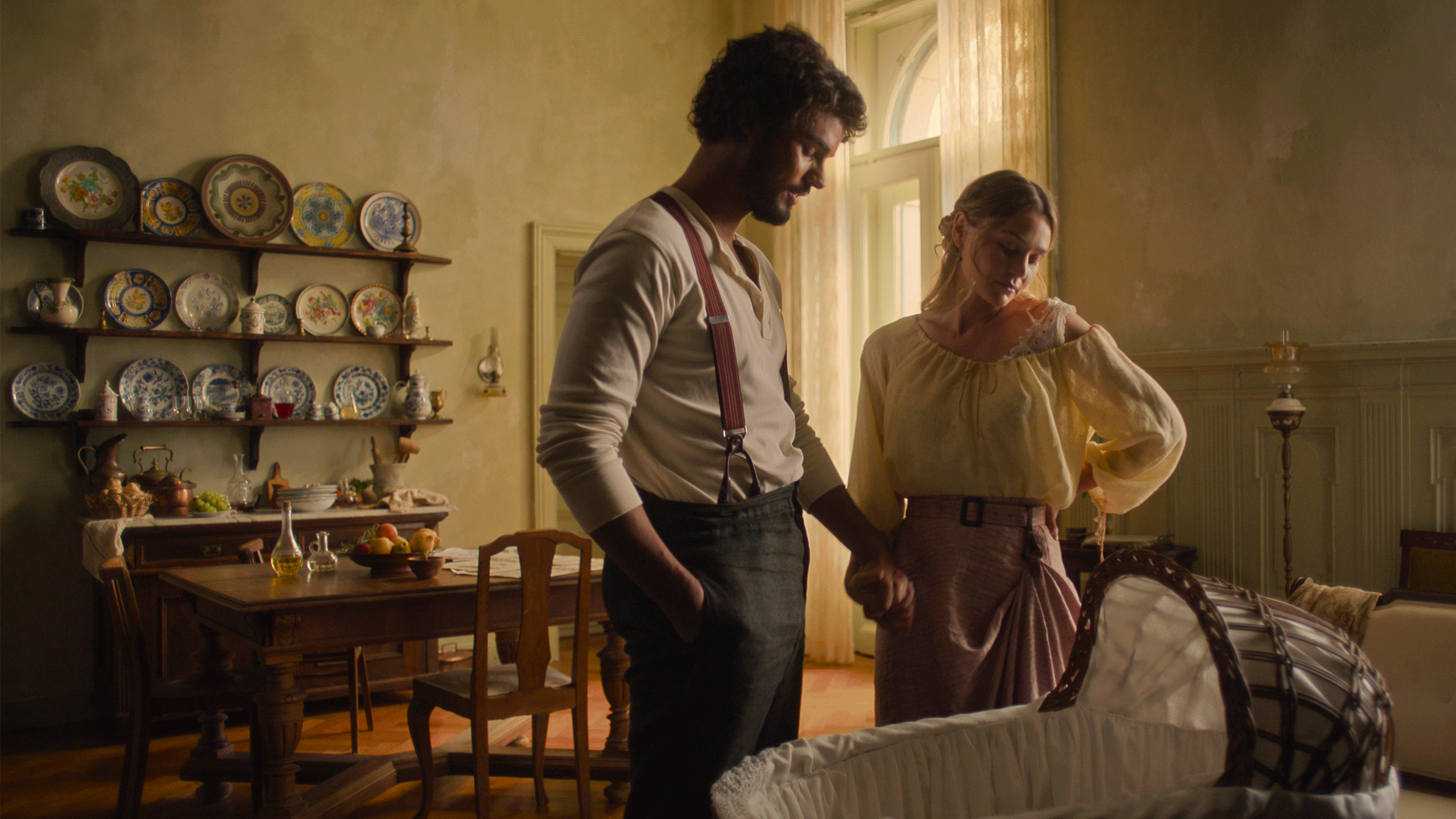
Season 1 had already set the stall for The Buccaneers' visual storytelling, Markéta tells us. "[It's a] late Victorian world with a contemporary twist — bold block colors, breathtaking landscapes, and stunning locations. We took this DNA and infused it into the new settings of our season," the production designer explains. "Most of the season is set in new places, but we inherited the iconic Tintagel castle exteriors (and a couple interiors), so we were expanding this world, adding new gardens with a wedding marquee, rooftop scenes, and a whole suite of interiors: the Duke’s quarters, the Dowager Duchess’s rooms, a mausoleum, and a beautiful guest bedroom where Nell and Mrs. St. George have the most heartbreaking conversation."
Where Do You Look for Inspiration for the Sets for The Buccaneers?

"It's a bit of a cocktail. I start with paintings and illustrations (notable mention to Eduard Vuillard, Félix Vallotton, John Singer Sargent and, well, many others), old films ranging from classic Hollywood to the Czechoslovak New Wave (The Daisies) to the ’90s (Age of Innocence, Martin Scorsese). Fashion editorials present and past (I love Tim Walker), architectural history, antique catalogues, historical photography (Flashbak), and blogs (Messy Nessy Chic, Library Time Machine), museums and archives (V&A, Sambourne House). I also take a rather immersive, part flâneuse, part psychogeography approach — wander through city streets, reading up on their history, hunting for hidden traces and pockets of time, imagining what they might have looked like — how did it feel to be there — and dream up our film world."
How did you balance the more traditional design elements while keeping that contemporary feel in this period drama?

"This was a delicate balancing act. We created a world set in the late 19th century, and infused it with contemporary aesthetics and a touch of fairy-tale fantasy — building a world that had its own inner logic and rules. We knew we could be bold, but the contemporary elements should never distract or disorient; everything is there to serve the story, the feeling, the characters. We were also aiming to create an elegant, classy look — no ugliness was allowed.
For the traditional side, I believe if you want to break the rules, you first have to know them inside out. So, we researched the period through galleries, museums, books, antique shops, literature, and I even listened to lectures by Victorian scholars on what the Victorians lived like. I soaked it all in to develop a kind of visual vocabulary, imagining what life back then might really have felt and looked like. Then we ran that Victorian world through a contemporary filter, added a dash of fantasy, sprinkled in occasional visual metaphors—whilst keeping an eye on the aesthetics, always elegant. When it made sense, it was opulent; when it was supposed to be a bit quieter, it was simple... and somehow it all came together.
One key principle was never to go against the traditional Victorian style and feel. Contemporary choices were always an echo, a nod to the old times. Take the wallpapers, for example: modern, yes, but their patterns were rooted in traditional designs. The interiors could be exuberantly cluttered with pattern and colour and objects or, in contrast, almost minimalistic — like Jinny and Guy’s Italian home, which resulted in a kind of Victorian shabby chic. It’s a space that feels a little like exile: basic, but cozy. We used a melange of styles and inspiration."

"Take the wedding / midsummer night dream marquee: a real mix — Victorian glasshouse meets wedding tent with antique Japanese canvas panels, dressed in a style of a dreamy beach wedding furnished with antique garden furniture. Another rule was to use period-appropriate details whenever possible. Whether it was Conchita’s logbook or gas chandeliers — a lot of care went into getting these right. But we also had a cheeky rule: if it’s not period correct but it’s gorgeous, it’s worth considering — and quite often, we did!"
How Does the Difference in American and English Spaces Play Out in the Set Design?

"The set design’s job is to serve the story and the characters. Every detail was carefully chosen to highlight those cultural contrasts without ever feeling forced — because the sets are really just another way the story speaks. The differences between Americans and English had to come through naturally. Both London and New York of the late 1880s had their own distinct look, and even with our touch of fantasy, we made sure they felt very different — not just in architecture and color, but in scale and technology too. The London street where Conchita lived was white Regency stucco; the streets that served as New York had Victorian buildings with facades of dark stone and generally a much larger scale.
For interiors, it really depends. Public places and institutions are impersonal, and were designed to evoke the mood we wanted to create, for example enclosed or ambushed, while private spaces reflected the personality of their inhabitants."
How Important a Role Does Color Play?

"We followed color schemes for each world and each character — because color isn’t just decoration, it has a powerful emotional language. At the same time, we needed to make sure the world felt different from scene to scene, while keeping the story’s flow smooth. The audience should always understand subliminally where they are, without ever feeling disoriented. So, keeping an eye on the color scheme within the bigger picture was also key.
When it came to characters’ homes, their spaces were shaped by their energy, tastes, and backgrounds. Conchita’s place, for example, is maximalist to the extreme — lavish textures, bold patterns, and details that scream elegance wrapped in exuberance. This maximalist interior is completely over the top, just like her. The colors — aniline pinks and blues — weren’t typical Victorian palette choices, but they did exist back then (I found a Ashmolean Museum exhibition Victorians in Colour absolutely inspiring).
The colors were just not used quite like this — in this particular combination, for wallpapers, for fireplaces. Theo’s rooms in Tintagel, by contrast, are all dark oak and gentlemanly tradition, with just the occasional flash of eccentricity — an artist quietly enclosed by convention."
Are There Any Hints to the Storyline in the Set Design?
"Oh, absolutely — design elements are quietly whispering the story all the time. Sometimes they shout the story — some props even drive the narrative, especially newspapers and letters. Victorian newspapers had a very specific look, and our brilliant graphic designer, Barbara Sandberg, nailed the right balance between historical Victorian press and contemporary tabloid: using authentic fonts, illustrations, mastheads, and ads, but then she gave it a playful twist, blending that old-world charm with the boldness of a modern tabloid: oversized headlines, eye-catching layouts. The result? A perfect hybrid, a love child of Victorian decorum and today’s loudest press, that fits perfectly within The Buccaneers’ world.
The settings themselves are crafted not just as backdrops but as emotional landscapes. Later in the show, when we move into institutions, their official, austere atmosphere underscores the gravity of the story, creating a stark contrast with the warmth and chaos of the domestic interiors. Every detail is there to support the storytelling, to deepen the mood, and to keep the audience feeling where they are — both physically and emotionally."
What was Your Favorite Detail to Design in Series 2?

"I have to say, I enjoyed designing pretty much every set in season two. Each episode brought something fresh and exciting, and now that more episodes are out, there’s so much more to look forward to. I’d rather not give away too much — so stay tuned!
The Dowager Duchess was one of the subtle, intriguing characters with a rich backstory and a fascinating inner life. She has her private quarters at Tintagel and then she has a little pied-à-terre elsewhere, and as her story unfolds, you realize she’s not quite what she seems… and that is reflected in the look. But I’d be spoiling the fun if I said more!
But maybe I can drop another innocent hint: New York street... I’ve turned European locations to New York streets before, once even won a Tribeca ad festival award for an ’80s Wall Street recreation in Barcelona. There are certain tropes you always lean on: steam rising from tubes, roadworks, yellow cabs, street signs. Now, the underground was just being built in the time of The Buccaneers, so we used the steam, and construction fences, and although cabs back then were black and dark, we painted parts of the carriages in yellow. We shot this street in Glasgow, and it was genuinely touching to see locals bring their children, saying: 'This is New York a hundred years ago, it’s like time travel.' So, stay tuned and keep an eye out — there’s magic in the details, and there's plenty more to come."
And, most importantly, are you team Guy or team Theo?
"Ha! I’m not saying, because honestly, I don’t know. Guy embodies the passionate, instinctive, Dionysian spirit that follows his heart rather than the rules, while Theo represents reason, duty, and reflection, the Apollonian principle... but then Theo can't help but reach for that Dionysian sparkle, too.
For me, the characters and their story represent timeless tension between heart and mind, chaos and order, freedom and responsibility... it's impossible to make a choice! I'm a lot like Nan in that sense... But one thing is for sure: later in the season... I’m definitely team Christina Hendricks."
