Before and after – a dingy, dated ski retreat in Utah now looks unrecognizable thanks to one major change
A soft, bright color palette and a spattering of metallic accents work together to elevate this home

The Livingetc newsletters are your inside source for what’s shaping interiors now - and what’s next. Discover trend forecasts, smart style ideas, and curated shopping inspiration that brings design to life. Subscribe today and stay ahead of the curve.
You are now subscribed
Your newsletter sign-up was successful
After a family decided to permanently relocate to their ski retreat in Park City, Utah, they realized their dated mountain home was in serious need of a revamp. LA-based interior design firm AE Design was called in to renovate and furnish the entire house, transforming it into a warm and inviting family home incorporating natural stone, layered textures, and varying wood finishes harking back to the home's heritage.
'Our clients had previously used this home for an occasional ski trip to Deer Valley,' explains Amy Elbaum, founder of AE Designs. 'During the pandemic, they decided to uproot from Chicago and move to Park City full time, but the house was not in great condition for full-time use, so, we were called in to fully update it into a family home that could be used year-round.'
Here, we take a peek inside to see how this dark and dingy mountain retreat has turned into a stylish modern home that's light and airy, with just the right amount of luxury thrown in for good measure.
Kitchen
Before
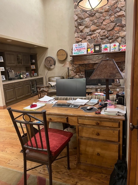
Prior to the renovation, the spacious open-plan kitchen was suffocatingly dark despite the lofty ceiling height, setting the theme for the rest of the home. Distinctive hallmarks of a mountain home such as the wood flooring and stone fireplace contributed to a rustic and rugged interior, but they also dated the space.
As Amy Eblaum of AE Designs explains: 'The entire house felt dark and that was a big part of the objective - to lighten things up but keep with the original character of the home.'
After
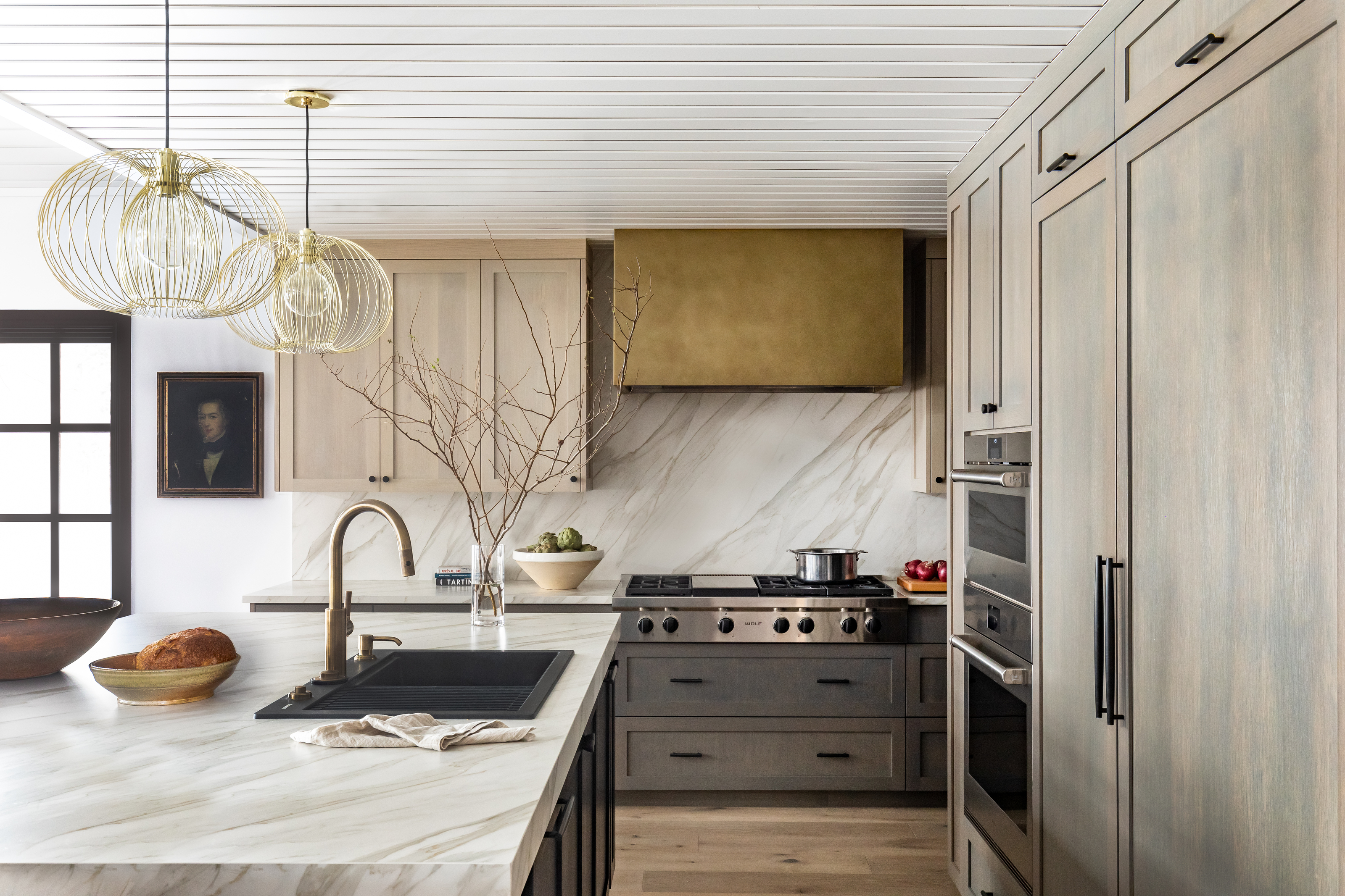
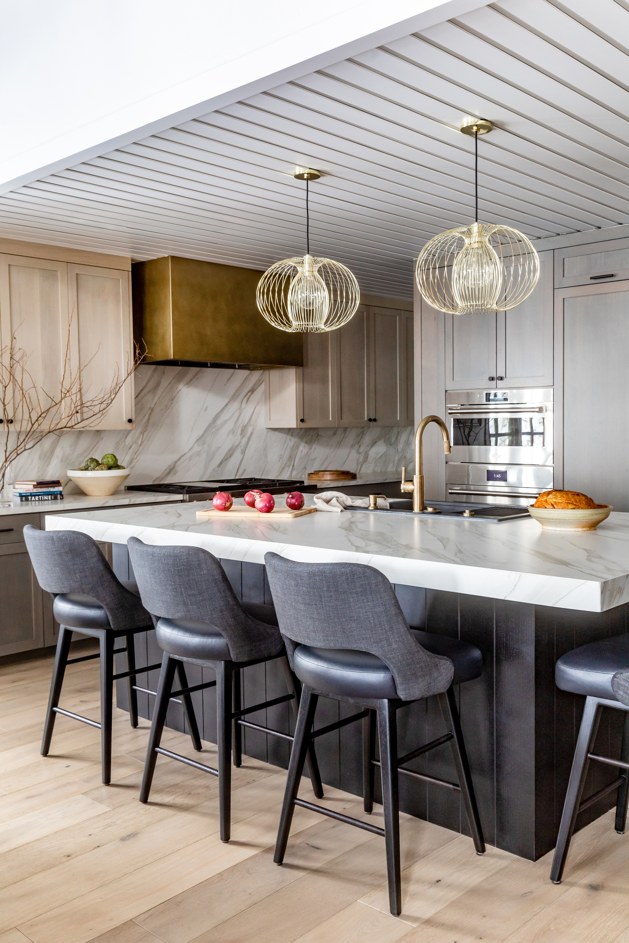
And that's exactly what they achieved. After Amy and her team worked their magic, this space is now a bright, airy, and inviting family kitchen that's almost entirely unrecognizable.
Much of this is down to the pared-back neutrals incorporated in the color palette. Spanning from the soft grey seating to the sandy tones of the shaker cabinets, with just the right amount of metallic tones in the plumbing fixtures, lighting, and oven vent, this carefully curated scheme does wonders for the space.
The Livingetc newsletters are your inside source for what’s shaping interiors now - and what’s next. Discover trend forecasts, smart style ideas, and curated shopping inspiration that brings design to life. Subscribe today and stay ahead of the curve.
'We used a lot of wood cabinetry of varying shades in this house to give it a warm feel,' says Amy. 'We like to bring brass into homes as an additional warmth factor. The aged brass finish on the hood breaks up the wood while introducing another complementary material. We are so thrilled with how it turned out.'
Dining area
Before
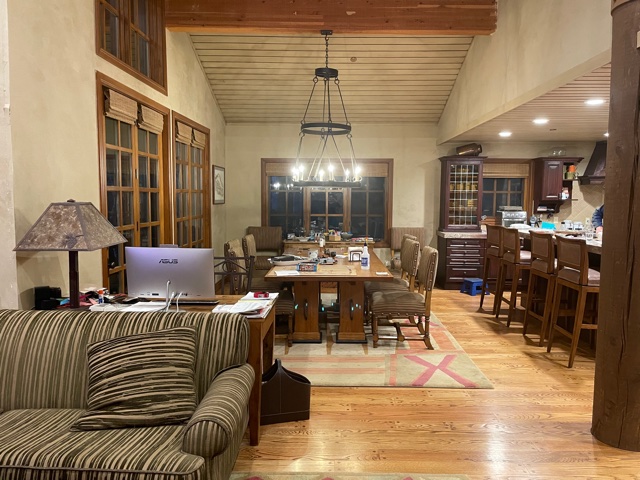
The same dark theme was apparent in the original dining space, too. Despite the high ceilings, exposed wooden beams, and large windows, the brown and grey tones completely overwhelmed the space. The large dining room showed lots of potential as a convivial space for both family and guests to enjoy time together, but the design fell short of inviting.
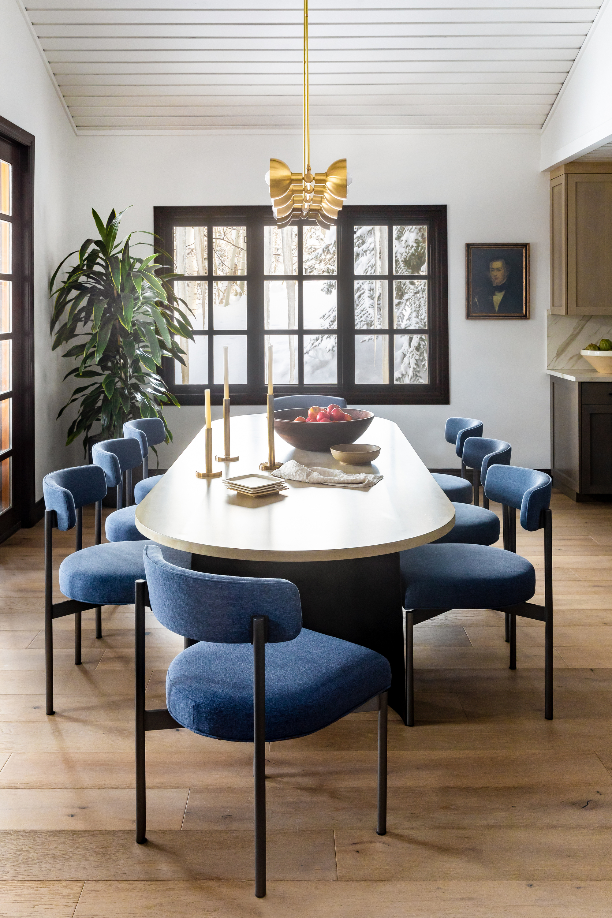
After
Thanks to the deeper shade of window trim, lighting flooring, and a bright lick of paint on the walls, the contrasting colors help to lift the space and make it feel far airier.
As a mountain property, it was important to tie the natural scenery outside the four walls into the interior design, blurring the lines between outdoors and in. 'The beautiful windows showcase snow a lot of the year but also beautiful greenery in the summer,' Amy explains. 'The use of natural materials such as wood, stone, and metal will compliment those views throughout the year.'
Brighter pops of color are also introduced in this space through the dining chairs, helping to inject character and personality, traits that were previously lacking. 'The clients are definitely fans of color, especially blues,' Amy adds. 'We used deep blues throughout the home as an accent color which works really well with the dark brown trim. Because this home has a warm, cozy feeling we utilized deeper colors that would compliment that feeling.'
Get the look
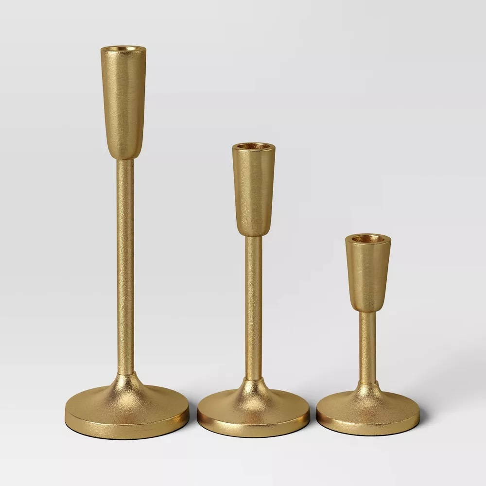
Perfect for dressing up your dining table, these gold effect taper holders are bang on trend for a transitional style that's at once traditional and modern. The set of three comes in various sizes, all offering a luxe way to light up your space.
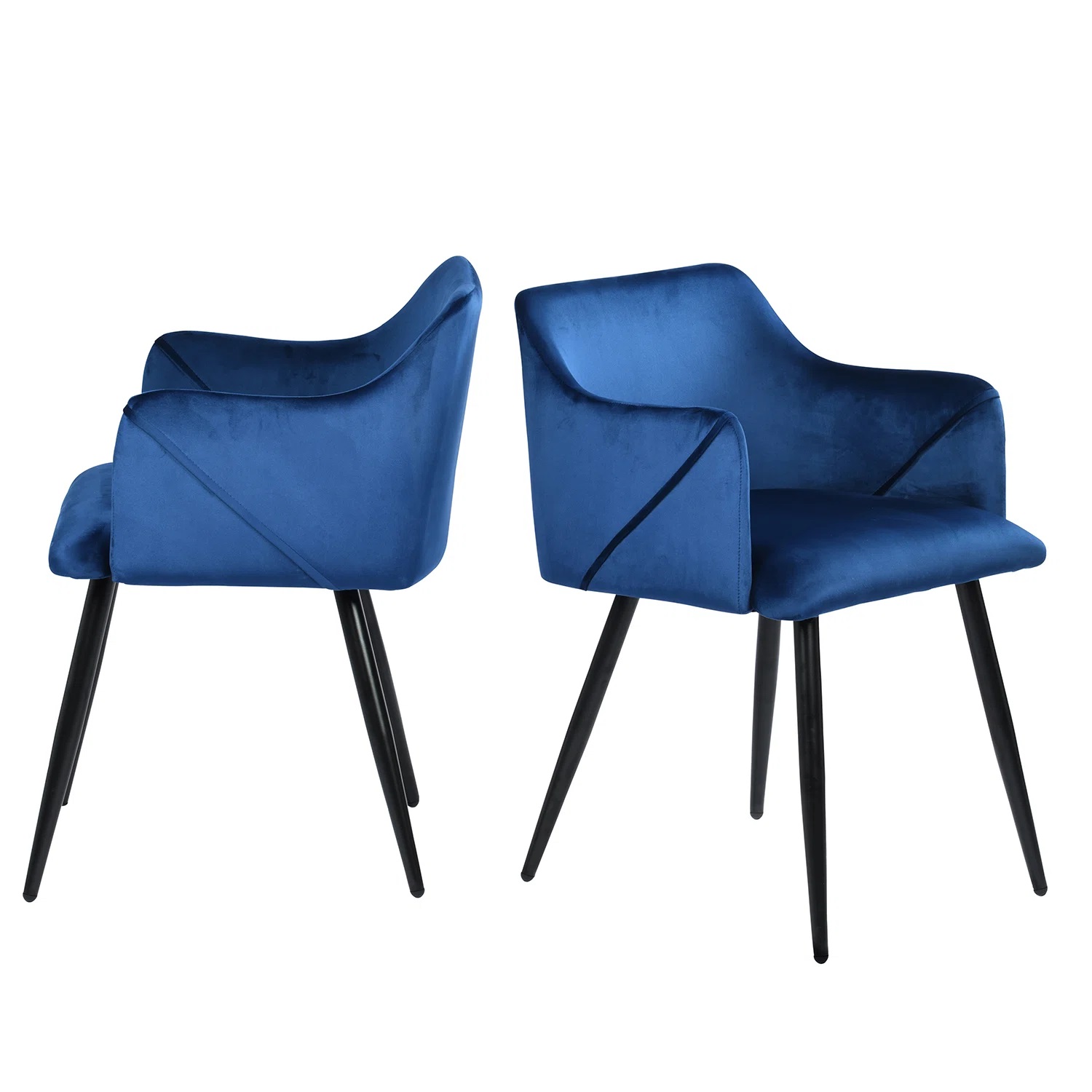
With its sleek lines and cushiony seats, this 2-piece set of dining chairs brings a contemporary accent to your dining room. They’re made from steel and engineered wood, with splayed, tapered legs that add a hint of mid-century modern style.
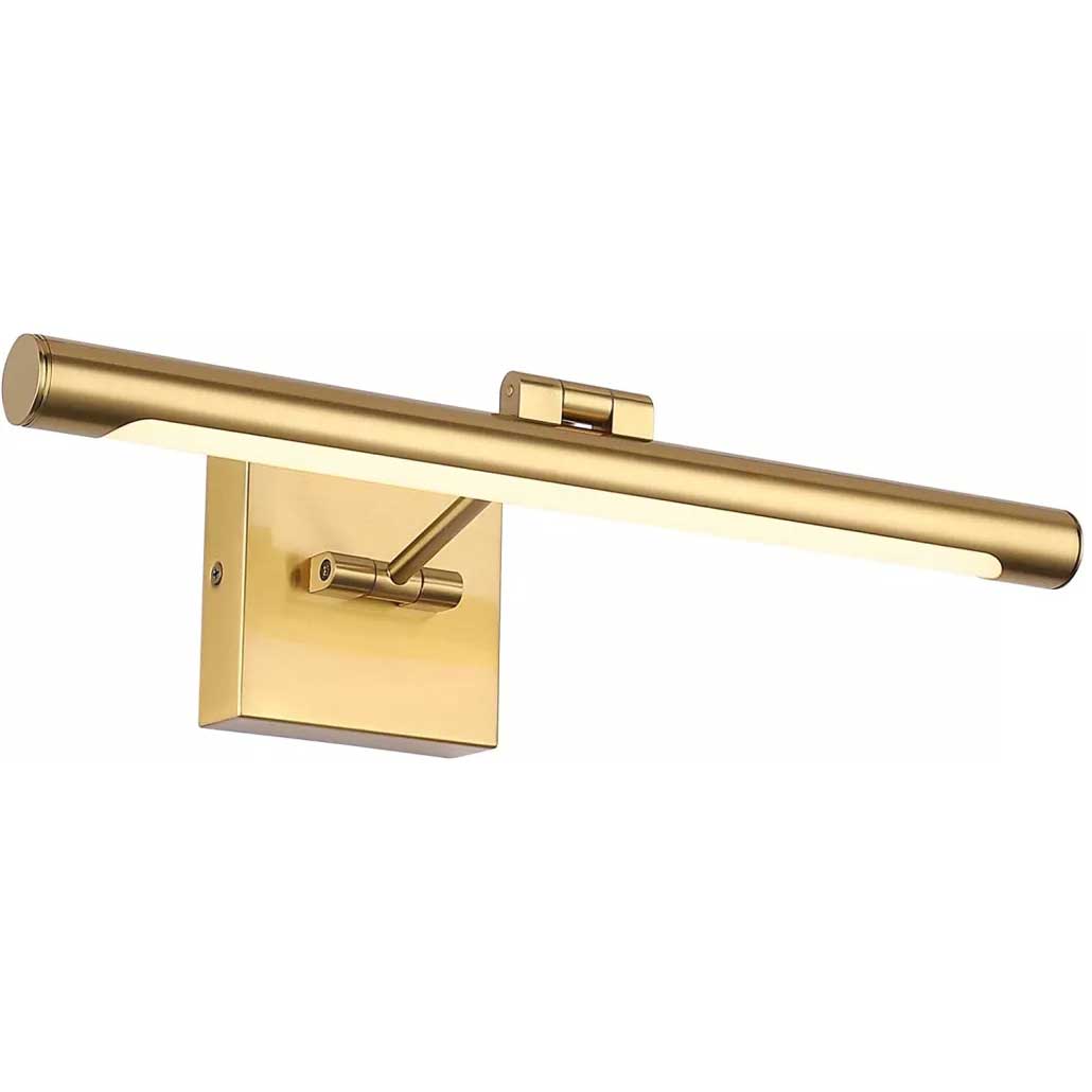
This brass effect sconce picture light from Amazon brings a classic look to your home with its single swing arm. The LED dimmer lets you soften the light in the evenings while the 90° swivel head allows you to swing the bulb up or down.
Living room
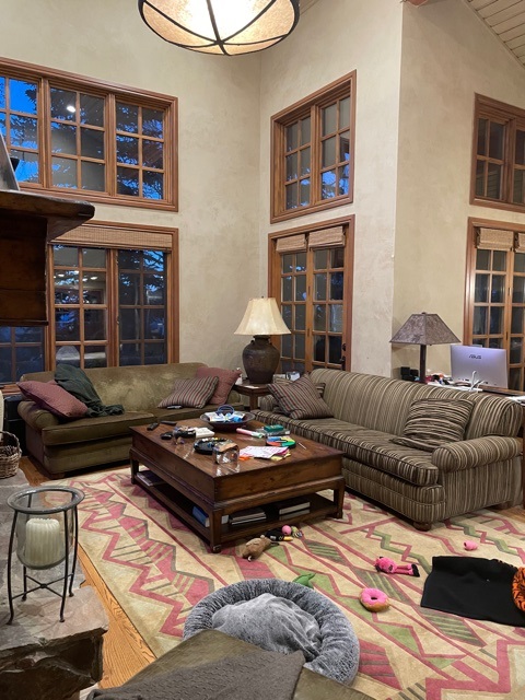
Before
The open floorplan on the main floor also incorporated a living space, but there was little distinction between the different areas, as you would have hoped from a living room dining room combo. The large patterned area rug helped to add some extra warmth and color, but that's about as far as the design went in terms of creating a distinct cozy living space.
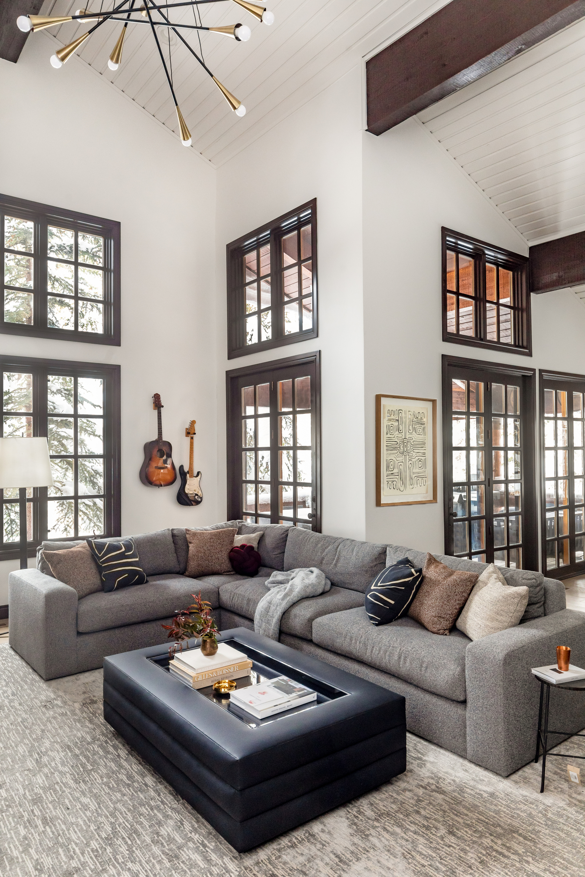
After
Now, the living room is a bright, calming space. The contrasting effect of the bright walls and ceilings with the darker wood tones of the window frames and beams creates a monochromatic theme that instantly elevates the space in more ways than one.
According to Amy, her team decided to paint all the trim and beams in the house a chocolate brown early on in the design process. 'We paired this with bright white walls to lighten up the space while still keeping consistent with the architectural design of the home,' she says. 'The darkness of the trim also allowed us to play with other varying lighter wood finishes throughout the house.'
Despite losing some of those earthier tones associated with ski properties, the soft grey sofa and rug still communicate the idea of natural stone. 'The biggest challenge was staying true to the fact that this is a mountain house while also making it feel like a home for a family that was used to a more cosmopolitan lifestyle,' adds Amy. 'We tried to give nods to the surroundings without making it feel like a vacation home.'
Main floor bathroom
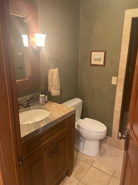
Before
The previous main floor bathroom was, like the rest of the home prior to the renovation, dingy, dated, and dark. Green walls, dark wooden cabinetry, and beige monolithic tiles made for a stuffy space that made this small bathroom feel closed in.
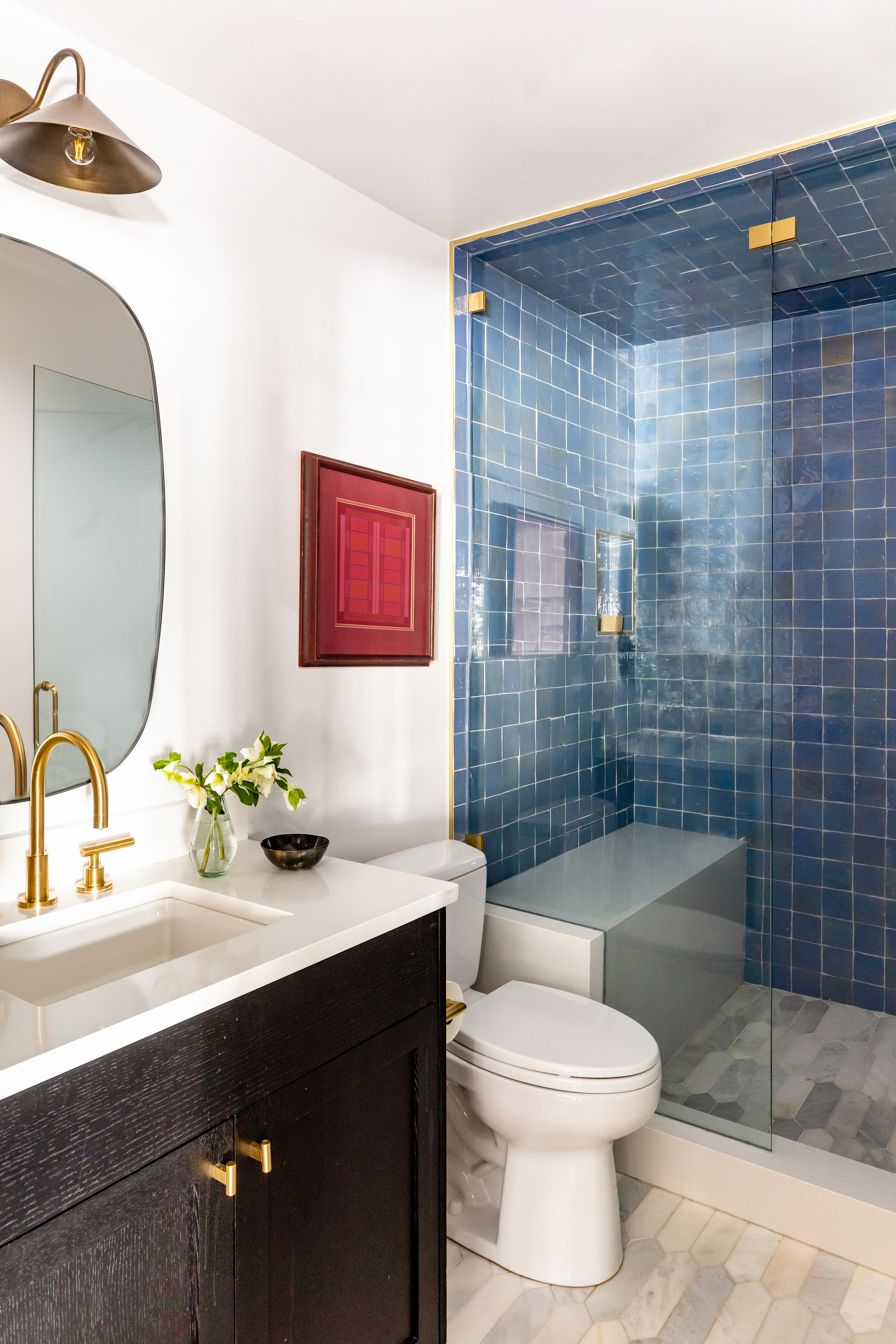
After
But not anymore. White walls, fresh black cabinetry, and blue patina tiles in the shower make this space colorful and welcoming, and the shower extension offers more space for a functional family bathroom.
'The other two bathrooms in the house were very neutral and so we felt we could take a bit of risk in this main floor bathroom,' explains Amy. 'This bathroom has a steam shower so we had to add tile to the ceiling as well and it felt like a great opportunity to go for something different. The individuality of these zellige tiles creates a really beautiful effect.'
Bunk room
Before
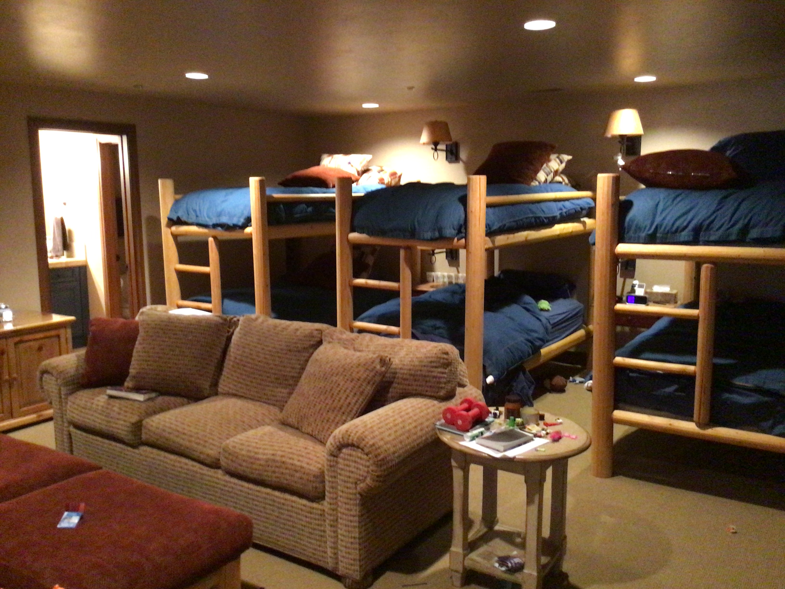
While spacious, the kids' bunk room was - you guessed it - incredibly dark and oppressive before Amy's team got to work transforming it, worsened by the fact that it's in a basement. The three identical bunk beds took up a lot of floor space, and their vertical positioning didn't allow for a sense of flow. For a kids' room, it was also crying out for some color.
After
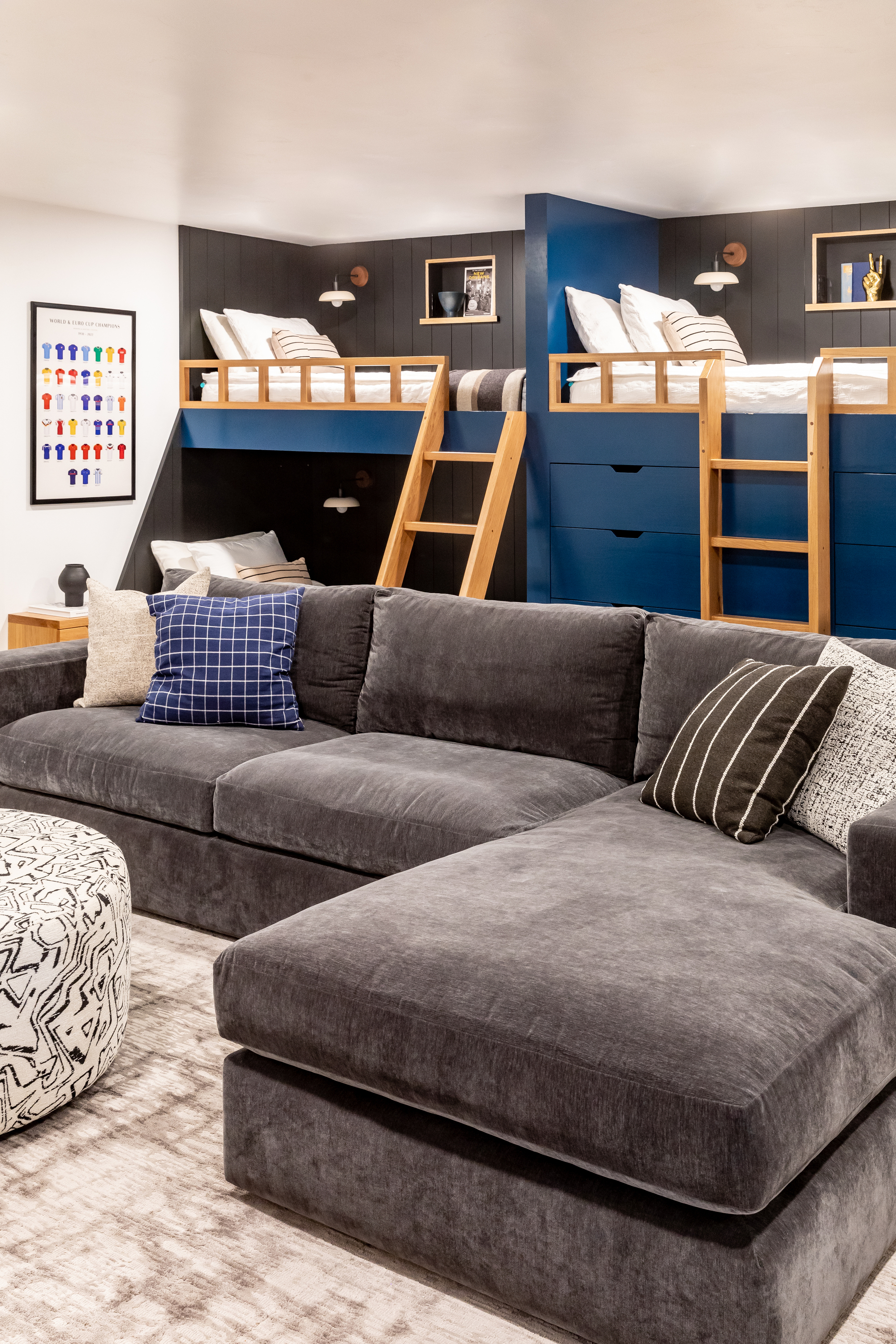
Amy and her team clearly thought so, too. They introduced new blue bunk beds and painted the walls a white shade, punctuated by the black back panels for that same contrasting effect used elsewhere in the home.
They also played around with the floorplan in the kids' room by simply turning the beds ninety degrees. 'When rethinking this room, we designed the new built-in bunk beds to run horizontally along the wall instead of projecting into the room to allow for more space for recessed lights,' Amy tells us. 'The white walls and ceiling immediately brightened up the space, also helping to give the illusion of a higher ceiling.'
Bedroom
Before
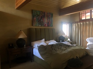
A large master bedroom was certainly not used to its full potential. Beige walls made for a confined feel and the styling lacked any sense of cohesion. A brighter palette was clearly needed to help modernize this space.
After
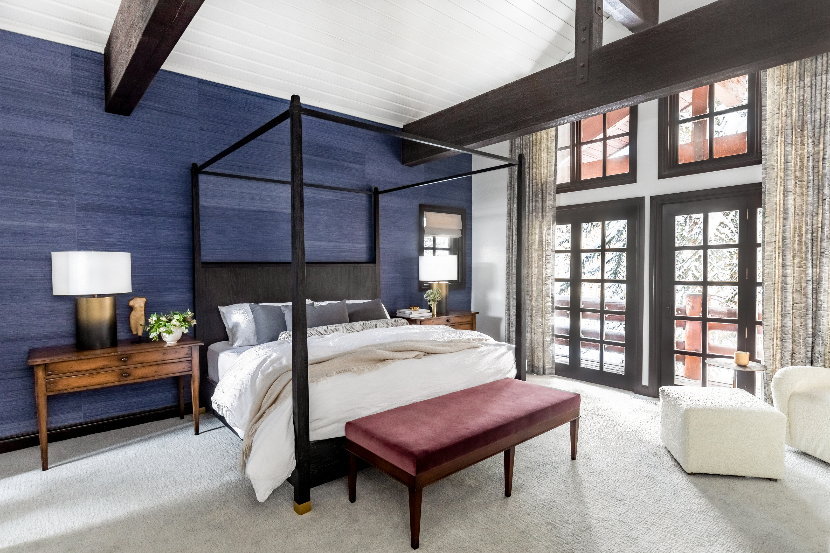
Thanks to Amy, the new room looks fresh and bright. Original vintage furniture, such as the side tables, is still incorporated into the new look, but they're used to thoughtfully compliment this contemporary space by adding a sense of charm.
The team chose to reuse the vintage nightstands in this room and update an existing bench by reupholstering it in new fabric. 'The nightstands had a beautiful, worn finish that complimented the architectural finishes in the space such as the shiplap ceiling, dark beams, and stone fireplace,' notes Amy. 'The bench already had a great silhouette and we used a maroon velvet to give it new life.'
She adds: 'The four poster bed tied these existing pieces together to create a more contemporary feel that still fit with the overall design of the home.'
En-suite bathroom
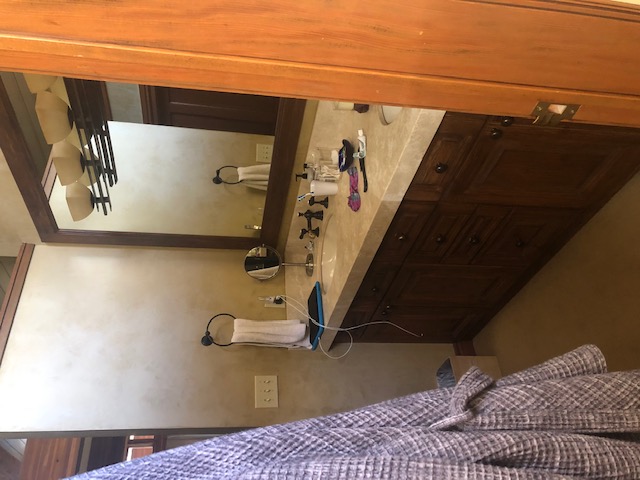
Before
The bedroom leads on to an en-suite bathroom which boasts a double vanity and large bath. Before the transformation, however, the space was dim with a dated interior. The cabinetry and hardware needed a serious shake-up.
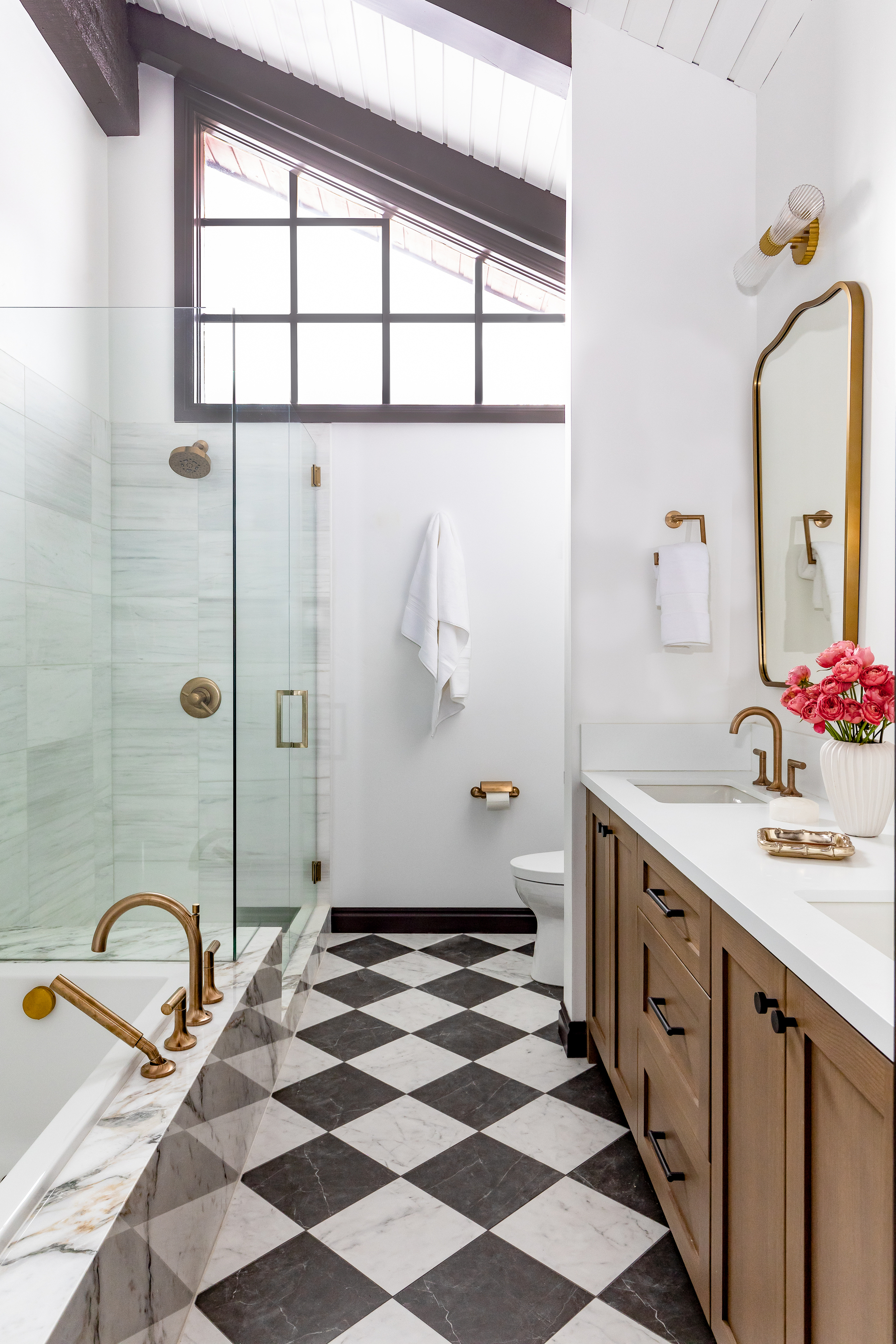
After
Both of those have had a modern revamp in the new bathroom, but Amy and her team didn't stop there. Monochromatic chequered bathroom floor tiles bring a classic feel to the space, echoed in the brass fixtures throughout the bath, shower, and vanity, while a beautiful built-in marble bath surround also serves as a bench in the walk-in shower.
The timeless traditional ideas are aided by more modern elements like the white countertops and light wooden cabinetry complete with matt black hardware. As Amy summarizes: 'The checkerboard marble floors felt like a great bridge between modern and transitional design, while still having a great impact on the space'. It proves just how impactful the pairing of classic and contemporary features can be.

Lilith Hudson is a freelance writer and regular contributor to Livingetc. She holds an MA in Magazine Journalism from City, University of London, and has written for various titles including Homes & Gardens, House Beautiful, Advnture, the Saturday Times Magazine, Evening Standard, DJ Mag, Metro, and The Simple Things Magazine.
Prior to going freelance, Lilith was the News and Trends Editor at Livingetc. It was a role that helped her develop a keen eye for spotting all the latest micro-trends, interior hacks, and viral decor must-haves you need in your home. With a constant ear to the ground on the design scene, she's ahead of the curve when it comes to the latest color that's sweeping interiors or the hot new style to decorate our homes.