Don't Redecorate Yet! Well, Until You Understand How Dominant and Recessive Colors Work — What You Need to Know About 'Color Saliency'
Understanding — no, *really* understanding — how color works can completely shift not only how your home looks, but feels

The Livingetc newsletters are your inside source for what’s shaping interiors now - and what’s next. Discover trend forecasts, smart style ideas, and curated shopping inspiration that brings design to life. Subscribe today and stay ahead of the curve.
You are now subscribed
Your newsletter sign-up was successful
Do you have a colorful object that jumps out a little too much in your living room? Or a wall that weirdly fades into the background in your bedroom? Do you have all of the wrong colors grabbing attention in the bathroom, or no colors at all grabbing attention in the hallway? Then it’s time to get your head around the idea of recessive and dominant colors — how some colors are visually louder than others, and some naturally quieter. Yes, these are effects that can be predicted, planned for, and put to work purposefully in decorating.
Decorating with color can be a tricky business. We can generally instinctively feel if certain colors stand out more than others — but why? And how do you balance them? This is where knowing which shades are deemed ‘dominant’ and which are considered ‘recessive’ can help. It’s also where understanding the science and psychology of color saliency can make decorating so much simpler. And I promise, it’s all less complicated than it sounds, and will forever change the way you look at color.
But these concepts are not here to dictate. Going for something avant-garde? Do it — but bear this color theory in mind, and the tones, hues, and shades that make your space harmonize will reveal themselves with much less umm-ing and ahh-ing. So, here's what you need to know.
Article continues belowWhat are Dominant Colors?
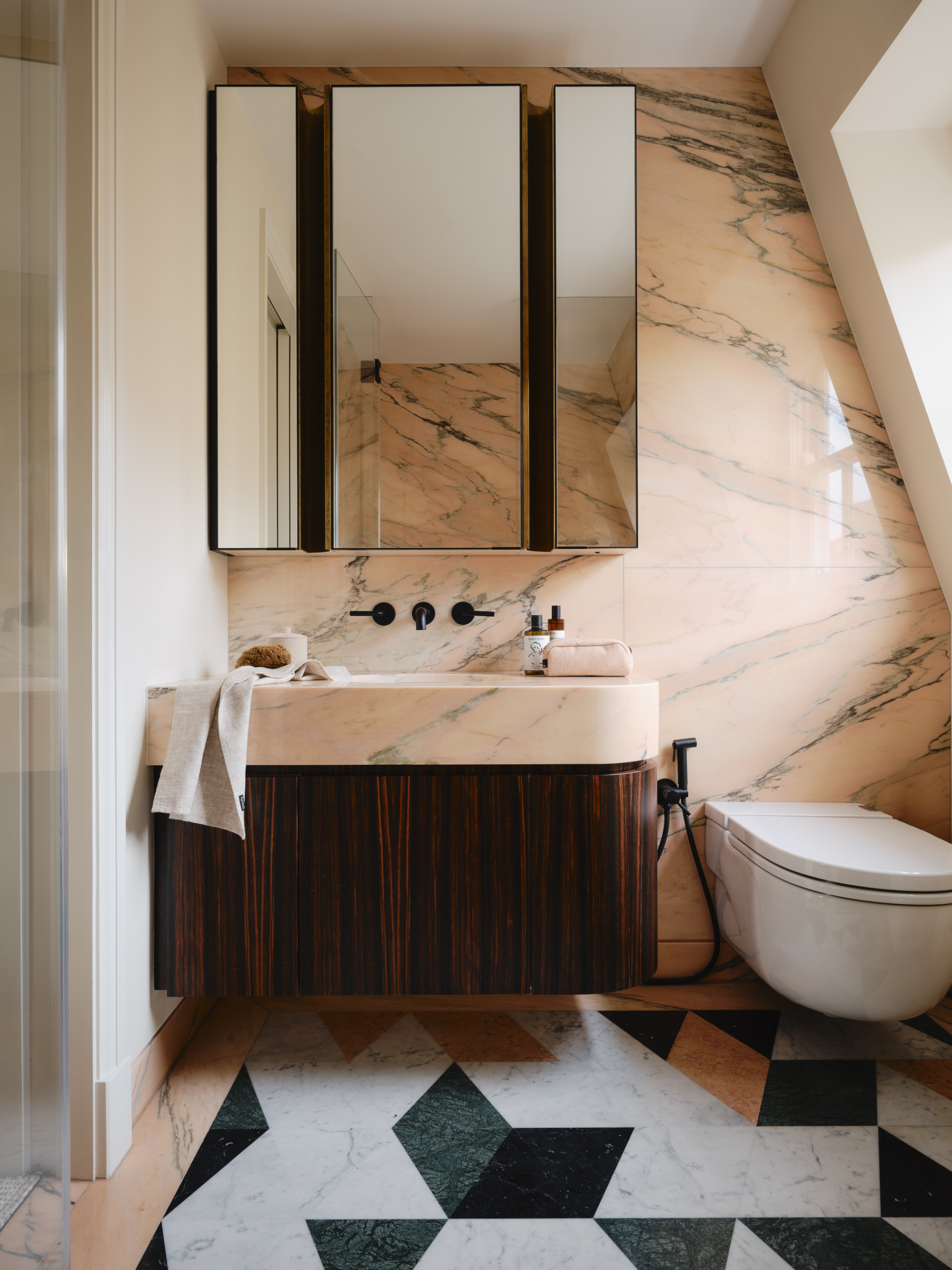
Dominant colors leap to the forefront, like the dark green floor tiles in this bathroom.
Dominant colors are perhaps the most obvious to define — yes, they’re the ones that leap into the forefront of the room (and the consciousness) due to their visual punchiness.
Such shades anchor an area, giving the palette weight and creating focal points to tell the eye where to move. They also compete for attention, making a room feel overwhelming and chaotic, so to keep things balanced, think of them as accents that punctuate and support the scheme rather than the main color event.
Bold hues immediately come to mind. Scarlet. Cobalt. Magenta. Saffron. Emerald. But colors don’t necessarily need to be pigment-rich to be deemed ‘dominant’ — heavy shades such as charcoal and navy also tick the box, and really any number of shades can become dominant if they’re set against a muted backdrop.
Jack Simpson, founder and creative director of Nomad, explains, "We gravitate towards dominant colors with a natural, earthy quality to them, such as deep greens, rich browns, and muted reds. These colors have impact without being too overwhelming, and bring warmth to a space."
The Livingetc newsletters are your inside source for what’s shaping interiors now - and what’s next. Discover trend forecasts, smart style ideas, and curated shopping inspiration that brings design to life. Subscribe today and stay ahead of the curve.
Indeed, dominance doesn’t have to mean intensity — it can also come from depth, intensity, and context.
Jack Simpson, founder and creative director of London-based Interior Design Studio and Property Developer Nomad, sees color as a transformative force, capable of shifting the atmosphere of a room and sparking emotion. He approaches it confidently yet with delicacy — while embracing boldness, his palettes remain refined, subtle, and versatile.
What Are Recessive Colors?
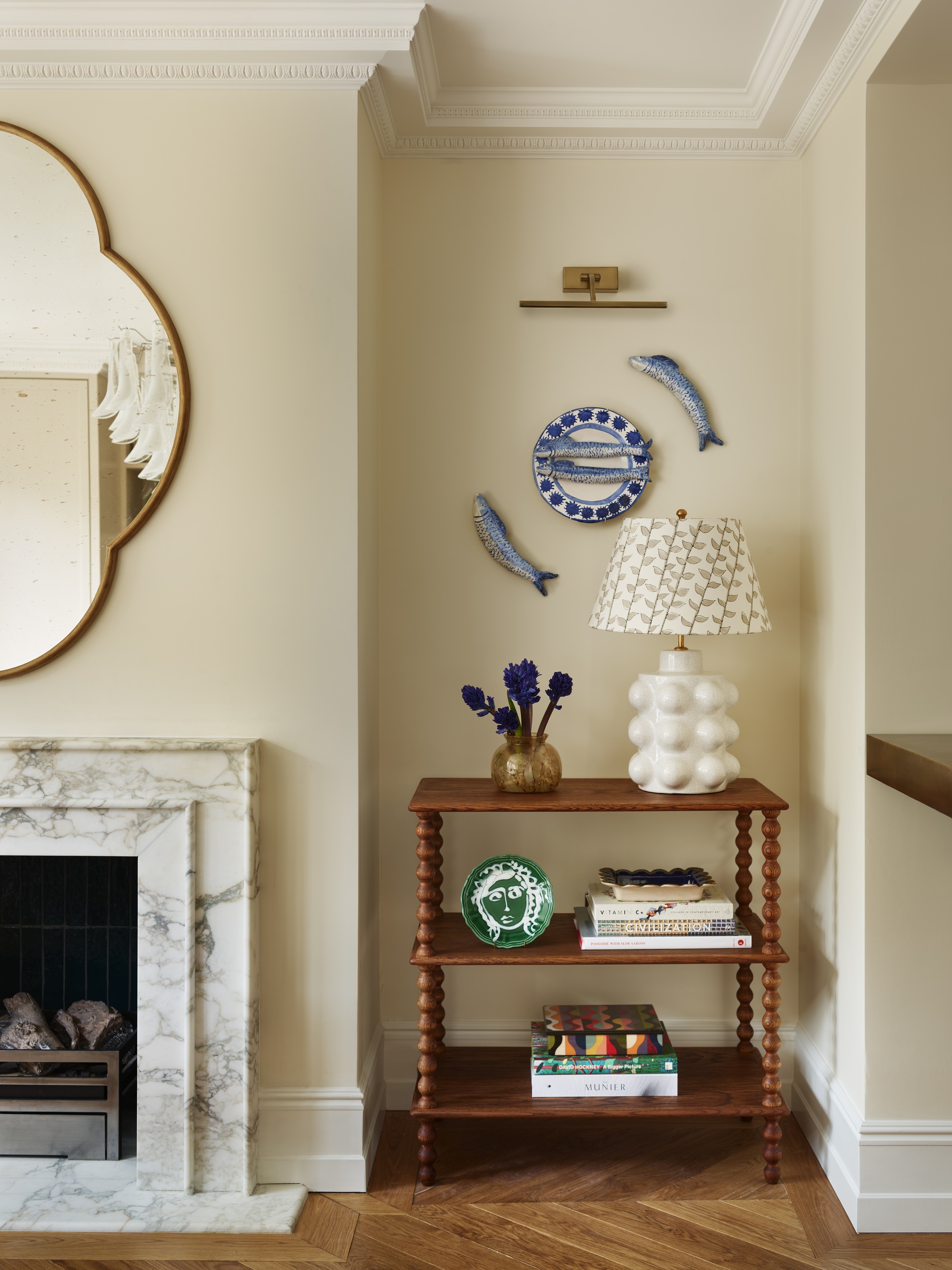
Recessive colors settle in the back ground, like the soft butter yellow paint in this room.
You won’t be surprised to hear that recessive colors are those that sink into the background, retreating from the main composition of the interior and allowing attention to gather elsewhere. They’re often, but not limited to, cooler hues — your blues, your greens, and your violets — as well as the neutrals.
Recessive colors are a welcoming rest stop for the eye on its journey through the space. They make rooms feel lighter and airy, they’re the decorative Yin to a dominant color’s Yang — there to create a pleasing equilibrium.
So, where to put them? Often recessive colors are best situated as part of the backdrop — walls, flooring, fabrics, and the like. The hues have a calmness about them, and compared to dominant colors, are more focused on the overall harmony of the interior.
But this doesn’t mean they don’t have personality or can’t be used creatively. "We love to experiment, for example, pairing dusty reds and pinks with their lighter counterparts for a color-drenching effect with strong contrast and depth," says Jack. "We recently did this in a project, and it was so beautiful I recreated it in my own house."
What is Color Saliency?
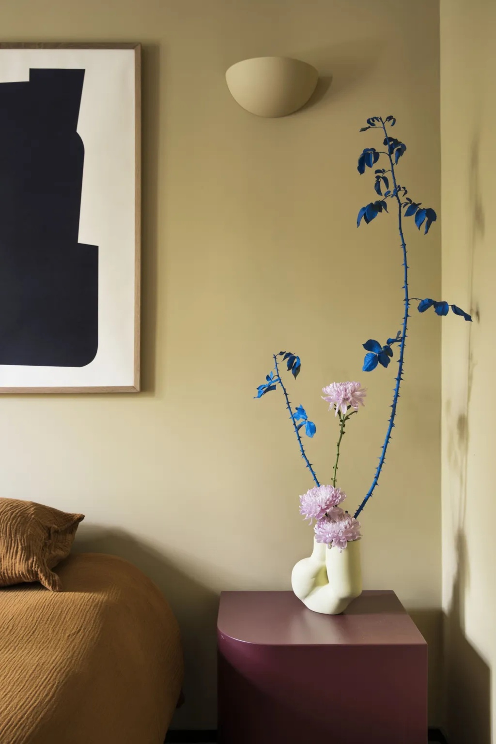
The bright blue stems are very salient in this space, set against a recessive yellow wall.
When we talk about ‘color saliency’ — a phrase I’m sure comes up in everyone’s dinner party chat (not) — what we mean is how much a color attracts the gaze, stands out, or pulls attention. It’s about whether a shade fades humbly into its surroundings or instantly commands attention. 'How salient is this tone?’ you might say; dominant colors tick the ‘salient’ box, while recessive hues are less so.
"Understanding color saliency is an essential skill for any interior designer," explains Camilla Kelly, founder and creative director of The Mint List. "It’s all about achieving the right ratio — ensuring dominant and recessive colors sit comfortably alongside each other without one overpowering the room."
And the ultimate goal? "A home where color feels effortless. Where no single shade clamors for attention, and all elements contribute to a unified, harmonious whole," she adds.
"Color saliency can completely shift the emotional atmosphere of a space," agrees Alicia Meireles, creative director at Own London. "Functionally, it’s about guiding the eye and defining zones — a bold dominant color might draw attention to a feature, while recessive tones can make a space feel larger and more open."
Developing her palettes by deeply considering the function of a space as well as how light moves through it, founder and creative director of London-based interior design studio, The Mint List, Camilla is drawn to colors that reflect the character and history of the homes she works with, favouring palettes that feel grounded, quietly expressive, and emotive.
How to Use Color Saliency When Decorating
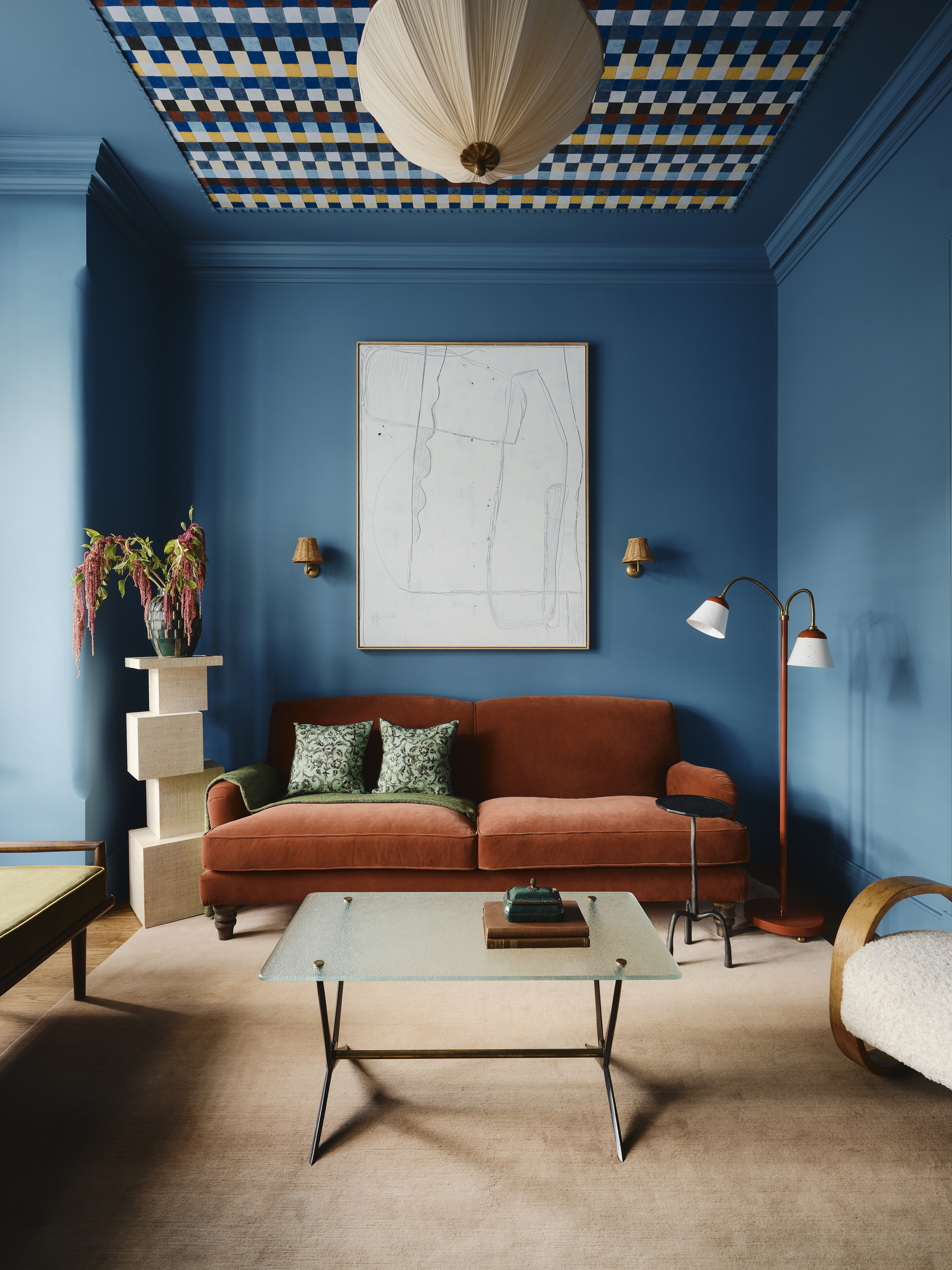
Understanding color saliency lets you balance colors harmoniously in a scheme.
Color saliency determines the hierarchy of colors within an interior, so the more dominant can be deployed to draw attention to certain areas — a statement piece of furniture, art, or architecture, while the recessives are there to keep the surrounding space open, calm, and cohesive, so the focal points can breathe.
What does that look like in practice? "I love incorporating dominant colors into schemes in a way that feels intentional but never overpowering," explains Camilla Kelly. "It might be a striking dark tone highlighting a sash window within an otherwise neutral palette, an anthracite column radiator against a crisp white wall, or a bold hue on doors, skirtings, or architraves to bring a contemporary edge to a space without overwhelming it."
"For me, it’s about balance and storytelling," says Alicia Meireles. "Dominant colors are the main character in your design narrative, while recessive colors play the supporting role to add depth and harmony. I like to use dominant tones on large, impactful surfaces like walls or big pieces of furniture, and then bring in recessive shades through smaller accents, textures, and layered materials."
Seeing colour as something with its own character, Alicia Meireles, creative director of multidisciplinary design studio Own London, creates schemes that are capable of shaping mood as much as aesthetics. Inspired by nature and travel, her palettes are vibrant yet personal, always chosen to uplift you every time you walk into a space.
Whether you’re decorating with bold dominant hues or soft recessive tones, the true measure is how they coexist. Color saliency can guide each color to play its part, resulting in a home that feels complete and considered.
Understanding how to use color in your interiors properly can completely shift not only the way it looks, but how it feels. And you can thank color psychology in interior design for that.

Amy Moorea Wong is a color authority and contemporary interior design writer who has specialized in all things decorating for over a decade. Amy is Livingetc magazine’s Colour Expert, Interiors Editor at The Glossary magazine and a Contributing Editor at Homes & Gardens magazine, and she frequently contributes to an array of global publications to share her insights on interior design zeitgeist. Her book Kaleidoscope: Modern Homes in Every Colour explores a collection of cool colorful homes fizzing with creativity, surprises, and inspiration.