Before & After: this Mediterranean style LA home has gone from dated and cluttered to classy and contemporary
This tired LA home has undergone a beautiful transformation which acts as a lesson on pairing contemporary accents with traditional elegance

The Livingetc newsletters are your inside source for what’s shaping interiors now - and what’s next. Discover trend forecasts, smart style ideas, and curated shopping inspiration that brings design to life. Subscribe today and stay ahead of the curve.
You are now subscribed
Your newsletter sign-up was successful
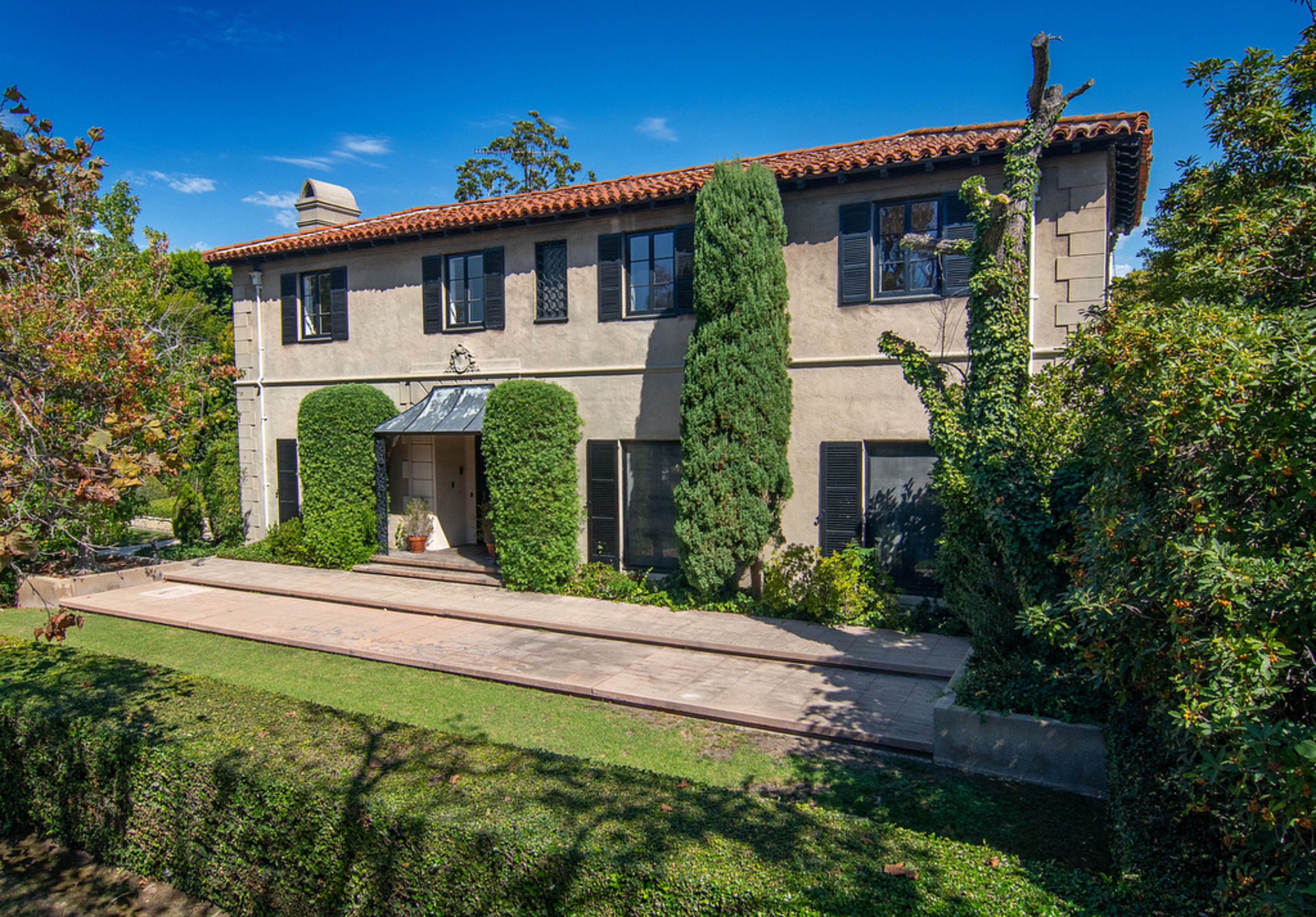
This beautiful Mediterranean style home in LA has been given a contemporary makeover by HGTV design star, Francesca Grace. The transformation turned the dated and cluttered looking interior into an elevated modern home with curved furniture, textured accents and a fresh color palette.
The five bedroom, four bathroom estate infuses Francesca's signature eclectic design aesthetic into the home's traditional architecture. Inspired by its historical footprint in LA's Hancock Park neighborhood, Francesca wanted to enhance the property's natural beauty and reflect the traditional Mediterranean influences in her design.
'The house is nestled in the beautiful historic Hancock Park neighborhood in Los Angeles,' Francesca explains. 'It's a traditional Mediterranean home and I wanted to stay true to its bones by making sure all the furnishings and details reflected that in a more contemporary way.'
Article continues belowThe living room sets the tone for the rest of the home, with custom striped upholstered accents, richly patterned rugs, and warm wood details for an inviting and eclectic look. Francesca then injected character and charm to the space with the help of modern art pieces and vintage finds. We take a look inside for all the latest design inspiration we need.

Lilith is an expert at following news and trends across the world of interior design. She has an eye for appealing designs and interesting spaces which she regularly shares with readers through home tours, such as this one. After seeing the beautiful transformation of this LA home, she was keen to impart the designer's lessons on mastering a modern look.
Before the renovation:
Entryway
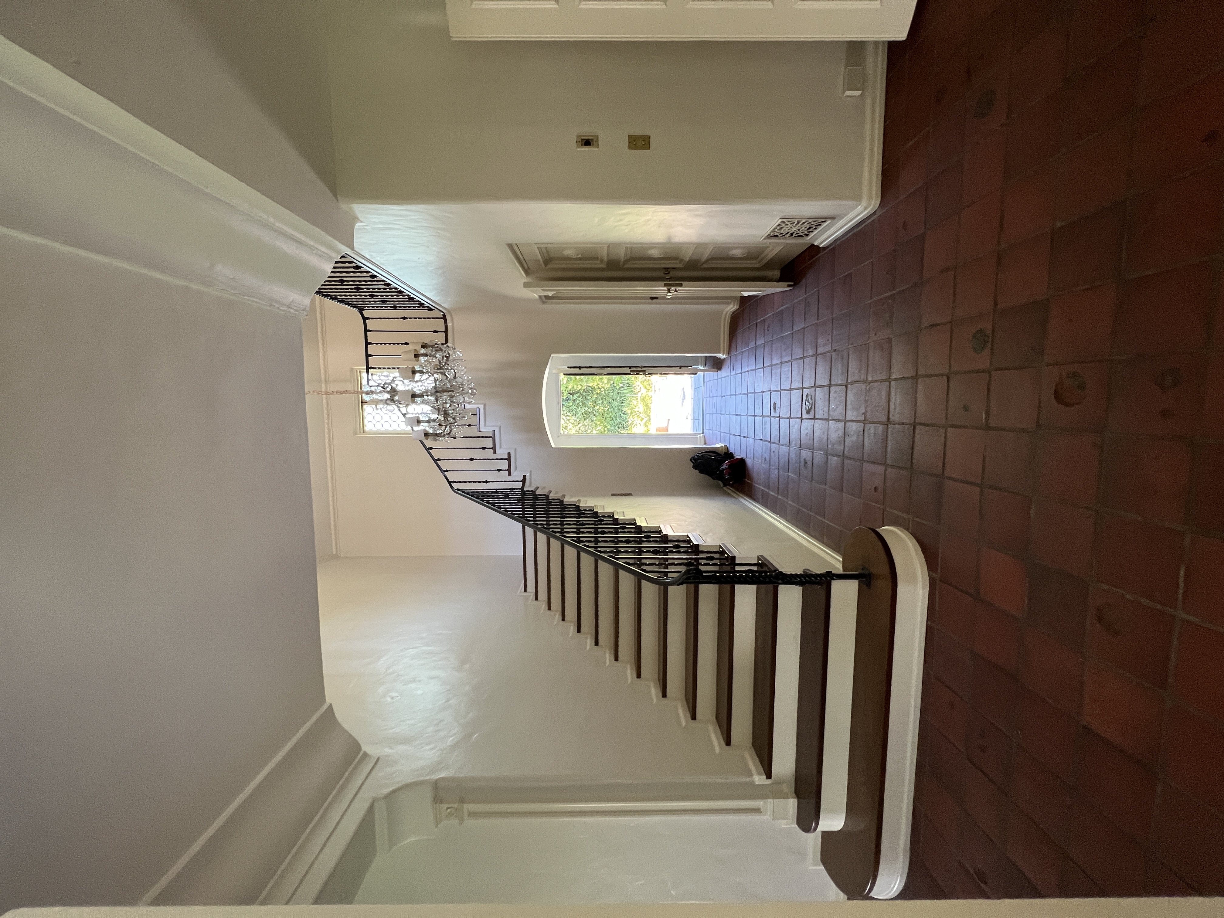
Prior to the design makeover by Francesca Grace, the home's entryway was dull and lacklustre and hadn't been used to its full potential. As the space you first lay your eyes upon, this dimly lit room failed to invite guests inside. A lack of decor meant that no style or character was introduced despite beautiful historical features like the terracotta tiles and sweeping staircase.
Breakfast room
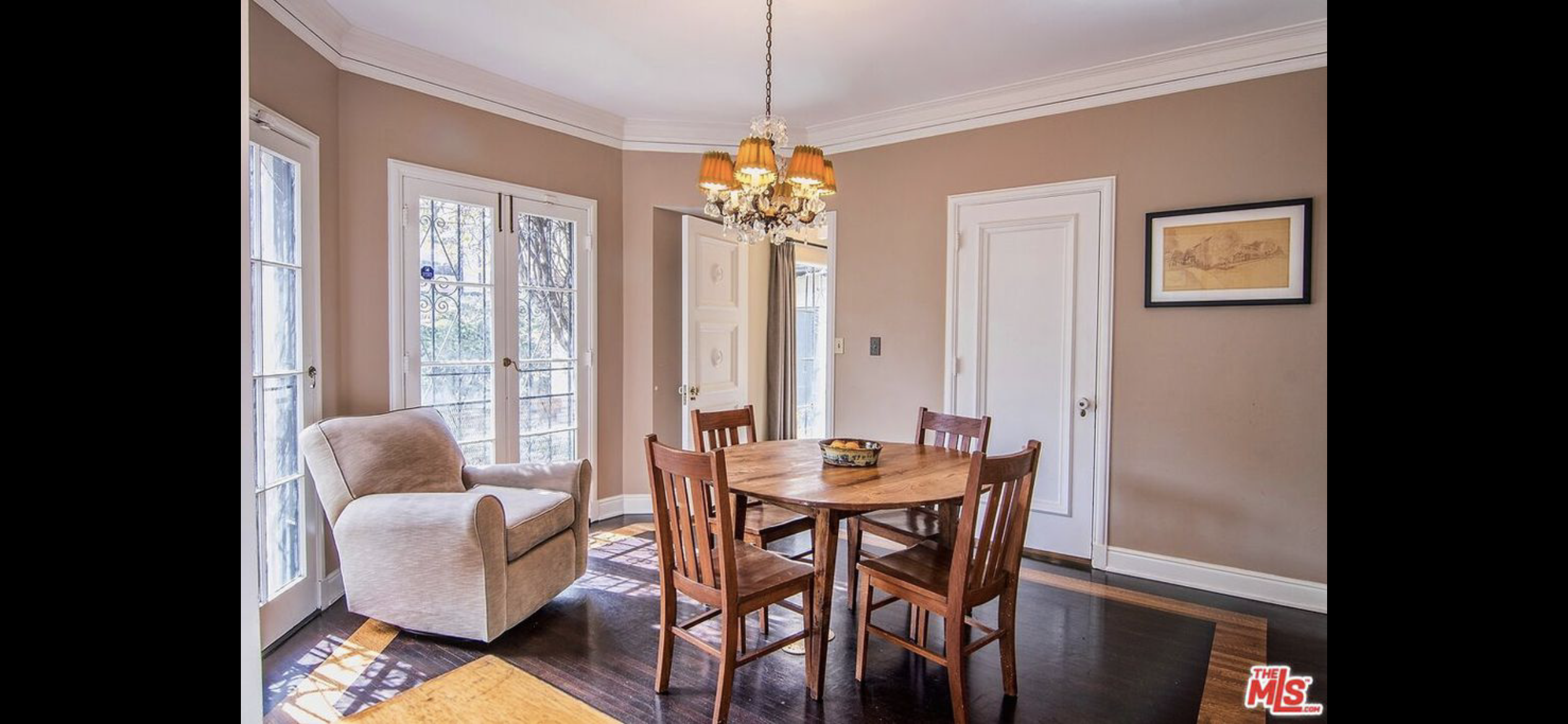
The breakfast room was flooded with natural light thanks to the large French windows but the dark wooden dining set and flooring counteracted that, making the space feel dim and enclosed - one of the biggest decorating mistakes you can make in a small room. Overall, the design lacked any cohesive feel or flow from the adjoining rooms and held no personality.
Living room

The large living room was filled with eclectic furniture which made the space feel cluttered, lacking any main focal point. Despite including some beautiful vintage pieces, you were never sure where to lay your eyes.
The Livingetc newsletters are your inside source for what’s shaping interiors now - and what’s next. Discover trend forecasts, smart style ideas, and curated shopping inspiration that brings design to life. Subscribe today and stay ahead of the curve.
Architectural elements like the large fireplace and built-in arched shelving were also disguised rather than accentuated, meaning the room lacked any notable design statements.
Dining room

The huge dining room featured a beautiful octagonal coffered ceiling with a large Persian rug on the wooden floor, but the decor again failed to offer any sense of cohesion. Yellow chairs clashed with the light blue walls and dark wooden furnishings, giving the space a dated feel. Overall, the design felt traditional and stale.
Study
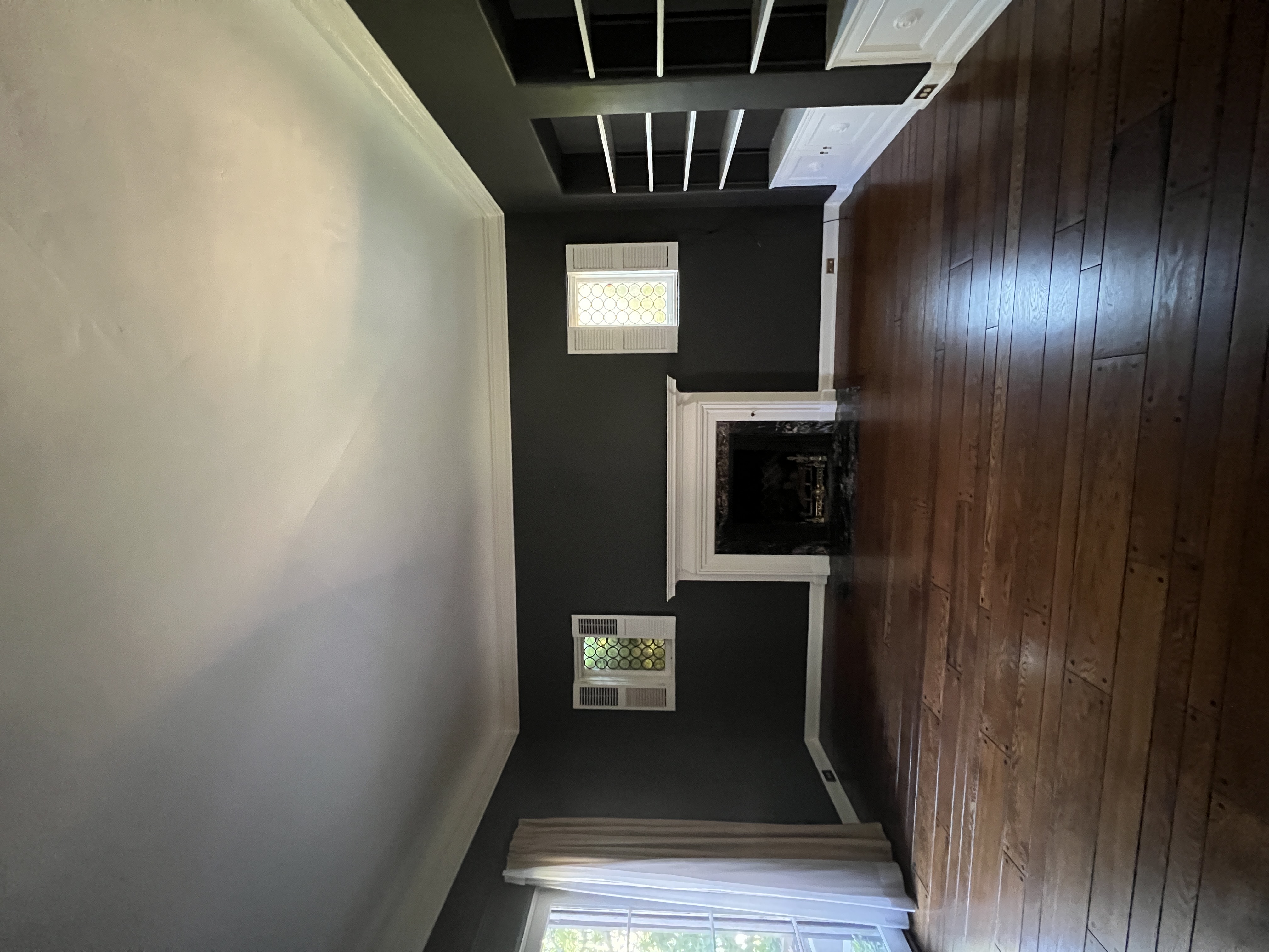
A large room (now the study), painted a beautiful deep green, hadn't served a purpose for the homeowner's. The wide fireplace and built-in recessed shelving lend themselves well to what is now a beautiful home office seen below.
Bedroom

Upstairs, the master bedroom looked cluttered. The mix-matched furniture and pink walls failed to compliment one another, while the mahogany decor made the space feel dark despite the large French windows. What's more, placement of the furniture also hindered the bedroom layout and failed to make wise use of the space.
After the renovation:
Entryway
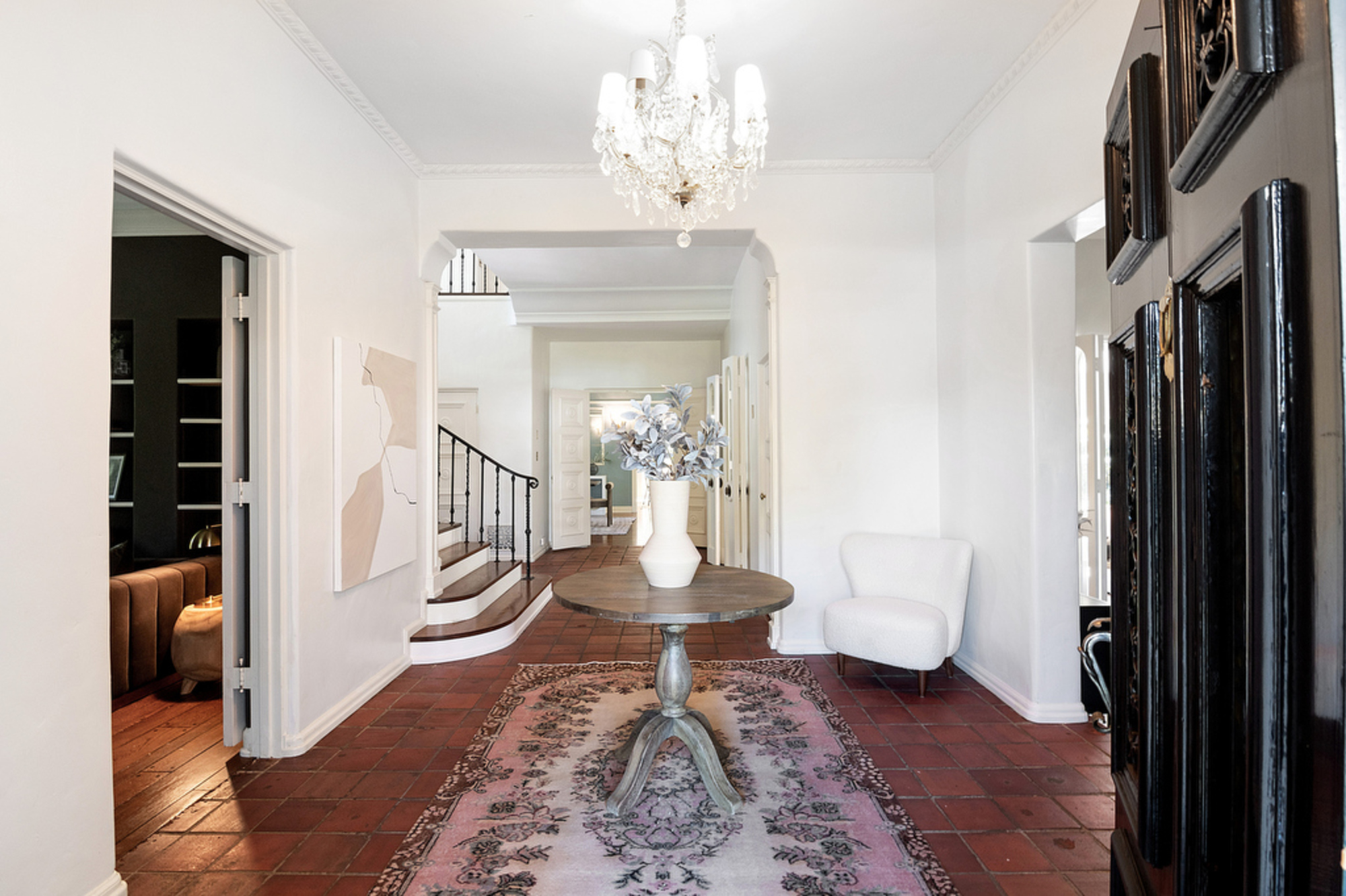
Since Francesca worked her magic on the property, the huge entryway has been used to its full potential. The white walls have been stripped back and, with the help of the chandelier entryway lighting, the space feels far brighter. Meanwhile, details such as the artwork, chair and table make this room feel instantly cozier and more welcoming.
This contemporary entryway now has a luxurious feel, but Francesca made sure to retain original features like the terracotta tiles. How did she strike the perfect balance between classic and modern? 'It was all about finding that balance with color, pattern, and mixing different elements together,' explains Francesca.
She continues: 'The traditional round center table is decorated with a modern floral centerpiece that is beautifully complemented by the floral patterned rug. The colors are soft and welcoming, setting the mood for the rest of the home.'
Breakfast room
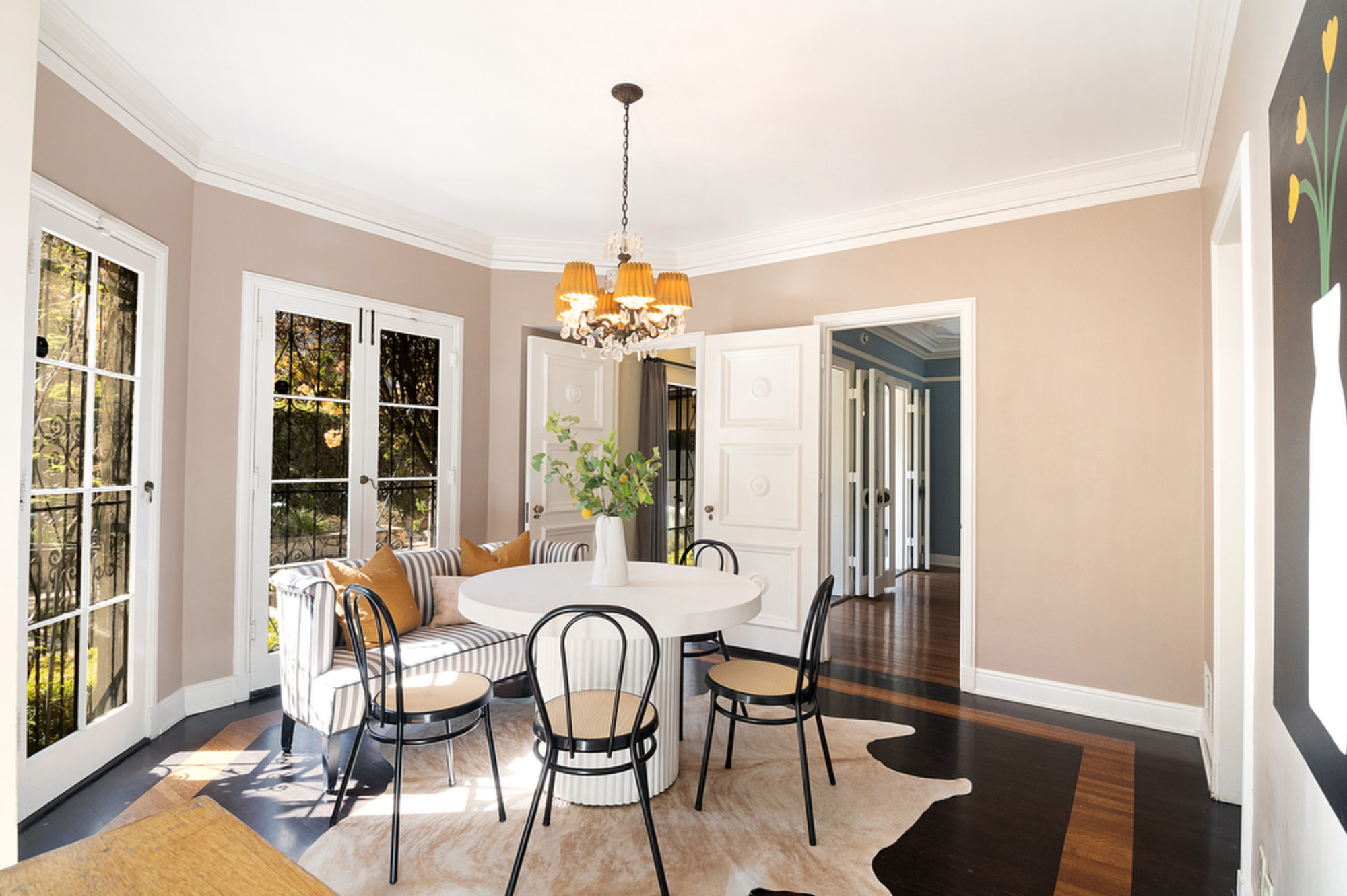
The breakfast room has been transformed into a bright and airy space thanks to the use of lighter furniture. The simple white table and black chairs work far better against the beige foundation of the walls and parquet flooring, culminating in a calming, neutral color scheme.
Living room
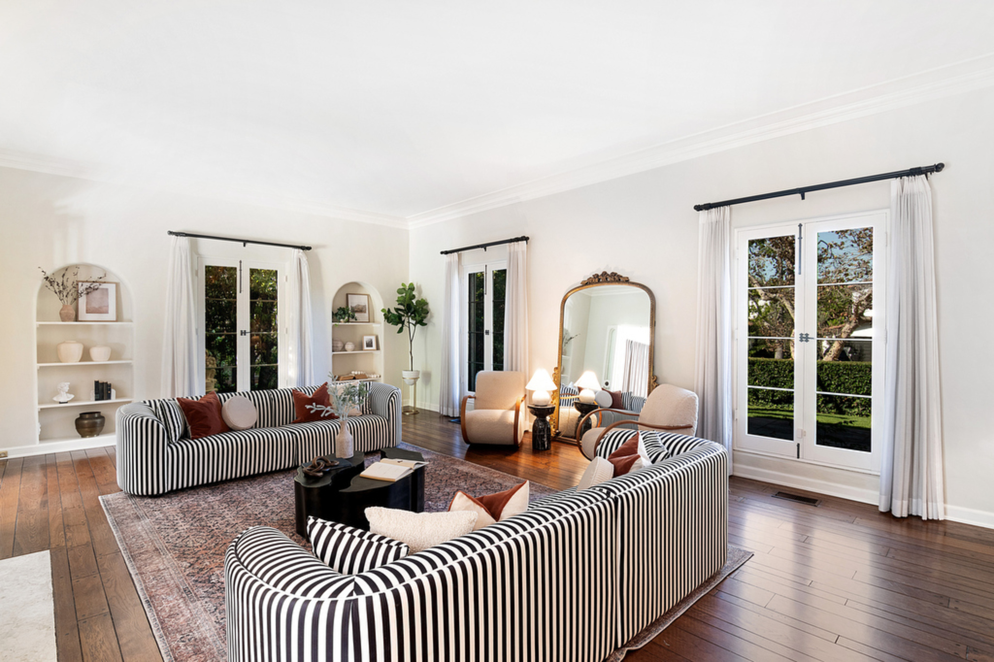
The living room really sets the tone for the rest of the home and, since the decor has been stripped back for a more minimalist look, it feels a lot more spacious.
'I adore our custom striped couches and they were the perfect addition to this house. This is a great example of how we mixed a classic black and white stripe with more modern/contemporary boucle chairs,' Francesca explains.
Details such as the shelving have been more carefully curated with more contemporary home décor pieces that contribute to the overall design, rather than detract from in.
'The pattern and textures really balance each other beautifully and the large ornate mirror really helps open up the space and bring in more light,' Francesca adds. 'I love how the entire room came together and think as a whole this has to be my favorite rooms we've designed.'
Dining room
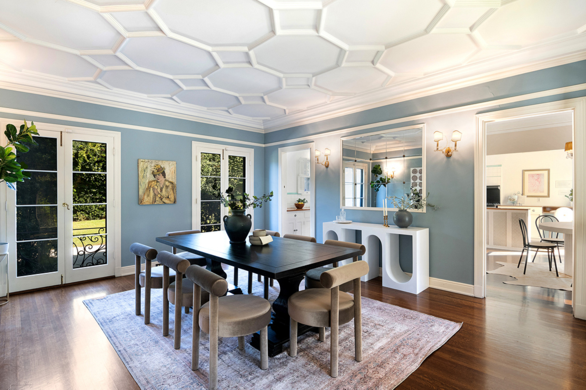
In the dining room, lighter colored furniture offers a simple solution to what was previously an overwhelmingly dark space, creating a more airy feel. That said, the contrast of the black dining table with the textured velvet chairs creates an impactful statement that still looks fresh and modern.
'The room is painted light blue so we really wanted to play off of that and also give it a heavy contrast, which is why we decided to add a very traditional black dining table and complement it with the mauve contemporary dining chairs,' Francesca explains. 'The curves in the white cement console table juxtapose the sharp lines of the honeycomb ceiling and continues to tell the story of classic and modern designs.'
Study
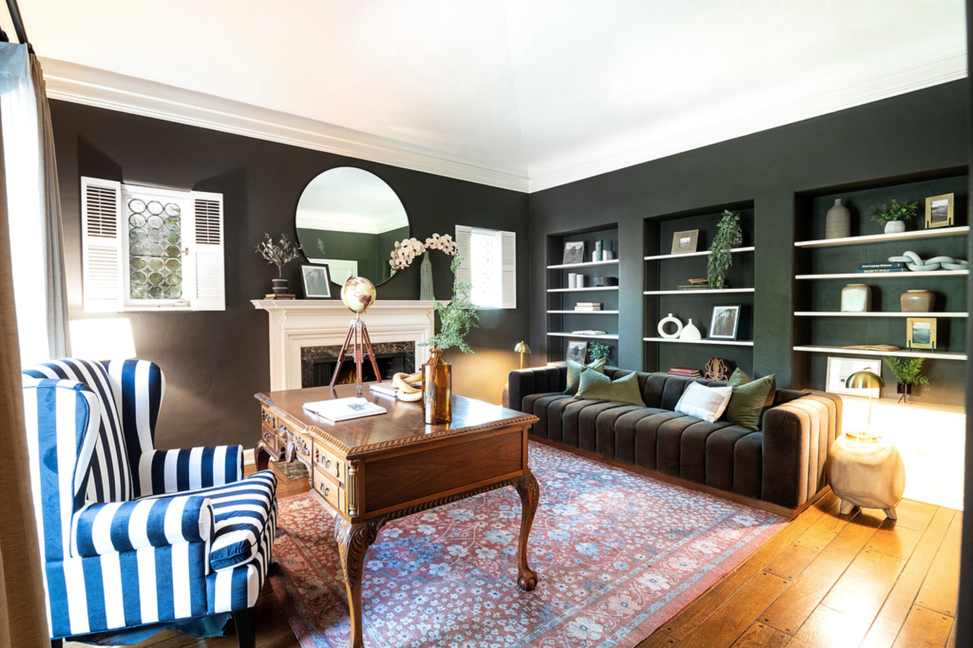
One of the most impressive transformations in this home is the study which acts as an exemplary method on how to use dark colors in interior design. The deep forest green marries beautifully with the striped wingback chair for a sophisticated look that's sure to promote productivity.
'I love a dark study/library room. It has such an impactful feeling without being too busy,' says Francesca. 'When deciding how to furnish this room, I wanted to make it felt functional and aesthetically pleasing. We placed an antique desk and a more contemporary brown mohair couch again to bring in that balance of past and present. You'll also notice the striped chair to add our touch of timeless edge.'
Bedroom
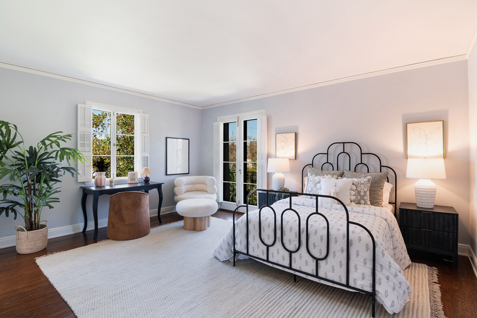
The bedroom is now bright and spacious, with an entirely new layout that's far more calming. Textured details like the area rug and the boucle chair offer a soft contrast to the striking iron bedframe which makes a beautiful focal point.
'When it came to selecting bedroom pieces, it was all about finding that balance between unique, timeless, and sophisticated,' Francesca explains. 'The black iron bed frame has an elegant art deco style to it. We complemented its strong features with delicate floral print bedding and contemporary touches, like the boucle accent chair with its matching ottoman.'
If there was ever an example of how to pair contemporary features with traditional elegance, it's Francesca's transformation of this home.

Lilith Hudson is a freelance writer and regular contributor to Livingetc. She holds an MA in Magazine Journalism from City, University of London, and has written for various titles including Homes & Gardens, House Beautiful, Advnture, the Saturday Times Magazine, Evening Standard, DJ Mag, Metro, and The Simple Things Magazine.
Prior to going freelance, Lilith was the News and Trends Editor at Livingetc. It was a role that helped her develop a keen eye for spotting all the latest micro-trends, interior hacks, and viral decor must-haves you need in your home. With a constant ear to the ground on the design scene, she's ahead of the curve when it comes to the latest color that's sweeping interiors or the hot new style to decorate our homes.