An Unexpected Island Design Made This Small and Awkward Kitchen Work a Million Times Better
This triangular kitchen proves that perhaps sometimes, rules are there to be broken

The Livingetc newsletters are your inside source for what’s shaping interiors now - and what’s next. Discover trend forecasts, smart style ideas, and curated shopping inspiration that brings design to life. Subscribe today and stay ahead of the curve.
You are now subscribed
Your newsletter sign-up was successful
For an industry that's meant to pride itself on creativity and self-expression, there's a surprising amount of 'rule following' when it comes to interior design. Never mix metals, only stick to one print, always decorate in threes... the rules go on, and on. And, for a long time, these ideals have been followed dogmatically.
Now, forgive me if this is earth-shattering information, but what if I told you that sometimes, the true design magic only really happens when the rules are broken. I'm not saying you have to go completely off the rails, but taking a slightly more relaxed approach to your home's design can help you create a space that is not only more reflective of your personal style but that is also better suited to the space around you. Instead of trying to desperately mold or shape a room to fit your restrictive standards, accept the space for what it is, and try to incorporate its uniqueness into its design. It's this type of design that results in some of the most effective modern kitchen ideas.
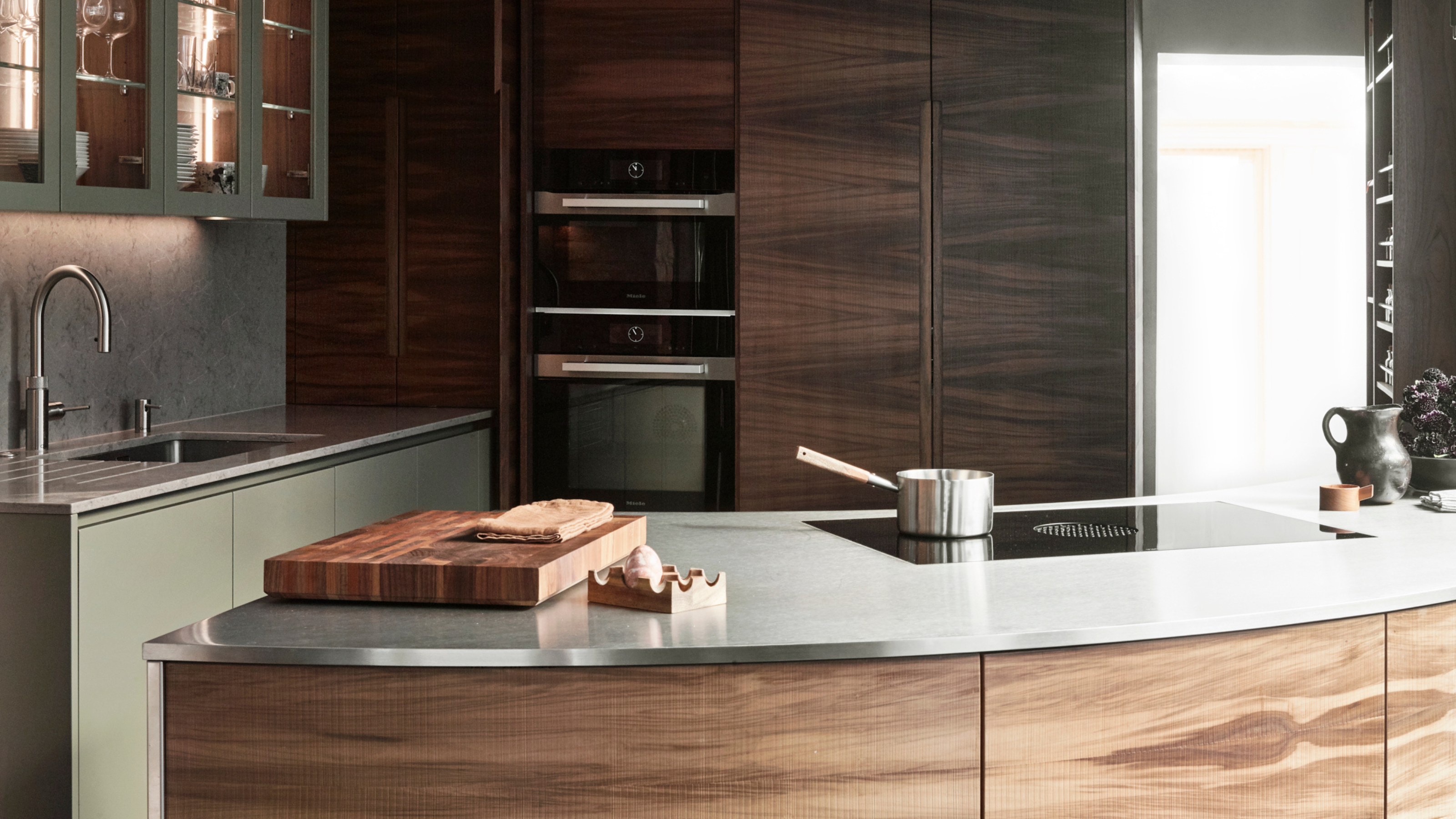
Such is the case with this striking Roundhouse design. Not afraid of changing things up, this kitchen says goodbye to the traditional structure and instead embraces the uniqueness of the home.
Article continues below 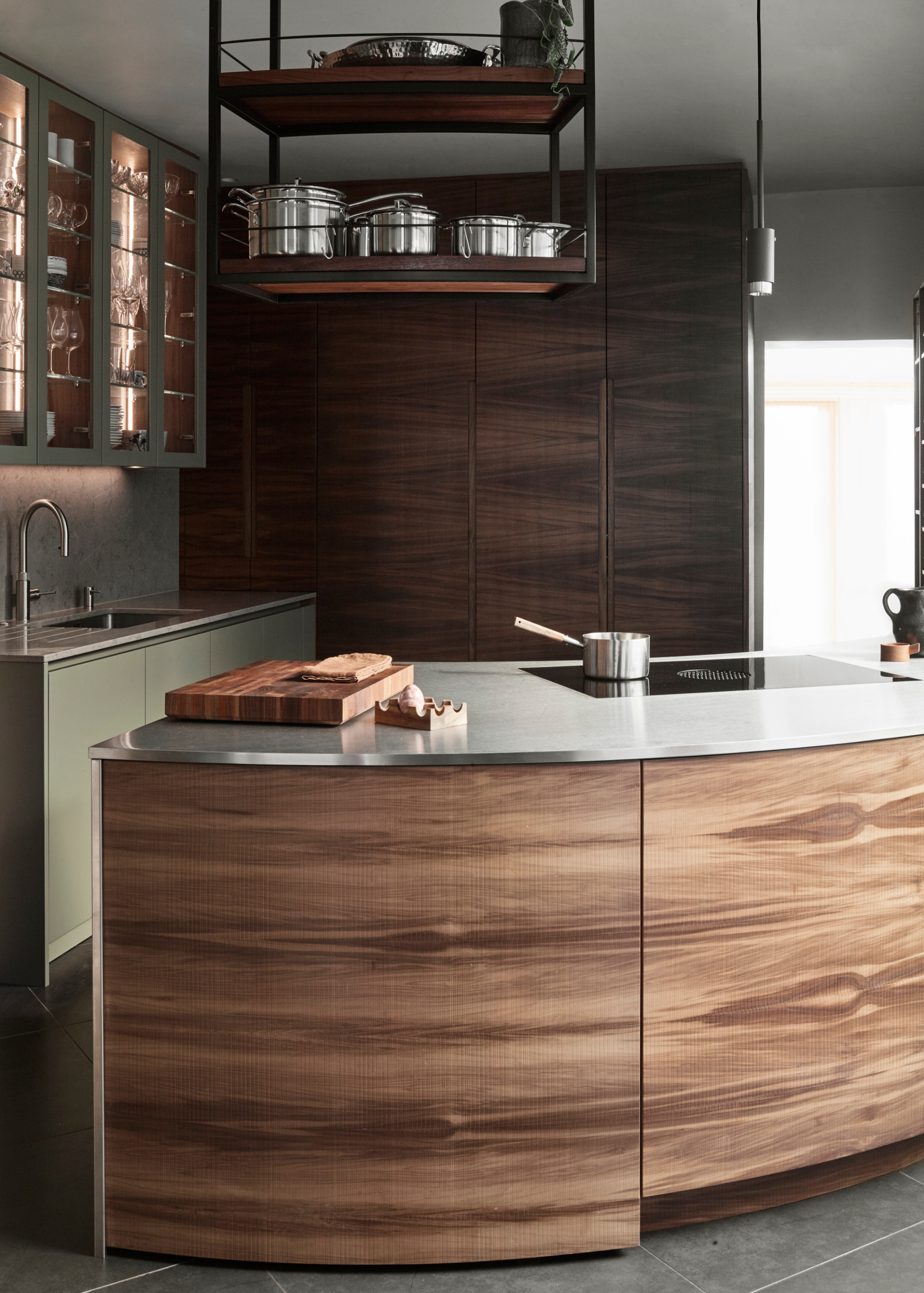
The proportions of this space make for a more streamlined design.
Most kitchen islands are rectangular, and create a very specific flow around the space. That's why this arched island came as such a revelation. "We definitely had to think outside the box with this kitchen," admits Roundhouse senior designer Ben Hawkswell.
As anyone who has ever lived in a kitchen with an awkward layout will know, a little bit of creative thinking can go a long way. This is especially true in tight galley kitchens, where proportions can often make the space feel awkward or boxed in.
"The layout included two walkways leading to the rear of the house, which really limited usable wall space. An island wasn’t quite right for the proportions, so instead of going for a conventional straight or angled peninsula, which would have felt too close to the dining area, we designed a fluid, curved work area that greets you as soon as you enter the space," Ben explains.
Rethinking the boundaries of what a kitchen island could and should look like enabled Ben to explore a whole new approach to designing a kitchen. Adopting this new approach meant Ben was able to design a space that delivered all the functionality and style you'd expect from any Roundhouse kitchen, while simultaneously creating something that looked unlike anything he'd ever worked on before.
The Livingetc newsletters are your inside source for what’s shaping interiors now - and what’s next. Discover trend forecasts, smart style ideas, and curated shopping inspiration that brings design to life. Subscribe today and stay ahead of the curve.
While opting for a curved island may seem to be a subversive move, the shape is actually surprisingly beneficial for the flow of the kitchen. The island typically acts as the central anchor for the kitchen area, the space around which people can gather and socialize. Giving this social hub a softer, curved form invites a more open, relaxed atmosphere.
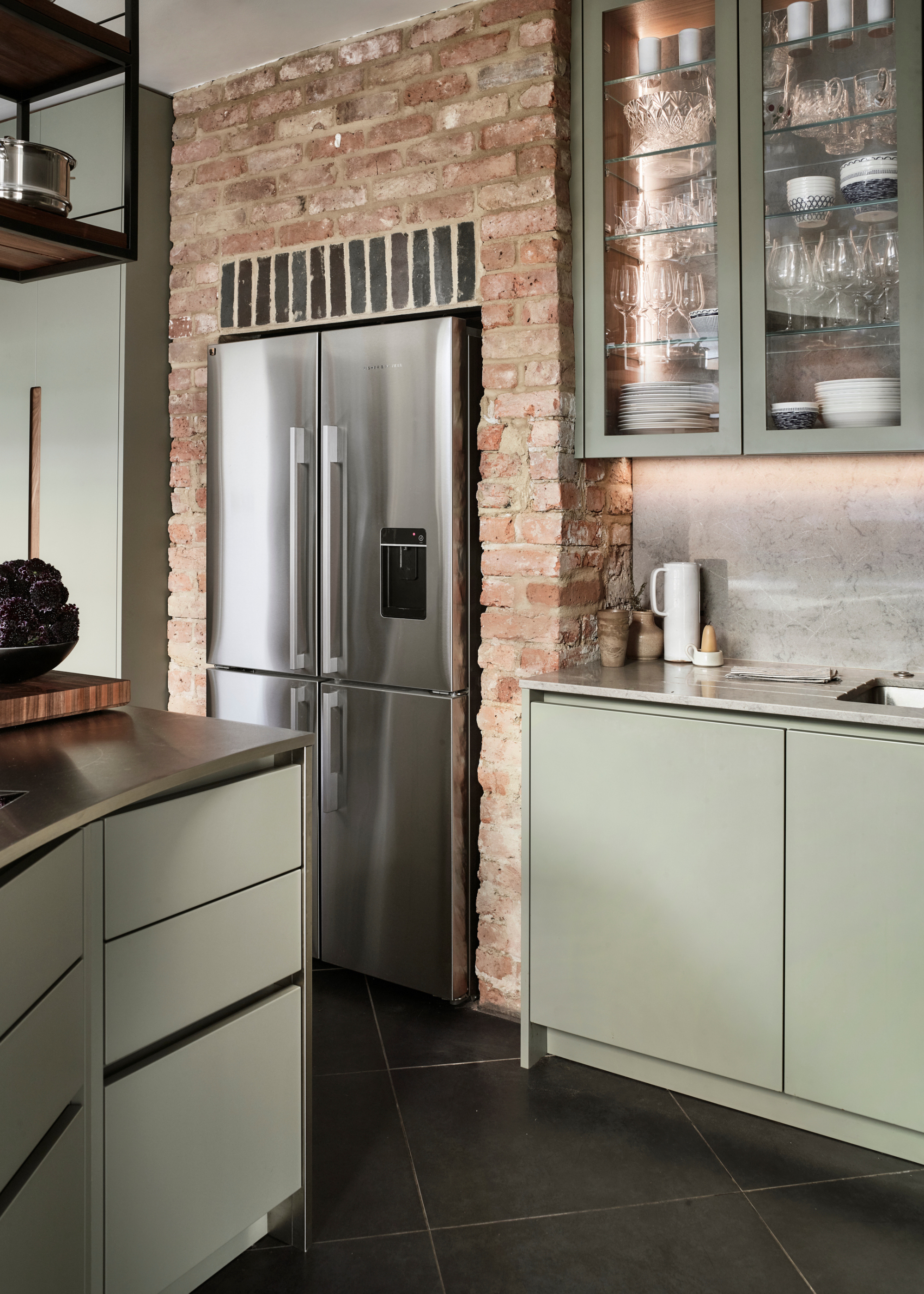
Positioning the fridge to the side of the kitchen allowed for maximal space.
This fix wasn't just a smart solution for an awkward space, as Ben says; "It became a standout design feature, perfectly positioning the cook for conversation and connection."
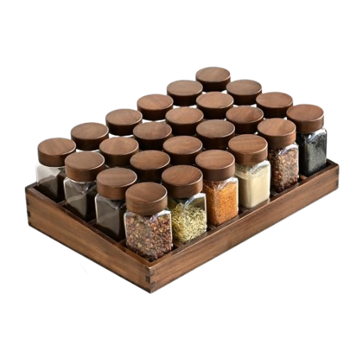
However, this was not the only design rule Ben experimented with in this kitchen. He continues, "We also broke the rules by embracing open storage, adding aerial shelving suspended from the ceiling and a bespoke timber spice rack that makes clever use of a former window opening - keeping everyday essentials beautifully on display and within easy reach."
Rejecting the idea that your goods should be hidden away and instead bringing them right to the foreground on full display helps to accentuate this laid-back, relaxed atmosphere in this space.
Although we now know it was a resounding success, what made Ben choose to break these golden design rules in the first place?
Well, as he explains, "We chose to break the rules because the new kitchen needed to surpass the previous one in every way — offering more kitchen storage, better work surface space, and greater visual impact."
When working within the confines of a pre-existing space, it can be tempting to follow the guidelines already laid out, offering slight tweaks and adjustments to help elevate the design slightly. Much more challenging, though, is to attempt to remove the memory of the former design and create an entirely new, different space. More difficult, but also more effective, as this kitchen proves.
"It was all about creating a space that felt elevated in both function and finish, and to fit within the space it is in with materials and detailing that truly made it stand out," Ben says.
The Design
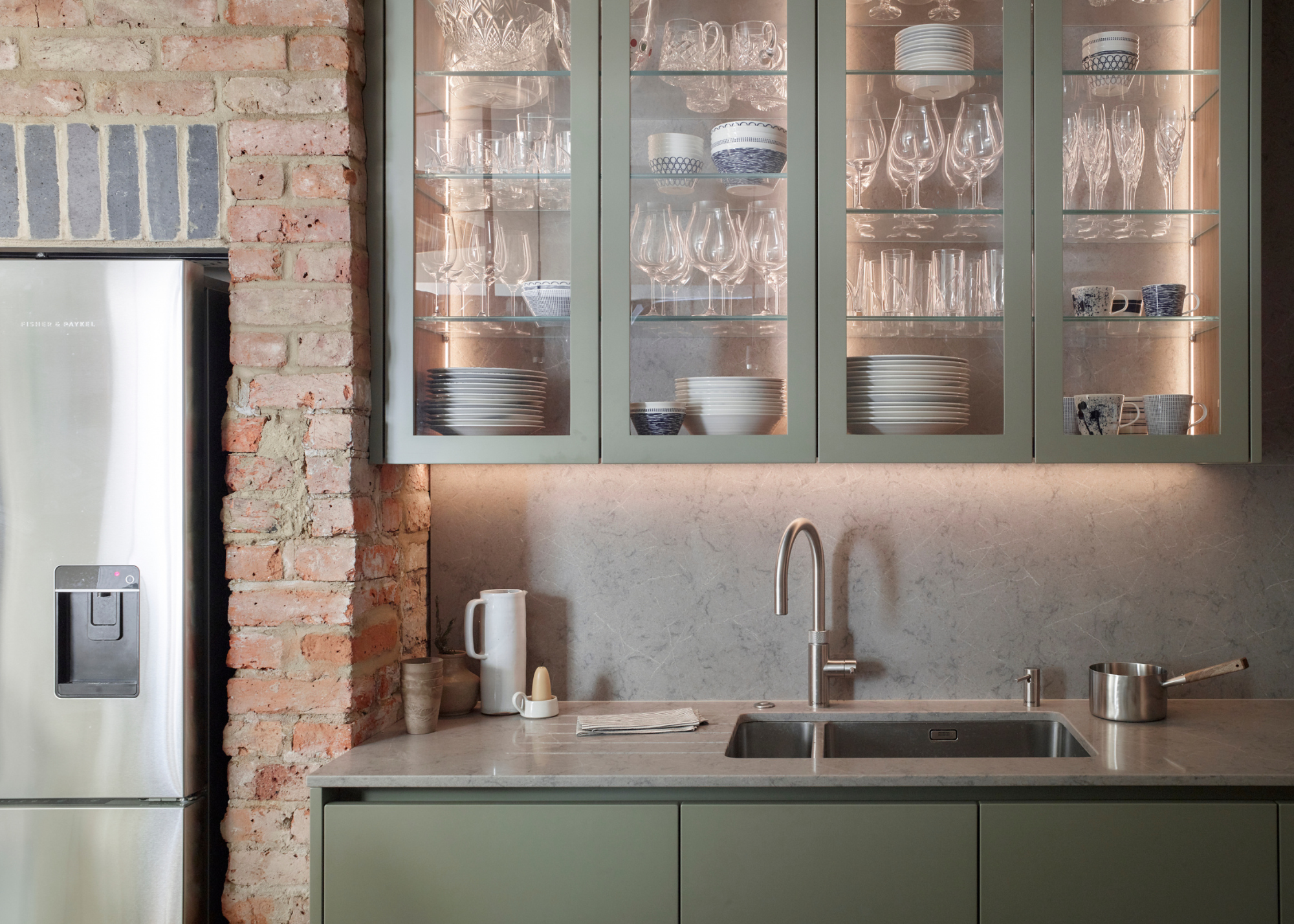
Glass-fronted cabinets add a vintage touch to the otherwise modern kitchen design.
While the architecture of this property presented challenges to overcome, it also possessed unique charms to highlight. As Ben puts it, "The layout of the space presented both a challenge and an opportunity."
With limited wall space and various original period architectural features, Ben had several aspects to consider in his design, forcing him to adapt his traditional approach to create something that would complement the home while still feeling completely original and modern.
"It encouraged a more creative approach, leading to the sculptural curved peninsula that not only maximised worktop area but also became a striking focal point," Ben explains.
Working alongside the architecture of the space created the opportunity for more surprising features, as Ben says, "The quirks of the architecture, like an old window opening, also inspired bespoke solutions such as the timber spice rack and aerial shelving, turning functional needs into standout design moments."
This combination of functionality and striking design was key to the entire process. Figuring out not just how to make the space as usable as possible, but also as beautiful, is what allowed for such a unique design.
"Functionality had to work hand in hand with style, so we incorporated clever design mechanisms to keep the space looking clean and considered. Appliances were concealed wherever possible—a bi-fold dresser hides the coffee machine and mixer, while a pocket door cabinet allows the main ovens to disappear from view when not in use, letting the beautiful veneer cabinetry take centre stage," Ben says.
Keeping appliances tucked away, but having seasonings and pans displayed on open shelving is a perfect example of how Ben created a sense of balance in this space. Even the most stylish kitchen appliances can make a kitchen look cluttered; however, having pots and pans out can help lend a chef's kitchen feel to the space.
Design Rule to Never Break
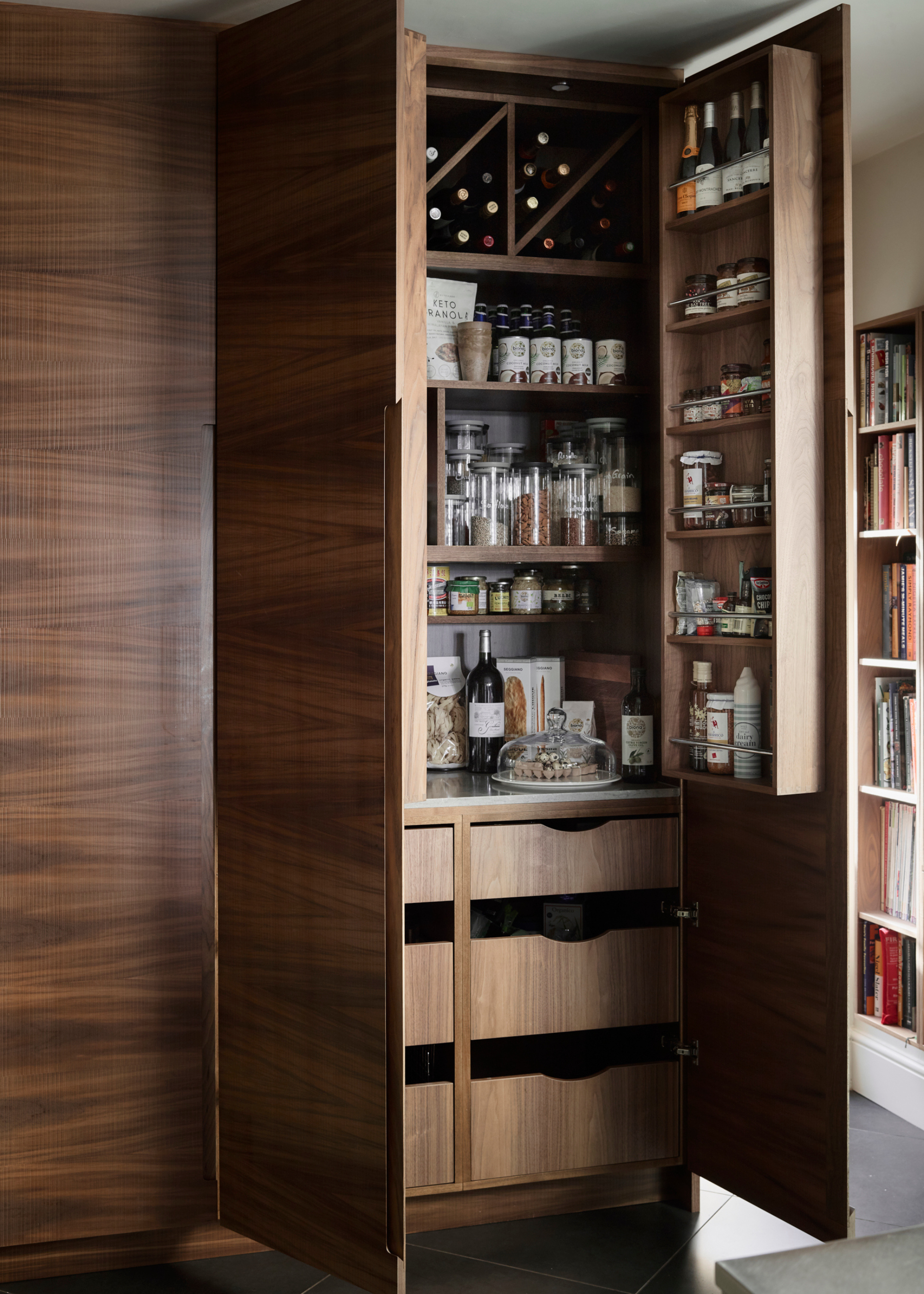
Timber cabinetry conceals plenty of additional kitchen storage.
So, are there any rules that Ben would never break?
"We’re not afraid to bend the rules, but one thing I always stick to is that functionality can never be sacrificed for style," he says.
The balance of style and function is precisely what sets this small kitchen apart from the rest. Kitchens should be designed with their owner in mind, to accurately reflect the way in which the space will be used.
"A kitchen has to work beautifully day to day - so while we love making bold design moves, they always have to enhance how the space is used, not just how it looks," Ben explains.
Moving beyond these outdated design rules is the first step to establishing a unique, secure sense of style. Instead of thinking about what you can and can't do, why not spend some more time considering what actually appeals to you?

Maya Glantz is a Design Writer at Livingetc, covering all things bathrooms and kitchens. Her background in Art History informed her love of the aesthetic world, and she believes in the importance of finding beauty in the everyday. She recently graduated from City University with a Masters Degree in Magazine Journalism, during which she gained experience writing for various publications, including the Evening Standard. A lover of mid-century style, she can be found endlessly adding to her dream home Pinterest board.
