This smart NYC apartment is a modern masterclass in getting a lot of storage into a small space
A couple's apartment in Manhattan has been cleverly conceptualized with hidden storage units by AMMOR Architecture


One of the problems with apartment living is, of course, the storage. For young parents, conventional wisdom often dictates that when you have kids, you must make the compromise of moving out of the city, away into a home that can accommodate the whole family. But! What if we told you that clever design could solve all your problems?
'This apartment is a part of a large building complex in Manhattan, New York, owned by a married couple,' says Goil Amornvivat, partner at AMMOR Architecture. 'The owners are hip, young professionals who recently had a baby.'
While space in this modern home was limited, the architecture firm made it their priority to open up rooms, views and boost storage units that were cleverly hidden in plain sight.
Article continues below'The most premium luxury in New York is not an object or a thing; it is space,' says Goil. 'This home is in a super-urban environment so we wanted to contrast that by creating a bright, warm, calm, and peaceful place. One of our goals was to reduce the home’s visual noise by creating a lot of closed storage. We also turned a tight three bedroom into a two generous-sized bedroom apartment. This way we were able to create nicer, larger and more well-lit spaces.'
Apart from the newly renovated, expansive bedrooms, the home also has a terrace overlooking the New York downtown.

Aditi is a homes writer and editor with several years of experience. Her articles, backed by expert insights, offer suggestions aimed at helping readers make the best home design choices. Each piece presents latest ideas, information, and trends to her readers. For this piece, she spoke to one of the top architecture firms in New York to learn how a small city apartment was converted into one that has generous space, style, and storage.
Entryway
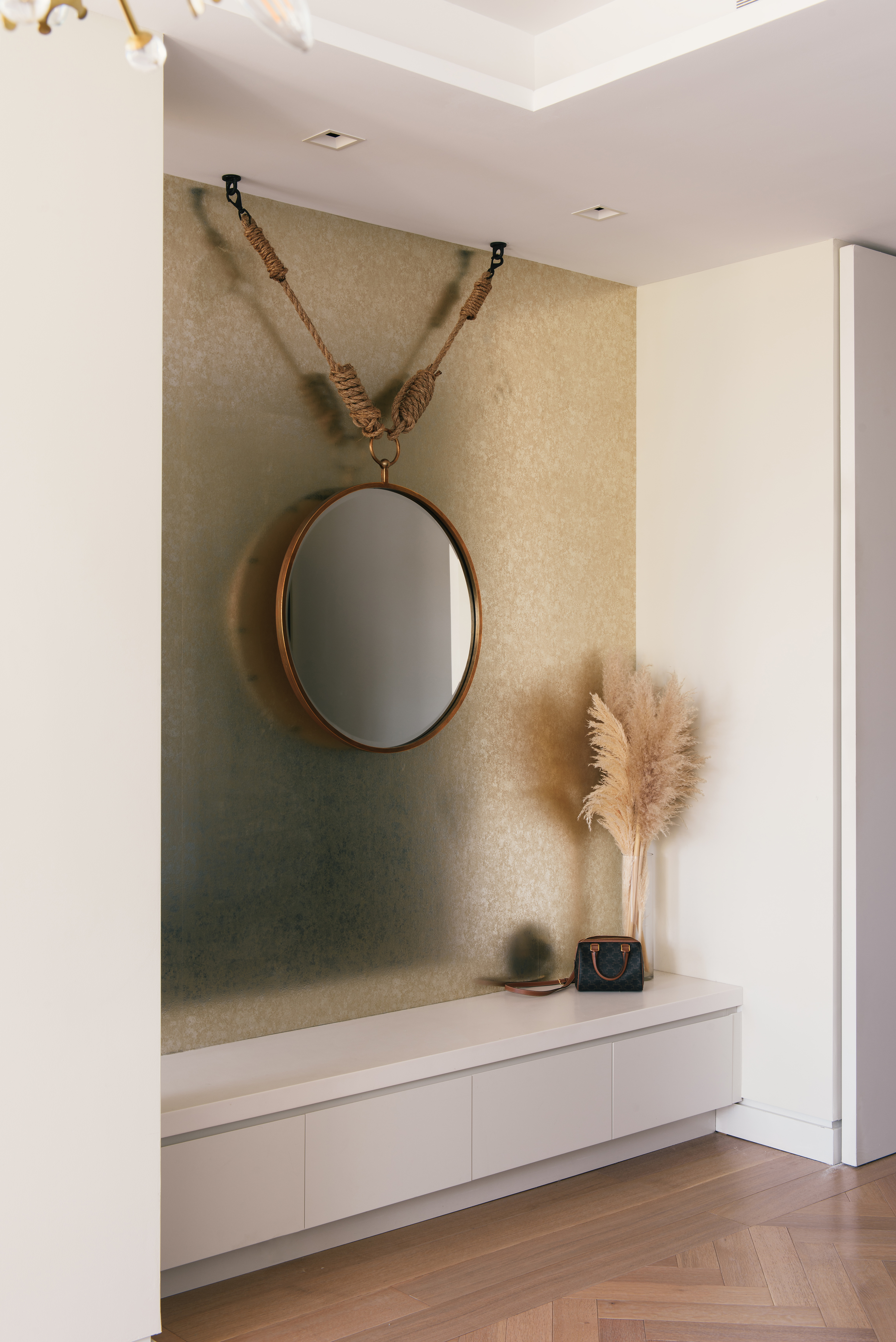
Much of the home's layout was reconfigured to accommodate more function and style. The entrance was originally a small hallway, which was opened up, now overlooking the terrace, and views beyond. Storage is added under the bench. And, to further perk up the space, the apartment entryway has a gold foil wallpaper, that injects color into a largely all-white home.
'We always start the home's palette with a strong neutral base and build up from that,' says Goil. 'Limited hues make sure the whole house feels like one, although at key moments we did have fun, like in the master bedroom and the powder room. The gold foil wallpaper in the entrance was brought in to help bounce the light around in the space.'
The Livingetc newsletters are your inside source for what’s shaping interiors now - and what’s next. Discover trend forecasts, smart style ideas, and curated shopping inspiration that brings design to life. Subscribe today and stay ahead of the curve.
Dining room
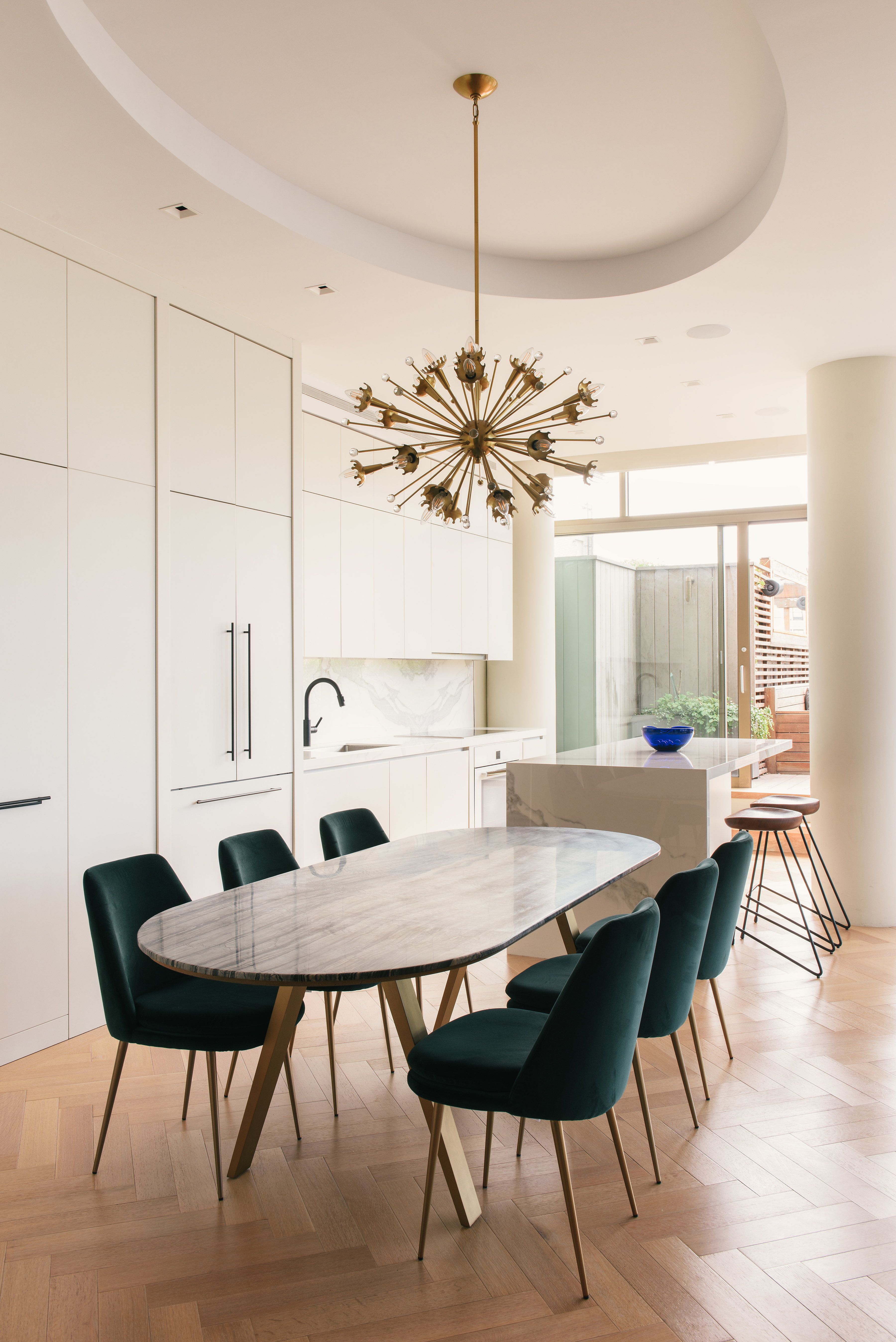
While the home has a generous open plan, each space has its own identity and design, with an overall muted palette unifying all elements. All along the wall behind the dining space is a storage unit; one that hides crockery, tchotchkes and even a home bar. Against the wooden flooring and table, the green upholstered chairs inject texture and comfort.
Curves are a big dining table trend today – a shape that invites people to literally gather round. 'We chose an oval table that offers significant seating, yet is an easier shape to move around, with no sharp corners,' says Goil. This was also a key decision keeping in mind that the house will soon have a toddler running about.
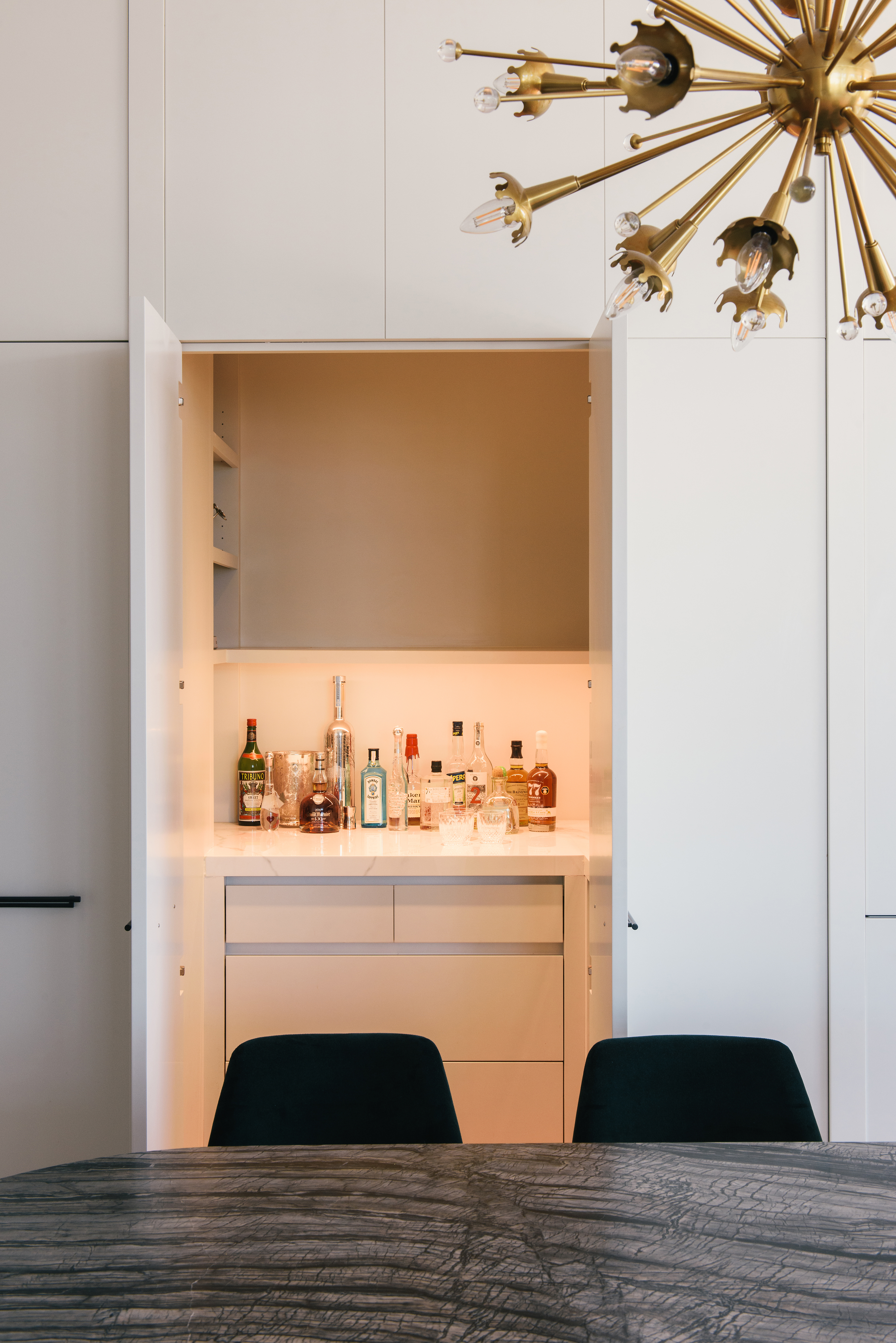
'Closed, clever storage is a big USP of our firm,' says Goil. 'In this space, the original wall behind the dining jogged in and out, so we straightened it with closed storage. While the front is uniform, the depths of the cabinet vary.'
Recessed lighting has been added inside the cabinets, and all shelves have a soft open and close functionality.
Kitchen
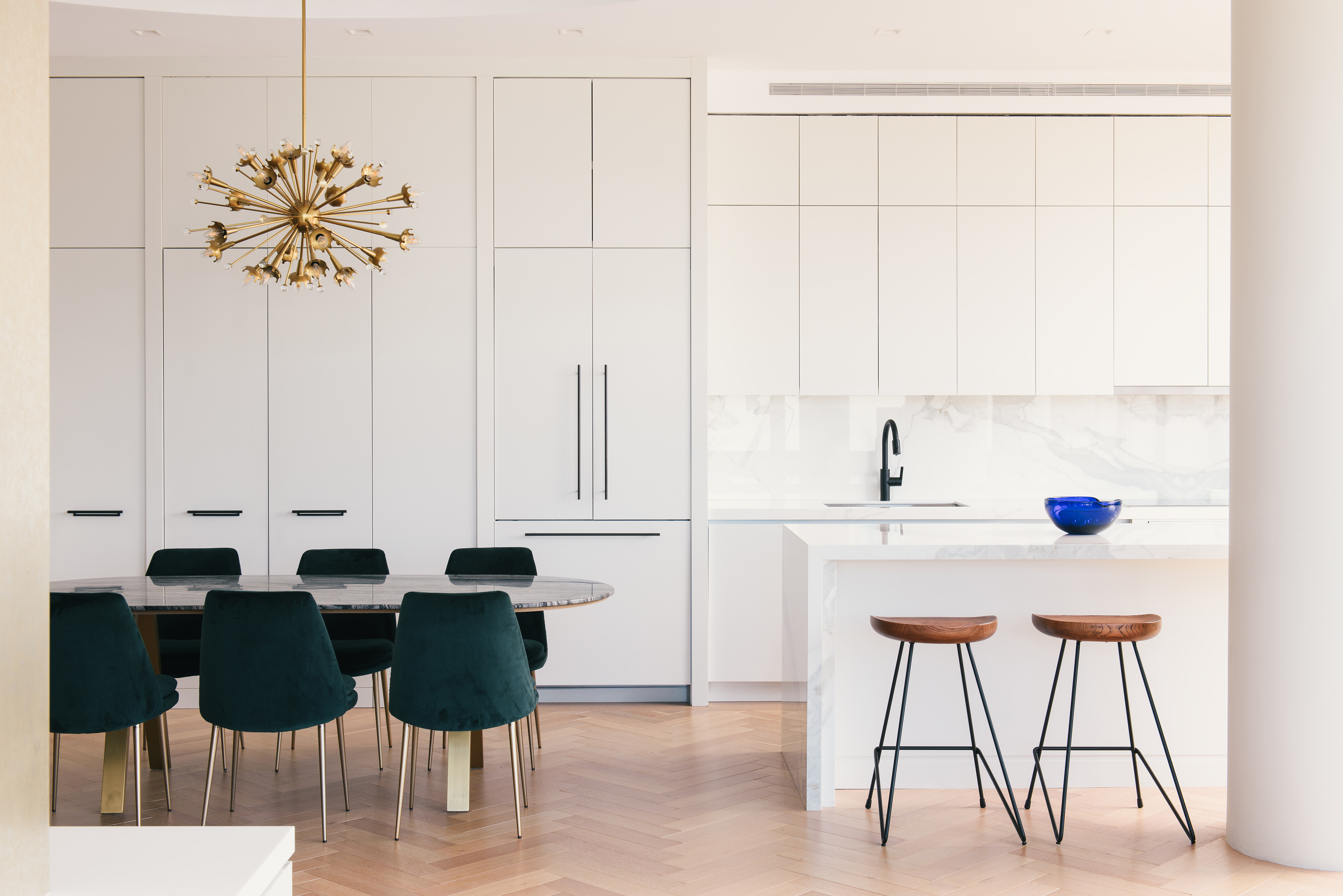
The kitchen is custom designed. The kitchen cabinet colors are kept white, and the countertop and backsplash are both solid surfaces called Neolith (a manmade counter-grade material that simulates the look of a large slab of stone).
'We reconfigured the closed small kitchen into one that looks nice, open, and is seamlessly integrated into the living room,' says Goil. 'All in all, giving a grand look to the interior. We also moved this space a little closer to the terrace, making entertaining outdoors easier and more pleasant.'
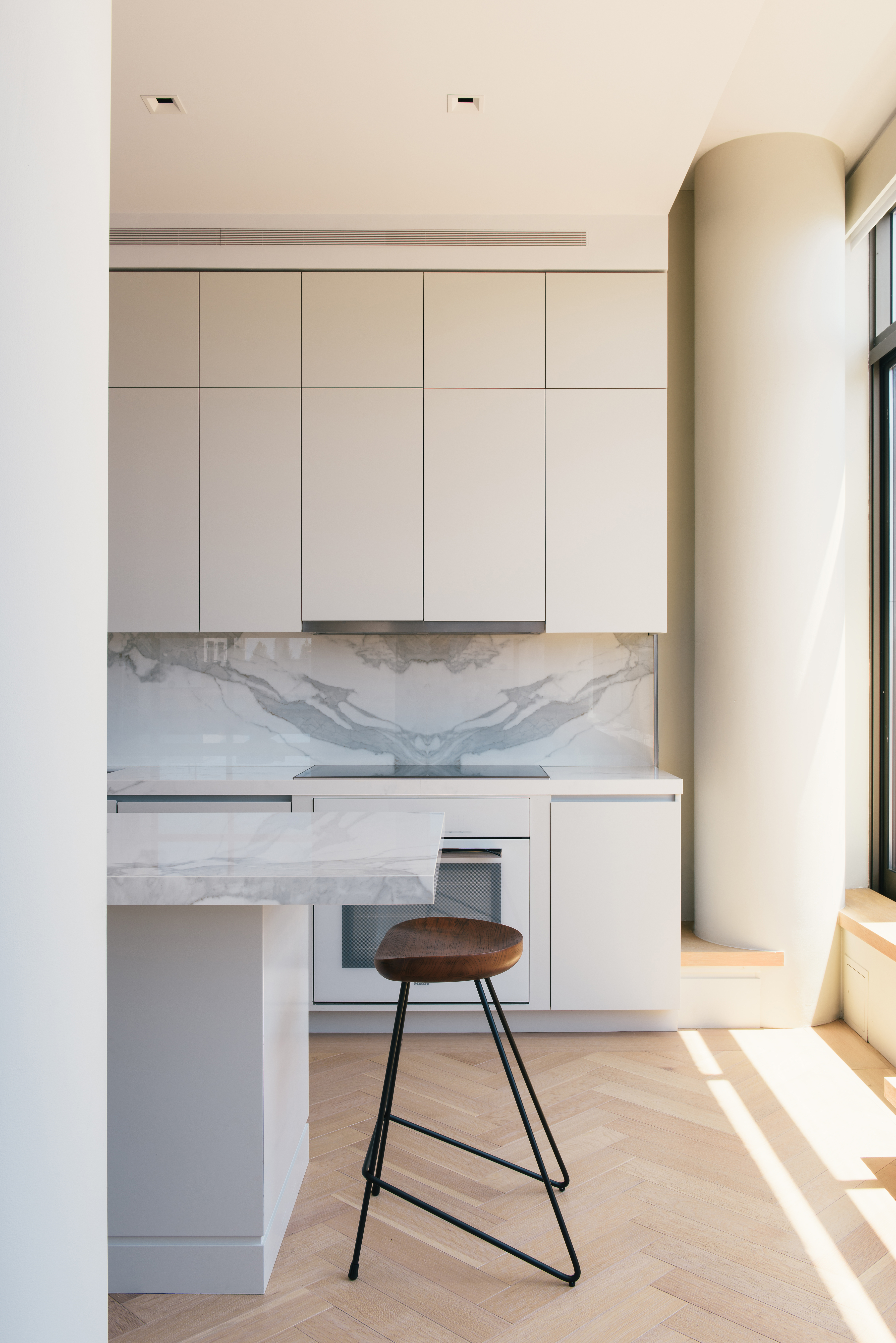
Almost all of the storage is placed behind closed doors. 'The entire back wall looks like millwork panels, but these are doors that hide a fridge, a bar, a pantry, and more,' says Goil. 'Sure it all looks easy but there's a lot of complexity involved in creating hidden storage units!'
'We also added a drop ceiling above the kitchen, with integrated ambient lighting,' says Goil.
Living Room
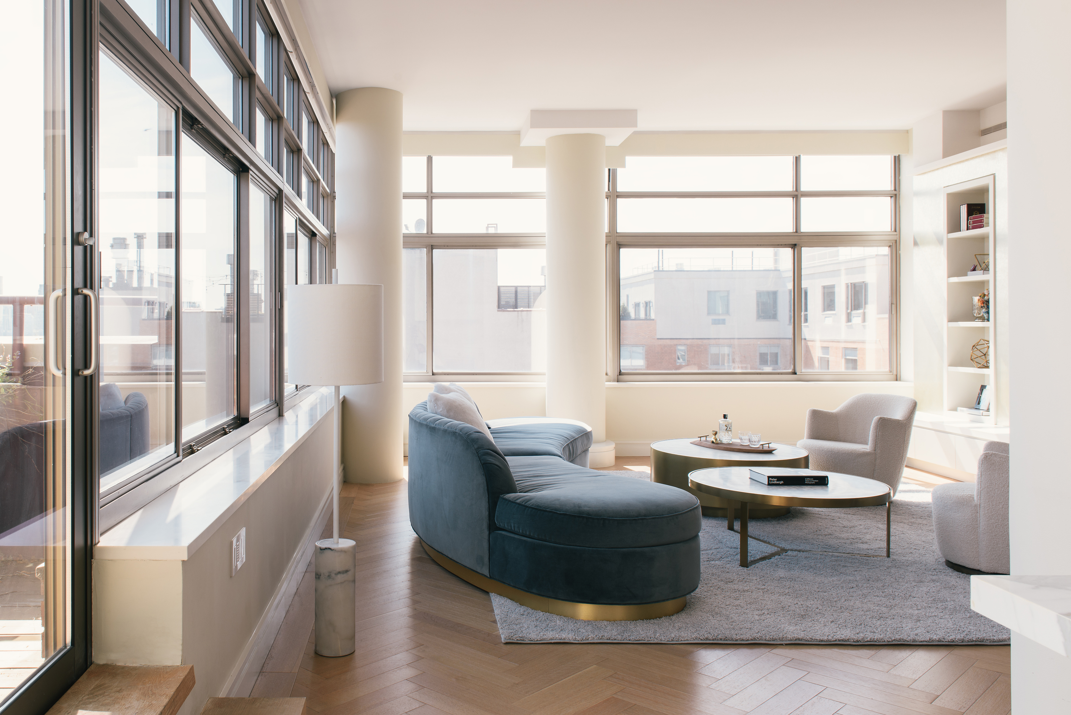
The heart of the home, a cozy, convivial spot for the family and one that opens up panoramic views of the city is designed with a lot of consideration. A soft navy living room color palette balanced with grey takes over, juxtaposed well against the New York landscape.
'We wanted to soften the space with plush upholstered items,' says Goil. 'And the sofa's curve helped soothe the space. Also, against the room's strong architectural base, the custom curved sofa stands out.'
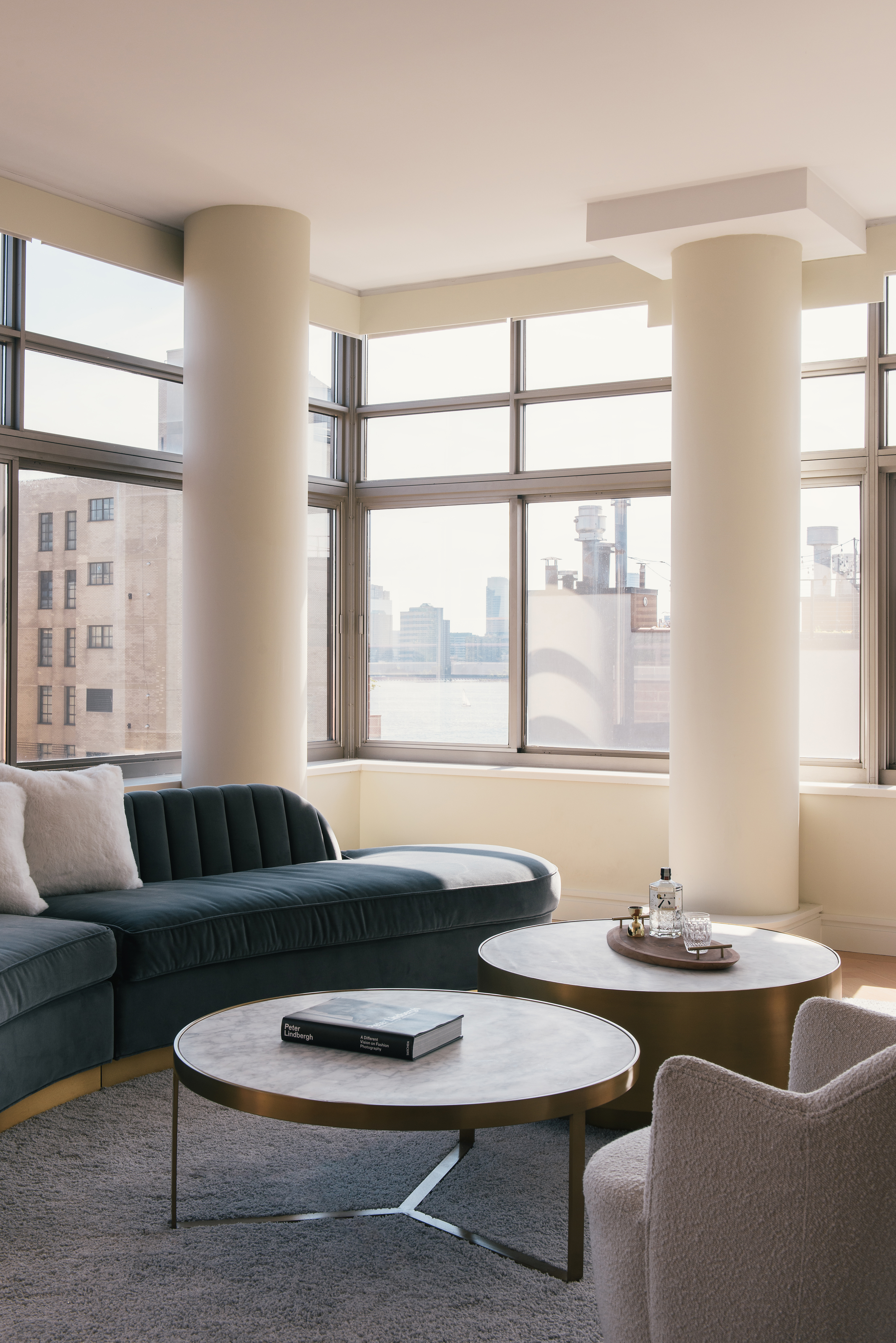
The presence of the aboriginal columns gives the room a unique architectural look and feel and, adds to the curves and soft shapes of the room. A low plinth runs across the living room and the entrance, which is functionally enriched with storage.
The use of white on the walls and the storage helps merge the two, making the home and every room look larger and airier than it is. Placed atop the wooden flooring, the grey carpet adds a sense of layering and coziness.
A sliding panel door has been added between the living room and the private areas of the house [not pictured], helping the bedrooms get closed off for privacy during parties.
Terrace
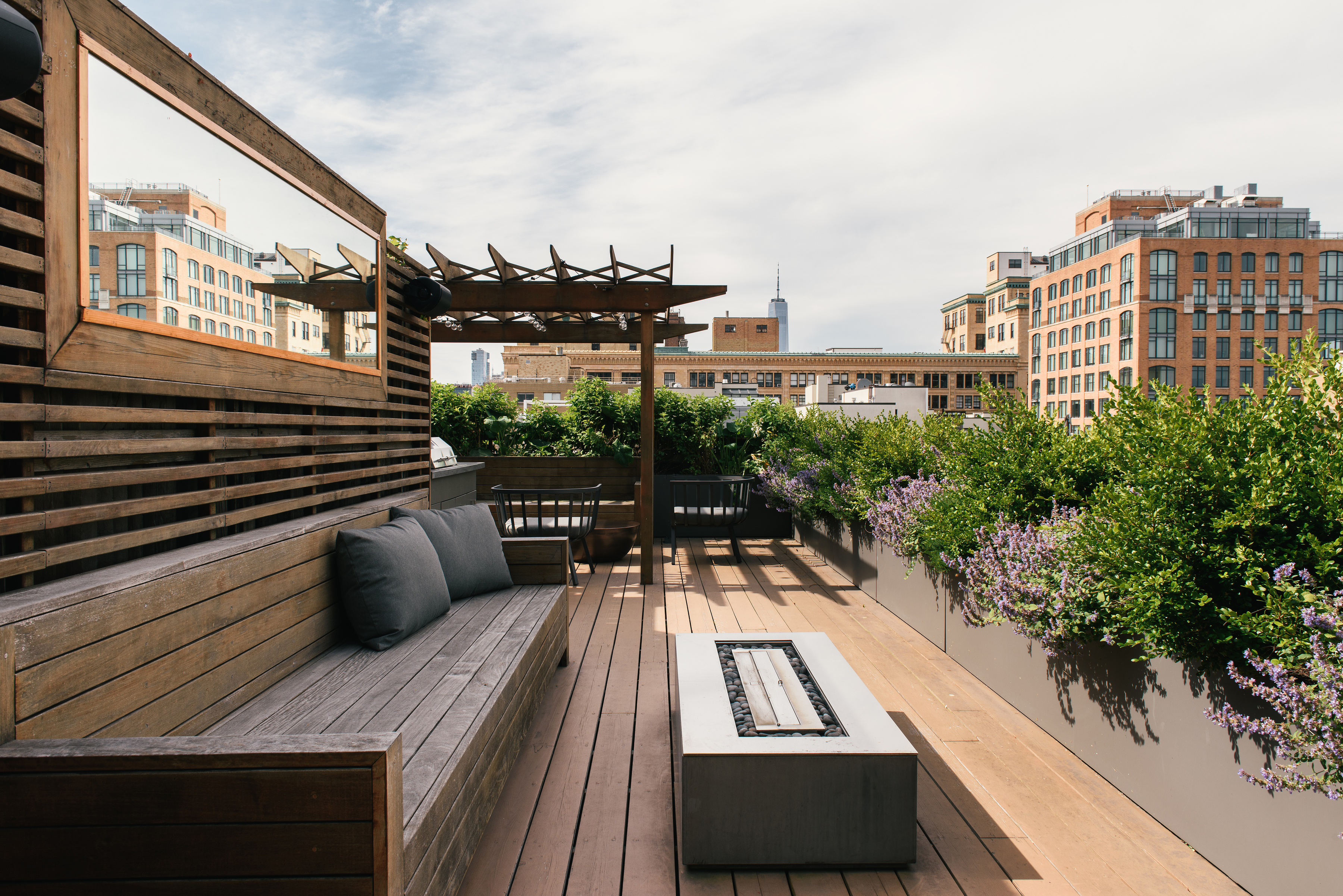
Situated close to the kitchen and the living room, the terrace garden is the most premium location in this home. A city apartment with an outdoor space high above is a dream for most homeowners.
The terrace features built-in benches and a millwork grill. The firm also placed a mirror in this area to reflect the Hudson view.
'Another big move that was made in this home was enlarging the floor-to-ceiling aperture of the door to the terrace,' says Goil. 'We installed large sliding doors and lengthened the steps leading to this space, thereby connecting the interior and exterior better; almost like one space pours into the other. The larger aperture also helps bring in more light into the home.'
Master Bedroom
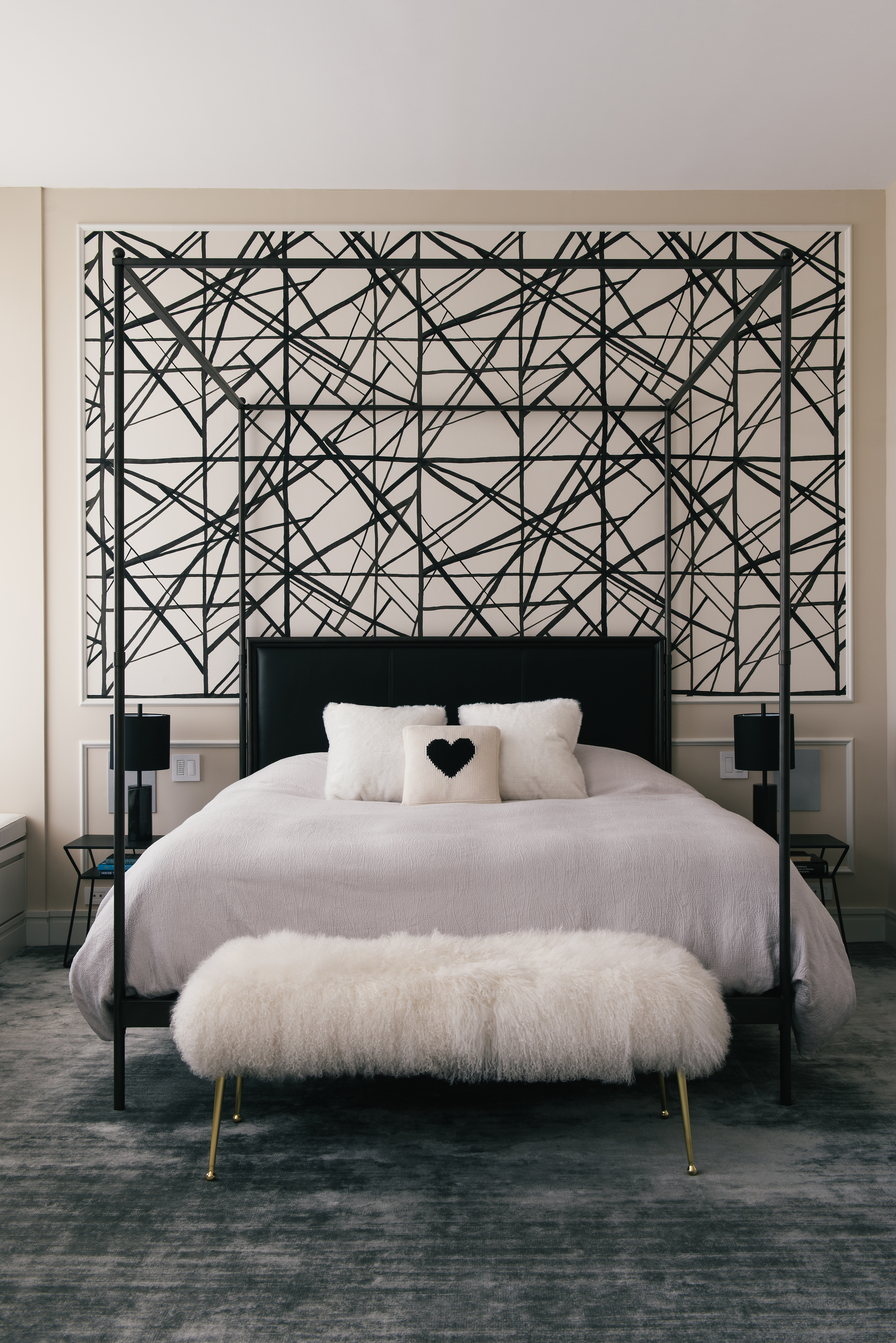
The master bedroom is a room full of character, thanks to the eye-catching Kelly Wearstler wallpaper, the dark headboard, the plush bench, and the sheer scale of the renovated space.
'The primary bedroom is a well-proportioned, volumetrically sound space, considering the high ceilings,' says Goil. 'In this room, the ceiling needed to be dropped due to the new HVAC system/ducting we put in. And so, we used the dropped ceiling to create an intimate vestibule for the bed area. Also, stepping onto the bed is an experience, with the silk viscose wall-to-wall carpet.'
Study
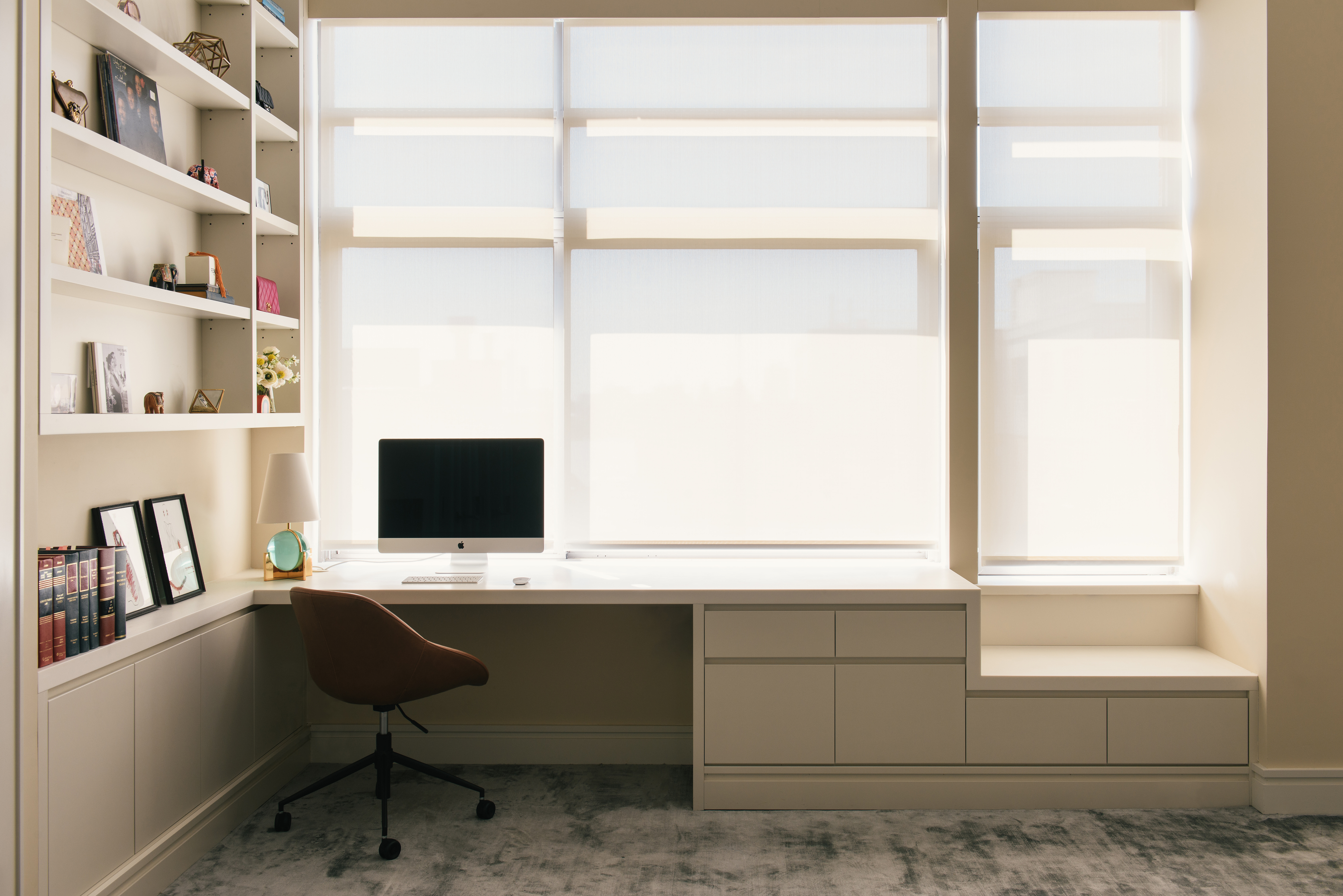
Within the master bedroom is a sizeable modern home office; one that is enriched with plenty of storage, comfort, and, mild filtered light. 'The desk is integrated into the window wall, and the millwork extends to the full length of the room, and becomes a bench by the bed.'
Large windows are covered with light, white shades, and the palette is muted, to encourage the feeling of openness.
The bedroom carpet runs across the room, adding to the cocooning, soft underfoot feeling. The layering of plush materials ensures the room is cozy and inviting at all times, to rest, sleep or work in.
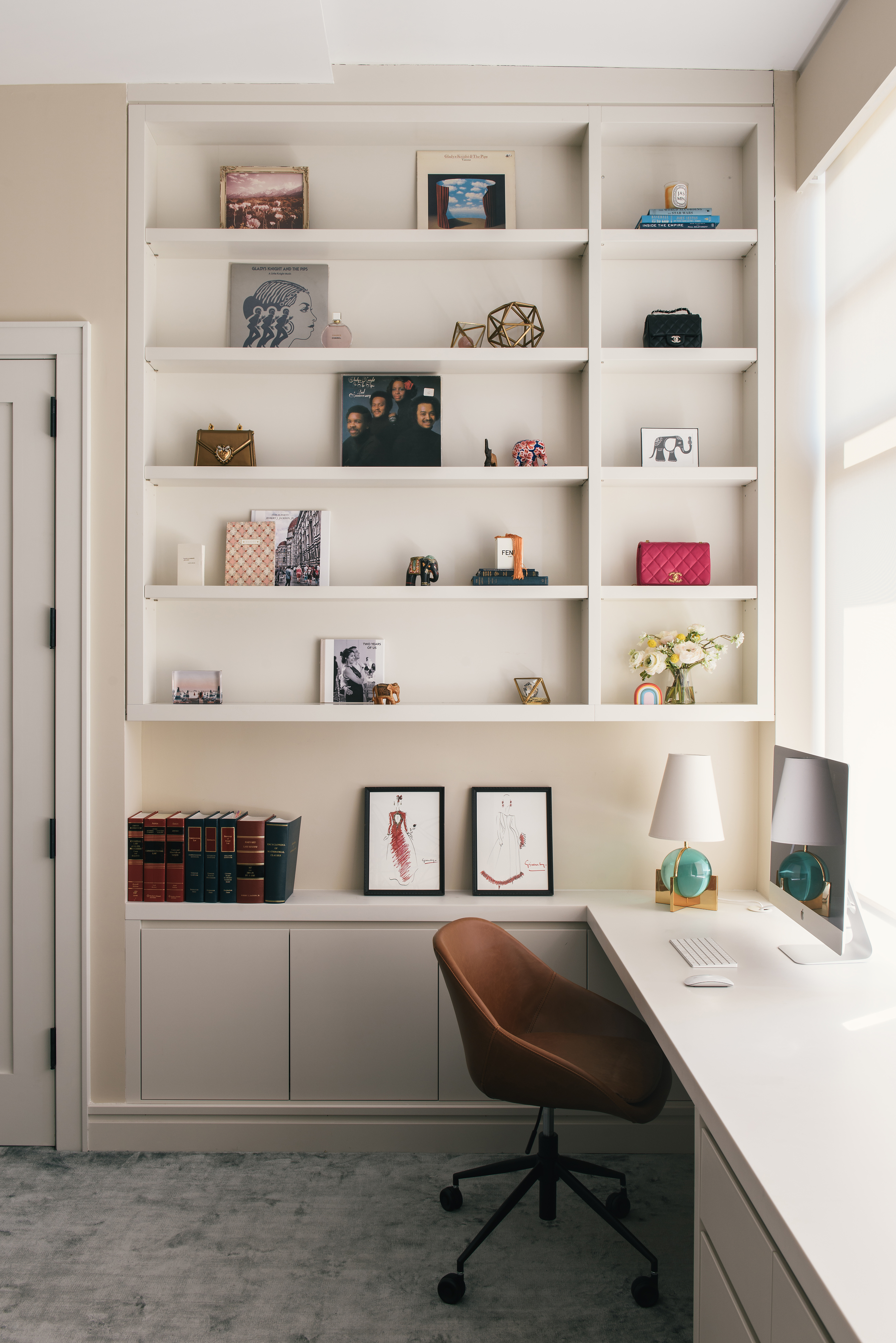
'This space has two types of storage – open and closed,' says Goil. 'For the home office area, we provided closed storage for filing, books and stationery, and open shelves to showcase decor and personal items.'
Nursery
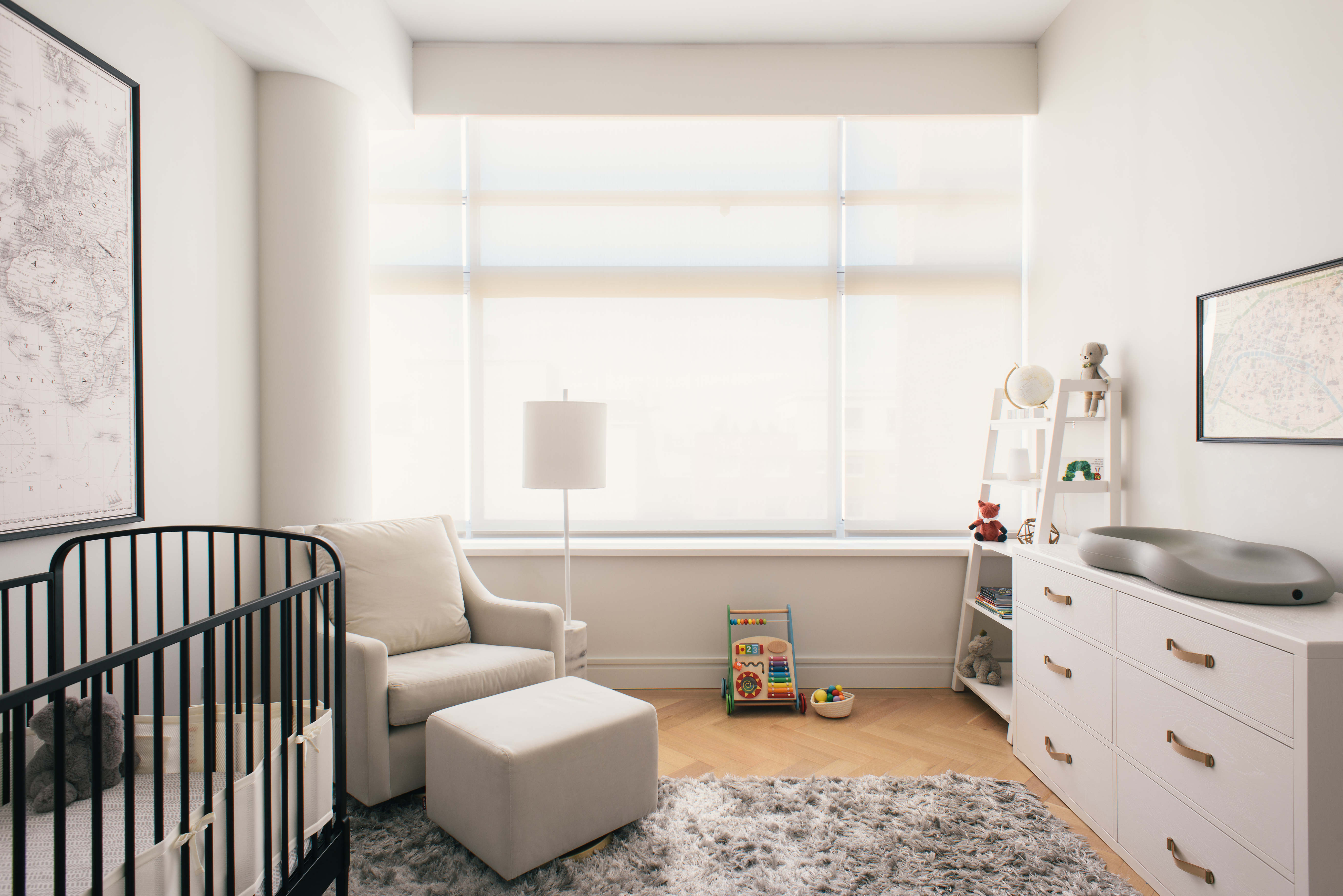
The second bedroom is converted into a nursery, with custom storage units and furniture. The palette is white, which is an ideal neutral nursery idea, and practical for a room that can transition with the child. Soft, filtered light enters this room too, with the long, white blinds. Much like all other spaces in the house, this bedroom also has views of the city.
'The home was an exercise in 'opening things up', whether it's connecting with each other, the views or the light,' says Goil.
Powder room
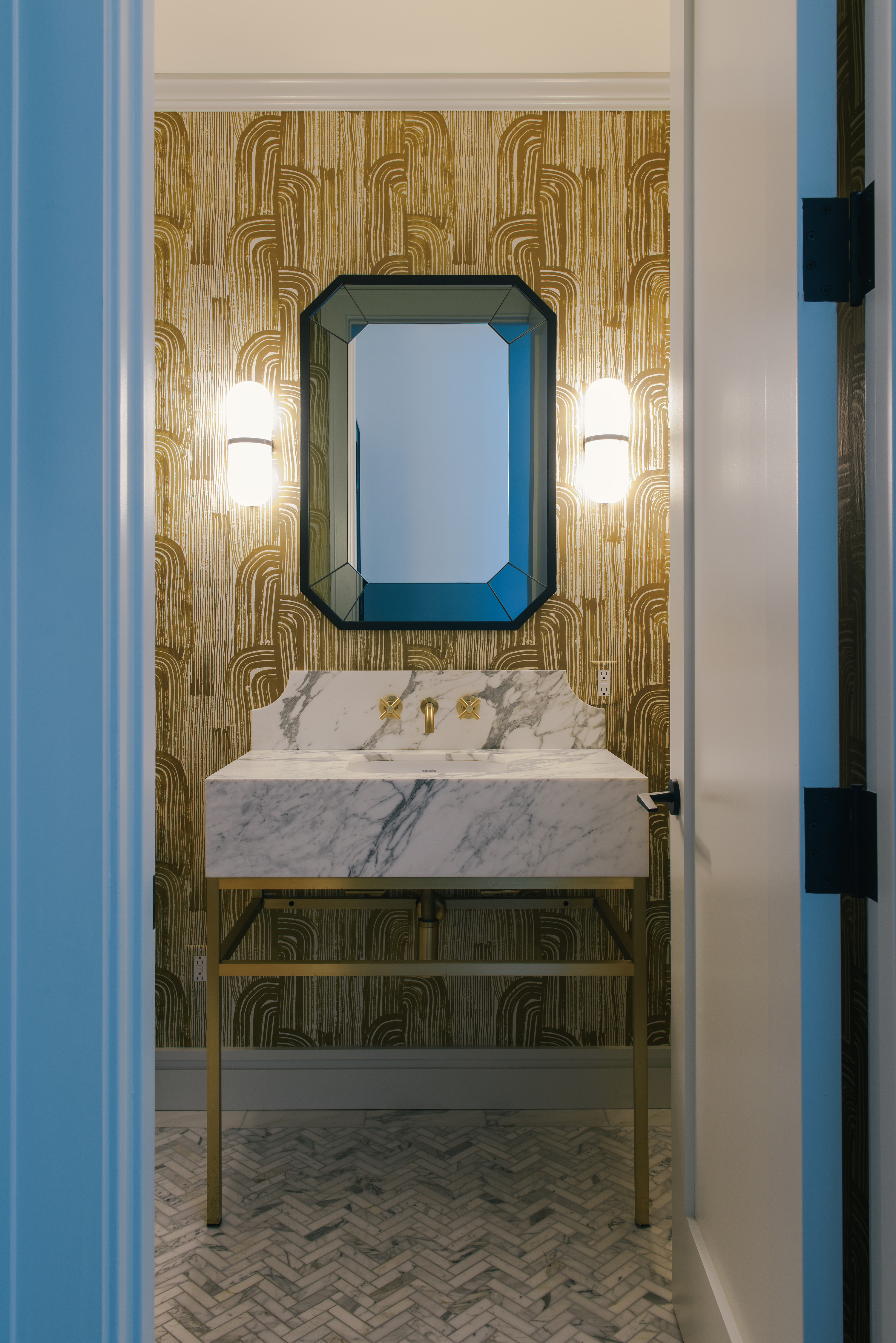
This room along with the master bedroom speaks of color, glam, and high-concept style. The powder room features a Kelly Wearstler wallpaper, and a charming marble basin, with gold-toned fixtures. The floor tiles give movement to the room, and the door frame in blue sets the tone of the design of the space.
See more of AMMOR Architecture projects.

Aditi Sharma Maheshwari started her career at The Address (The Times of India), a tabloid on interiors and art. She wrote profiles of Indian artists, designers, and architects, and covered inspiring houses and commercial properties. After four years, she moved to ELLE DECOR as a senior features writer, where she contributed to the magazine and website, and also worked alongside the events team on India Design ID — the brand’s 10-day, annual design show. She wrote across topics: from designer interviews, and house tours, to new product launches, shopping pages, and reviews. After three years, she was hired as the senior editor at Houzz. The website content focused on practical advice on decorating the home and making design feel more approachable. She created fresh series on budget buys, design hacks, and DIYs, all backed with expert advice. Equipped with sizable knowledge of the industry and with a good network, she moved to Architectural Digest (Conde Nast) as the digital editor. The publication's focus was on high-end design, and her content highlighted A-listers, starchitects, and high-concept products, all customized for an audience that loves and invests in luxury. After a two-year stint, she moved to the UK and was hired at Livingetc as a design editor. She now freelances for a variety of interiors publications.