Why Are All the Coolest Bars Painted Red Right Now? Design Notes From These "Intimate and Transportive" Spaces You'll Want to Bring Home
No, it's not just you — these sexy, red-drenched hangouts are everywhere. We spoke with designers behind some of the best to learn how to capture their electrifying feel
Last year, as we looked into the design phenomena that we predicted would shape life and interiors in 2026, I appropriated the David Bowie-inspired expression Space Oddity to reference restaurants and high-fidelity clubs where sleek, back-lit surfaces, sculptural lines, and sensorial palettes transport guests elsewhere — a dimension where the everyday momentarily pauses to give way to an alternate, fantasy world.
That same intention is what, in my opinion, drives the relentless advance of red bars: a desire to break free from the norm and have fun. In a bleak and uncertain world, these escapism-ready addresses are becoming ubiquitous within the London bar industry — and just as prominent in other global metropolises.
To understand what exactly makes this color trend such a recognizable moment in design right now, I sat down with the interior design studios behind some of the coolest red bars across town, and beyond, to gather insights on how to translate their electrifying feeling into your own home. So read on and take notes.

Behind the Rise of Red Bars

Red bars are quickly taking over London's nightlife scene, and Upstairs at Hausu, a newly unveiled high-fidelity cocktail bar, captures their immersive charm.
"Red is the color of heat, intensity, and energy," Livingetc's color expert Amy Moorea Wong recently told us, adding that, also representing "passion and sensuality, it brings in the drama." The same is true when this fiery shade is used in hospitality, where the hue can simultaneously help capture retro-fueled throwbacks.
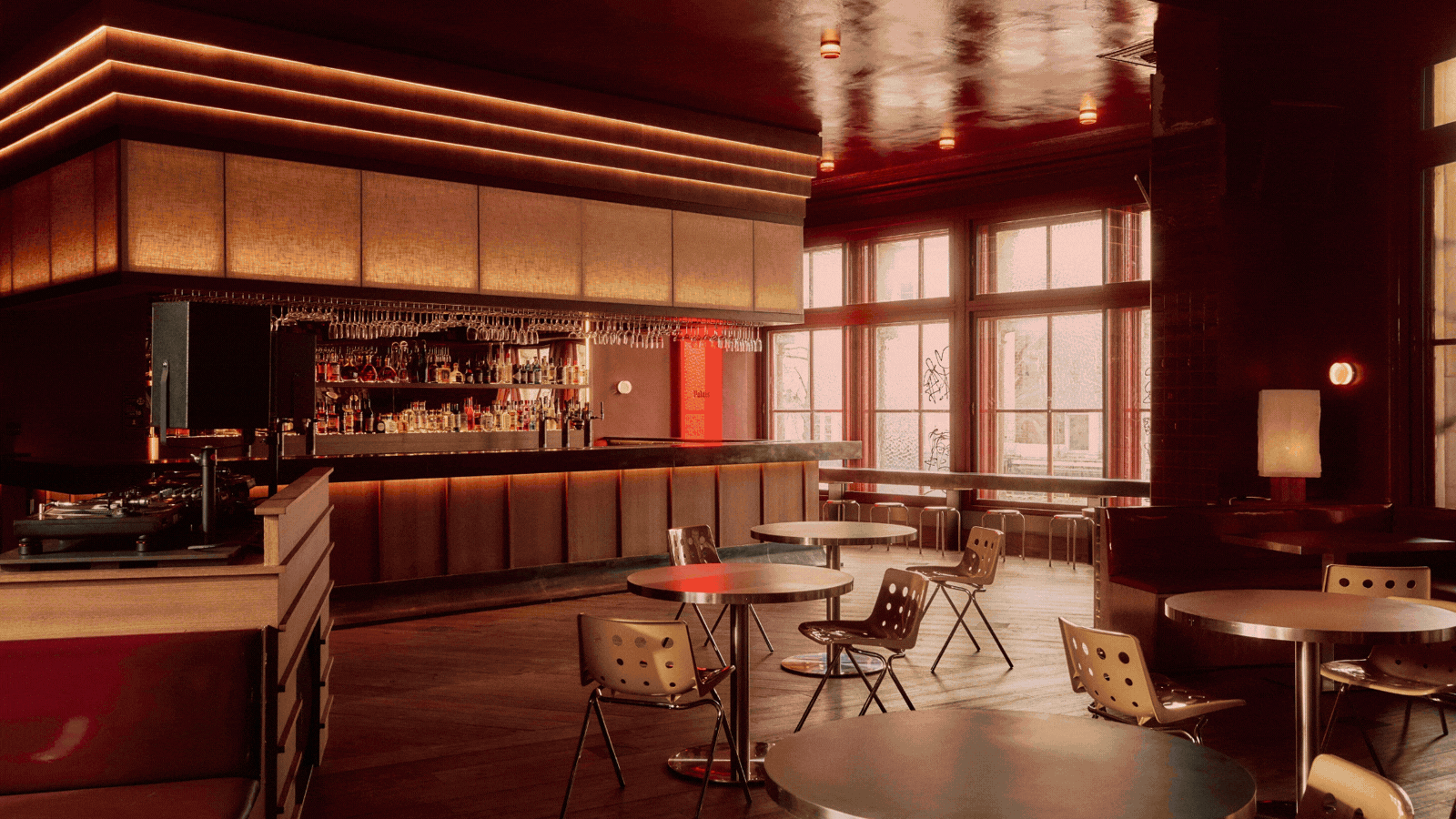
Fare Inc.'s founder, Annie Harrison, who recently completed the groovy makeover of Peckham's just-relaunched Palais — an 11,000-square-foot multi-space with a 500-capacity basement club, a 270-guest cocktail bar, and an independent music venue — knows that well, as the inspiration for this project stemmed from the vibrancy of the 1970s.

"The red changes throughout the day, and double-aspect windows highlight the different tones in the walls, tiles, and upholstery, adding energy to the room that's palpable as soon as you walk in." — Annie Harrison, founder at Fare Inc.
"The original building was a department store that closed its doors at the end of that decade to become the original Palais nightclub," she says of the address, which reopened this month after 15 years and is a collaboration with the architects of studio NIKJOO. "We wanted to remember this time between the building's two lives, and the red felt like the perfect color to invoke this era."
In many ways, the color palette of Palais allows it to exist in between states. "The red changes throughout the day," Harrison explains. "Double-aspect windows highlight the different tones in the walls, tiles, and upholstery, adding energy to the room that's palpable as soon as you walk in."
When Color Roots People in Space

15 years after shutting its doors, Palais is reborn as a no-phone nighttime cove for the music and the design curious crowd.
As well as Little Greene's burned earth Arras paint color, they played with Solus's Locale tiles from the brand's Carnival range to reflect the red brand signage, and with LED and natural light to diffuse the low, soft lighting that brings the space to life, honing in on that after-hours, nightclub feel.
Throughout Palais, warm oak details, chrome decor, and PVC seating infuse the destination with an industrial-chic aesthetic. Alongside its textural furnishings, the space's strict no-phone policy and minimalist DJ booth ensure the focus remains on the lived experience, foregrounding sensory immersion over technological clutter.
While replicating the scale of Palais would be a complex, if not an impossible, endeavor, from a residential perspective, the idea behind its striking design is to root whoever comes by in a specific moment in time. Something we, too, should aspire for guests to feel when hosting dinner parties.

Tucked beneath Lina Stores Shoreditch, Bar Lina is a velvet-clad cocktail spot oozing old Italian glamour.
Peckham's Palais isn't the only London hotspot to have embraced the power of red. At the aperitivo-central Bar Lina in Shoreditch, the irreverent, cheeky subterranean sister of storied Italian restaurant Lina Stores, studio A-nrd's Alessio Nardi and Lukas Persakovas turned to a burgundy-leaning tone (not far off this Theatre Red by Little Greene) to unleash a sense of exclusivity and warmth.
Compared to brighter, or more primary, reds, which can feel quite sharp and energetic, the duo explains, deeper jewel hues make for an "enveloping" effect. "They completely change the way a place is experienced, naturally encouraging a more social, relaxed ambiance," they say. After a long period of lighter, more neutral interiors, "there's a renewed interest in spaces that feel atmospheric and transportative". Together with red, nuances of oxblood, terracotta, amber, and green carry depth, favoring "a stronger emotional response," A-nrd's Nardi and Persakovas say.
Palette as an Emotional Threshold

Bar Lina's color-drenched burgundy look, expressed across all surfaces and furniture, creates a tangible gap between its underground hangout and the shop upstairs.
Bar Lina's color-drenched look came from a desire to establish an emotional fracture between the address's ground-level retail space and the downstairs area. "The idea was to introduce a monochromatic moment within the old bank vault, almost as a hidden, more immersive experience," they explain. "Red allowed us to create that shift very clearly, moving away from the openness and brightness of the main restaurant while still referencing a certain Italian sensibility around nightlife and glamour."
Everything here, from the painted walls and ceilings to upholstery, leather, and the marble detailing, is designed to draw you in. "The dimmer tones, reflective surfaces, and softer lighting conjure up a space that feels intimate and heightened, but still comfortable," Nardi and Persakovas say. "Somewhere that encourages people to slow down, stay longer, and engage with their surroundings and with each other." The result is, to say the least, cinematic.

Who said red can only be introduced through paint? At Upstairs at Hausu, the suspense and charm of red bars is gently hinted at through floating curtains.
Choosing to paint a nook of your open-plan living room or home bar red requires some serious commitment. But what if there was a less demanding way to let the intoxicating energy of your favorite nightlife hangouts inside your home?
Holly and Tom Middleton-Joseph's newly unveiled Upstairs at Hausu, the hi-fi cocktail bar of the eponymous South London eatery, shows just how much of a difference curtains can make when styled properly.
Paired with industrial furniture, bare cement and brick walls, and a series of mismatched pendant paper lanterns, alongside a retro sound system and thriving plants, these see-through textile insertions grant the address an absorbing, emotional essence. Because, sometimes, one brave element is enough to revolutionize a space.
Steal the Look for Your Own Home

For Enrique Ventosa, the co-founder of studio PLUTARCO., people shouldn't "be afraid of having a darker space in their home," as darker tones and shades of red are your gateway to impactful drama.
"The challenge with red is that it can very quickly become overwhelming if it isn't handled with restraint," A-nrd's Nardi says. "It's a color that dominates, so every decision around it has to be deliberate." This, his creative partner adds, includes lighting, which needs to be painstakingly balanced not to feel oppressive and harsh.
The duo recommends working within a tight tonal range, introducing variation through material and finish — gloss, matte, soft textiles, mirrored surfaces — rather than contrast to avoid crafting an environment that feels fragmented. A piece of advice the team of Madrid-based studio PLUTARCO. implements across all projects of their residential, retail, and hospitality practice.
Red is a key shade in their work. "We love how it is directly linked to nature, through the hues of a long sunset or the vibrant colors of flowers and earth," co-founder Enrique Ventosa explains. "Plus, its many shades mean it can adapt to every situation."

Statement furniture and shelving can also be a more subtle way to incorporate red into your domestic decor.
Nuances like marron, wine, terracotta, or traffic red are PLUTARCO.'s go-to shades of red. Elegant and versatile, "they can be combined with other tones to create the perfect match," Ventosa says.
Among the colors that go with red, "light blue is ideal with marron as it softens its darker notes. Wine and pistachio green is another powerful combo, as the warmer tones of the former counter the acidity of the latter. Terracotta and ochre make for a total-warm chromatic scheme, while traffic red is great to pair with median pink, just like Yves Saint Laurent or Luis Barragán did."

From an operative kitchen counter and bar to a sleek, glamorous home cocktail corner, studio PLUTARCO. knows how to let red do its trick in the domestic environment.
Quirky, sculptural furniture pieces and accessories, especially if boasting a lacquered finish, can be another easy way to seamlessly integrate red in your interior design plan. And the creatives at PLUTARCO. often do just that: "we always like unexpected contemporary touches, as they offer a fresh take to the distinctive home style of our clients," Ventosa explains.
His ultimate tip for a home bar worth a social gathering? "Don't be afraid to experiment with different patterns and shades: after all, this is the perfect place to go a little crazy".
Flip through our lifestyle pages for more expert advice and curation on all things entertaining, culture, and travel.
Ready for Pride Month? Check out our edit of queer spaces in London for design obsessives.
