The Livingetc newsletters are your inside source for what’s shaping interiors now - and what’s next. Discover trend forecasts, smart style ideas, and curated shopping inspiration that brings design to life. Subscribe today and stay ahead of the curve.
You are now subscribed
Your newsletter sign-up was successful
How do you take a totally unrenovated home, built in 1883, and update it for modern life? While, at the same time, keeping as much of its period charm?
That was the challenge set to Colleen Healey, founder of her eponymous Washington, D.C., architecture firm. 'The brief was to preserve what we can especially in the more formal parts of the house, re-do all of the bathrooms and kitchens, connect the house to the garden, bring light in through unexpected ways, honor the past but make it modern!' Colleen says.
And while no project is without its difficulties, dealing with a 140 year old structure certainly doesn't help - especially when the owner wants a fully modern home.
Article continues below'Working on a period property gives you so much to work from and respond to,' Colleen says. 'There is a natural sense of give and take between old and new that has to happen to find the right balance. In this case, we bridged historic and modern through shared elements of texture and rhythm and created surfaces that bounced light in a similar way in both the original and new. We also exposed original raw materiality and structure (brick and original floor joists for example) in the spaces that we made more modern. This helped to bring in a warmth that was inherent in the more cellular rooms of the Victorian areas of the house, but that was needed to blend the modern openness of the renovated new spaces.'
Living room
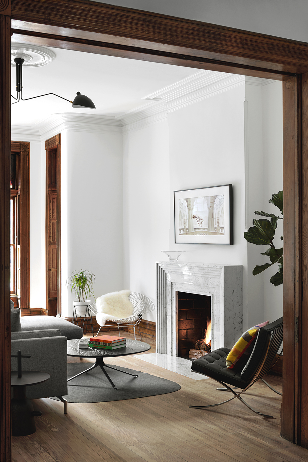
As with many period properties, the rooms are not always regular rectangles, which can lead to design issues. However, Colleen decided the best approach for the curves of the wall leading into the living room window was not to try to fight them, but to use them as starting point for other spaces.
'We embraced the curved surfaces and made some of our own to draw those original features (present originally only in the front half of the house) into the back kitchen area,' Colleen says. 'These surfaces bounce soft light into the space, so we used that same trick upstairs in our skylights at the second floor landing to bring soft light in from above.'
The ashy blonde wood of the living room flooring adds to the calming feel of this space. 'The flooring in the front part of the house is all original pine,' Colleen says. 'In the rear of the house, we used pine but ran it diagonally across the floor. None of the rear kitchen and garden room walls are square so running the flooring diagonally avoided any misalignment and celebrated the new design while still honoring the original flooring material.'
The Livingetc newsletters are your inside source for what’s shaping interiors now - and what’s next. Discover trend forecasts, smart style ideas, and curated shopping inspiration that brings design to life. Subscribe today and stay ahead of the curve.
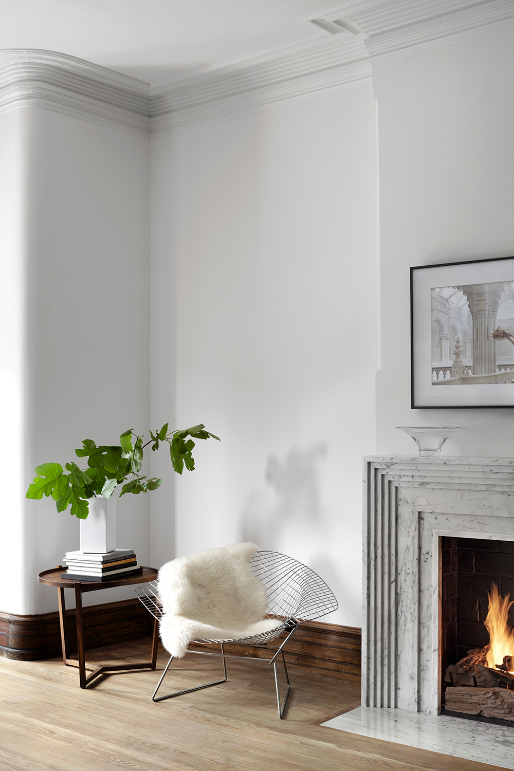
To contrast with the dark wood of the shutter and skirting, the walls are painted in Benjamin Moore's Super White over original plaster.
The fireplace is made of Carrara marble pieces that are cut and layered together. 'We wanted something with crisp modern edges but that aligned with the ornate Victorian detailing of the room, and had a stepped texture akin the crown molding and period trim details,' Coleen says.
Dining room
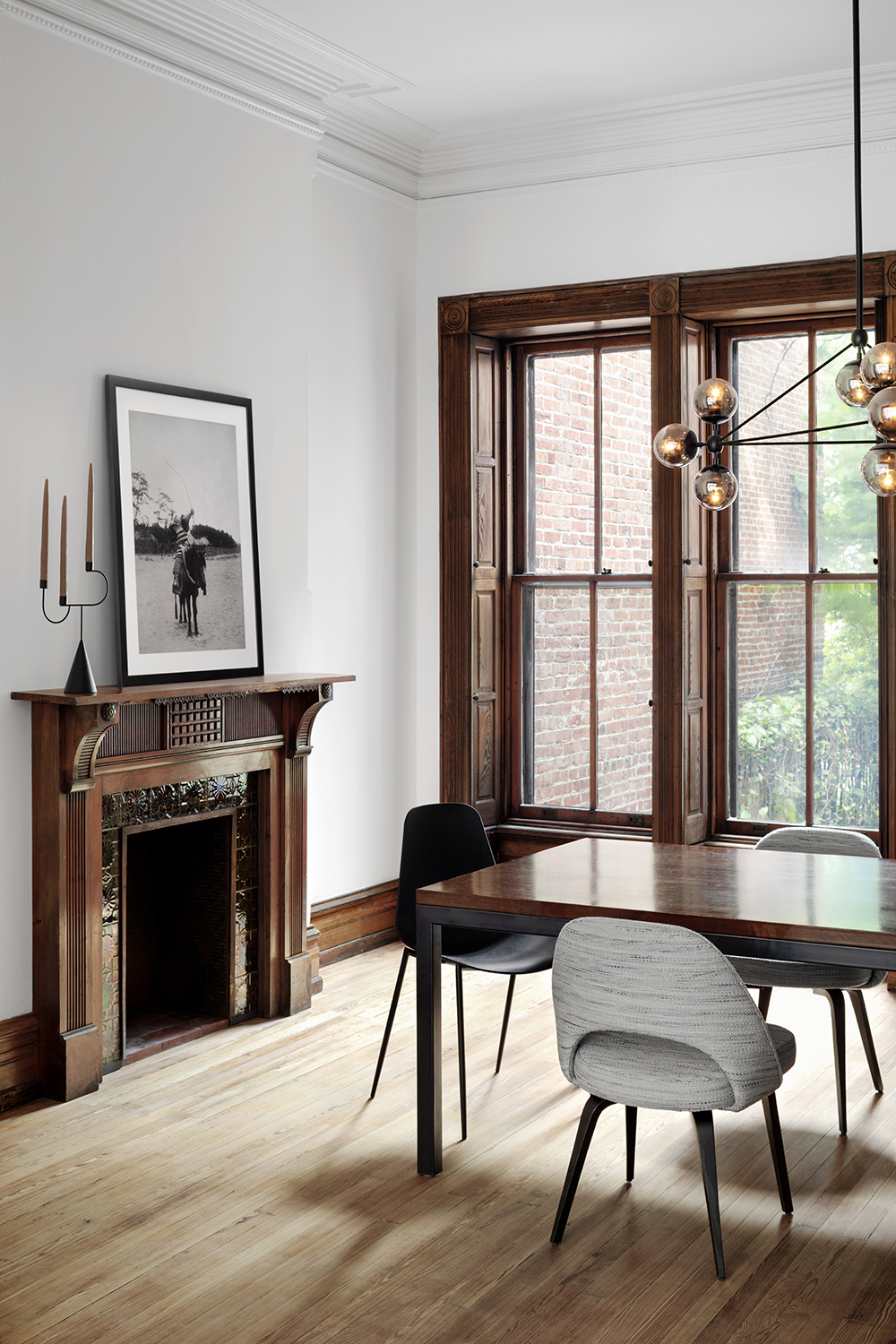
The open plan dining room is separated from the living room area by a dark wood trim, and feel cohesive thanks to the way the floor and white walls carry through.
Here, the ornate wood fireplace may contrast the modern stone fireplace in the living area, but it feels in keeping with the window panels, which are an opposite to the modern dining chairs. Keeping some pieces aligned in period helps to maintain the feeling of balance Colleen has so expertly created.
Kitchen

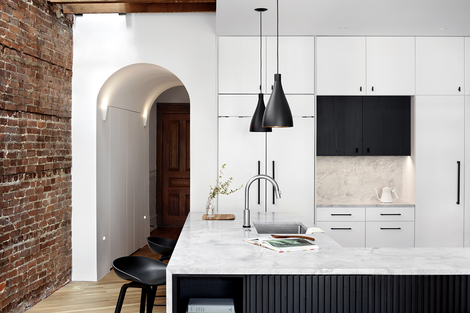
Instead of trying to match a highly functional modern kitchen to the period surrounds, Colleen decided that contrast was a better approach. However, there are some elements from the decor that carry through into the design here, such as the white kitchen cabinets that match the dazzling white walls seen in the living room.
'It’s tough in an open plan kitchen area to not overwhelm the room with too many different textures or colors,' Colleen says. 'Especially since kitchens tend to have a lot of “stuff” sitting on counters. The original surfaces of red brick, wood flooring and exposed ceiling joists already bring a lot of material and color to this room, so we kept the material palette simple. The grey and white countertop is muted and honed so that it doesn’t create a lot of shiny reflection. The dark cabinets have a rhythmic slat pattern to them and compliment the dark metal shelves, door and black plumbing fixtures and hardware.'
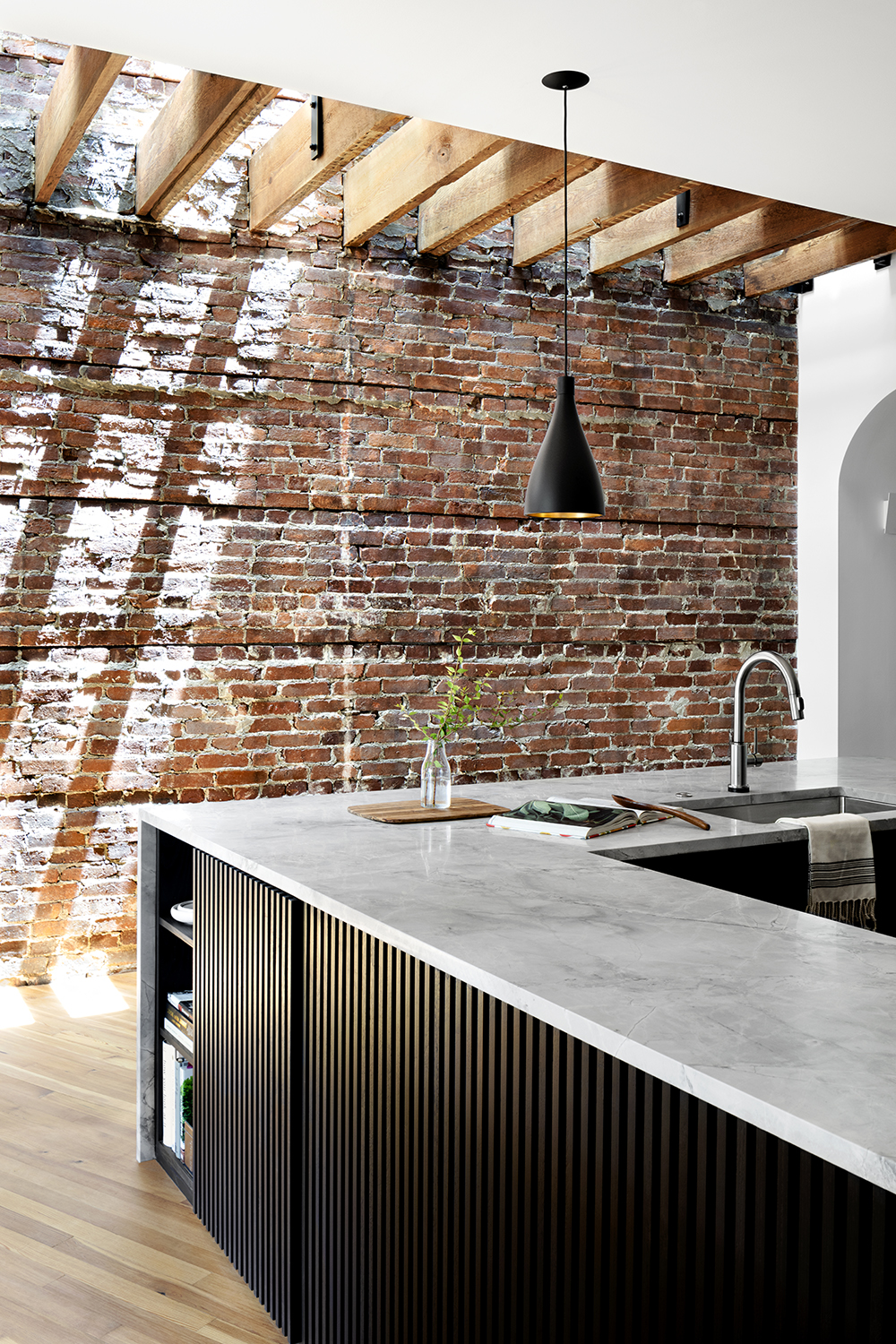
The subtle texture of the kitchen island plays off the comforting roughness of the exposed brick. 'The cabinet doors are a stained ash that we worked really hard on getting not too blue, not too black but light enough to see the subtle grain of the ash,' Colleen says.
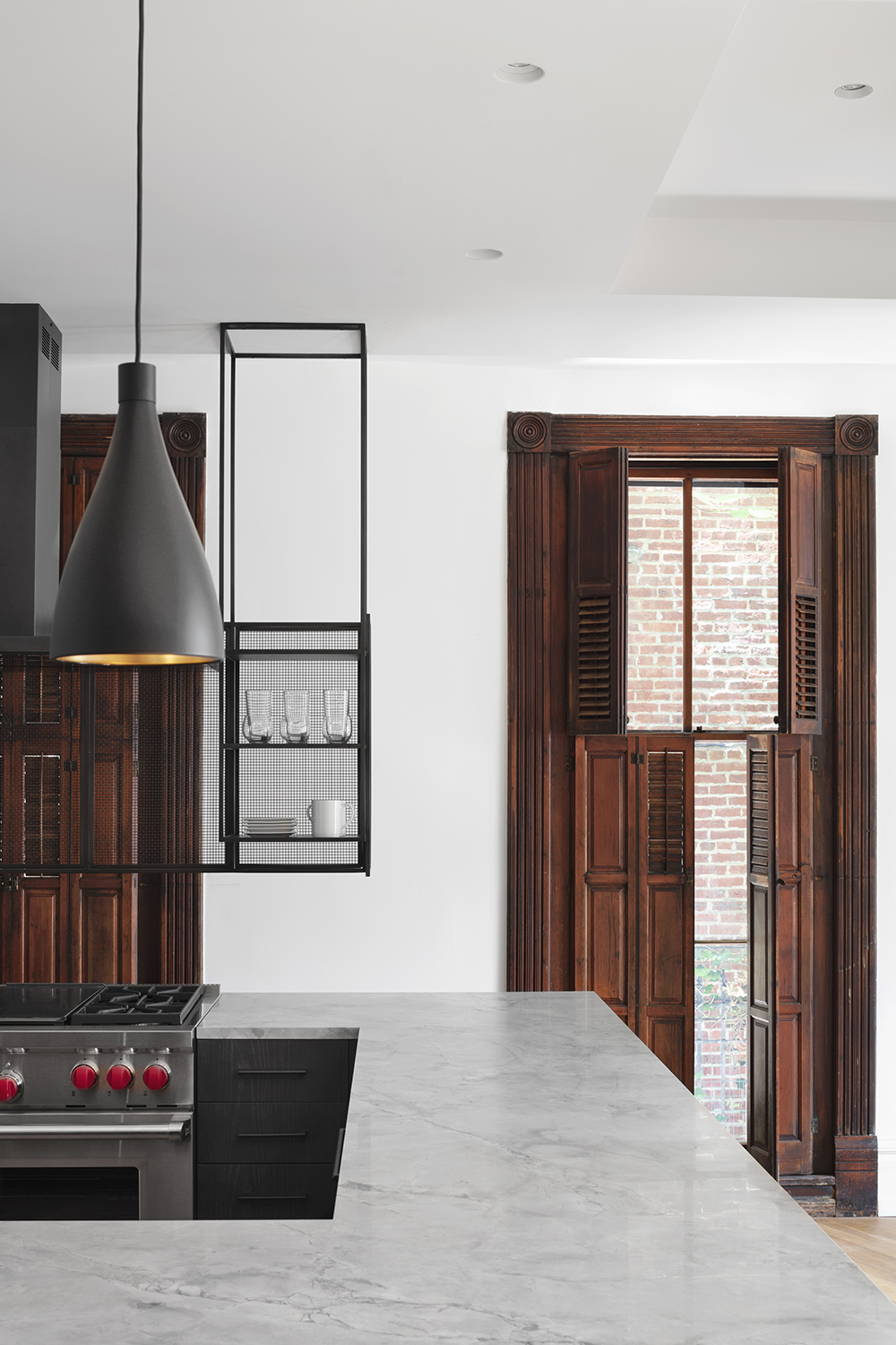
The large kitchen island is actually in a U shape, creating a sense of zoning within this open plan space.
'We put slats on the doors and back panels of the island so that it would feel more like a piece of decorative furniture in the room rather than looking at the back of an island,' Colleen says.
Skylight
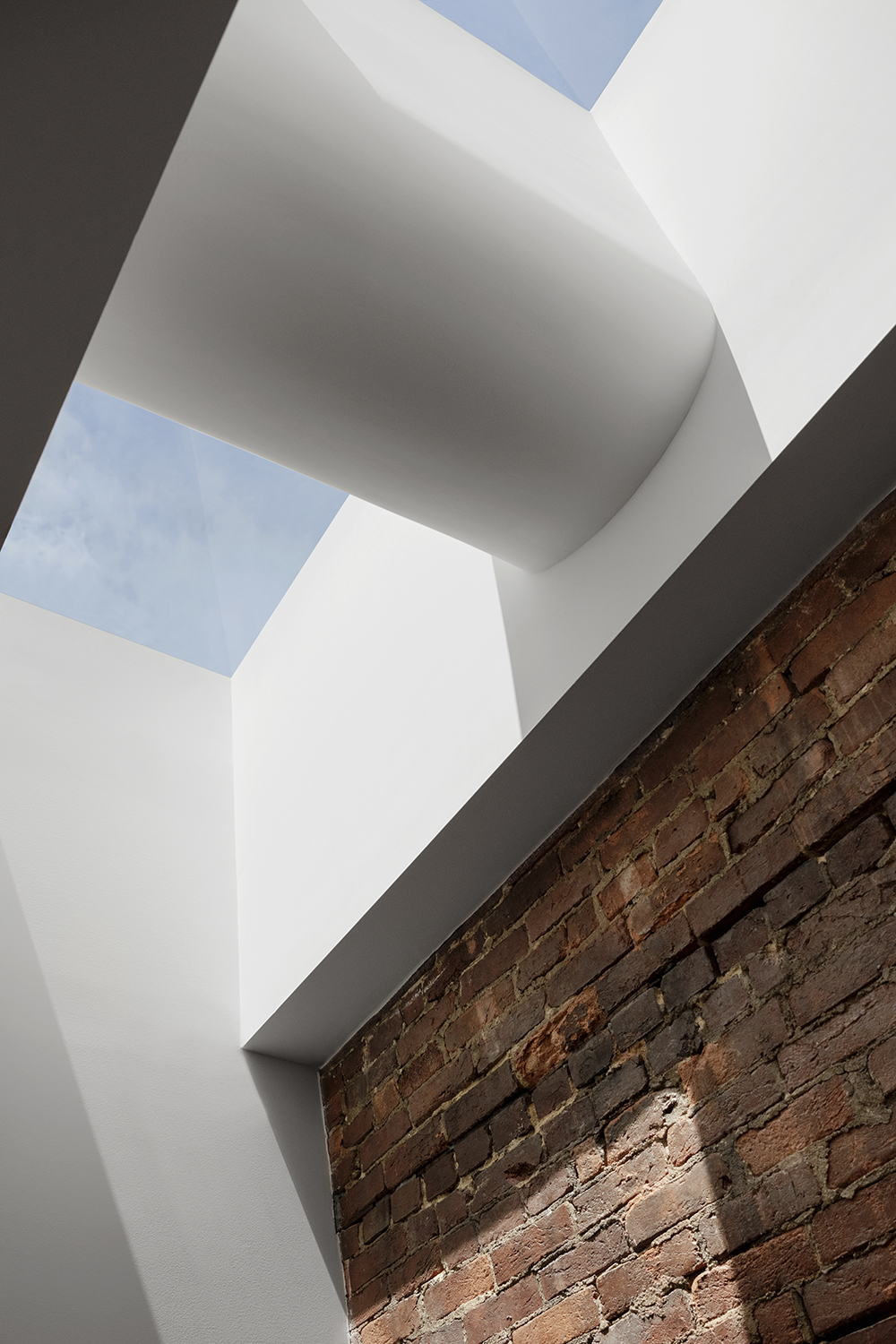
The architectural elements Colleen added are just as fascinating and smart as her blend of old and new. Skylights on the second floor bring light through a new opening in the ceiling of the kitchen, creating a rich interplay of light across exposed original elements of brick and original wood joists.
Arched passageway
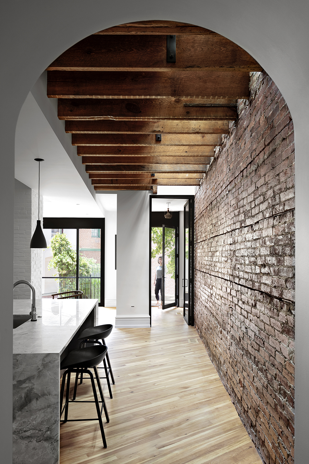
To the side of the kitchen is an arched passageway, connecting the front to the back of the house. Playing on a historical shape, but done in a modern way, Colleen has skillfully blended the old with the new yet again.
'There was an existing arched door opening in this space, but we extended it about 8’ deeper to create a dramatic threshold into the new kitchen space,' Colleen says. 'The extended sculpted surface is enveloping preparing you to enter a more private part of the house. The arched aesthetic is repeated in the sculpted ceiling of the skylights above at the second floor and reference back to the subtle sculpted corners in the bay windows at the front of the house. The original house has such a high level of detailed finesse we wanted to continue that narrative of craftsmanship throughout the newly renovated spaces as well.'
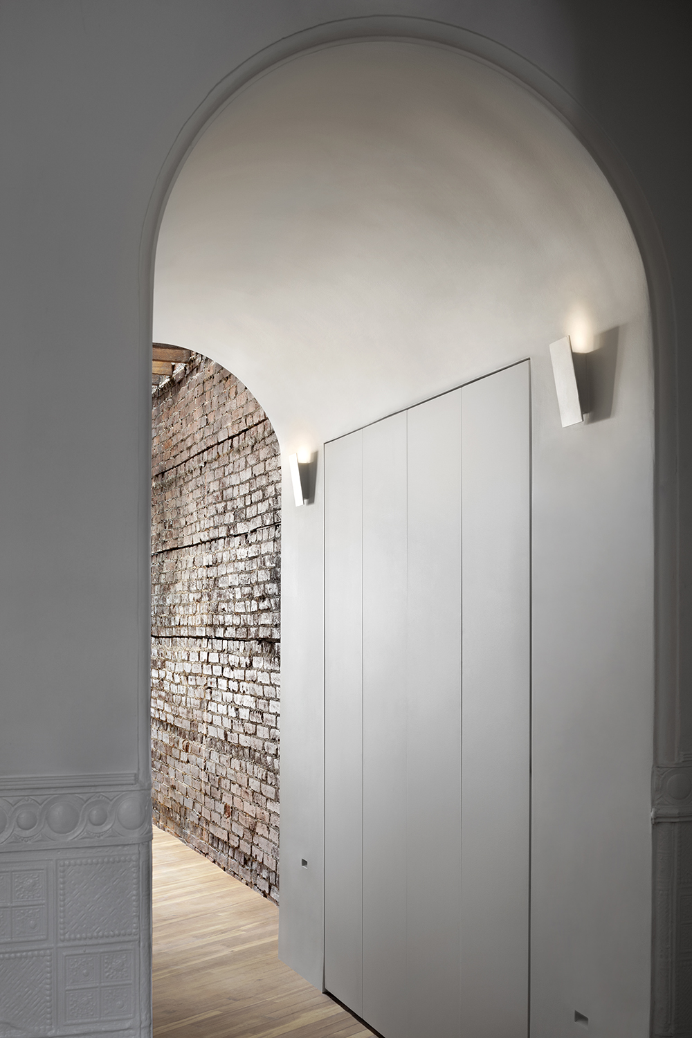
'This space hides the entrance to the powder room as well as some hidden cabinetry,' Colleen says.
Den
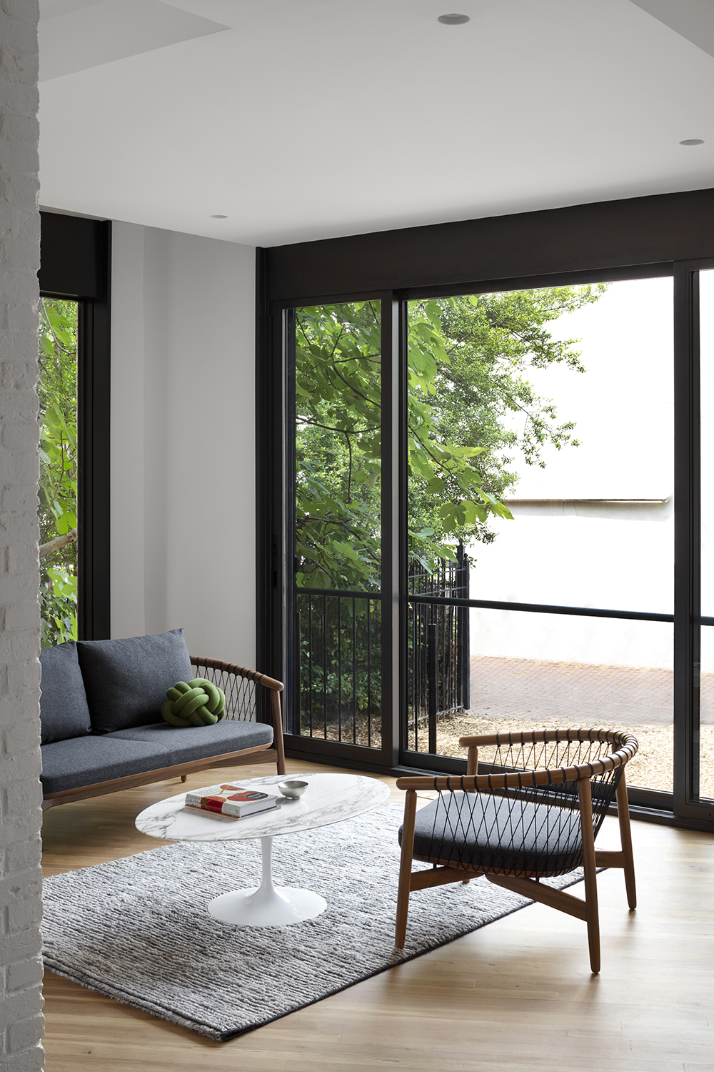
Despite having adopting a lot of the approaches of minimalism, Colleen was able to keep this home feeling warm and inviting. The trick? 'The original brick wall and pine floorings bring in the natural tones to balance with our more stark white walls and ceilings,' she says.
'We also helped with the furniture selections and chose walnut pieces from Design Within Reach that have a delicate rope detail to keep the furniture light and airy. In terms of scale, it’s not a large room so that helps it feel intimate despite being so open to the garden and the kitchen space. A warm fireplace also sets the mood!'
Bedroom
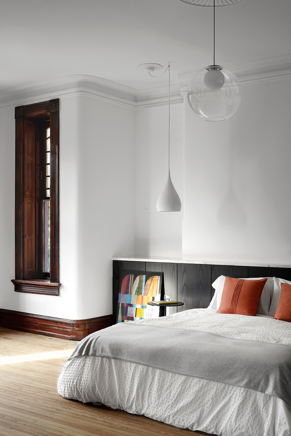
The modern bedroom actually makes use of period features found in this quarter of the house. The headboard may appear to be built in storage, but it has another purpose, too.
'There is actually an old fireplace hiding behind the headboard wall!' Coleen says. 'We covered over it in order to get a better bed layout and preserve the views to Logan Circle at the front of the house. But the fireplace wall was not wide enough to put both a bed and end tables along it, so we created the long low headboard wall to run the full length of the room. It provided storage but also created a new horizontal surface across that side of the room to be a backdrop for the bed and freestanding night stands. The dark ash cabinetry brought in a warm wood surface without competing with the pine wood of the floors.'
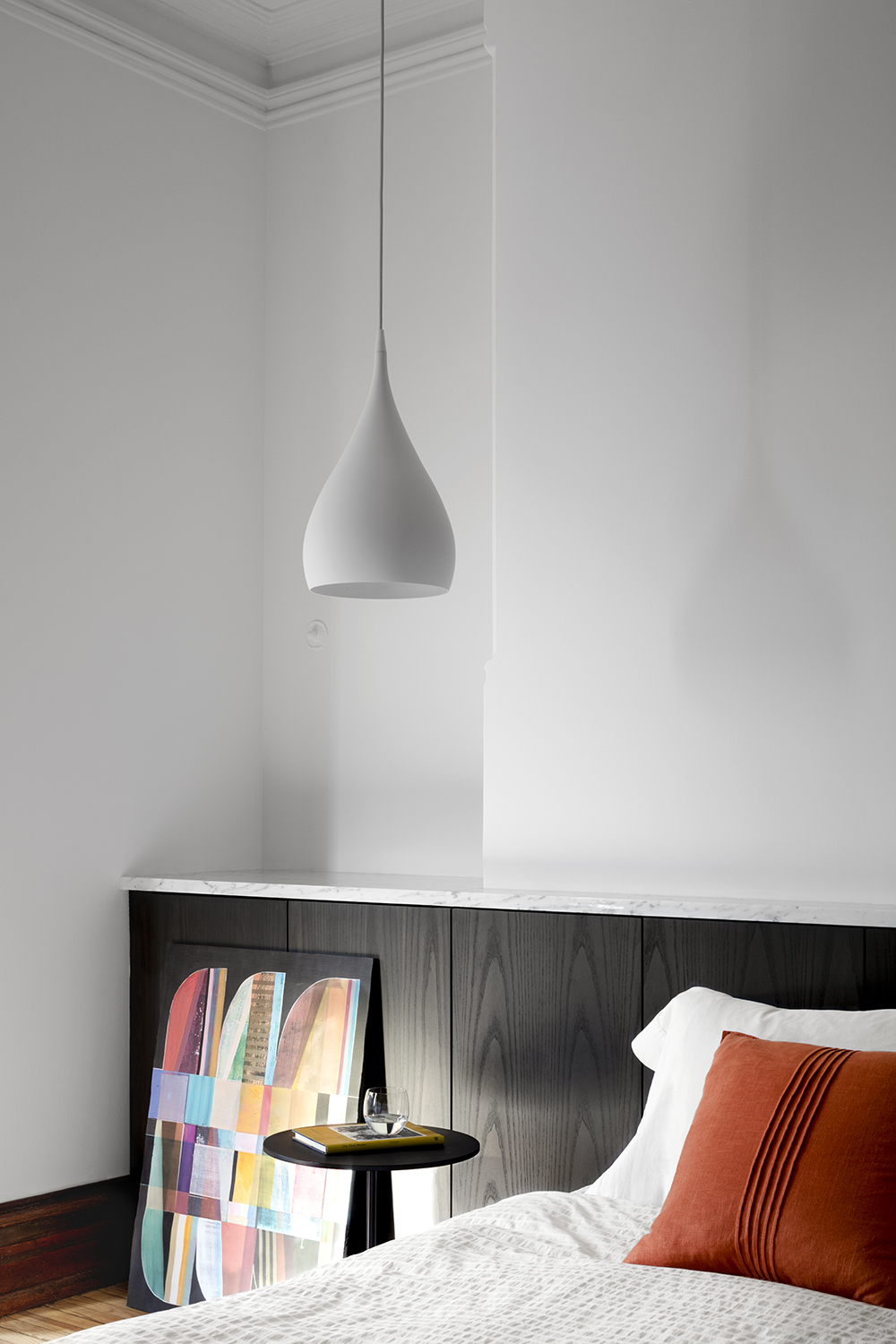
The headboard is topped with a Carrara marble that matches some of the marble in the primary bathroom, helping to marry all of the materials of the suite together.
'While marble is a little less common in a bedroom, it’s paired with the ash cabinetry and is layered behind the bed and nightstands so felt it was a subtle touch,' Colleen says. 'Given that this space is used for extra glasses of water, plants, etc we wanted to make sure that it would be a durable surface.'
Bathroom
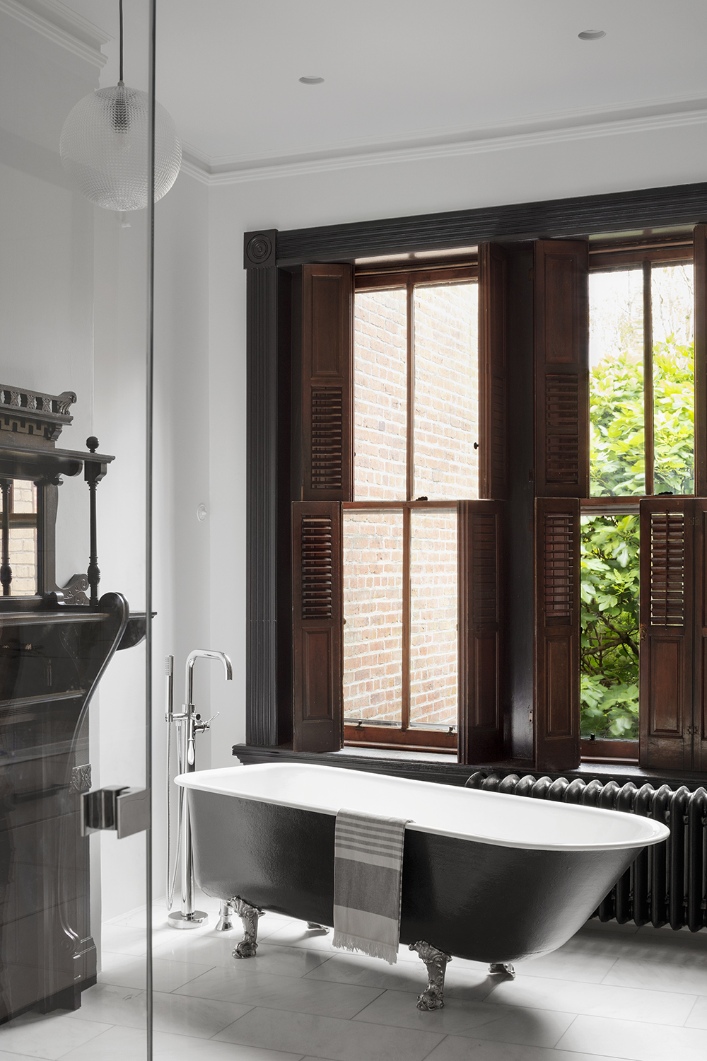
Just like with the kitchen, Colleen needed to create a functional modern bathroom in a period space. 'It’s definitely a challenge to find the right balance and let both the past and present be elevated from their contrasted surroundings,' Colleen says.
'We enjoy blending original and new in unexpected ways - hard reflective sheets of glass and crisp tile surfaces contrast with the ornate original mantle, the clawfoot tub and the soft wooden shutters at the windows. We tried to not let either the past or the current win - so it feels familiar yet new.'
Staircase
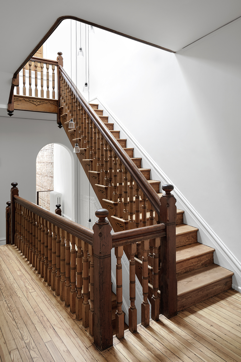
Happily, the staircase didn't need much restoring.
'We really didn’t touch it much besides the new skylight and light fixture that starts at the top level and hangs down three stories,' Colleen says. 'We focused on brightening the walls around it and the lighting (both natural and decorative) so that it would act more like a piece of historic sculpture that you moved through.'
Second floor skylights
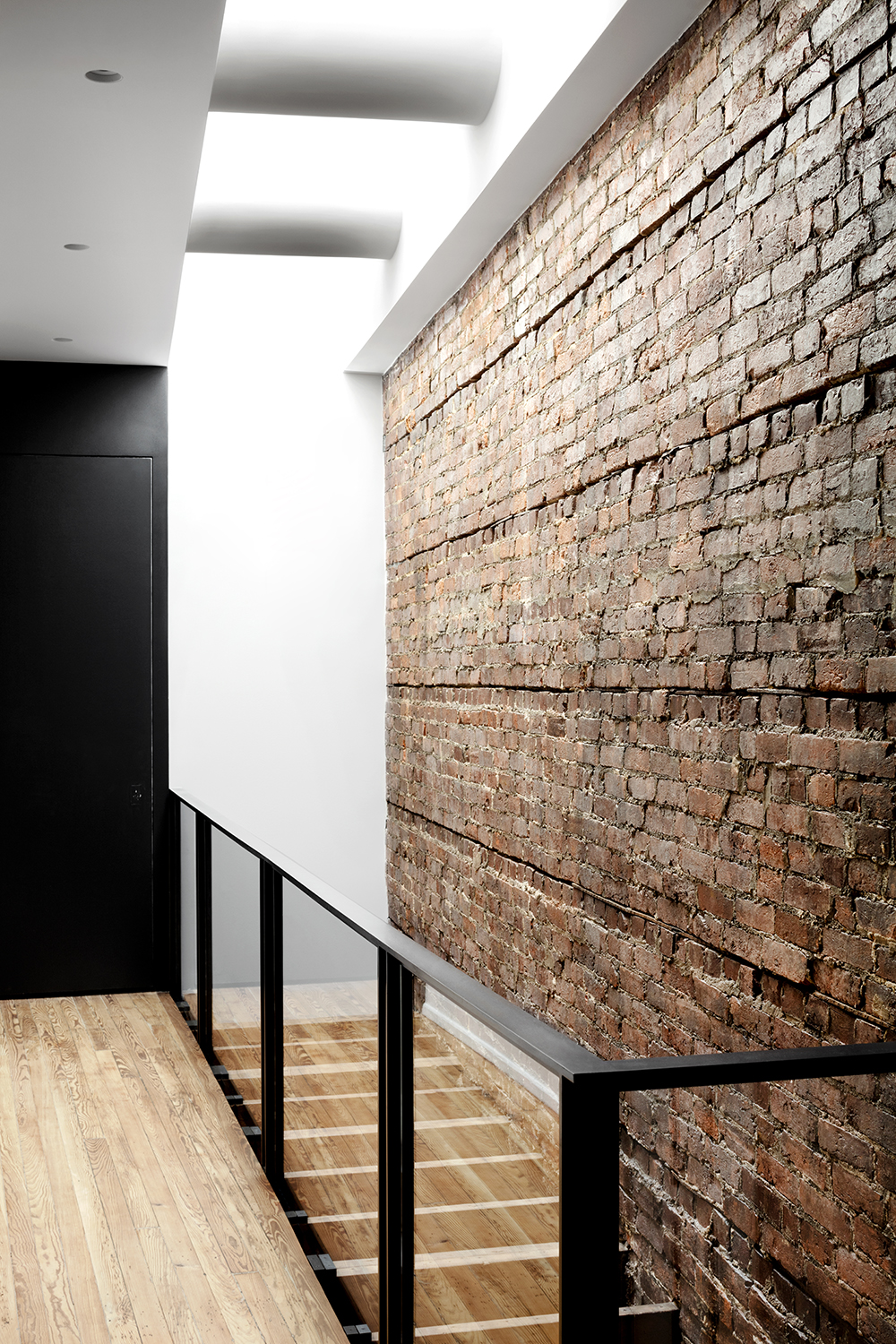
'The sculpted skylights at the top of the second floor were one of the biggest changes to the existing house,' Colleen says. 'They bring natural light all the way down two stories into the kitchen space and highlight the pattern of the existing ceiling joists that we kept in tact. Those exposed joists reveal the historic pieces of the home in a space where upper private levels of the home engage with the public first floor spaces. The house opens up to you at this point, letting you into the literal bones of the structure, a glimpse into the past, as well as a glimpse into the private areas of the homes upper levels.'
See more of Colleen Healey Architecture projects.
The editor of Livingetc, Pip Rich (formerly Pip McCormac) is a lifestyle journalist of almost 20 years experience working for some of the UK's biggest titles. As well as holding staff positions at Sunday Times Style, Red and Grazia he has written for the Guardian, The Telegraph, The Times and ES Magazine. The host of Livingetc's podcast Home Truths, Pip has also published three books - his most recent, A New Leaf, was released in December 2021 and is about the homes of architects who have filled their spaces with houseplants. He has recently moved out of London - and a home that ELLE Decoration called one of the ten best small spaces in the world - to start a new renovation project in Somerset.