The Livingetc newsletters are your inside source for what’s shaping interiors now - and what’s next. Discover trend forecasts, smart style ideas, and curated shopping inspiration that brings design to life. Subscribe today and stay ahead of the curve.
You are now subscribed
Your newsletter sign-up was successful
True, 950 square feet isn't the smallest apartment you can imagine. But it's not the spacious and sprawling home you tend to associate with architects, who always seem to have vast spiral staircases and interesting additions.
Yet while the Washington, D.C home of Nicholas Potts - founder of Nicholas G Potts architecture studio - lacks the grandeur of some purpose built projects, its considered yet opulent interior more than makes up for it.
And in fact, the renovation of this modern home was still very much a grand design. Nicholas inserted walls to zone spaces, he created a calming palette to blur corners and folded in luxe moments like a show stopping red marble fireplace.
'This apartment was originally built in 1925, but had been largely stripped of its character with an ill-conceived open plan whose effect was to make a smallish apartment feel both small and chaotic,' Nicholas says. 'Rather than introduce something that felt wholly new, we thought of this renovation as a way of restoring it to an idealized state, based on discrete and well proportioned rooms.'
It's a bold way to approach decorating an apartment, to reconfigure and refine the space rather than work with what is there. 'Acknowledging that the apartment is quite limited in floor area, we calibrated the scale of new elements (such as oversized herringbone floors) and introduced new details, such as the seamless floor-to-ceiling cove, to hide corners and trick the eye into seeing more space than is here,' Nicholas says.
Kitchen
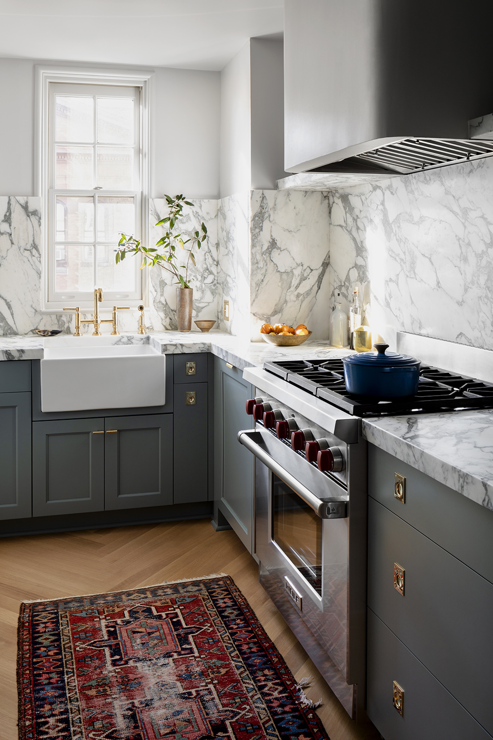
It's unusual for an apartment kitchen not to be open plan, but cordoning it off helps to keep the living area feel more calm in its separation. But just because this is a small kitchen with only one window, Nicholas was keen to keep it looking light and bright.
'By placing most of the storage in a full height wall of pantry cabinets, we were able to do away with the visual clutter of upper cabinets,' Nicholas says. 'Essentially everything from counter height up is in the same color family. And, by introducing a high backsplash and letting the pattern of the countertop run up the wall, you read the room as larger than it actually is.'
The Livingetc newsletters are your inside source for what’s shaping interiors now - and what’s next. Discover trend forecasts, smart style ideas, and curated shopping inspiration that brings design to life. Subscribe today and stay ahead of the curve.
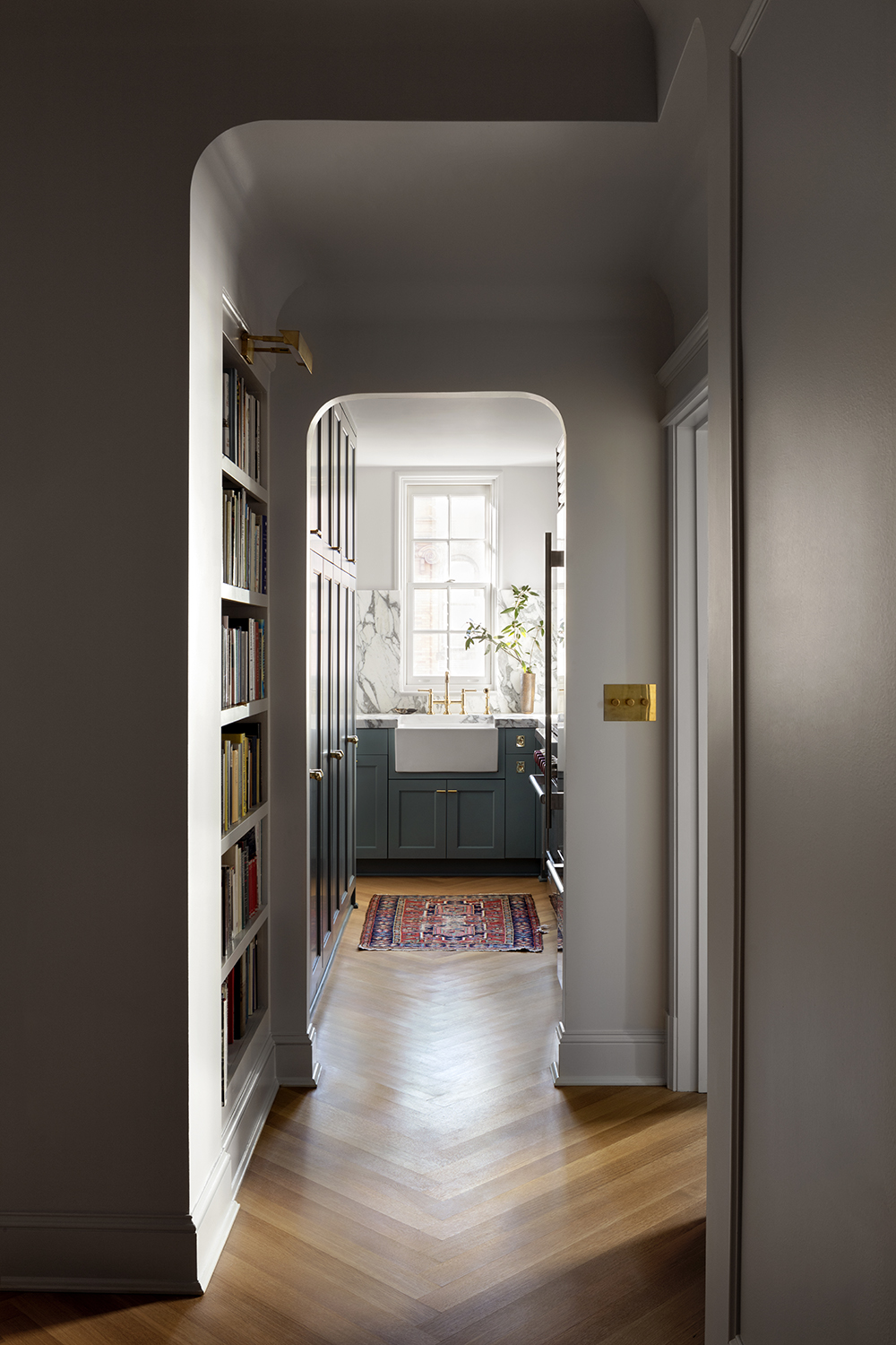
The countertop and backsplash is made from Corcia Arabescato by ABC Stone, while the sink is from Shaws of Darwen. The antique rug is from Frances Loom.
Living room
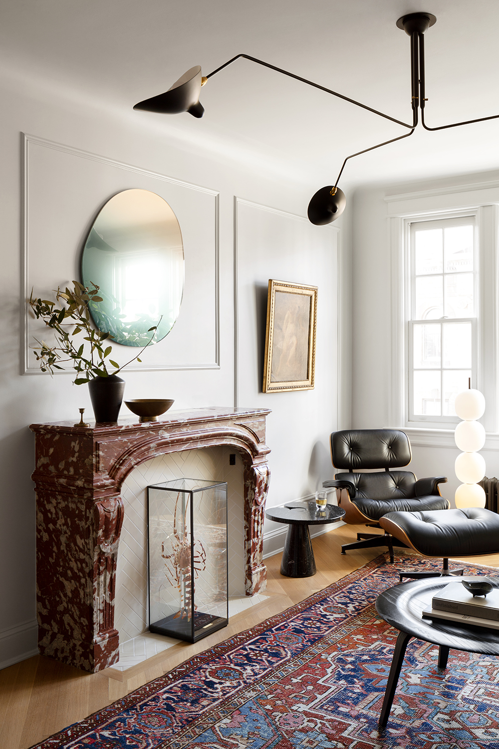
This small apartment living room is yet more proof that grandeur can be added to any space of any size. 'The room had previously lacked an anchoring element, and by adding the fireplace mantel we were able to reorient the room to focus on this wall,' Nicholas says.
Incredibly, this is also one of the smartest living room TV tricks ever, as it's also a very space-efficient way of hiding the television, which lives inside of the mantel on a motorized lift.
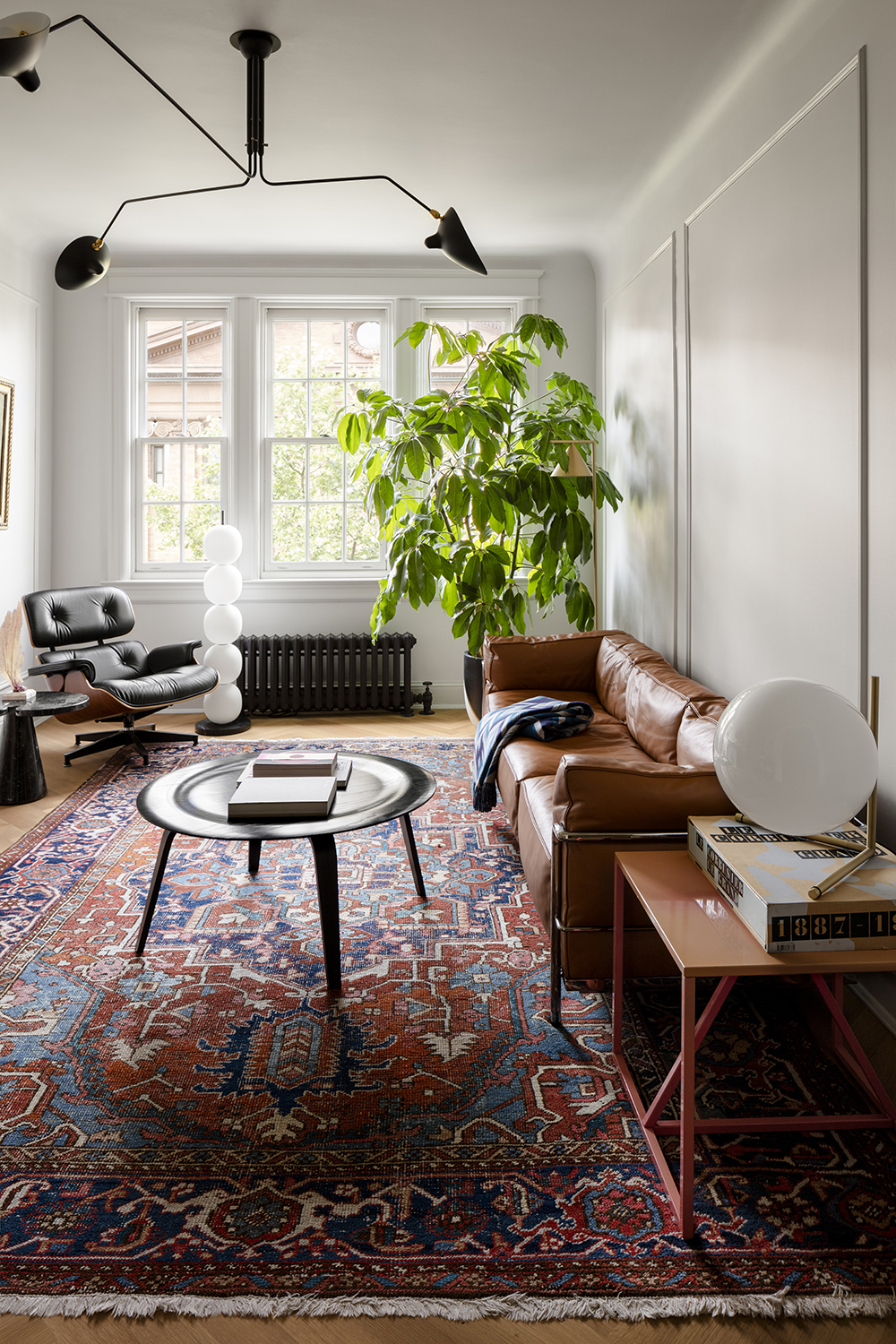
While the fireplace is a focal point of the apartment living room, Nicholas also used it as a starting point for the rest of the decor. 'The rest of the furnishings in the room play against the formality and scale of the fireplace,' he says.
'But since so much of the midcentury design classics had some root in classicism, it all kind of works - the Charlotte Perriand/Le Corbusier sofa we used was actually designed in 1928, so it's nearly contemporary to the apartment's original construction.'
The ceiling light is by Serge Mouille.
Home office
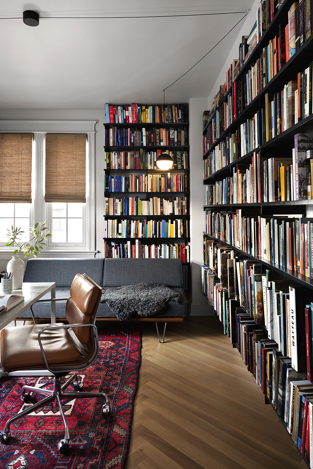
The apartment's second bedroom has been turned into a home office, and functions as library, too. Books are important to Nicholas - they line his entryway too - and storage was a key concern.
'Our book collection is in the thousands, and inventorying them is no small task!' Nicholas says. 'We tried organizing them by color in a previous apartment which turned out disastrously - committing a book to memory based on the color of its spine is impossible. The organization here puts function first, and each wall is thematic in terms of content (Art History, Criticism, history, Architecture, and Interiors), similar to a proper library. Given the number of books, we did everything possible to lessen the visual heaviness of the books - floating a cantilever shelf system 14 inches above the floor to give some breathing room along the edges of the room, and reducing the height of each shelf slightly as you move up the wall as a sort of entasis to make it appear more balanced and stable.'
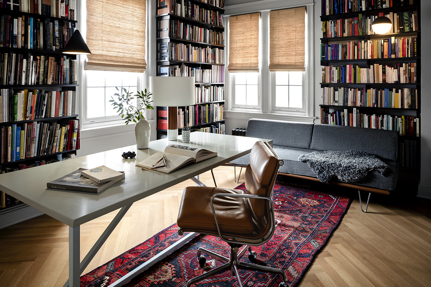
The desk in the apartment office is from Blu Dot, the chair is Eames Office chair for Herman Miller and the chaise is by Ray and Charles Eames, also for Herman Miller. The antique area rug was sourced from Frances Loom.
Dining room
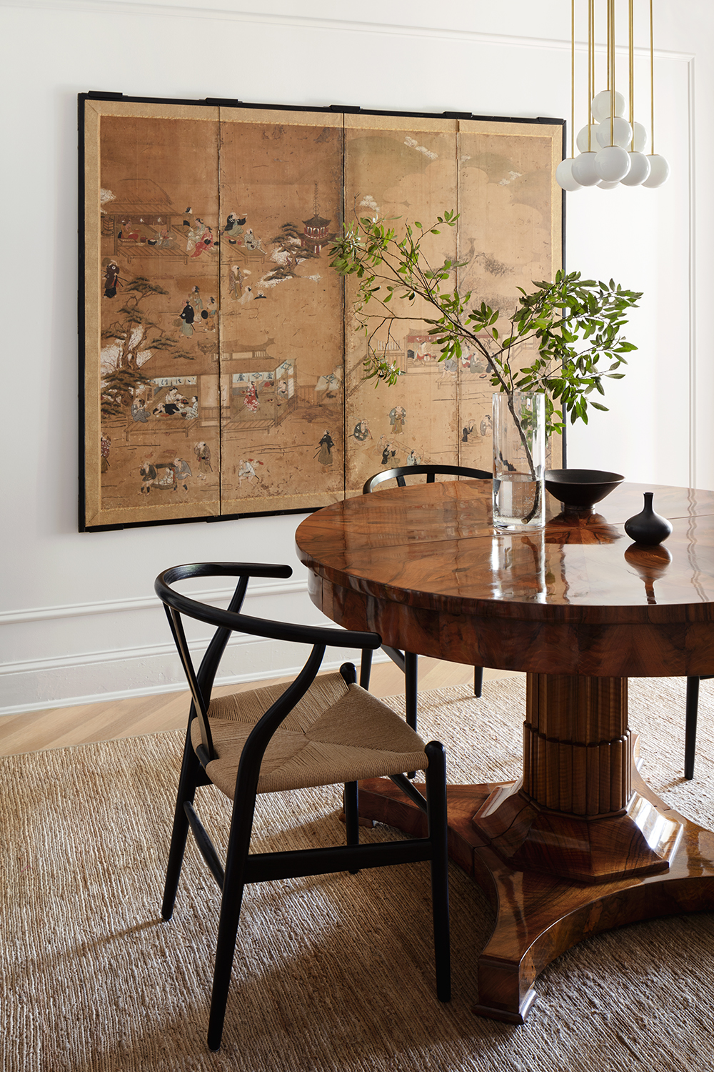
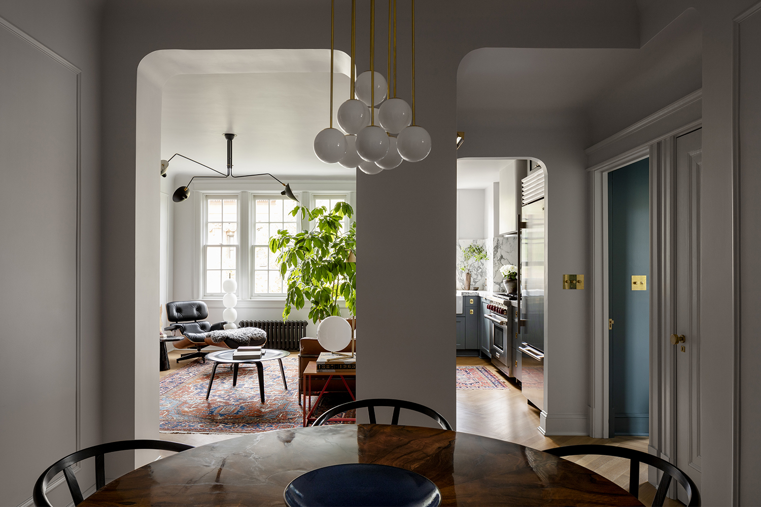
While there is a mix of eras in the dining room, there are unifying themes that bind the pieces together.
'The Biedermeier dining table and the Michael Anastassiades fixture above it share a lot of the same DNA,' Nicholas says. 'A rigorous use of pure shapes, rich materials, and an overall stripped down classicism that bridges the 200 years between them.'
Bedroom
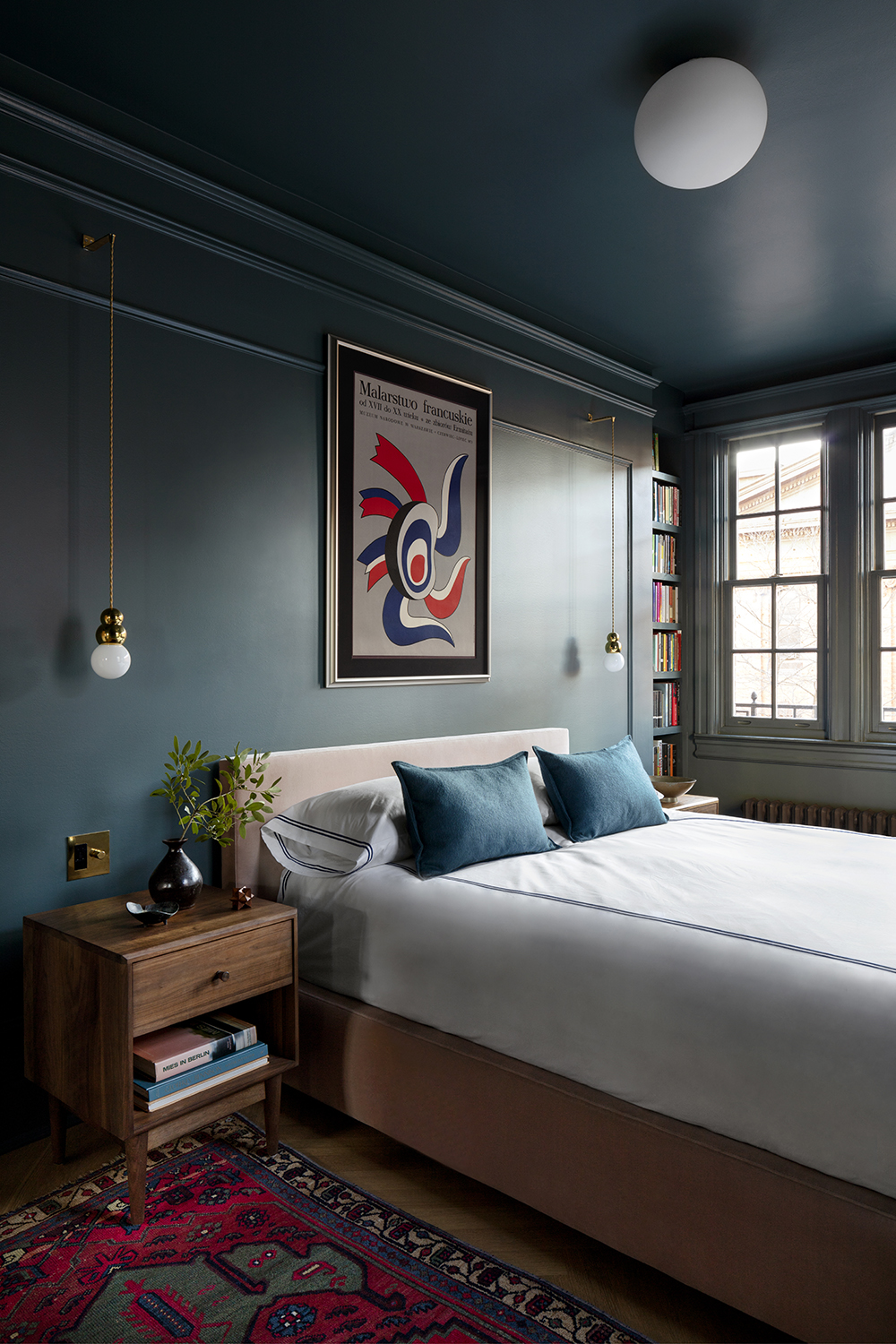
Everything in this modern bedroom, from the walls to the trim to the ceiling, is the same hue - Farrow and Ball's Inchyra Blue. 'We wanted to balance the light levels of this room, which gets by far the most amount of daylight in the apartment, with its function as a bedroom, which wants the lowest amount of direct sunlight,' Nicholas says.
'The all-over scheme is deeply relaxing and contemplative, and by allowing all of the architectural elements of the room to work together without competing for attention against a white background, the intensity of the color becomes less obvious, even mysterious,' he continues.
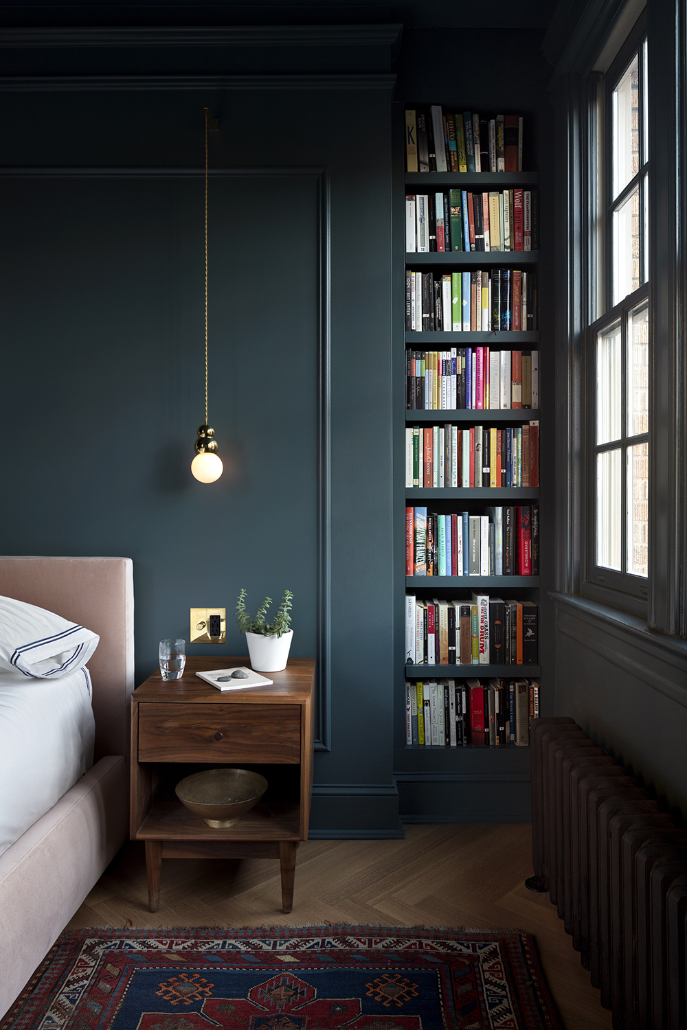
As in the dining room, the lights are by Michael Anastassiades. And just as in the rest of the apartment, Nicholas found a home for books.
Hallway
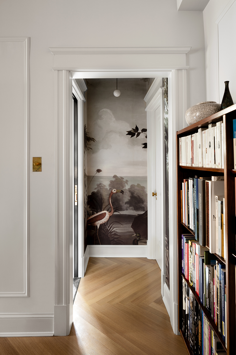
Between the dining room and bathroom is this vestibule. It'a a small area, but that didn't stop Nicholas from utilizing its beauty. And counter-intuitively, he has created a way for how to make a tiny apartment feel bigger.
'This space was one of a few small architectural moments we introduced to create more distinction between separate zones of the apartment, in this case to buffer between the bathroom and dining room, spaces which should never directly connect,' Nicholas says.
'We had the idea very early on of doing something with a panoramic wallcovering here, to turn a visual buffer into a moment of pure escape. As you approach the vestibule from the dining room, it becomes a focal point that highlights the figures in the landscape almost as a work of art in itself, while approaching it from the other direction, the wallpaper shares coloring and a graphic scale with the marble wall panels in the bathroom, effectively extending it.'
Nicholas admits the decorative choice was unexpected. 'It's unusual to use a monumental-scaled wallcovering in such a small space,' he says. 'But by using unexpected scales we could elevate a transitional moment like this into something that feels intentional.'
The wall mural is by Ananbo.
Bathroom
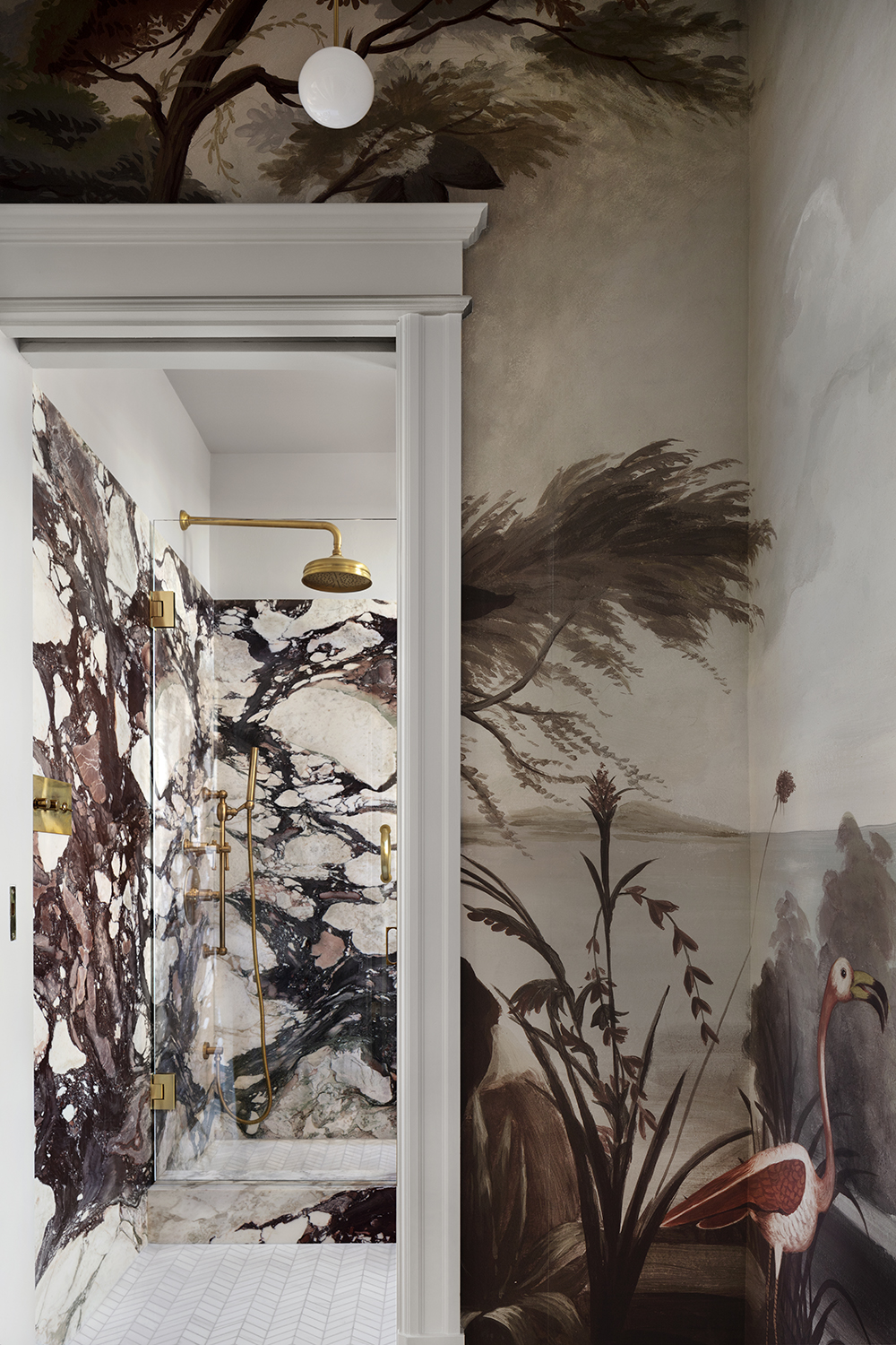
The modern bathroom that the mural leads onto is just as dramatic as the wallpaper. Richly veined, it's an incredibly opulent and dramatic space.
'There's a falsehood out there that you need to make every small space white in order to make it feel bigger and 'brighter' (whatever that actually means),' Nicholas says. 'Yet light colors, by their very nature, highlight every corner and shadow. The giant pattern of the Calacatta Viola marble we used in the bathroom has the opposite effect: the surfaces of the walls, rather than the corners, draw your eye's attention, and although you of course know that the room is small, the corners recede and your perception of the bounds of the room disappears, while the marbling takes on an extra depth which is reinforced by the high gloss of the surfaces and the treatment of the lavatory alcove with mirrors. So much of this apartment is about optical sleight-of-hand and, and the bathroom is the ultimate expression of this.'
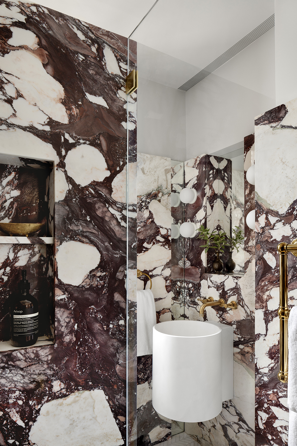
The stone wall slabs are made from Calacatta Viola Grande by ABC Stone, while the sink is from Boffi and the shower and faucets from Rohl.
See more of Nicholas's work at Nicholas G Potts.
The editor of Livingetc, Pip Rich (formerly Pip McCormac) is a lifestyle journalist of almost 20 years experience working for some of the UK's biggest titles. As well as holding staff positions at Sunday Times Style, Red and Grazia he has written for the Guardian, The Telegraph, The Times and ES Magazine. The host of Livingetc's podcast Home Truths, Pip has also published three books - his most recent, A New Leaf, was released in December 2021 and is about the homes of architects who have filled their spaces with houseplants. He has recently moved out of London - and a home that ELLE Decoration called one of the ten best small spaces in the world - to start a new renovation project in Somerset.