The ‘Hidden Hue’ Rule Is Possibly Why Your Neutral Color Scheme Doesn’t Look Right — And It’s So Easy to Fix When You Know How
Matching undertones transforms neutrals from background shades into a beautifully considered palette

The Livingetc newsletters are your inside source for what’s shaping interiors now - and what’s next. Discover trend forecasts, smart style ideas, and curated shopping inspiration that brings design to life. Subscribe today and stay ahead of the curve.
You are now subscribed
Your newsletter sign-up was successful
A perfectly balanced neutral color palette may come across as effortless, but any designer will tell you that getting neutrals 'just right' is an art form. The reason? Neutrals aren’t really neutral at all. Each one carries subtle undertones that can either harmonize beautifully or clash in a way that leaves a space feeling flat, mismatched, or even unintentionally cold.
"The biggest challenge I see when speaking to clients is that people often think neutrals are the 'safe' choice, but they can actually be quite tricky," says Tash Bradley, director of design at paint company Lick. The secret to a rich and layered neutral space lies entirely in paying attention to the undertones — a concept I'm dubbing the 'hidden hue rule'. Just like with bold, saturated, or bright color palettes, matching the hidden undertones will ultimately lead to a more curated space.
Perfecting a neutral color scheme isn’t about stripping color away. It’s about honoring the beauty of undertones. Once you train your eye to see them, your rooms will never look the same. Here's everything you need to know.
Article continues belowWhat Is the Hidden Hue Rule? And Why We Care About Undertones
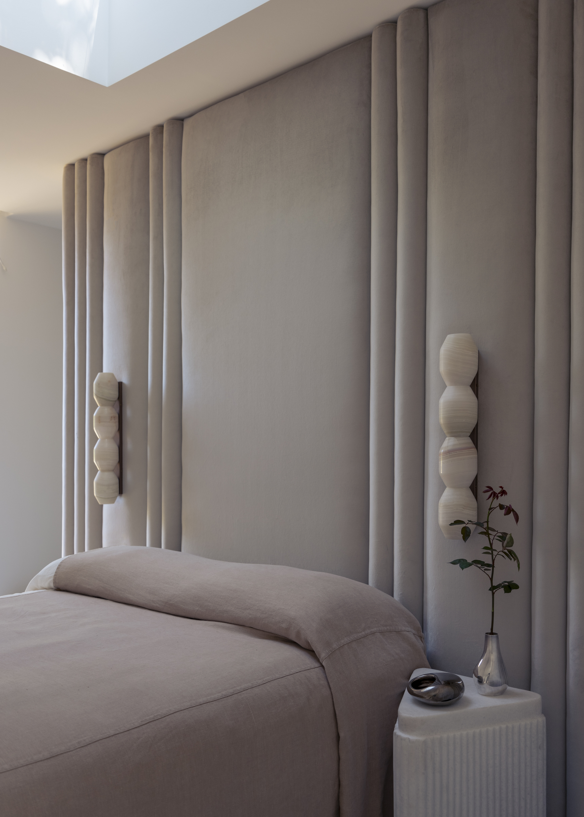
This bedroom feels luxurious instead of flat because of the coordinating undertones in each shade.
The hidden hue rule highlights the significance of undertones in color theory in a way that makes it easier to understand when creating a color palette.
Simply put, undertones are what make or break a neutral palette, and matching undertones matters because it creates flow. Interior designer, Nina Lichtenstein, explains it by saying, "Think of it like tuning instruments in an orchestra: when they’re in harmony, you don’t notice each note, you just feel the music. Rooms designed with aligned undertones achieve that same effect."
The biggest roadblocks in decorating with neutrals often stem from assuming that all neutrals play well together. "A creamy beige might look lovely on its own, but pair it with a cool gray and suddenly the warmth in the beige reads yellow, even dingy. The same happens when combining whites: one with a hint of pink can make another with a green cast look sickly," says Nina.
Without recognizing the undertones, what should be serene quickly feels out of balance. It’s this subtle discipline that separates a neutral scheme that feels intentional from one that feels unfinished.
The Livingetc newsletters are your inside source for what’s shaping interiors now - and what’s next. Discover trend forecasts, smart style ideas, and curated shopping inspiration that brings design to life. Subscribe today and stay ahead of the curve.

Nina Lichtenstein is a residential interior designer who strives to showcase her in-depth construction and design expertise in her projects. Nina believes that home design should capture a homeowner’s uniqueness by how it serves the person. She has been celebrated for designing, renovating, and building elegant living spaces.
How to Use the Hidden Hue Rule in Your Home
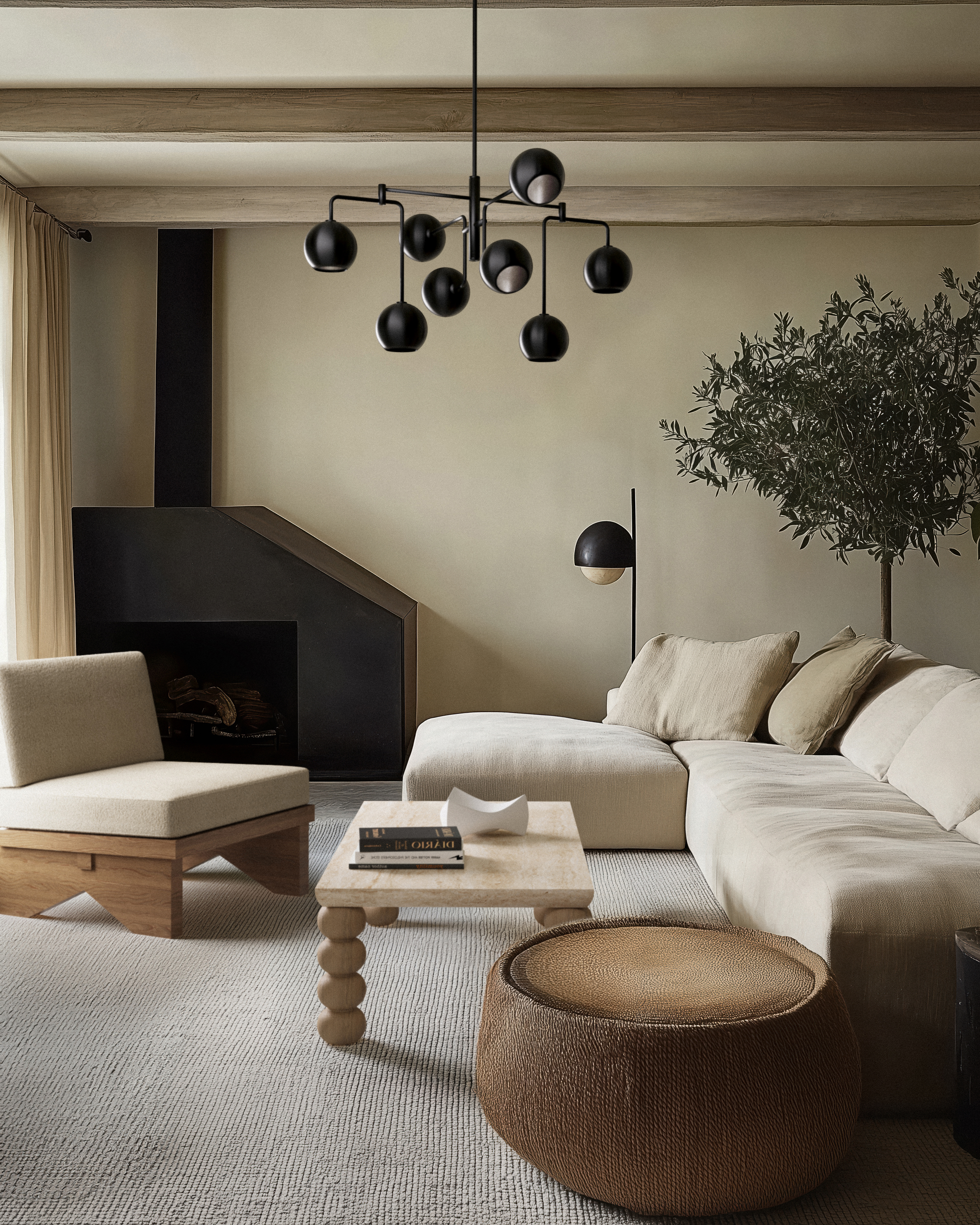
The decor elements, like warm woods and dark metals, are what bring this neutral palette to life.
So how do you choose neutral paint colors that belong together? Start the way you would with any color palette: by choosing an anchor color and identifying the base undertone. Neutrals always lean one way or another, toward blue, green, pink, violet, yellow, or orange. The key is to stay consistent.
From there, look for complementary shades on the color wheel that share a similar undertone, whether that’s warm, cool, or even slightly pink or green.
For example, Nina explains, "If your anchor shade is a cool gray with a blue undertone, look for complementary cool-based taupes, whites, or charcoals to support it. If your foundation is a warm greige, pair it with neutrals carrying similar warmth so they reinforce one another rather than compete."
Tash Bradley adds that the undertones need to complement the light direction of your room. "Warmer colors, like White 06 or Taupe 03, will work well as a paint color for North-facing rooms or East-facing rooms, whereas cooler undertoned colors, like White 04 or Grey 01, would feel cold in these spaces," says Tash.
When it comes to decor, try rounding out your neutral palette with coordinating throws, rugs, upholstery, and decor. "This will help you create the mood you want in a space — whether light and refreshing or cozy and warm," says Nina.
"Mixing within the same undertone family creates cohesion, while adding texture through fabrics and finishes keeps the palette interesting," says Tash. When neutrals are in harmony, they allow the other elements of the room, like furniture and artwork, to shine without ever looking bland.

Tash Bradley is a color expert, color psychologist, and the director of design at Lick, a UK-based paint company. Tash has long been working in the creative industry; first as a professional artist, and then in marketing. In the last 10 years, she has specialized in color and interior design, working alongside her mother in property development and home decoration, as well as studying interior design at the University of Arts London.
Neutral Palettes That Use the Hidden Hue Rule
Warm harmony
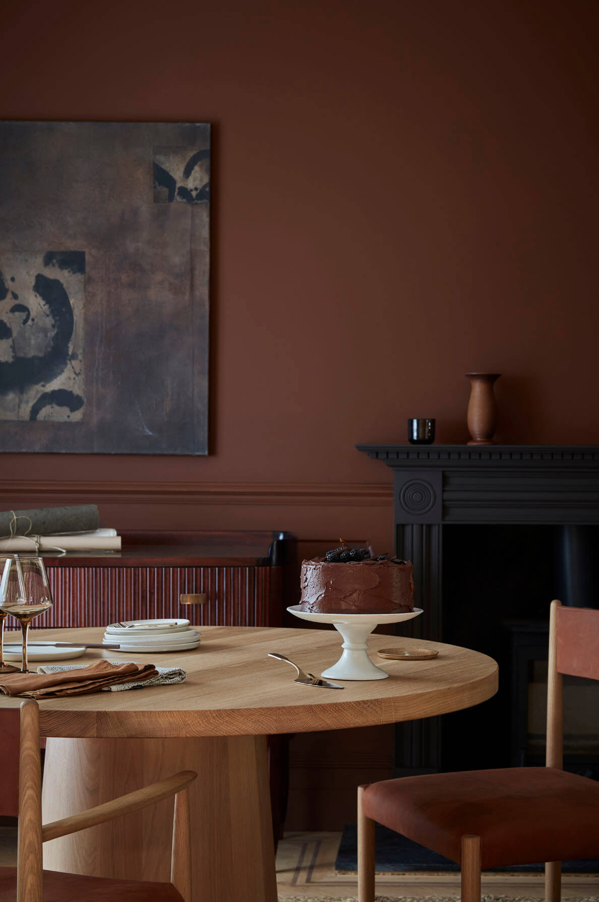
Nina says, "Mix creamy white, mushroom taupe, camel, and deep chocolate to create a palette that feels both sophisticated and comforting."
Cool Serenity
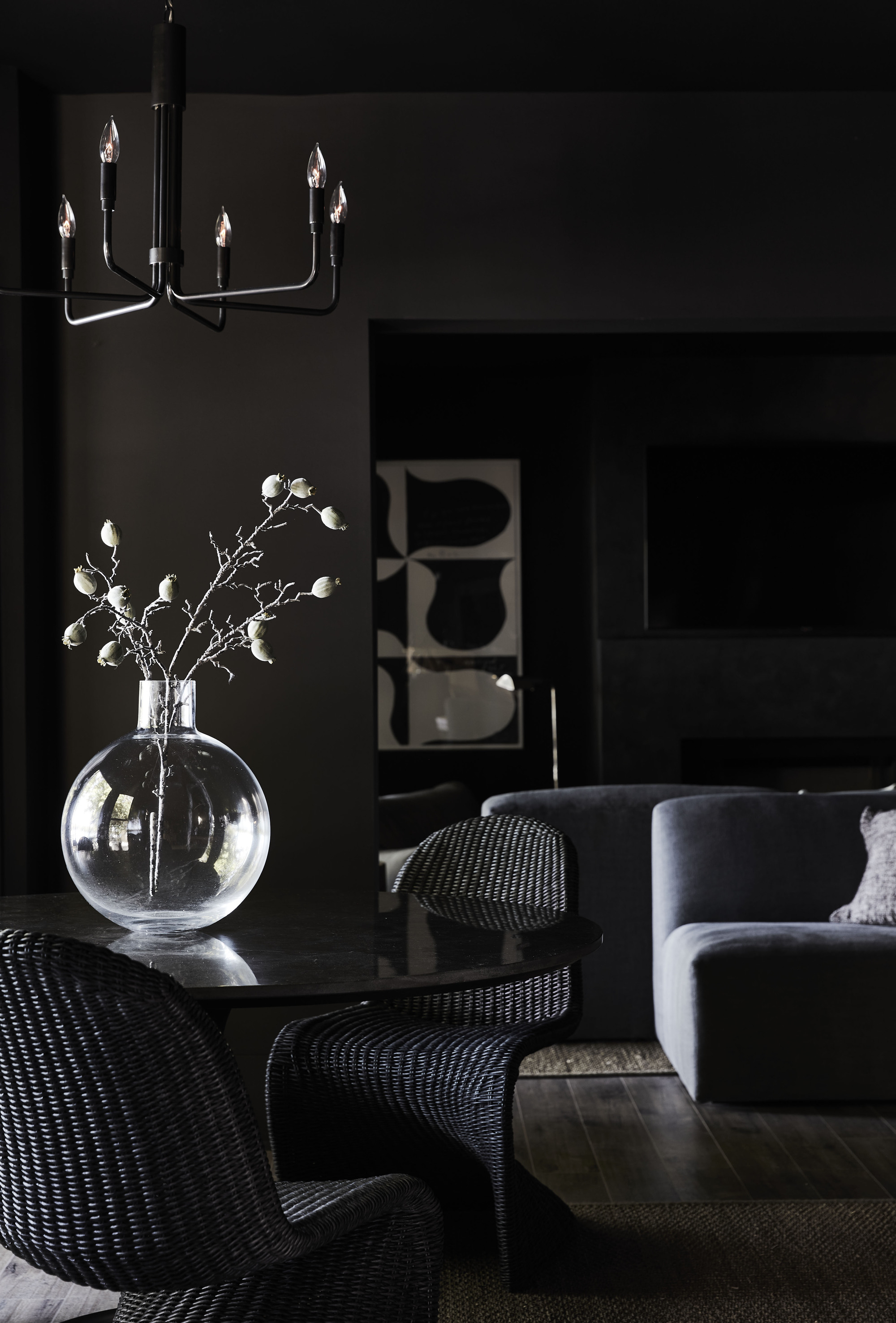
Try a moodier palette with combinations of foggy gray, crisp white, charcoal, and a hint of slate blue for depth.
Modern Greige
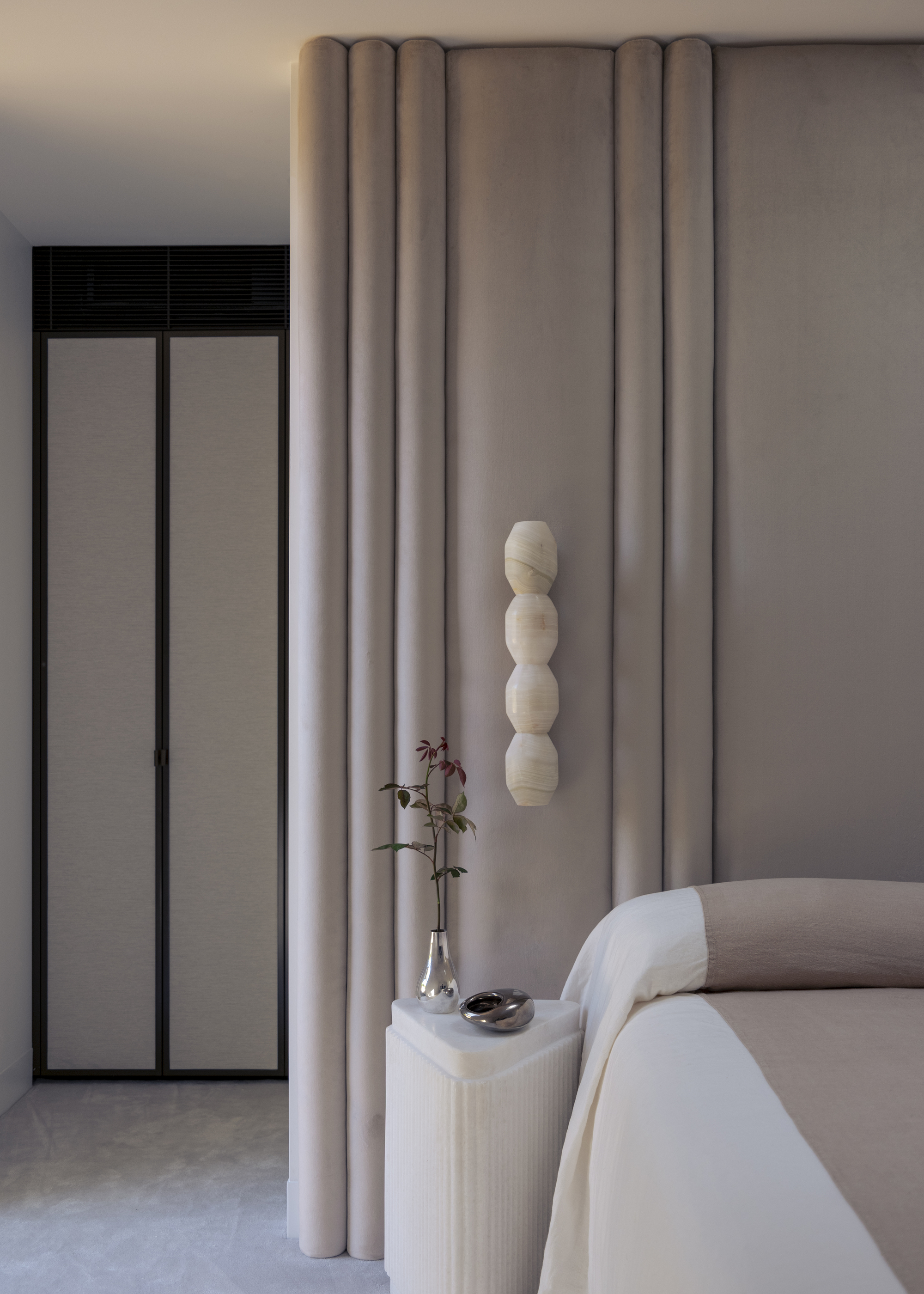
"Soft greige, warm ivory, driftwood, and blackened bronze accents — this palette is versatile enough for both traditional and contemporary spaces," says Nina.
Earthy Neutrals
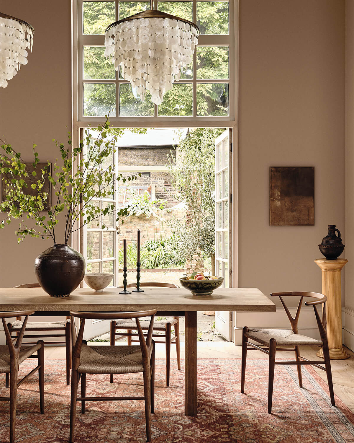
Mix sandy beige, stone gray, clay, and espresso, grounding and organic for a palette that's like a landscape brought indoors.
When done right, undertone-matched neutrals don’t just blend, they elevate. Everything feels intentional and soothing to the eye, creating flow in a space rather than disruption.
"This is when neutrals stop being a backdrop and become the design itself," says Nina. The depth and richness created rival most vibrant color palettes.

Olivia Wolfe is a Design Writer at Livingetc. She recently graduated from University of the Arts London, London College of Communication with a Masters Degree in Arts and Lifestyle Journalism. In her previous experience, she has worked with multiple multimedia publications in both London and the United States covering a range of culture-related topics, with an expertise in art and design. At the weekends she can be found working on her oil paintings, reading, or antique shopping at one of London's many vintage markets.


