6 Outdated Kitchen Trends Designers Are Distancing Themselves From in 2026 — And What They Say You Should Replace Them With
Designers reveal the looks and features dating your space and, crucially, what to do about it

The Livingetc newsletters are your inside source for what’s shaping interiors now - and what’s next. Discover trend forecasts, smart style ideas, and curated shopping inspiration that brings design to life. Subscribe today and stay ahead of the curve.
You are now subscribed
Your newsletter sign-up was successful
Trends move fast, especially in kitchens, where last season’s hot look can quickly become this season’s design regret. Scroll through the latest kitchen trends, and it’s clear the vibe has shifted away from showroom perfection, towards more lived-in reality. The focus now isn’t just on how a space photographs, but how it makes you feel – so ideas like full open plan kitchens, too-decorative backsplashes, statement extractors, and too-minimalist designs have all fallen out of favor.
That doesn’t mean ripping everything out at the first hint of change. It’s more about recognizing the choices that stealthily date a kitchen and make it feel slightly out of step with how we really live. Oversized statements, sterile minimalism, and features that try too hard to dominate the room are all being rethought. Designers are dialing up warmth, layering, and smart solutions that support your daily routines rather than staging moments.
The six outdated kitchen trends ahead aren’t design disasters — most earned their place at one point in time. But priorities evolve, and what’s replacing them reflects a broader shift toward kitchens that feel relaxed, responsive, and real. Spaces that balance practicality with personality and will still feel right long after the novelty of your new kitchen wears off.
Article continues below1. SINGLE MATERIAL FLOORING
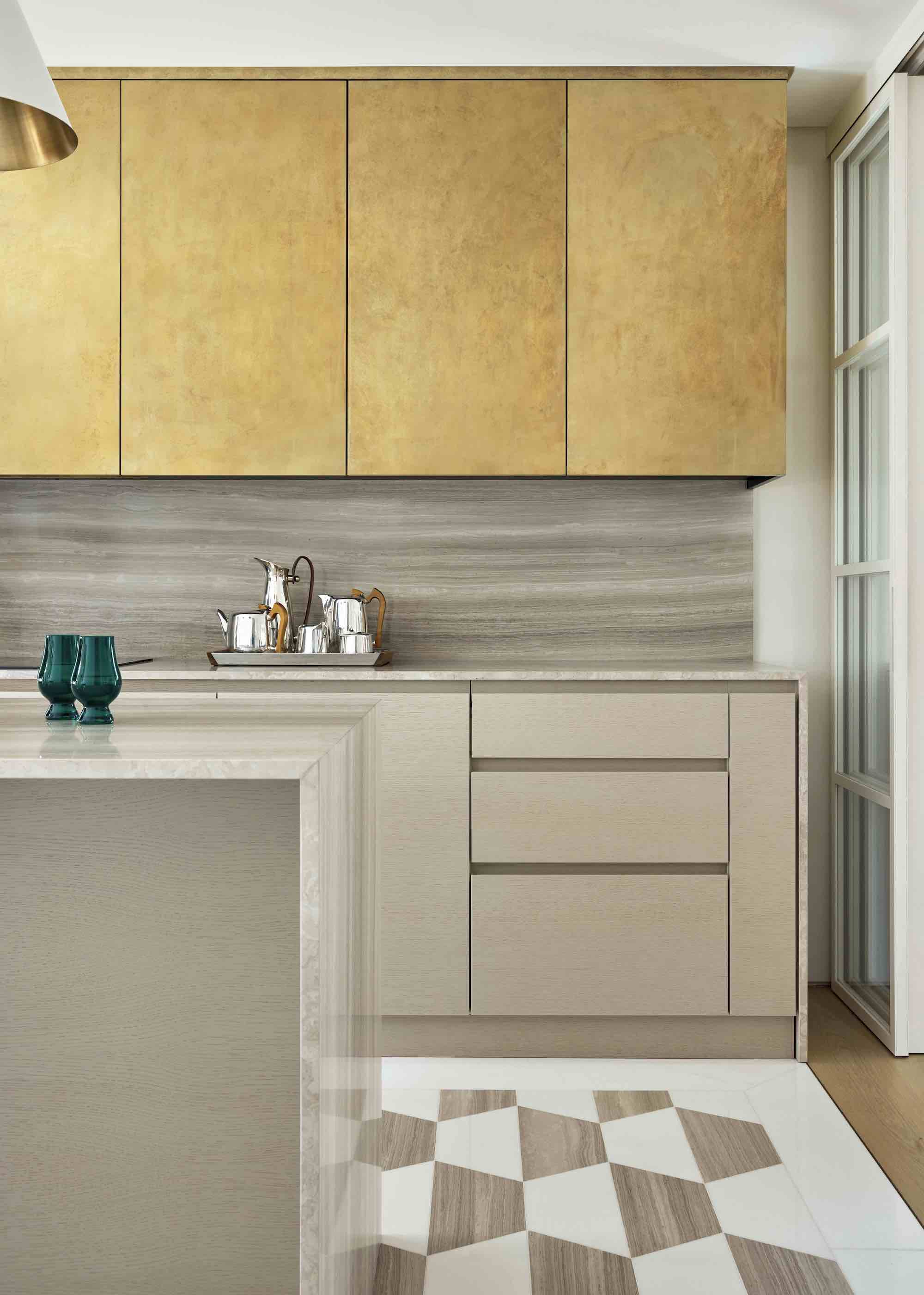
DO INSTEAD: Use layered flooring changes to zone space and add visual depth.
Continuity once defined kitchen flooring, one material flowing uninterrupted through the space in the name of cohesion. Increasingly, however, that approach lacks imagination. Kitchens now support multiple modes of living, and flooring that treats the entire footprint as one zone often fails to reflect how differently those areas function in practice. Switching materials improves durability where needed and defines activity without interrupting flow.
Modern kitchens tend to be multifunctional and much larger than before, so introducing subtle ways to ‘zone’ the area can really help. “Just as an area rug naturally defines a seating zone, a change in flooring can gently signal a shift in function, guiding how the space is used without the need for walls or partitions,” explains Michael Tyrrell, a senior interior designer at OWN London.
“Varying the flooring also adds visual interest. In a large, open room, a single material can sometimes feel flat or overwhelming. Thoughtful transitions help break up the space, creating contrast while still allowing it to feel cohesive. When done well, these changes feel intentional and enhance both the flow of the room and its overall character.”
Then there’s the practical reason for using a different material in the kitchen. “Kitchens are hardworking spaces, exposed to heavy foot traffic, spills, moisture, and stains. Stone or tiled flooring is often better suited to these conditions, as it’s durable and easy to maintain, whereas timber tends to show wear more quickly in such an environment,” says Michael.
The Livingetc newsletters are your inside source for what’s shaping interiors now - and what’s next. Discover trend forecasts, smart style ideas, and curated shopping inspiration that brings design to life. Subscribe today and stay ahead of the curve.
Material choice is equally key, according to Michael. “When the texture and character of the flooring align with the wider design scheme, the transition feels smooth and intentional, reinforcing a sense of cohesion throughout the space,” he says.
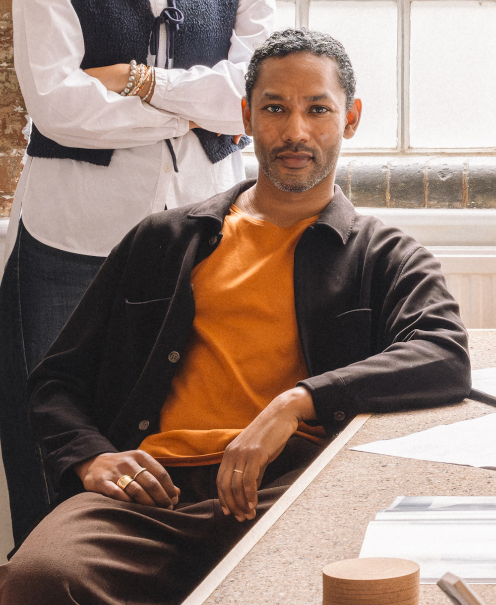
Michael Tyrrell is a Senior Interior Designer at OWN London, specialising in high-end residential projects. Originally trained in law, he pivoted to a career in design, refining his aesthetic and architectural sensibility under Zaha Hadid, Studio Ashby, and Maddux Creative. Michael combines logistical precision with creative excellence to deliver sophisticated, soulful, and meticulously executed interior spaces.
2. OTT BACKSPLASHES
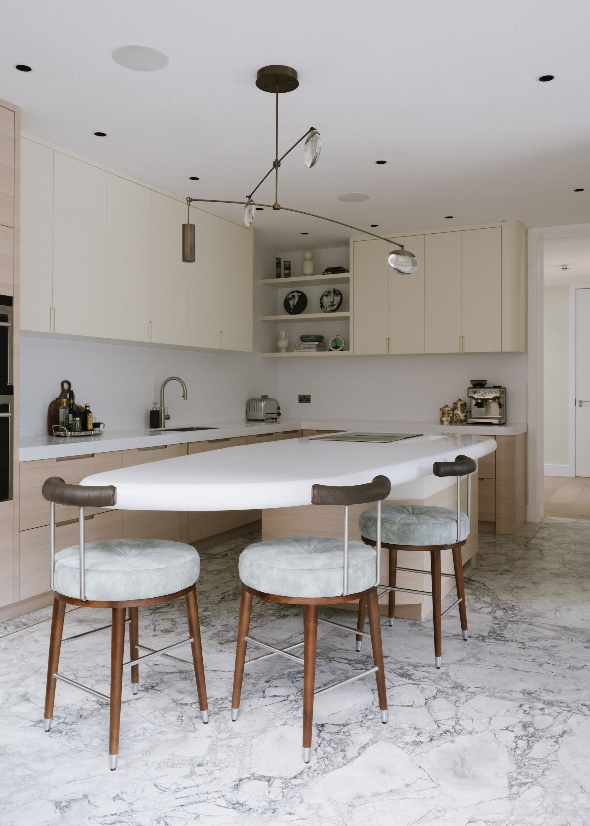
DO INSTEAD: Choose restrained surfaces that support the scheme rather than dominate it.
Statement kitchen backsplashes have carried visual drama in kitchens for years, but their OTT nature often dates them way before they physically need replacing. Bold pattern, color, or contrast can anchor a space firmly to a moment in trend time, making evolution difficult as surrounding elements change. Savvy designers are increasingly favoring splashback surfaces that support the broader scheme instead of competing for attention.
“The main reason high-impact splashbacks become outdated is because colors are often changing quite quickly, and sometimes people are tempted to go for a trend colour as opposed to something that is very homogenous with the rest of the home,” says interior designer Kia Stanford, founder of Kia Designs. This disconnect can create visual dissonance.
When the material is thoughtfully integrated into the wider palette, it avoids tying the kitchen to a specific moment and instead supports a more timeless scheme.
Subtle surfaces also create flexibility. “In this project, we used a full Corian splashback, and solid surfaces like this allow the kitchen to evolve,” she explains. “Because the backdrop is calm and cohesive, personality can come through styling, accessories, and everyday objects rather than being fixed into the architecture.
“The emphasis moves away from the splashback itself. Rather than the surface demanding attention, it allows everything placed in front of it to become the focus, which ultimately creates a more balanced and enduring result,” she concludes.

Kia Stanford is the creative force behind Kia Designs, a London studio known for crafting deeply personal, elegant interiors since 2008. Blending function with flair, she transforms homes into soulful spaces that reflect the people who live in them. A BIID Registered Interior Designer, Kia brings calm, clarity, and a touch of magic to every project she touches.
3. FULLY OPEN-PLAN KITCHENS
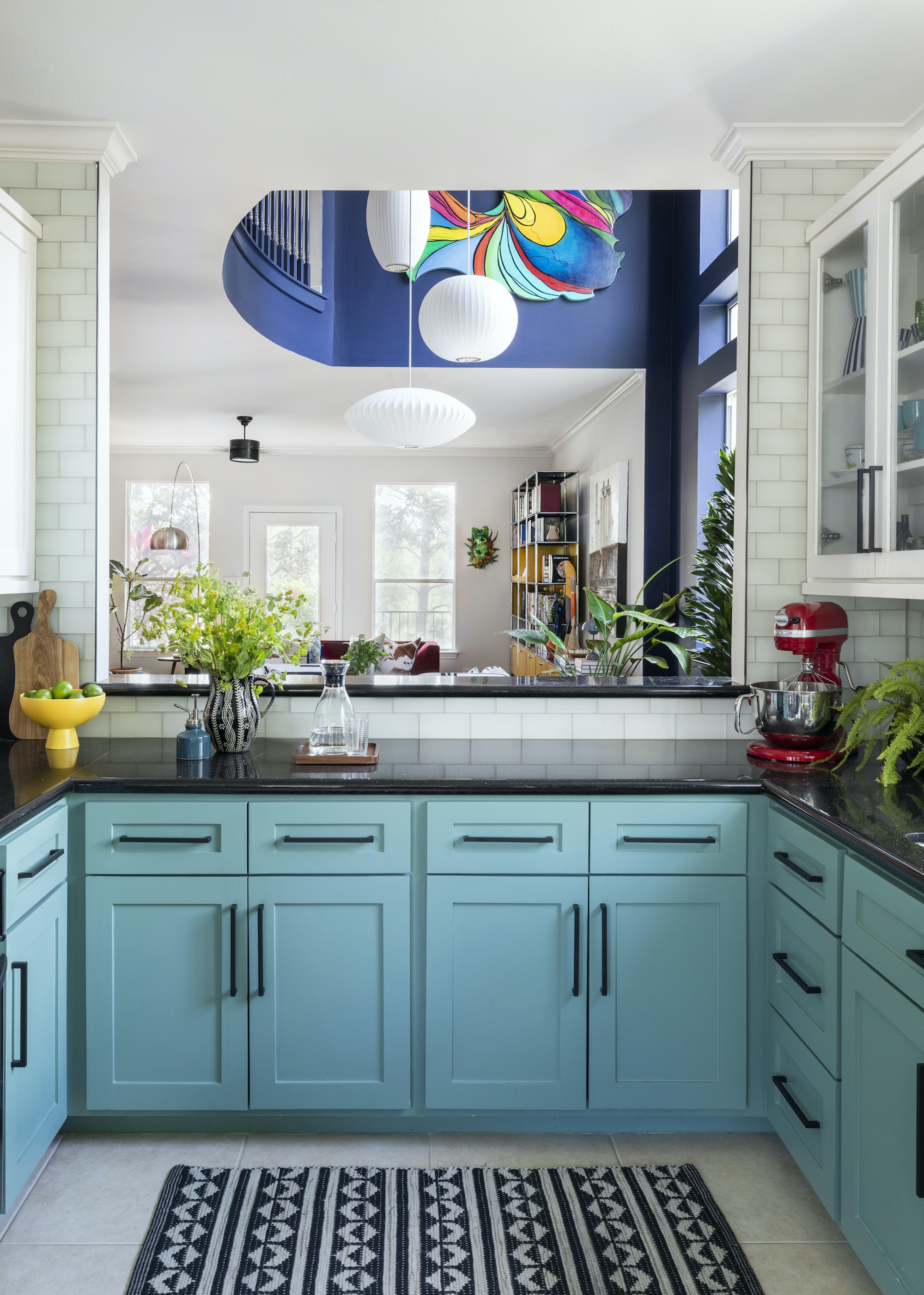
DO INSTEAD: Introduce broken-plan definition that balances openness with privacy and function.
Open-plan kitchens once embodied contemporary living — sociable, expansive, and connected. Yet actually living this way has exposed limitations in the layout style. For homes that accommodate working, studying, and downtime alongside entertaining, constant openness can feel noisy, exposed, and, frankly, annoying. Broken-plan layouts are emerging as a more responsive alternative, introducing definition without sacrificing light or connection.
“While kitchens certainly remain the heart of the home, we're definitely seeing a move away from the more recent impulse to reflexively assume that they should be open-plan!” says Emily June Spanos, principal and founder of Emily June Designs. “Broken-plan living feels more like a course correction after years of expansive open kitchen, living, and dining spaces.”
Defined, partitioned kitchens tend to create a greater sense of intimacy and warmth, Emily June explains, and lifestyle changes are likely to continue to shape priorities. “Working from home has changed how noise and activity impact daily living, and fully open floor plans can feel vast and cavernous, not to mention loud,” she says.
The joy of broken-plan is that you do not have to give up on the light-filled airiness of open-plan entirely. “Introducing flexibility while still allowing a space to feel open and light is a delicate balance,” she says. Architectural nuance provides solutions. “Focusing on natural light and using pass-through openings, like the one shown here, allows the kitchen to feel connected without fully opening up the entire room.” Carving off snug spaces and more intimate areas for peace and quiet isn’t a compromise; it’s just more realistic.

Emily June Spanos established her Houston-based studio in 2016. Renowned for her fearless approach to color, pattern and texture, Emily’s interiors are always adventurous and filled with joy.
4. GLAZED UPPER CABINETS
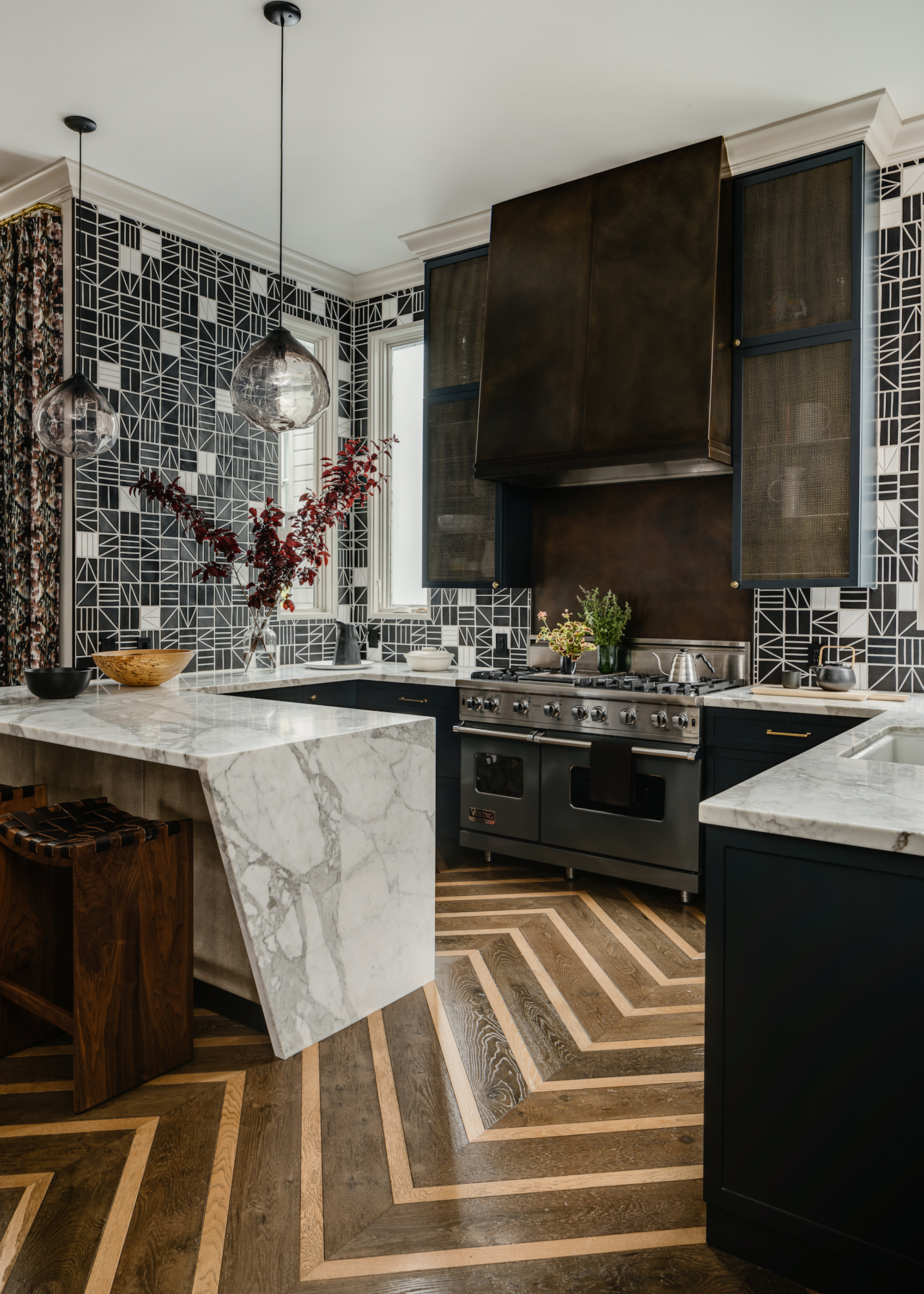
DO INSTEAD: Swap glass for metal mesh to add texture without visual clutter.
Glass kitchen cabinets promise a curated display but often deliver visual noise — exposing everyday clutter while contributing limited material depth. Designers are increasingly turning to more modern solutions that balance openness with tactility. One of our all-time favorites is fine metal mesh, which introduces texture and permeability, reducing cabinetry dominance while maintaining lightness.
“Metal mesh cabinetry brings both performance and personality to a kitchen in a way traditional glazed uppers simply can’t,” agrees John K Anderson of JKA Design. Function underpins its appeal. “The open weave allows for subtle airflow, which helps prevent moisture buildup and makes the cabinets easier to maintain over time, especially in hardworking kitchens.”
Material richness strengthens the visual argument. “Aesthetically, the material introduces texture and depth where glass can sometimes feel flat or predictable,” he adds. “It has an industrial edge, but when paired with warm woods or refined finishes, it reads as tailored and architectural rather than utilitarian.”
Placement remains strategic. “Metal mesh cabinetry tends to work best in kitchens where you want a balance of openness and texture rather than the visual weight of solid or glazed uppers,” he notes. “That said, we also love using it in more traditional homes as a point of contrast — it can modernize millwork without feeling stark.”

San Francisco interior designer John K. Anderson creates classic environments as seen through a modernist’s eye. With over 20 years of experience in residential, commercial and hospitality design, he is known for his dynamic balance of contemporary, mid-century and traditional elements, developing urbane interiors that are fresh and enduring.
5. HARDCORE MINIMALISM
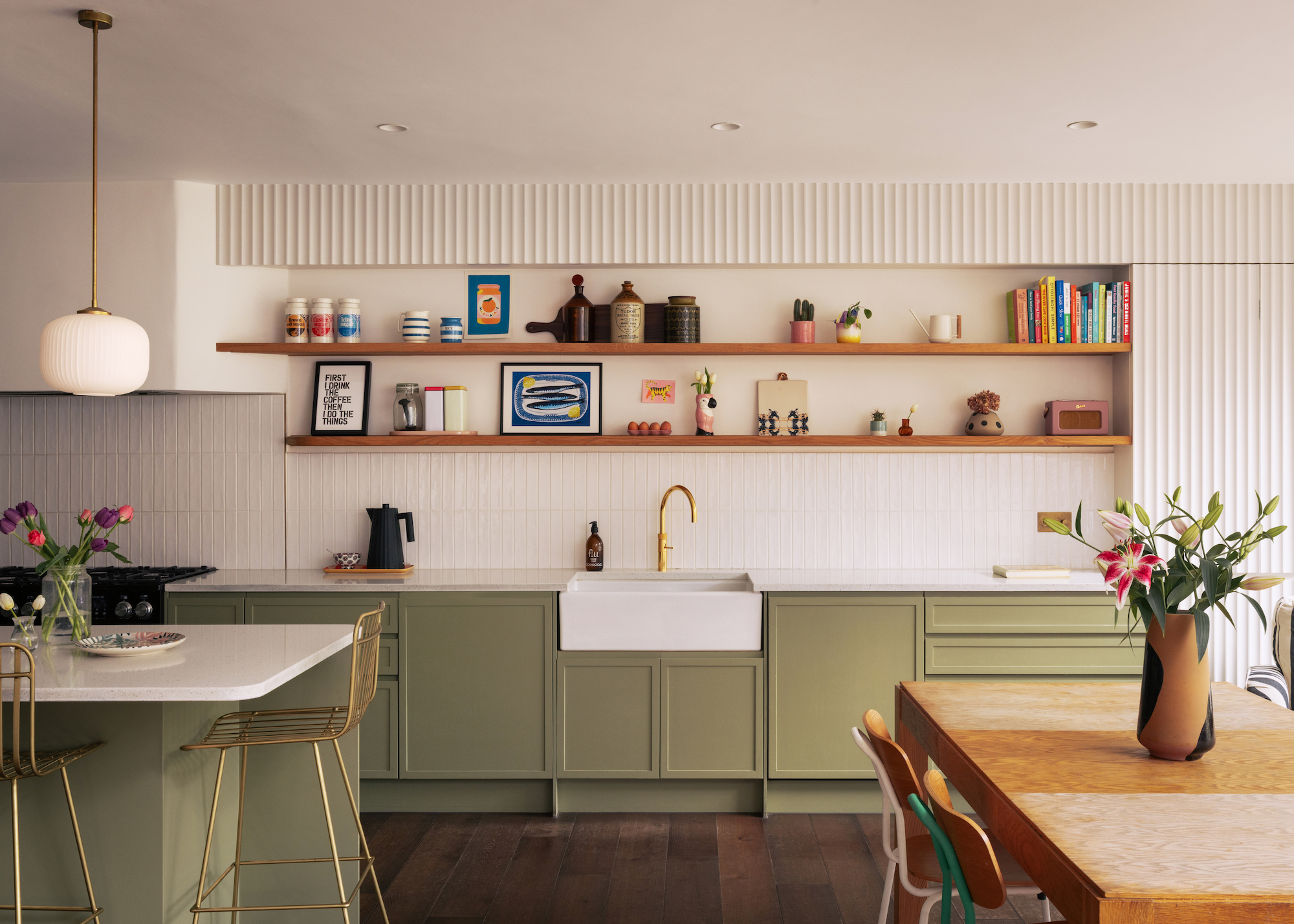
DO INSTEAD: Keep it contemporary but introduce layers of texture and embrace character.
Minimalist kitchens built on glossy flat planes and stripped-back uniformity once signalled sophistication, but increasingly they risk feeling impersonal and unimaginative. A purely reductive approach prioritises wipe-clean efficiency over atmosphere. Designers are shifting toward contemporary schemes that retain a modern vibe while layering texture and nuance. The new way to do modern kitchen design is taken straight from the ‘living room’ moodboard.
“Our approach is about taking the kitchen out of the kitchen, shifting it closer to ‘a living room’ with a richer, layered spatial experience, gravitating away from the more utilitarian aspects of cooking and preparing, while still being practical and functioning,” says architect Charles Tashima, founder of Studio Tashima.
This softer way of designing a kitchen is driven by texture and feel rather than hard-line minimalism. “Three-dimensional and textural surfaces allow us to move beyond the established language of easy-wipe melamine-faced doors, metro tiled splashbacks, chrome taps, and LED downlights brightly lighting dark granite countertops to offer a softer, more characterful atmosphere,” Charles explains.
Material layering plays a central role. “Fluted and reeded panelling, irregular tiles, lined cabinetry, oak screens, exposed brickwork and ceiling rafters are just some of the materials and surfaces we like to use in a modern kitchen,” he says. “Added to this are the subtle shifts in paint sheen or even colour, the use of brass or bronze, and reclaimed materials with their patina, all acknowledging that smooth surfaces, too, can be thought of three-dimensionally.”
The best character-led spaces evolve naturally. “Our palette usually arises responsively and organically — taking cues from the building itself as well as the likes and dislikes of our clients and the things they bring with them and aspire to achieve,” he says. “Working with a full collection of parts and pieces, we like to think of this as a choreography of space where surface depth, shadow and variation are set in concert with the proportions of the space and the objects within (books, paintings, furniture). This is an approach we refer to as ‘a living architecture’ — built form as alive and living.”

Charles Tashima founded Studio Tashima, a practice focused on private residential work for over 25 years. Its open, intuitive approach has evolved through working primarily with existing buildings. Charles’ collaborative ethos is shaped by years of teaching, a Liberal Arts degree from Wesleyan, an architecture degree from Harvard GSD, and a travelling fellowship studying vernacular, domestic architecture across Eastern Europe, Turkey, and Greece.
6. SHOWPIECE EXTRACTORS
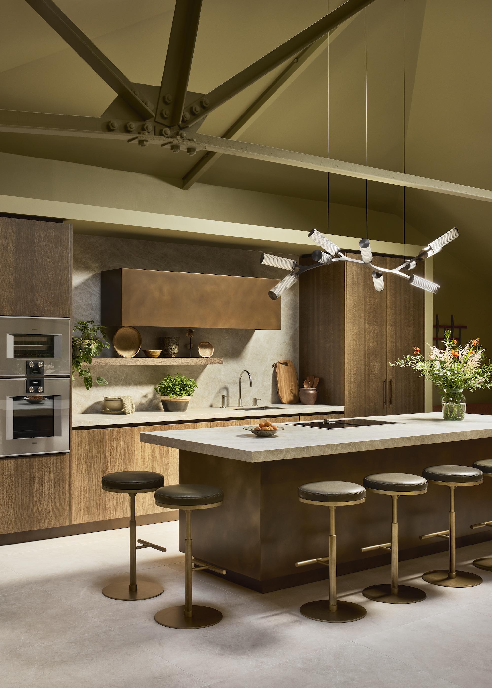
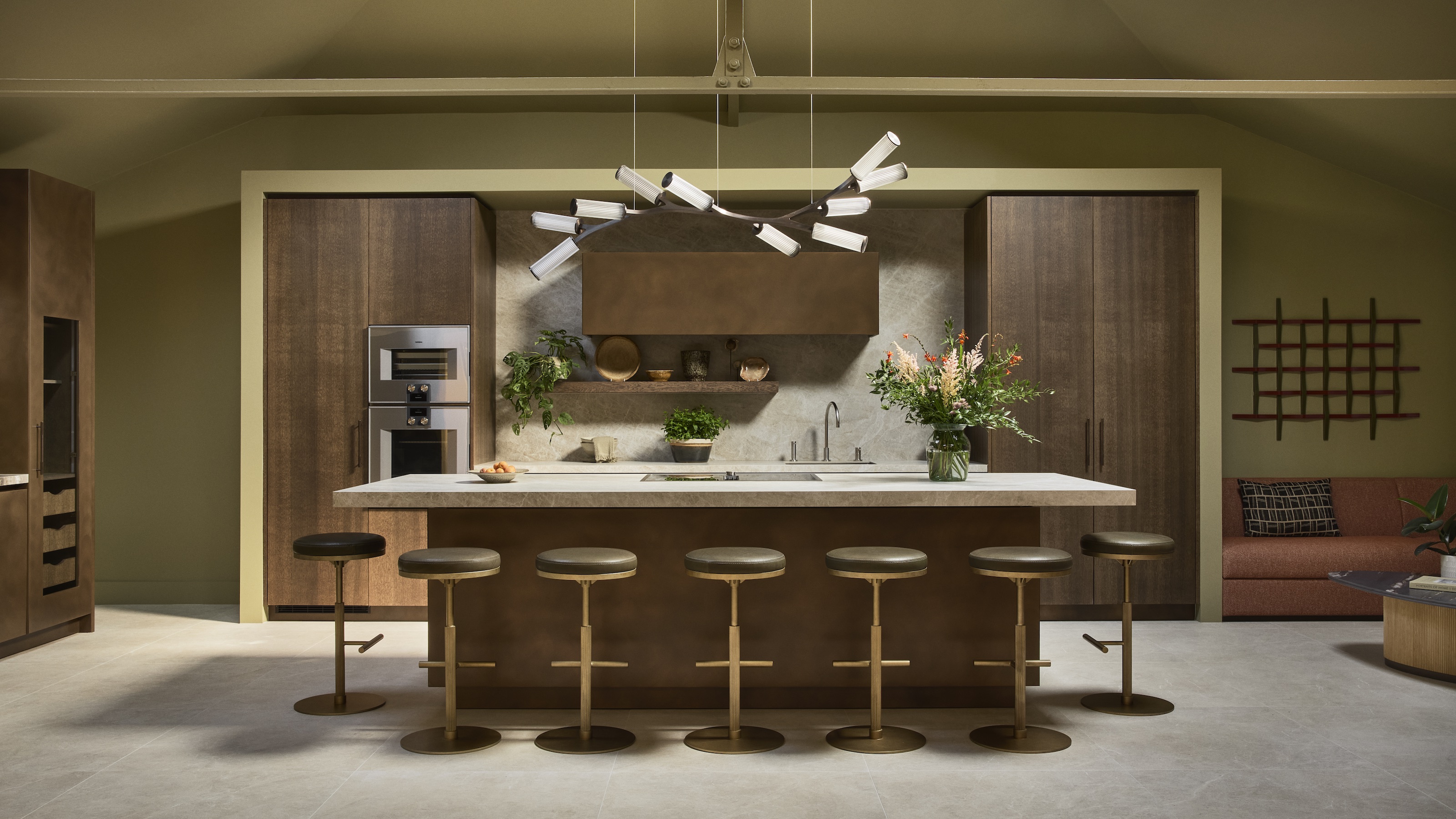
DO INSTEAD: Go for a downdraft hob and let your lighting steal the show.
Whether a stainless-steel blinder or oversized chimney-led affair, statement extractor hoods once carried serious focal-point status. But in open-plan kitchens, that visual dominance can easily overpower, interrupting sightlines and competing with more considered architectural moments. Increasingly, designers are dialling extraction design back, letting lighting, joinery, and materiality take the spotlight instead.
“I have a bit of a personal dislike of oversized overhead hoods – once they dominate the view or the noise level, they stop enhancing the kitchen,” says Brian Woulfe, founder of Designed by Woulfe. “Above an island, especially, I think they interrupt the experience of cooking, chatting, or even watching TV.”
Discreet solutions offer performance without spectacle. “I often steer clients towards downdraft extraction on islands because it keeps the sightlines clean and lets you stay connected to the room,” he adds. “Hob-based systems do the job quietly and efficiently without becoming the focal point.”
Indeed, venting hobs are gaining serious traction, neatly combining cooking and extraction in one discreet solution. By removing the need for overhead bulk entirely, they support cleaner lines, calmer ceilings and more freedom with statement lighting, which is exactly where many contemporary kitchen schemes focus the visual drama.

Irish-born and London-based, Brian Woulfe is an award-winning interior designer and LSE Real Estate Economics graduate. A former concert pianist, he redirected that discipline into design, founding Designed by Woulfe in 2009 and building a global portfolio across five continents. His work centres on luxurious yet functional interiors shaped around each client’s personality.
For a broader reality check beyond cabinetry, take a look at the outdated design trends currently being reassessed across the home — it might save you from your next design regret. And, why not sign up to the Livingetc newsletter, so you're always abreast of the next big trends, and which have fallen out of favor.

Linda is a freelance journalist who has specialized in homes and interiors for more than two decades, and now writes full-time for titles like Homes & Gardens, Livingetc, Ideal Home, and Homebuilding & Renovating. She lives in Devon with her cabinetmaker husband, two daughters, and far too many pets, and is currently honing her DIY and decorating skills on their fourth (and hopefully final) major home renovation.
