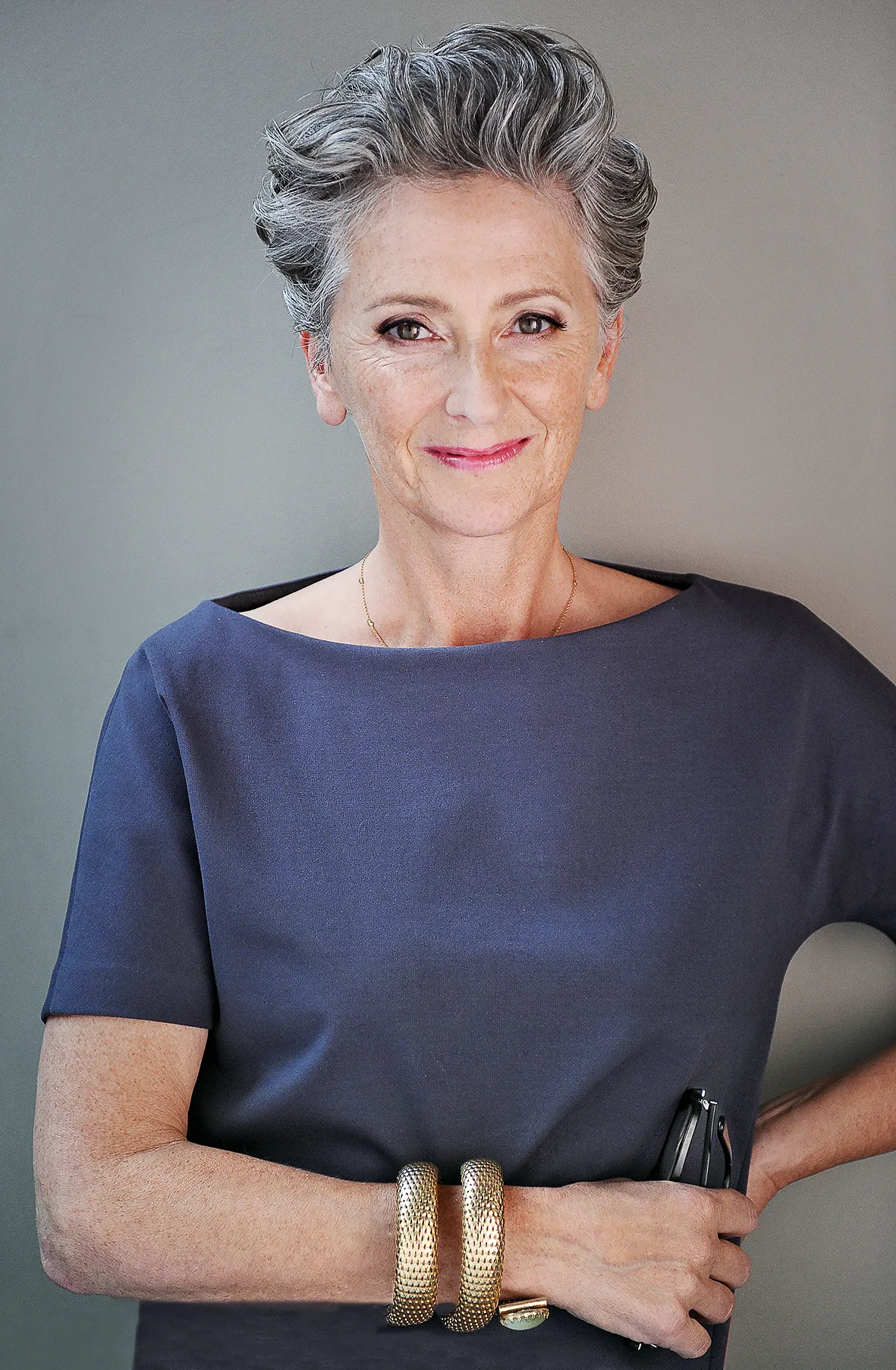
HOW DID YOU START OUT?
I first worked in fashion, for the legendary Mrs B (Burstein) at Browns in London and then as a stylist for Bergdorf Goodman in New York. It’s where I met my Dutch husband Frans van der Heijden, an advertising photographer. Together we collaborated on ad campaigns and films. Just after we moved to Amsterdam in the late 1990s, I started designing sculptural hand-blown glass vessels, and together with Frans our Heijden-Hume furniture collection, including tables, benches, books shelves and room dividers, in finishes such as walnut, oak and ash came into being.
WHEN WAS YOUR BIG INTERIORS BREAK?

In 2001, I met a Dutch lady at a dinner in Russia – I’d gone over there to do a reccy on a glass blowing company. She contacted me a year later to ask if I wanted to redo the interiors of her house. I’d wanted to change from film and fashion to design, it’s why we created the glass and furniture collections, and suddenly here was this ‘fairy godmother’ I’d been hoping to find.

WHAT SIGNIFIES YOUR STYLE?
If there’s a link between projects, it’s the way I customize furniture and carpets, create good lighting and add in a mix of unexpected details, such as one-off vintage pieces and a dramatic, sophisticated colour palette. I like to create spaces that feel personal, energetic, comfortable and surprising.

DESCRIBE YOUR DESIGN PROCESS
I act on instinct – it’s a ‘sixth sense’ feeling I get the minute I walk into a new space. I’m entirely self-educated – I wouldn’t know what rules I'm supposed to be breaking. First, I paint the walls in colour – it's my version of a neutral – then work with fabrics in a very painterly way. With a range of textures, from silk, linen and velvet to sandblasted timber, I create a palette of four or five key hues, also adding into the mix interestingly veined stone and bronze for taps and handles. We story board everything but putting it all together on a table to ensure the colours and textures work well together, and then I take a few things away. Less is always more.

WHAT ARE YOUR KEY INGREDIENTS FOR A GREAT ROOM?
Comfort, good lighting and an intimate atmosphere. A mix of textures – rough and smooth, matt and shiny, printed and woven – creates an effect that’s visually welcoming, not overwhelming. For fabrics, Dedar does strong, quality plains; for pattern, I’m enjoying Zak + Fox’s linens right now. I source hand woven or knotted rugs, designed specifically in colour and pattern for each space, from Tai Ping and La Manufacture Cogolin.

WHAT DO YOU LOOK FOR IN FURNITURE AND ACCESSORIES?
I’m always drawn to pieces with a sense of story and a handmade feel – pieces that will age with you. I head to the The New Craftsmen for accessories which really exude the touch of the human hand, like Nicola Tassie’s jugs and Joe Hogan’s baskets. I like Feldspar’s hand-dimpled porcelain, from mugs to candles. A sensual, sculptural feel, with a bit of a curve, lends softness to a room without being too stuffy or feminine.

DO YOU HAVE CLEVER WAYS OF PERSONALISING SPACE?
We always customise cushions, each one with different detailing, sizing, stitching, buttoning, and trims, depending on where they’ll be used. They really dress up a space. And I’m not above a bit of DIY – we often repaint tables or chairs in black.

ARE THERE ANY NEW MATERIALS YOU'VE BEEN TRYING OUT? I’m currently playing around with patterning in brick – we’re working on a new-build project and I’m preferring it to render. I’d be happy not to see any more classic black and white marble for a while – I much prefer terrazzo and more interesting stones by Belgian company Hullebusch. We’re currently designing a beautiful fireplace in Rogo Alicante.

DO YOU HAVE A FAVOURITE COLOUR PALETTE?
I draw inspiration from what I can see through the windows outside – in Hamburg, the colours of the sky, river and sea, as well as the oxidised rooftops of the city’s domes and mansards, guided the Elbphilharmonie apartment’s green and blue scheme. We’re just renovating our own home in Amsterdam – I’m working with olive tones, interjected with red. In an urban space, hues like ochre and navy complement the dark industrial feel outside. Argile paints have the most wonderful dense matt finish, and we use Little Green’s four shades of ‘Pearl’ a lot.

WHEN DO YOU KNOW A SPACE WILL WORK?
When it’s atmosphere makes you want to stay forever. There’s a word in Dutch, ‘gezelig’, which means cosy – it’s how I feel about my friend and design hero Douglas Mackie’s sitting room, it looks as though is grown up over a period of time. Rooms need to tell a story – coming home is about coming home to something that’s yours.