13 ways repetition in interior design can be used to create calmingly sophisticated rooms
Repetition in interior design is a simple formula for consistency, and an easy way to pack interiors with plenty of visual interest
Repetition in interior design isn’t just an excuse to double up on favorite pieces of decor. This core principle is like a steady heartbeat for your home – it creates visual rhythm and consistency, helping you build a cohesive design story that’s hard to forget.
“Think about the chorus of a song that repeats – you remember it and often commit it to memory,” says Pittsburgh-based interior designer Colleen Simonds. “Visual effects work the same way – when you see a repeating pattern or motif or detail, it grabs your attention and stays with you – it's what you remember about a room.”
Elements worth repeating throughout interior design range from shapes, textures, colors, and lines that can easily reverberate across furniture, decor, and architecture. Think of these recurring elements like tools to reinforce a point; repetition is a crucial tool for building a clear and connected palette.
“That cohesion – or repetition – can be applied at every scale through color, texture, materiality, and detailing so that every single design element from the floors and millwork, to ceiling beams, hardware, fittings and furniture are speaking the same harmonious language,” explains Andrew Kline, Associate Principal at Workshop/APD.
And beyond the most classic elements of design, interior designers have plenty of expert tricks in their repertoire to make repetition work throughout modern homes – here are some key tips worth repeating.
how to perfectly achieve repetition in interior design
1. REPEAT KEY PIECES OF FURNITURE
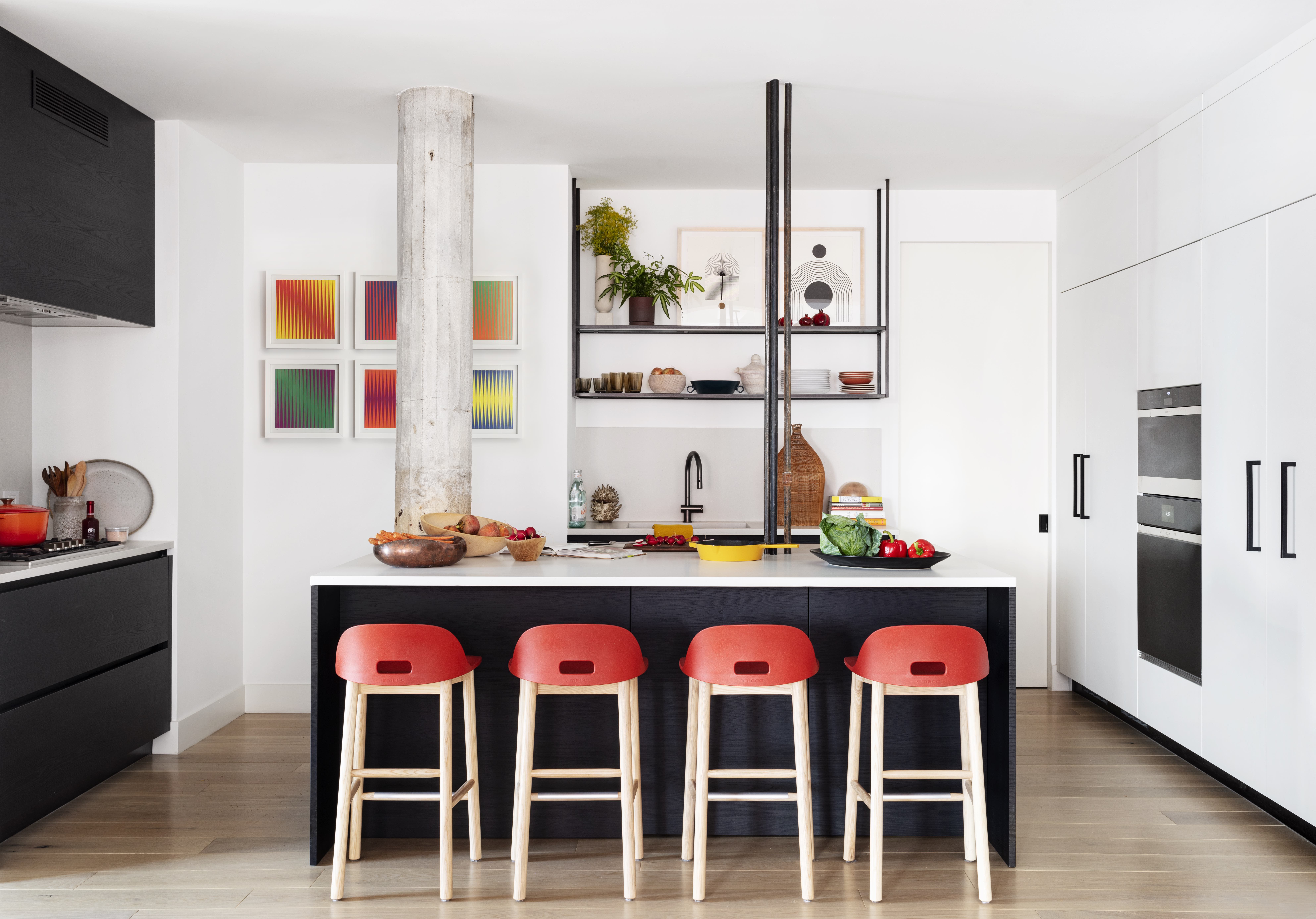
Incorporating key pieces of furniture in multiples is a tried-and-true trick that builds cohesion throughout your space; it’s why a series of chairs around a dining table looks consistent rather than redundant. These recurring elements can stabilize your room without appearing like clutter.
In the above modern kitchen, four red bar stools are hard to miss, and that’s exactly the point: the bold series strengthens the kitchen’s overall palette. “This kitchen had an overall strong color theme, with a lot of ebonized wood cabinetry and white countertops and walls and repeating colorful counter stools that contrast with the island break up the cabinetry,” says New York’s Lucy Harris.
The Livingetc newsletters are your inside source for what’s shaping interiors now - and what’s next. Discover trend forecasts, smart style ideas, and curated shopping inspiration that brings design to life. Subscribe today and stay ahead of the curve.
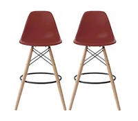
2xhome set of Two red bar stools, 28 inches high, Amazon
With their nod to mid-century elegance through the slender legs, these deep red bar stools still make a visual statement. Line them up in a row of four for instant repetition.
2. Pair one large piece of furniture with two small
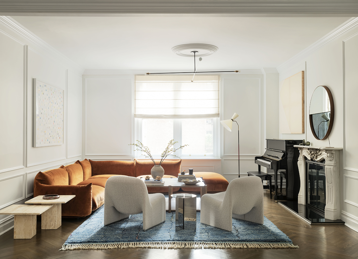
Of course, you don’t need to repeat yourself more than once – one popular formula, often seen in living rooms, pairs one large sofa with two smaller chairs. This form of repetition uses visual weight to establish balance in interior design. “We will often use chairs in pairs in the living room,” says Damian Zunino of Studio DB. “Having multiples helps anchor the space and counters the scale of a sofa that is often opposite or adjacent to the chairs.”
You’ll see this simple formula in action in the living room above, where a set of chairs acts as a counterpoint to a larger L-shaped sofa. “In our Fifth Avenue apartment project, the sculptural pair of chairs floated in the space to define the living area in an elegant and functional manner,” explains Zunino.
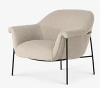
Penelope accent chair, Lulu and Georgia
Cocooning seats and slimline legs, this modern/organic accent chair was just made to be repeated.
3. REUSE COLORS FOR A STRONG COLOR SCHEME
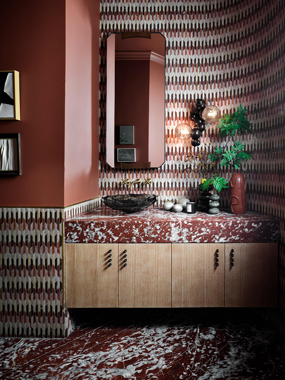
We never tire of picking new color trends year after year, and that’s because strong colors – especially ones that repeat to build a cohesive palette – are fundamental for pulled-together looks. “Repeating colors in a space creates rhythm and cohesion,” says Jessica Davis of Atelier Davis. “It leads your eye around from element to element and creates a sense of harmony in the space.”
When colors repeat, they often show up on and off the wall. In the modern bathroom above, bathroom wall tiles set the tone for a colorful pattern that pops throughout the space. “It's a bold palette but the repeated colors help it remain cohesive and calm,” says Davis. “I used the mosaic as a jumping off point for the colors repeating the terracotta hues in the counter, the floor and on the walls. I also took some of the warm brown [and] tan colors and repeated those in the sink and window shade.”
4. Use the SAME SHAPES to BUILD COHESION
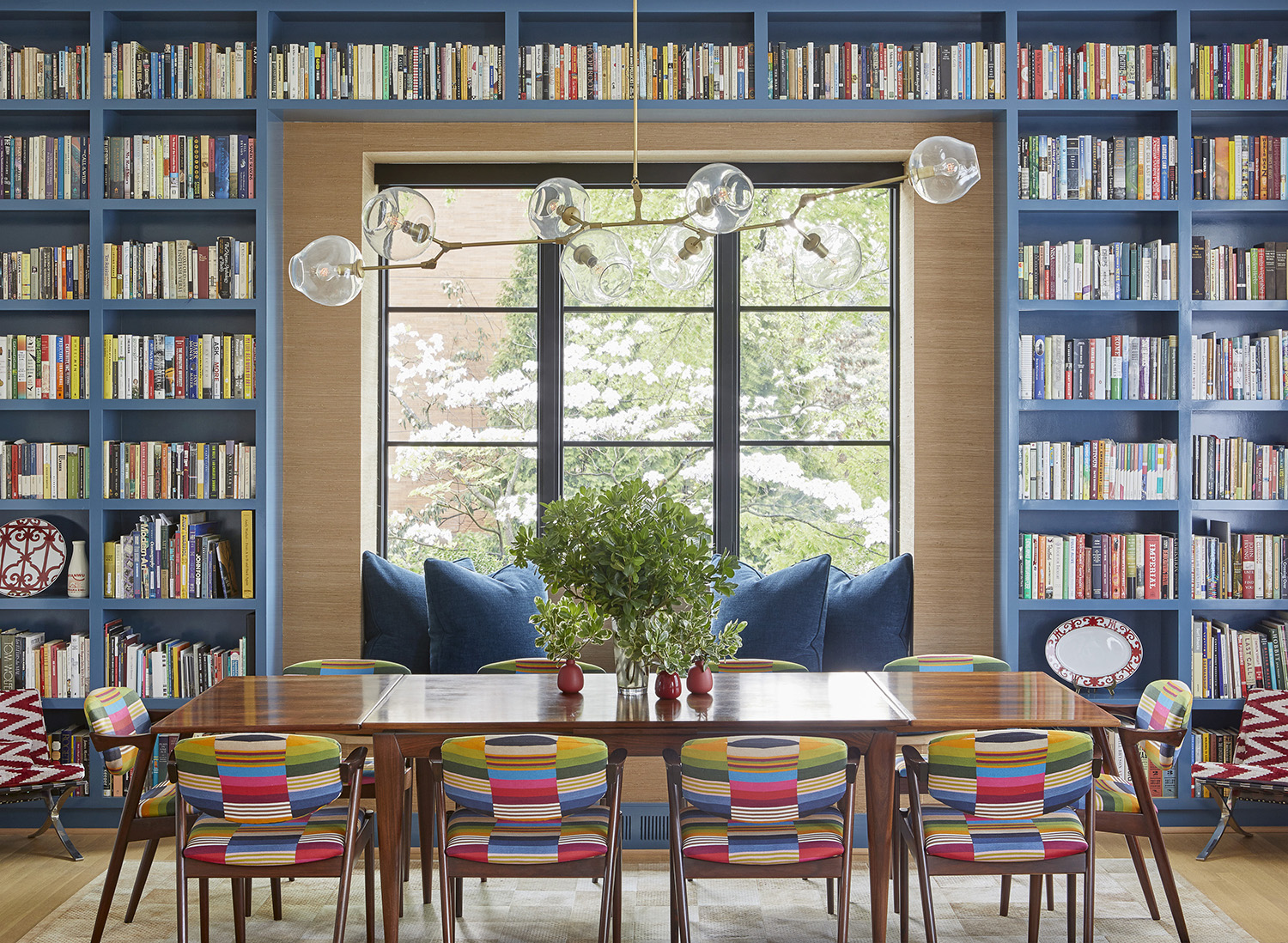
Like same-shaped buttons on a device, recurring shapes help us dial into interior schemes; they create visual order, and lead our eye from one spot to the next. There are foolproof ways to achieve this with patterns – like integrating geometric prints or gallery walls – while a range of shapely furniture and decor can reinforce the idea just the same.
In the above dining area, a colorful home library is stacked with visual interest – every shape reinforces each other, even right down to the books. “The broad takeaway here is geometry and the power of repeating shapes,” explains interior designer Colleen Simonds. “Rectangular bookshelves, rectangular dining table, rectangular fabric on the dining chairs, a rectangular window seat, the window mullions – you get it.”
5. LINES ARE WORTH REPEATING
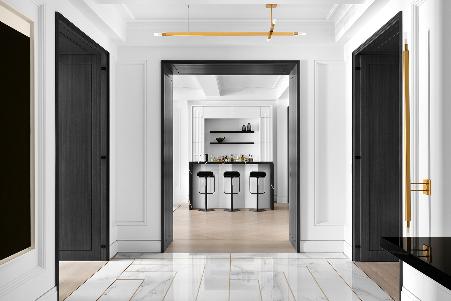
Like a song’s chorus, some lines are worth repeating – again and again. This form of repetition, using anything from curvy to straight lines and complementary silhouettes, brings continuity across architecture, furniture, and decor. “There are so many great ways to add depth and interest to a space with repeating lines,” says Andrew Kline of Workshop/APD.
In the space above, a lineup of right angles creates rhythm in the interior design from one room to the next, starting with open doorways that frame a fluted wet bar. “My favorite part of this bar is that it plays with repetition and scale,” says Kline. “The face of the bar feels like a magnified version of the fluted trim on the back, transforming and enlarging something hyper traditional so that it almost becomes pop art.”
6. CREATE MULTIPLE TOUCHPOINTS WITH TEXTURE
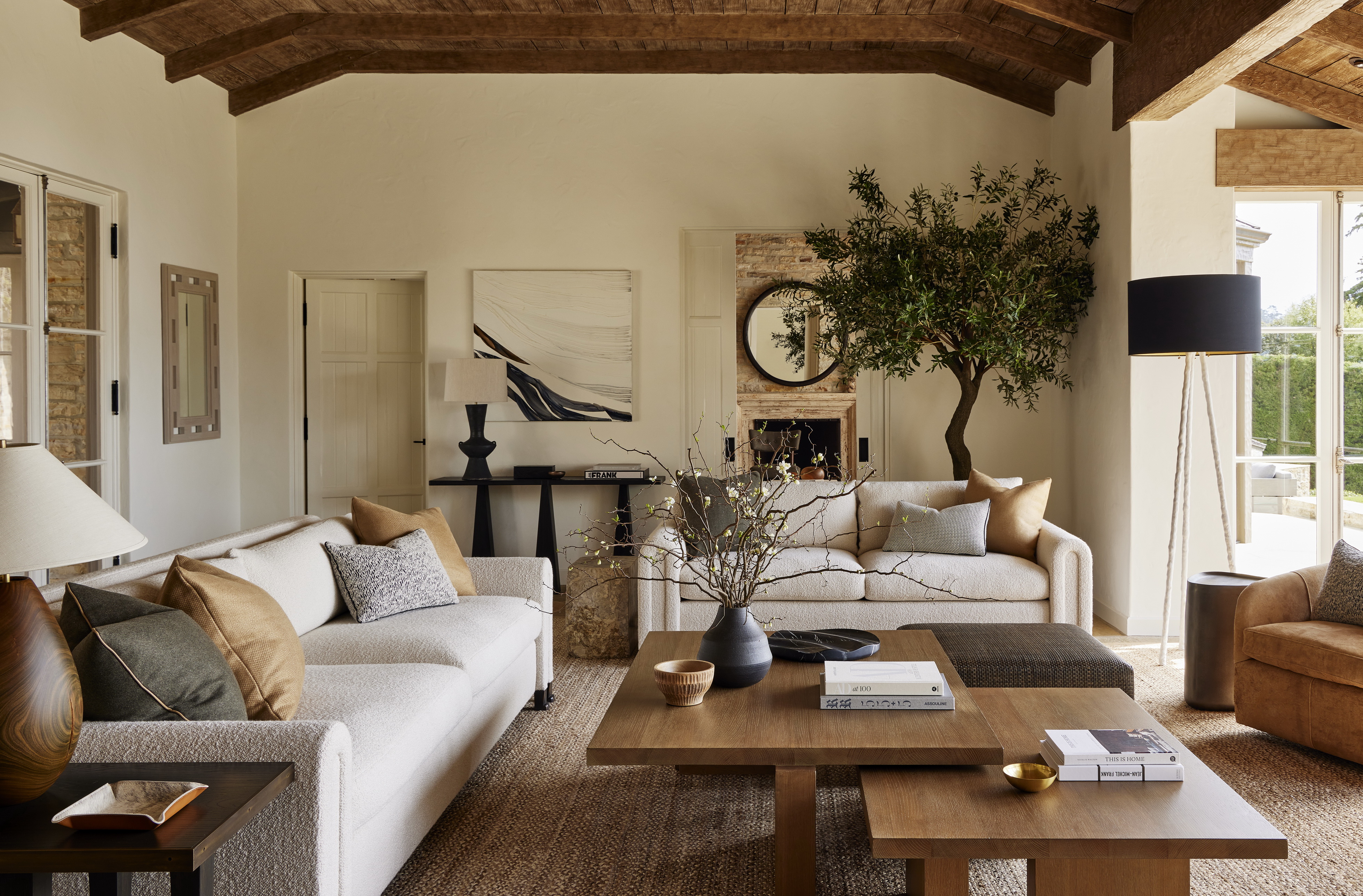
As one of the main elements of design, texture leaves a mark on interior schemes – and when it’s repeated, you can hone in on how a space feels overall. “Once we’ve established a mood – how we want the space to make our clients feel – we begin to think about a cohesive palette of colors and textures that can be applied across the interior architecture and design,” says Andrew Kline of Workshop/APD.
In the relaxed California living room above, a warm color scheme shines through a thoughtful repetition of textures. “In this living room, the design team did a masterful job of pulling the tones of the ceiling beams into the coffee table, and their texture into the lighting and accessories,” explains Kline of the cozy, cohesive mood. “The sofas echo the color of the walls, but there’s a rich, deep texture to the boucle that makes it interesting. It’s cohesive but tactile, so the repetition is never boring.”
7. HIGHLIGHT REPETITION IN ARCHITECTURE
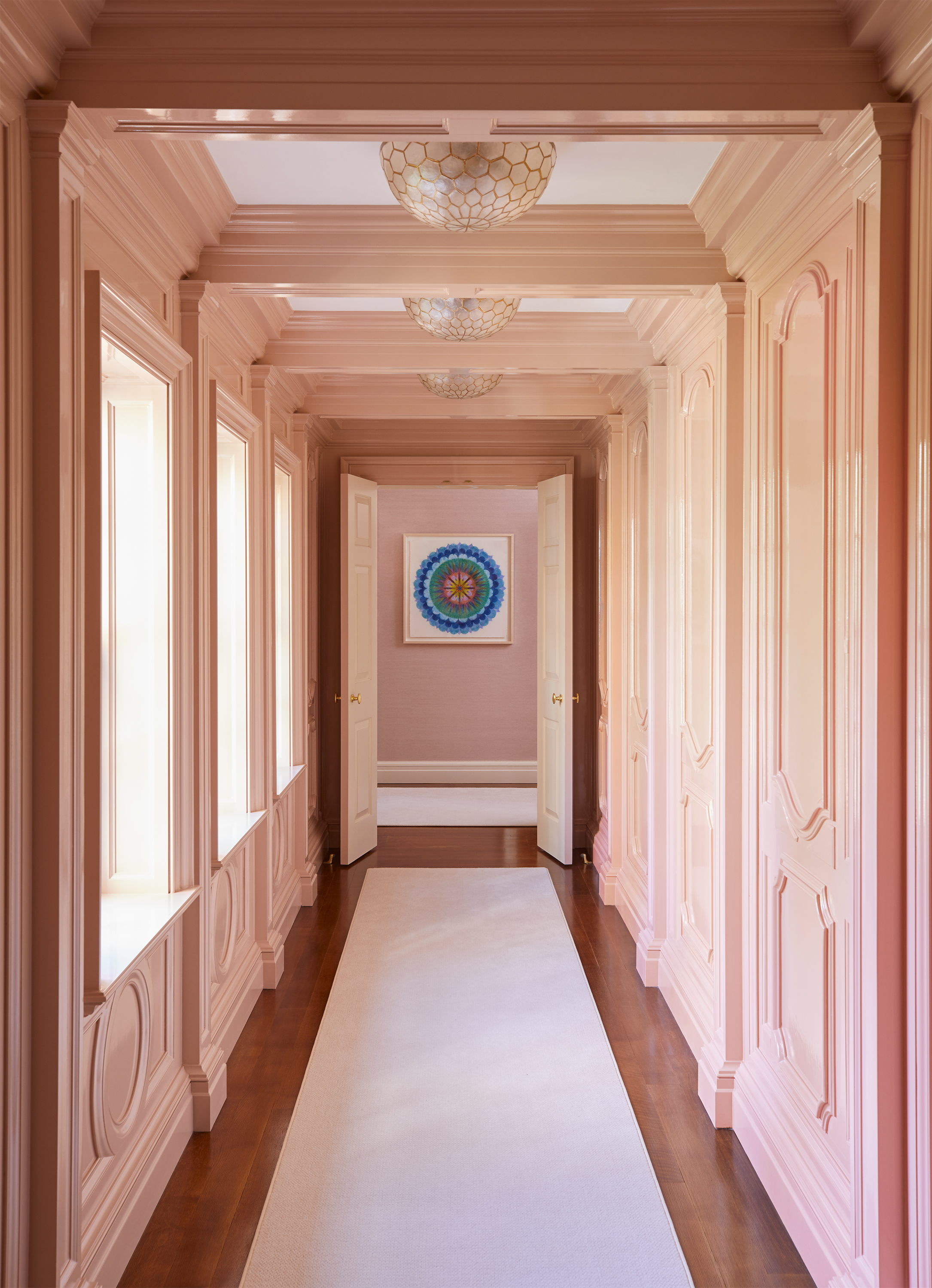
Repetition is often built into your interior whether you realize it or not – think of a line of rectangular windows along a room, a series of interior arches down a hallway, or wraparound wainscoting with wall-to-wall pattern. “Repetition and symmetry in architecture establishes visual order and is pleasing to the eye,” explains designer Colleen Simonds.
In the above interior, repetition takes form through a series of paneling updated with a modern neutral color scheme. “Lacquering the whole thing in one color creates calm and a 'wow' effect simultaneously… and you'll notice the scallop detail on the ceiling light fixtures repeating the scalloping in the piece of art hung at the end,” says Simonds. “Your eye registers those at the same time – even if you don't totally know that you do.”
8. REITERATE DESIGN LANGUAGE FROM ROOM TO ROOM
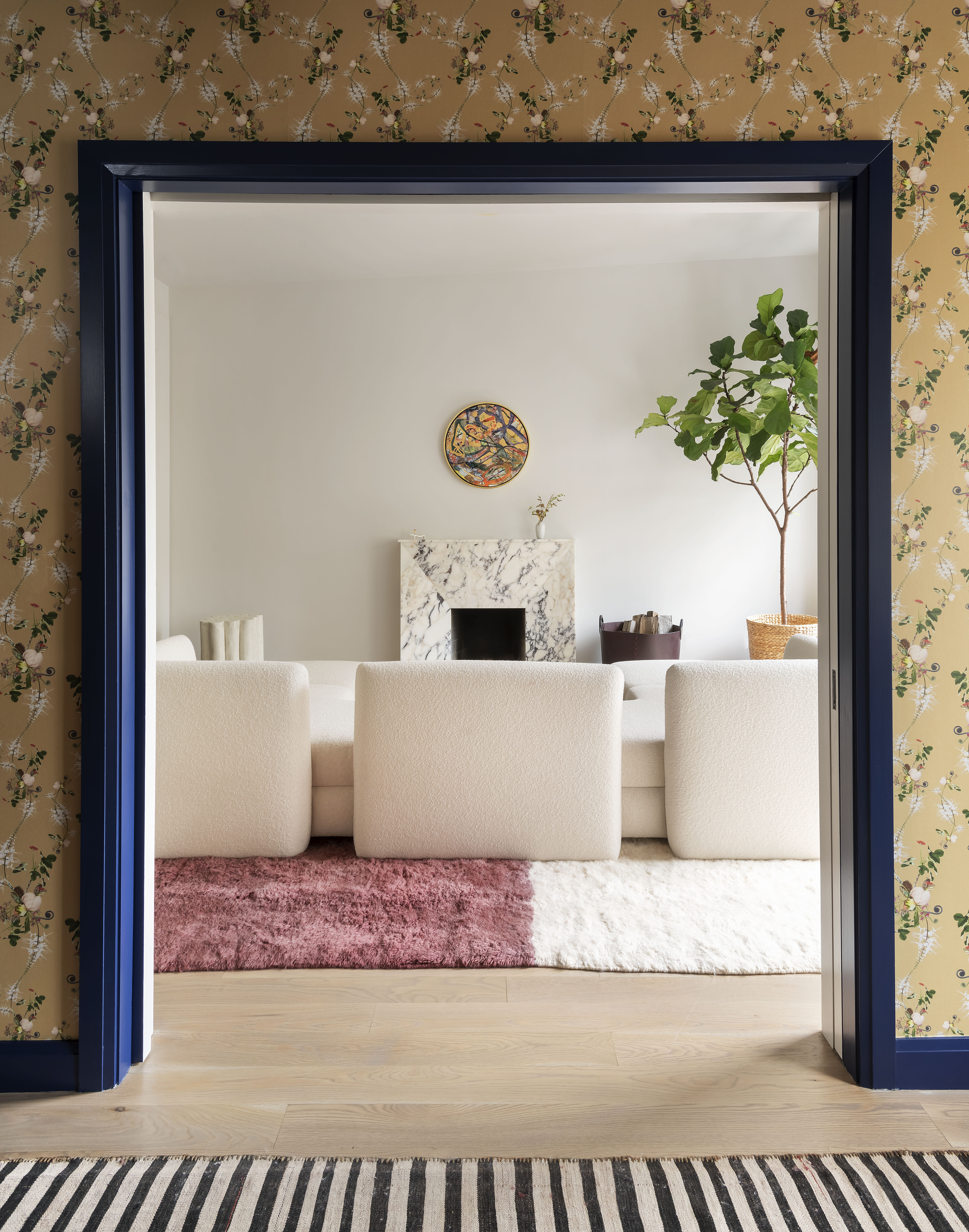
With so much talk of cohesion in your space, don’t forget to think about connecting your many spaces. In the same way that repetition can help your eye move throughout an interior scheme – connecting different points in space – it can also establish continuity from one room to the next.
In the above interior, repeating shapes and colors create a thoughtful sightline between two different spaces. “On each project, we look for themes that work their way throughout the entire project, creating a sense of cohesion from room to room,” says Damian Zunino of Studio DB. “While we also like the tension between unexpected design decisions, there is always a consistent theme, be it a shape, color or texture.”
9. REPETITION KEEPS INTERIORS IN ORDER
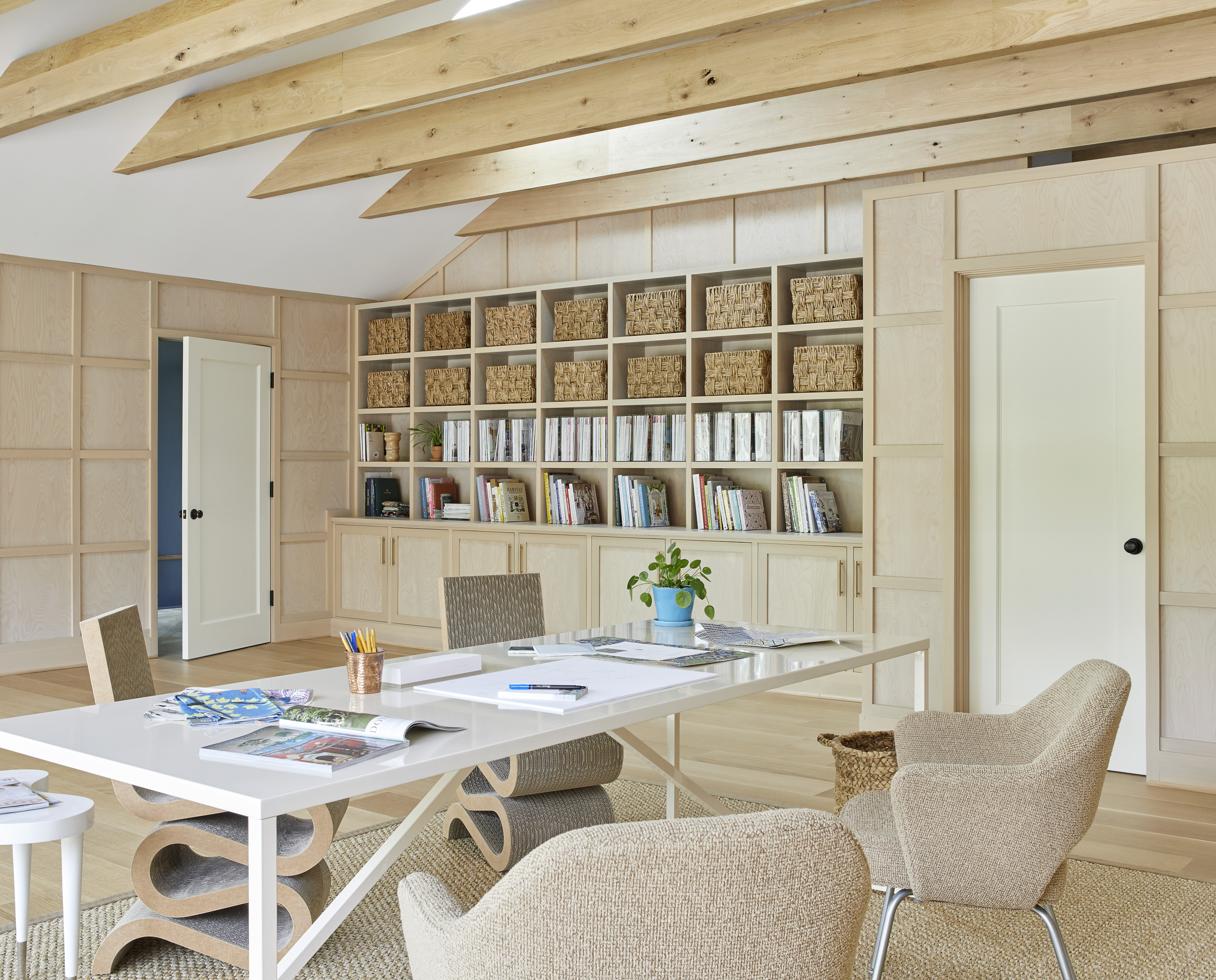
Along with cohesion, repetition is especially popular in spaces that benefit from visual order — it’s why bookshelves are go-to home office ideas, or clean-lined cabinets are trademarks of modern kitchen ideas. “[Most] people are naturally drawn to symmetry and order and find it aesthetically pleasing without even realizing it,” explains Pittsburgh-based deigner Colleen Simonds.
You’ll see how repetition creates a smooth, organized rhythm in Simonds office design above, where she doubled up on rectangular and square elements within built-in bookshelves and wall panels. “The repeating shapes create a very clear sense of order and structure in what is usually a space filled with visual chaos – tons of colorful and patterned samples, etc,” says Simonds. “I have a big rectangular desk, too – and a corkboard divided into equal quadrants. The power of geometry!”
10. EXTRA LIGHT FIXTURES BRING FUNCTION

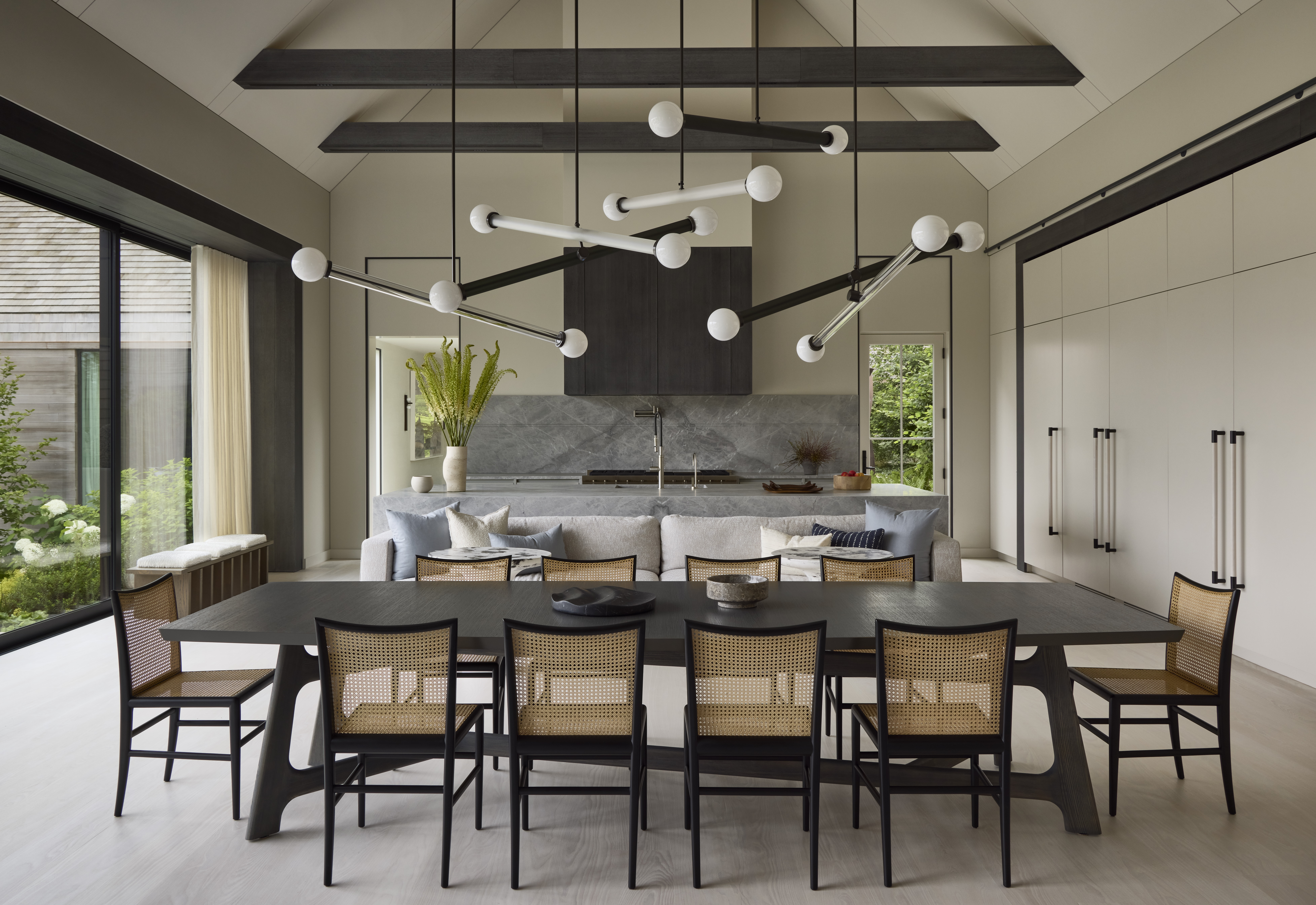
While lighting trends often embrace repetition to maximize light flow, they’re also easy on the eye. “As a concept, you can apply the repetition of light to decorative and functional elements,” says Andrew Kline of Workshop/APD. You might see pendant lights hung in rows over a kitchen island for balance, a set of wall lights on either side of a fireplace for symmetry, or repeated down a long hallway for visual rhythm with a sense of direction – it’s all functional yet stylish.
In the dining area above, a cluster of light fixtures reference materials throughout the interior (like black steel window frames) while creating a burst of visual interest. “My favorite part about this installation is that it's not a cut-and-paste repetition but a reinterpretation – our team specified double and single iterations of the same light fixture in a number of finishes, and installed them twisted and angled and hung at different heights, filling and defining the space since this is an open plan Great Room that also contains the kitchen and living room,” explains Kline. There’s a repetition of light itself here, too – the beams are lit throughout.”
11. CREATE HIERARCHY WITH SCALE
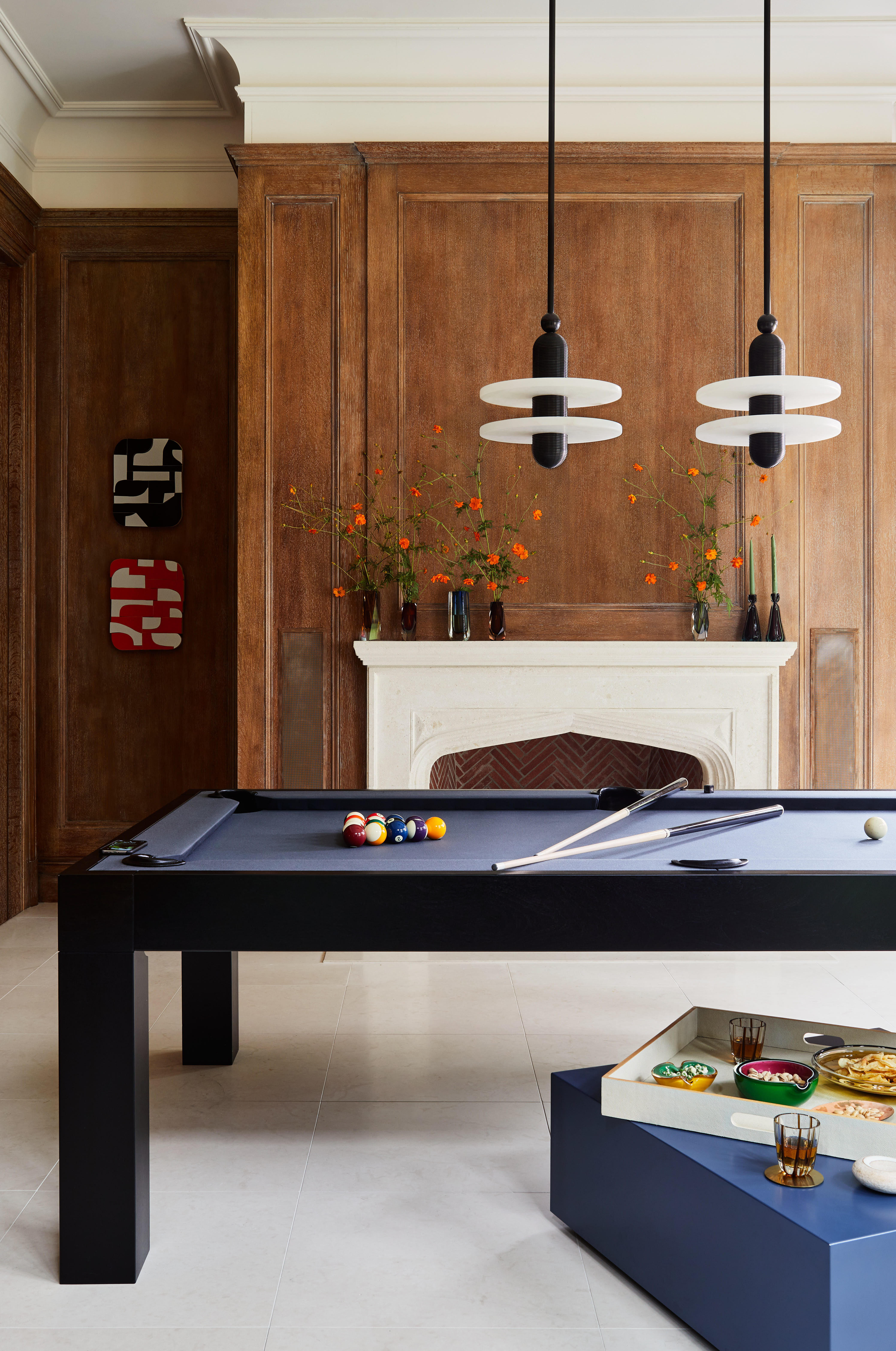
Repeating design elements runs the risk of looking monotonous – but if you switch up the pattern with different scales, you’ll create plenty of visual interest through contrast. “I think an interior should have some larger and smaller items for good aesthetic hierarchy,” says New York-based interior designer Lucy Harris. “The best way to complement the larger items is with the repetition of several smaller items that are similar to each other or the same – it contrasts nicely to the larger pieces.”
In the above games room, a clutch of repeating elements with different scales bring contrast and relief to the hulking pool table. “A large, horizontal light fixture, which is classic over a billiards table, would have felt heavy and not have given the fresh look that the two vertically-oriented pendants did,” explains Harris. “Your eye is then drawn to the repetition of the paintings, which are even smaller than the lights for a little punctuation – kind of how a colon can clean up a long sentence and make it look much better.”
12. LOOK TO LARGER FEATURES FOR INSPIRATION
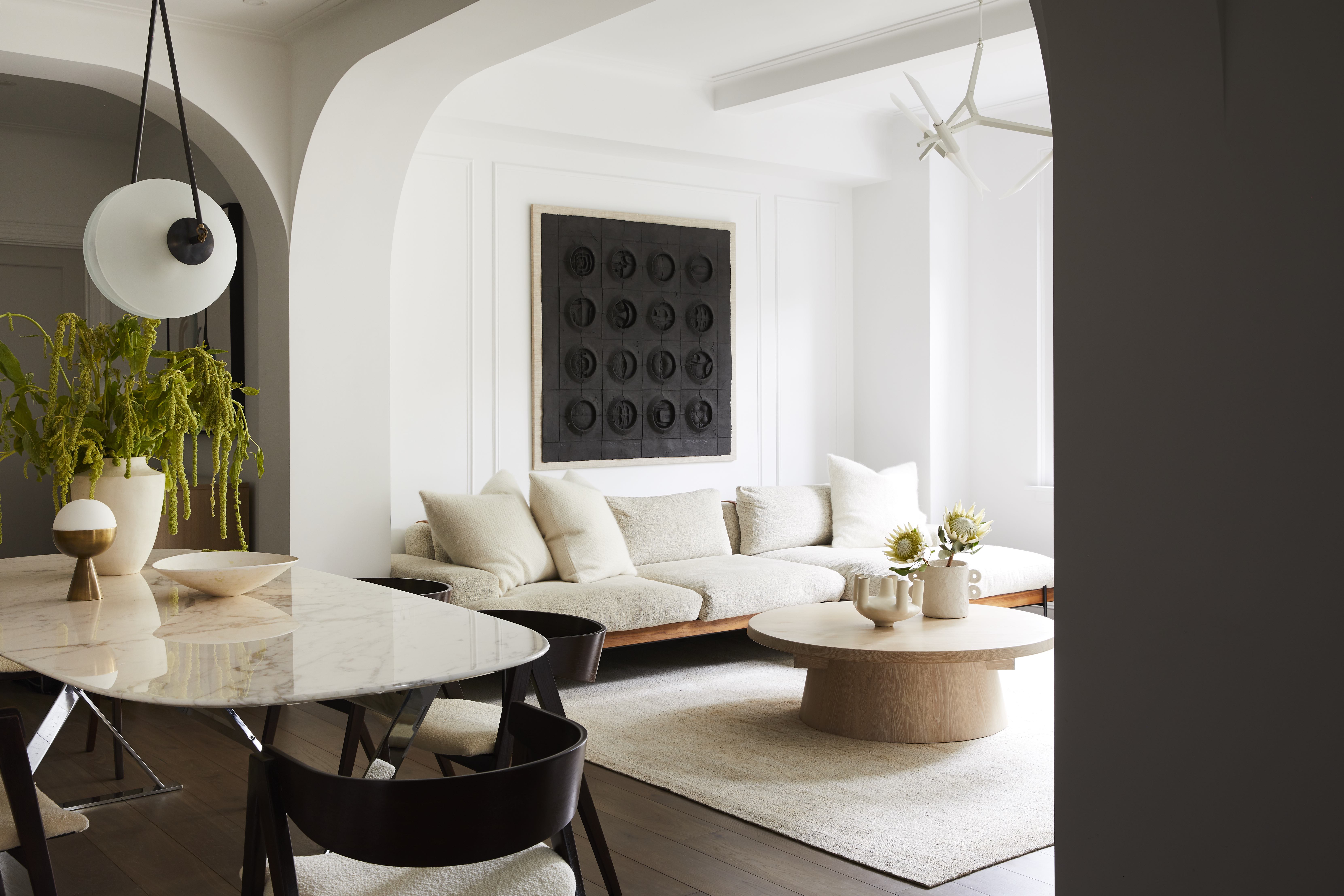
Instead of starting small, look for inspiration from large features within your space for inspiration; anything from a curved sofa to a sculptural fireplace feature materials and forms worthy of repeating throughout your space. “In our work, we find it's helpful to have one large, bold gesture that sets the tone, and that can inform and influence secondary and tertiary elements,” says Kevin Greenberg of Brooklyn’s Space Exploration Design.
In the open dining and living area above, architectural curves were the inspiration for corresponding decor throughout the room. “In this project, that defining gesture is expressed as the unframed arches that frame the dining room and library,” says Greenberg. “Those arches act as a kind of tuning fork, and we allowed their proportions and their sinuous curvature to reverberate throughout this room: the gesture appears again in the artwork, in the radii of the dining and coffee tables, and especially in the statement light fixture above the dining table.”
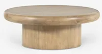
Jono round coffee table, Lulu and Georgia
Whether you have the architectural curves or not this modern/organic coffee table is a perfect center piece to build a scheme around.
13. WORK IN A SERIES OF ARTWORK
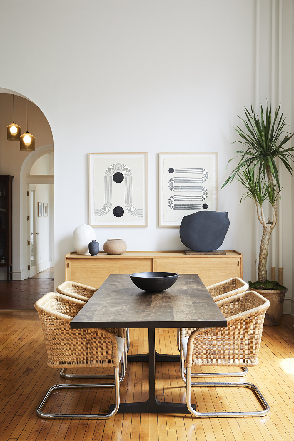
A series of eye-catching wall art (with matching sizes and a unified style from frame to frame) can bring rhythm and stability all in one go; think of it like letting your favorite artist do all the work for you. “When they are the same size and framed the same way, diptychs, triptychs and series emphasize repetition,” explains Kevin Greenberg of Space Exploration Design.
In the dining room above, a pair of prints by Los Angeles’ Block Shop makes repetition the room’s focal point. “The bold graphics complement the limited palette of the rest of the interior, and the variation between the two images creates a sense of broken symmetry with just enough tension between them to add something unique to the overall feeling of the room,” explains Greenberg.
Keith Flanagan is a New York based journalist specialising in design, food and travel. He has been an editor at Time Out New York, and has written for such publications as Architectural Digest, Conde Nast Traveller, Food 52 and USA Today. He regularly contributes to Livingetc, reporting on design trends and offering insight from the biggest names in the US. His intelligent approach to interiors also sees him as an expert in explaining the different disciplines in design.

